How JS Works: Animation with CSS and JavaScript
[We advise you to read] Other 19 parts of the cycle
Part 1: Overview of the engine, execution time mechanisms, call stack
Part 2: About the V8 internals and code optimization
Part 3: Memory management, four types of memory leaks and dealing with them
Part 4: Event loop, asynchrony, and five ways to improve code with async / await
Part 5: WebSocket and HTTP / 2 + SSE. What to choose?
Part 6: Features and Scope of WebAssembly
Part 7: Web Workers and Five Use Cases
Part 8: Service Workers
Part 9: Web push notifications
Part 10: Tracking DOM Changes with MutationObserver
Part 11: The engines of rendering web pages and tips to optimize their performance
Part 12: Browser networking subsystem, optimizing its performance and security
Part 12: Browser networking subsystem, optimizing its performance and security
Part 13: Animation with CSS and JavaScript
Part 14: How JS works: abstract syntax trees, parsing and its optimization
Part 15: How JS Works: Classes and Inheritance, Babil and TypeScript Transformation
Part 16: How JS Works: Storage Systems
Part 17: How JS Works: Shadow DOM Technology and Web Components
Part 18: How JS: WebRTC and P2P Communication Mechanisms Work
Part 19: How JS Works: Custom Elements
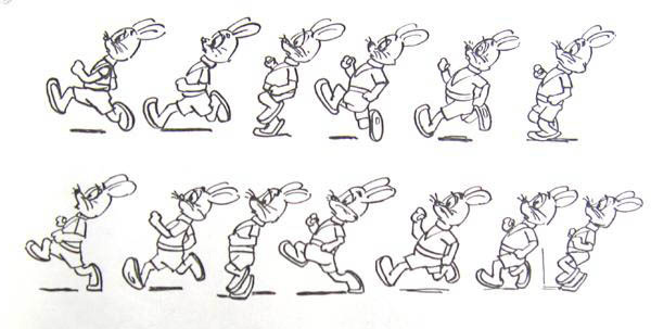
Animation is an integral part of modern web interfaces. On how it is relevant, attractive and productive, depends on a large proportion of user experience from working with the site or web application. Today, in the translation of the thirteenth part of a series of materials on the features of JavaScript and related technologies, we will talk about the animation performed by CSS and JS, as well as discuss approaches to its optimization.
Overview
Surely you know that animation, in addition to its purely utilitarian role, has a huge impact on the attractiveness of web applications. Users are increasingly paying attention to UX-design projects, which leads to the fact that the owners of web resources come to realize the importance of creating on their websites such conditions that would allow users to feel comfortable there. All this, in addition to the visual appeal of the pages and the convenience of working with them, leads to the fact that web projects become “harder”, to the fact that the number of dynamic elements grows in their interfaces. All this requires more complex animations, which, for example, allow you to organize a smooth change in the status of web pages during the user experience with them. Today, animation is not considered something special. Users are becoming more demanding, they are already accustomed to expecting web projects to have interactive, responsive interfaces.
However, animating interfaces is not so simple. What to animate? When to animate? What sensations should animation cause? Finding answers to these questions may require a lot of effort.
')
JavaScript animation and CSS animation
You can create animations in two main ways: using JavaScript, using the web animation API , and using CSS. The choice of method depends on the specific task, so I immediately want to note that it is impossible to clearly speak about the advantage of one technology over another.
▍CSS-animation
CSS animation is the easiest way to get something moving around the screen. Let's start with a simple example that demonstrates moving an element along the X and Y axes. This is done using the CSS
translate transform, which is configured for a duration of 1000 ms. .box { -webkit-transform: translate(0, 0); -webkit-transition: -webkit-transform 1000ms; transform: translate(0, 0); transition: transform 1000ms; } .box.move { -webkit-transform: translate(50px, 50px); transform: translate(50px, 50px); } When you add the
move class, the transform value changes and the transition begins. In addition to the duration, we can customize the dynamics of the animation ( easing ). The essence of this setting comes down to the fact that it affects how the user perceives the animation. We’ll talk about animation dynamics later.The illustration below shows support for CSS transitions with modern browsers.
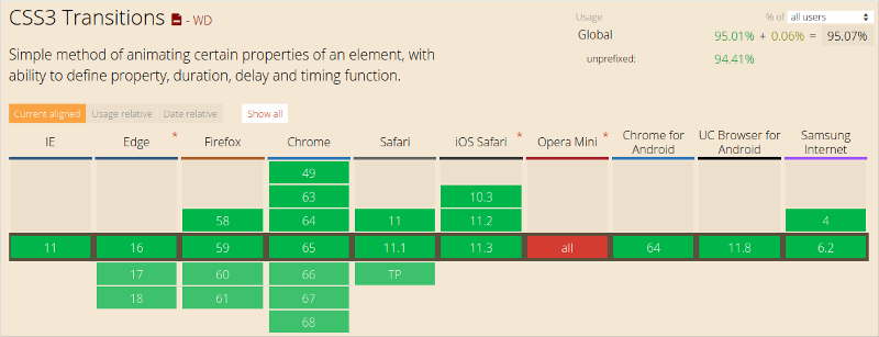
Support for CSS transitions with modern browsers
As you can see, this feature has a very high level of support.
If, as in the previous code snippet, you create separate CSS classes to control the animation, then you can enable or disable the animation using JavaScript.
Suppose we have the following element.
<div class="box"> Sample content. </div> Using JavaScript, you can start and stop its animation.
var boxElements = document.getElementsByClassName('box'), boxElementsLength = boxElements.length, i; for (i = 0; i < boxElementsLength; i++) { boxElements[i].classList.add('move'); } In this code snippet, we take all the elements that are assigned to the
box class and add the class move to them in order to start their animation.Such CSS sharing features — for describing animations, and JS — for launching and disabling it, make the application well-balanced. The developer can focus on managing the state of the elements from JavaScript by simply assigning the appropriate classes to the target elements, allowing the browser to independently perform the animations described by CSS. If you delve into a similar scenario of working with animation, you can listen to the event's
transitionend event, but you should do so only if you support older versions of Internet Explorer.The
transitionend event is raised at the end of the transition. Here's how to work with him. var boxElement = document.querySelector('.box'); // box. boxElement.addEventListener('transitionend', onTransitionEnd, false); function onTransitionEnd() { // . } In order to make web interface elements more dynamic, in addition to using CSS transitions, you can use CSS animations. They give the developer a much greater level of control over the individual keyframes of the animation, the duration of the animation steps and the iterations of the animation.
Keyframes are used to tell the browser which CSS property values should have at specified times. The browser independently finds intermediate values for properties when moving from one keyframe to another.
Consider an example.
/** * - * . * ( ), * ! */ .box { /* */ animation-name: movingBox; /* */ animation-duration: 2300ms; /* - */ animation-iteration-count: infinite; /* */ animation-direction: alternate; } @keyframes movingBox { 0% { transform: translate(0, 0); opacity: 0.4; } 25% { opacity: 0.9; } 50% { transform: translate(150px, 200px); opacity: 0.2; } 100% { transform: translate(40px, 30px); opacity: 0.8; } } Here is the page that shows the operation of this code.
Using CSS animations, the animation itself is described independently of the target element, and then use the
animation-name property to select the desired animation.CSS animations, until now, sometimes require the use of browser developer prefixes. So, the prefix
-webkit- used in Safari, Safari Mobile, and Android browsers. In Chrome, Opera, Internet Explorer, and Firefox browsers, animations work without prefixes. In order to create CSS code with prefixes, you can use a variety of auxiliary tools, which allows the developer, in the source code of animations, to do without prefixes.▍JavaScript animation
Creating animations using JavaScript using the web animation API is more difficult than using CSS transitions and CSS animations, but this approach usually gives the developer much greater possibilities.
JS-animations are described in the application code. Like any other code, they can, for example, be placed in objects. Here is an example of the JS code you need to write in order to recreate the CSS transition described above.
var boxElement = document.querySelector('.box'); var animation = boxElement.animate([ {transform: 'translate(0)'}, {transform: 'translate(150px, 200px)'} ], 500); animation.addEventListener('finish', function() { boxElement.style.transform = 'translate(150px, 200px)'; }); By default, the use of the web animation API only modifies the appearance of the element. If you want the object to remain in the position to which it was moved during the animation, you must, at the end of the animation, modify its style. That is why in the above example, we listen for the
finish event and set the property of the box.style.transform element to translate(150px, 200px) , which expresses the same thing that was done with the object using the second transformation performed by JS.When using JavaScript animations, the developer has full control over the element styles at each stage of the animation. This means that the animation can be slowed down, paused, stopped, reversed, manipulated elements in any way. This is especially useful during the creation of complex applications, the development of which uses an object-oriented approach, since the behavior of elements can be properly encapsulated.
Animation dynamics
The natural movement of objects gives users a feeling of comfort when working with web applications, which leads to a better user experience.
If we talk about how objects move in the real world, it can be noted that they, for example, do not move linearly. In the physical world, moving objects accelerate and slow down, since they are affected by a variety of environmental factors. The human brain is accustomed to expect from objects such movements, therefore, animating web applications, it should be taken into account.
Here are a couple of terms that will be useful to us when talking about the dynamics of animation. Namely, let's talk about the so-called smoothness functions. Their use allows you to influence the dynamics of the animation.
ease-inis a function that, when applied, first performs the animation slowly and then accelerates gradually.ease-outis a function whereby the animation starts quickly, and then slowly slows down.
These functions can be combined. As a result, the
ease-in-out function can be obtained, for example.Controlling the dynamics of animation allows you to make the movement of objects perceived as more natural.
▍Keywords to control the dynamics of animation
CSS transitions and animations allow the developer to choose smoothness features. There are various keywords that affect the dynamics of an animation. In addition, you can create your own functions and smoothness. Here are some keywords that can be used in CSS to control the dynamics of an animation:
- linear
- ease-in
- ease-out
- ease-in-out
Let us consider them in more detail in order to find out how they affect the animation.
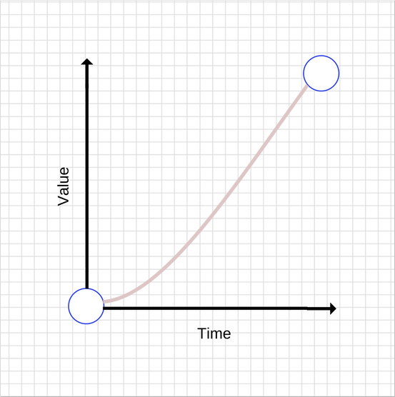
Linear Animation linear
The
linear keyword allows for linear animation. In fact, this animation is described by a linear function, when applied, the object is animated at a constant speed, without acceleration and deceleration.This is what a linear CSS transition graph looks like.
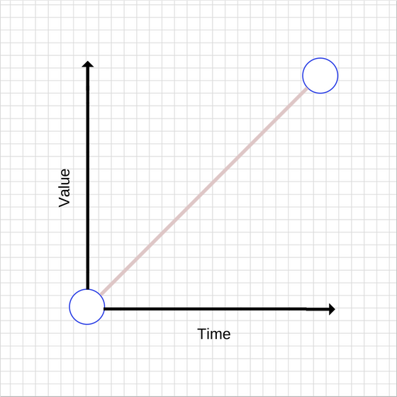
Linear animation
It can be seen that over time the value increases evenly. Linear displacements, however, are perceived as unnatural. In general, it should be noted that such animations should be avoided.
Here is the description of the animation:
transition: transform 500ms linear; EaseEasy-out animation
As already mentioned, the use of the
ease-out function leads to a high animation speed at the beginning of the process (its speed is higher than with a linear function), which slows down at the end of the animation. Here is the graphic representation of such an animation.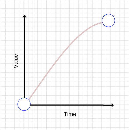
Ease-out animation
In general, such an animation is better suited for the user interface, since its quick start gives the feeling of responsiveness of the element, while the slowdown at the end of the animation also makes it more natural due to the presence of uneven movement.
There are many ways to achieve this effect, but the easiest way is to use the CSS
ease-out keyword: transition: transform 500ms ease-out; EaseEasy-in animation
This animation is the opposite of the one we just looked at. It is characterized by low speed at the beginning and increase in speed at the end. Here is its graphic representation.
Ease-in animation
Compared to the
ease-out animation, the ease-in animation looks unusual, as it gives a feeling of a low level of responsiveness of the element due to a slow onset. Acceleration at the end also creates strange sensations, as the speed of animation increases over time, while objects in the real world, before stopping, usually reduce speed.To use this animation, similarly to the previous one, you can use the
ease-in keyword: transition: transform 500ms ease-in; EaseEasy-in-out animation
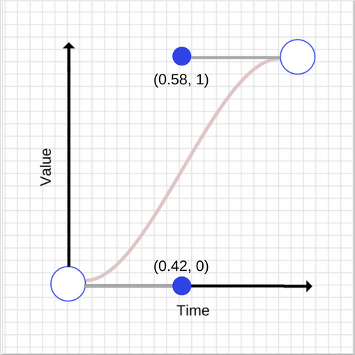
This animation is a combination of
ease-in and ease-out animations. Here is what her schedule looks like.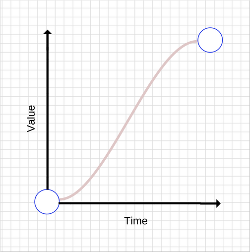
Ease-in-out animation
It is worth noting here that it is not recommended to use animations that are too long, as they create the feeling that the interface has stopped responding to its effects.
You can use this animation using the
ease-in-out keyword: transition: transform 500ms ease-in-out; ▍Creating eigenfunctions of smoothness
The developer can define his own smoothness functions, which give much better control over what user experience is created by the animations used in the project.
In fact, behind the keywords that we talked about above (
ease-in , ease-out , linear ) are Bezier curves , details of which can be used to control the animation here and here . Give them some time, since it is on them that the creation of eigenfunctions of smoothness is based.Bezier curves
To construct a Bezier curve, you need four values, or, more precisely, two pairs of numbers. Each pair describes the X and Y coordinates of the reference point of the cubic Bezier curve. The curve itself begins at the coordinate (0, 0), and ends at the coordinate (1, 1). You can customize the properties of control points. The values of the X coordinates of the control points must be in the range [0, 1], the values of Y must also fall in the range [0, 1], although it should be noted that the specifications do not fully clarify this point.
Even a small change in the X and Y values of the reference points leads to a significant change in the curve. Take a look at a pair of graphs of Bezier curves, the reference points of which have very close, but different coordinates.
First bezier curve
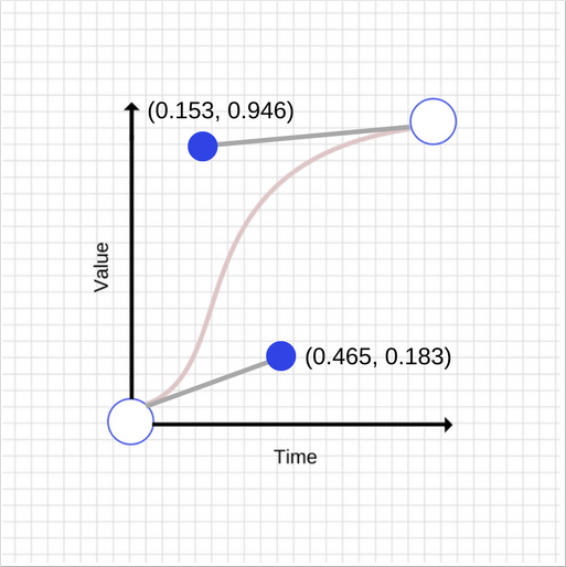
Second bezier curve
As you can see, these two graphs are very different from each other. Here is the description of the second curve in CSS:
transition: transform 500ms cubic-bezier(0.465, 0.183, 0.153, 0.946); The first two numbers are the X and Y coordinates of the first reference point, the second pair is the coordinates of the second one.
Optimize animation performance
When animating interfaces, you need to ensure that the frame rate does not fall below 60 FPS, otherwise it will badly affect how users perceive animated pages.
Like everything else in this world, you have to pay for the animation. At the same time, the animation of some properties is “cheaper” than the animation of others. For example, animating the
width and height properties of an element changes its geometry and may cause other elements on the page to move or resize. This process is called page layout. We spoke about this in one of the previous materials.In general, you should avoid animating the properties of elements that cause a change in the page layout or redrawing it. For most modern browsers, this means limiting the
opacity and transform animations.SSCSS-property will-change
The will-change CSS property can be used to tell the browser that we intend to change the property of the element. This allows the browser to apply suitable optimizations in advance of the animation. However, you should not abuse the
will-change property, as this will lead to waste of browser resources, which, in turn, will lead to performance problems.For example, here's how to add this property for
transform and opacity animations: .box { will-change: transform, opacity; } This property is not yet understood by all browsers, but its support is available in Chrome, Firefox and Opera browsers.
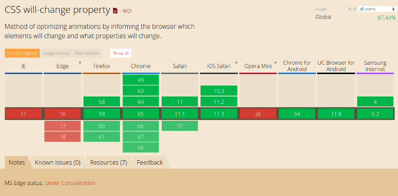
Support CSS properties will-change
▍JavaScript or CSS?
What to choose for animation - web animation API, called from JS, or CSS? You probably remember that above we said that a similar question cannot be answered unambiguously. However, in order to still decide on the technology, consider the following considerations:
- CSS animations and web animations, if they have native support, are usually processed by the compositor thread. It differs from the main browser thread (main thread), where tasks are performed on styling elements, on creating a layout, on displaying data on the screen, and on executing JS code. This means that if the browser performs some complex tasks in the main thread, the animations will be performed normally, without interruptions.
- Transforms and
opacityanimations can, in many cases, be processed by the composition stream. - If some kind of animation causes a page to be redrawn or a layout change, the main thread will have to work. This is true for CSS animations, and for JS-animations. The additional load on the system, caused by changing the layout or redrawing the page, is likely to slow down the tasks performed by CSS or JavaScript, putting the system in a difficult position.
▍Select objects for animation
Sophisticated animation makes the project more interesting and more attractive to users. They enjoy working with him. You can animate almost anything you want: the width and height of elements, their position on the screen, colors and backgrounds. However, planning to animate something, you should think about performance. Unsuccessfully selected animations can adversely affect how users perceive the project, so the animations should be both fast and relevant. In fact, it is worth striving to give the interface a natural and attractive, limited to a minimum of animation.
▍Using animations to support user interaction
You should not animate anything just because you have the technical ability to do it. Instead, use carefully selected animations to improve the interaction of page elements with the user. Avoid animations that interrupt or interfere with the user's activities.
▍ Animations causing a heavy load on the system
Worse than misplaced animation can only be an animation that “hangs” the page. Users of any web project just do not like it.
Results
In this article, we talked about the animation of elements of web pages using CSS and JavaScript. Animation is a powerful tool, so you should handle it carefully. With the right approach, animation can significantly improve the user experience of working with a web resource.
Previous parts of a series of articles:
Part 1: How JS Works: Overview of the Engine, Runtime Mechanisms, Call Stack
Part 2: How JS Works: About V8 Inside and Code Optimization
Part 3: How JS works: memory management, four types of memory leaks and how to deal with them
Part 4: How JS works: event loop, asynchrony, and five ways to improve code with async / await
Part 5: How JS: WebSocket and HTTP / 2 + SSE work. What to choose?
Part 6: How JS Works: Features and Scope of WebAssembly
Part 7: How JS Works: Web Workers and Five Use Cases
Part 8: How JS Works: Service Workers
Part 9: How JS Works: Web Push Notifications
Part 10: How JS Works: Tracking DOM Changes with MutationObserver
Part 11: How JS Works: Web Page Rendering Engines and Tips for Optimizing Their Performance
Part 12: How JS Works: Browser Network Subsystem, Optimizing Its Performance and Security
Dear readers! Have you ever come across cases when animation really interferes with working with any web resource?

Source: https://habr.com/ru/post/354438/
All Articles