Mother's son's style of girlfriend
Hi, Habr! We continue our experimental series of articles, watching which you can in real time influence the course of creating a game on UWP. In this part, we will talk about the style of the application and show that doing beautiful is not so difficult. Do not forget to leave comments!

I give the floor to the author, Alexey Plotnikov .
')
Initially, in this article I planned to talk about styling the window title and status bar, but we already talked about the title at the Microsoft blog and duplicating this information does not make any sense, as it does not make sense to touch on the subject of application styling in such a narrow aspect.
What does stylization mean from a developer's point of view and were, for example, standard Windows 2000 programs stylish? Of course, they were, if we consider the term “stylization” exclusively in the digital field. All controls in the system had the same color and relief, and the response to pressing or pointing was familiar and expected, regardless of the program or individual window in it. And I knowingly cited the example of Windows 2000, since Windows XP left it (Windows ME does not count), which brought with it significant changes in the style of controls. Curvature, bright colors and a more vivid reaction to user actions - all this appeared along with the new Windows, and each subsequent version continued this tradition and its appearance became a direct continuation of current trends in the digital world.
It turns out that the style in the context of software development - this is what our controls and the program as a whole look like? No, because style is, first of all, consistency of appearance within one ecosystem and, until recently, the whole OS was considered to be such an ecosystem.
Changes began with the advent of mobile devices, which changed the philosophy of interaction with the program. More and more, the user began to perceive the program not as part of the OS, but as an independent ecosystem with its own internal rules and features. The easiest way to understand this is by browsing sites on the Internet. Go through all your tabs in the browser, and you will see completely different, not similar to each other styles, but at the same time, most often, agreed within the same site. It was mobile devices that began to blur the line between the rules applicable to sites, when the user focuses on content and the rules of the software world, where the program was perceived as part of the OS.
For the first time, I tried to implement this philosophy in Windows 8, when, in a certain sense, the OS itself was similar to the browser, in which we ran applications like sites and all the concentration was on their content in isolation from the rest of the OS. However, the mass user of such changes did not understand, since personal computers were still the main Windows platform. When the changes made to Windows 8.1 did not help either, Widows 10 was born, where there are classic programs that are still perceived as part of the entire OS and universal applications, which for the most part focus the user's attention on themselves.
All of this reasoning and a digression into history is aimed at understanding the only important point - your UWP application is not so much a part of the operating system as an independent world into which the user is immersed. More precisely, it should be so.
“What's wrong with the standard controls?” - you ask, because they have a consistent style both within the application and throughout the OS as a whole. And with them everything is in order, provided that you do not mind that your application has become for the user one of many that he won’t be remembered by anything.
Despite all of the above, it is extremely important to understand that without high-quality functionality or content, no personal style will help your application to achieve the user's location and, at the same time, with high-quality content, your style should complement and not pervert its perception.
As I develop applications, I brought out for myself the minimum necessary to achieve a sense of individuality and immersing a user into the world of an application, but I’ll just say that even in this cycle we are talking about a game, conceptually I’m not developing a game, but an application with the presence of game mechanics and then its design and style should not be perceived as applicable only to games.

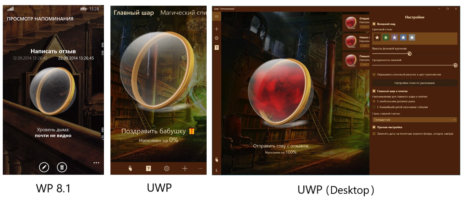
The figure above shows an example of the settings of one of my UWP applications “ Ball reminder ”. The first version of this application was released on Windows Phone 8.1 and from the point of view of the main functionality it didn’t practically differ from the current UWP version except for the lack of a unique style. The importance of styling has become clear due to monitoring reviews and ratings of the application, since the UWP version has a rating higher by an average of 0.7 points, and among the reviews there are regular phrases “beautiful” or “stylish”.
Let us examine which minimal style elements I set in the application:
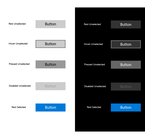
The combination of these four colors is more than enough to change the style of the entire application. For example, the standard button has a color for the background in a calm state, the second one for the background when hovering and a separate one for indicating pressing. The fourth color determines the text inside the button.
I draw your attention to the fact that in articles devoted to styling and design I do not consider the new design style of Fluent Design applications, since it appeared relatively recently and is still evolving. In addition, the concept of Fluent Design is much broader than just setting a particular style for the basic elements and requires deep immersion in its philosophy, which has not happened to me yet. I will definitely consider Fluent Design later, but only as an alternative style version for my applications.
Let's go to practice. To begin with, we will decide on the place where the application colors are stored. Since the listed colors should be available from almost anywhere in the application, it’s best to save them in a global resource file. Such a file in my applications is the ApplicationStyle file about which I wrote at the end of the first article of the cycle.
Colors will be stored as SolidColorBrush resources.
UWP resources are instances of an object with predefined properties and a text key that can be accessed by them.
Here is an example of the resources I use in the application:
Key names indicate the role of color in the interface, and I described the logic of their use in the example above and, although you are free to use other names, try to select them so that you can quickly find out what resource you need at any time and anywhere in the program.
Then you can access this resource from both XAML and application code.
In the first case, the markup looks like this:
And in the second so:
It is the second option that will help when setting the window title colors, with the mention of which I started the story. In section 3 of the heading styling article, I gave a sample code to color the heading in the required colors. For the convenience of working with this code, I combine it into a procedure called SetTitleBar, which I place in the main class of the application (when using MVVM it is a ViewModel).
Notice that the header properties accept objects of the Color type, and our resources are of the SolidColorBrush type, so we first create local objects for each color, and then refer to their Color properties.
Call this procedure as early as possible, so I do it at the end of the initialization of the extended splash screen (the New procedure) and set the color for the status bar on mobile devices.
This code is partially familiar to you, since we used it to get the height of the status bar in order to correctly position the image on the screen saver, but now it is supplemented with three lines for setting the color. The first reports that the status bar should not be transparent, and the second and third according to the already familiar method sets the color for it.
So, with the technical part figured out, but what about the creative? Not many of you are part of a team where there is a designer and, especially, not all of them have creative talents themselves. I also do not belong to those, but I know that “It is not the gods who burn the pots” and there is nothing shameful in achieving the result experimentally.
This is exactly how the default color scheme was born in the mentioned application “Ball reminder”. First, I selected a suitable background image, and then based on it, the most contrasting color for the background (StandartBackgroundBrush). After that, in the graphic editor, based on this color, I chose a lighter (LightBackgroundBrush) and darker (DarkBackgroundBrush), and at the end the lightest for the foreground (ForegroundBrush). This was followed by a long process of rewriting the styles of the main controls and as this work proceeded, the chosen colors underwent changes for better perception.
However, towards the end of development, the chosen color scheme began to bother me fairly and, even though I understood that the effect was purely psychological, it made me add a few more color schemes to the application and the possibility of their choice. And in the process of writing this article, it suddenly dawned on me, because adding new color schemes to an already finished application is much easier, since you can immediately see the change in the entire interface. But what about the readers, what probably only started the development of their application and have difficulty in presenting the final result? Yes, I myself in the process of developing new applications would like to know in advance what colors to choose and how it will look like in the end.
Without thinking twice, I decided to write a small application “ColorSelector” to quickly create color schemes for the application. Since it took only a couple of days to create it, it has the most basic set of functions and, undoubtedly, will be expanded and developed in the future in terms of functionality. Connect to this process on GitHub .
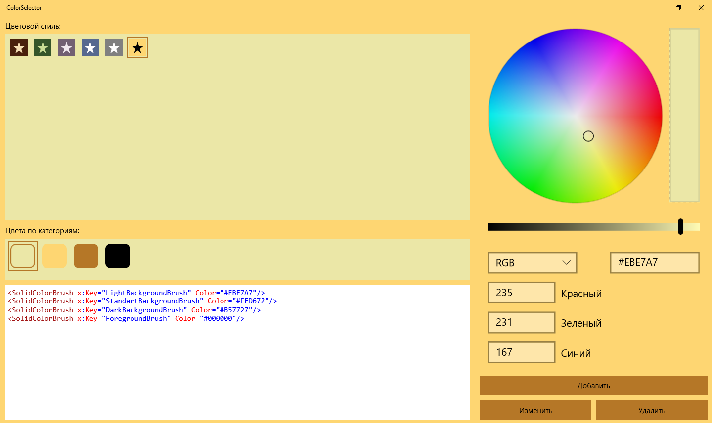
It is important to note the differences in the approach in the ColorSelector code from what I describe in this article. The approach in the article assumes the presence of a single color scheme in your application, and the ColorSelector is created taking into account the possibility of choosing schemes. If the ColorSelector source is not enough for you to implement custom schemes in your application, then write in the comments, and in a separate article I will discuss how to modify the solutions described above.
If we consider this article as a continuation of the previous one, at the moment we have created an extended splash screen and used two colors from the application color scheme: LightBackgroundBrush for the window background (in the article about the splash screen just BackgroundBrush) and ForegroundBrush for text. According to the results of this article, using the entire set of colors, the window title and the status bar were styled.
The next step will be to develop the interface of the main window, and there will already appear various controls for styling which it is not enough just to assign resources for any properties. Changes that we will need to make will require rewriting of control templates, and this topic is extensive and concerns not only the styling of the application, so I will look at it in a separate article (and perhaps not in one).
Fortunately, elements such as panels and containers do not require deep intervention in their structure, so you can immediately apply colors from the set to them to achieve a consistent look. Also in the article “ Eat three donuts from UWP and not choke ” I told about how easy it is to repaint application icons created from PNG files that we can easily stylize with one of the colors of the set (according to the logic, this is ForegroundBrush).
In conclusion, I would like to clarify to whom the approach described in this article is oriented. If you have an experienced designer in your team or you yourself have enough experience, then it’s not for me to teach you how to make a seemingly attractive application. However, the Windows store is full of applications with high-quality content or functionality, but with a completely nondescript appearance. This is due to the fact that many developers consider the issue of styling too complicated or time consuming to study, as a result of which they are not ready to waste time on it. I propose to achieve a good result, with a minimum set of efforts. After two articles, you already have a high-quality look at the start, and after two or three, that you are planning and will be able to stylize the entire application.
Follow this cycle and be sure to participate through your comments and suggestions in the comments. See you again!
- Part 1: Where to start
- Part 2: Advanced Splash Screen
- Part 3: The style of the mother's son's girlfriend
- Part 4: Receiving user data (voluntary)
- Part 5: Where do you keep the data?
I give the floor to the author, Alexey Plotnikov .
')
Initially, in this article I planned to talk about styling the window title and status bar, but we already talked about the title at the Microsoft blog and duplicating this information does not make any sense, as it does not make sense to touch on the subject of application styling in such a narrow aspect.
What does stylization mean from a developer's point of view and were, for example, standard Windows 2000 programs stylish? Of course, they were, if we consider the term “stylization” exclusively in the digital field. All controls in the system had the same color and relief, and the response to pressing or pointing was familiar and expected, regardless of the program or individual window in it. And I knowingly cited the example of Windows 2000, since Windows XP left it (Windows ME does not count), which brought with it significant changes in the style of controls. Curvature, bright colors and a more vivid reaction to user actions - all this appeared along with the new Windows, and each subsequent version continued this tradition and its appearance became a direct continuation of current trends in the digital world.
It turns out that the style in the context of software development - this is what our controls and the program as a whole look like? No, because style is, first of all, consistency of appearance within one ecosystem and, until recently, the whole OS was considered to be such an ecosystem.
Changes began with the advent of mobile devices, which changed the philosophy of interaction with the program. More and more, the user began to perceive the program not as part of the OS, but as an independent ecosystem with its own internal rules and features. The easiest way to understand this is by browsing sites on the Internet. Go through all your tabs in the browser, and you will see completely different, not similar to each other styles, but at the same time, most often, agreed within the same site. It was mobile devices that began to blur the line between the rules applicable to sites, when the user focuses on content and the rules of the software world, where the program was perceived as part of the OS.
For the first time, I tried to implement this philosophy in Windows 8, when, in a certain sense, the OS itself was similar to the browser, in which we ran applications like sites and all the concentration was on their content in isolation from the rest of the OS. However, the mass user of such changes did not understand, since personal computers were still the main Windows platform. When the changes made to Windows 8.1 did not help either, Widows 10 was born, where there are classic programs that are still perceived as part of the entire OS and universal applications, which for the most part focus the user's attention on themselves.
All of this reasoning and a digression into history is aimed at understanding the only important point - your UWP application is not so much a part of the operating system as an independent world into which the user is immersed. More precisely, it should be so.
“What's wrong with the standard controls?” - you ask, because they have a consistent style both within the application and throughout the OS as a whole. And with them everything is in order, provided that you do not mind that your application has become for the user one of many that he won’t be remembered by anything.
Despite all of the above, it is extremely important to understand that without high-quality functionality or content, no personal style will help your application to achieve the user's location and, at the same time, with high-quality content, your style should complement and not pervert its perception.
Gentleman's set of beautiful applications
As I develop applications, I brought out for myself the minimum necessary to achieve a sense of individuality and immersing a user into the world of an application, but I’ll just say that even in this cycle we are talking about a game, conceptually I’m not developing a game, but an application with the presence of game mechanics and then its design and style should not be perceived as applicable only to games.
The figure above shows an example of the settings of one of my UWP applications “ Ball reminder ”. The first version of this application was released on Windows Phone 8.1 and from the point of view of the main functionality it didn’t practically differ from the current UWP version except for the lack of a unique style. The importance of styling has become clear due to monitoring reviews and ratings of the application, since the UWP version has a rating higher by an average of 0.7 points, and among the reviews there are regular phrases “beautiful” or “stylish”.
Let us examine which minimal style elements I set in the application:
- Standard background color (also known as StandartBackgroundBrush). In the example with the choice of style, it is shown by filling the square.
- Light background color (aka LightBackgroundBrush). This color shaded the panel in which the squares with the sets are located.
- Dark background color (also known as DarkBackgroundBrush). It sets the color of the frame that frames the square, showing the current selection.
- Foreground color (aka ForegroundBrush). This color is filled with stars inside the squares, and it is also used as the text color.
The combination of these four colors is more than enough to change the style of the entire application. For example, the standard button has a color for the background in a calm state, the second one for the background when hovering and a separate one for indicating pressing. The fourth color determines the text inside the button.
I draw your attention to the fact that in articles devoted to styling and design I do not consider the new design style of Fluent Design applications, since it appeared relatively recently and is still evolving. In addition, the concept of Fluent Design is much broader than just setting a particular style for the basic elements and requires deep immersion in its philosophy, which has not happened to me yet. I will definitely consider Fluent Design later, but only as an alternative style version for my applications.
Let's go to practice. To begin with, we will decide on the place where the application colors are stored. Since the listed colors should be available from almost anywhere in the application, it’s best to save them in a global resource file. Such a file in my applications is the ApplicationStyle file about which I wrote at the end of the first article of the cycle.
Colors will be stored as SolidColorBrush resources.
UWP resources are instances of an object with predefined properties and a text key that can be accessed by them.
Here is an example of the resources I use in the application:
<SolidColorBrush x:Key="LightBackgroundBrush" Color="#7690C9"/> <SolidColorBrush x:Key="StandartBackgroundBrush" Color="#56698F"/> <SolidColorBrush x:Key="DarkBackgroundBrush" Color="#2D2556"/> <SolidColorBrush x:Key="ForegroundBrush" Color="#FFFFFF"/> Key names indicate the role of color in the interface, and I described the logic of their use in the example above and, although you are free to use other names, try to select them so that you can quickly find out what resource you need at any time and anywhere in the program.
Then you can access this resource from both XAML and application code.
In the first case, the markup looks like this:
Background="{StaticResource StandartBackgroundBrush}" And in the second so:
.Background = Application.Current.Resources.Item("StandartBackgroundBrush") It is the second option that will help when setting the window title colors, with the mention of which I started the story. In section 3 of the heading styling article, I gave a sample code to color the heading in the required colors. For the convenience of working with this code, I combine it into a procedure called SetTitleBar, which I place in the main class of the application (when using MVVM it is a ViewModel).
Public Sub SetTitleBar() Dim tb As ApplicationViewTitleBar = ApplicationView.GetForCurrentView.TitleBar Dim lb As SolidColorBrush = Application.Current.Resources.Item("LightBackgroundBrush") Dim sb As SolidColorBrush = Application.Current.Resources.Item("StandartBackgroundBrush") Dim db As SolidColorBrush = Application.Current.Resources.Item("DarkBackgroundBrush") Dim fb As SolidColorBrush = Application.Current.Resources.Item("ForegroundBrush") tb.BackgroundColor = sb.Color tb.ButtonForegroundColor = fb.Color '... End Sub Notice that the header properties accept objects of the Color type, and our resources are of the SolidColorBrush type, so we first create local objects for each color, and then refer to their Color properties.
Call this procedure as early as possible, so I do it at the end of the initialization of the extended splash screen (the New procedure) and set the color for the status bar on mobile devices.
If Metadata.ApiInformation.IsTypePresent("Windows.UI.ViewManagement.StatusBar") Then StatusBar.GetForCurrentView.BackgroundOpacity = 1 Dim db As SolidColorBrush = Application.Current.Resources.Item("DarkBackgroundBrush") StatusBar.GetForCurrentView.BackgroundColor = db.Color statusBarRect = StatusBar.GetForCurrentView.OccludedRect End If This code is partially familiar to you, since we used it to get the height of the status bar in order to correctly position the image on the screen saver, but now it is supplemented with three lines for setting the color. The first reports that the status bar should not be transparent, and the second and third according to the already familiar method sets the color for it.
So, with the technical part figured out, but what about the creative? Not many of you are part of a team where there is a designer and, especially, not all of them have creative talents themselves. I also do not belong to those, but I know that “It is not the gods who burn the pots” and there is nothing shameful in achieving the result experimentally.
This is exactly how the default color scheme was born in the mentioned application “Ball reminder”. First, I selected a suitable background image, and then based on it, the most contrasting color for the background (StandartBackgroundBrush). After that, in the graphic editor, based on this color, I chose a lighter (LightBackgroundBrush) and darker (DarkBackgroundBrush), and at the end the lightest for the foreground (ForegroundBrush). This was followed by a long process of rewriting the styles of the main controls and as this work proceeded, the chosen colors underwent changes for better perception.
However, towards the end of development, the chosen color scheme began to bother me fairly and, even though I understood that the effect was purely psychological, it made me add a few more color schemes to the application and the possibility of their choice. And in the process of writing this article, it suddenly dawned on me, because adding new color schemes to an already finished application is much easier, since you can immediately see the change in the entire interface. But what about the readers, what probably only started the development of their application and have difficulty in presenting the final result? Yes, I myself in the process of developing new applications would like to know in advance what colors to choose and how it will look like in the end.
Without thinking twice, I decided to write a small application “ColorSelector” to quickly create color schemes for the application. Since it took only a couple of days to create it, it has the most basic set of functions and, undoubtedly, will be expanded and developed in the future in terms of functionality. Connect to this process on GitHub .
It is important to note the differences in the approach in the ColorSelector code from what I describe in this article. The approach in the article assumes the presence of a single color scheme in your application, and the ColorSelector is created taking into account the possibility of choosing schemes. If the ColorSelector source is not enough for you to implement custom schemes in your application, then write in the comments, and in a separate article I will discuss how to modify the solutions described above.
Next steps
If we consider this article as a continuation of the previous one, at the moment we have created an extended splash screen and used two colors from the application color scheme: LightBackgroundBrush for the window background (in the article about the splash screen just BackgroundBrush) and ForegroundBrush for text. According to the results of this article, using the entire set of colors, the window title and the status bar were styled.
The next step will be to develop the interface of the main window, and there will already appear various controls for styling which it is not enough just to assign resources for any properties. Changes that we will need to make will require rewriting of control templates, and this topic is extensive and concerns not only the styling of the application, so I will look at it in a separate article (and perhaps not in one).
Fortunately, elements such as panels and containers do not require deep intervention in their structure, so you can immediately apply colors from the set to them to achieve a consistent look. Also in the article “ Eat three donuts from UWP and not choke ” I told about how easy it is to repaint application icons created from PNG files that we can easily stylize with one of the colors of the set (according to the logic, this is ForegroundBrush).
Conclusion
In conclusion, I would like to clarify to whom the approach described in this article is oriented. If you have an experienced designer in your team or you yourself have enough experience, then it’s not for me to teach you how to make a seemingly attractive application. However, the Windows store is full of applications with high-quality content or functionality, but with a completely nondescript appearance. This is due to the fact that many developers consider the issue of styling too complicated or time consuming to study, as a result of which they are not ready to waste time on it. I propose to achieve a good result, with a minimum set of efforts. After two articles, you already have a high-quality look at the start, and after two or three, that you are planning and will be able to stylize the entire application.
Follow this cycle and be sure to participate through your comments and suggestions in the comments. See you again!
Source: https://habr.com/ru/post/354426/
All Articles