Typography in iOS
Most of the information in the application is transmitted through text. Therefore, it has to impose a lot, and the ignorance of the whole rendering mechanics entails various problems. For example, a simple task is to add text selection to an existing application. Replace UILabel with UITextView, and suddenly all the indents go, the text looks completely different or doesn't fit on the screen at all.
Under the cut, you will find a transcript of Irina Dyagileva ’s speech at AppsConf , in which she explained why this is happening and what settings are best to use in one way or another.
')
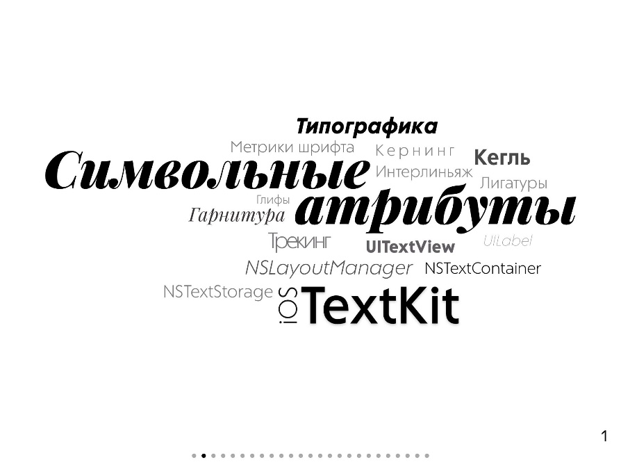
The article will consist of two parts, first we will talk about the basic terms of typography, about fonts and their metrics and about the most frequently used symbolic attributes. And in the second part we will talk in detail about TextKit and the differences in rendering UITextView and UILabel.
About Speaker: Irina Dyagileva, a leading iOS developer at RAMBLER & Co. Over the years of experience, iOS development has managed to participate in the creation of several applications for large newspaper publishers, in which it was necessary to exercise complete control over the drawing of the text .
First, let's deal with the basic terms of typography, let's talk about fonts and their metrics, and about the most frequently used symbolic attributes.
The main term for typography is font. A font is a set of characters that have a similar pattern and has three components: a typeface, a style, and a size. A typeface is a whole group of fonts that were designed to look harmonious with each other, they have a similar pattern.

Fonts within the same group have different styles . The outline, in turn, is also divided into three characteristics. We distinguish between characters in width, in saturation and in slope. There is often confusion between italic and oblique . These are completely different styles, italic is originally contained in the font file, and it is only similar to the normal one. And the oblique is a software-synthesized distortion of characters from the direct type. And finally, the third component is the size or in another way the size .

Each character on the printed page is assigned a specific place, this rectangle is called the kegel platform . Its height from the bottom to the top is called the size or font size. The system is able to return us a rectangle, which is given to the character on the printed page, but in fact its height is not equal to the size. It is called Bounding Rect and consists of the following values: the leading gap and the height of the line. The height of the line in the general case is also not equal to the size.

If we look at all the characters, they seem to lie on one straight line. This line is called the font line or Baseline , parallel to it is the middle line of the font or Meanline . And the distance between them is called x-height , which characterizes the height of lowercase letters. The symbol x is taken as the standard, hence the name of the x-height metric. We can also get the height of capital letters - cap-height .

And the last two metrics are ascender and descender . All that goes above the Baseline to the highest point of the top callouts is the ascender, and the descender is the one that goes down, so it is negative.

Now let's look at a couple of lines. The distance from the baseline of one line to the baseline of another line is called leading or leading. We love the parameter that we can edit in several ways. First, we can change the Line spacing . It is given in absolute values and only increases the distance between the lines. The indent of the first line remains unchanged.

The next setting of the Line Height Multiple is set in relative values. This is some value by which each line of text is multiplied. In the figure below, we see that the first line also has an indent. To understand this, in fact, is very important, because as a result of such changes, other indents can go, for example, at the text element.

The next two attributes are Minimum Line Height and Maximum Line Height . They set the string limit. For example, for a given point and a given font, the line height is 200 points. If we set the Minimum Line Height = 170, then nothing will change, because we satisfy these conditions. But as soon as we exceed the value of 200 points, we will see that the lines began to increase. And also pay attention to the picture below, the first line has some indent. Similarly, Maximum Line Height, increasing the value - nothing changes, because satisfy the conditions. Just starting to decrease - the lines begin to converge.

To select one of these settings, you must sit down with the designer and see exactly what he asked in his graphic editor, and select the appropriate attributes. Otherwise, then there will be problems with the alignment of text elements.
And the last attribute is Baseline offset , which also visually distributes lines from each other, but it is intended a little for another, namely for upper and lower indices, for example, x 2 , the logarithm of the base. Reduce the font size and shift it to some specific value relative to the Baseline, using this attribute.
Now let's move the whole paragraphs. Here everything is actually simple, no surprises, we can increase the values after the paragraph - Paragraph Spacing , we can set the Paragraph Spacing Before , and then some indentation will be added before the paragraph. And note that the first paragraph remained in its place, since there is no paragraph in front of it and, accordingly, nothing has been added to it.

We can move the first line (First Line Head Indent ) and also indent all the other lines on the left (Head Indent) or on the right ( Tail Indent ). In this case, if Tail Indent is set to negative, the indent will be at the right border, and a positive one will set the indent from the left border.
If we add characters one after another, then, due to the specifics of the characters themselves, the overall picture will not be very. For example, in the figure below, the symbols “T” and “o” are very distant from each other, they want to be brought together. A "r" and "n" on the contrary stuck together, they want to be put off.

To do this, they came up with two concepts: kerning and tracking . They always go together, because characterize one value - intersymbol spaces . Kerning is set for a specific pair of characters and is written in the font file, forming the whole kerning table. And tracking is set for a range of characters or the entire document, without being tied to specific characters. Those. if we turn on kerning (it is on by default), we will see that the characters are displayed differently. We can both increase and decrease this value. In iOS, we can only set the tracking and somehow modify the value that is written in the font file.
Those who have ever worked with text already know that there are methods that translate character ranges into glyph ranges and vice versa. What is it and why their number can not match? A symbol is a semantic unit of a language ; it is a letter, a number, a mathematical operation. And Glyph is her visual presentation . And their number may not coincide when using ligatures . By default, mandatory ligatures are included in iOS, and we see that the two “l” characters in succession have turned into one Glyph, there were 5 characters, and there were 4 glyphs. We can also include all the ligatures that are written in the font file, and then we will get even more beautiful elements, as in the picture below.

Now let's deal with the TextKit framework, which appeared in iOS 7 and provides us with great opportunities in text editing . It consists of a specific set of classes and protocols for working with text, its main elements: Layout Manager , Text Storage , Text View and Text Container . To understand what each of them is responsible for, they often draw an analogy with the MVC paradigm.

Text Container and Text Storage are Model or data. Layout Manager - Controller. Text View - respectively View. Now a little more about each of them.
Text Storage is a storage. It contains information about the characters and their attributes, ensures that the data is consistency, notifies the Layout Manager that there have been any changes in the data.
Text Container is also a model, because it supplies the Layout Manager with fragments of lines in which it is necessary to draw text, in addition, with its help, exception areas are set that the text will flow around.
And finally, the Layout Manager as it should be for the controller in MVC is responsible for a lot of functions. First, it monitors Text Storage and Text Container. Generates glyphs from characters, translates ranges from one to another, and deals with the immediate drawing of glyphs.
To initialize the Text Kit stack, you first need to create a Text Storage and initialize it with some attribute string. After that, you can create a Layout Manager and add it to Text Storage. Moreover, we can add as many Layout Manager as we want.

For example, when there are multiple views for the same data. After that create the Text Container and add it to the Layout Manager. By analogy, we can add it as many times as we need, for example, for multicolumn layout. Finally, the last optional step is the creation of a Text View, to which we transfer the Text Container, or we can draw glyphs directly through the Layout Manager.
All the standard UITextView and UILabel elements that are responsible for drawing text already have an initialized Text Kit stack, but they look and render the text completely differently. In the picture below, no additional settings other than the font are indicated, but we see that the text looks completely different. Let's see why. Firstly, with UITextView, the text does not start from the leftmost edge. The configuration of the LineFragmentPadding of the Text Container is in charge of this; it sets the indent of the line fragment to the left and right. Those. if we turn it off, the text will move to the very edge.

There are also indents from the top and bottom and by default they are equal to 8 points. If we turn them off, we will see that the text has gone up. And the last thing that is very striking is the line spacing or leading. The fact is that the UITextView uses the default specified in the font file by default, and UILabel does not, hence the difference. In the Layout Manager, we can turn off this setting and get exactly the same display as the UILabel.

Many do not like to use Auto Layout and calculate the height of the text frame, most often using the method of boundingRectWithSize . There are a lot of negative reviews about this method, but in fact you just need to pass the right parameters to it. That is, first of all, you need to correctly pass Size, specify the correct width, taking into account all the indents. If we consider the height of the text for the Text View, then we must not forget to subtract the indents from the LineFragmentPadding line fragment , and also remove the indents from the Text Container from the width of the Text View. And only this width is already passed to this method.
An attribute line cannot know where it will be displayed, in a UILabel or UITextView. Therefore, she needs to pass some additional information, namely, some options that she will use when calculating the height of the text. We are interested in two options. UsesLineFragmentOrigin we pass it when it is necessary to count the multiline text. And the second setting: whether it is necessary to use standard font liding when calculating. For UILabel, we should not pass this setting, and for UITextView, if this option is enabled in the LayoutManager, we should remember to transfer. Then this method will return the correct height.
Probably, you wondered why we need as many as two settings: Line Fragment Padding, which sets the left and right indents, and Text Container Inset, which can also set the left and right indents. Why did Apple come up with two settings?

Suppose we typeset an e-book and want to place in the center a static picture that the text will flow around. This is very simple, Text Container has an array of UIBezierPath exclusion areas. We just take the frame of this image, translate into the Text Container frame and give the Text Container to wrap this area. But in the example above, we see that the text is closely adjacent to the picture - this is not very beautiful. For this, Line Fragment Padding will help us.

In the figure above, fragments of the lines and Text View Background Color are highlighted so that it is more visible. If we edit the Text Container Inset , the indentation will be added along the entire perimeter of the text, and if we edit Line Fragment Padding, then each fragment of the line on the left and right will add the value that we specified. Those. The text looks completely different and does not fit close to the picture. That's it for this Line Fragment Padding and invented.
Especially observant noticed hyphenation by syllables, and this is the next TextKit chip, which allows you to make hyphenations in one line of code. Those who have ever worked with Core Text know how painful it is and how difficult it is.

First you need to determine the language, insert possible hyphenation points, then insert a hyphen in the right place, calculate it all. Now we can set the HyphenationFactor in the Layout Manager, and then the hyphenation will be added to the entire text. Or we can set the object NSParagraphStyle, then hyphenation will be added to the desired paragraph. The value of HyphenationFactor varies from 0 to 1. Zero means that there will be no transfers at all; unit, that they need to be added whenever the text does not completely fill the line; and an intermediate value means that if the text is less than the specified number of percent, then we are trying to insert hyphenation.

We have already examined how the flow is defined in the text. And what if we need to add a picture directly to the text and this picture should be displayed along with the text. This is also done very simply, we create an NSTextAttachment, add a picture to it, wrap it all up in an attribute string, and continue to work as with a normal NSAttributedString. But there are nuances, we cannot specify any desired size of this picture, i.e. the size of the characters with the attachment will be equal to the width and height of the image itself. And in order to somehow change or shift this, you need to inherit from NSTextAttachment, override one method and add some of your own indents.
If we want to extend the functionality, we inherit from NSTextStorage, LayoutManager or TextContainer. If everything is simple with the last two, then with NSTextStorage you have to tinker a little. Because NSTextStorage is actually a cluster class. Those. creating an instance of NSTextStorage we do not know which instance of the class will be returned to us. This imposes additional restrictions on inheritance. First, we have to provide our data warehouse, it can be some attribute string, and also redefine two methods for reading and modifying characters and attributes in this string.

This may be necessary if we are doing some chat, for example, and want to remind all the speakers that they will have a reception this evening, and so that no one misses, we want to send a notification to the whole channel. We write

To implement this in NSTextStorage there is a processEditing method. The system calls it on its own when we notify the LayoutManager that changes have occurred. With the help of a regular expression, we need to find all the occurrences of certain characters and add or, on the contrary, remove some attributes.

To add some kind of custom drawing area, you also have to tinker a bit, you just can't do it out of the box. We inherit from the NSTextContainer object, and when the LayoutManager delivers fragments of strings to us, we use some algorithm to determine the areas in which the text should be drawn.

The figure above is a rather complicated UIBezierPath, created from svg images. The search for the intersection of the source fragment of a string with UIBezierPath is searched. Only the desired piece is returned to the LayoutManager, and the rest of the string is written to the RemainingRange, which will come in at the next iteration.
So, the Text Kit allows you to:
As well as Text Kit helps to implement some other interesting features, such as Dynamic type or text animation.
And finally, some useful links:
https://github.com/idva/typography-ios
https://github.com/idva/text-attributes-ios
James Felici "Typography. Font, layout, design "
Text Programming Guide for iOS
Attributed String Programming Guide
Getting to Know TextKit
Butterick's Practical Typography
And contacts Irina Dyagileva:
https://www.linkedin.com/in/dyagileva
https://github.com/idva
Under the cut, you will find a transcript of Irina Dyagileva ’s speech at AppsConf , in which she explained why this is happening and what settings are best to use in one way or another.
')
The article will consist of two parts, first we will talk about the basic terms of typography, about fonts and their metrics and about the most frequently used symbolic attributes. And in the second part we will talk in detail about TextKit and the differences in rendering UITextView and UILabel.
About Speaker: Irina Dyagileva, a leading iOS developer at RAMBLER & Co. Over the years of experience, iOS development has managed to participate in the creation of several applications for large newspaper publishers, in which it was necessary to exercise complete control over the drawing of the text .
Typography Terms
First, let's deal with the basic terms of typography, let's talk about fonts and their metrics, and about the most frequently used symbolic attributes.
Font
The main term for typography is font. A font is a set of characters that have a similar pattern and has three components: a typeface, a style, and a size. A typeface is a whole group of fonts that were designed to look harmonious with each other, they have a similar pattern.
Fonts within the same group have different styles . The outline, in turn, is also divided into three characteristics. We distinguish between characters in width, in saturation and in slope. There is often confusion between italic and oblique . These are completely different styles, italic is originally contained in the font file, and it is only similar to the normal one. And the oblique is a software-synthesized distortion of characters from the direct type. And finally, the third component is the size or in another way the size .
Each character on the printed page is assigned a specific place, this rectangle is called the kegel platform . Its height from the bottom to the top is called the size or font size. The system is able to return us a rectangle, which is given to the character on the printed page, but in fact its height is not equal to the size. It is called Bounding Rect and consists of the following values: the leading gap and the height of the line. The height of the line in the general case is also not equal to the size.
If we look at all the characters, they seem to lie on one straight line. This line is called the font line or Baseline , parallel to it is the middle line of the font or Meanline . And the distance between them is called x-height , which characterizes the height of lowercase letters. The symbol x is taken as the standard, hence the name of the x-height metric. We can also get the height of capital letters - cap-height .
And the last two metrics are ascender and descender . All that goes above the Baseline to the highest point of the top callouts is the ascender, and the descender is the one that goes down, so it is negative.
Leading
Now let's look at a couple of lines. The distance from the baseline of one line to the baseline of another line is called leading or leading. We love the parameter that we can edit in several ways. First, we can change the Line spacing . It is given in absolute values and only increases the distance between the lines. The indent of the first line remains unchanged.
The next setting of the Line Height Multiple is set in relative values. This is some value by which each line of text is multiplied. In the figure below, we see that the first line also has an indent. To understand this, in fact, is very important, because as a result of such changes, other indents can go, for example, at the text element.
The next two attributes are Minimum Line Height and Maximum Line Height . They set the string limit. For example, for a given point and a given font, the line height is 200 points. If we set the Minimum Line Height = 170, then nothing will change, because we satisfy these conditions. But as soon as we exceed the value of 200 points, we will see that the lines began to increase. And also pay attention to the picture below, the first line has some indent. Similarly, Maximum Line Height, increasing the value - nothing changes, because satisfy the conditions. Just starting to decrease - the lines begin to converge.
To select one of these settings, you must sit down with the designer and see exactly what he asked in his graphic editor, and select the appropriate attributes. Otherwise, then there will be problems with the alignment of text elements.
And the last attribute is Baseline offset , which also visually distributes lines from each other, but it is intended a little for another, namely for upper and lower indices, for example, x 2 , the logarithm of the base. Reduce the font size and shift it to some specific value relative to the Baseline, using this attribute.
Paragraph
Now let's move the whole paragraphs. Here everything is actually simple, no surprises, we can increase the values after the paragraph - Paragraph Spacing , we can set the Paragraph Spacing Before , and then some indentation will be added before the paragraph. And note that the first paragraph remained in its place, since there is no paragraph in front of it and, accordingly, nothing has been added to it.
We can move the first line (First Line Head Indent ) and also indent all the other lines on the left (Head Indent) or on the right ( Tail Indent ). In this case, if Tail Indent is set to negative, the indent will be at the right border, and a positive one will set the indent from the left border.
Kerning and Trekking
If we add characters one after another, then, due to the specifics of the characters themselves, the overall picture will not be very. For example, in the figure below, the symbols “T” and “o” are very distant from each other, they want to be brought together. A "r" and "n" on the contrary stuck together, they want to be put off.
To do this, they came up with two concepts: kerning and tracking . They always go together, because characterize one value - intersymbol spaces . Kerning is set for a specific pair of characters and is written in the font file, forming the whole kerning table. And tracking is set for a range of characters or the entire document, without being tied to specific characters. Those. if we turn on kerning (it is on by default), we will see that the characters are displayed differently. We can both increase and decrease this value. In iOS, we can only set the tracking and somehow modify the value that is written in the font file.
Characters and Glyphs
Those who have ever worked with text already know that there are methods that translate character ranges into glyph ranges and vice versa. What is it and why their number can not match? A symbol is a semantic unit of a language ; it is a letter, a number, a mathematical operation. And Glyph is her visual presentation . And their number may not coincide when using ligatures . By default, mandatory ligatures are included in iOS, and we see that the two “l” characters in succession have turned into one Glyph, there were 5 characters, and there were 4 glyphs. We can also include all the ligatures that are written in the font file, and then we will get even more beautiful elements, as in the picture below.
Textkit
Now let's deal with the TextKit framework, which appeared in iOS 7 and provides us with great opportunities in text editing . It consists of a specific set of classes and protocols for working with text, its main elements: Layout Manager , Text Storage , Text View and Text Container . To understand what each of them is responsible for, they often draw an analogy with the MVC paradigm.
Text Container and Text Storage are Model or data. Layout Manager - Controller. Text View - respectively View. Now a little more about each of them.
Text Storage is a storage. It contains information about the characters and their attributes, ensures that the data is consistency, notifies the Layout Manager that there have been any changes in the data.
Text Container is also a model, because it supplies the Layout Manager with fragments of lines in which it is necessary to draw text, in addition, with its help, exception areas are set that the text will flow around.
And finally, the Layout Manager as it should be for the controller in MVC is responsible for a lot of functions. First, it monitors Text Storage and Text Container. Generates glyphs from characters, translates ranges from one to another, and deals with the immediate drawing of glyphs.
Initialization
To initialize the Text Kit stack, you first need to create a Text Storage and initialize it with some attribute string. After that, you can create a Layout Manager and add it to Text Storage. Moreover, we can add as many Layout Manager as we want.
For example, when there are multiple views for the same data. After that create the Text Container and add it to the Layout Manager. By analogy, we can add it as many times as we need, for example, for multicolumn layout. Finally, the last optional step is the creation of a Text View, to which we transfer the Text Container, or we can draw glyphs directly through the Layout Manager.
UITextView and UILabel
All the standard UITextView and UILabel elements that are responsible for drawing text already have an initialized Text Kit stack, but they look and render the text completely differently. In the picture below, no additional settings other than the font are indicated, but we see that the text looks completely different. Let's see why. Firstly, with UITextView, the text does not start from the leftmost edge. The configuration of the LineFragmentPadding of the Text Container is in charge of this; it sets the indent of the line fragment to the left and right. Those. if we turn it off, the text will move to the very edge.
There are also indents from the top and bottom and by default they are equal to 8 points. If we turn them off, we will see that the text has gone up. And the last thing that is very striking is the line spacing or leading. The fact is that the UITextView uses the default specified in the font file by default, and UILabel does not, hence the difference. In the Layout Manager, we can turn off this setting and get exactly the same display as the UILabel.
Many do not like to use Auto Layout and calculate the height of the text frame, most often using the method of boundingRectWithSize . There are a lot of negative reviews about this method, but in fact you just need to pass the right parameters to it. That is, first of all, you need to correctly pass Size, specify the correct width, taking into account all the indents. If we consider the height of the text for the Text View, then we must not forget to subtract the indents from the LineFragmentPadding line fragment , and also remove the indents from the Text Container from the width of the Text View. And only this width is already passed to this method.
An attribute line cannot know where it will be displayed, in a UILabel or UITextView. Therefore, she needs to pass some additional information, namely, some options that she will use when calculating the height of the text. We are interested in two options. UsesLineFragmentOrigin we pass it when it is necessary to count the multiline text. And the second setting: whether it is necessary to use standard font liding when calculating. For UILabel, we should not pass this setting, and for UITextView, if this option is enabled in the LayoutManager, we should remember to transfer. Then this method will return the correct height.
Indents in UITextView
Probably, you wondered why we need as many as two settings: Line Fragment Padding, which sets the left and right indents, and Text Container Inset, which can also set the left and right indents. Why did Apple come up with two settings?
Suppose we typeset an e-book and want to place in the center a static picture that the text will flow around. This is very simple, Text Container has an array of UIBezierPath exclusion areas. We just take the frame of this image, translate into the Text Container frame and give the Text Container to wrap this area. But in the example above, we see that the text is closely adjacent to the picture - this is not very beautiful. For this, Line Fragment Padding will help us.
In the figure above, fragments of the lines and Text View Background Color are highlighted so that it is more visible. If we edit the Text Container Inset , the indentation will be added along the entire perimeter of the text, and if we edit Line Fragment Padding, then each fragment of the line on the left and right will add the value that we specified. Those. The text looks completely different and does not fit close to the picture. That's it for this Line Fragment Padding and invented.
Transfers
Especially observant noticed hyphenation by syllables, and this is the next TextKit chip, which allows you to make hyphenations in one line of code. Those who have ever worked with Core Text know how painful it is and how difficult it is.
First you need to determine the language, insert possible hyphenation points, then insert a hyphen in the right place, calculate it all. Now we can set the HyphenationFactor in the Layout Manager, and then the hyphenation will be added to the entire text. Or we can set the object NSParagraphStyle, then hyphenation will be added to the desired paragraph. The value of HyphenationFactor varies from 0 to 1. Zero means that there will be no transfers at all; unit, that they need to be added whenever the text does not completely fill the line; and an intermediate value means that if the text is less than the specified number of percent, then we are trying to insert hyphenation.
We have already examined how the flow is defined in the text. And what if we need to add a picture directly to the text and this picture should be displayed along with the text. This is also done very simply, we create an NSTextAttachment, add a picture to it, wrap it all up in an attribute string, and continue to work as with a normal NSAttributedString. But there are nuances, we cannot specify any desired size of this picture, i.e. the size of the characters with the attachment will be equal to the width and height of the image itself. And in order to somehow change or shift this, you need to inherit from NSTextAttachment, override one method and add some of your own indents.
Inheritance
If we want to extend the functionality, we inherit from NSTextStorage, LayoutManager or TextContainer. If everything is simple with the last two, then with NSTextStorage you have to tinker a little. Because NSTextStorage is actually a cluster class. Those. creating an instance of NSTextStorage we do not know which instance of the class will be returned to us. This imposes additional restrictions on inheritance. First, we have to provide our data warehouse, it can be some attribute string, and also redefine two methods for reading and modifying characters and attributes in this string.
This may be necessary if we are doing some chat, for example, and want to remind all the speakers that they will have a reception this evening, and so that no one misses, we want to send a notification to the whole channel. We write
@channel and this is automatically highlighted.To implement this in NSTextStorage there is a processEditing method. The system calls it on its own when we notify the LayoutManager that changes have occurred. With the help of a regular expression, we need to find all the occurrences of certain characters and add or, on the contrary, remove some attributes.
To add some kind of custom drawing area, you also have to tinker a bit, you just can't do it out of the box. We inherit from the NSTextContainer object, and when the LayoutManager delivers fragments of strings to us, we use some algorithm to determine the areas in which the text should be drawn.
The figure above is a rather complicated UIBezierPath, created from svg images. The search for the intersection of the source fragment of a string with UIBezierPath is searched. Only the desired piece is returned to the LayoutManager, and the rest of the string is written to the RemainingRange, which will come in at the next iteration.
So, the Text Kit allows you to:
- Add dynamic text formatting.
- Set arbitrary areas of drawing and wrapping.
- Use TextAttachment.
- Carry words by syllables.
As well as Text Kit helps to implement some other interesting features, such as Dynamic type or text animation.
And finally, some useful links:
https://github.com/idva/typography-ios
https://github.com/idva/text-attributes-ios
James Felici "Typography. Font, layout, design "
Text Programming Guide for iOS
Attributed String Programming Guide
Getting to Know TextKit
Butterick's Practical Typography
And contacts Irina Dyagileva:
https://www.linkedin.com/in/dyagileva
https://github.com/idva
We remind you that this year the AppsConf mobile development conference has been removed from RIT ++ into a separate event and will be held on October 8 and 9 . We are planning to organize a large-scale event , gather activists from all Russian communities of mobile developers, submit over 60 reports for more than 500 people.
Of course, we are looking for speakers , and we will be happy not only recognized, well-known masters, but also new faces . We want to emphasize that you should not be afraid to submit an application without having a lot of experience in public speaking - in order for the report to be great we have a school of speakers , including in the format of a telegram channel .
Until early June, early bird tickets are available at the lowest price.
Source: https://habr.com/ru/post/354184/
All Articles