We map the entire Internet using the Hilbert curves.
The internet is great. Very large. You just will not believe how magnificently it is great. In a sense, it may seem to you that the range of / 22 blocks that you received as a local Internet registrar (LIR) is very much - but on the scale of the entire Internet, it is, nuts.
Of course, in fact, it turned out to be not so great - not just because we needed IPv6. However, this is another story.
The fact is that IPv4 (the most widely used version of the IP protocol) sets an address limit of 2³². This means that you have about 4.2 billion IP addresses that you can work with - although this isn’t quite true, since large sections are not available for use:
The address ranges (shown as a record using classless addressing, CIDR ) listed above are “removed” for us - which is 588,316,672 addresses, or approximately 13% of the total number of addresses.
')
However, considering that we still have 3,706,650,624 addresses, this seems to be not so much, and is in ideal reachability for sending a packet to each of them.
So ... This is certainly not the first time someone tries to do this - there is enough of enough “background noise” (unsolicited packets) on the Internet, most of them are created by systems that try to hack other systems.
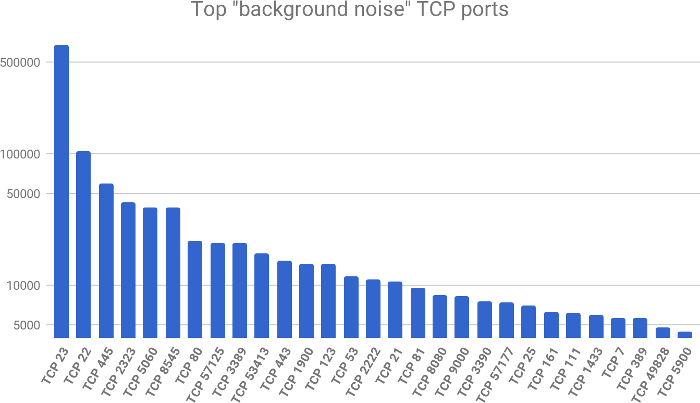
Here we can observe that port 23 is much higher (on a logarithmic scale) than all other ports - and this is the port for telnet, which is often used in unprotected routers and other IoT devices.
Knowing this, I sped up and sent ICMP ping to every host on the Internet to see how most of the Internet would respond to this ping (and show me if there is a computer connected to the network).
A day later, I sent 3.7 billion packets and received a huge text file. Now we just have to find a way to draw this map!
The problem with the display of IP addresses is that they are one-dimensional, changing in the direction of increasing or decreasing, and people are not so good at perceiving a large number of one-dimensional points. Therefore, we need to find a way to present them in such a way that we can fill two-dimensional space with them, which will also help us to get more useful graphs.
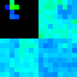
Fortunately, mathematics hurries us to help - this time in the form of parametric Peano curves ( space filling curves ):

For me, it didn’t work out how to use it until I numbered the nodes through which the curve passes.
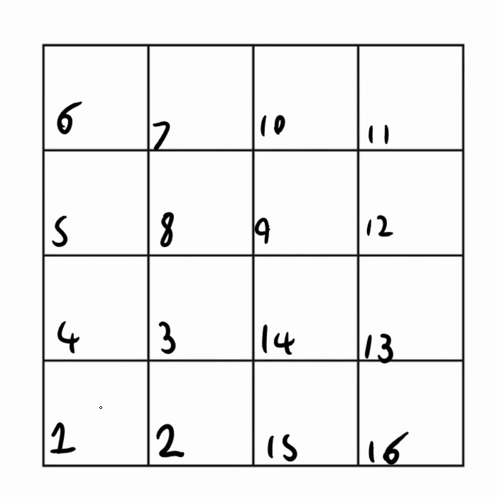
It took me even more time before I realized that we could again display the same animation in one dimension, “unraveling” it:

In general, now that we have figured out how these graphs work, we can apply them to IP addresses.
Fortunately, there are tools that allow you to build such graphs based on the collected data on IP addresses, so we can only feed our data to one of them and wait for the result:
This command will draw the Hilbert curve using a gradient, showing how many systems are online in those / 24
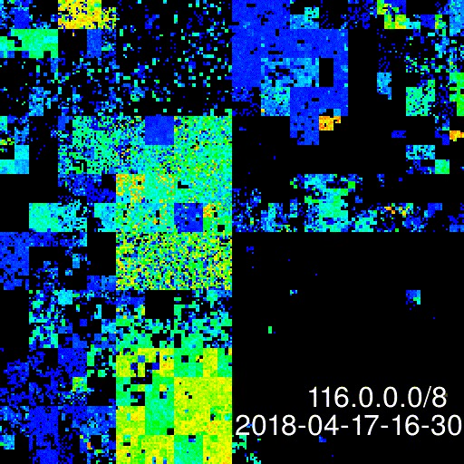
And so, let me introduce you - the IPv4 Internet card as of April 16, 2018:

You can click on the image and open the uncompressed version in full resolution - just note that it weighs 9 MB.
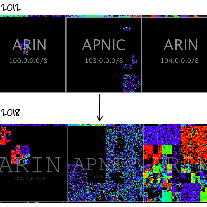
The last public scan of which I know was made in 2012 by a Carna botnet measuring 420 thousand devices. Using the data obtained by the botnet, we can clearly see some changes.
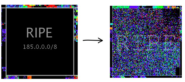
In 2012, RIPE did not even touch 185.0.0.0/8, later it will become the range that they will use for the latest distributions, and will give only / 22 from the IP space to each new RIPE member. Because of this, the range of 185.0.0.0/8 looks strange against the background of other ranges and there are no mass allocations in it, so it looks very “fit” against the background of all the others.
RIPE - not the only ones who have fully used the bands over the past time. Below we see three other different online registrars (RIRs) that have consumed their ranges over the past 6 years:
In addition to all this, I also scanned several IP ranges at the APNIC ( Asia-Pacific Network Information Center ) every 30 minutes for 24 hours. The data I got from this experiment allows you to see how the Internet “breathes” as customers go online in the morning and go offline at night:
The most interesting part of this “gif” is how does the dynamic IP pool from the ISP look like, showing customers logging out online for a short time and then joining and receiving a new IP address (this is why more active IP addresses “move” during days):
Oh yeah, and if you're wondering what IPv6 looks like in this format and how many addresses we already use, here’s the final schedule:

Of course, in fact, it turned out to be not so great - not just because we needed IPv6. However, this is another story.
The fact is that IPv4 (the most widely used version of the IP protocol) sets an address limit of 2³². This means that you have about 4.2 billion IP addresses that you can work with - although this isn’t quite true, since large sections are not available for use:
| IP range | Application |
|---|---|
| 0.0.0.0/8 | Local system |
| 10.0.0.0/8 | Local LAN |
| 127.0.0.0/8 | Loopback |
| 169.254.0.0/16 | “ Link Local ” |
| 172.16.0.0/12 | Local LAN |
| 224.0.0.0/4 | Multicast |
| 240.0.0.0/4 | “For future use” |
')
However, considering that we still have 3,706,650,624 addresses, this seems to be not so much, and is in ideal reachability for sending a packet to each of them.
So ... This is certainly not the first time someone tries to do this - there is enough of enough “background noise” (unsolicited packets) on the Internet, most of them are created by systems that try to hack other systems.
Here we can observe that port 23 is much higher (on a logarithmic scale) than all other ports - and this is the port for telnet, which is often used in unprotected routers and other IoT devices.
Knowing this, I sped up and sent ICMP ping to every host on the Internet to see how most of the Internet would respond to this ping (and show me if there is a computer connected to the network).
A day later, I sent 3.7 billion packets and received a huge text file. Now we just have to find a way to draw this map!
Meet the Hilbert curves
The problem with the display of IP addresses is that they are one-dimensional, changing in the direction of increasing or decreasing, and people are not so good at perceiving a large number of one-dimensional points. Therefore, we need to find a way to present them in such a way that we can fill two-dimensional space with them, which will also help us to get more useful graphs.
Fortunately, mathematics hurries us to help - this time in the form of parametric Peano curves ( space filling curves ):
For me, it didn’t work out how to use it until I numbered the nodes through which the curve passes.
It took me even more time before I realized that we could again display the same animation in one dimension, “unraveling” it:
In general, now that we have figured out how these graphs work, we can apply them to IP addresses.
Fortunately, there are tools that allow you to build such graphs based on the collected data on IP addresses, so we can only feed our data to one of them and wait for the result:
cat ping.txt | pcregrep -o1 ': (\d+\.\d+\.\d+\.\d+)' | ./ipv4-heatmap -a ./labels/iana/iana-labels.txt -o out.png This command will draw the Hilbert curve using a gradient, showing how many systems are online in those / 24
And so, let me introduce you - the IPv4 Internet card as of April 16, 2018:
You can click on the image and open the uncompressed version in full resolution - just note that it weighs 9 MB.
The last public scan of which I know was made in 2012 by a Carna botnet measuring 420 thousand devices. Using the data obtained by the botnet, we can clearly see some changes.
In 2012, RIPE did not even touch 185.0.0.0/8, later it will become the range that they will use for the latest distributions, and will give only / 22 from the IP space to each new RIPE member. Because of this, the range of 185.0.0.0/8 looks strange against the background of other ranges and there are no mass allocations in it, so it looks very “fit” against the background of all the others.
RIPE - not the only ones who have fully used the bands over the past time. Below we see three other different online registrars (RIRs) that have consumed their ranges over the past 6 years:
In addition to all this, I also scanned several IP ranges at the APNIC ( Asia-Pacific Network Information Center ) every 30 minutes for 24 hours. The data I got from this experiment allows you to see how the Internet “breathes” as customers go online in the morning and go offline at night:
The most interesting part of this “gif” is how does the dynamic IP pool from the ISP look like, showing customers logging out online for a short time and then joining and receiving a new IP address (this is why more active IP addresses “move” during days):
Oh yeah, and if you're wondering what IPv6 looks like in this format and how many addresses we already use, here’s the final schedule:
Source: https://habr.com/ru/post/353986/
All Articles