Experiments on cats: how to increase the number of purchases in the application

Experiments in public are loved not only by sociologists, but also by product managers - especially when it is the most effective way to find out which “tricks” will work for your audience. We, at Mobile Dimension, decided to check whether the seals or a thoughtful value proposition would increase the number of in-app purchases, and came up with interesting results.
Our application, " Pregnancy Calendar ", is built on a very loyal user monetization scheme - the display of advertising. Future mothers can use all our functionality for free, but instead they watch ads. For those who are depressed by this prospect, it is possible to turn off advertising by making an in-app purchase — every whim for your money.
But that's bad luck - users complain that they don’t want to watch ads, but do not turn off advertising, however. We set a goal to motivate future mothers to more often turn off advertising - and when it comes to increasing the number of in-app purchases, our hands are stretching to start testing hypotheses.
')
We analyzed all the "entry points" that lead the user to disable advertising, as well as the page itself disable advertising. The main entry point was the button “Why do I see ads?” At the bottom of the application screens, which users see under the banner (320x50) ads at the bottom of the screens. It is through it that they get on the screen disable advertising. On the screenshots you can see how it looked a few months ago.
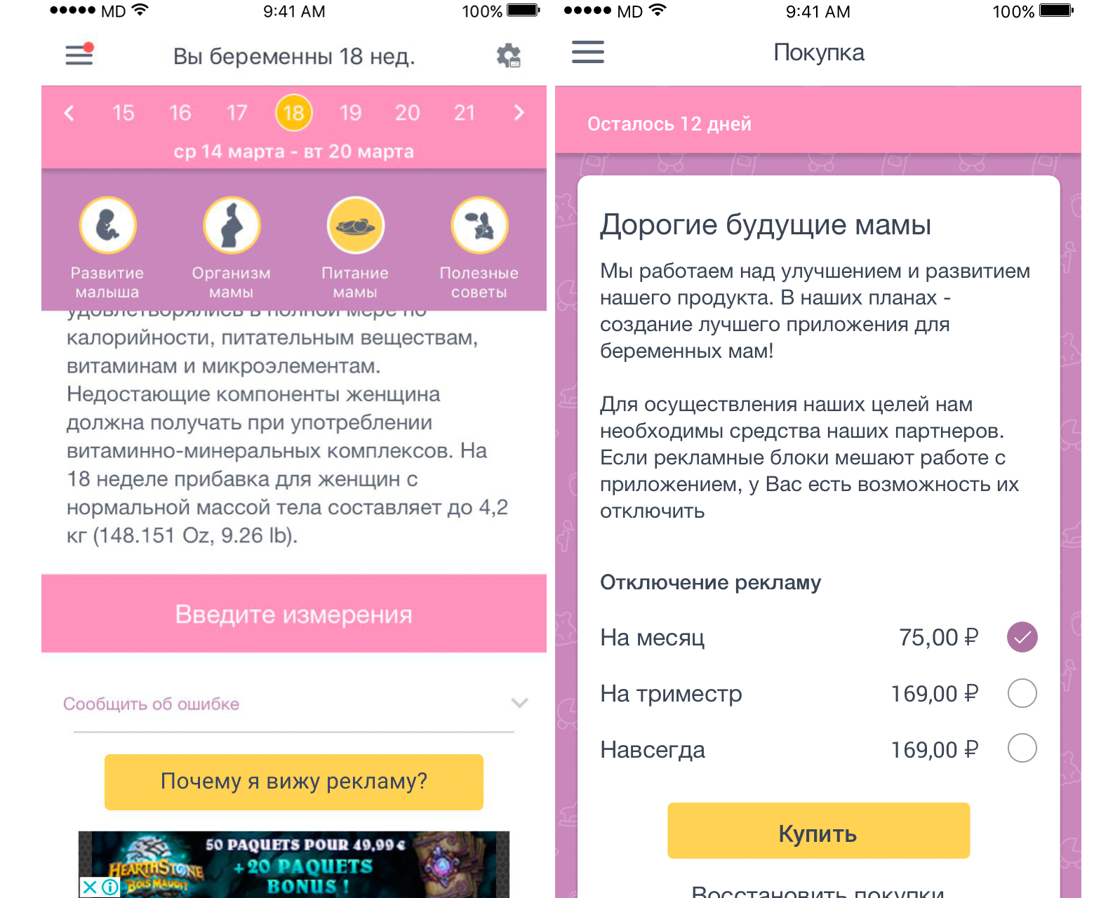
On these screens, we saw several problems:
- The button “Why do I see ads?” Doesn’t motivate to turn off ads, it does not carry the message to action;
- The purchase screen for disabling advertising is not “selling”, as is the text on it;
- The pricing experiment - the principle of bait, which is described in the book “Estimated Irrational Predictions” by Deng Ariela - in our case did not catch on and did not increase the number of downloads (therefore, the two prices on the screen are the same).
It was decided to apply the rules that are most often used for texts and buttons when creating landing pages, as well as bright and interesting pictures.
Here is what we took from tips on building selling pages:
- “Favorite application without advertising” - a capacious and concrete value proposition, from which it is easy to understand what is so attractive about disabling advertising;
- "5 reasons to turn off advertising" - we wrote out the benefits that the user will receive if you disable advertising;
- “Disable” or “Buy” is a verb in the infinitive that describes one key action and gives a message to it. This is the action that should solve the problem of our users;
- Beautiful pictures that attract attention;
- Lack of choice in price.
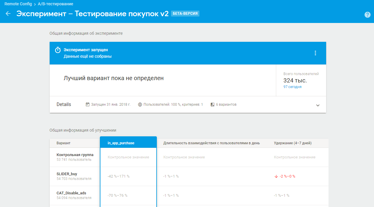
Starting once, we could not stop, and drew as many as 4 options for the screen disable advertising. In order to understand which of them will work for our pregnant audience and will help us increase purchases, disable advertisements, we have come to use Firebase Remote Config to test hypotheses for a part of the audience.
So, here are the screens we rendered:
1. Interactive screen with a slider. We wrote out 5 reasons why the user just needs to disable advertising in the application:
- It is cheaper and healthier than a cup of coffee;
- Section "News" without advertising articles;
- No promotional push mailings;
- No more annoying banners;
- Useful offers from partners will remain only in the menu.
The slider with the reasons automatically scrolls through the pictures at a certain interval, but if you wish, you can also scroll manually. According to our idea, the screen checks the hypothesis that it is important for users to convey the advantages of a particular purchase with a reasoned argument. In this case, the screen allows you to "stick" on it, scrolling the slider.

2. Screen with a list. It has the same 5 reasons to disable advertising. The screen also tests the hypothesis that it is important for users to convey the advantages of a particular purchase with conviction, but at the same time show all the arguments at once so that you can see them all at a glance at the screen.

3. Screen with a cat. After long and heated debates, we still decided to check how much the emotional component influences the decision to buy. It also tests the hypothesis that the recognizable mimy-cute image of a cat from a cartoon can also be an advantage. There are no arguments on this screen, the reasons for disabling advertising is just a value proposition.

4. Screen with balls. It also checks the user's emotional response and its influence on the purchase decision. Only, unlike a cat, images of balls are used on it. As planned by our designers, the balls symbolize freedom from advertising - they fly away, and advertising goes along with them :)

Testing was conducted in two stages. Most of us "put" on the slider - we even argued on the "lemonade" box - but the result surprised us. At the end of the first stage, the largest number of advertising outages fell on the screen with balls - 29%. In second place is a cat with 25% and in third place is a slider with 24%. The “weakest link” turned out to be a list of 5 reasons to turn off advertising, so it did not go through the second stage of testing.
In addition to the reaction to the screens themselves, we checked whether the text “More than 10,000 mothers have already turned off advertising” has somehow affected the conversion from the screen. The experiment showed that the phrase works - 54% of users turned off advertising on screens with this text.
In the second stage, we checked which text on the button is more “catchy” - “Disable” or “Buy”. According to the results, it turned out that “Buy” is more motivating to bring the process of disabling advertising to the end - 56% of users turned off advertising on the screens with this text.
At the same time, the rating of the three remaining screens in the second stage has changed: now the first place is taken by the slider with 37% of blackouts, the second is the balls from 33% and closes the top three cat. We have a hypothesis that this is connected with two types of thinking of our audience: the decisions of one are more influenced by the rational component, and the decisions of the second are emotional. That is why the representatives of the rational group, who in the first experiment preferred the screen with the list, “flowed” to the screen with the slider during the second experiment.
In order to check which users we have as a result more - emotional or rational, who among them buys more and to whom we will be guided in the future, we launch the third stage of testing. But this will be another story.
Studying the audience brought a good result - the number of advertising outages and revenue from inn-app purchases increased by more than 2 times. Also, the number of transitions from the application screens to the advertising disable screen using the “Disable advertising” button has increased (our entry point, which we wrote about at the beginning of the article).

Outcome in figures and facts:
- At the first stage, the screen with balls won, and the “weakest link” was the screen with the list of “advantages”
- on the second, the slider broke into the lead, and the cat became the outsider
- the number of outages increased by more than 2 times
Our experiment showed that the emotional component plays an important role and should not be underestimated, but this is not all that matters. Seals affect, but do not decide. And, perhaps the most important point was a deeper understanding of the audience, its needs and conditional segmentation by emotionality. We will use this useful knowledge in our future global plans.
How do you study your audience and test hypotheses? Share stories, we are happy to read!
Dalia Mukhamedzyanova, Mobile Dimension Analyst
Source: https://habr.com/ru/post/353950/
All Articles