The evolution of advertising on TechMedia
In March, RUVDS together with TechMedia conducted a seminar on Geektimes. Despite the fact that the seminar was about Geektimes, we could not ignore some of the presentations and wanted to present them to the audience Habr.
We bring to your attention the transcript of the video speech of Evgenia Solodkoy about the evolution of advertising on Habrahabr and Geektimes.
Hello. My name is Zhenya, I have been working in Habré for the last 9 months, doing everything related to media advertising. Despite the fact that I have been working for only 9 months, now I will tell you how the advertisement on Geektimes looked (quite a long time ago). The only thing is that it will not be shown in the form of banners by those advertisers who then placed it - because NDA and all that, and it is not always possible to find such ancient images.
')
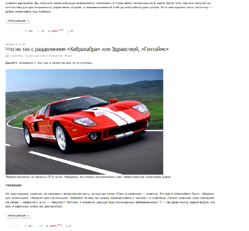
If we open Geektimes and find the oldest post in the most popular stream (and the most popular stream is gadgets), then we will find out that it was written on December 13, 2006.
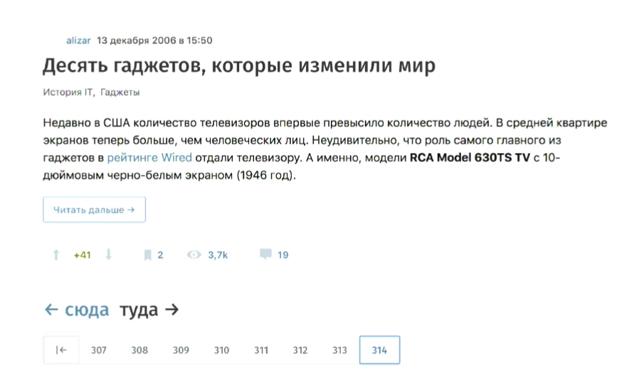
This is what I need. When we talk about Hicktimes, we often say that this is Habr's younger brother, that he is not so big that he appeared not so long ago that he doesn’t have such a huge audience. But in fact, he appeared a long time ago. This is about the first six months since Habr was created, then this post was written.

That's how it looked like Habr, in 2006.
Who will find advertising? Does anyone see an advertisement? No, in fact, it was not at all. But a little more about Hyktimes. I highlighted on this screenshot some tags, which are now quite popular hubs on hyktimes. For example: statistics, investments, power (now it is the regulation of the IT sector), names (now they are persons in IT). Social networks, mobile devices (this is a sub-gadget in gadgets), advertising, music, the future, that is - all these topics interested the audience of Habr already in 2006. And this is not a new audience, which came in 2014 and began to write on a new site.
Here the very first post of flow of gadgets which was such small in Habr's tape in 2006. There are popular blogs below and there are some weird stuff too. The blogosphere, podcasting are all hyktimes now. But there is no advertising (:)). So, in 2006 there was no advertising (as well as a separate Geektimes).

Later, in 2007, we had a banner of the standard for the advertising industry size of 240x400, which you see on the slide as "404 not found", because, unfortunately, the web archive does not host banners if they were hung through third-party twisters.
In 2008 we see the same 240x400, and we also have a hauling, the so-called leaderboard. What do you think, which of these two formats gave a higher CTR?
I just often come across opinions that hauling gives a higher CTR, but in reality this is not the case. In fact, 240x400 works better. and this is despite the fact that the constriction you hang up in a hat seems to be higher and more visible. But there are studies that prove that a person perceives any graphic information in a clockwise direction, moving from the left corner to the right and down. The so-called banner blindness, which we are talking about now, which is believed to have developed in the last 3 years, has always been, users see nothing useful from above, their eyes slip and fall on this banner to the right, and it clings to it more.
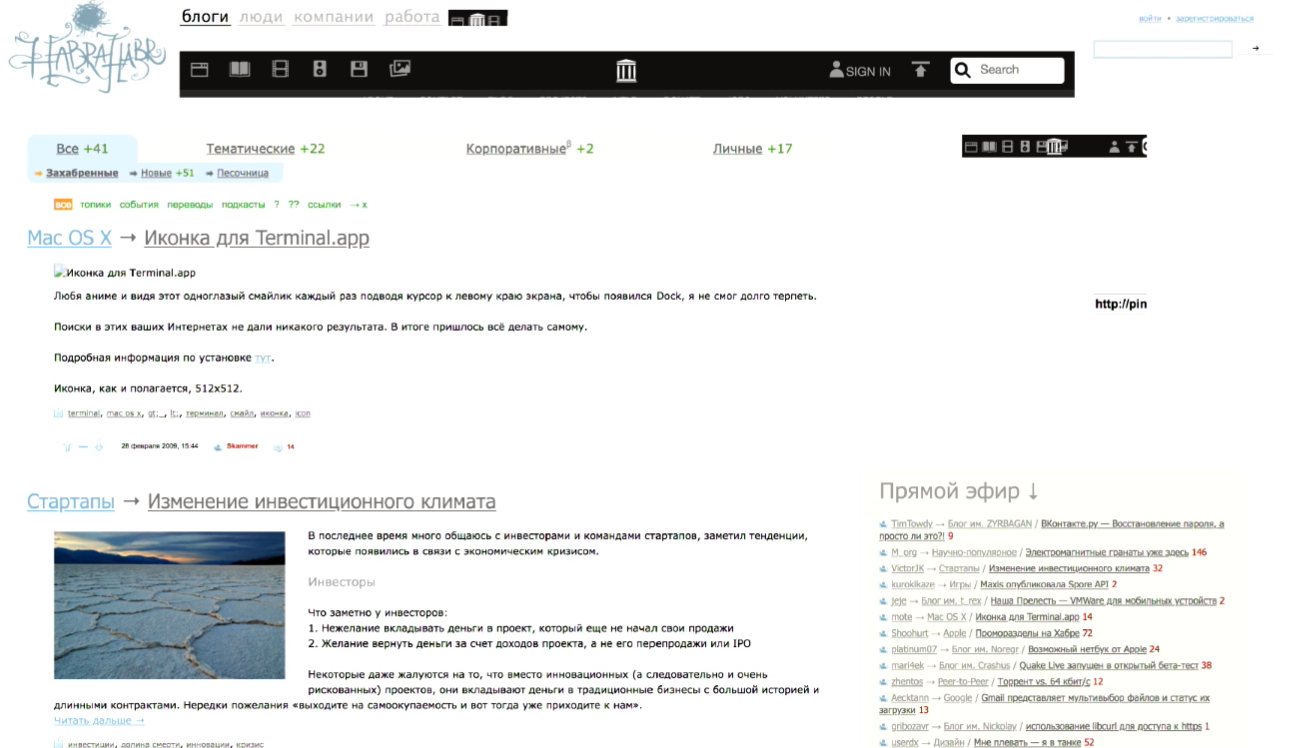
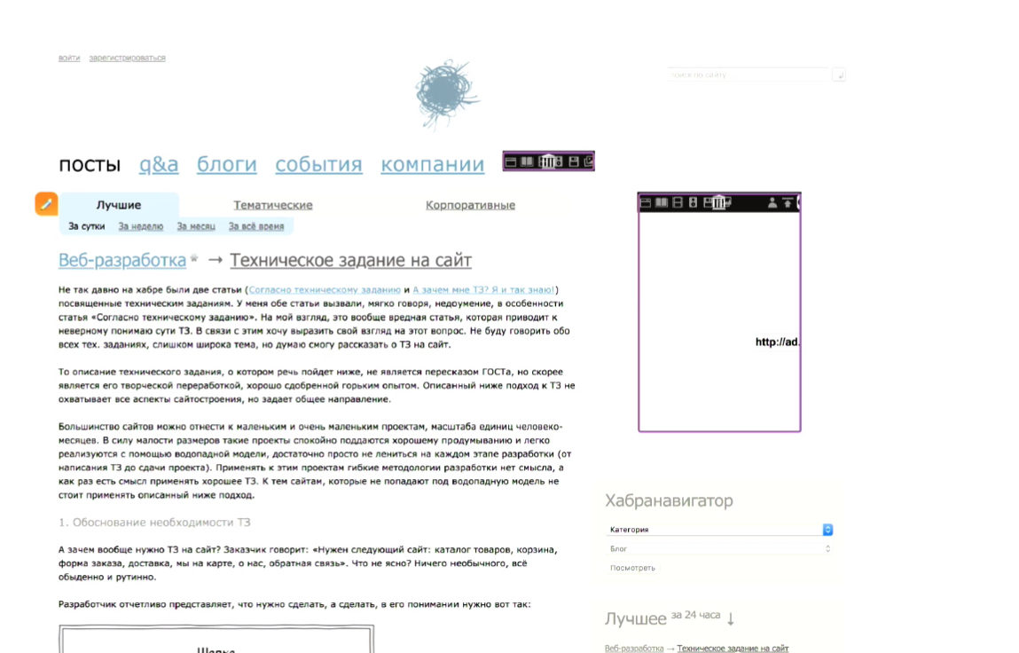
Then in 2009, we still have the same picture, but it is still Habr, and here we see MacOS themes, startups.

In 2010, we realized that hauling did not work well, it was finally removed, but there was 240x400 left. Pay attention, again, on the topics: scientifically popular - this is one of the biggest flows on Giktayms, he now occupies the top.

2011, again, we have 240x400, the design of Habra has changed a little and we see the very first publication in the ribbon post in the “iron” hub, this is again the topic of the letters.
2012, a small button appeared on top, it stood on the same line as the site menu and became more native. It housed a small advertising space, which nonetheless worked out better than hauling, which was previously in the top.
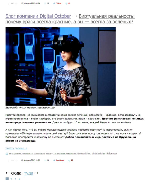
And 2012, I wanted to show you that we started writing about virtual reality, can you imagine, it was more than 5 years ago. When I remember about virtual reality glasses, how they began to be talked about and shown en masse at various events, I think it was recently, but it turns out that more than 5 years have passed.
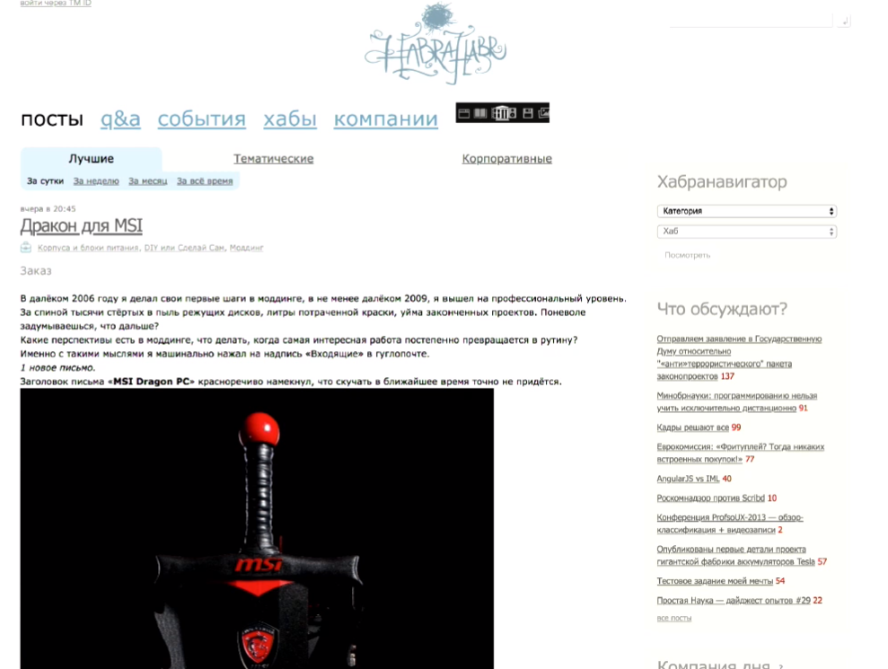
And 2014: Dragon for MSI - again, the topic of Hyktimes, but she was still on Habré, there are no banners at all. They went down. Why, because they didn’t really click on them then and we didn’t have much content to fill the whole page with banners. At this moment, Giktames separated from Habr. Many, many years (well, okay, eight) passed before it was allocated to a separate platform, and the audience was not born just out of nowhere, it migrated from Habr. That is why many users can say “this is not Habratexte” or this is not “Habratem”, because they are used to the fact that the presentation style is the same.
Our favorite post, "what is wrong with the separation of Habr and Hyktimes." Please note that there is no advertising at all and this is 2014, October.
But if we look forward 3 months, we have such a format in the corner from the bottom left, a super native, which was very well written into the design. He was flat and gray. This icon was completely gray, light gray with a dark outline and only when the mouse was hovering over it, it became colored.
What is good about this format: the fact that it looks like native buttons is true. When we talk about the audience Hiktaimes and Habra, we need to remember that it is very sensitive, both to the content that you write and the grammar that you use. Probably, if you divide Habr and Giktayms, then due to the fact that Habr is more technical and it is more about good, and Giktime is more about entertainment, you can neglect some of your design abilities on Habr, if you really wrote a useful article. I like to say that the GKTimes are boring, but the nerds are not in such a bad way. These are people who will meticulously dig around, and it will give them pleasure. (Comment of the speaker: Oh, if I knew then that they would be able to read the transcript of this speech. No, I would call them bothers anyway, I would just try to tell them better and more clearly.) And this concerns not only the content, This also applies to advertising, so when we place this format, a small button, yes it’s gray, not very noticeable, but you have to understand that it’s a half million people at that time who go to this site every day and they know its design thoroughly. And when they see such a new button, the first thing that happens is the wow effect. This is better for the brand than some banner hanging from above, about which they think: “Lord, what a stupid designer drew it, I would have done better,” and nothing but a negative attitude to the brand and to the advertisement itself does not occur.
In 2014, we described our audience. 73% of men, 27% of women. Pay attention, women on Giktayms more than on Habré. It seems that if you think about geeks - you rarely think about women, but in fact they do not, there are a lot of them and we have them. Note, there is still a button. And then such a standard of our banner placements was born, we had a banner in ATF for all fans of branded placements who say: “I want only the first screen so that everyone can see me for sure” and don’t think at that moment that their banner is quickly squandered, because this is a ribbon, users read, they leave the first screen faster than what is under the scroll, so-called BTF. A hauling appeared in the content feed and a banner appeared on the second screen, which arrived later. By the way, users see it longer, if your marketer suddenly asks you which banner is better, above or below, and this will be related to Hycktimes, most likely the banner below will be longer in the user's active screen.
Then we had such wonderful stubs, because we all remember that Habr and Giktayms is an area of boring and IT people as I said, and they love AdBlock very much and do not like banners very much, so I had to somehow think of a way to communicate with them. And this is what I wanted to say, and said. We communicate not only in content with our users, we also communicate in banners. When we communicate with them in banners, we need to remember that the tone of communication on the site should be about the same for any format, no matter if you post or you place a banner.
Of course it's great when a creative agency draws you a stack of 300x250, 300x600 banners (and so on), you shove them into AdWords on all sites, and you seem to be doing everything. And then you look at the statistics, you see there Giktayms and you think: why they click on Gktayms so badly. Well, because your banner, despite the fact that it is so beautiful, does not fit into the general tone of communication of this site. But such a message, even despite the fact that it consists entirely of two lines of text and one button, can give you a greater CTR than the banner, which was not made specifically for this site, but to a huge audience to run all over the runet.
In 2016, we again had two sidebar banners: on top and in the ribbon, and one appeared in the footer.
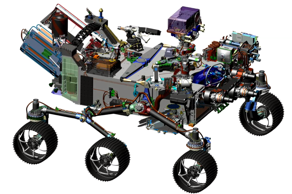
This is a picture to attract attention. One of the most popular publications on giktimes - about space, and this is the Curiosity rover that NASA launched in 2016, it seems (author's note: no, they launched it in 2011, in 2016 it was 4 years on Mars.). This is also an example of what kind of graphic content you can place in banners, posting them on beckatures to arouse users' interest, a positive attitude towards the brand and a desire to see what it is.
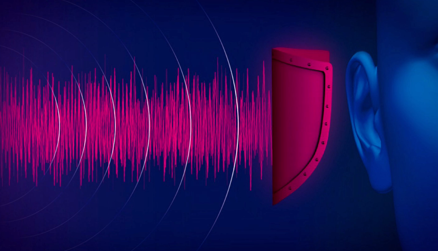
This picture is about Mercedes, there was such a cool article on Hyktimes about the fact that a second before the accident the smart system in Mercedes makes a certain sound at a certain frequency in a very short period of time so that the driver can respond faster. And this is also an example of what kind of content can go well and looking at this picture you may not immediately consider the information that Mercedes is a very cool car, but you can add it somehow in a very short slogan and place it on the banner and It will go better for an audience that reads such articles.

And so we quickly came to 2018. Now we have 4 banner places. As the ribbon of posts grew and the amount of content within one page on the site increased, the number of advertising places increased, and the formats increased. Now we allow the top to place 300 * 600, hauling we have remained standard for the site. Below you can also place two banners. One in the sidebar, one in the footer. What does this give us? This gives us the opportunity to communicate with the user at almost any stage of his site reading. Even if he came in and flipped through the ATF quickly (first screen) and he was not interested in reading the top tapes, he had already seen it, he wanted to see something lower, or he goes immediately to the comments in publications, which very often happens, he doesn't care will see some kind of banner.
Comment from colleagues from Habr in the hall:
On the mobile version, we have several formats. Others, mainly small constrictions. Despite the fact that the mobile is considered the fastest growing trend in advertising, in programmatic and in display, in richmedia, it is very difficult to make advertising in a mobile version so that it does not annoy users. As far as you know, if you place a large format in a mobile phone, you get a very large percentage of fraud. We choose not to give fraud to our advertisers, so that there is no such thing that users click, are angry at us, at advertisers, advertisers then have no conversion and everything is bad. We do not do that, but we have small banners in the mobile version.
Yes, in the mobile version there are completely different formats, there is a completely different layout. This is not adaptive, this is another site you can say.
What we have come up with in order to engage our users in communication with banners. According to studies, how many people do you think one person sees per day? Or glances over them. How many advertising messages per day are directed to the attention of a person? According to 2006 studies, it was 5,000 a day, while according to 1986 studies, as I recall, it was 500. Then it was, of course, all sorts of newspaper clippings, or signs on the street, something else. Probably, now this figure aspires to 50,000, apparently. And this is the banner blindness we are talking about, and how to fight it? Well, first of all, what I was talking about, choose the tone of office (tone of voice - literally “tone of voice”, a term in marketing, refers to the tonality and character of the brand-led communication) of your creative to the tone of the site, so that communication was within the environment to which the user is accustomed when he came here to consume content.
Secondly, you can do the following. Here you have 50,000 banners on the Internet, which every day try to appear to the user. What can you do about it? You can make it so that at the moment when he came to Giktaims to read something cool that he really likes, during his lunch break, no other brand showed him an advertisement. Well, or no other at all. But here one of the approaches is to show a message that is complex, so to speak. When you show two banners and “A” is written on one of them, “B” is written on the second one and the user sees one of them, no matter what, and when he sees something similar, his eye involuntarily clings to this banner or for this picture, because that's how we are. We first perceive the information unconsciously, therefore if we see something again, the probability that we will catch our attention on this increases. We kind of stop looking at something familiar. This can occur within a single page. Firstly, it allows you to increase the likelihood of contact with the user, secondly, it allows you to tell a little more. So how do we support the standard Acceptable Ads ... Who knows what Acceptable Ads are? There is such an initiative, which started, it seems, 3 years ago, after AdBlock appeared and when everyone had already begun to massively cut advertising, the so-called pain of advertisers (and sites, in fact) appeared, because everyone would soon see their ads . If you do not show ads, you will soon stop buying. There are studies that prove that if Coca-Cola stops spending money on marketing, then in 3 years everyone will buy Pepsi, all of a sudden. So here. Acceptable Ads is an initiative that is intended to lead to the agreement of publishers, advertisers and users. The banner should be simple, it should not cause negative reflexes to the user (for example, when you enter the site and there the video opens abruptly and some loud music begins). Maybe you watch a video online, every time I see a 1xBet ad. Every time I think that I will die when it starts (very loud and sudden). So, Acceptable Ads was invented to prevent such an advertisement, so that the advertisement would be pleasant, so that it could be looked at, that it would be useful and at the same time be normally integrated into the site, and not as it happens, you go to a well-known distinguished site, 400 pixels to the left screen ,, and drives something with sound. Given the fact that we support this standard Acceptable Ads, we do not place animated banners. Therefore, it is obvious that the scope for creativity at the client is very small. You have 300 pixels by 600 pixels, and somehow you need to fit everything there.
You can, for example, make 2 banners that will be displayed simultaneously, and they will tell “A” and “B” about your product.

They can also be in the sidebar, or you can, for example, place one banner, but place it so that it catches the eye of users more often. How to do it.

You choose dynamic placement. There is such a thing as a programmatic, this is (note by the author: not only, but including. Further, a very simplified description) when advertising is placed on an open auction and you don’t seem to set anything right, except for the price for the target action, and the system then over time, she learns who better to show your banner. It is almost the same, only depending on where the user is at the time of scrolling the page, your banner will appear at the top, in the middle or at the bottom.
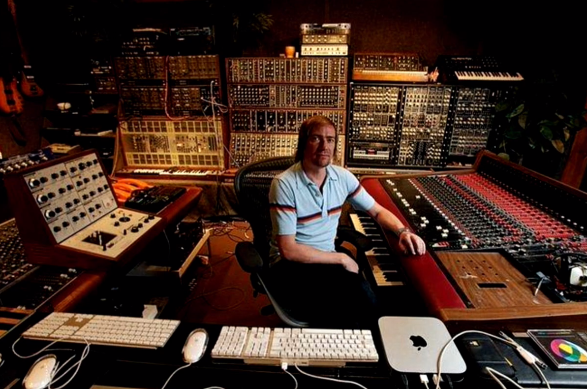
This is another cool picture about what kind of content love on Giktimes. This is the post of 2017, an overview of the history of synthesizers. And just about we look with our banners when we try to understand what is best to do.
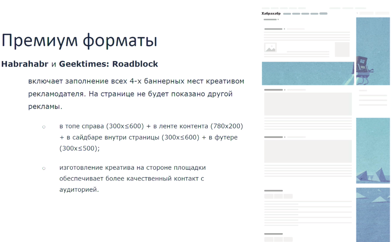
The option is to take all the attention away from other advertisers and tell only about yourself, for such very confident companies it is Roadblock. I don’t know who invented Roadblock, but I think it was a brilliant man, because he has several undeniable advantages. First, advertisers who are placed according to the Roadblock format, they immediately eliminate any competitor. That is, there is no other advertising on the page at all. Imagine, you go to the store, back to the fizzy drinks, and there is only Coca-Cola. Everything, you have no choice, you will not take Pepsi because only Coca-Cola is there. Well, conditionally, go to the newspaper stall and there is only Esquire. You will be reading Esquire, probably. First, you eliminate competitors, and second, you can use this format to tell users, if they are your target audience, about how you take care of them. That is, you place 4 banners, make them beautiful, write on them some advantages of your company or your product, or just tell us how stunning, new it is, and so on. But we don’t overdo it, because we remember that if we don’t tell that he’s stunning but with flaws, they will find them themselves, dig them out and then they will hit you on the hat. You can place all these four banners, the user will not see another advertisement and will understand that you take care of him as an advertiser, so that he sees something good, something useful, well-made, and not some other garbage.
No, you can't, of course, just hang the whole page with red banners flashing with green and write “Buy and sell”. No you can not. Well, and we do not post this, because all banners from advertisers are coordinated with us. Yes, we can come up with all this, make it ourselves, make several sets, launch into rotation, test for which the audience responds better and give a detailed report.
This is an example of how we did Roadblock creative, the content here is removed so that everything fits one page. It was Roadblock for freelance (our service for freelancers, everything is obvious). You can yourself evaluate how much you would like to see such a creative on the page, but in my opinion this is better than any remarketing from Google, which endlessly offers you products from an online store, even if you did not go there half a year or everything bought it. You can tell so, but you can in another way. In another way - this is a question for each specific advertiser.
We also have the latest format, which I have already mentioned when I showed that we had AdBlock stubs. We realized that these stubs can be used not only to encourage the user to disable AdBlock and give us money to advertise to support all this good in the form of a site, content, and so on, but also to tell them something else. You can even tell them a joke. We did, in the picture you can see, the first test creative that we had there, and it still hangs there. "AdBlock stole this banner, but banners are not teeth - they grow back." In the first three days, when we placed this stub instead of our standard text, we received 1200 clicks from Habr and about 400 with heatsinks, but so that you understand, before that, people also clicked on the stub about "Disable AdBlock, we need it to develop our services," they clicked on it about 35 times a day. A button leads to our article on why we advertise.
(Further on the examples with the texts on the slide).
Yes, here we motivate users to disable AdBlock. Here we motivate users to participate in the moderation of creatives and write to us if they see something bad, poor quality, unpleasant, offensive, and so on. From below, we advertised a product management conference, and from above we advertised freelance. It was a long March weekend, during the holidays.
This format also gives you a very rigid framework, but a very large scope for communication with users, because you can write almost anything. This is part of the site, it's all customizable inside. This is not considered an advertisement because it is an unobtrusive message. Not at banner places, but under banner places. This is their wrong side, as it were. If nothing works because everything is cut out by filters, this appears. In the case of applying for banners, this is really part of the content of our site, we just wrote about it differently. In the case of freelance, this is essentially our partner project, we just, again, wrote about it differently. We have a link to it in the header, AdBlock does not cut it. We probably have one of the highest percentages of users with AdBlock, because these are the people who wrote it, including, probably, you can say so. It is more on Habré, a little smaller on giktimes, but in different periods from 25% to 35%.
Another one of my favorite posts on giktime about a man who gathered a flamethrower to destroy termites, a flamethrower that anti-termite mixture burning up to 3000 degrees Celsius destroys parasites. I wish you the same about blasting banners so that the audience responded well to them.
- I'm just wondering where there are more spelling and grammatical errors, on Giktams or on Habré? Has anyone analyzed this, maybe it launched neuron or something else?
I honestly did not analyze, but perhaps my colleagues from the editorial board or Anton can answer this question.
- Yes, where simply mistakes more grammar?
I put on the fact that more errors on Habré.
We have a moderators' service, which is designed to comb posts, including looking, so that they are not badly decorated and with errors. Therefore, even if this occurs, the moderators quickly fix it. Feels like more on giktaims, if you answer your question.
- And I have a question for my wife. What do you think of the role of display advertising. Banners, for the user, it is now more communication, PR?
Yes, definitely. Let me show you one more thing I wanted to voice.
- And do I understand correctly that it used to be a performance, and earlier banners were aggressive? Or is it that we live in such a world, in our own Habra-world.
Look, I don't know which of you represents agencies or brands, but who ever placed an advertisement for yourself or a client? A little bit about the history of banners. Banners generally appeared as any advertisement in order to lead the user to your product. Then the division into performance advertising and branding advertising appeared, but if you look at the benchmarks, for example, the statistics that Google gives.

I have chosen Russia here, these are all formats and all verticals. Then it seems to me that something has broken because he believes that the CTR of a standard banner with a picture and now this banner with a picture was 0.45. The mystery lies in the fact that in the verticals they do not have everything working.
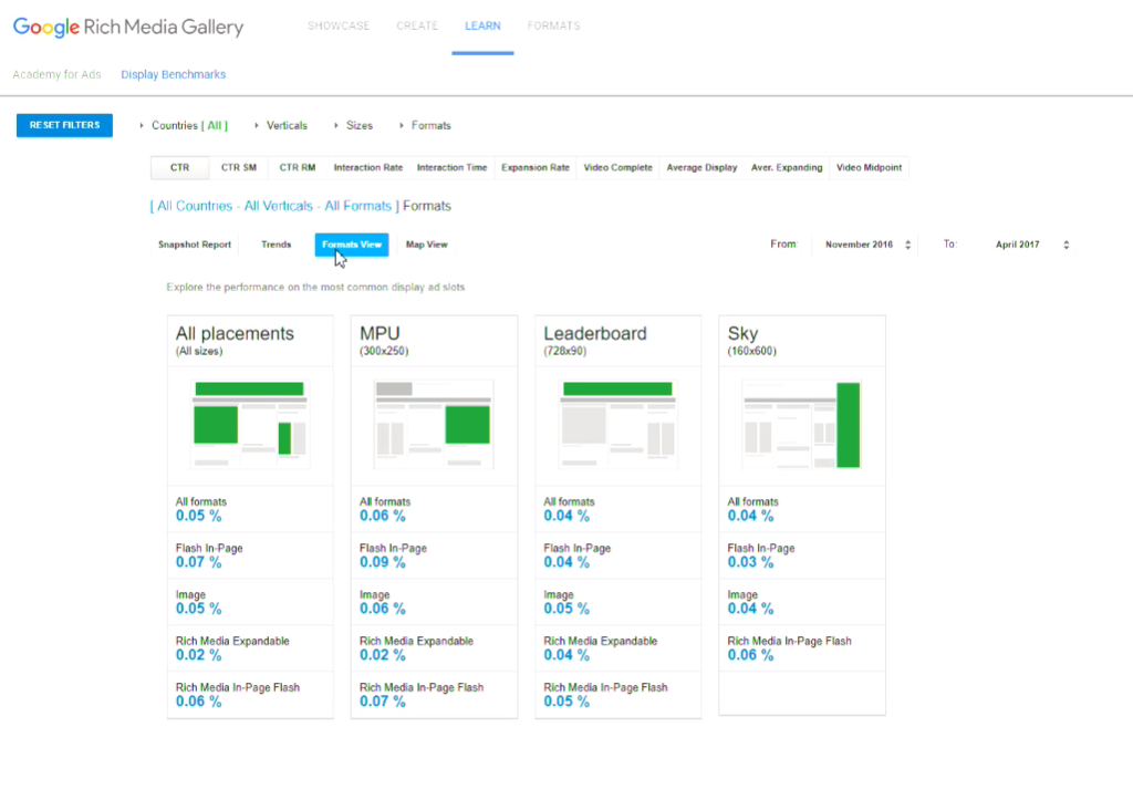
But if we look at all countries, it turns out that the average CTR for display advertising is 0.05%. CTR 0.05%! And any bursts are much higher than the average of the historical ones that you can look at in studies, they are most likely dictated by fraud, bots, doorways, some kind of nets with non valid traffic. We just have to admit that people do not like to click on banners, and this is generally an image format in terms of the fact that it is a picture. It is not very good to do this not with a picture, but with an element of the site, in order to lure the user there to click unintentionally. They work mainly on brand recognition. Basically on building communication. I love Coca-Cola, I can talk about it endlessly. Not Coca-Cola itself, but their marketing. When you see a big Coca-Cola graffiti on the house, you think cool graffiti, you remember about the summer or about some kind of parties, and it becomes somehow more pleasant for you. Banners are the same. They are meant to make a person feel something. Something that is close to him, something that will cause him some emotions and at the same time build there some kind of neural connection associative with your brand.

There are performance banners, but they look like this. Here is a performance banner. The man went, looked at the bed, saw the bed. Everything, nothing aesthetic about it. This is a specific goal. Remind the person that he watched, bring him there. In my opinion it looks acceptable if you were really looking for something. The entire retargeting advertising stack rests on the fact that if the user was looking for, he should be reminded of this. But this is not a media ad in its standard sense. And such banners have a CTR of 0.9%, 1.3%. This is not the norm. I answered your question?
- My question was also related to explaining to the audience how they can use this information for their advertising purposes, because we mainly have representatives of brands here, these are companies, editors, people who are responsible for the content in companies. How could they use this in practice? Because it seems to me that for them it is a bit of a parallel universe, for those who are engaged in blogs.
Yes, it is possible.We can, first, help you yourself. Because we know our audience, we have a huge experience in placing this advertisement, we present what we can tell them, we can hold a brainstorm together with marketing representatives of your company. But the idea is that banners should help you remind a person of something and build a positive impression of your brand. Therefore, when you want to place banners, if you really want them to work, first of all think what you want to say with them, what kind of association do you want to build and what is the usual tone of communication on this site you choose, be it a blog or megapost or comment that you write from the brand. Surely there is something that you can broadcast in the form of a picture, that it will also be cool, but at the same time keep in touch with the image,which you build in any other communication environment.
- Do I understand correctly that in this case banners can be subordinated to content? Suppose I clinic Shilov, I wrote a post about the vitreous body in the eye. And the banner I will do with the vitreous bodies in the eye.
Well, for example, full face, profile, vitreous incision, or drawing something to draw. The question is that the banners work a little bit not to post more text “click here”, but to submit it more creatively. I have one good friend who has been working in Internet advertising for a long time, 20 years old, and he believes, and there is a lot of research that confirms that very soon we will all come to the fact that again there will be banners posted for a week on the website, bought directly, because firstly they will cut out everything that is now advertising with some kind of codes, secondly, users simply get very tired of this remarketing, that something is catching up with them and they want anonymity. Again, all marketers will have to figure out how to convey meaning to the user. Imaginethat you are placing a picture in the newspaper, and you need people to come to you after that. Banner is about the same. Therefore, you need to study more visual art in order to understand how this should work well.
-The question is practical, associated with events. If you place invitations to events on your banners, how much it will work or with this audience it is better not to do so and do it with the help of marketing, calls, direct and indirect tele.
Thanks for asking.We have cases when we place banners about events. We have about three categories of banners that work very well. On average, it is higher than on our site and they hit benchmarks that I previously showed several times. The very first of these is HR banners, when we post vacancies and narrow down the audience to a specific specialization. In second place are these events. They do not give a very high CTR, but higher than benchmarkovsky, it can give about 0.15, but again, I repeat, this cannot replace telemarketing, because if we imagine a sales funnel, then telemarketing is right here, and banners here. People can see the banners and this can make them go see your conference site or something else. I believe that our users are Giktatimes, due to the fact that they are boring and I will not tire of repeating it,bores in a good way, like Ilon Musk, nobody knew about him for a very long time, then he sold PayPal and now he launches rockets into space. They can see the banner and basically do not click on it, and go to Google to see what it is.
- Yes, I understand that.
Placing banners is worth it, you just need to be very careful about what you write on them. As we wrote, for example, there is such a conference, right here, which almost everyone wants to attend. We did not just write it. A partner came to us with a conference, and it turned out that 60% of the employees wanted to go there, although not all of our product managers. And we wrote like this. This is true, it somehow attracts the attention of users, because they think “What means almost everything, maybe I want to,” and it works in this case, they click. It’s not a fact that they buy everything from you right away, we cannot give these guarantees. But the events are worth it, yes, they are good for our audience, especially for hyktimes, because hyktimes is basically an audience very interested. Their bread, do not feed something new to learn from someone to ask something,get to the bottom of someone. Say what you did here like that, but I would do better. I answered your question?
- Yes, thank you very much, very good example. And the second small question is related to the fact that it’s not a secret to anyone that many advanced IT professionals turn off banners, as it happens on Habré and Hyktimes, do you have any numbers and can you keep track of whether community members are sitting with banners turned on or not ?
Yes, we can track how many of them, I have already spoken about this, but we do not track who, do not violate the anonymity in this plan. We keep track of them, but we do not fight them aggressively. We allowed users with positive karma, for the new year we made a newsletter for them with a gift, and allowed users with positive karma to disable advertising in general. Go to your profile, put a tick "I do not want to watch ads." There are 1600 people on them, on Habré 3800, something like that. On Habr comes 8 million. person per month. How many of them with positive karma of all? At the same time, we still have a huge mass of unregistered users, they cannot even afford it at all.
- In AdBlock there is a function that you can ask to show ads on a specific site. Can you say any numbers on your sites, does anyone use it at all or not?
That is, when the user presses the white sheet? No, we do not have such numbers because we do not follow our users enough to climb into their extensions and read something there, no. We have about 15% of users who watch our ads precisely because they agreed in principle to this white list, which is provided by AdBlock itself.
- A short question. Is this kind of advertising used which gives some kind of buns to users of Hiktaimes or Habra for the fact that they are users of Hiktaimes or Habra, that is, special promotional codes or something else? That is what encourages people to relate better to advertising, roughly speaking.
Yes it is clear. We had such banners before, in 2012, 2014, 2015 we definitely had such banners. It was a promo code on GetTaxi, a promo code on Uber, something else. They were, yes, but we ourselves do not offer this format to advertisers, usually. By the way, a good idea, maybe we should offer.
Yes, the idea is good, in posts it has long been used to track the audience that comes from the sites.
We bring to your attention the transcript of the video speech of Evgenia Solodkoy about the evolution of advertising on Habrahabr and Geektimes.
Hello. My name is Zhenya, I have been working in Habré for the last 9 months, doing everything related to media advertising. Despite the fact that I have been working for only 9 months, now I will tell you how the advertisement on Geektimes looked (quite a long time ago). The only thing is that it will not be shown in the form of banners by those advertisers who then placed it - because NDA and all that, and it is not always possible to find such ancient images.
')
If we open Geektimes and find the oldest post in the most popular stream (and the most popular stream is gadgets), then we will find out that it was written on December 13, 2006.
This is what I need. When we talk about Hicktimes, we often say that this is Habr's younger brother, that he is not so big that he appeared not so long ago that he doesn’t have such a huge audience. But in fact, he appeared a long time ago. This is about the first six months since Habr was created, then this post was written.
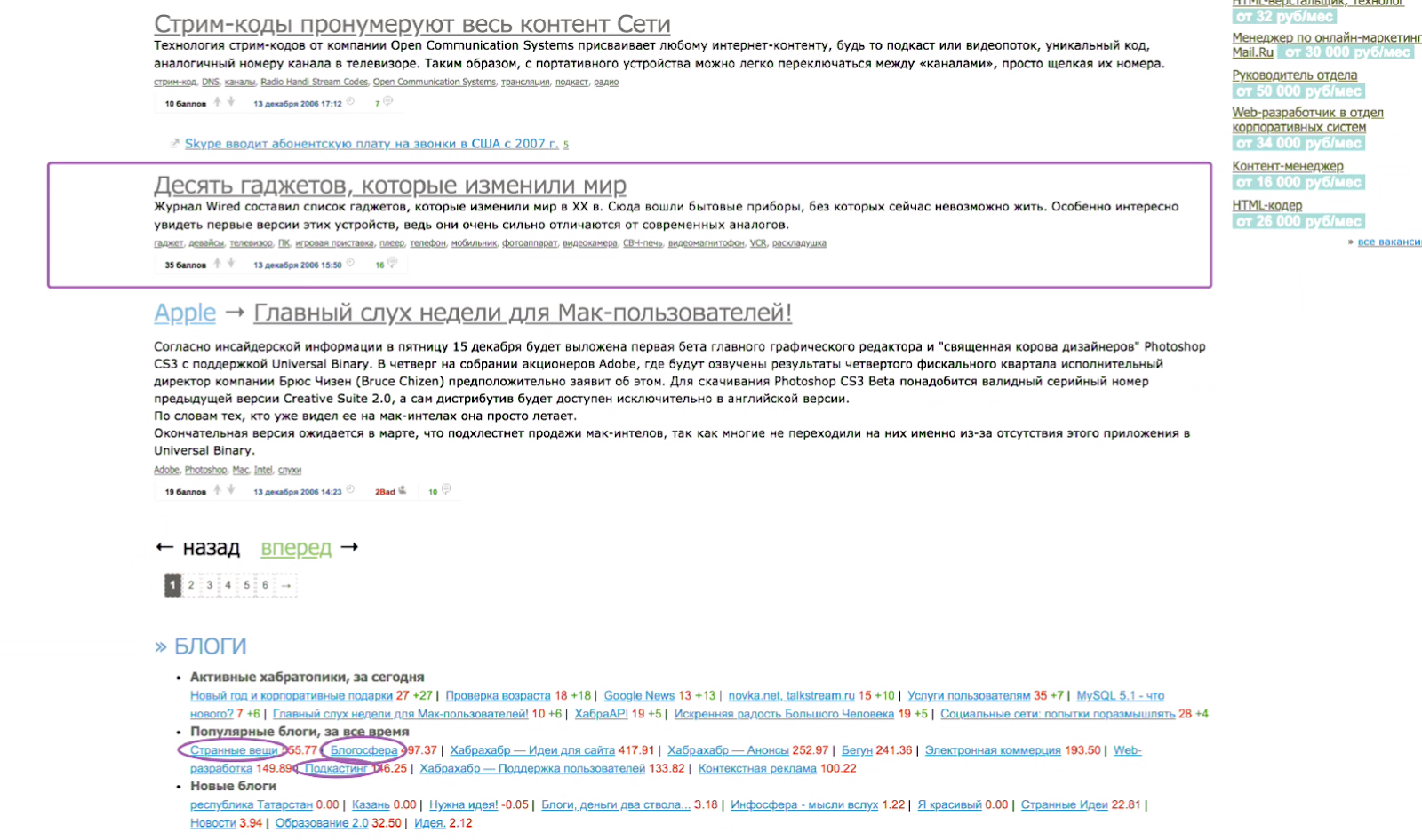
That's how it looked like Habr, in 2006.
Who will find advertising? Does anyone see an advertisement? No, in fact, it was not at all. But a little more about Hyktimes. I highlighted on this screenshot some tags, which are now quite popular hubs on hyktimes. For example: statistics, investments, power (now it is the regulation of the IT sector), names (now they are persons in IT). Social networks, mobile devices (this is a sub-gadget in gadgets), advertising, music, the future, that is - all these topics interested the audience of Habr already in 2006. And this is not a new audience, which came in 2014 and began to write on a new site.
Here the very first post of flow of gadgets which was such small in Habr's tape in 2006. There are popular blogs below and there are some weird stuff too. The blogosphere, podcasting are all hyktimes now. But there is no advertising (:)). So, in 2006 there was no advertising (as well as a separate Geektimes).
Later, in 2007, we had a banner of the standard for the advertising industry size of 240x400, which you see on the slide as "404 not found", because, unfortunately, the web archive does not host banners if they were hung through third-party twisters.
In 2008 we see the same 240x400, and we also have a hauling, the so-called leaderboard. What do you think, which of these two formats gave a higher CTR?
I just often come across opinions that hauling gives a higher CTR, but in reality this is not the case. In fact, 240x400 works better. and this is despite the fact that the constriction you hang up in a hat seems to be higher and more visible. But there are studies that prove that a person perceives any graphic information in a clockwise direction, moving from the left corner to the right and down. The so-called banner blindness, which we are talking about now, which is believed to have developed in the last 3 years, has always been, users see nothing useful from above, their eyes slip and fall on this banner to the right, and it clings to it more.
Then in 2009, we still have the same picture, but it is still Habr, and here we see MacOS themes, startups.
In 2010, we realized that hauling did not work well, it was finally removed, but there was 240x400 left. Pay attention, again, on the topics: scientifically popular - this is one of the biggest flows on Giktayms, he now occupies the top.
2011, again, we have 240x400, the design of Habra has changed a little and we see the very first publication in the ribbon post in the “iron” hub, this is again the topic of the letters.
2012, a small button appeared on top, it stood on the same line as the site menu and became more native. It housed a small advertising space, which nonetheless worked out better than hauling, which was previously in the top.
And 2012, I wanted to show you that we started writing about virtual reality, can you imagine, it was more than 5 years ago. When I remember about virtual reality glasses, how they began to be talked about and shown en masse at various events, I think it was recently, but it turns out that more than 5 years have passed.
And 2014: Dragon for MSI - again, the topic of Hyktimes, but she was still on Habré, there are no banners at all. They went down. Why, because they didn’t really click on them then and we didn’t have much content to fill the whole page with banners. At this moment, Giktames separated from Habr. Many, many years (well, okay, eight) passed before it was allocated to a separate platform, and the audience was not born just out of nowhere, it migrated from Habr. That is why many users can say “this is not Habratexte” or this is not “Habratem”, because they are used to the fact that the presentation style is the same.
Our favorite post, "what is wrong with the separation of Habr and Hyktimes." Please note that there is no advertising at all and this is 2014, October.
But if we look forward 3 months, we have such a format in the corner from the bottom left, a super native, which was very well written into the design. He was flat and gray. This icon was completely gray, light gray with a dark outline and only when the mouse was hovering over it, it became colored.
What is good about this format: the fact that it looks like native buttons is true. When we talk about the audience Hiktaimes and Habra, we need to remember that it is very sensitive, both to the content that you write and the grammar that you use. Probably, if you divide Habr and Giktayms, then due to the fact that Habr is more technical and it is more about good, and Giktime is more about entertainment, you can neglect some of your design abilities on Habr, if you really wrote a useful article. I like to say that the GKTimes are boring, but the nerds are not in such a bad way. These are people who will meticulously dig around, and it will give them pleasure. (Comment of the speaker: Oh, if I knew then that they would be able to read the transcript of this speech. No, I would call them bothers anyway, I would just try to tell them better and more clearly.) And this concerns not only the content, This also applies to advertising, so when we place this format, a small button, yes it’s gray, not very noticeable, but you have to understand that it’s a half million people at that time who go to this site every day and they know its design thoroughly. And when they see such a new button, the first thing that happens is the wow effect. This is better for the brand than some banner hanging from above, about which they think: “Lord, what a stupid designer drew it, I would have done better,” and nothing but a negative attitude to the brand and to the advertisement itself does not occur.
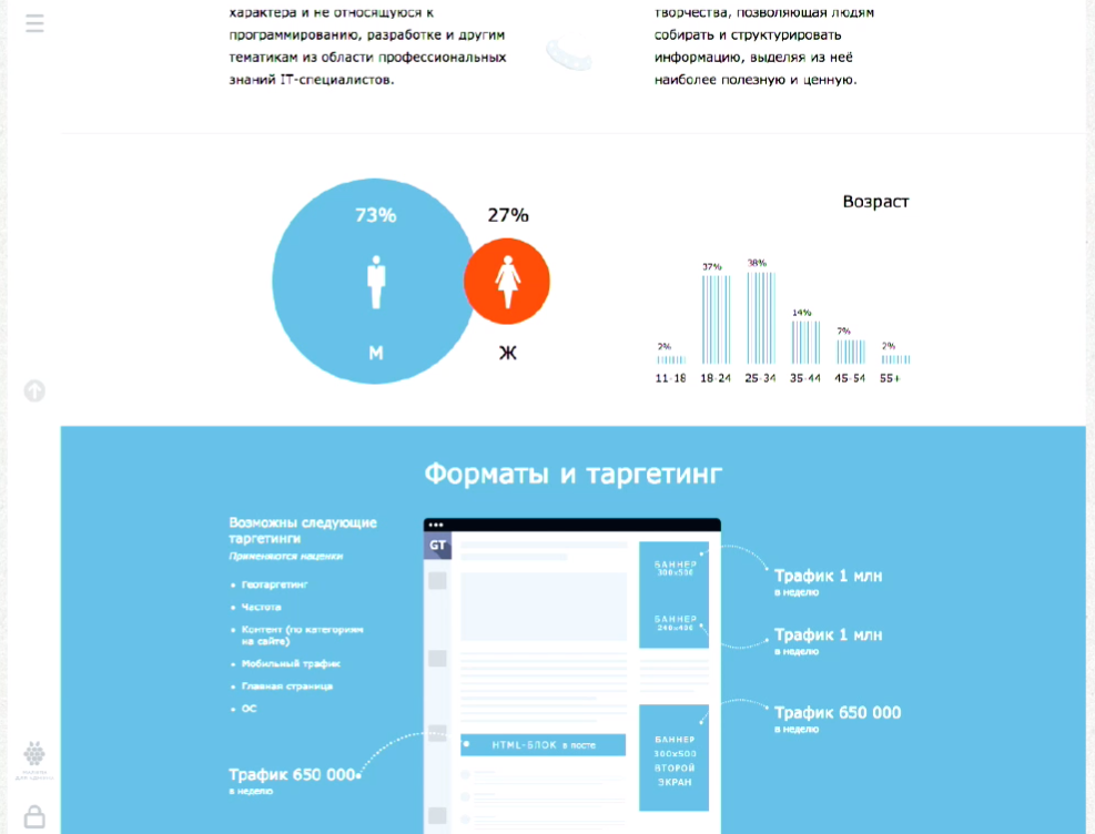
In 2014, we described our audience. 73% of men, 27% of women. Pay attention, women on Giktayms more than on Habré. It seems that if you think about geeks - you rarely think about women, but in fact they do not, there are a lot of them and we have them. Note, there is still a button. And then such a standard of our banner placements was born, we had a banner in ATF for all fans of branded placements who say: “I want only the first screen so that everyone can see me for sure” and don’t think at that moment that their banner is quickly squandered, because this is a ribbon, users read, they leave the first screen faster than what is under the scroll, so-called BTF. A hauling appeared in the content feed and a banner appeared on the second screen, which arrived later. By the way, users see it longer, if your marketer suddenly asks you which banner is better, above or below, and this will be related to Hycktimes, most likely the banner below will be longer in the user's active screen.
Then we had such wonderful stubs, because we all remember that Habr and Giktayms is an area of boring and IT people as I said, and they love AdBlock very much and do not like banners very much, so I had to somehow think of a way to communicate with them. And this is what I wanted to say, and said. We communicate not only in content with our users, we also communicate in banners. When we communicate with them in banners, we need to remember that the tone of communication on the site should be about the same for any format, no matter if you post or you place a banner.
Of course it's great when a creative agency draws you a stack of 300x250, 300x600 banners (and so on), you shove them into AdWords on all sites, and you seem to be doing everything. And then you look at the statistics, you see there Giktayms and you think: why they click on Gktayms so badly. Well, because your banner, despite the fact that it is so beautiful, does not fit into the general tone of communication of this site. But such a message, even despite the fact that it consists entirely of two lines of text and one button, can give you a greater CTR than the banner, which was not made specifically for this site, but to a huge audience to run all over the runet.
In 2016, we again had two sidebar banners: on top and in the ribbon, and one appeared in the footer.
This is a picture to attract attention. One of the most popular publications on giktimes - about space, and this is the Curiosity rover that NASA launched in 2016, it seems (author's note: no, they launched it in 2011, in 2016 it was 4 years on Mars.). This is also an example of what kind of graphic content you can place in banners, posting them on beckatures to arouse users' interest, a positive attitude towards the brand and a desire to see what it is.
This picture is about Mercedes, there was such a cool article on Hyktimes about the fact that a second before the accident the smart system in Mercedes makes a certain sound at a certain frequency in a very short period of time so that the driver can respond faster. And this is also an example of what kind of content can go well and looking at this picture you may not immediately consider the information that Mercedes is a very cool car, but you can add it somehow in a very short slogan and place it on the banner and It will go better for an audience that reads such articles.
And so we quickly came to 2018. Now we have 4 banner places. As the ribbon of posts grew and the amount of content within one page on the site increased, the number of advertising places increased, and the formats increased. Now we allow the top to place 300 * 600, hauling we have remained standard for the site. Below you can also place two banners. One in the sidebar, one in the footer. What does this give us? This gives us the opportunity to communicate with the user at almost any stage of his site reading. Even if he came in and flipped through the ATF quickly (first screen) and he was not interested in reading the top tapes, he had already seen it, he wanted to see something lower, or he goes immediately to the comments in publications, which very often happens, he doesn't care will see some kind of banner.
Comment from colleagues from Habr in the hall:
On the mobile version, we have several formats. Others, mainly small constrictions. Despite the fact that the mobile is considered the fastest growing trend in advertising, in programmatic and in display, in richmedia, it is very difficult to make advertising in a mobile version so that it does not annoy users. As far as you know, if you place a large format in a mobile phone, you get a very large percentage of fraud. We choose not to give fraud to our advertisers, so that there is no such thing that users click, are angry at us, at advertisers, advertisers then have no conversion and everything is bad. We do not do that, but we have small banners in the mobile version.
Yes, in the mobile version there are completely different formats, there is a completely different layout. This is not adaptive, this is another site you can say.
What we have come up with in order to engage our users in communication with banners. According to studies, how many people do you think one person sees per day? Or glances over them. How many advertising messages per day are directed to the attention of a person? According to 2006 studies, it was 5,000 a day, while according to 1986 studies, as I recall, it was 500. Then it was, of course, all sorts of newspaper clippings, or signs on the street, something else. Probably, now this figure aspires to 50,000, apparently. And this is the banner blindness we are talking about, and how to fight it? Well, first of all, what I was talking about, choose the tone of office (tone of voice - literally “tone of voice”, a term in marketing, refers to the tonality and character of the brand-led communication) of your creative to the tone of the site, so that communication was within the environment to which the user is accustomed when he came here to consume content.
Secondly, you can do the following. Here you have 50,000 banners on the Internet, which every day try to appear to the user. What can you do about it? You can make it so that at the moment when he came to Giktaims to read something cool that he really likes, during his lunch break, no other brand showed him an advertisement. Well, or no other at all. But here one of the approaches is to show a message that is complex, so to speak. When you show two banners and “A” is written on one of them, “B” is written on the second one and the user sees one of them, no matter what, and when he sees something similar, his eye involuntarily clings to this banner or for this picture, because that's how we are. We first perceive the information unconsciously, therefore if we see something again, the probability that we will catch our attention on this increases. We kind of stop looking at something familiar. This can occur within a single page. Firstly, it allows you to increase the likelihood of contact with the user, secondly, it allows you to tell a little more. So how do we support the standard Acceptable Ads ... Who knows what Acceptable Ads are? There is such an initiative, which started, it seems, 3 years ago, after AdBlock appeared and when everyone had already begun to massively cut advertising, the so-called pain of advertisers (and sites, in fact) appeared, because everyone would soon see their ads . If you do not show ads, you will soon stop buying. There are studies that prove that if Coca-Cola stops spending money on marketing, then in 3 years everyone will buy Pepsi, all of a sudden. So here. Acceptable Ads is an initiative that is intended to lead to the agreement of publishers, advertisers and users. The banner should be simple, it should not cause negative reflexes to the user (for example, when you enter the site and there the video opens abruptly and some loud music begins). Maybe you watch a video online, every time I see a 1xBet ad. Every time I think that I will die when it starts (very loud and sudden). So, Acceptable Ads was invented to prevent such an advertisement, so that the advertisement would be pleasant, so that it could be looked at, that it would be useful and at the same time be normally integrated into the site, and not as it happens, you go to a well-known distinguished site, 400 pixels to the left screen ,, and drives something with sound. Given the fact that we support this standard Acceptable Ads, we do not place animated banners. Therefore, it is obvious that the scope for creativity at the client is very small. You have 300 pixels by 600 pixels, and somehow you need to fit everything there.
You can, for example, make 2 banners that will be displayed simultaneously, and they will tell “A” and “B” about your product.
They can also be in the sidebar, or you can, for example, place one banner, but place it so that it catches the eye of users more often. How to do it.
You choose dynamic placement. There is such a thing as a programmatic, this is (note by the author: not only, but including. Further, a very simplified description) when advertising is placed on an open auction and you don’t seem to set anything right, except for the price for the target action, and the system then over time, she learns who better to show your banner. It is almost the same, only depending on where the user is at the time of scrolling the page, your banner will appear at the top, in the middle or at the bottom.
This is another cool picture about what kind of content love on Giktimes. This is the post of 2017, an overview of the history of synthesizers. And just about we look with our banners when we try to understand what is best to do.
The option is to take all the attention away from other advertisers and tell only about yourself, for such very confident companies it is Roadblock. I don’t know who invented Roadblock, but I think it was a brilliant man, because he has several undeniable advantages. First, advertisers who are placed according to the Roadblock format, they immediately eliminate any competitor. That is, there is no other advertising on the page at all. Imagine, you go to the store, back to the fizzy drinks, and there is only Coca-Cola. Everything, you have no choice, you will not take Pepsi because only Coca-Cola is there. Well, conditionally, go to the newspaper stall and there is only Esquire. You will be reading Esquire, probably. First, you eliminate competitors, and second, you can use this format to tell users, if they are your target audience, about how you take care of them. That is, you place 4 banners, make them beautiful, write on them some advantages of your company or your product, or just tell us how stunning, new it is, and so on. But we don’t overdo it, because we remember that if we don’t tell that he’s stunning but with flaws, they will find them themselves, dig them out and then they will hit you on the hat. You can place all these four banners, the user will not see another advertisement and will understand that you take care of him as an advertiser, so that he sees something good, something useful, well-made, and not some other garbage.
No, you can't, of course, just hang the whole page with red banners flashing with green and write “Buy and sell”. No you can not. Well, and we do not post this, because all banners from advertisers are coordinated with us. Yes, we can come up with all this, make it ourselves, make several sets, launch into rotation, test for which the audience responds better and give a detailed report.
This is an example of how we did Roadblock creative, the content here is removed so that everything fits one page. It was Roadblock for freelance (our service for freelancers, everything is obvious). You can yourself evaluate how much you would like to see such a creative on the page, but in my opinion this is better than any remarketing from Google, which endlessly offers you products from an online store, even if you did not go there half a year or everything bought it. You can tell so, but you can in another way. In another way - this is a question for each specific advertiser.
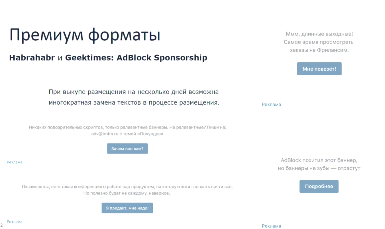
We also have the latest format, which I have already mentioned when I showed that we had AdBlock stubs. We realized that these stubs can be used not only to encourage the user to disable AdBlock and give us money to advertise to support all this good in the form of a site, content, and so on, but also to tell them something else. You can even tell them a joke. We did, in the picture you can see, the first test creative that we had there, and it still hangs there. "AdBlock stole this banner, but banners are not teeth - they grow back." In the first three days, when we placed this stub instead of our standard text, we received 1200 clicks from Habr and about 400 with heatsinks, but so that you understand, before that, people also clicked on the stub about "Disable AdBlock, we need it to develop our services," they clicked on it about 35 times a day. A button leads to our article on why we advertise.
(Further on the examples with the texts on the slide).
Yes, here we motivate users to disable AdBlock. Here we motivate users to participate in the moderation of creatives and write to us if they see something bad, poor quality, unpleasant, offensive, and so on. From below, we advertised a product management conference, and from above we advertised freelance. It was a long March weekend, during the holidays.
This format also gives you a very rigid framework, but a very large scope for communication with users, because you can write almost anything. This is part of the site, it's all customizable inside. This is not considered an advertisement because it is an unobtrusive message. Not at banner places, but under banner places. This is their wrong side, as it were. If nothing works because everything is cut out by filters, this appears. In the case of applying for banners, this is really part of the content of our site, we just wrote about it differently. In the case of freelance, this is essentially our partner project, we just, again, wrote about it differently. We have a link to it in the header, AdBlock does not cut it. We probably have one of the highest percentages of users with AdBlock, because these are the people who wrote it, including, probably, you can say so. It is more on Habré, a little smaller on giktimes, but in different periods from 25% to 35%.
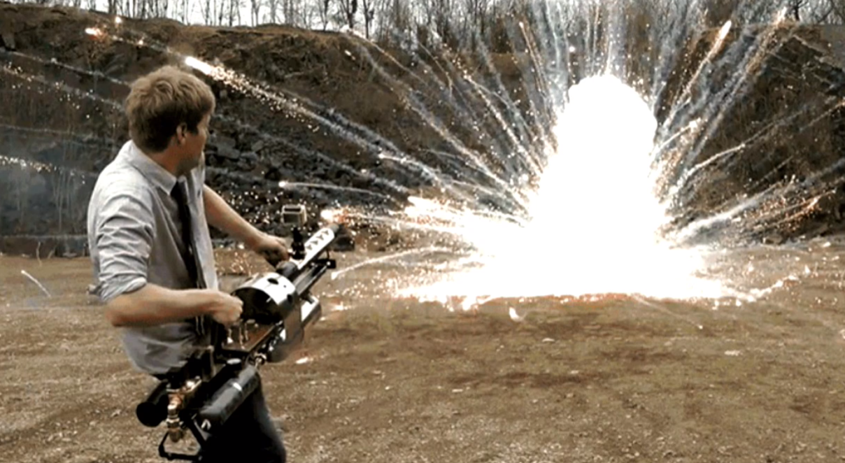
Another one of my favorite posts on giktime about a man who gathered a flamethrower to destroy termites, a flamethrower that anti-termite mixture burning up to 3000 degrees Celsius destroys parasites. I wish you the same about blasting banners so that the audience responded well to them.
Answers on questions
- I'm just wondering where there are more spelling and grammatical errors, on Giktams or on Habré? Has anyone analyzed this, maybe it launched neuron or something else?
I honestly did not analyze, but perhaps my colleagues from the editorial board or Anton can answer this question.
- Yes, where simply mistakes more grammar?
I put on the fact that more errors on Habré.
We have a moderators' service, which is designed to comb posts, including looking, so that they are not badly decorated and with errors. Therefore, even if this occurs, the moderators quickly fix it. Feels like more on giktaims, if you answer your question.
- And I have a question for my wife. What do you think of the role of display advertising. Banners, for the user, it is now more communication, PR?
Yes, definitely. Let me show you one more thing I wanted to voice.
- And do I understand correctly that it used to be a performance, and earlier banners were aggressive? Or is it that we live in such a world, in our own Habra-world.
Look, I don't know which of you represents agencies or brands, but who ever placed an advertisement for yourself or a client? A little bit about the history of banners. Banners generally appeared as any advertisement in order to lead the user to your product. Then the division into performance advertising and branding advertising appeared, but if you look at the benchmarks, for example, the statistics that Google gives.
I have chosen Russia here, these are all formats and all verticals. Then it seems to me that something has broken because he believes that the CTR of a standard banner with a picture and now this banner with a picture was 0.45. The mystery lies in the fact that in the verticals they do not have everything working.
But if we look at all countries, it turns out that the average CTR for display advertising is 0.05%. CTR 0.05%! And any bursts are much higher than the average of the historical ones that you can look at in studies, they are most likely dictated by fraud, bots, doorways, some kind of nets with non valid traffic. We just have to admit that people do not like to click on banners, and this is generally an image format in terms of the fact that it is a picture. It is not very good to do this not with a picture, but with an element of the site, in order to lure the user there to click unintentionally. They work mainly on brand recognition. Basically on building communication. I love Coca-Cola, I can talk about it endlessly. Not Coca-Cola itself, but their marketing. When you see a big Coca-Cola graffiti on the house, you think cool graffiti, you remember about the summer or about some kind of parties, and it becomes somehow more pleasant for you. Banners are the same. They are meant to make a person feel something. Something that is close to him, something that will cause him some emotions and at the same time build there some kind of neural connection associative with your brand.
There are performance banners, but they look like this. Here is a performance banner. The man went, looked at the bed, saw the bed. Everything, nothing aesthetic about it. This is a specific goal. Remind the person that he watched, bring him there. In my opinion it looks acceptable if you were really looking for something. The entire retargeting advertising stack rests on the fact that if the user was looking for, he should be reminded of this. But this is not a media ad in its standard sense. And such banners have a CTR of 0.9%, 1.3%. This is not the norm. I answered your question?
- My question was also related to explaining to the audience how they can use this information for their advertising purposes, because we mainly have representatives of brands here, these are companies, editors, people who are responsible for the content in companies. How could they use this in practice? Because it seems to me that for them it is a bit of a parallel universe, for those who are engaged in blogs.
Yes, it is possible.We can, first, help you yourself. Because we know our audience, we have a huge experience in placing this advertisement, we present what we can tell them, we can hold a brainstorm together with marketing representatives of your company. But the idea is that banners should help you remind a person of something and build a positive impression of your brand. Therefore, when you want to place banners, if you really want them to work, first of all think what you want to say with them, what kind of association do you want to build and what is the usual tone of communication on this site you choose, be it a blog or megapost or comment that you write from the brand. Surely there is something that you can broadcast in the form of a picture, that it will also be cool, but at the same time keep in touch with the image,which you build in any other communication environment.
- Do I understand correctly that in this case banners can be subordinated to content? Suppose I clinic Shilov, I wrote a post about the vitreous body in the eye. And the banner I will do with the vitreous bodies in the eye.
Well, for example, full face, profile, vitreous incision, or drawing something to draw. The question is that the banners work a little bit not to post more text “click here”, but to submit it more creatively. I have one good friend who has been working in Internet advertising for a long time, 20 years old, and he believes, and there is a lot of research that confirms that very soon we will all come to the fact that again there will be banners posted for a week on the website, bought directly, because firstly they will cut out everything that is now advertising with some kind of codes, secondly, users simply get very tired of this remarketing, that something is catching up with them and they want anonymity. Again, all marketers will have to figure out how to convey meaning to the user. Imaginethat you are placing a picture in the newspaper, and you need people to come to you after that. Banner is about the same. Therefore, you need to study more visual art in order to understand how this should work well.
-The question is practical, associated with events. If you place invitations to events on your banners, how much it will work or with this audience it is better not to do so and do it with the help of marketing, calls, direct and indirect tele.
Thanks for asking.We have cases when we place banners about events. We have about three categories of banners that work very well. On average, it is higher than on our site and they hit benchmarks that I previously showed several times. The very first of these is HR banners, when we post vacancies and narrow down the audience to a specific specialization. In second place are these events. They do not give a very high CTR, but higher than benchmarkovsky, it can give about 0.15, but again, I repeat, this cannot replace telemarketing, because if we imagine a sales funnel, then telemarketing is right here, and banners here. People can see the banners and this can make them go see your conference site or something else. I believe that our users are Giktatimes, due to the fact that they are boring and I will not tire of repeating it,bores in a good way, like Ilon Musk, nobody knew about him for a very long time, then he sold PayPal and now he launches rockets into space. They can see the banner and basically do not click on it, and go to Google to see what it is.
- Yes, I understand that.
Placing banners is worth it, you just need to be very careful about what you write on them. As we wrote, for example, there is such a conference, right here, which almost everyone wants to attend. We did not just write it. A partner came to us with a conference, and it turned out that 60% of the employees wanted to go there, although not all of our product managers. And we wrote like this. This is true, it somehow attracts the attention of users, because they think “What means almost everything, maybe I want to,” and it works in this case, they click. It’s not a fact that they buy everything from you right away, we cannot give these guarantees. But the events are worth it, yes, they are good for our audience, especially for hyktimes, because hyktimes is basically an audience very interested. Their bread, do not feed something new to learn from someone to ask something,get to the bottom of someone. Say what you did here like that, but I would do better. I answered your question?
- Yes, thank you very much, very good example. And the second small question is related to the fact that it’s not a secret to anyone that many advanced IT professionals turn off banners, as it happens on Habré and Hyktimes, do you have any numbers and can you keep track of whether community members are sitting with banners turned on or not ?
Yes, we can track how many of them, I have already spoken about this, but we do not track who, do not violate the anonymity in this plan. We keep track of them, but we do not fight them aggressively. We allowed users with positive karma, for the new year we made a newsletter for them with a gift, and allowed users with positive karma to disable advertising in general. Go to your profile, put a tick "I do not want to watch ads." There are 1600 people on them, on Habré 3800, something like that. On Habr comes 8 million. person per month. How many of them with positive karma of all? At the same time, we still have a huge mass of unregistered users, they cannot even afford it at all.
- In AdBlock there is a function that you can ask to show ads on a specific site. Can you say any numbers on your sites, does anyone use it at all or not?
That is, when the user presses the white sheet? No, we do not have such numbers because we do not follow our users enough to climb into their extensions and read something there, no. We have about 15% of users who watch our ads precisely because they agreed in principle to this white list, which is provided by AdBlock itself.
- A short question. Is this kind of advertising used which gives some kind of buns to users of Hiktaimes or Habra for the fact that they are users of Hiktaimes or Habra, that is, special promotional codes or something else? That is what encourages people to relate better to advertising, roughly speaking.
Yes it is clear. We had such banners before, in 2012, 2014, 2015 we definitely had such banners. It was a promo code on GetTaxi, a promo code on Uber, something else. They were, yes, but we ourselves do not offer this format to advertisers, usually. By the way, a good idea, maybe we should offer.
Yes, the idea is good, in posts it has long been used to track the audience that comes from the sites.
Source: https://habr.com/ru/post/353764/
All Articles