Impose flex-calendar
The year 2018 is coming, fashionable boys have long been laying out on the grid, and I'm sitting on the third bootstrap with col-md kocheryachus, glancing at the fourth.
I decided that this is not the case, and it is worth refreshing a little knowledge, but the grid seems to have lame support, but flex even supports irons.
So I decided to master it. And the process of learning with you will share. In general, we will impose a calendar for the whole year.
We will need
- vue
gluemoment- and a bit of flex
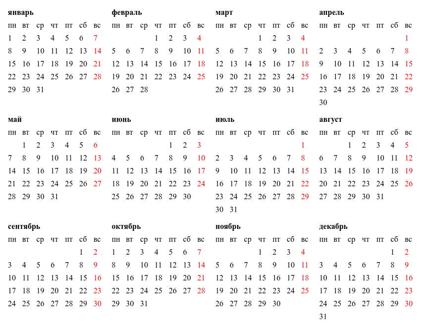
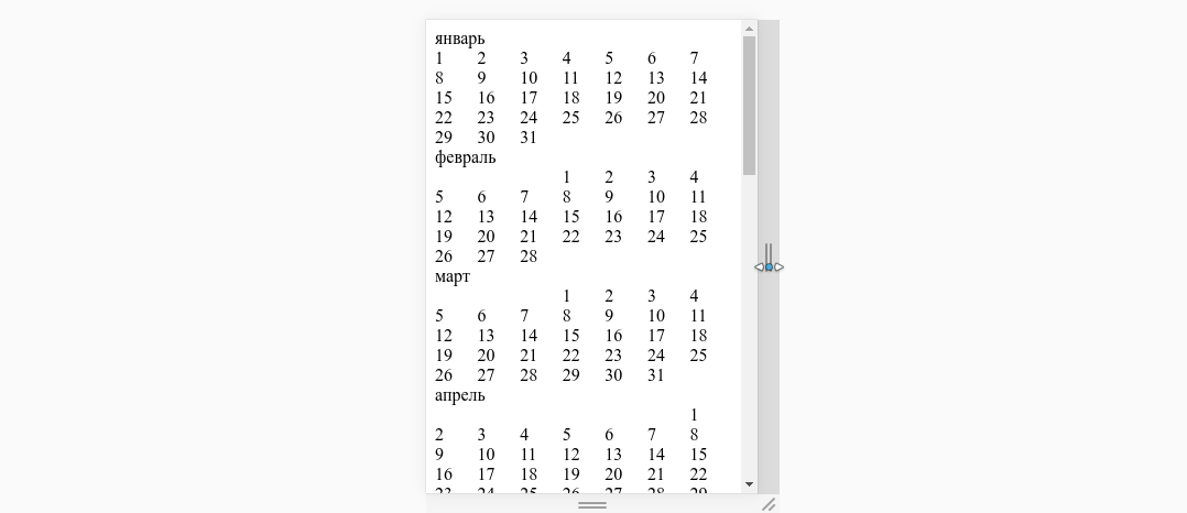
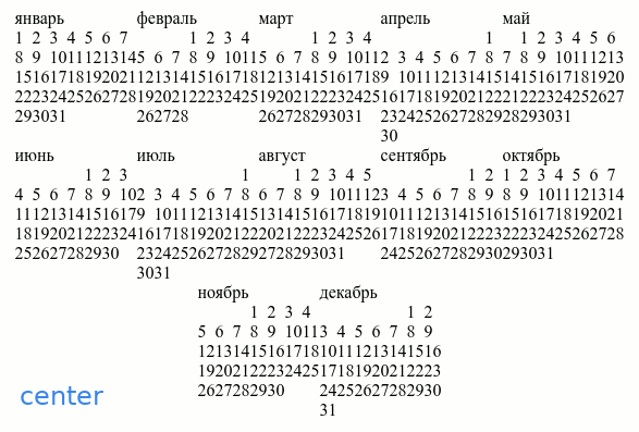
The result will look something like this:
It so happened that I am an adept vue , and therefore I will use it for rendering. I’ll use the moment library for working with dates, I can do without it, but I’m more used to it.
Training
Install vue-cli if you don’t have one yet:
npm install -g vue-cli create a project based on the webpack-simple template, I will use scss (mainly for comments), so when the wizard asks you
? Use sass? (y/N) Answer y (es), generally run:
vue-init webpack-simple calendar_flex cd calendar_flex npm install let's add the moment.js library
npm install -S moment clear the App.vue file
<template> </template> <script> export default { name: 'app', data () { return { } } } </script> <style> </style> So as not to seem barbarian, we will not simply impose a naked calendar, and develop a separate component.
Create a Calendar.vue file:
<template> <div></div> </template> <style lang="scss" scoped> </style> <script> export default { props: { year: { // type: Number, default: (new Date()).getFullYear() }, }, data () { return {} } } </script> connect component globally to main.js
import Vue from 'vue' import App from './App.vue' import Calendar from './Calendar.vue' Vue.component("calendar", Calendar); new Vue({ el: '#app', render: h => h(App) }) add a component to App.vue
<template> <calendar></calendar> </template> ... If everything is done correctly, we will see the word "Calendar" on a white background.
Preparing data
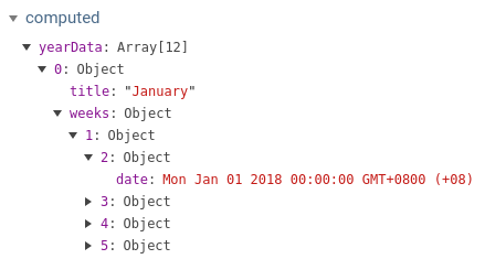
Before you draw something you need to prepare the data for the calendar. I suggest to pack the data for the year into an array of months. In turn, each month will be an object of the form:
{ title: '', weeks: {1: {}, 2: {}, ...} } I mean the name of the month and an array of weeks. Each week will be an object where a date will be attached to each day (from 1 to 7) and some other meta information can also be:
week = { 1: {date: new Date(), ...}, // 2: {date: new Date(), ...}, // ... } Switch to the Calendar.vue file and update the part responsible for the script:
import moment from 'moment'; export default { ... computed: { yearData() { let data = []; for (let m = 0; m < 12; ++m) { // let day = moment({year: this.year, month: m, day: 1}); let daysInMonth = day.daysInMonth(); // let month = { // title: day.format("MMMM"), weeks: {}, }; // for (let d = 0; d < daysInMonth; ++d) { let week = day.week(); // , // , // 53 if (m === 11 && week === 1) { week = 53 } // , if (!month.weeks.hasOwnProperty(week)) { month.weeks[week] = {} } // , weekday() , // , , // month.weeks[week][day.weekday() + 1] = { date: day.toDate(), }; // , moment day.add(1, 'd'); } // data.push(month); } return data } } ... } You can look into vue-devtools and see there:
Impose
Well, let's get something out. First, we will learn how to impose one month, and then, as we master, we will derive all the rest. In general, the Calendar.vue template is correct:
<template> <div class="month"> <div class="title">{{yearData[0].title}}</div> <div class="week" v-for="week in yearData[0].weeks"> <div class="day" v-for="day in 7"> <span v-if="week[day]">{{week[day].date.getDate()}}</span> </div> </div> </div> </template> First, let's make the dates display in our week in a row, for this we fix the style:
<style lang="scss" scoped> .week { display: flex; } </style> 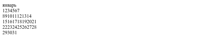
We now point out that every day should occupy the same amount of space in our series:
<style lang="scss" scoped> .week { display: flex; } .day { flex-grow: 1; } </style> 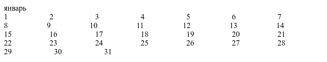
Well, it seemed to be more decent, only the numbers are still jumping. This happens because flex-grow essentially distributes empty space, and the text of numbers in this empty space is not included, so that the cells with numbers become really equal should be specified in the style so that the width of the text is not taken into account. To do this, set the flex-basis property to zero.
If it is not completely clear what I am saying, try to study this picture:

Well, how? Rule the style:
<style lang="scss" scoped> .week { display: flex; } .day { flex-grow: 1; flex-basis: 0; } </style> from now beauty

I think we are now ready to try to output all the months, rule the template:
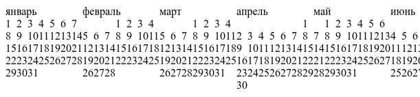
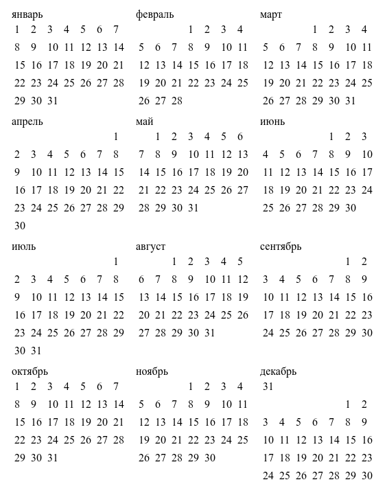
<template> <div class="year"> <div class="month" v-for="month in yearData"> <div class="title">{{month.title}}</div> <div class="week" v-for="week in month.weeks"> <div class="day" v-for="day in 7"> <span v-if="week[day]">{{week[day].date.getDate()}}</span> </div> </div> </div> </div> </template> Great, we already have a kind of responsive calendar:
But this is not enough for us, our calendar is displayed in a column, as the grandfather bequeathed to div , but we would have a line ... Let's do it by analogy. We just assigned flex every week to her days. Now let's assign our year block to flex as a container for its months. Add styles:
<style lang="scss" scoped> .week {...} .day {...} .year { display: flex; } .month { flex-grow: 1; flex-basis: 0; } </style> Even, some kind of porridge:
The reason for this porridge is that, by default, flex does not make transfers, but tries to display everything in one line, and, accordingly, compresses as long as it is strong enough, but they are not enough. To enable the carry mode, you need to add the flex-wrap property in our year container, let 's do this:
<style lang="scss" scoped> .week {...} .day {...} .year { display: flex; flex-wrap: wrap; // } .month {...} </style> Well, uh ... like it became better, although it endures:
Here the air is not enough, but by the way, it's even more interesting for us. Obviously, November and December feel best, but since we are for equality, let’s press them so that they don’t stand out.
To squeeze, you need to remove flex-grow: 1 from the month, (current added, now delete ...), which is responsible for stretching within the line:
<style lang="scss" scoped> ... .month { flex-basis: 0; } </style> 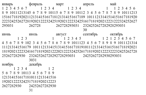
For how the last two will be located (in fact, not only for them) of the hanging elements are responsible justify-content in the container style, by default it is equal to flex-start . Can be leveled at the end.
<style lang="scss" scoped> .week {...} .day {...} .year { display: flex; flex-wrap: wrap; justify-content: flex-end; // } .month {...} </style> Here is a gif with different meanings:
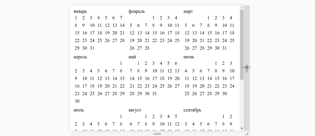
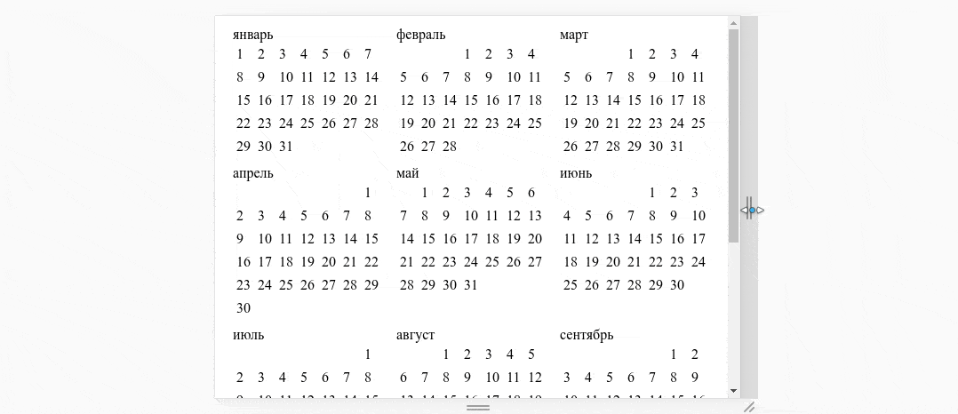
Since I plan that I will always have the same number of months in a row, and I want them to occupy all the free space, then I probably will return flex-grow: 1 ; back and add some air:
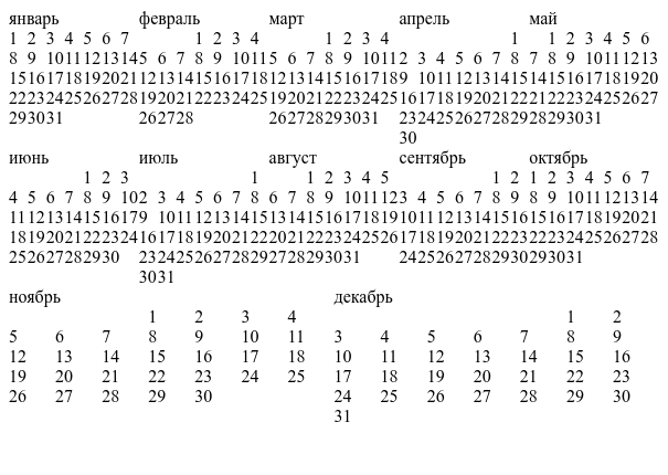
<style lang="scss" scoped> .week {...} .day { margin: 0.25em; // flex-grow: 1; flex-basis: 0; } .year { display: flex; flex-wrap: wrap; } .month { margin: 0.25em; // flex-basis: 0; flex-grow: 1; // } </style> beauty:
Once again, back to justify-content and flex-grow: 1 . Compare two gifs, on the first one at month flex-grow = 1 , on the second one - the property is absent:
Which option do you prefer, decide for yourself.
Add a line with the days of the week. First we add a computable property to the script.
export default { ... computed: { weekDays () { // let days = []; for(let i = 1; i<=7;++i) { days.push(moment().isoWeekday(i).format("dd")) } return days; }, ... } } And now we will display them in the template:
<template> <div class="year"> <div class="month" v-for="month in yearData"> <div class="title">{{month.title}}</div> <div class="week"> <div class="day" v-for="d in weekDays"> <span>{{d}}</span> </div> </div> <div class="week" v-for="week in month.weeks"> <div class="day" v-for="day in 7"> <span v-if="week[day]">{{week[day].date.getDate()}}</span> </div> </div> </div> </div> </template> 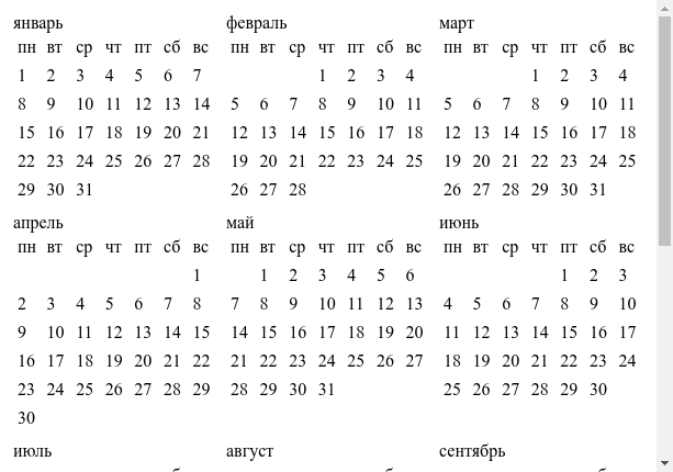
I want Sunday to be red, let's add a dynamic style to the .day node:
<template> <div class="year"> <div class="month" v-for="month in yearData"> ... <div class="week" v-for="week in month.weeks"> <div class="day" v-for="day in 7" :class="{[`week-day-${day}`]: true}"> <span v-if="week[day]">{{week[day].date.getDate()}}</span> </div> </div> </div> </div> </template> And now we will correct the styles, we will bring a bit of beauty:
<style lang="scss" scoped> .title { // margin: 0.25em; font-weight: bold; } .week-day-7 { // color: red; } ... </style>
Well, the final touches: add the ability to change the year and make a fixed header using flex .
Switch to the App.vue file, and adjust the template:
<template> <div class="wrapper"> <div class="content"> <div class="header"> <div class="title">{{year}}</div> </div> <div class="body"> <calendar :year="year"></calendar> </div> </div> </div> </template> added a line with the year, until, apparently, not fixed:
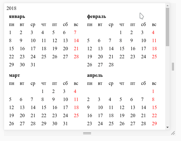
Let's tweak the styles in App.vue , remove the padding in the body , set the height of html and body to the entire height of the window, and make the header more colored, I intentionally use two style nodes, one for the global styles, the other for local ones:
<style lang="scss"> html { height: 100%; } body { height: 100%; margin: 0; } </style> <style lang="scss" scoped> .title { font-weight: bold; font-size: 1.5em; margin: 0.25em; text-align: center; } </style> The idea of creating a fixed header on flex is to use two nested flex containers, one of which limits the height of the entire content, and the second, nested, uses flex-direction: column .
Rule the style:
<style lang="scss" scoped> .title {...} .wrapper { // display: flex; height: 100%; // , ' body } .content { // display: flex; flex-direction: column; } .body { // flex-grow: 1; // , overflow-y: auto; // , } </style> 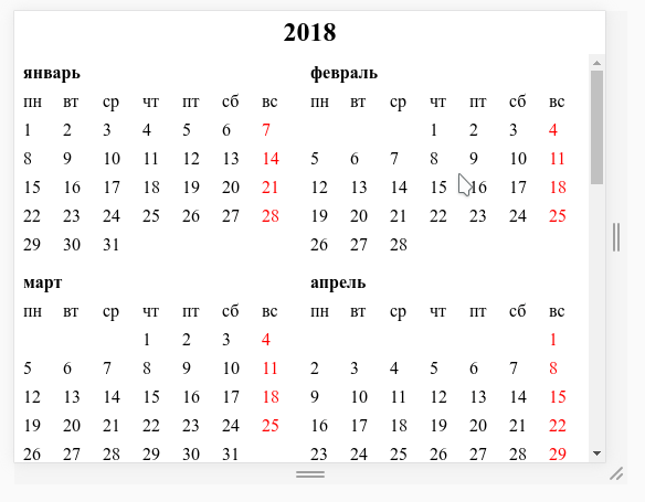
Great, huh? You can even make a footer:
<template> <div class="wrapper"> <div class="content"> <div class="header"> <div class="title">{{year}}</div> </div> <div class="body"> <calendar :year="year"></calendar> </div> <div class="header"> <div class="title">{{year}}</div> </div> </div> </div> </template> 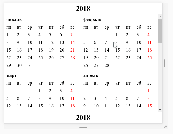
Well, let's add buttons to switch the year:
<template> <div class="wrapper"> <div class="content"> <div class="header"> <button @click="--year"><</button> <div class="title">{{year}}</div> <button @click="++year">></button> </div> <div class="body"> <calendar :year="year"></calendar> </div> <div class="header"> <div class="title">{{year}}</div> </div> </div> </div> </template> 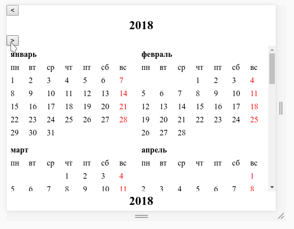
We will use the knowledge we have already received, and we will make the heading more flex-shaped, correct the styles:
<style lang="scss" scoped> .title {...} .header { padding: 0.25em; display: flex; justify-content: space-between; } .wrapper {...} .content {...} .body {...} </style> 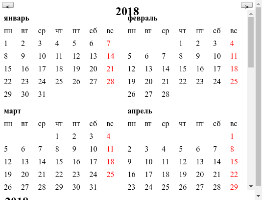
Hmm ... something is wrong here. Even our headlines squeezed right and layout floated. Unfortunately, this is the moment that I did not fully understand why this happened. But as I believe, this is due to the fact that display: flex sets the dynamic height, and being inside another flex container, it is oriented on the dimensions specified by its parent.
In general, in order to cure it, it is necessary to prohibit the flex container inside which our header is located to compress its dimensions, for this we add the flex-shrink property:
<style lang="scss" scoped> .title {...} .header { padding: 0.25em; display: flex; flex-shrink: 0; // justify-content: space-between; } .wrapper {...} .content {...} .body {...} </style> Well, that's all, now you have a flex-calendar for any year!

This article failed to show all flex features, but I think it’s possible to reflect the general approach of working with it.
I hope that the article will help those who, like me, stuck in css-times somewhere between the 3rd and 4th bootstrap, make their first steps towards the modern css.
')
Source: https://habr.com/ru/post/353664/
All Articles