Learn OpenGL. Lesson 5.2 - Gamma Correction

Gamma Correction
So, we calculated the colors of all the pixels of the scene, it's time to display them on the monitor. In the early days of digital image processing, most monitors had cathode ray tubes (CRTs). This type of monitor had a physical feature: increasing the input voltage by half did not mean a twofold increase in brightness. The relationship between input voltage and brightness was expressed by a power function, with a rate of about 2.2, also known as a gamma monitor.
- Opengl
- Creating a window
- Hello window
- Hello triangle
- Shaders
- Textures
- Transformations
- Coordinate systems
- Camera
Part 2. Basic lighting
Part 3. Loading 3D Models
')
Part 4. OpenGL advanced features
- Depth test
- Stencil test
- Mixing colors
- Face clipping
- Frame buffer
- Cubic cards
- Advanced data handling
- Advanced GLSL
- Geometric shader
- Instancing
- Smoothing
Part 5. Advanced Lighting
- Advanced lighting. Model Blinna-Phong.
- Gamma Correction
This feature of monitors (by coincidence) is very similar to how people perceive brightness: with a similar (but inverse) power dependence. To better understand this, take a look at the following image:
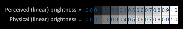
The top line shows how the brightness is perceived by the human eye: when you increase the brightness by 2 times (for example, from 0.1 to 0.2), the picture really looks like it is twice as bright: the changes are seen quite clearly. However, when we speak of the physical brightness of light, such as the number of photons leaving a light source, the lower scale gives a true picture. On it, doubling the value gives a physically correct brightness, but since our eyes are more susceptible to changes in dark colors, this seems somewhat strange.
Since the upper version is more familiar to the human eye, monitors still use a power dependence when outputting colors, so the original, in the physical sense, brightness values are converted to non-linear brightness values shown on the upper scale. This is mainly done because it looks better.
This feature of monitors really makes the picture better for our eyes, but when it comes to rendering graphics, one problem arises: all the color and brightness parameters that we set in our applications are based on what we see on the monitor. This means that all these parameters are in fact non-linear. Take a look at the chart:
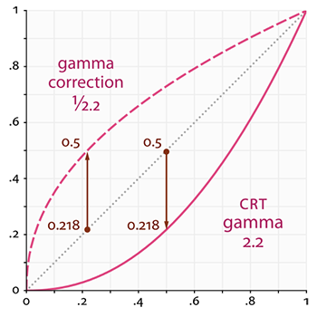
The gray line corresponds to the color values in linear space; the solid red line represents the color space displayed by the monitor. When we want to get 2 times brighter color in a linear space, we simply take and double its value. For example, take the color vector that is, dark red color. If we doubled its value in linear space, it would become equal . On the other hand, when displayed, it will be converted to the monitor color space as as seen from the graph. This is where the problem arises: by doubling the dark red light in the linear space, we actually make it more than 4.5 times brighter on the monitor!
Prior to this tutorial, we assumed that we were working in a linear space, but in fact we were working in a color space defined by the monitor, so all the colors and lighting variables we set were not physically correct, but just looked right on our monitor. Guided by this assumption, we (and artists) usually set the lighting values brighter than they should be (because the monitor darkens them), which makes most subsequent calculations in linear space wrong as a result. Also note that both charts start and end at the same points, only intermediate colors are dimmed on the display.
As I said, since the color values are selected based on the image displayed by the monitor, all intermediate lighting calculations performed in linear space are physically incorrect. This becomes more and more obvious when we start using more advanced lighting algorithms. Just take a look at the image:
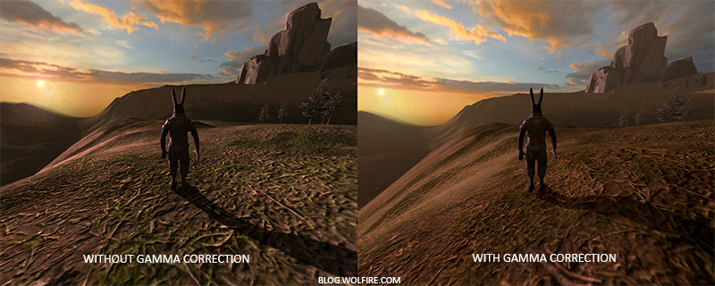
As you can see, the color values (which we have previously updated) using gamma correction are much better combined with each other, and the dark areas become lighter, which increases their detail. There is a much better image quality, with very minor modifications.
Without a properly tuned monitor gamut, the illumination looks wrong, and it will be quite difficult for artists to get realistic and beautiful results. To solve this problem it is necessary to apply gamma correction .
Gamma Correction
The idea of gamma correction is to apply the inversion of the gamma of the monitor to the final color before outputting to the monitor. Look again at the gamma curve at the beginning of this lesson, drawing attention to another line marked with a dash, which is the inverse of the monitor's gamma curve. We multiply the displayed color values in the linear space by this inverse gamma curve (we make them brighter), and as soon as they are displayed on the monitor, the gamma curve of the monitor will be applied to them, and the resulting colors will again become linear. In fact, we make intermediate colors brighter to balance their shading by the monitor.
Let's give one more example. Suppose we again have a dark red color . Before displaying this color on the monitor, we first apply the gamma correction curve to its components. The color values in the linear space, when displayed on the monitor, are raised to a power of approximately 2.2, so inversion requires us to raise values to the power of 1 / 2.2. Thus, the dark red color with gamma correction becomes = = . This corrected color is then displayed on the monitor, and as a result it is displayed as = . As you can see, when we use gamma correction, the monitor displays the colors exactly as we set them in the linear space in our application.
A gamma of 2.2 is the default value, which roughly expresses the average gamut of most displays. The color space resulting from this gamma is called the sRGB color space. Each monitor has its own gamma curves, but a value of 2.2 gives good results on most monitors. Because of these small differences, many games allow players to change the gamma setting.
There are two ways to apply gamma correction to your scenes:
- Use native OpenGL sRGB support for framebuffer.
- Perform gamma correction manually, in fragment shaders.
The first option is simpler, but gives you less control. By setting the GL_FRAMEBUFFER_SRGB flag, you tell OpenGL that each subsequent drawing command must perform a gamma correction to the sRGB color space before writing data to the color buffer. After enabling GL_FRAMEBUFFER_SRGB, OpenGL automatically performs gamma correction after running each fragment shader for all subsequent frame buffers, including the default frame buffer.
The inclusion of the GL_FRAMEBUFFER_SRGB flag is accomplished with the usual glEnable call:
glEnable(GL_FRAMEBUFFER_SRGB); Now your rendered color buffers will have a corrected gamma and, since this is done by hardware, it doesn't cost us anything. The only thing you need to remember with this approach (although with a different approach too) is that gamma correction converts colors from linear space to non-linear, so it is very important that you perform gamma correction only at the last, final stage. If you apply gamma correction to the final output, all subsequent operations on these colors will work with incorrect values. For example, if you use multiple frame buffers, you probably want intermediate results to remain in linear space and only the last buffer applied gamma correction before sending it to the monitor.
The second approach requires a little more work, but it gives us full control over gamma operations. We apply gamma correction at the appropriate stage of the fragment shader, so gamma correction is applied to the resulting colors immediately before sending to the monitor:
void main() { // [...] // - float gamma = 2.2; FragColor.rgb = pow(fragColor.rgb, vec3(1.0/gamma)); } The last line of code raises each component of the color fragColor , adjusting the result of this shader.
The problem with this approach is that you must apply gamma correction for each fragment shader that contributes to the final output, so if you have a dozen fragment shaders for several objects, you will have to add the gamma correction code to each of the of them. A more sensible solution would be to add the post-processing step to your rendering cycle and apply gamma correction on the final quad as the last step. Then you will need to do this only once.
Actually, these 2 lines of code are technical implementations of gamma correction. Not too impressive, right? Wait, there are a couple of nuances that you should consider when gamma correction.
sRGB textures
Whenever you draw or edit an image on your computer, you choose colors based on what you see on the monitor. In fact, this means that all images created or edited by you are not in linear space, but in sRGB space, that is, doubling the dark red color on the screen, based on the brightness you perceive, is not equal to doubling the red color component.
As a result, texture artists create them in sRGB space, and if we use these textures in our application as they are, we must take this into account. Before we applied gamma correction, this was not a problem, since the textures looked good in sRGB space, and without gamma correction, we also worked in this space, so the textures were displayed exactly as intended. However, now that we are displaying everything in a linear space, the texture colors are incorrectly transmitted, as seen in the following image:
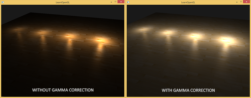
The texture is overexposed, and this is because the gamma correction, in fact, was applied to it twice! Judge for yourself: when we create an image based on what we see on the monitor, we adjust the gamut of color values of the image so that they look true on the screen. As we perform gamma correction again when rendering, the images become too bright.
To solve this problem, we need to make sure that the artists painting textures work in a linear space. However, since most artists do not even know what gamma correction is and it is easier for them to work in sRGB space, this is most likely not an option.
Another solution is to adjust or convert these sRGB textures back to linear space before doing any manipulations on their colors. We can do this as follows:
float gamma = 2.2; vec3 diffuseColor = pow(texture(diffuse, texCoords).rgb, vec3(gamma)); Nevertheless, doing this for every texture in the sRGB space is rather troublesome. Fortunately, OpenGL gives us another solution to our problems, providing us with the internal texture formats GL_SRGB and GL_SRGB_ALPHA .
If we create a texture in OpenGL with any of the two sRGB texture formats specified, OpenGL automatically converts their colors to a linear space as soon as we use them, which allows us to work correctly in a linear space with all the color values extracted from the texture. We can declare a texture as sRGB as follows:
glTexImage2D(GL_TEXTURE_2D, 0, GL_SRGB, width, height, 0, GL_RGB, GL_UNSIGNED_BYTE, image); If you want to use the alpha component in your texture, you will need to designate the internal texture format as GL_SRGB_ALPHA .
You must be careful when declaring your textures as sRGB, because not all textures will be in sRGB space. Textures used to paint objects, such as diffuse maps, are almost always in sRGB space. The textures used to extract lighting parameters, such as glare and normal maps, on the contrary, are almost always in linear space, so if you declare them as sRGB, the lighting will go. Be careful when specifying texture types.
By declaring our diffuse textures as sRGB, you will again get the expected result, but this time you only need to apply the gamma correction once.
Attenuation
Another point that will be different when using gamma correction is the light attenuation. In the real physical world, the illumination fades almost inversely as the square of the distance from the light source. In human language, this means that the light intensity decreases with distance from the light source, as shown below:
float attenuation = 1.0 / (distance * distance); However, using this equation, the damping effect is too strong, and the light spot gets a small radius, which does not look physically reliable. Therefore, we used other equations for damping (we discussed this in the tutorial on the basics of lighting ), which provide more tuning options, or a linear variant in general:
float attenuation = 1.0 / distance; Without a gamma correction, the linear variant gives much more plausible results than the quadratic one, but when we turn on the gamma correction, the linear attenuation looks too weak, and a physically correct quadratic unexpectedly gives better results. The figure below shows the differences between the options:
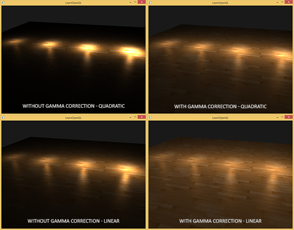
The reason for this difference is that the light attenuation function changes the brightness, and since we didn’t display our scene in a linear space, we chose the attenuation function that looked best on our monitor, although it wasn’t physically correct. When we used the quadratic damping function without gamma correction, in fact it turned into when displayed on the monitor, which gave a much greater attenuation effect. It also explains why the linear version gives the best results without gamma correction, because with it = , which is much more like a physically correct relationship.
The more advanced attenuation function, which we discussed in the fundamentals of lighting, is still useful in scenes with gamma correction, because it gives much more control for more accurate attenuation (but, of course, requires other parameters when using gamma correction).
I wrote a simple demo scene, the source code of which you can find here . By pressing the spacebar, you can switch between scenes with and without gamma correction, each of which uses its own textures and fading functions. This is not the most impressive demonstration, but it does show how to use these techniques.
To summarize: gamma correction allows you to work with colors in a linear space. Since linear space is inherent in the physical world, most physical calculations will produce better results, such as light attenuation calculations. The use of gamma correction makes it much easier to achieve realistic results as the lighting techniques used become more complex. That is why it is recommended to immediately adjust the lighting parameters to work with gamma correction.
Additional materials
- What every developer should know about gamma is a well-written, detailed article by John Novak on gamma correction.
- www.cambridgeincolour.com is also about gamma and gamma correction.
- blog.wolfire.com - David Rosen's blog post about the benefits of gamma correction when rendering graphics.
- renderwonk.com - some more practical considerations.
Source: https://habr.com/ru/post/353632/
All Articles