18 rules of the perfect psd layout - a useful checklist for designers
The general principle - Do not do marriage.
Do not take the marriage. Do not pass the marriage.
Toyota.
We rarely take in the development of projects with already implemented design, but this happens. When mock-ups are created inside the studio, at any problematic stage of the coding, the developer can clarify with the project manager or the designer himself what was meant and how it should look. But in a situation where the customer has already given someone money for the layouts and then came to you for the development, it will not work out this way: it becomes impossible to communicate between the designer and the developer, and there is no one to correct the flaws in the layouts. From this article, you will learn where unfortunate designers get up to and what to check before giving layouts to layout.
The grid is designed to simplify the layout and determine the location of key elements. In some cases, designers deliberately move away from the 12-column grid to create an extraordinary design.
')
But if, while creating the layout, you still adhered to the grid - please make sure that this is true. Layout designers continually complain that in a project from page to page, the design may be very different: identical blocks appear to the left or to the right, icons of different sizes, and the buttons do not resemble each other.
When the elements are knocked out of the grid, the layout process is delayed - additional time is spent on finding out the position of the blocks or on editing, if the folded page does not coincide visually with the layout. There are also problems with the adaptability of the pages, since it is unclear how objects that have gone beyond the grid should behave on devices of a smaller diagonal.
In Photoshop, it is convenient to duplicate layers: copied along with the style and all the settings and dragged it to the right place. In a creative impulse, some designers do not bother to give the layers adequate names and arrange them among themselves, but after that they cannot understand to which block which layer belongs and where to look for it on the layout.
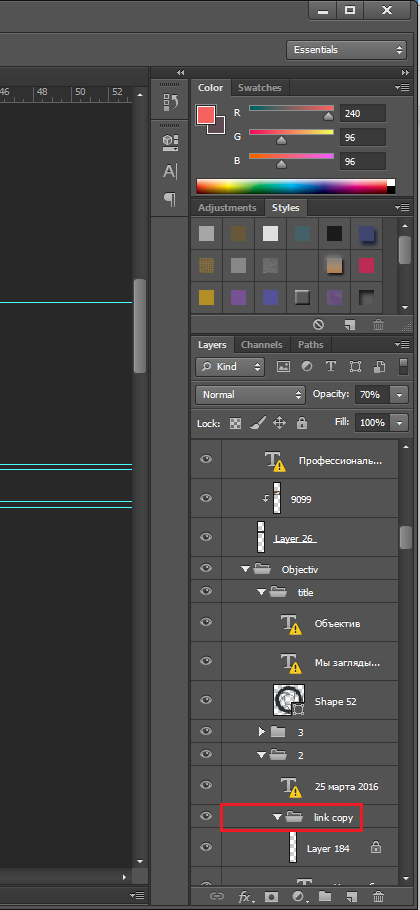
When passing to the layout, make sure that your layers are uniquely named and distributed into folders, based on the layout logic. And do not forget to remove unnecessary, or at least glue the layers with the effects between themselves (why it is not always possible to do so - below).
In an ideal layout, all indents and sizes of blocks should be unified. There, one pixel more, here - one less, and then the maker-up then sit and choose, as it is right. Perhaps this will not greatly affect the appearance of the page, although the customers are different: for someone, every extra pixel catches the eye. Or, perhaps, the tester will impose a ready layout on the layout source through the Pixel Perfect plugin and write a list of a million bugs, finding such inconsistencies an error. Make sure that the padding of the content area from the header and footer is the same across all your pages.
Objects also have hidden dangers - sometimes when creating forms in Photoshop, even if the designer used the grid, such errors occur:
The formatter is unlikely to take into account these subtleties and, most likely, will cut the size of the object so that it fits exactly into the grid. Therefore, the rule is that ALL objects must have integer dimensions, otherwise the result may be very different from the original layout.
In Photoshop, there is a handy tool - a “pipette”, and designers love to use it - poked, and you don’t need to remember the color number. But if you poke at the edge of the element, the color may be distorted by the shade of the background. Another danger - if the radius of the pipette is more than 1 pixel, Photoshop will show the average value between adjacent colors.
Andrey, developer
Another life hack of designers, which annoys the web designers, is to make the color lighter (including the text), the designer simply increases the transparency of the layer. The coder will have to use a pipette, and again, there is a high probability of error (especially in cases with gradient fills for elements).
If a designer has been making layouts for printing in a printing house before the web, he may sin with the habit of rasterizing texts, but for the coder, this becomes a serious problem: such text cannot be copied - you can only re-type it manually. And this is the least of the problems: where does the layout designer get the outline, size and color of the screened text - that’s the question.
When layout, the developer is more comfortable and faster to look at the parameters of the shadow or gradient than to pipette in different areas of this zone when the layer is rasterized. This speeds up the layout and affects the result: there are fewer chances to make a mistake with the color transition.
If a dark background is superimposed over the image (for example, a hover), it should not be glued to the image itself - it must be a separate translucent or gradient layer so that you can look at its parameters.
When applying, the content of the lower layers is taken into account, and it is not easy to convey such effects in the imposition, so the layout designers strongly dislike them. And for good reason: not every browser version is ready to display them as the designer intended.
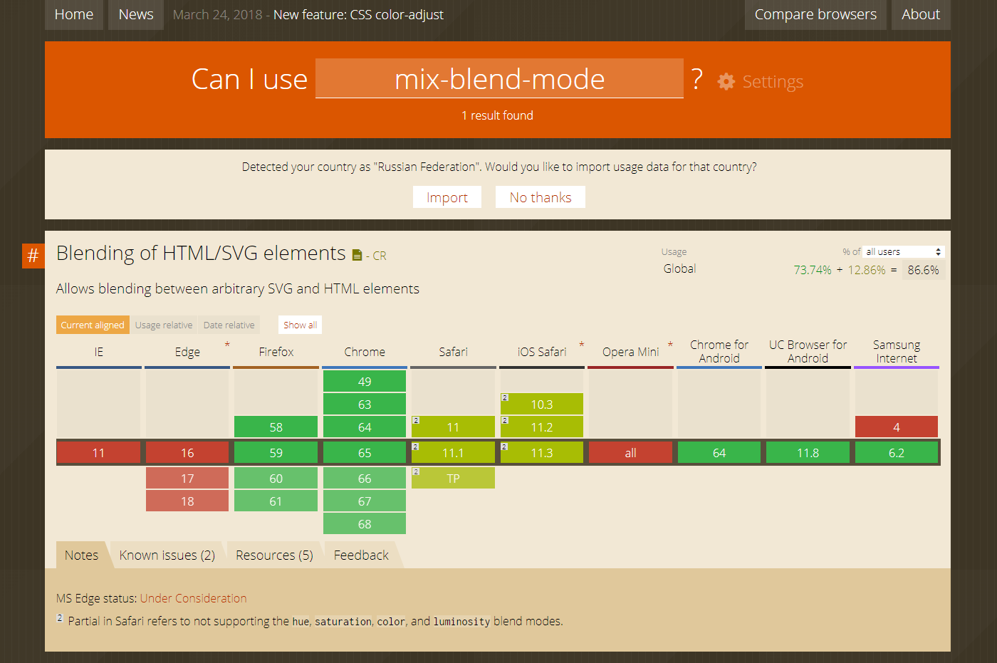
Blend effects in different browsers
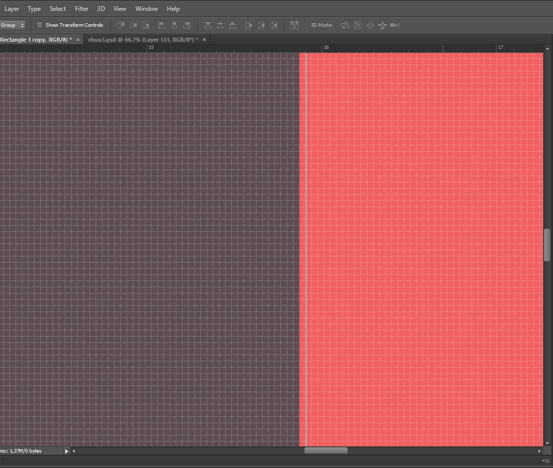
This usually happens by chance, if a whole transformation tool has been applied, for example, a transformation tool - the font has increased / decreased proportionally to the image. The problem is that browsers do not take into account fractional values and simply round them to the nearest one.
For the entire project, it is desirable to use no more than 3 styles - these can be fonts of one typeface (Light, Regular and Bold) or different. This is not a hard limit - it all depends on the objectives of the project, but there is a certain meaning in it: the smaller the font variations, the higher the focus on the text of the reader. It is considered a rule along with the layout to transfer the headsets that were used there, or at least give links to Google Fonts.
Custom fonts and their faces should be checked for the presence of the web version. The fact is that such fonts affect the speed of the page loading - to display them the browser needs to first download them, and it will take some time. In a good way, the weight of a non-standard font should not exceed 1 megabyte. And it is better that such a font on the page was only one. Well, do not forget that fonts are worth the money. Sometimes - big ones. We had cases where the font was specially developed for a specific project - that is also a problem.
It often happens that the line spacing and indents between paragraphs do not coincide inside the blocks on the layout and differ from page to page - make sure that they are the same. Do not separate headings from paragraphs into separate text blocks in order to manually increase the space between them - use the leading settings and paragraphs.
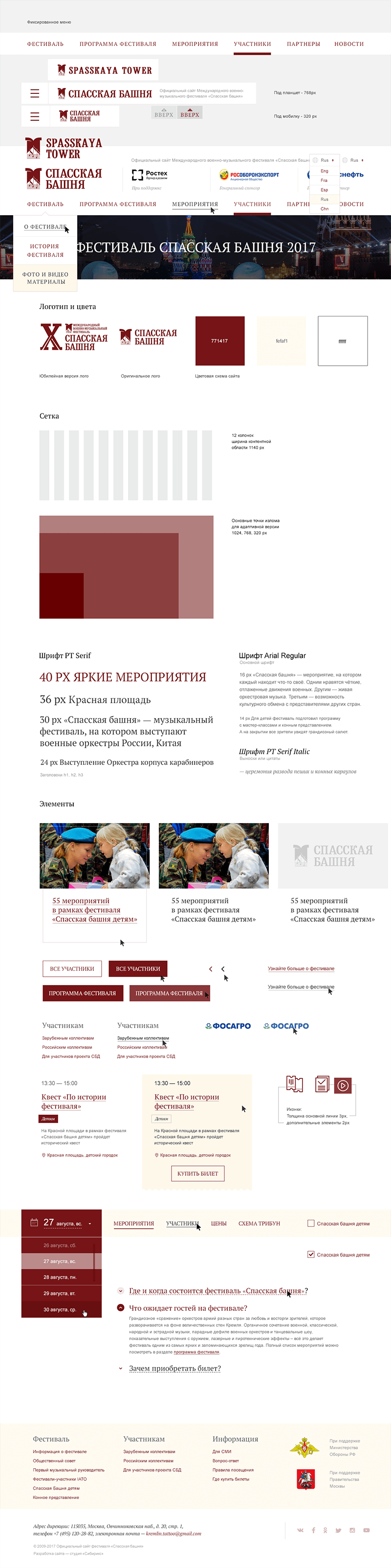
UI-kit for the Spasskaya Tower project
Elements like buttons or drop-down lists have several states, but often designers draw only one of them. Thanks to this, you get, for example, untidy hops, which the layout designer, in the absence of a sample, made himself.
Check that the objects involved in animations and interactive interactions are broken down into layers. For example: a view when pointing at an object is one layer, the view when clicking on it is another, the view in statics is the third. The same rules work for banners.
It is advisable to mark the layers with animations and interactivity colors and accompany them with comments. It is also very desirable to state in the comments exactly how this should work and give examples.
In the project, depending on the tasks, the icons are different: sometimes the designer creates a unique set with his own hand, sometimes it is easier and faster for him to find the right one of a million options somewhere here and modify it if necessary.
But it happens that designers use icons in PNG format - when zooming on screens with high resolution (and now even on mobile phones, pixel density is crazy), the edges of the image are blurred. Hence the rule: all icons should be in SVG format - so they remain clear, no matter what their size.
Some designers prefer that the icons are collected in one place - in a separate folder - and that their names are identical to the layers in the layout. It is more convenient for others to have SVG images embedded in the main file, since it is much easier and faster to cut svg from the layout than to search for the desired icon in another folder.
In a creative impulse it is difficult to keep track of the fact that everything was done correctly. There, the layer was copied and left without a name, there the object got a little out of the edge of the column, then the font accidentally “zazhirnitsya” built-in photoshop settings instead of choosing the desired style - who does not happen? And with those who have our check list!
Do not take the marriage. Do not pass the marriage.
Toyota.
We rarely take in the development of projects with already implemented design, but this happens. When mock-ups are created inside the studio, at any problematic stage of the coding, the developer can clarify with the project manager or the designer himself what was meant and how it should look. But in a situation where the customer has already given someone money for the layouts and then came to you for the development, it will not work out this way: it becomes impossible to communicate between the designer and the developer, and there is no one to correct the flaws in the layouts. From this article, you will learn where unfortunate designers get up to and what to check before giving layouts to layout.
"Almost" on the grid
The grid is designed to simplify the layout and determine the location of key elements. In some cases, designers deliberately move away from the 12-column grid to create an extraordinary design.
')
But if, while creating the layout, you still adhered to the grid - please make sure that this is true. Layout designers continually complain that in a project from page to page, the design may be very different: identical blocks appear to the left or to the right, icons of different sizes, and the buttons do not resemble each other.
When the elements are knocked out of the grid, the layout process is delayed - additional time is spent on finding out the position of the blocks or on editing, if the folded page does not coincide visually with the layout. There are also problems with the adaptability of the pages, since it is unclear how objects that have gone beyond the grid should behave on devices of a smaller diagonal.
Sergey, the developer in the studio Siberiks:
“Probably the main problem is that not all designers know at least the basics of html and css, so the layouts are made without regard to the layout. For example, it is often found when the adaptive blocks are recompiled in such a way that it’s impossible to duplicate content for the mobile and desktop versions - this slows down the work on the layout. ”
Vladimir, head of the studio:
“There are a million cases when a programmer says“ this is impossible, ”and then takes and does as it should. So it is possible. And most of the limitations, inconvenient for a programmer, but interesting from the point of view of design, are artificial. It is impossible to draw a clear boundary. Only an iterative discussion and attempts to implement the plan work. Try, watch, discuss, do, experiment. Otherwise, everything will fall to the dull patterns. For part of the projects, this is OK. And for the part - no. Are you doing in the spirit of the conveyor or doing the festival work? We wrote about this in more detail in the creativity slider . ”
Copy Paste
In Photoshop, it is convenient to duplicate layers: copied along with the style and all the settings and dragged it to the right place. In a creative impulse, some designers do not bother to give the layers adequate names and arrange them among themselves, but after that they cannot understand to which block which layer belongs and where to look for it on the layout.
When passing to the layout, make sure that your layers are uniquely named and distributed into folders, based on the layout logic. And do not forget to remove unnecessary, or at least glue the layers with the effects between themselves (why it is not always possible to do so - below).
Incomprehensible indents
In an ideal layout, all indents and sizes of blocks should be unified. There, one pixel more, here - one less, and then the maker-up then sit and choose, as it is right. Perhaps this will not greatly affect the appearance of the page, although the customers are different: for someone, every extra pixel catches the eye. Or, perhaps, the tester will impose a ready layout on the layout source through the Pixel Perfect plugin and write a list of a million bugs, finding such inconsistencies an error. Make sure that the padding of the content area from the header and footer is the same across all your pages.
Objects also have hidden dangers - sometimes when creating forms in Photoshop, even if the designer used the grid, such errors occur:
The formatter is unlikely to take into account these subtleties and, most likely, will cut the size of the object so that it fits exactly into the grid. Therefore, the rule is that ALL objects must have integer dimensions, otherwise the result may be very different from the original layout.
Colors "by eye"
In Photoshop, there is a handy tool - a “pipette”, and designers love to use it - poked, and you don’t need to remember the color number. But if you poke at the edge of the element, the color may be distorted by the shade of the background. Another danger - if the radius of the pipette is more than 1 pixel, Photoshop will show the average value between adjacent colors.
Andrey, developer
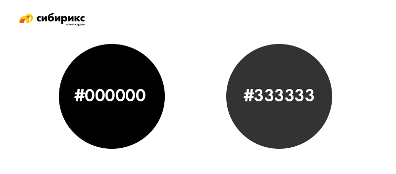
“It is especially annoying when the designer defined colors“ by eye ”, and then you sit with a set of mixed gray and you don't know which one to use. This is due to the fact that there is no banal color map of the project, on which the designer himself could rely when working on internal pages, and the layout designer. ”The unspoken rule does not recommend using black with the number # 000000 - it is too contrasting against the white background. Look at the difference:
Another life hack of designers, which annoys the web designers, is to make the color lighter (including the text), the designer simply increases the transparency of the layer. The coder will have to use a pipette, and again, there is a high probability of error (especially in cases with gradient fills for elements).
Raster elements
Text
If a designer has been making layouts for printing in a printing house before the web, he may sin with the habit of rasterizing texts, but for the coder, this becomes a serious problem: such text cannot be copied - you can only re-type it manually. And this is the least of the problems: where does the layout designer get the outline, size and color of the screened text - that’s the question.
Shadows and gradients
When layout, the developer is more comfortable and faster to look at the parameters of the shadow or gradient than to pipette in different areas of this zone when the layer is rasterized. This speeds up the layout and affects the result: there are fewer chances to make a mistake with the color transition.
If a dark background is superimposed over the image (for example, a hover), it should not be glued to the image itself - it must be a separate translucent or gradient layer so that you can look at its parameters.
Overlay effects
When applying, the content of the lower layers is taken into account, and it is not easy to convey such effects in the imposition, so the layout designers strongly dislike them. And for good reason: not every browser version is ready to display them as the designer intended.
Blend effects in different browsers
Font problems
Fractional sizes
This usually happens by chance, if a whole transformation tool has been applied, for example, a transformation tool - the font has increased / decreased proportionally to the image. The problem is that browsers do not take into account fractional values and simply round them to the nearest one.
Many fonts
For the entire project, it is desirable to use no more than 3 styles - these can be fonts of one typeface (Light, Regular and Bold) or different. This is not a hard limit - it all depends on the objectives of the project, but there is a certain meaning in it: the smaller the font variations, the higher the focus on the text of the reader. It is considered a rule along with the layout to transfer the headsets that were used there, or at least give links to Google Fonts.
Andrey, developer:
“Now most browsers have moved away from TTF and OTF fonts - and if the developer uses them in the old-fashioned way, they will not be displayed correctly everywhere. We in the studio long ago switched to the WOFF or WOFF2 format so that there are no problems. You can translate the font here or here . ”
Using custom fonts
Custom fonts and their faces should be checked for the presence of the web version. The fact is that such fonts affect the speed of the page loading - to display them the browser needs to first download them, and it will take some time. In a good way, the weight of a non-standard font should not exceed 1 megabyte. And it is better that such a font on the page was only one. Well, do not forget that fonts are worth the money. Sometimes - big ones. We had cases where the font was specially developed for a specific project - that is also a problem.
Sloppy typography
It often happens that the line spacing and indents between paragraphs do not coincide inside the blocks on the layout and differ from page to page - make sure that they are the same. Do not separate headings from paragraphs into separate text blocks in order to manually increase the space between them - use the leading settings and paragraphs.
Evgeny, developer:Be sure to show on the layout of the paragraph, paragraph, headings 1-4 levels (h1, h2, h3, h4), bulleted and numbered lists. Better yet, collect all this in a separate document - a guideline or a UI-kit. Here you can add the behavior of links (active, hover, visited).
“If possible, you should not use complex effects on typical text pages if it is assumed that the customer will be able to change them from the admin panel. Most likely, he will be able to “wrap” such elements in a div. Sometimes this is solved by snippets or other methods, but it still causes difficulty in filling with content. ”
UI-kit for the Spasskaya Tower project
Incomprehensible animation
Elements like buttons or drop-down lists have several states, but often designers draw only one of them. Thanks to this, you get, for example, untidy hops, which the layout designer, in the absence of a sample, made himself.
Check that the objects involved in animations and interactive interactions are broken down into layers. For example: a view when pointing at an object is one layer, the view when clicking on it is another, the view in statics is the third. The same rules work for banners.
It is advisable to mark the layers with animations and interactivity colors and accompany them with comments. It is also very desirable to state in the comments exactly how this should work and give examples.
Eugene, art director:
“Photoshop is a photoshop, but now there are so many progressive tools, within which the necessary lines of code are created for each element at once - it’s not difficult for the maker to turn the design layout into a layered page. But in general, of course, everything depends on the maker-up - if he is the norm, then the result will be the norm, no matter what editor it is drawn :) ”
Icons in PNG
In the project, depending on the tasks, the icons are different: sometimes the designer creates a unique set with his own hand, sometimes it is easier and faster for him to find the right one of a million options somewhere here and modify it if necessary.
But it happens that designers use icons in PNG format - when zooming on screens with high resolution (and now even on mobile phones, pixel density is crazy), the edges of the image are blurred. Hence the rule: all icons should be in SVG format - so they remain clear, no matter what their size.
Some designers prefer that the icons are collected in one place - in a separate folder - and that their names are identical to the layers in the layout. It is more convenient for others to have SVG images embedded in the main file, since it is much easier and faster to cut svg from the layout than to search for the desired icon in another folder.
Check list
In a creative impulse it is difficult to keep track of the fact that everything was done correctly. There, the layer was copied and left without a name, there the object got a little out of the edge of the column, then the font accidentally “zazhirnitsya” built-in photoshop settings instead of choosing the desired style - who does not happen? And with those who have our check list!
Checklist for preparing Photoshop layout for transfer to layout
- If the designer used the grid, all the blocks on the layout are located strictly on it.
- All objects on the layout have integer dimensions.
- Repeating elements on the pages are always the same.
- All layers are grouped in folders and distributed according to the layout logic. Superfluous removed, similar - merged.
- Indents from elements are unified.
- The colors on the layout match the main colors of the project.
- Text as text (not rasterized).
- Overlay effects, shadows and gradients are not rasterized.
- Using overlay effects is advisable.
- Fonts have non-detailed dimensions.
- Fonts used in the project are collected in a separate folder.
- Non-standard fonts and their faces are checked for the presence of the web version. The weight of one non-standard font does not exceed 1 Mb.
- Line spacing and indentation in the text are unified.
- All icons in SVG format and collected in one place. The names of the icons are the same and understandable, coincide with the name of the identical layers on the layout.
- For all active elements there are layers with hovers.
- Objects involved in animations / interactive interactions are broken down into layers. For banners - the same.
- For animations and interactive interactions, comments are spelled out and examples are given on how this should look.
- For the layout, a guideline has been created with a project color palette and text styles.
Source: https://habr.com/ru/post/353430/
All Articles