Animation in Angular Applications

No serious application can do without animation in one form or another. Animation makes applications more modern, beautiful, and often more understandable, improving the spatial orientation within the application. Without feedback, it is sometimes difficult to understand what happened when we clicked on an item. Previously, if you need to add animation to the application, I used CSS-animation and in general I was almost satisfied.
After the transition of our product to Angular 2+, we were faced with the fact that Angulyar provides its own mechanism for describing animation. Since Angulyar fully owns DOM transactions, he can simplify the description of the animation and we decided to try to abandon the animation on CSS. On the whole, it was interesting to see what came of it. For almost a year of project development, we have not switched back to CSS-animation, and I can say that you can live quite successfully with Angulyar’s animation. In this article I will tell you how to use animation in projects on Angular 2+ and about features that are still not described in the official guide for some reason.
Animation setting
Animation in Angulyar is based on Web Animations API - this is the standard that gives JS flexibility, while maintaining the performance of CSS-animation. You can read more about this API here . In browsers that support this standard, the animation uses the same mechanism as for CSS-animation, and therefore the performance should be no worse. In other browsers you need to use polyfil . Starting from the sixth version of Angulyar, if you don’t use AnimationBuilder directly (which is rarely needed), you no longer need to turn on the polyfill - Angulyar will switch to using CSS animation for unsupported browsers.
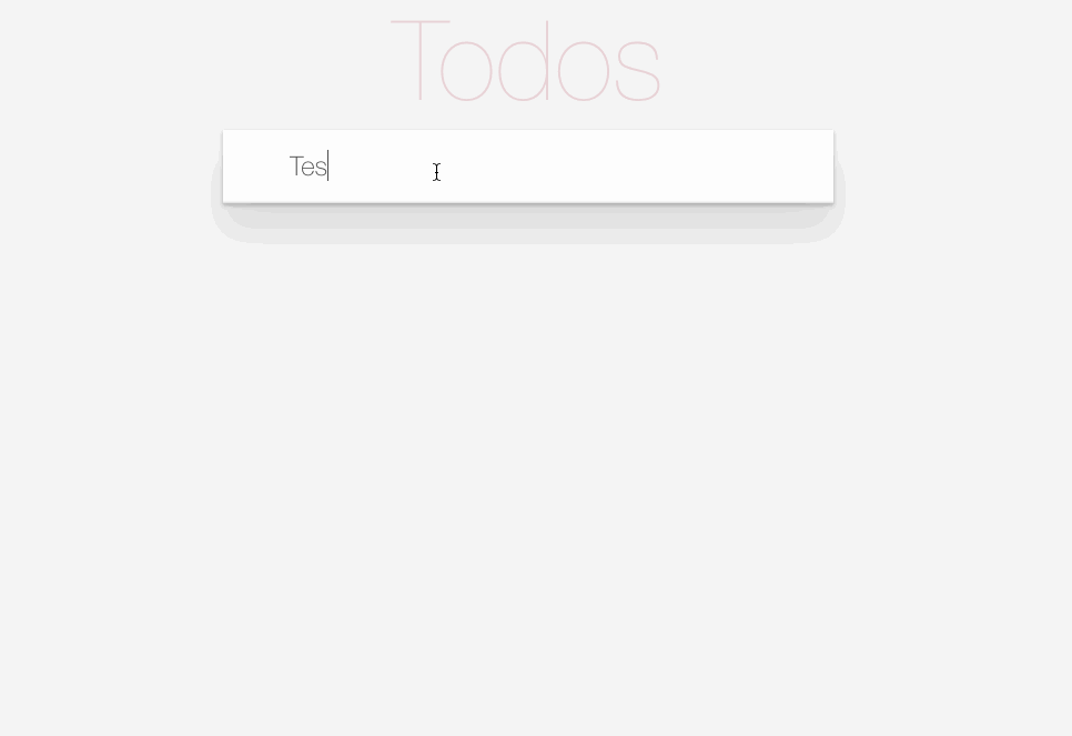
For our experiments with animation, we will create a simple ToDo-application and add the necessary animation to it, using only the capabilities of Angulyar. You can see the complete application code in the repository , but here I will provide only the part directly related to the animation.
Before we begin to deal with the animation, we need to add the ability to use the animation mechanism in the project. To do this, you just need to include BrowserAnimationsModule in the project, and all the animation options will be available to us. In total, Angulyar has two animation- related modules — BrowserAnimationsModule and NoopAnimationsModule . The second is needed in order to disable the animation when testing the component.
Basic use of animation in Angular
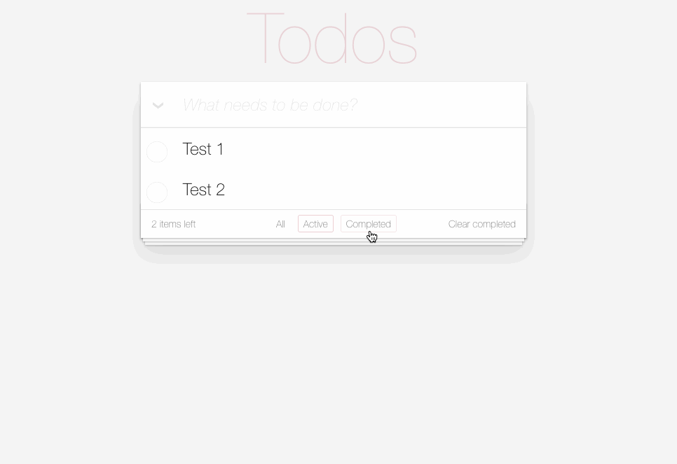
So, in the ToDo application, we need the following animation:
- When the user marks some task as completed, this item should be animated to switch to the new state. Fair and reverse action.
- Adding or deleting new tasks in the list should be animated.
Here is what it will look like:
What is animated is understandable, now let's consider how we do it. The whole animation of Angulyar is described in the component metadata. We will animate the TodoItem component, and we will add our animation to it. To create an animation in Angulyar, a number of entities are used that we need to import from the animation module — trigger, state, style, animate, transition, keyframes. Let's look at why we need each of them before adding animation. All information, of course, can be found in the documentation of Angulyar, but without basic concepts we cannot go to more complex situations.
trigger - allows you to bind your animation to a component or to DOM elements inside the component. In addition to specifying the name of the trigger, we can also set all animation states and describe transitions between different states. After adding a trigger to the component's metadata, it must be bound to the component or to the elements in the template that will be animated. How this is done, we will look at later. Typically, creating a trigger looks like this:
@Component({ selector: 'my-component', templateUrl: 'my-component-tpl.html', animations: [ trigger("myAnimationTrigger", [ state(...), state(...), transition(...), transition(...) ]) ] }) class MyComponent { } state - allows you to specify the state of the component that will be used in the animation, specifying the state name and style set for the state. In fact, the whole animation of Angulyar is a finite state machine, where the transition from one state to another occurs:
@Component({ selector: 'my-component', templateUrl: 'my-component-tpl.html', animations: [ trigger("myAnimationTrigger", [ state('collapsed', style({ height: '0px', color: 'maroon', borderColor: 'maroon' })), state('expanded', style({ height: '*', borderColor: 'green', color: 'green' })) ]) ] }) class MyComponent { } You need to understand that the state parameters will be applied on the element while it is in this state.
style - allows you to describe a list of CSS parameters and their values that will be used in the animation or in the state of the component, specified through the state. You can only animate the parameters that the browser considers animated. An example of how style is used, we saw above in the description of the state function. But before we go further, I want to highlight one important point in setting the values of CSS parameters.
Sometimes it happens that you do not know what parameter value will be during the execution of your application - for example, the height or width of the element. In this case, it is quite difficult to animate the changes of such a parameter through CSS, but in Angular it is quite easy to solve - you need to use '*' as the value of the parameter. Then Angulyar will take the value from the DOM.
animate - the main function of animation. When using it, you need to set timing parameters and / or style parameters that will change during the animation. The important point is that the style options specified in the animate will only be active at the time of the animation. But when it ends, they will return to those dictated by the state of the element in the DOM, unless, of course, at the end of the animation the component is in one of the states described by state. Animation timing parameters can take on different values that should be familiar to you from CSS animation:
animate(500, style(...)) animate("1s", style(...)) animate("100ms 0.5s", style(...)) animate("5s ease", style(...)) animate("5s 10ms cubic-bezier(.17,.67,.88,.1)", style(...)) transition - allows you to describe the sequence of transitions between the states of the element being animated. The first parameter we define when the animation starts. We can then specify animation parameters using animate and style. To determine the parameters for starting the animation, we can use the following options:
- transition ("on => off", animate (...)) - will start the animation when the trigger transitions from the 'on' state to the 'off' state
- transition ("on <=> off", animate (...)) - will start the animation when going from 'on' to 'off' and back
- transition ("* => off", animate (...)) - starts the animation when switching from any state to the off state. It is also possible to indicate the reverse direction 'on => *'.
- transition ("void => *", animate (...)) - will start the animation when the element is added to the DOM. When specifying a reverse transaction, '* => void', the animation will start when the item is removed from the DOM
Also, as the parameters for starting the animation, you can specify the function to which the animation parameters will be transferred, where there are fields fromState and toState. Based on the values of these fields, you can decide whether to run the animation. If the function returns true, the animation will start.
In the Angulyar animation engine, there are still some aliases for defining transitions: enter / leave and increment / decrement. The first pair, in fact, is similar to the version * => void and void => *, and the second allows you to start the animation when the trigger value has decreased or increased by one. This is convenient, for example, when implementing the image slider component: by changing the index of the current image, you will control the animation of the component.
By default, all animation specified in the transaction will be executed sequentially. If you need to perform parallel animation, you need to use the group function and wrap the animation in it:
group([ animate("1s", { background: "black" })) animate("2s", { color: "white" })) ]) There is also a sequence function that will start the animation sequentially, but it is usually not used, as it is implied by default.
keyframes - allows you to determine how the animation will behave at various stages of the animation time. To do this, you have a scale from 0 to 1, and you can specify at what stage of this gap and how the styles of your animated element should look. For example, in this way you can implement a bounce-animation element:
transition('* => bouncing', [ animate('300ms ease-in', keyframes([ style({transform: 'translate3d(0,0,0)', offset: 0}), style({transform: 'translate3d(0,-10px,0)', offset: 0.5}), style({transform: 'translate3d(0,0,0)', offset: 1}) ])) ]) So, we looked at the basic functions of animation in Angulyar. But before we begin to animate our ToDo list, we need to consider two more things: how to connect the animation to the component and how to track the transitions of the component from one state to another.
There are two ways to connect an animation to a component: hang the animation on an element in the component template or hang the animation on the component itself. To hang an animation on an element in a template, simply add an attribute to the element with an animation trigger and transfer the desired state to it:
<div [@myAnimationTrigger]="myStatusExp">...</div> In this example, the variable myStatusExp is defined in the component, and when it changes, the animation will run if the necessary transitions to the transition are specified.
If you need to throw the animation on the component itself, you can use the decorator @HostBinding for this:
class MyComponent { @HostBinding('@myAnimationTrigger') public myStatusExp; } The last thing left to consider is how to track the change in animation in the component. To do this, you can hang handlers on the animation trigger, at the start and stop animation:
<todo-item *ngFor="let item of items" (@myAnimationTrigger.start)="animationStarted($event)" (@myAnimationTrigger.done)="animationDone($event)" [@myAnimationTrigger]="myStatusExp"> </todo-item> As a result, at the start or end of the animation, Angular will call our handlers and pass an AnimationEvent with the following contents:
interface AnimationEvent { fromState: string toState: string totalTime: number phaseName: string element: any triggerName: string disabled: boolean } As you can see, the event contains a lot of data about the animation. Usually a subscription to the end of the animation is useful to perform some action, for example, to remove a modal window from the DOM.
So, we have considered the basic methods with the help of which animation is described in Angular. Now let's add animation to our component's metadata:
@Component({ ... animations: [ trigger('stateAnimation', [ state('incomplete', style({ 'color': 'black', 'text-decoration': 'none' })), state('complete', style({ 'color': '#d9d9d9', 'text-decoration': 'line-through' })), transition('incomplete => complete', [ style({ 'text-decoration': 'line-through' }), animate('0.2s') ]), transition('complete => incomplete', [ style({ 'text-decoration': 'none' }), animate('0.2s') ]) ]), trigger('todoAnimation', [ transition(':enter', [ style({ height: 0 }), animate('0.3s ease-in', style({ height: '*' })) ]), transition(':leave', [ animate('0.3s ease-out', style({ transform: 'scale(0)' })) ]), ]) ] ... }) export class TodoItemComponent { ... @HostBinding('@todoAnimation') true; @HostBinding('@stateAnimation') get state() { return this.todo.completed ? 'complete' : 'incomplete'; } ... } The full code can be seen in the repository in the base-animation branch.
Let's take a look at what the animation code does. We create two animation triggers: one to animate the state change of the task (stateAnimation), and the second to animate the addition or removal of tasks from the list (todoAnimation).
Let's start with the second trigger. In it we set two transitions of the component state. When an element appears in the DOM, we set the initial height of the element to 0 and animate the height change to a value that is determined by the element's content. When removing an element from the DOM, we apply a scale transformation from the runtime state equal to 1 to the final equal to 0. Everything is quite simple.
Now let's look at the first trigger. In it, we first define two component states — incomplete and complete — and specify the styles for these states. As I said above, these styles will be active in the component while it is in the state. Then we set two transitions between these states, where we first apply the styles to the component (so that the user can immediately see part of the changed styles), and then animate the remaining parameters.
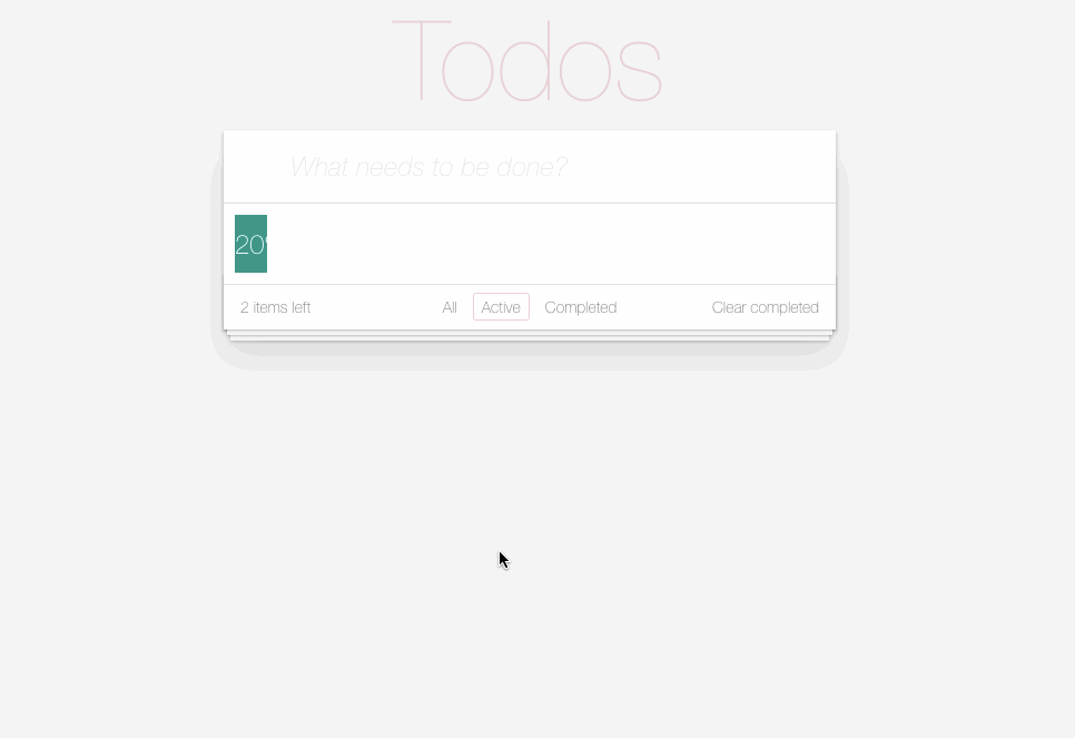
So, we added the necessary animation to our application, but after playing a little, we realized that there is a problem: we wanted our animation to work only when the user performs some actions on the task list, but it also works when the task list filter changes and when you first fill the list with tasks. This is because our ngFor directive rearranges our list when the filter changes.
After some thought, we understand that we need to somehow turn off the animation for a while, while we change the task list, and Angulyar gives us this opportunity. To do this, add the attribute [@ .disabled] to the template of the TodoList component:
<ul class="todo-list" [@.disabled]="disableAnimation"> <app-todo-item *ngFor="let todo of todos; trackBy: trackById" [todo]="todo"></app-todo-item> </ul> By changing the values of the disableAnimation component variable, we can enable and disable the animation of the TodoItem components. You can see the code for controlling the value of the disableAnimation variable in the source code in the repository.
An important point: if the animation is disabled, the handlers for starting and stopping the animation will still be called. To understand whether they were called when the animation was disabled, you need to use the disabled parameter in the animation event. If it is true, then the animation has been disabled.
Now our animation works as it should, but this is far from the limit of the possibilities of animation in Angulyar. Let's look at what else can be done and what is not yet described in the animation guide.
Moving animations from components and using parameters
Within the framework of a product, animation is often repeated in several components, differing only in the parameters of this animation — the animation timings or the initial and final values. In order not to duplicate the animation many times, there are two solutions.
The first thing that comes to mind is to put a function in a separate file, which, based on the parameters passed, will return the result of creating an animation trigger using the trigger function. Here's what it looks like:
export const todoAnimation = (timing, enterStart, enterStop, leaveStop) => { return trigger('todoAnimation', [ transition(':enter', [ style({ height: enterStart }), animate(timing, style({ height: enterStop })) ]), transition(':leave', [ animate(timing, style({ transform: 'scale(' + leaveStop + ')' })) ]) ]); } This solution is quite working, but starting from the fourth version of Angulyar, two possibilities have been added that allow reuse of animation - setting parameters for animation functions and using animation through useAnimation. Let's look at them in order.
So, starting from the 4th version, the following functions support the setting of animation parameters:
state([...], { /* options */ }) transition([...], { /* options */ }) sequence([...], { /* options */ }) group([...], { /* options */ }) query([...], { /* options */ }) animation([...], { /* options */ }) useAnimation([...], { /* options */ }) animateChild([...], { /* options */ }) We have not yet considered a number of functions from this list, but do not worry: we will talk about them later. The parameters of the functions in this list are different. For example, the transition, sequence, group, and animation functions can take two parameters as options: delay and params.
The delay parameter allows you to delay the launch of the animation. Values cannot be percent or negative.
The params parameter allows you to pass parameters to the function, which will be substituted into the values when using a specific animation function. How this happens, we will see below in the examples.
As parameters now it is possible to use only timing parameters or style value parameters. The state function can only accept the params parameter, which is logical, since the delay is useless for it.
The parameters of the remaining functions will be discussed later. Another important point: if you use the substitution of parameters in the function, then you must specify the default values, otherwise Angulyar will give an error.
Let's rewrite the animation function using parameters:
export const todoAnimation = (timing, enterStart, enterStop, leaveStop) => { return trigger('todoAnimation', [ transition(':enter', [ style({ height: "{{ enterStart }}" }), animate("{{ timing }}", style({ height: "{{ enterStop }}" })) ], { params: { enterStart: 0, enterStop: 1, timings: '0.3s' } }), transition(':leave', [ animate(timing, style({ transform: 'scale({{ leaveStop }})' })) ], { params: { leaveStop: 0, timings: '0.3s' }}) ]); } Another important point: the transferred animation parameters will be substituted at the moment of the animation launch and cannot be changed during the animation.
It is also important that the parameters of the animation can be transferred at the time of launching the animation. It will look something like this:
<div [@fadeAnimation]="{value: 'fadeIn', params: { start: 0, end: 1, timing: 1000 } }" >...</div> The second feature that was added in version 4 is a set of two functions, animation and useAnimation. The first allows you to describe the animation, and the second - to use it in the component metadata. Here is what it would look like if there were fadeIn / fadeOut animations in the component:
import { animation, style, animate } from "@angular/animations"; export const fadeAnimation = animation([ style({ opacity: "{{ from }}" }), animate("{{ time }}", style({ opacity: "{{ to }}" })) ], { time: "1s", to: 1, from: 0 }) Now use the animation in the component:
import {useAnimation, transition} from "@angular/animations"; import {fadeAnimation} from "./animations"; ... transition('* => fadeIn', [ useAnimation(fadeAnimation, { from: 0, to: 1, time: '1s easy-in' }) ]), transition('* => fadeOut', [ useAnimation(fadeAnimation, { from: 1, to: 0, time: '1s easy-out' }) ]) As you can see, when describing the animation through animate, we specified values for all parameters. If when using animation through useAnimation some parameter is not passed, then the parameter specified by us in animation as default will be used. Before we use the new animation features, we need to consider two more new features.
Query and stager functions
The query function is very similar to element.querySelectorAll. It allows you to select elements from the DOM and start animation on them with a pack or change the styling of these elements. This will allow us to move the animation from the TodoItem component to a higher level in TodoList and make the animation more flexible, for example, to start the animation of each even item. Here is the use of the query function:
query('*', style({ opacity: 0 })) query('div, .inner, #id', [ animate(1000, style({ opacity: 1 })) ]) The first parameter is the selector by which the elements will be selected. The following selector options are currently supported:
- Regular CSS selector - classic CSS selectors can be used as a selector, for example, such a query ('div, #id, .class, [attr], a + b')
- Use of aliases: enter and: leave - allows you to select elements added or deleted in the DOM Angular.
- @triggerName or @ * - allows you to select either elements with a given trigger, or all elements that have any trigger set
- : animating - allows you to select all the elements that are currently animated
- : self - allow you to select the element against which the query is called
All of the above selectors can be combined, for example, like this:
query(':self, .record:enter, .record:leave, @subTrigger', [...]) As you can see, this provides many opportunities for creating more complex animation elements.
The query function can also take parameters when it is used and in addition to the delay and params parameters, which we talked about above, it also supports two more — optional and limit.
By default, if there is not a single element under your selector, an exception will be generated. If for you the absence of elements is not an erroneous situation, you can set the optional parameter to true. In this case, the absence of elements will be considered a normal situation.
The second parameter, limit, allows you to select not all items via query, but only a specified number. If you specify a negative value in the limit parameter, the items will be selected from the bottom of the list.
The second function, stagger, is useful when used together with the query-animation in this case. Suppose that we have a code that shows messages to the user through ngFor:
<div [@notificationAnimation]="notifications.length"> <div *ngFor="let notification of notifications"> {{ notification }} </div> </div> And there is an animation of fade on the added elements through the use of query:
trigger('notificationAnimation', [ transition('* => *', [ query(':enter', [ style({ opacity: 0 }), animate('1s', style({ opacity: 1 })) ]) ]) ]) If we launch the application, we will see that the appearance of the list of notifications occurs at the same time, and this is not at all what we would like. We would like the notifications to appear in turns, with a slight delay, and also disappear. To implement this effect, we can use the stagger function:
trigger('notificationAnimation', [ transition('* => *', [ query(':enter', stagger('100ms', [ animate('1s', style({ opacity: 1 })) ]) ]) ]) The stagger function will add a delay before starting the animation of our elements, which will make their appearance smoother and more accurate. To make the disappearance of notifications smooth as well, the behavior of the stagger function should be reversed. To do this, we can either specify a negative value in the parameters of the function call, or simply add a reverse parameter:
stagger('100ms reverse', [...]) So let's rewrite task animation using the query function. To do this, move it from the TodoItem component to the TodoList component:
@Component({ selector: 'app-todo-list', templateUrl: './todo-list.component.html', styleUrls: ['./todo-list.component.css'], animations: [ trigger('todoList', [ transition('* => *', [ query(':enter', [ style({ height: 0 }), animate('0.3s ease-in', style({ height: '*' })) ], { optional: true }), query(':leave', [ animate('0.3s ease-out', style({ transform: 'scale(0)' })) ], { optional: true }) ]) ]) ] }) export class TodoListComponent implements OnInit, AfterViewInit { ... } And connect it in the template of our to-do list:
<ul class="todo-list" [@.disabled]="disableAnimation" [@todoList]="todos.length"> <app-todo-item *ngFor="let todo of todos; trackBy: trackById" [todo]="todo" (itemRemoved)="remove($event)" (itemModified)="update($event)" ></app-todo-item> </ul> Having played with the animation, we will see that the appearance of the elements works as it should, but the removal of tasks from the list is worked out without animation. This is due to the fact that the restructuring of the to-do list occurs before we have time to animate. Before you fix the problem, you need to consider another innovation of animation.
Animating children
If an application needs to animate several groups of elements at the same time, and one of the groups is the parent in the DOM for the second, then the animation of the parent elements will take precedence over the animation of the children, and the animation of the child elements will be disabled. Suppose that in the component template there is the following code:
<div [@parentAnimation]="exp"> <header>Hello</header> <div [@childAnimation]="exp"> one </div> <div [@childAnimation]="exp"> two </div> <div [@childAnimation]="exp"> three </div> </div> As you can see, the parent and child animations start when the same component variable changes, i.e. at the same time. , .
, animateChild, . :
@Component({ selector: 'parent-child-component', animations: [ trigger('parentAnimation', [ transition('false => true', [ query('header', [ style({ opacity: 0 }), animate(500, style({ opacity: 1 })) ]), query('@childAnimation', [ animateChild() ]) ]) ]), trigger('childAnimation', [ transition('false => true', [ style({ opacity: 0 }), animate(500, style({ opacity: 1 })) ]) ]) ] }) animateChild : , , — duration. , , 0 .
animateChild() , . , :
<ul class="todo-list"> <li *ngFor="let todo of todos; trackBy: trackById" @todoList> <app-todo-item @todoItem [todo]="todo" (itemRemoved)="remove($event)" (itemModified)="update($event)" ></app-todo-item> </li> </ul> :
@Component({ selector: 'app-todo-list', templateUrl: './todo-list.component.html', styleUrls: ['./todo-list.component.css'], animations: [ trigger('todoList', [ transition(':enter, :leave', [ query('@*', animateChild()) ]) ]), trigger('todoItem', [ transition(':enter', [ useAnimation(enterAnimation) ]), transition(':leave', [ useAnimation(leaveAnimation) ]) ]) ] }) . animateChild , . , .
, .
, , , , , . , .
, , , . , , . , , .
, , DI. . :
import { AnimationBuilder } from "@angular/animations"; @Component({...}) class MyCmp { constructor(public builder: AnimationBuilder) {} animate() { const factory = this.builder.build([ // ]); const player = factory.create(this.someElement); player.play(); } } , :
– play, pause, restart, finish, reset. , , . , onDone(fn: () => void): void onStart(fn: () => void): void.
, -, .
, , , . , , animation-player .
. - :
set percentage(p: number) { const lastPercentage = this._percentage; this._percentage = p; if (this.player) { this.player.destroy(); } const factory = this._builder.build([ style({ width: lastPercentage + '%' }), animate('777ms cubic-bezier(.35, 0, .25, 1)', style({ width: p + '%' })) ]); this.player = factory.create(this.loadingBar.nativeElement, {}); this.player.play(); } , . , , . . , , . , . , . , .
, DOM . . , .
, - router-outlet , , , router-outlet, . router-outlet . ? , :
<div [@routeAnimation]="prepRouteState(routerOutlet)"> <router-outlet #routerOutlet="outlet"></div> <div> , prepRouteState, :
@Component({ animations: [ trigger('routeAnimation', [ transition('homePage => supportPage', [ // ... ]), transition('supportPage => homePage', [ // ... ]) ]) ] }) class AppComponent { prepRouteState(outlet: any) { return outlet.activatedRouteData['animation'] || 'firstPage'; } } , , data, :
const ROUTES = [ { path: '', component: HomePageComponent, data: { animation: 'homePage' } }, { path: 'support', component: SupportPageComponent, data: { animation: 'supportPage' } } ] , :
@Component({ ... animations: [ trigger('routeAnimation', [ transition('completed <=> all, active <=> all, active <=> completed', [ query(':self', style({ height: '*', width: '*' })), query(':enter, :leave', style({ position: 'relative' })), query(':leave', style({ transform: 'scale(1)' })), query(':enter', style({ transform: 'scale(0)' })), group([ query(':leave', group([ animate('0.4s cubic-bezier(.35,0,.25,1)', style({ transform: 'scale(0)' })), animateChild() ])), query(':enter', group([ animate('0.4s cubic-bezier(.35, 0, .25, 1)', style({ transform: 'scale(1)' })), animateChild() ])) ]), query(':self', style({ height: '*', width: '*' })), ]) ]) ] }) export class AppComponent { prepRouteState(outlet: any) { if (outlet.isActivated) { return outlet.activatedRoute.data.getValue()['status'] || 'all'; } } } , . all active, . , , . :self, DOM. , query(':self', style({ height: '*', width: '*' })), , DOM . .
, DOM, — . enter/leave. , , group. , .
Conclusion
, . , , , , , , . , , . -.
')
Source: https://habr.com/ru/post/353150/
All Articles