Introducing the new dialog item
Hi, Habr! I present to you the translation of the article " Meet the New Dialog Element " by Keith J. Grant.
HTML 5.2 introduced a new dialog element for native modal windows. At first glance, it seems quite simple (it is), but after playing with it, I found that it has several great features that are easy to miss.
I built a full demo at the end of the article, but if you want to take a look at it while reading, you can find it here .
')
Here is an example of the basic markup for the dialog window:
The open attribute means that the dialog is visible. Without this attribute, the dialog will be hidden until you use JavaScript to make it visible. Without any styling, the dialogue is as follows:
On the page it is absolutely positioned, so that it will appear ahead of all the content, as you would expect, and it will be horizontally centered. By default, its width is equal to the width of the content inside.
JavaScript has several methods and properties to make it easier to work with the dialog element. showModal () and close () are the two methods that you may need most.
When you use showModal () to open a dialog, a background is added to the page, blocking user interaction with content outside the modal window. By default, the background is completely transparent, but you can make it visible with CSS (more on this below).
Pressing Esc will close the dialog, and you can also create a close button with a call to the close () method.
There is a third method, show () , which also shows a modal window, but without a background background. The user will be able to interact with items outside the dialog.
Currently dialog is supported only in Chrome. Firefox provides basic styling, but to use the JavaScript API, the user must explicitly enable this feature. I think soon Firefox will enable it by default.
Fortunately, we have a polyfill that supports both JavaScript behavior and default styling. To use it, install the dialog-polyfill in npm, or use the good old script tag. Polyfill works in IE9 and higher.
When using a polyfill, each dialog on the page must be initialized:
This technique does not replace the native behavior of the dialog for browsers that support it.
It is pleasant to open and close a modal window, however it doesn’t look very professional. Adding styling is as easy as styling any other element. The background can be styled using the new pseudo-element :: backdrop .
For older browsers that use polyfill, this pseudo-element will not work. In this case, the polyfill adds the .backdrop element, which immediately follows the dialog. You can style it with CSS like this:
Add a little more markup for styling. The generally accepted approach is to break the dialog box into title, body, and footer:
By adding some CSS, you can make the modal window look exactly as you need it:

Often we want a bit of reverse interaction with the user through the dialog box. When the dialog closes, you can pass the string value to the close () method. This value is assigned to the returnValue property of the DOM dialog element, so you can read it later:
There are also other events to which you can subscribe. Two very useful ones: close (triggered when the window is closed) and cancel (triggered when you press Esc to close the window).
The only missing thing is the ability to close the modal window when clicking on the background, but there is a workaround. Clicking the background triggers a click event on the dialog as the target element. And if you create a dialog so that the children fill the entire space of the dialog box, these children will be targeted for any clicks inside the dialog. Thus, you can subscribe to events of a click on a dialogue, and close it when the immediate purpose of the click is the dialog window itself:
It's not perfect, but it works. Please let me know if you find the best way to track background clicks.
I worked a lot on the demo below. Play around with it and see what else you can do with the dialog element. The demo includes a polyfill, so it will work in most browsers.
Link to the demo .
HTML 5.2 introduced a new dialog element for native modal windows. At first glance, it seems quite simple (it is), but after playing with it, I found that it has several great features that are easy to miss.
I built a full demo at the end of the article, but if you want to take a look at it while reading, you can find it here .
')
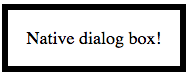
Here is an example of the basic markup for the dialog window:
<dialog open> Native dialog box! </dialog> The open attribute means that the dialog is visible. Without this attribute, the dialog will be hidden until you use JavaScript to make it visible. Without any styling, the dialogue is as follows:
On the page it is absolutely positioned, so that it will appear ahead of all the content, as you would expect, and it will be horizontally centered. By default, its width is equal to the width of the content inside.
Basic operations
JavaScript has several methods and properties to make it easier to work with the dialog element. showModal () and close () are the two methods that you may need most.
const modal = document.querySelector('dialog'); // ( "open") modal.showModal(); // ( "open") modal.close(); When you use showModal () to open a dialog, a background is added to the page, blocking user interaction with content outside the modal window. By default, the background is completely transparent, but you can make it visible with CSS (more on this below).
Pressing Esc will close the dialog, and you can also create a close button with a call to the close () method.
There is a third method, show () , which also shows a modal window, but without a background background. The user will be able to interact with items outside the dialog.
Browser and polyfill support
Currently dialog is supported only in Chrome. Firefox provides basic styling, but to use the JavaScript API, the user must explicitly enable this feature. I think soon Firefox will enable it by default.
Fortunately, we have a polyfill that supports both JavaScript behavior and default styling. To use it, install the dialog-polyfill in npm, or use the good old script tag. Polyfill works in IE9 and higher.
When using a polyfill, each dialog on the page must be initialized:
dialogPolyfill.registerDialog(modal); This technique does not replace the native behavior of the dialog for browsers that support it.
Stylization
It is pleasant to open and close a modal window, however it doesn’t look very professional. Adding styling is as easy as styling any other element. The background can be styled using the new pseudo-element :: backdrop .
dialog { padding: 0; border: 0; border-radius: 0.6rem; box-shadow: 0 0 1em black; } dialog::backdrop { /* */ background-color: rgba(0, 0, 0, 0.4); } For older browsers that use polyfill, this pseudo-element will not work. In this case, the polyfill adds the .backdrop element, which immediately follows the dialog. You can style it with CSS like this:
dialog + .backdrop { background-color: rgba(0, 0, 0, 0.4); } Add a little more markup for styling. The generally accepted approach is to break the dialog box into title, body, and footer:
<dialog id="demo-modal"> <h3 class="modal-header">A native modal dialog box</h3> <div class="modal-body"> <p>Finally, HTML has a native dialog box element! This is fantastic.</p> <p>And a polyfill makes this usable today.</p> </div> <footer class="modal-footer"> <button id="close" type="button">close</button> </footer> </dialog> By adding some CSS, you can make the modal window look exactly as you need it:
More control
Often we want a bit of reverse interaction with the user through the dialog box. When the dialog closes, you can pass the string value to the close () method. This value is assigned to the returnValue property of the DOM dialog element, so you can read it later:
modal.close('Accepted'); console.log(modal.returnValue); // `Accepted` There are also other events to which you can subscribe. Two very useful ones: close (triggered when the window is closed) and cancel (triggered when you press Esc to close the window).
The only missing thing is the ability to close the modal window when clicking on the background, but there is a workaround. Clicking the background triggers a click event on the dialog as the target element. And if you create a dialog so that the children fill the entire space of the dialog box, these children will be targeted for any clicks inside the dialog. Thus, you can subscribe to events of a click on a dialogue, and close it when the immediate purpose of the click is the dialog window itself:
modal.addEventListener('click', (event) => { if (event.target === modal) { modal.close('cancelled'); } }); It's not perfect, but it works. Please let me know if you find the best way to track background clicks.
Work demo
I worked a lot on the demo below. Play around with it and see what else you can do with the dialog element. The demo includes a polyfill, so it will work in most browsers.
Link to the demo .
Source: https://habr.com/ru/post/353014/
All Articles