Gradient text length limit

Consider creating the effect of leaving a text in transparency as an alternative to cutting text with ellipses.
Surely, you have noticed, and maybe even used in practice such a technique as cutting off long words with dots, so that they fit into the design.
Frequent case text length restrictions - this is the name of the user. At the same time, letters that go beyond the permissible limits are not always cut out at the root. The user can see the entire name in any way, for example, a mouse tip with the full name is displayed on the mouse hover.
')
But dots are not the only solution. For example, we in the team liked the option of leaving long names smoothly into transparency (Fig. 1) [1].
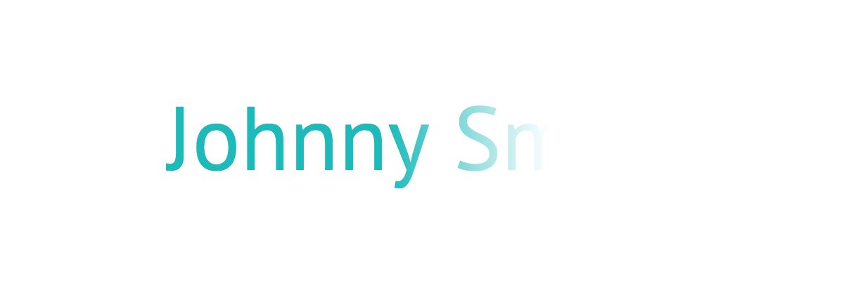
Fig. one
Ways to implement it further and consider. As an example, we will use the contents of the figure above (Fig. 1). We will describe everything using HTML and CSS. Without React and webpack, sorry.
Solution 1. CSS (linear-gradient function)
The first thing that comes to mind is to use the
linear-gradient CSS function.We describe the rectangle:
- height is equal to the size;
- width is N (N depends on how much we want to cover the area with a gradient);
- depending on the background color, set the gradient (one of the points is completely transparent, the other is solid);
- absolute positioning fasten to the right edge of the block with the text.
Using this algorithm, we recreate our example. I remind you that we have a turquoise text on a white background.
Markup:
<span class="text-eclipse" aria-label="Johnny Smith" title="Johnny Smith">Johnny Sm</span> Styling:
.text-eclipse { position: relative; } .text-eclipse::after { content: ""; position: absolute; top: 0; right: 0; width: 45%; /* 1 */ height: 100%; background: linear-gradient(to right, rgba(255, 255, 255, 0) 0%, rgb(255, 255, 255) 100%); /* 2 */ } - the width is better set in relative units, so as not to do unnecessary operations when changing font sizes;
- according to the
transparentstandard, this is actually an abbreviation ofrgba(0, 0, 0, 0)[3]. In this regard, a bug is observed in Safari [4].
As a result, we get our result (Fig. 1).
But what if we repaint the background? (Fig. 2)

Fig. 2
In this case, we need to remember to override the gradient of our rectangle that overlaps the text (Fig. 3).

Fig. 3
It was a solid background. We omit the probability that it changes dynamically, but we should not exclude the fact that the background can be set as a gradient (Fig. 4).

Fig. four
Here it is already difficult for us to choose colors to the gradient of our rectangle. I could not close my eyes to this problem, since in our design the background in some places flowed into a gradient (radial, to be exact).
So, the disadvantages of this method:
- the color of the gradient is tied to the background color, and you need to know and remember;
- if a gradient is applied to the background, then we can do nothing.
Decision 1.1. CSS (background-clip property)
In CSS, there is a
background-clip (at the time of this writing, it is included in the CR [2] status in the specifications), which, according to the standard, takes three values of the border-box , padding-box and content-box . If you add the prefix -webkit- to the property, another one will appear - text (Fig. 5). Just we need it.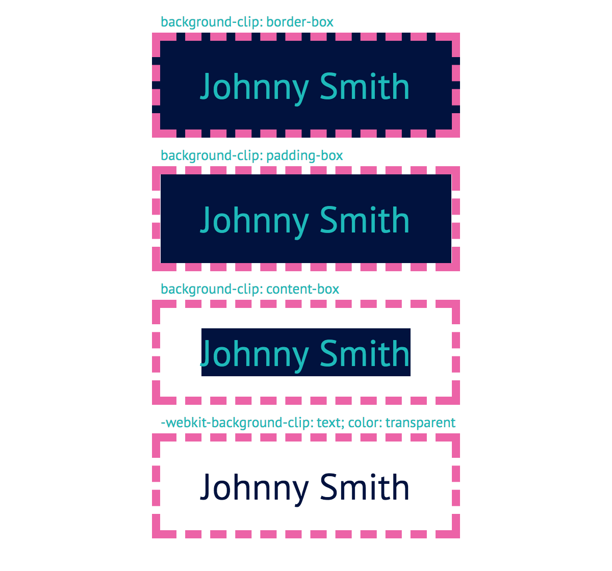
Fig. five
The figure (Fig. 5) clearly shows how each value works. It is important that in the
text example the transparent font color is also set, otherwise the use of the property would lose its meaning, since we would not see at all how the background is cropped.Thanks to this background behavior with
background-clip we can solve our problem. Set the gradient color of the font, using the background (Fig. 6).Markup:
<span class="text-eclipse" aria-label="Johnny Smith" title="Johnny Smith">Johnny Sm</span> Styling:
.text-eclipse { background: linear-gradient(to right, rgb(0, 186, 187) 50%, rgba(0, 186, 187, 0) 100%); -webkit-background-clip: text; color: transparent; } Fig. 6
Now we are not dependent on the background color.
But, naturally, everything is not “perfect”. There are at least two minuses:
- it is problematic to change the color of the text due to the use of
linear-gradient. I wish he was inherited and did not care for us; - if IE and Edge support are needed [5], then the
textvalue of thebackground-clipdoes not satisfy this condition, which is why the figure will be just filled (Fig. 7).

Fig. 7
Solution 2: SVG
Before the desire to finally write a super library on Javascript, which will solve this trivial task, will prevail, it is worth remembering about the beloved and flexible SVG. Its capabilities are not limited to the creation of only primitive shapes and curves. Specifically, we are interested in the
<text> element.Note in advance the following:
- SVG elements do not define its size,
width,heightandviewBoxare responsible for this (ifwidthandheightnot declared). That is, in our case, no matter how long the text, it will not affect the parent; - There are two basic attributes for styling any SVG elements:
fill(fillcolor) andstroke(strokecolor). If we draw an analogy with CSS, then the first is bothbackgoundandcolor, and the second isborder-color. It turns out<text>we can safely fill the gradient withfill.
Let's start with a gradient:
<linearGradient> <stop offset="0.5" stop-color="#00babb" /> <stop offset="1" stop-color="#00babb" stop-opacity="0" /> </linearGradient> This is equivalent to writing
linear-gradient(to right, rgb(0, 186, 187) 50%, rgba(0, 186, 187, 0) 100%) .Apply a gradient to the text:
<svg xmlns="http://www.w3.org/2000/svg"> <linearGradient id="textEclipseGradientId"> <stop offset="0.5" stop-color="#00babb" /> <stop offset="1" stop-color="#00babb" stop-opacity="0" /> </linearGradient> <text fill="url(#textEclipseGradientId)">Johnny Sm</text> </svg> As a result, we obtain (Fig. 8):
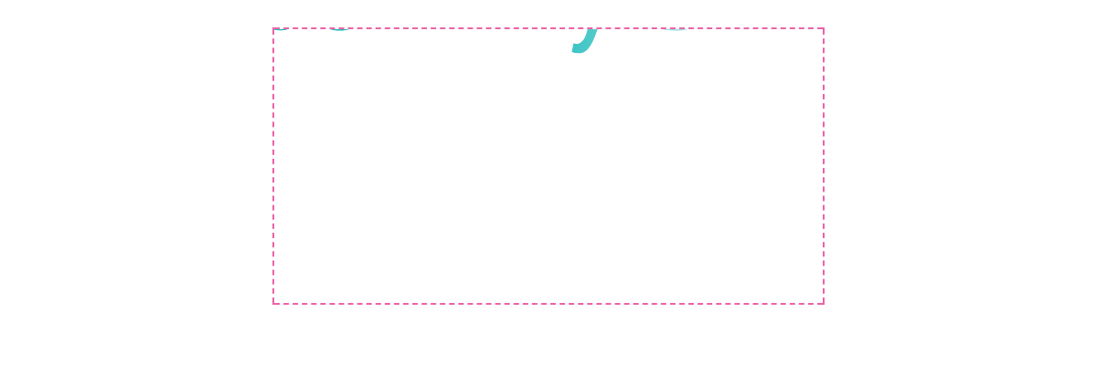
Fig. eight
Hmm, something went wrong. Let's figure it out.
Everything is clear with the dimensions: we did not specify them, so the default dimensions (300x150) were applied. Then it turns out the problem with the positioning of the text.
For vertical positioning, there is an attribute
y . We give it half the height of the SVG. As with the method of vertical positioning of blocks through the top: 50% we need to do something like transform: translateY(-50%) . The dy attribute of the <text> element will help us. We will set the relative unit. This is approximately 0.3em of the font size (Fig. 9).Markup:
<svg xmlns="http://www.w3.org/2000/svg"> <linearGradient id="textEclipseGradientId"> <stop offset="0.5" stop-color="#00babb" /> <stop offset="1" stop-color="#00babb" stop-opacity="0" /> </linearGradient> <text y="50%" dy="0.3em" fill="url(#textEclipseGradientId)">Johnny Sm</text> </svg> 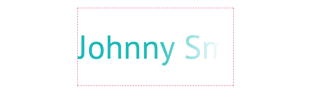
Fig. 9
Now let's deal with the size. Once the elements cannot resize SVG, we will create an HTML element with the same text, and SVG will be positioned absolutely relative to it.
Markup:
<span class="text-eclipse"> <svg xmlns="http://www.w3.org/2000/svg"> <linearGradient id="textEclipseGradientId"> <stop offset="0.5" stop-color="#00babb" /> <stop offset="1" stop-color="#00babb" stop-opacity="0" /> </linearGradient> <text y="50%" dy="0.3em" fill="url(#textEclipseGradientId)">Johnny Sm</text> </svg> <span>Johnny Sm</span> </span> Styling:
.text-eclipse { position: relative; display: inline-block; } .text-eclipse svg { position: absolute; top: 0; left: 0; width: 100%; height: 100%; } .text-eclipse span { color: transparent; } Now the color is sewn into the
<stop> element, and we would like it to inherit from color . To do this, we need to set stop-color: currentColor for <stop> .Styling:
.text-eclipse stop { stop-color: currentColor; } In principle, everything. Let's polish some points and add ARIA attributes.
Markup:
<span class="text-eclipse"> <svg aria-hidden="true" xmlns="http://www.w3.org/2000/svg" width="0" height="0"> <linearGradient id="textEclipseGradientId"> <stop offset="0.5" /> <stop offset="0.1" stop-opacity="0" /> </linearGradient> <text y="50%" dy="0.3em" fill="url(#textEclipseGradientId)">Johnny Sm</text> </svg> <span aria-label="Johnny Smith" title="Johnny Smith">Johnny Sm</span> </span> Note:
- just in case, set
width="0"andheight="0"so that the page does not jump before applying CSS; aria-hidden="true"hide from screen readers;
Styling:
.text-eclipse { position: relative; display: inline-block; } .text-eclipse svg { position: absolute; top: 0; left: 0; z-index: 0; width: 100%; height: 100%; } .text-eclipse stop { stop-color: currentColor; } .text-eclipse span { position: relative; z-index: 5; /* 1 */ color: transparent; } - we make the HTML element the main thing in the stream, since the SVG acts only as a “mask”.
Demo
And here not without problems:
- the
dyvalue for vertical alignment strictly depends on the font family used; - depending on the font, the “tail” of the first letter in the word may be clipped (you can specify
overflow: visiblein<svg>, but this will not work in IE and Safari); - as in SVG for masks, gradients, patterns, etc. there must be a unique id for their use; for
<linearGradient>, a new id should be generated to avoid conflicts between several such elements. It’s impossible to render in one gradient, so we inherit color from a particular<svg>; - There is no possibility of changing the font color through CSS by hover, focus, etc.
If we talk about cross-browser compatibility, then it should work wherever SVG 1.0 is supported.
Total
Of the solutions considered, I, of course, give my preference to the variant with SVG, since it is much more flexible than the others. We are not at all concerned with the background color or the gradient. We work with plain text, and SVG adapts.
In general, the task is really simple, you need only attentiveness and good awareness to solve it quickly.
If you have any comments or suggestions, please share them in the comments to the article.
Thank.
UPD:
- Added a note to the account support Edge properties
background-clip: text. Thanks monochromer . - It was rightly noticed about the moment with the selection of the text that I missed. Thank you questor
- Answered in the thread about the comment "How to deal with multi-line text?" . Thank you kazmiruk . Created a demo .
- Edits to Solution 3: corrected shortcomings in SVG and CSS code; added link to codepen with demo; added another drawback to the third color change solution.
Note
- In the example, we have a limit of 9 characters. The task, where to cut off unnecessary characters - on the server or on the client, purely individual.
- CR - Candidate Recommendation.
- CSS Image Values and Replaced Content Module Level 3; 4.4 Gradient Color-Stops
- Bug with transparent in Safari
background-clip: textdoes not work in Edge versions <12
Source: https://habr.com/ru/post/352664/
All Articles