3 common design mistakes that are easy to fix

About the #logomachine_help Category
Hello! In the VKontakte community there is a rubric in which we give subscribers design tips. We show what can be changed in graphics to make the design look neater and clearer. Today, on the example of the participants in our column, consider what techniques can refresh your design.
1. Emoreco: add personality

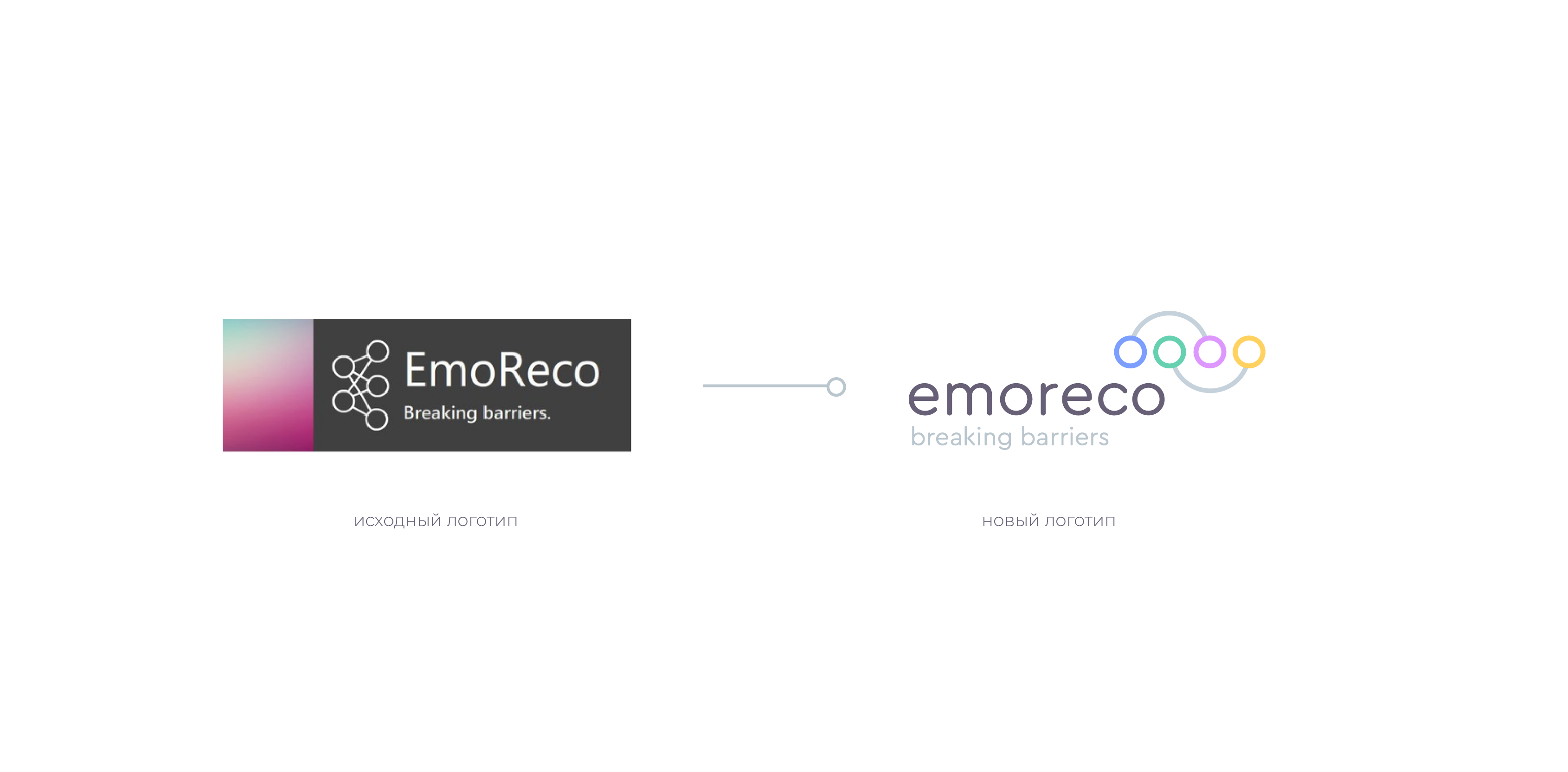
Original logo and project description
Usage example
')
The main problem of the logo was the discrepancy between the image and the task: the sign resembles a bunch of faceless blockchain logos, it looks strictly and unfriendly. We would like such a project to look more friendly.
Before after
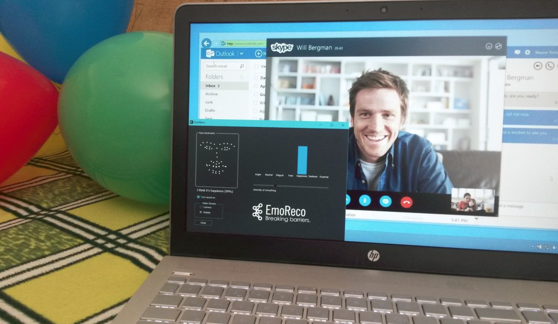
As key images, we chose the “smiles” and “points” that are characteristic of software from the field of computer vision. Different colors of the “dots” show the variety of emotions - this technique can be used in the whole corporate style.
A soft form font emphasizes openness to communication, and spelling of the name in lower case makes the logo less detached from consumers.

Deciphering the concept
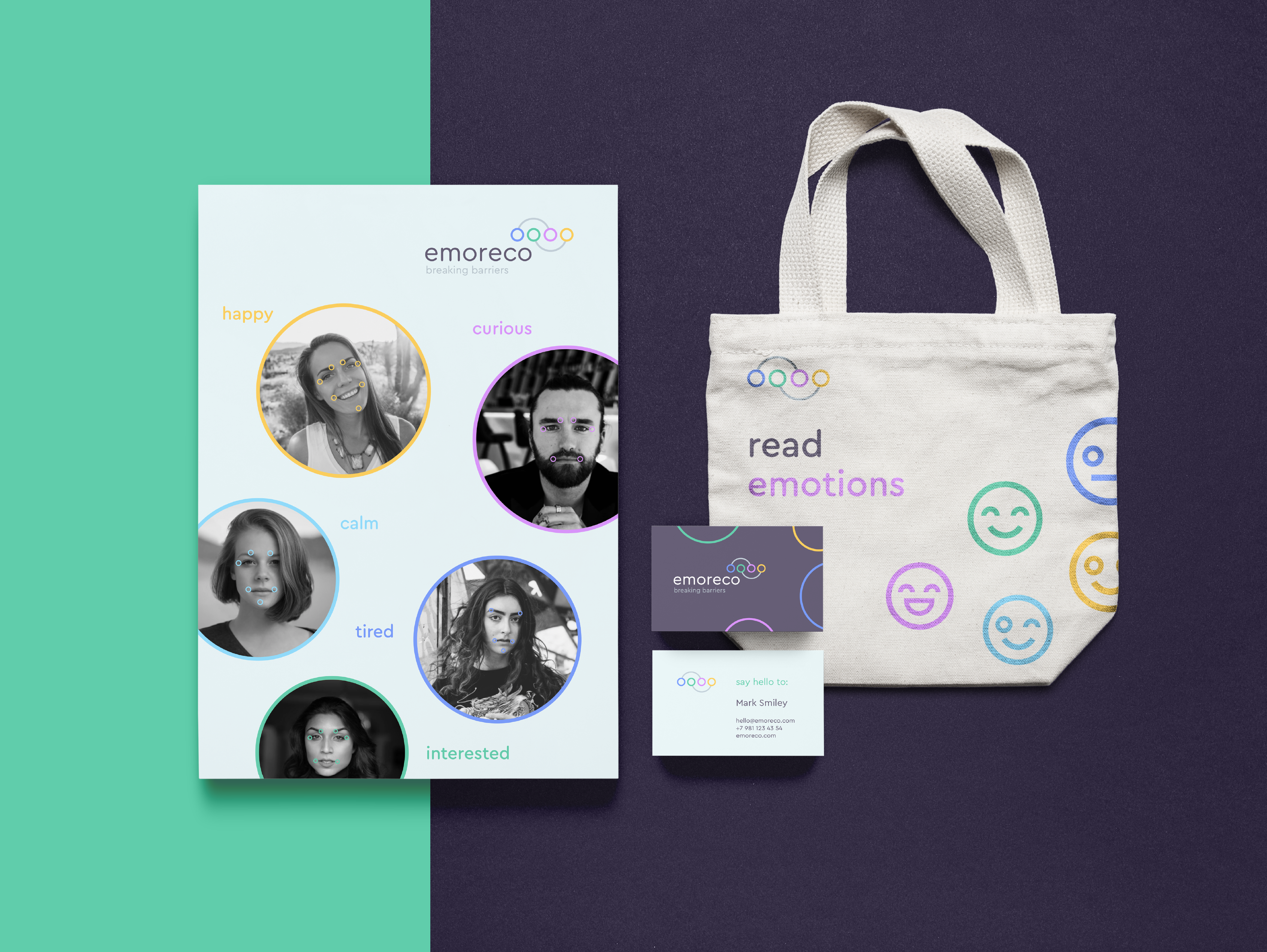
Examples of using the new style
Total
The result is a modern and friendly sign that invites the consumer to interact.
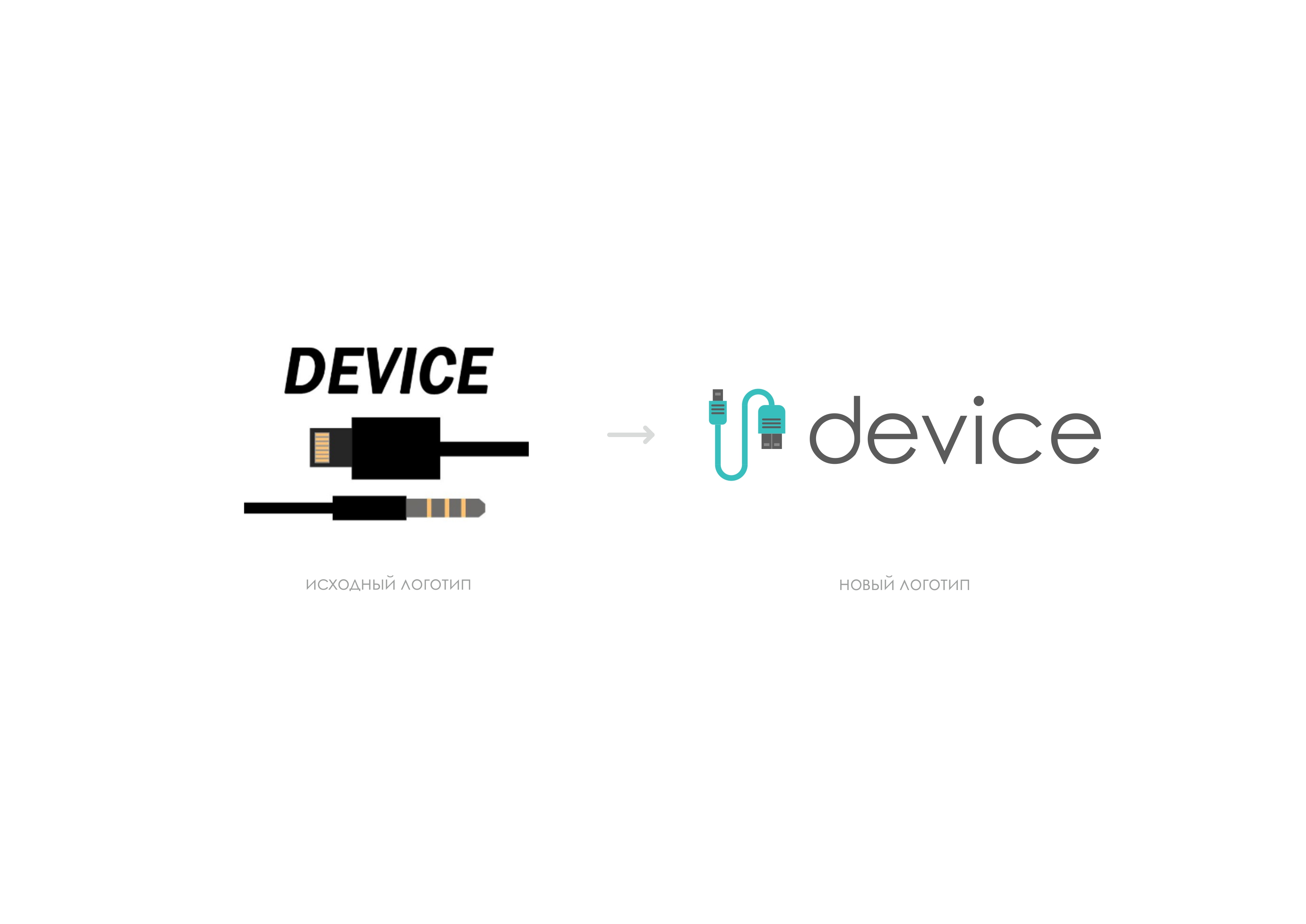
2. Device: add recognition
Original logo
Unfortunately, there was not very much information, so we will focus on correcting obvious errors.
Such a logo is quite difficult to distinguish from any other logo repair equipment, we decided to add a key color.
Before after
In addition, we simplified the graphics with thin font and lowercase letters, and made the sign more accurate.
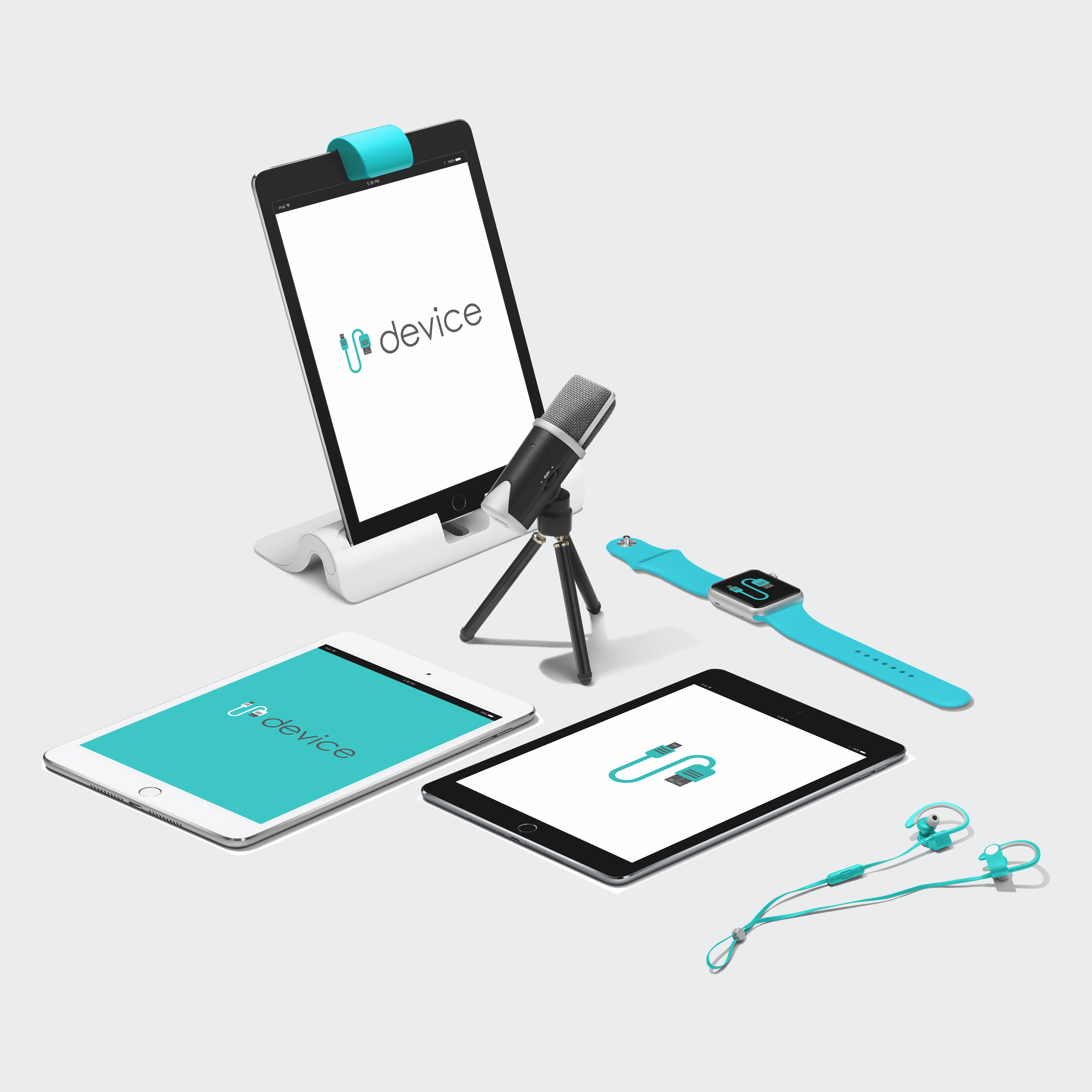
Examples of media design
Total
The logo turned out to be modern and now causes the necessary association in the eyes of the consumer.
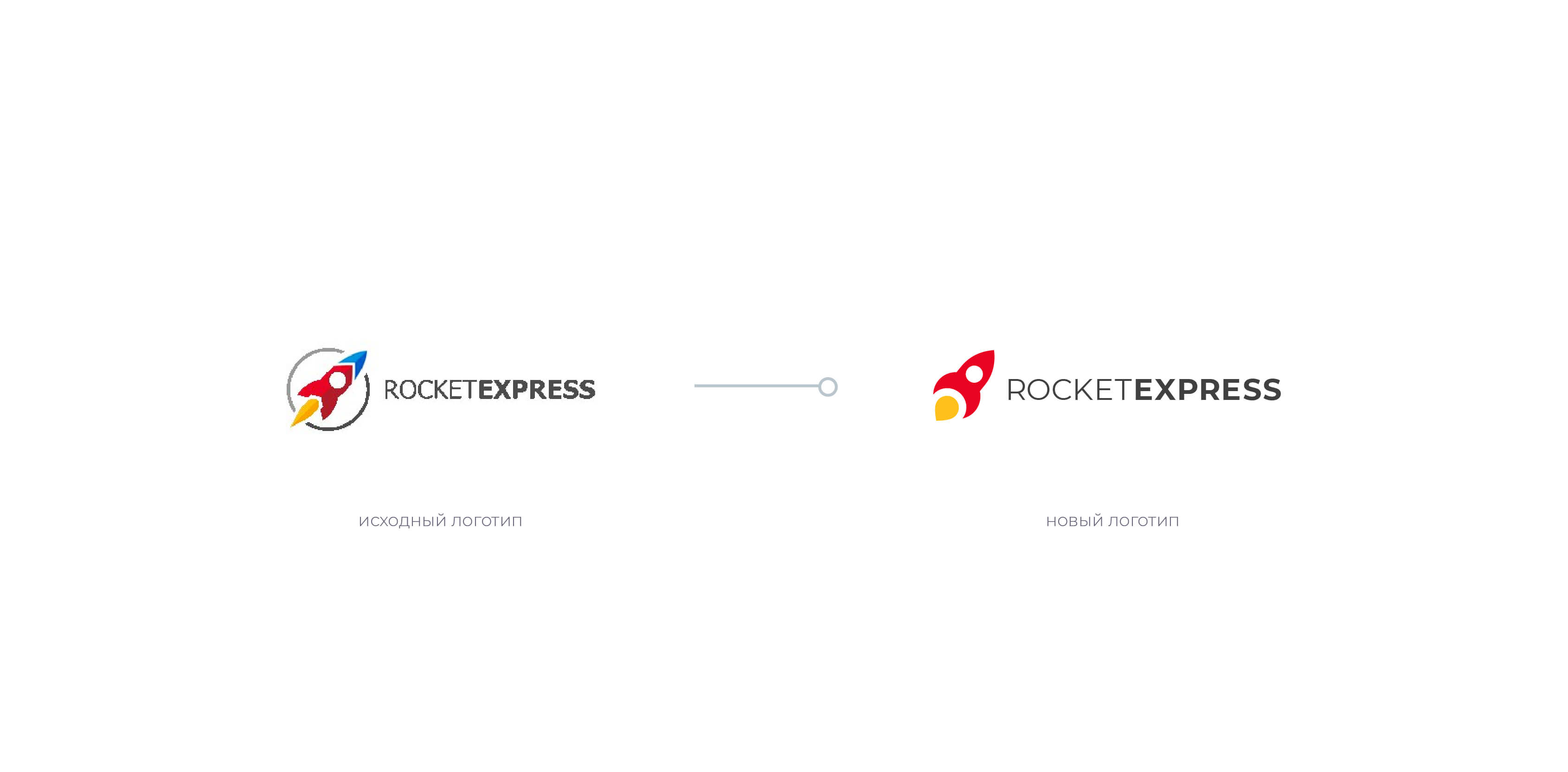
3. RocketExpress: Simplify Graphics

The original logo and description of the project (jackals are not ours, so it was, honestly)
The main disadvantage of the old logo is outdated graphics. Now he looks overly detailed and childish. Based on the general tendency to simplify, we got rid of everything superfluous in the sign, having built a form based on geometric primitives.
Before after
To form a recognizable image, we left only red and dark gray as company colors, and yellow was chosen for accents.

Examples of branded media

Hefty Chic Kamaz
Total
With simplified graphics, the logo has become much easier to use.
That's all!
If you want to become a member of the #logomachine_help category, leave a description of your project and current logo in the comments. We will select interesting projects and help them with the logo as in this issue.
The article was prepared by Danya from Logmachines.
Source: https://habr.com/ru/post/352480/
All Articles