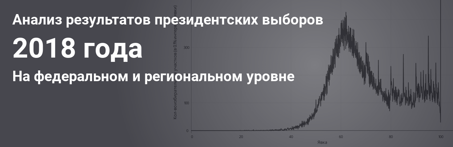
Analysis of the results of the presidential election of 2018. At the federal and regional level
A feature of the Russian presidential election in 2018 was that the main indicator now was not the percentage for the main candidate, but the turnout. Another important indicator was a record high number of observers across the country. Observers were sent, including to the republics of the North Caucasus, where traditionally the results were simply drawn.
Presidential elections, even without taking into account the large-scale campaign to increase turnout through contests, local referendums, and administrative pressure, attract much more attention than parliamentary elections. However, after analyzing the results, one can continue to notice anomalies in the results, although they are already less pronounced at the federal level.
I analyzed the results at both the federal and (more interesting) regional levels, and also talked about how I created the service for analyzing elections.
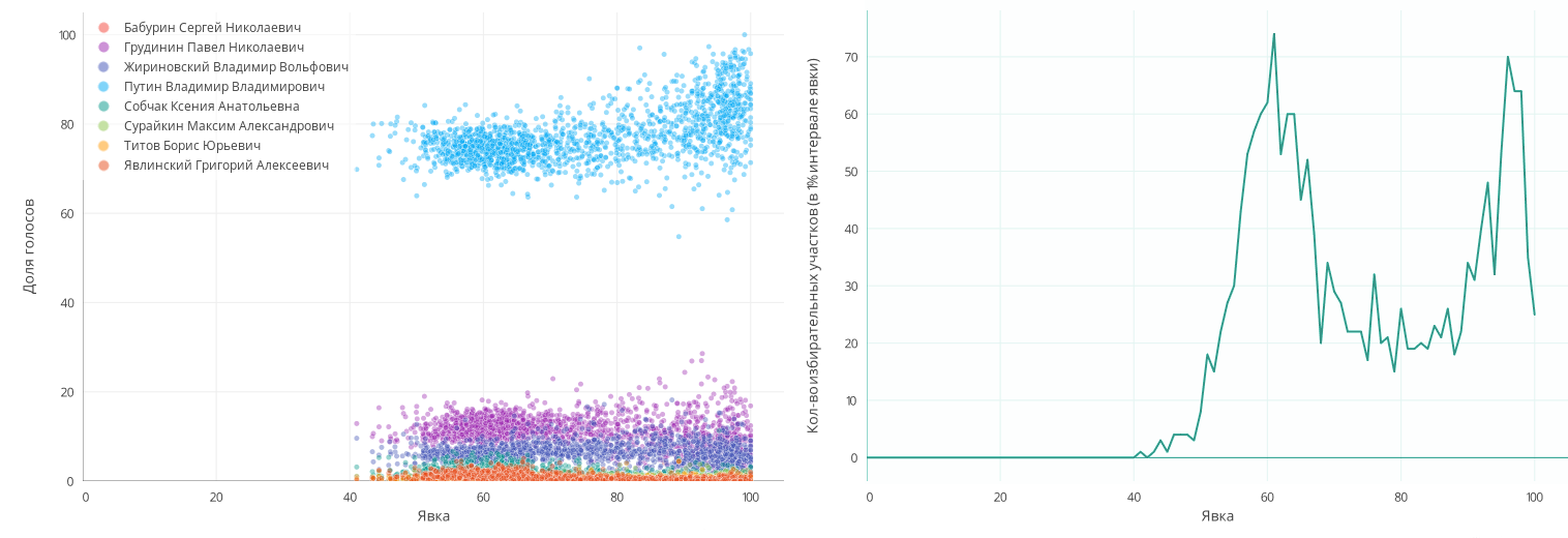
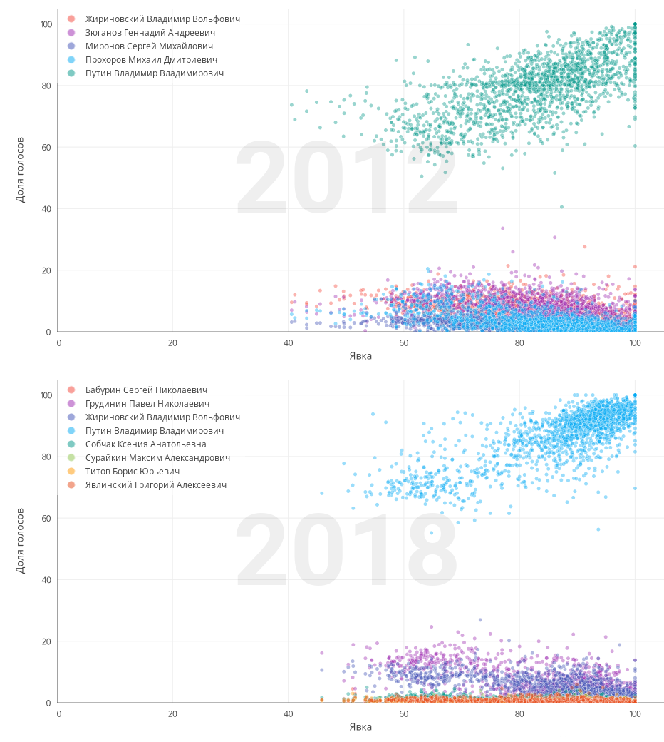
If we consider the distribution of the share of votes for candidates depending on the turnout, we can see the classic situation already, when the turnout is higher, the higher the share of votes for the main candidate, striving for a 100% and 100% turnout. The share of other candidates, respectively, decreases proportionally. All pictures are clickable.
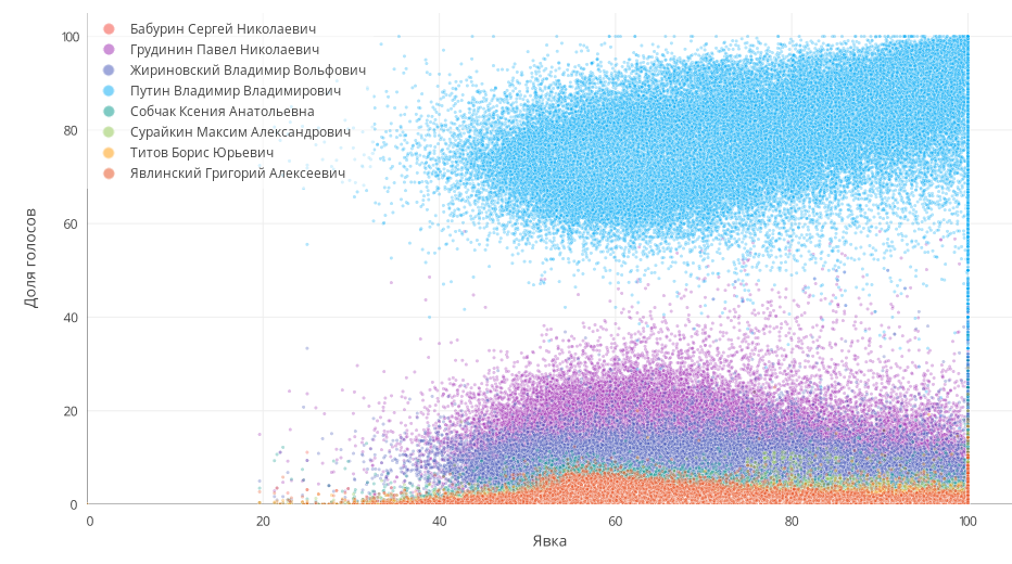
(On this picture and on the following point - PEC).
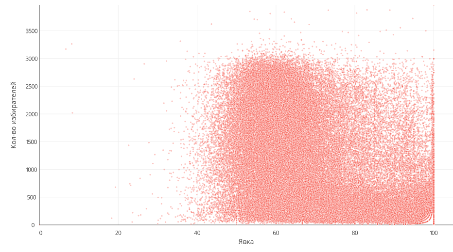
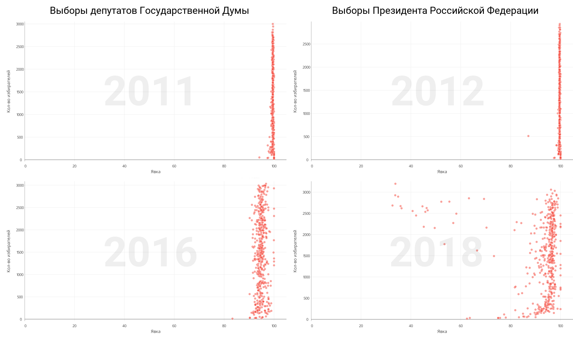
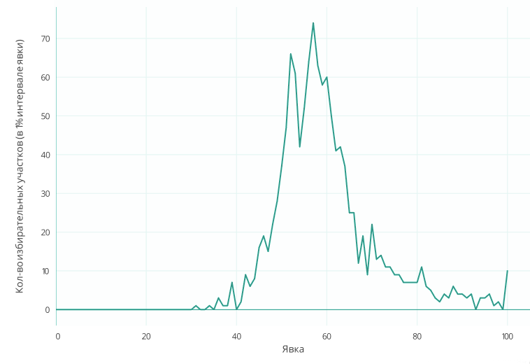
You can also recall the many mathematical studies showing a rather unusual distribution of plots depending on the attendance at them. Instead of a normal or lognormal distribution, we see an interesting curve, with very strange peaks at round values (70%, 75%, 80%, etc.), increasing the turnout by about 100% and going upwards by 100%. Here are the results of the 2012 presidential election:
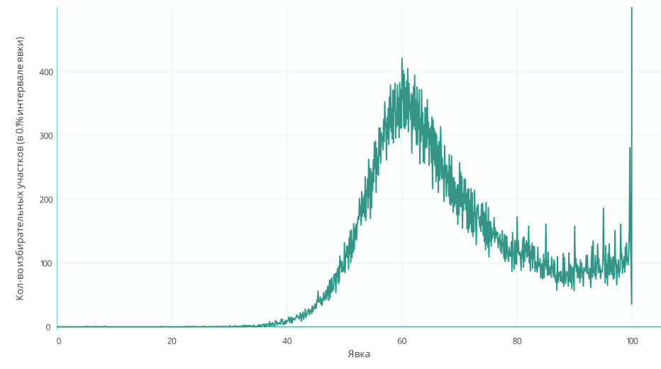
In the 2018 election, the curve looks even stranger. The number of sites with a turnout of more than 80% has significantly increased, and the peaks at round values have increased even more.
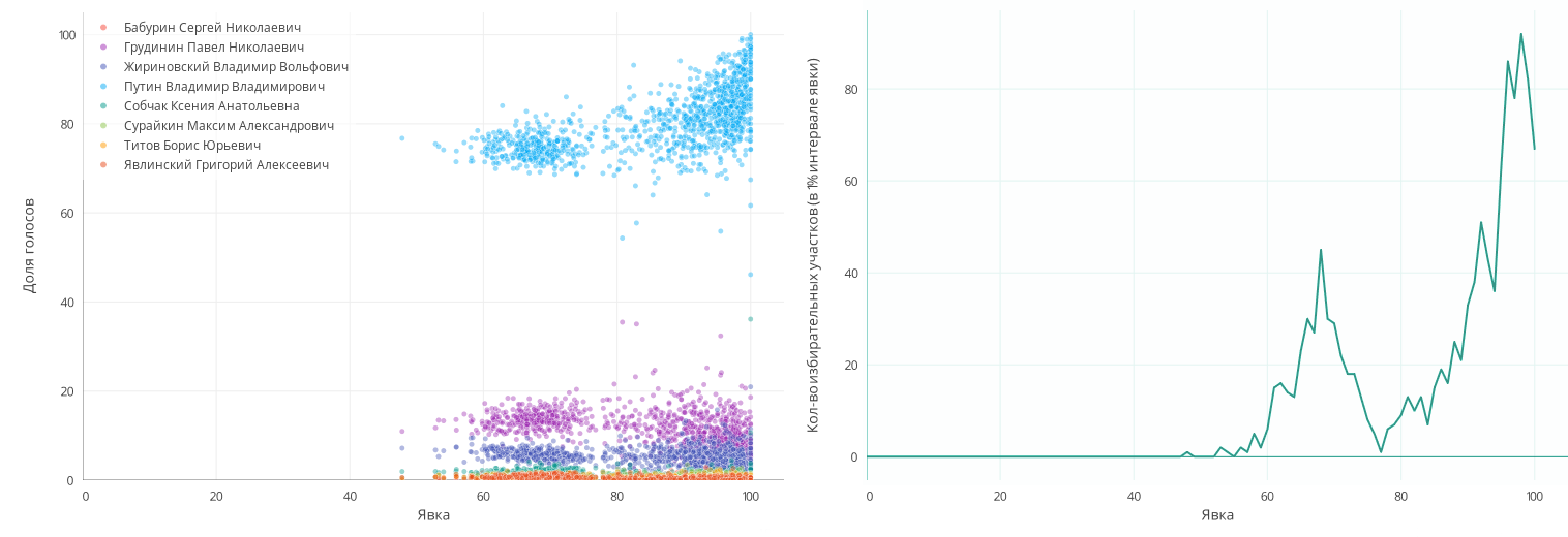
It is noteworthy that a high turnout is observed not only in small polling stations: there are cases when 90% -100% of turnout occur in areas to which 1500-2000 people are assigned. Here are the results of the 2012 elections:
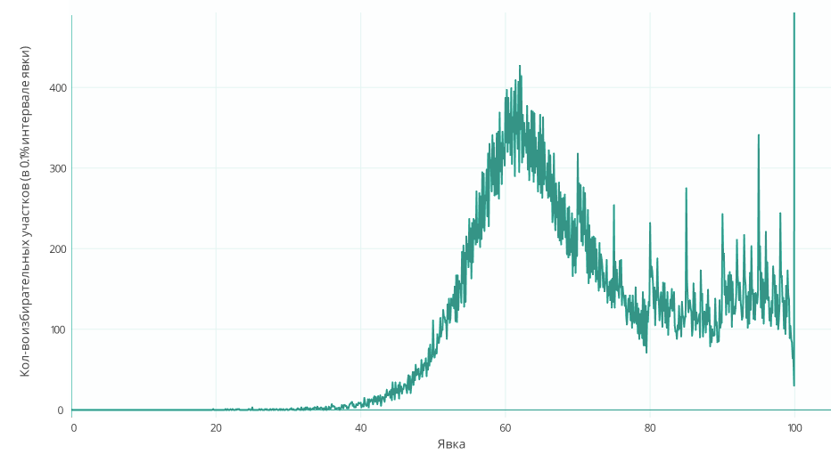
But the results of the elections in 2018:
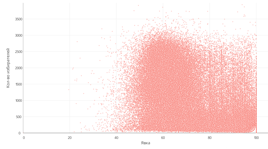
As can be seen, the number of sites decreased from 100% turnout, but now they were distributed in the turnout segment of 70% -100%. Also here you can see a more pronounced distribution of PECs on round numbers, such as 80%, 85%, etc.
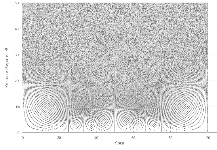
Incidentally, the rounding of lines from points on a low number of voters in the polling stations is normal. The fact is that due to the strongly manifested discreteness of possible turnout with small numbers of voters, a picture is observed in which the number of possible turnout values decreases with a decrease in the number of voters. Here, I even made a graph from the test data obtained by the randomizer:
Analysis of elections at the regional level
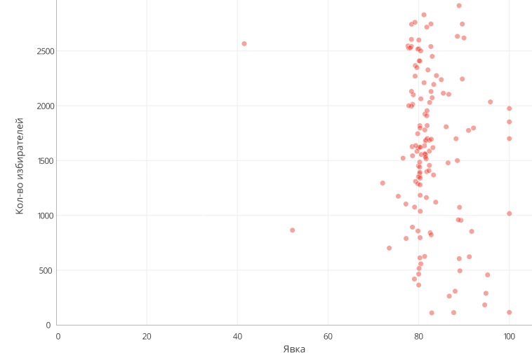
But it is much more interesting to consider data on elections by region. For example, the Republic of Ingushetia. The absolute majority of PECs are very conveniently located in the area of 80% turnout, ± 2%.
Another anomaly is observed in the Samara region: there, at sites with a turnout higher than 80%, the proportion for the main candidate, although increasing, is insignificant. Moreover, approximately on this site the share of votes for two subsequent candidates increases, of course, at the expense of all the others. It can also be seen that the sections of the distribution are not distributed at all normally and lognormally, but in the form of two “mountains”.
One would think that this is due to the difference in voting between the city and the village, but in Chuvashia the situation is even more significant because there are 77% turnout disappearing, but the second cluster of PECs, with about 100% turnout, 2 times more than with natural turnout.
As for Chechnya, where 100% results were traditionally drawn, in the presidential elections of 2018 many artifacts appeared with an unusual, not 100% turnout. Most likely, of course, this is the result of the work of independent observers from all over the country who went to Chechnya to observe the vote. Turnout up to 40% is noticeable at some sites, while turnout at some sites has dropped to 90%. All this once again shows the scale of fraud in the republic.
It is also impossible to ignore the results of the elections in the Kemerovo region, where in 2012 there was a significant number of polling stations with exactly 80% shares for the main candidate, and now the PECs were divided into two types:
The first type (there are few such sites) is areas with a low turnout.
The second type (and there are a lot of such) - these are sites with a turnout from 75% to 100% and equally reduced share of votes for other candidates besides the main one.
However, there are examples of regions in which anomalies are poorly represented, which is why it can be assumed that frauds were of a single nature. For example, in the Tver region, despite the peaks at 70% and 100% and other minor anomalies, in comparison with the regions described above and the general statistics for Russia, the distribution is quite similar to a lognormal distribution.
Development of election analysis service
Looking at the various charts for the federal level, I wanted to repeat them, but only for my area. I found a repository with code for ipython, which built similar graphs, but there were some errors in the code, or the site of the electoral commission was updated, or something else, but the parsing of the electoral commission site ended in error.
Then I left only the data visualization from that code, and the page parsing was completely rewritten. After that, I managed to get a picture with the results, which I wanted, but then there was a desire to be able to hover over some area and, at a minimum, get its number in order to then find detailed information. But this was impossible, which is why the idea to create a service for this type of analysis of any elections for any region arose.
I did not want to develop a desktop application, because it would increase the threshold for users to enter, and I could bring unexpected problems on platforms on which I did not test the program. This is an application that the user needs every day, because this option is not suitable.
Also, I did not want to understand the modern collection of JavaScript libraries, I even considered the option to broadcast the Qt application to a browser , where the image is rendered via WebGL.
Fortunately, I found the Dash for Python library, which allows logic and a html page to be written in Python, and the page itself will be generated using ReactJS. The page is made up of ready-made blocks, if they are not enough, you can add your own. Dash provides a reactive decorator for managing event page data: for example, changing a value in a field, this leads to a call to an anchored function that returns some calculated result, say, to the header. As a result, I had to write only the logic of the pop-up window with a hint of work from my own written JavaScript code.
Since so far the candidates are changing in the elections, to simplify the work with the data, it was decided to use the NoSQL database, and specifically - MongoDB, as the most widely heard. Before, I didn’t work with it, which I regretted, because Mongo liked it very much, although I had to adapt for some time after traditional SQL and converting the data to a third normal form.
Thus, in about a month and a half I created a beta version of the service, which I presented to the public, after which I also made various changes. For example, before data loading from the site of the election committee took about 12 hours, and after the introduction of asynchrony and mass deferred addition of information to the database, this time was reduced to three hours. Most of the time, of course, takes the process of loading pages. For some reason, GAS "Vybory" does not want to quickly give up the page, often losing the connection. In this regard, I had the idea to provide an API for convenient data download by third-party applications, but I am not sure how interesting it is for users.
My service allows you to see the results on the sites of any territory for any (while 4 are available) elections, 4 most important graphs of dependence of different parameters on turnout are formed, even PEC addresses are shown, when selecting a group of points, you can see where these sites are located. I didn’t parse myself the addresses of the PECs, but used the ready-made database that the guys from the GIS-Lab downloaded.
You can view the service online at cikinfo.modos189.ru
You can also run on your computer, the source is hosted on GitLab .
UP (April 16): At the request, I posted a dump of the service database. Download . I also remind you that there is an opportunity to download this data from the site of the election committee. Added a small instruction in the readme to the project repository.
')
Source: https://habr.com/ru/post/352424/
All Articles