From idea to AppStore
It all started with a simple idea.
In our life there are always some events, good, bad, it does not matter. I always wanted to write down such things so that I could later understand what brought me where I am.
Although a notebook and pen are a reliable way, they still need to be carried with you and not to forget to write down, besides, it is very often just physically difficult to write something down. However, we always have telephones with us, so it was decided to make a website with the functionality of recording such events.
Each event can somehow be described.
This is how the concept of a “ Type ” event occurred, for example - you won the competition, this is a good event.
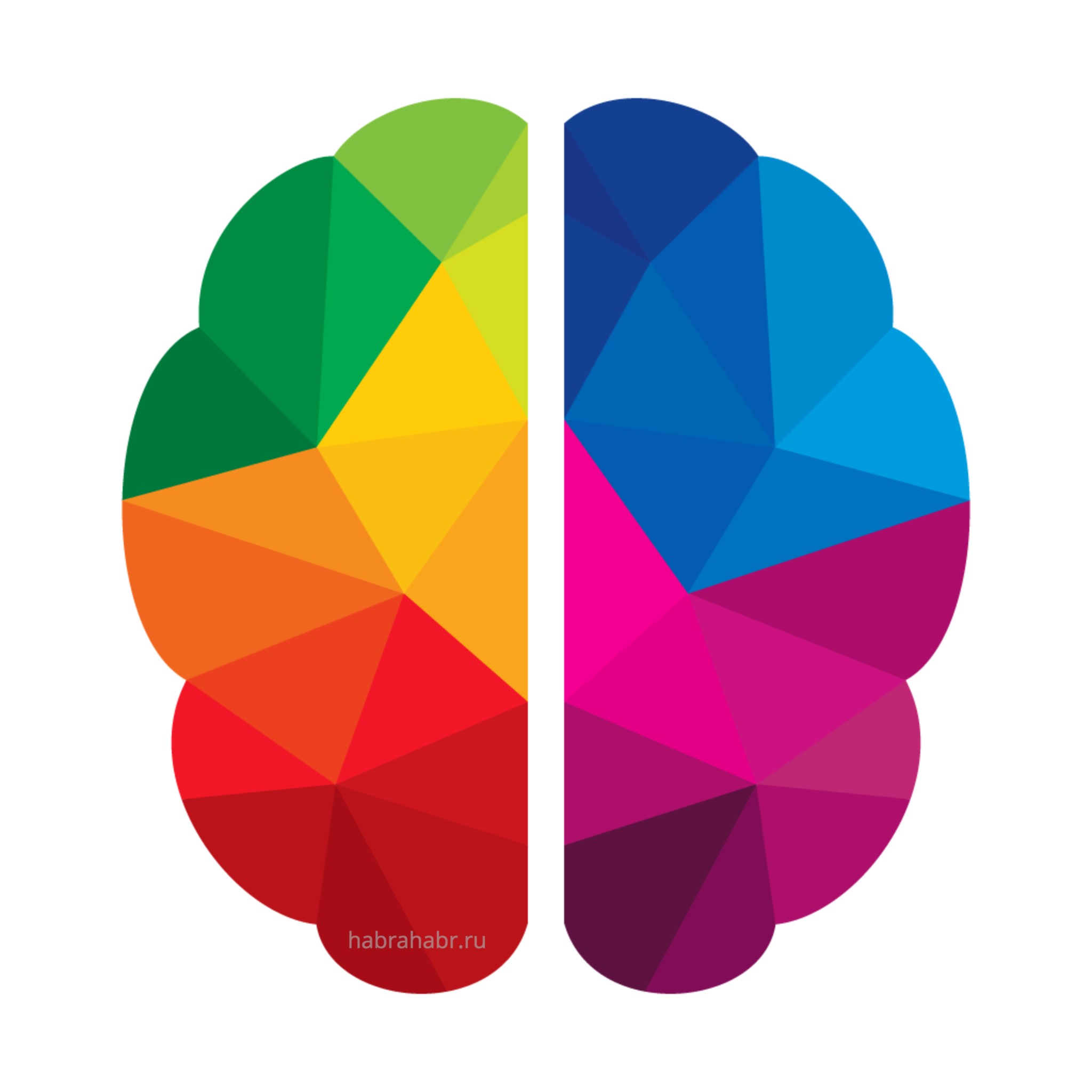
Since the types need to somehow mark, and it turned out that at the beginning of the development I read a lot of literature on web design - it was decided to use colors (they all mention their influence on our mind).
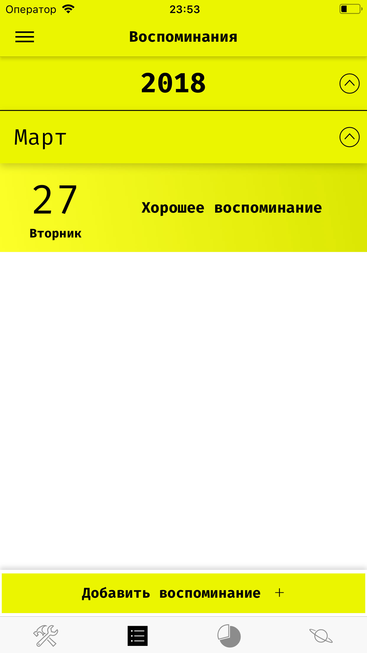
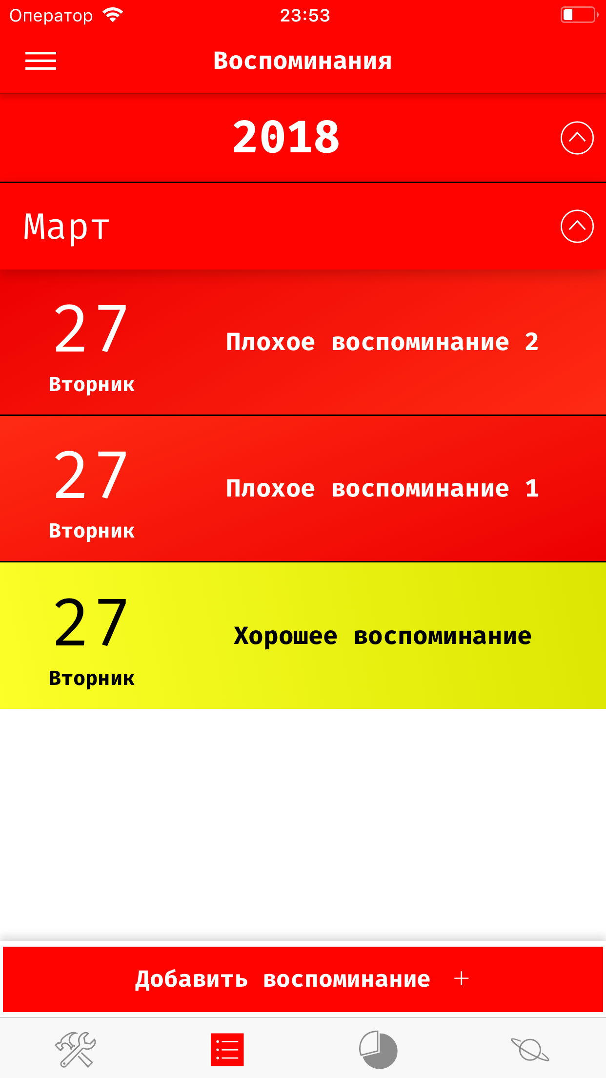
At first the types were predefined - Good (Green) and Bad (Red). Of course, two types are not enough to describe our life, and other types began to appear - Fun, Stress, Problem, and so on.
Problem
With the appearance of the “Problem” type, a new vision has appeared - problems appear, they affect our lives for a while, and then they are solved (in most cases). It turns out this event does not occur at the moment of time, but in the gap! This means that events must have the possibility of having a duration.
Moreover - those events that are happening now have a greater influence on us than those that have already ended. Combining it all into one concept, I came to the following - the event has a start date and an end date, and the type of event, in turn, has a separate color for current and past events (for example, for current Bad events I used bright red color, and for past - faded).
Everything was good, but new types were constantly appearing, and when I got tired of adding them to the manual one, the user was able to add their own types and customize their color.
Somewhere in this moment I decided to abandon the idea of a web site.
There were two reasons:
- I wanted to be able to add events offline
- Using the web site, no matter how adapted it is, is still inconvenient from the mobile
Memory golem

Thus, the “Memory Golem” mobile application was born. The name deserves special attention, in the first place “ Events ” (Events) became “ Memories ” (Memories). Secondly, the word " Golem ", like the mythical creature from Jewish fairy tales, implied a kind of protection of these very memories.
Server Backend has always been on Java, and specifically SpringMVC
All the current functionality has migrated to the application, except for one detail - the way to save memories. From now on, they were stored on a mobile device, completely offline. That is, the application can be used even in an airplane with all the available functionality.
However, if desired, the user can be registered and get the opportunity to save their memories on a remote server, and moreover - to synchronize these memories between different devices (even on different OS).
Mobile platform made it possible to expand horizons
The first important step was the adaptation of the application to the state of the user. The meaning is as follows:
')
the user has “current” memories of a certain type, they by definition affect his life. Each type has a separate color for the current memory. So we can unambiguously determine by transitivity what color now has an impact on the user's life!
And if we can define it, then we can display it. This I did - the application got the opportunity to change its color to the color of the most popular type among current memories.
There was a problem
The application has labels, what to do if the label is the same color as the color of the application? The answer is simple - the inscription should change its color.
Having studied this question in detail, I stopped at the following solution: in order not to knock down the user with the number of colors, possible text colors are only black and white, and to determine which one to use, I used simple logic — choose a color that has a Euclidean distance from the current color applications.
Back to our Golem
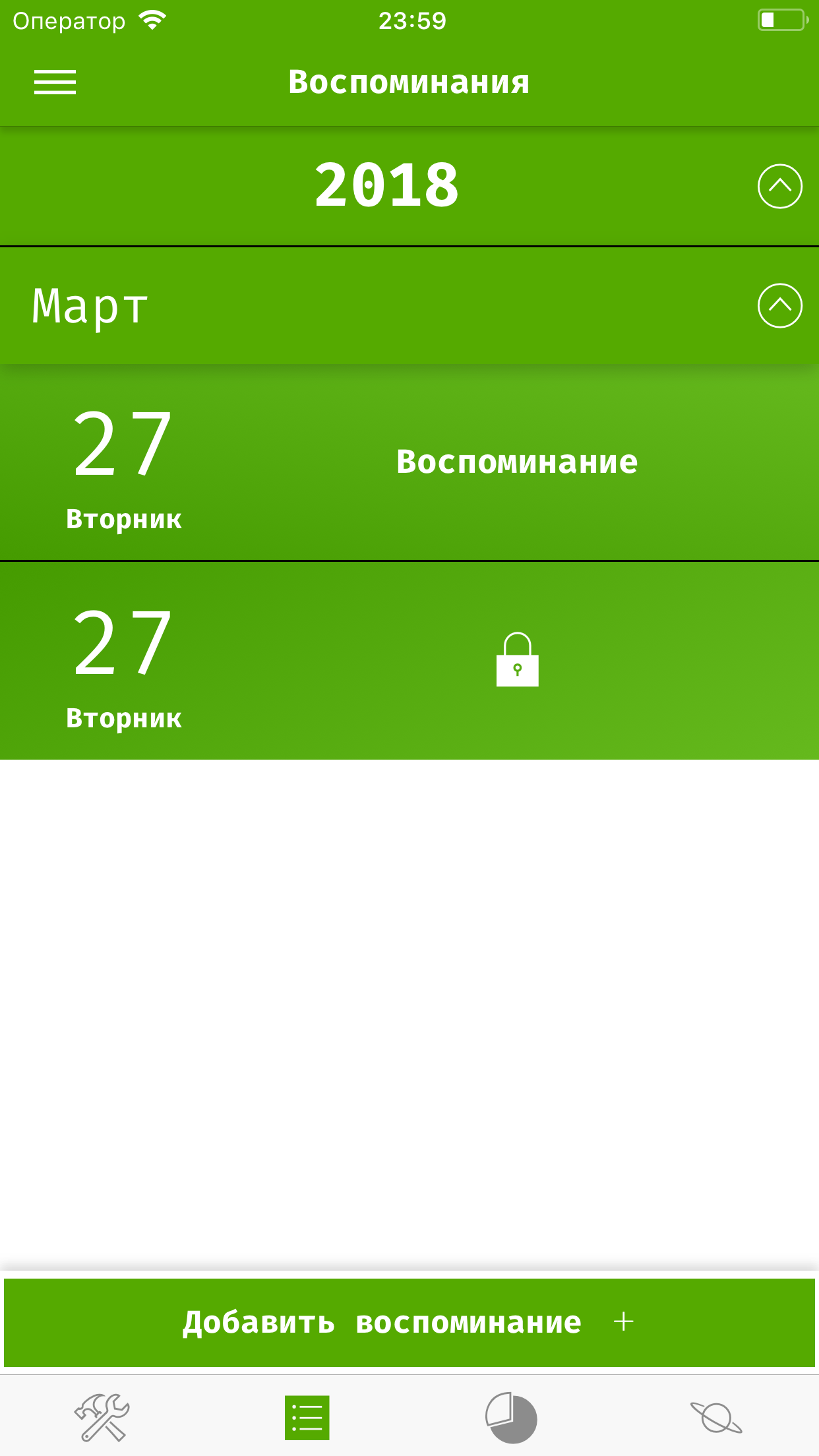
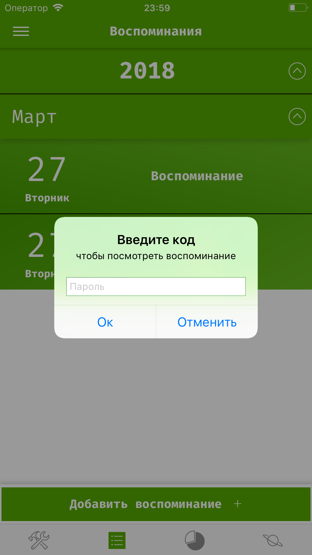
He must protect. Accordingly, there should be a way to protect memories from third-party viewing. The classic solution is the passcode that is installed in the application and used to lock / unlock memories.
The only difference from the same kind of solution in other applications is the ability to block not the entire application, but only individual memories. Such locked memories cannot be viewed or edited until you unlock them, but otherwise, the application can be freely used.
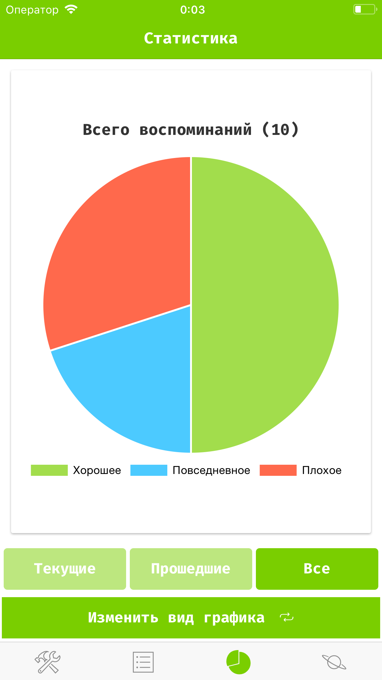
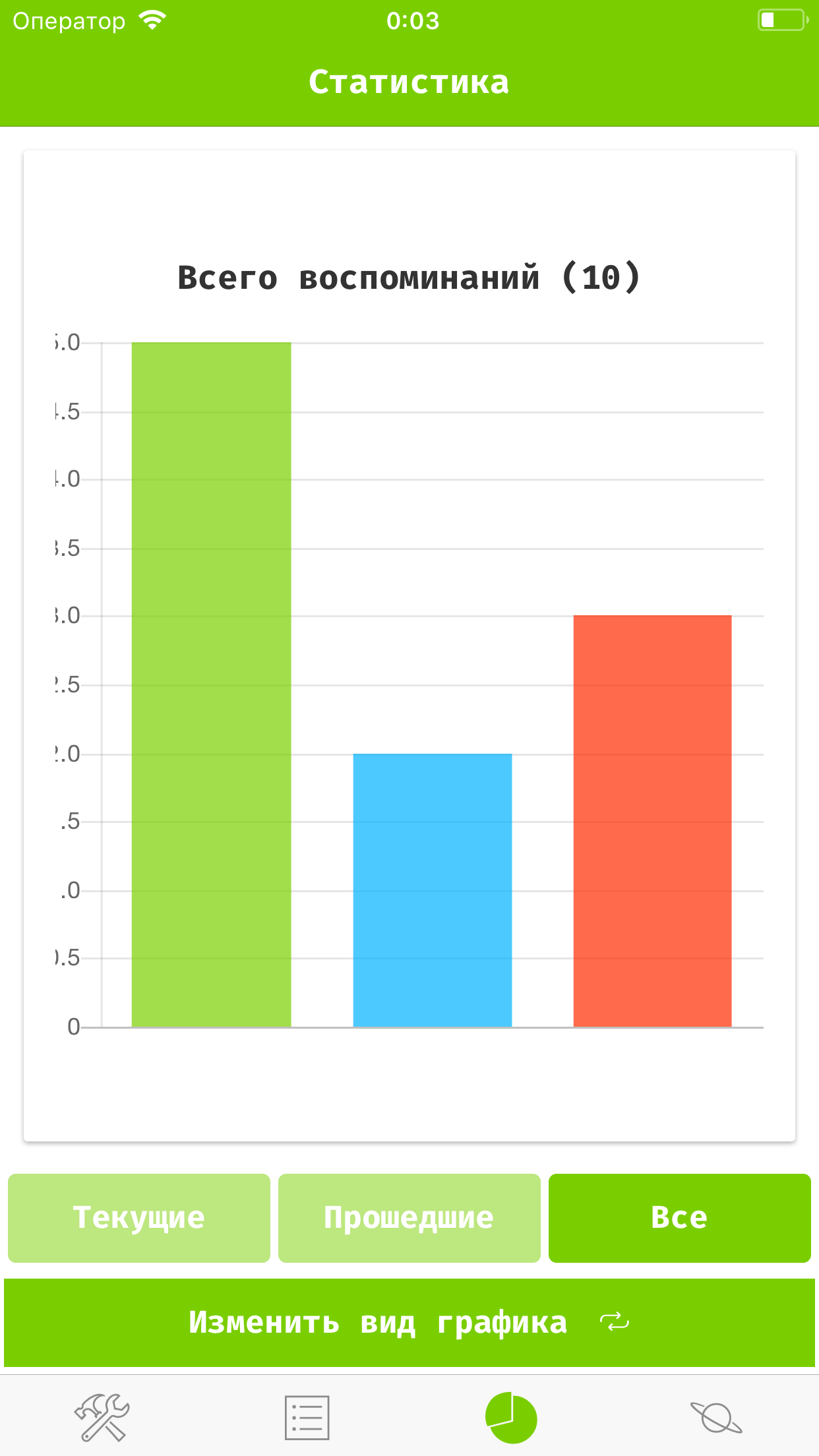
Further statistics appeared
It is quite logical if we write something down - we may want to see how much we wrote there. Statistics is simple:
- number of all memories
- number of current memories
- number of past memories
grouped by type of memories. All this is displayed in a nice-looking form of diagrams, which, moreover, can be switched: Columnar -> Circular -> Radial.
At this stage, it seemed to me the application can be released
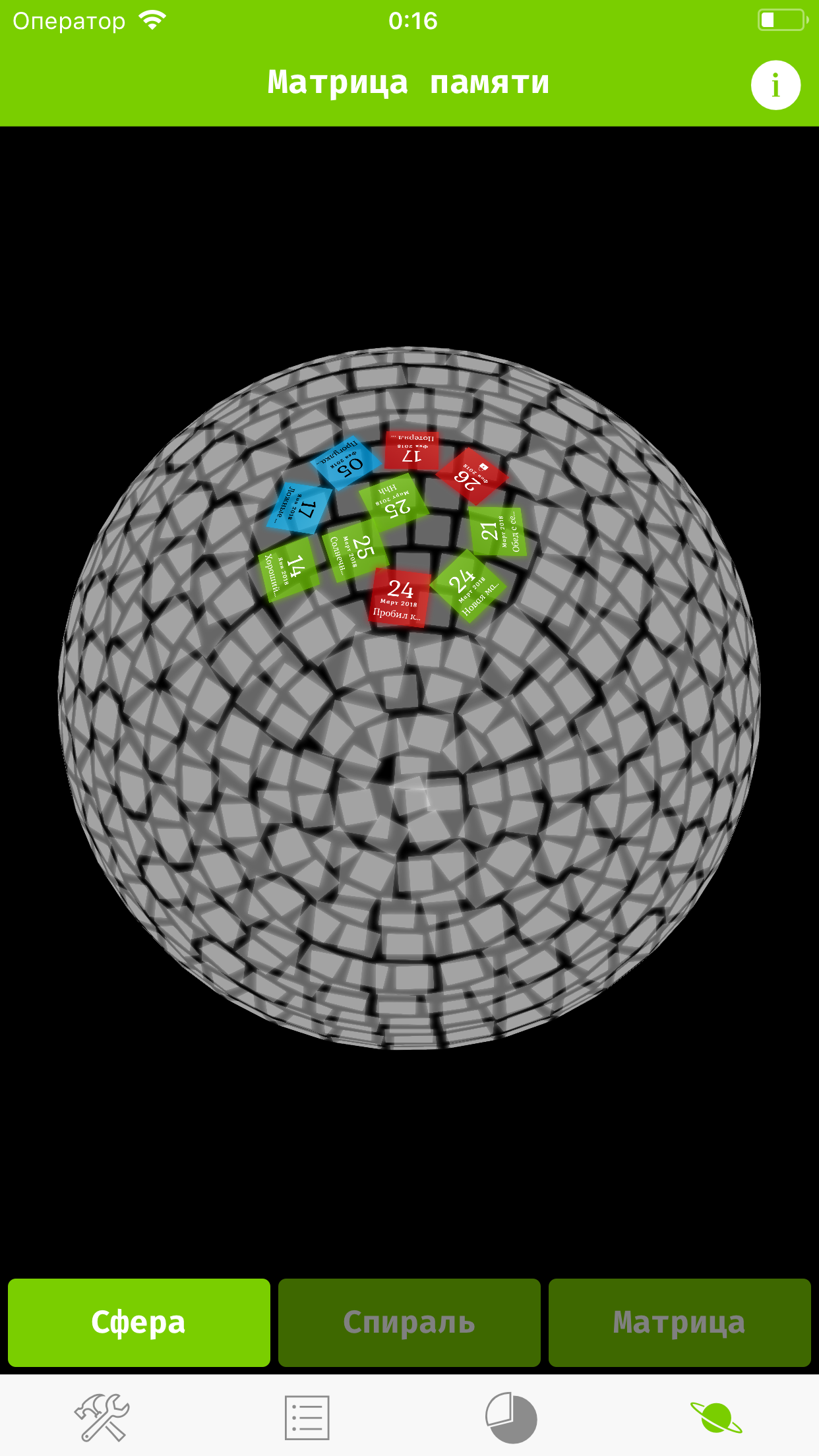
But by chance, I caught the eye of the 3d model of the periodic table , and as I got through, I had to do the same for myself.
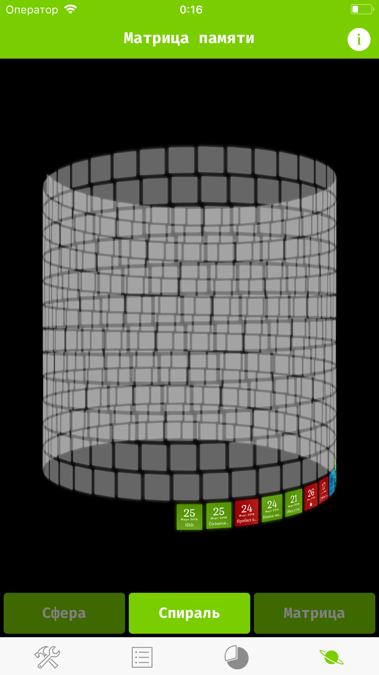
I set to work, and a month later, the application could already boast of the so-called "Memory Matrix" - a 3D model of the user's list of memories, presented in 3 types: Sphere, Spiral and Matrix. These models can be rotated, moved and edit memories directly on them.
The most difficult thing in this was not even analytical geometry, but the number of displayed memories. And the matter is not really in quantity, but in the fact that it was intended for mobile devices, and from the first time only 130 were able to be displayed simultaneously (more than 200 applications immediately crashed), but after optimization this number was increased almost 4 times, and now 512 recent memories are displayed.
Rebranding
The application was almost ready for release, I looked at the icon, the title - and depressed. Not that they were terribly bad, but the icon was frankly cheap (he drew himself in inkspace), but the name, well, it was at least too long.
I started the changes with the icon. My friend helped me a lot in choosing the latter, because I loved the details too much, so I wanted something like this:
But he reasonably remarked that minimalism is now in fashion, and helped to choose the one that now adorns the page in the AppStore.
And already with the change of the icon a new name was invented.
Release Rejected
On Habré there are dozens of articles about the publication process in the AppStore, I think many people know what the process is about, and if not, I’ll briefly tell - Create an application in iTunes connect, fill in information such as descriptions, screenshots, etc., then upload the build and publish it on the so-called Review.
I did not pass my first Review
The reason was simply ridiculous: when you just download an application, it has no data, and since it adjusts its color to the data, it is initially black and white.
Apple representatives compared this result with screenshots where, for clarity, the memories were already filled, they thought it was a bug, and registered the application.
Important lesson
It was unpleasant, but it allowed me to take a new look at the UX. As a result, I redid almost all of the UI, added initial data initialization and simplified a lot of things. So, I think, as a result, this only improved the application. In the end, even if a representative of Apple could not figure out what to expect from an ordinary user
Finish line
After the fiasco with review and rework of the UI, I was ready to release the application. I finished the privacy policy, made beautiful screenshots, came up with a tempting description, created a website for the application, set up a fairly detailed guide on how to use it, updated the information for the reviewer just in case, so that he would understand everything and fill in the new build on the review.
The status of your app, "***", is now Ready for Sale
I received such a message from Apple at 5 am, was overjoyed, quickly checked everything at Test Flight, downloaded promotional codes for friends, published the app and went to study.
What is the moral of this story?
Like anyone who has gone through some difficulties - I want to help others avoid them, this is what I would like to know BEFORE embarking on this path:
- It is imperative to check that what the reviewer sees when installing your application matches what is on the screenshots, even if the application behaves differently when it is first started. Otherwise, you can run into a redget. It seems okay, but the sediment remains. (Another option is to describe all the differences and their causes in the review notes)
- Be sure to conduct usability testing. By the end of the development, you get so used to the application that you cannot even imagine how some concept may not be understandable to the user, especially if the idea evolved in your head for a long time, before coming to what it became
- If a hybrid application is localized through js, this does not mean that the AppStore will know about it. It is necessary to configure localization in Xcode (EXCEPT localization in iTunes connect), otherwise it will work like mine - although the application has a Russian name in the Russian-language AppStore, and all the texts inside are correctly localized - when installed on the device, it has the name in English, because that I did not configure localization in Xcode. I hope to fix this in the next update.
- If you plan to release a hybrid application on iOS - without a poppy just nowhere.
- The ability to test a hybrid application in a browser is certainly convenient, but only useful at the very beginning. After connecting any plug-in that works with native functions - all testing must necessarily occur on the device, or the simulator.
References
Open libraries that are very helpful in creating the application (even wondering if there are some of these things on the swift)
Source: https://habr.com/ru/post/352298/
All Articles