UWP Game: Advanced Splash Screen
Hi, Habr! We continue our experimental series of articles for self-taught programmers, in which Alexey Plotnikov , one of the members of our Microsoft Developer community, talks about creating a game for UWP. Today we will talk about the extended splash screen. Do not forget to leave comments, you can influence the course of development.

I give the word to the author.
')
Objectively speaking, the topic of the extended splash screen was worth considering closer to the end of this cycle. This is not only not the most important part of the application, but, in principle, not mandatory. However, since the cycle is written in parallel with the development of the project, this makes some adjustments to the order of writing articles. I have an extended splash screen ready, and in the course of the cycle there will be situations where I will be sent to it, so I decided to talk about it first.
We start small - what is a splash screen and why should it be expanded? You have definitely come across application screensavers long before the advent of UWP. We will not go far. When you start Visual Studio, you enter a rectangular image with the appropriate caption.

Each program needs a little time to initialize and load the interface, and at this time the user understands that something is happening, the splash screen image is shown. In programs where the startup process is more complicated and the time is longer, an extended screen saver is used. On these we often see text or status bar showing the download status of the application.
Now let's see how this works in UWP. The main difference lies in the features of the platform. Since it is universal, the concept of “window” is not a priority here, and the concept of “screen” comes to the fore. The container in which the screen is displayed depends on the device and the window is only on the PC.
The first thing that a user sees when launching your application is a splash screen consisting of a PNG image and a background fill. If you have just created your application and have not changed anything, the splash screen will be painted in the main color of the system, and in the center there will be a basic “stub” picture, which is automatically created along with the application. Standardly this picture is located in the Assets folder and is called SplashScreen.png. Also in the file name there may be something like “scale-200”. This is part of the scaling system, which I will talk about separately in one of the articles in the series, and now I’ll touch only on general features.
Since your application can run on a variety of devices, you have the opportunity to create several variants of images with different sizes, so that at different screen resolutions it does not lose in quality from stretching or compressing. The standard name of any image in the project consists of two parts - the name and extension. Such an image will be perceived as an image with a scale of 100%. If you add “.scale-xxx” between the name and the extension, where xxx is the scaling factor, it will be considered as the default for screens with such a scale, and stretched or shrunk for others (if there are no versions for them with their scale). For example, for a scale of 200%, the name of the splash screen image would be “SplashScreen.scale-200.png”. Hereinafter, I will only consider images at a scale of 100%, so as not to duplicate the topic planned for future articles.
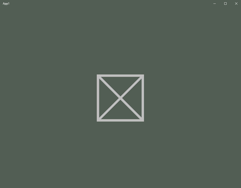
Now directly about the size of the image. All basic visual resources of the application have fixed sizes for each of the scales. The image on the screen saver in a standard scale should have a size of 620x300 pixels. If you try to use a different size, you will receive an error warning, however, looking at the screenshot above, you can see a square image of a clearly different size. In fact, it also has a size of 620x300 pixels, only a large part of it is transparent, which is not only forbidden to do, but is even recommended in many scenarios.
As the background fill of the splash screen, the system default color or specified by you in the application manifest is used.
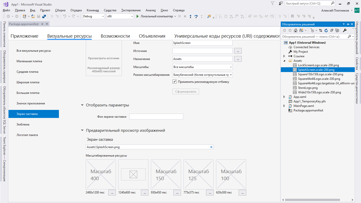
Setting the color for the background, as well as choosing your own image, is done in the manifest editor window on the "Visual Resources" tab in the "Screen Saver" subsection. As mentioned in the previous article, you can open the manifest editor by double-clicking on the Package.appxmanifest file in the object browser. This editor develops along with the UWP platform and in the latest versions of VS a tool appeared that allows you to quickly form one image, all the necessary variations of it at different scales, but I’ll talk about this tool separately in another article, and here I’ll consider only the manual setting of parameters .
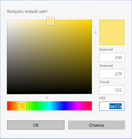
In the first field “Screen saver background” you need to specify the background color in HTML (HEX) format. You can get the color value in a suitable format in almost any image editor (including Paint 3D) or online, but do not forget about the rules for recording this color, according to which the beginning of the alphanumeric value should be a “#”. For example, my screen saver uses the value "# fae57a" as a background.
The second “Splash Screen” field prompts you to specify the storage folder and the base name for the image file. The “Assets” folder is not a mandatory location for storing images, as is the name “SplashScreen”, but the need to change them may arise unless you transfer old projects. In other cases, it is much easier to use the base values, so in my project I leave the name and path unchanged. Also note that when specifying the base name, you do not need to add an indication of the scale. Such a prefix in the name appears automatically when selected in the boxes below.
Actually, the windows below contain a preview of the installed images and the buttons for their selection for each scale. Also next to the windows there is a hint on what size the image should have for a specific scale. As you might have guessed, you can select an image of the appropriate size anywhere with any name, and it will be placed in the specified folder with the specified name and adding scale data.
After selecting the background color and image, you can launch the application and watch the result of the changes made.

So, the standard splash screen is ready and it's time to move on to creating an enhanced version. As I mentioned above, in more complex programs, instead of the standard screensaver image, a screensaver with a download status is displayed. The expanded screen saver UWP performs the same function, but it makes sense to use it only if there are lengthy tasks at the start. In my application to such tasks include: loading saves, initial miscalculation of changes, accessing the database on the network and checking purchases. On different devices, all these tasks will take different times and it would be nice if, on weaker devices, at that moment the user understood that the application was not stuck.
Despite the title “Extended splash screen”, which is fixed in the documentation, in fact we will deal with a self-created page that will simulate a splash screen with additions of load indicators and in any case will be preceded by the display of a standard screen, which we have disassembled above . As a result, the expanded screensaver should for the most part repeat the standard one and appear as smoothly as possible after the standard one.
From the point of view of design, this stage is very important and, depending on the flight of your imagination, you can create a very interesting and attractive screensaver that will greatly affect the perception of your application, so do not underestimate this step and limit yourself to trivial loading indicators like ProgressRing.
A little thought, I decided to implement the indication of loading by rotating the blades in the mill and adding a text line that displays the current loading status. Thus, as planned, the standard screen will imperceptibly turn into an expanded one, the blades will begin to rotate, and the text will appear below. However, taking the first steps in this matter, I came to the conclusion that the available materials do not cover the issue completely, and some are not used by the most successful “crutches”.
Below, I'll tell you my own recipe for creating a splash screen based on online articles and official guidelines, but still different from them.
As I mentioned above, the extended splash screen is a regular application page, which we will make as close as possible to the basic splash screen. To add a new page to the project, go to the “Project> Add New Element” menu and select the “Empty Page” element in the dialog box that appears. In the official documentation, it is recommended to use “ExtendedSplash” as the name of this page and, although we are free to choose any other name, we have no objective reasons for this. Specify the proposed name and click "Add."
The newly created page consists of two files: one for the ExtendedSplash.xaml markup and the second for the ExtendedSplash.xaml.cs / vb code. We will return to them a little later, but for now the next step.
In the official manual, this step is performed at the end, but I prefer to carry it out in advance. The fact is that it is not enough for us to simply add a country and, in order for it to appear immediately behind the system splash screen, you need to perform some manipulations in the file App.xaml.cs / vb .
As you remember from the previous article, this is the main application file that is responsible for its life cycle. In particular, it has an OnLaunched procedure, which runs immediately when the application is started and in which the start page is set.
Here is the code of this procedure immediately after creating a new project (VB.NET):
To shorten the code, commenting is removed from it.
To fully understand what is happening in this procedure, a more extensive deepening of the life cycle and application navigation will be needed, but we'll talk about this in one of the following articles. For now, all you need to understand from this code is that you first create a Frame object, which is set as the content (visual root) of the application, and then this Frame navigates to the MainPage page of the application.
And here it would be logical to assume that instead of MainPage, you need to set ExtendedSplash and we will get the desired page as the start page, but this option does not suit us, since in this case the ExtendedSplash page will be saved in the navigation history and you can return to it, we don't need that. To solve this problem, instead of navigating, we set the application’s content not as Frame, but as ExtendedSplash itself, which, although it is an Page object, can also be the visual root of the application.
Fix the code as follows:
As you have noticed, the code has undergone changes in the first condition. At the bottom of this block, a check is made to see if the application is running and, if it is not running, a new object of the ExtendedSplash page is assigned as the application content.
Also, as a parameter when declaring a new class ExtendedSplash, the SplashScreen class is given. This class is an important part of creating an advanced splash screen, as it contains data about the size and position of the image on the basic splash screen, which will help us to seamlessly replace the basic screen with our own. Well, so that this class contains the necessary data, we take it from the arguments obtained by the OnLaunched procedure from the system.
Stayed the final touch. In the file of the ExtendedSplash.xaml.cs / vb code, you need to add the New constructor, which will accept an object of the SplashScreen type:
Now when you start the application, we will see the ExtendedSplash page, not the MainPage page, which will allow us to immediately see the changes made to the page markup and more conveniently debug the code.
The first and simplest change in the layout of the ExtendedSplash page is to set the background color of the page to the same as that of the basic splash screen. The newly created page already contains the root Grid element with the Background property. By default, this property is set to a system resource, but we will replace it with a color that was previously indicated in the application manifest. In principle, the color value can be indicated on the direct Background = "# fae57a", but I store the primary colors of the application in a special file ApplicationStyle.xaml , which I mentioned at the end of the previous article. I call the resource for the background as “BackgroundBrush”, and then refer to it in the right places.
In the style resource file:
And finally, we got to the place where the main differences between my method and that described in the official manual and other articles begin.
If you have already studied the article from the official documentation, then you noticed that we use the Canvas element to position the image on the page. It is necessary so that we can set the image not only the size, but also the position, but in practice everything is not as perfect as expected.
The authors of the manual proceed from the fact that the image of the screen saver can be scaled differently in different situations. The reason may be as the scaling factor on different devices, and the size of the window on the PC. The behavior of the base image in all these situations is regulated by the system, and, so that we can imitate this behavior, we are given the above-mentioned SplashScreen class, the only property of which is ImageLocation of the Rect type. This property contains information about the size (width, height) and position of the image (X, Y), so it is quite logical that for manipulating the image on the basis of the available data, we can use the Canvas element, which works with objects precisely on the basis of such parameters.
And in fact, if you implement an advanced screen saver as it is recommended, then everything will work, but, only on a PC. If you run the application on the phone, then completely unpredictable metamorphosis begins to occur. Your image will either not display or will not display correctly. When the screen is rotated in a horizontal position, the image runs off to the edge of the screen, partially cutting off and only when returning to the vertical position, it will take the right place.
Judging by the mass of discussions in the network, as well as on the articles with recommended corrections, it can be concluded that I am not the only one who has encountered a similar problem. The most popular solution that I found recommends using different markup for different devices. Canvas for PC and Grid for mobile. Fully repeating this decision, I got a workable splash screen coupled with a persistent feeling that I was using unnecessary crutches.
In the end, I decided to independently understand what exactly is happening on the basic screen and how much I need to imitate it. As a result of a series of experiments on different devices and emulators, I realized that you can completely reject information about the position of the image. Regardless of the window size, device type or orientation, the image on the basic splash screen is always displayed in the center of the screen. Thus, we can only extract information about the size of the image, and we can easily repeat the basic screen.
My window layout at the first stage looks like this:
Before starting to analyze it, I want to turn to novice developers. If this is your first encounter with the XAML markup language, I highly recommend that you work as little as possible in a window designer (also called “Designer”). Despite his improvement with each new version of Visual Studio, it still remains not an exact tool. For example, when dragging an Image control onto a page, you might think that you aligned it in the center, but in fact, positioning can be set based on indents, rather than based on vertical and horizontal position properties. In our markup, it is extremely important to exclude any indents and other factors affecting the position of images, except for two properties: HorizontalAlignment and VerticalAlignment.
But back to the markup. In order for it to work without errors, you need to add image files to the project, which are used as sources in the Image elements. I put them in the “SplashScreens” subfolder of the “Assets” folder. To add images to the project, right-click on the desired folder and select the menu item: “Add> Existing item ...”. Three images as I need to separate the static elements from moving.
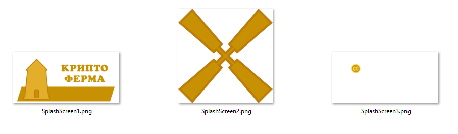
It is important to note that the first and third images are the same size as the base 620x300 pixels (for a standard scale), while the third image contains the icon in the same place where it is located on the whole image, and the rest of it is transparent. This is done in order to minimize labor costs for positioning them relative to each other. The image of the blades is cropped to the edge and has no excess areas.
All three images are placed strictly in the center of the page. In our case, the center of the Grid element, but since it is the root element of the page and has no indentation, its center is equal to the center of the page. Next, we need to set the correct order of overlay images on each other, so that the situation in which the blades will be behind the mill does not work out. For this, the Canvas.ZIndex property is used, and it does not matter at all what order the Image elements are in the markup, and only the value of this property is important. The higher the value, the element will be higher in the overlay (Z-axis).
The last element in the markup is a text block that will display the status of the download. It is located centrally relative to the horizontal plane and lower relative to the vertical. Also indicated is a small indent from the bottom, so that the text does not “stick” to the edge of the screen. Two more properties indicate the text color and style of the outline.
The resource for the text color is set as follows:
At this point, the first stage of work with markup can be considered complete, however, we will return to it when we add animation of rotation for the blades.
The most important part of the work will be carried out in the code of the page, which is in the file ExtendedSplash.xaml.cs / vb .
The first step is to import the Windows.UI.Core namespace and add the variables that we need later in the code:
The code begins with a subscription to the root container resizing event. This will be needed to make changes to the image size when the window size or device orientation changes. Next, the SplashScreen class passed in the argument is transferred to the local variable, which we will contact to obtain information about the required image size.
After checking the local variable splash, which should not be empty, proceed to further manipulations. You can now subscribe to the Dismissed event, which occurs when the system splash screen closes. This point is important for understanding the general principle of the splash screen. In fact, while the code is being executed inside the New procedure, the page is still initializing and it is not ready to be displayed, therefore the basic splash screen “secures” the application showing that it is running and the necessary page will now appear. In many ways, this is precisely why an expanded splash screen is needed so that lengthy initialization processes are accompanied by live visualization, and not a static patch.
The next line of code saves the current scaling factor for the correct interpretation of the dimensions, and the dimensions themselves are further code stored in the splashImageRect variable. And at the end of the last line calls the procedure, where we operate with all the data obtained.
Of course, after adding this code, we will receive three error messages, since we have no procedures to which the above events are attached, and there is no SetSizeImage procedure.
Add them:
This code in turn sets the size for each image placed on the page. In the case of the first and third images, it is enough for us to set the width and height of the image to be equal to what we have withdrawn from the SplashScreen class, adjusted for the scaling factor. Please note that the last line of the ScaleFactor variable is assigned one, and when you call this procedure again, the correction for the scaling factor will not actually occur. This is due to the same problem for which the solution from the official manual does not work on mobiles. For some reason, the SplashScreen class, when first launched, reports the size of the image, taking into account the scaling factor, and with further manipulations, such as turning the device, without it. That is why during initialization this coefficient is saved for the first manipulation and is reset to one for further.
It is absolutely possible that in one of the further builds of Windows 10 this oddity will be eliminated, and we will need to change this code, but for now it works fine on all the released builds up to Fall Creators Update.
Separate consideration is worth setting the size for the second image. More precisely, in the case of him, we do not limit ourselves only to setting the size, but we also set the position, because initially the blades are in the middle, and not in the area of the mill.
By the way, it’s enough to set the size only for one of the sides, for example, for the width, since the image is square and will proportionally change the height to the same size. When setting a size other than an amendment to the scaling factor, we also adjust the size based on the main image. More precisely, we take as the basis the width of the image and calculate what proportion of this size the blades occupy. In my case, this is 0.3073.
Further, based on the same logic, we calculate the distance from the center to the desired point, taking the width of the entire image as a basis. The next line sets the indentation left and up to the calculated distance.
We start the application and see that at this stage, the result is not visually different from the basic splash screen. Now we run the application on the mobile and see a slight shift of our image relative to the base one. It is caused by the fact that the base screen is positioning itself in the middle of the screen completely ignoring such interface elements as the status bar at the top of the phone or the lower virtual button panel, which is present on some models. Let's make the required changes to the code.
First, prepare a variable to store the height of the status bar:
This code is interesting at once with two points. First, here we first come across the adaptive code that I mentioned in the previous article. The essence of the condition is that we check the availability of the required class on the end device and, if it exists, the code inside the condition will be executed without errors.
Despite the adaptive code, accessing the StatusBar will not lead to success, and we will receive a message about the absence of such a class. This is due to the fact that UWP applications initially have only common code that is able to run on all supported devices without any manipulations. Links to platform-specific classes are added separately. The status bar is inherent only to mobile devices, so first you need to add a link to the desired class library. Go to the menu "Project> Add link ...". We find on the left the “Universal Windows” section and the “Extensions” subsection. In the list of libraries we find the library "Windows Mobile Extensions for the UWP" and select the version equal to the minimum version of our application.
Now the code above works without errors. More precisely, it will work only on the mobile, and on all other devices will be ignored.
Finally, we will correct the code for positioning and setting image sizes:
The added code shifts each image up by a size equal to the height of the status bar and now when you run the application on any device, our image is in the same place as the base one. Unfortunately, this decision is still not complete. Some phone models do not have hardware buttons, and instead the phone control buttons are located on the virtual panel of the phone itself, which leads to the same effect of displacement and, as I did not search, I could not find information on where to get the height of this panel, and, in general, to receive information about its presence or absence, in order to make the necessary changes. If you have this information, be sure to share it in the comments.
Now that all the necessary adjustments have been made, it remains to add a response to changes in the window size or orientation of the device:
It's all very simple. , SplashScreen , , , SetSizeImage.
. , . , - , DismissedEventHandler. , . :
DismissExtendedSplash , . , Async Await, . : Await , , . Await / /, Async.
DismissExtendedSplash, :
. , , . . , 15 . , 15 , .
, Frame, . , .
: , 15 .
, , «». .
XAML :
. -, 0 . , .
-, Storyboard, Double. Double . . , .
, . New :
, , .

.
, , , .
- Part 1: Where to start
- Part 2: Advanced Splash Screen
- Part 3: The style of the mother's son's girlfriend
- Part 4: Receiving user data (voluntary)
- Part 5: Where do you keep the data?
I give the word to the author.
')
Objectively speaking, the topic of the extended splash screen was worth considering closer to the end of this cycle. This is not only not the most important part of the application, but, in principle, not mandatory. However, since the cycle is written in parallel with the development of the project, this makes some adjustments to the order of writing articles. I have an extended splash screen ready, and in the course of the cycle there will be situations where I will be sent to it, so I decided to talk about it first.
We start small - what is a splash screen and why should it be expanded? You have definitely come across application screensavers long before the advent of UWP. We will not go far. When you start Visual Studio, you enter a rectangular image with the appropriate caption.
Each program needs a little time to initialize and load the interface, and at this time the user understands that something is happening, the splash screen image is shown. In programs where the startup process is more complicated and the time is longer, an extended screen saver is used. On these we often see text or status bar showing the download status of the application.
Now let's see how this works in UWP. The main difference lies in the features of the platform. Since it is universal, the concept of “window” is not a priority here, and the concept of “screen” comes to the fore. The container in which the screen is displayed depends on the device and the window is only on the PC.
The first thing that a user sees when launching your application is a splash screen consisting of a PNG image and a background fill. If you have just created your application and have not changed anything, the splash screen will be painted in the main color of the system, and in the center there will be a basic “stub” picture, which is automatically created along with the application. Standardly this picture is located in the Assets folder and is called SplashScreen.png. Also in the file name there may be something like “scale-200”. This is part of the scaling system, which I will talk about separately in one of the articles in the series, and now I’ll touch only on general features.
Since your application can run on a variety of devices, you have the opportunity to create several variants of images with different sizes, so that at different screen resolutions it does not lose in quality from stretching or compressing. The standard name of any image in the project consists of two parts - the name and extension. Such an image will be perceived as an image with a scale of 100%. If you add “.scale-xxx” between the name and the extension, where xxx is the scaling factor, it will be considered as the default for screens with such a scale, and stretched or shrunk for others (if there are no versions for them with their scale). For example, for a scale of 200%, the name of the splash screen image would be “SplashScreen.scale-200.png”. Hereinafter, I will only consider images at a scale of 100%, so as not to duplicate the topic planned for future articles.
Now directly about the size of the image. All basic visual resources of the application have fixed sizes for each of the scales. The image on the screen saver in a standard scale should have a size of 620x300 pixels. If you try to use a different size, you will receive an error warning, however, looking at the screenshot above, you can see a square image of a clearly different size. In fact, it also has a size of 620x300 pixels, only a large part of it is transparent, which is not only forbidden to do, but is even recommended in many scenarios.
As the background fill of the splash screen, the system default color or specified by you in the application manifest is used.
Setting the color for the background, as well as choosing your own image, is done in the manifest editor window on the "Visual Resources" tab in the "Screen Saver" subsection. As mentioned in the previous article, you can open the manifest editor by double-clicking on the Package.appxmanifest file in the object browser. This editor develops along with the UWP platform and in the latest versions of VS a tool appeared that allows you to quickly form one image, all the necessary variations of it at different scales, but I’ll talk about this tool separately in another article, and here I’ll consider only the manual setting of parameters .
In the first field “Screen saver background” you need to specify the background color in HTML (HEX) format. You can get the color value in a suitable format in almost any image editor (including Paint 3D) or online, but do not forget about the rules for recording this color, according to which the beginning of the alphanumeric value should be a “#”. For example, my screen saver uses the value "# fae57a" as a background.
The second “Splash Screen” field prompts you to specify the storage folder and the base name for the image file. The “Assets” folder is not a mandatory location for storing images, as is the name “SplashScreen”, but the need to change them may arise unless you transfer old projects. In other cases, it is much easier to use the base values, so in my project I leave the name and path unchanged. Also note that when specifying the base name, you do not need to add an indication of the scale. Such a prefix in the name appears automatically when selected in the boxes below.
Actually, the windows below contain a preview of the installed images and the buttons for their selection for each scale. Also next to the windows there is a hint on what size the image should have for a specific scale. As you might have guessed, you can select an image of the appropriate size anywhere with any name, and it will be placed in the specified folder with the specified name and adding scale data.
After selecting the background color and image, you can launch the application and watch the result of the changes made.
So, the standard splash screen is ready and it's time to move on to creating an enhanced version. As I mentioned above, in more complex programs, instead of the standard screensaver image, a screensaver with a download status is displayed. The expanded screen saver UWP performs the same function, but it makes sense to use it only if there are lengthy tasks at the start. In my application to such tasks include: loading saves, initial miscalculation of changes, accessing the database on the network and checking purchases. On different devices, all these tasks will take different times and it would be nice if, on weaker devices, at that moment the user understood that the application was not stuck.
Despite the title “Extended splash screen”, which is fixed in the documentation, in fact we will deal with a self-created page that will simulate a splash screen with additions of load indicators and in any case will be preceded by the display of a standard screen, which we have disassembled above . As a result, the expanded screensaver should for the most part repeat the standard one and appear as smoothly as possible after the standard one.
From the point of view of design, this stage is very important and, depending on the flight of your imagination, you can create a very interesting and attractive screensaver that will greatly affect the perception of your application, so do not underestimate this step and limit yourself to trivial loading indicators like ProgressRing.
A little thought, I decided to implement the indication of loading by rotating the blades in the mill and adding a text line that displays the current loading status. Thus, as planned, the standard screen will imperceptibly turn into an expanded one, the blades will begin to rotate, and the text will appear below. However, taking the first steps in this matter, I came to the conclusion that the available materials do not cover the issue completely, and some are not used by the most successful “crutches”.
Below, I'll tell you my own recipe for creating a splash screen based on online articles and official guidelines, but still different from them.
Step 1. Create a blank page
As I mentioned above, the extended splash screen is a regular application page, which we will make as close as possible to the basic splash screen. To add a new page to the project, go to the “Project> Add New Element” menu and select the “Empty Page” element in the dialog box that appears. In the official documentation, it is recommended to use “ExtendedSplash” as the name of this page and, although we are free to choose any other name, we have no objective reasons for this. Specify the proposed name and click "Add."
The newly created page consists of two files: one for the ExtendedSplash.xaml markup and the second for the ExtendedSplash.xaml.cs / vb code. We will return to them a little later, but for now the next step.
Step 2. Assignment of the ExtendedSplash as a start
In the official manual, this step is performed at the end, but I prefer to carry it out in advance. The fact is that it is not enough for us to simply add a country and, in order for it to appear immediately behind the system splash screen, you need to perform some manipulations in the file App.xaml.cs / vb .
As you remember from the previous article, this is the main application file that is responsible for its life cycle. In particular, it has an OnLaunched procedure, which runs immediately when the application is started and in which the start page is set.
Here is the code of this procedure immediately after creating a new project (VB.NET):
Protected Overrides Sub OnLaunched(e As Windows.ApplicationModel.Activation.LaunchActivatedEventArgs) Dim rootFrame As Frame = TryCast(Window.Current.Content, Frame) If rootFrame Is Nothing Then rootFrame = New Frame() AddHandler rootFrame.NavigationFailed, AddressOf OnNavigationFailed If e.PreviousExecutionState = ApplicationExecutionState.Terminated Then End If Window.Current.Content = rootFrame End If If e.PrelaunchActivated = False Then If rootFrame.Content Is Nothing Then rootFrame.Navigate(GetType(MainPage), e.Arguments) End If Window.Current.Activate() End If End Sub To shorten the code, commenting is removed from it.
To fully understand what is happening in this procedure, a more extensive deepening of the life cycle and application navigation will be needed, but we'll talk about this in one of the following articles. For now, all you need to understand from this code is that you first create a Frame object, which is set as the content (visual root) of the application, and then this Frame navigates to the MainPage page of the application.
And here it would be logical to assume that instead of MainPage, you need to set ExtendedSplash and we will get the desired page as the start page, but this option does not suit us, since in this case the ExtendedSplash page will be saved in the navigation history and you can return to it, we don't need that. To solve this problem, instead of navigating, we set the application’s content not as Frame, but as ExtendedSplash itself, which, although it is an Page object, can also be the visual root of the application.
Fix the code as follows:
Protected Overrides Sub OnLaunched(e As Windows.ApplicationModel.Activation.LaunchActivatedEventArgs) Dim rootFrame As Frame = TryCast(Window.Current.Content, Frame) If rootFrame Is Nothing Then rootFrame = New Frame() AddHandler rootFrame.NavigationFailed, AddressOf OnNavigationFailed If (e.PreviousExecutionState <> ApplicationExecutionState.Running) Then Window.Current.Content = New ExtendedSplash(e.SplashScreen) End If End If If e.PrelaunchActivated = False Then If rootFrame.Content Is Nothing Then rootFrame.Navigate(GetType(MainPage), e.Arguments) End If Window.Current.Activate() End If End Sub As you have noticed, the code has undergone changes in the first condition. At the bottom of this block, a check is made to see if the application is running and, if it is not running, a new object of the ExtendedSplash page is assigned as the application content.
Also, as a parameter when declaring a new class ExtendedSplash, the SplashScreen class is given. This class is an important part of creating an advanced splash screen, as it contains data about the size and position of the image on the basic splash screen, which will help us to seamlessly replace the basic screen with our own. Well, so that this class contains the necessary data, we take it from the arguments obtained by the OnLaunched procedure from the system.
Stayed the final touch. In the file of the ExtendedSplash.xaml.cs / vb code, you need to add the New constructor, which will accept an object of the SplashScreen type:
Public Sub New(splashscreen As SplashScreen) InitializeComponent() End Sub Now when you start the application, we will see the ExtendedSplash page, not the MainPage page, which will allow us to immediately see the changes made to the page markup and more conveniently debug the code.
Step 3: Page Layout
The first and simplest change in the layout of the ExtendedSplash page is to set the background color of the page to the same as that of the basic splash screen. The newly created page already contains the root Grid element with the Background property. By default, this property is set to a system resource, but we will replace it with a color that was previously indicated in the application manifest. In principle, the color value can be indicated on the direct Background = "# fae57a", but I store the primary colors of the application in a special file ApplicationStyle.xaml , which I mentioned at the end of the previous article. I call the resource for the background as “BackgroundBrush”, and then refer to it in the right places.
In the style resource file:
<SolidColorBrush x:Key="BackgroundBrush" Color="#fae57a"/> ExtendedSplash.xaml: <Grid Background="{StaticResource BackgroundBrush}"… And finally, we got to the place where the main differences between my method and that described in the official manual and other articles begin.
If you have already studied the article from the official documentation, then you noticed that we use the Canvas element to position the image on the page. It is necessary so that we can set the image not only the size, but also the position, but in practice everything is not as perfect as expected.
The authors of the manual proceed from the fact that the image of the screen saver can be scaled differently in different situations. The reason may be as the scaling factor on different devices, and the size of the window on the PC. The behavior of the base image in all these situations is regulated by the system, and, so that we can imitate this behavior, we are given the above-mentioned SplashScreen class, the only property of which is ImageLocation of the Rect type. This property contains information about the size (width, height) and position of the image (X, Y), so it is quite logical that for manipulating the image on the basis of the available data, we can use the Canvas element, which works with objects precisely on the basis of such parameters.
And in fact, if you implement an advanced screen saver as it is recommended, then everything will work, but, only on a PC. If you run the application on the phone, then completely unpredictable metamorphosis begins to occur. Your image will either not display or will not display correctly. When the screen is rotated in a horizontal position, the image runs off to the edge of the screen, partially cutting off and only when returning to the vertical position, it will take the right place.
Judging by the mass of discussions in the network, as well as on the articles with recommended corrections, it can be concluded that I am not the only one who has encountered a similar problem. The most popular solution that I found recommends using different markup for different devices. Canvas for PC and Grid for mobile. Fully repeating this decision, I got a workable splash screen coupled with a persistent feeling that I was using unnecessary crutches.
In the end, I decided to independently understand what exactly is happening on the basic screen and how much I need to imitate it. As a result of a series of experiments on different devices and emulators, I realized that you can completely reject information about the position of the image. Regardless of the window size, device type or orientation, the image on the basic splash screen is always displayed in the center of the screen. Thus, we can only extract information about the size of the image, and we can easily repeat the basic screen.
My window layout at the first stage looks like this:
<Grid Background="{StaticResource BackgroundBrush}"> <Image x:Name="SplashScreenImage3" Source="Assets/SplashScreens/SplashScreen3.png" Canvas.ZIndex="3" HorizontalAlignment="Center" VerticalAlignment="Center"/> <Image x:Name="SplashScreenImage2" Source="Assets/SplashScreens/SplashScreen2.png" Canvas.ZIndex="2" HorizontalAlignment="Center" VerticalAlignment="Center"/> <Image x:Name="SplashScreenImage1" Source="Assets/SplashScreens/SplashScreen1.png" HorizontalAlignment="Center" VerticalAlignment="Center"/> <TextBlock x:Name="LoadingSatatusTextBox" HorizontalAlignment="Center" VerticalAlignment="Bottom" Margin="0,0,0,20" TextAlignment="Center" Foreground="{StaticResource ForegroundBrush}" FontWeight="Bold"/> </Grid> Before starting to analyze it, I want to turn to novice developers. If this is your first encounter with the XAML markup language, I highly recommend that you work as little as possible in a window designer (also called “Designer”). Despite his improvement with each new version of Visual Studio, it still remains not an exact tool. For example, when dragging an Image control onto a page, you might think that you aligned it in the center, but in fact, positioning can be set based on indents, rather than based on vertical and horizontal position properties. In our markup, it is extremely important to exclude any indents and other factors affecting the position of images, except for two properties: HorizontalAlignment and VerticalAlignment.
But back to the markup. In order for it to work without errors, you need to add image files to the project, which are used as sources in the Image elements. I put them in the “SplashScreens” subfolder of the “Assets” folder. To add images to the project, right-click on the desired folder and select the menu item: “Add> Existing item ...”. Three images as I need to separate the static elements from moving.
It is important to note that the first and third images are the same size as the base 620x300 pixels (for a standard scale), while the third image contains the icon in the same place where it is located on the whole image, and the rest of it is transparent. This is done in order to minimize labor costs for positioning them relative to each other. The image of the blades is cropped to the edge and has no excess areas.
All three images are placed strictly in the center of the page. In our case, the center of the Grid element, but since it is the root element of the page and has no indentation, its center is equal to the center of the page. Next, we need to set the correct order of overlay images on each other, so that the situation in which the blades will be behind the mill does not work out. For this, the Canvas.ZIndex property is used, and it does not matter at all what order the Image elements are in the markup, and only the value of this property is important. The higher the value, the element will be higher in the overlay (Z-axis).
The last element in the markup is a text block that will display the status of the download. It is located centrally relative to the horizontal plane and lower relative to the vertical. Also indicated is a small indent from the bottom, so that the text does not “stick” to the edge of the screen. Two more properties indicate the text color and style of the outline.
The resource for the text color is set as follows:
<SolidColorBrush x:Key="ForegroundBrush" Color="#c89103"/> At this point, the first stage of work with markup can be considered complete, however, we will return to it when we add animation of rotation for the blades.
Step 4. Page code
The most important part of the work will be carried out in the code of the page, which is in the file ExtendedSplash.xaml.cs / vb .
The first step is to import the Windows.UI.Core namespace and add the variables that we need later in the code:
Imports Windows.UI.Core Public NotInheritable Class ExtendedSplash Inherits Page Friend splashImageRect As Rect Private splash As SplashScreen Friend ScaleFactor As Double Public Sub New(splashscreen As SplashScreen) InitializeComponent() End Sub End Class : Public Sub New(splashscreen As SplashScreen) InitializeComponent() AddHandler Window.Current.SizeChanged, AddressOf ExtendedSplash_OnResize splash = splashscreen If splash IsNot Nothing Then AddHandler splash.Dismissed, AddressOf DismissedEventHandler ScaleFactor = DisplayInformation.GetForCurrentView().RawPixelsPerViewPixel splashImageRect = splash.ImageLocation SetSizeImage() End If End Sub The code begins with a subscription to the root container resizing event. This will be needed to make changes to the image size when the window size or device orientation changes. Next, the SplashScreen class passed in the argument is transferred to the local variable, which we will contact to obtain information about the required image size.
After checking the local variable splash, which should not be empty, proceed to further manipulations. You can now subscribe to the Dismissed event, which occurs when the system splash screen closes. This point is important for understanding the general principle of the splash screen. In fact, while the code is being executed inside the New procedure, the page is still initializing and it is not ready to be displayed, therefore the basic splash screen “secures” the application showing that it is running and the necessary page will now appear. In many ways, this is precisely why an expanded splash screen is needed so that lengthy initialization processes are accompanied by live visualization, and not a static patch.
The next line of code saves the current scaling factor for the correct interpretation of the dimensions, and the dimensions themselves are further code stored in the splashImageRect variable. And at the end of the last line calls the procedure, where we operate with all the data obtained.
Of course, after adding this code, we will receive three error messages, since we have no procedures to which the above events are attached, and there is no SetSizeImage procedure.
Add them:
Private Sub SetSizeImage() End Sub Private Sub DismissedEventHandler(sender As SplashScreen, args As Object) End Sub Private Sub ExtendedSplash_OnResize(sender As Object, e As WindowSizeChangedEventArgs) End Sub SetSizeImage: Private Sub SetSizeImage() SplashScreenImage1.Height = splashImageRect.Height / ScaleFactor SplashScreenImage1.Width = splashImageRect.Width / ScaleFactor SplashScreenImage2.Width = splashImageRect.Width / ScaleFactor * 0.3073 SplashScreenImage2.Margin = New Thickness(-splashImageRect.Width / ScaleFactor * 0.547, -splashImageRect.Width / ScaleFactor * 0.1633, 0, 0) SplashScreenImage3.Height = splashImageRect.Height / ScaleFactor SplashScreenImage3.Width = splashImageRect.Width / ScaleFactor ScaleFactor = 1 End Sub This code in turn sets the size for each image placed on the page. In the case of the first and third images, it is enough for us to set the width and height of the image to be equal to what we have withdrawn from the SplashScreen class, adjusted for the scaling factor. Please note that the last line of the ScaleFactor variable is assigned one, and when you call this procedure again, the correction for the scaling factor will not actually occur. This is due to the same problem for which the solution from the official manual does not work on mobiles. For some reason, the SplashScreen class, when first launched, reports the size of the image, taking into account the scaling factor, and with further manipulations, such as turning the device, without it. That is why during initialization this coefficient is saved for the first manipulation and is reset to one for further.
It is absolutely possible that in one of the further builds of Windows 10 this oddity will be eliminated, and we will need to change this code, but for now it works fine on all the released builds up to Fall Creators Update.
Separate consideration is worth setting the size for the second image. More precisely, in the case of him, we do not limit ourselves only to setting the size, but we also set the position, because initially the blades are in the middle, and not in the area of the mill.
By the way, it’s enough to set the size only for one of the sides, for example, for the width, since the image is square and will proportionally change the height to the same size. When setting a size other than an amendment to the scaling factor, we also adjust the size based on the main image. More precisely, we take as the basis the width of the image and calculate what proportion of this size the blades occupy. In my case, this is 0.3073.
Further, based on the same logic, we calculate the distance from the center to the desired point, taking the width of the entire image as a basis. The next line sets the indentation left and up to the calculated distance.
We start the application and see that at this stage, the result is not visually different from the basic splash screen. Now we run the application on the mobile and see a slight shift of our image relative to the base one. It is caused by the fact that the base screen is positioning itself in the middle of the screen completely ignoring such interface elements as the status bar at the top of the phone or the lower virtual button panel, which is present on some models. Let's make the required changes to the code.
First, prepare a variable to store the height of the status bar:
Friend statusBarRect As Rect : If Metadata.ApiInformation.IsTypePresent("Windows.UI.ViewManagement.StatusBar") Then statusBarRect = StatusBar.GetForCurrentView.OccludedRect End If This code is interesting at once with two points. First, here we first come across the adaptive code that I mentioned in the previous article. The essence of the condition is that we check the availability of the required class on the end device and, if it exists, the code inside the condition will be executed without errors.
Despite the adaptive code, accessing the StatusBar will not lead to success, and we will receive a message about the absence of such a class. This is due to the fact that UWP applications initially have only common code that is able to run on all supported devices without any manipulations. Links to platform-specific classes are added separately. The status bar is inherent only to mobile devices, so first you need to add a link to the desired class library. Go to the menu "Project> Add link ...". We find on the left the “Universal Windows” section and the “Extensions” subsection. In the list of libraries we find the library "Windows Mobile Extensions for the UWP" and select the version equal to the minimum version of our application.
Now the code above works without errors. More precisely, it will work only on the mobile, and on all other devices will be ignored.
Finally, we will correct the code for positioning and setting image sizes:
Private Sub SetSizeImage() SplashScreenImage1.Height = splashImageRect.Height / ScaleFactor SplashScreenImage1.Width = splashImageRect.Width / ScaleFactor SplashScreenImage1.Margin = New Thickness(0, -statusBarRect.Height, 0, 0) SplashScreenImage2.Width = splashImageRect.Width / ScaleFactor * 0.3073 SplashScreenImage2.Margin = New Thickness(-splashImageRect.Width / ScaleFactor * 0.547, -splashImageRect.Width / ScaleFactor * 0.1633 - statusBarRect.Height, 0, 0) SplashScreenImage3.Height = splashImageRect.Height / ScaleFactor SplashScreenImage3.Width = splashImageRect.Width / ScaleFactor SplashScreenImage3.Margin = New Thickness(0, -statusBarRect.Height, 0, 0) ScaleFactor = 1 End Sub The added code shifts each image up by a size equal to the height of the status bar and now when you run the application on any device, our image is in the same place as the base one. Unfortunately, this decision is still not complete. Some phone models do not have hardware buttons, and instead the phone control buttons are located on the virtual panel of the phone itself, which leads to the same effect of displacement and, as I did not search, I could not find information on where to get the height of this panel, and, in general, to receive information about its presence or absence, in order to make the necessary changes. If you have this information, be sure to share it in the comments.
Now that all the necessary adjustments have been made, it remains to add a response to changes in the window size or orientation of the device:
Private Sub ExtendedSplash_OnResize(sender As Object, e As WindowSizeChangedEventArgs) If splash IsNot Nothing Then splashImageRect = splash.ImageLocation SetSizeImage() End If End Sub It's all very simple. , SplashScreen , , , SetSizeImage.
. , . , - , DismissedEventHandler. , . :
Private Async Sub DismissedEventHandler(sender As SplashScreen, args As Object) Await Dispatcher.RunAsync(CoreDispatcherPriority.Normal, New DispatchedHandler(AddressOf DismissExtendedSplash)) End Sub DismissExtendedSplash , . , Async Await, . : Await , , . Await / /, Async.
DismissExtendedSplash, :
Private Async Sub DismissExtendedSplash() LoadingSatatusTextBox.Text = " ..." Await Task.Delay(New TimeSpan(0, 0, 15)) Dim rootFrame As New Frame rootFrame.Navigate(GetType(MainPage)) Window.Current.Content = rootFrame End Sub . , , . . , 15 . , 15 , .
, Frame, . , .
: , 15 .
5.
, , «». .
XAML :
<Grid Background="{StaticResource BackgroundBrush}"> <Grid.Resources> <Storyboard x:Name="ImageRotateAnimation"> <DoubleAnimation Storyboard.TargetName="ImageRotate" Storyboard.TargetProperty="Angle" To="360" BeginTime="0:0:0.5" Duration="0:0:5" RepeatBehavior="Forever"/> </Storyboard> </Grid.Resources> <Image x:Name="SplashScreenImage3" Source="Assets/SplashScreens/SplashScreen3.png" Canvas.ZIndex="3" HorizontalAlignment="Center" VerticalAlignment="Center"/> <Image x:Name="SplashScreenImage2" Source="Assets/SplashScreens/SplashScreen2.png" Canvas.ZIndex="2" HorizontalAlignment="Center" VerticalAlignment="Center" RenderTransformOrigin="0.5 0.5"> <Image.RenderTransform> <RotateTransform x:Name="ImageRotate" Angle="0"/> </Image.RenderTransform> </Image> <Image x:Name="SplashScreenImage1" Source="Assets/SplashScreens/SplashScreen1.png" HorizontalAlignment="Center" VerticalAlignment="Center"/> <TextBlock x:Name="LoadingSatatusTextBox" HorizontalAlignment="Center" VerticalAlignment="Bottom" Margin="0,0,0,20" TextAlignment="Center" Foreground="{StaticResource ForegroundBrush}" FontWeight="Bold"/> </Grid> . -, 0 . , .
-, Storyboard, Double. Double . . , .
, . New :
ImageRotateAnimation.Begin, , .
.
, , , .
Source: https://habr.com/ru/post/351972/
All Articles