The scientific approach to the choice of illustrations for the post on Habré
The choice of illustrations for the article - the care of the author. Well, or the one who publishes it. Chose the wrong picture - got less attention and views. The icy headline can increase their number, but you can not fool the readers. They will read the article and dissolve the karma of the author in the nano-dust. Not once saw the discrepancy between the title and the content to which it led. I looked through all the publications with illustrations in one day and this is what I found.
Posts without images attract less attention. Posts with a funny picture provoke a look under the cat. Posts with a bored picture from photostock are boring and reduce views. If we had the opportunity to publish the same posts with different pictures without consequences for karma, we would sometimes see an inexplicable correlation of image proximity to the main topic of the post and the number of views. Of course, there are other factors like heading or text before kata, but the effect of the picture is no less great.
In order to somehow understand the proximity of the image, the topic of the article will try to determine 4 degrees of proximity, as advised in one of the mailings by editor.
The first degree of closeness is the literal meaning of the article. If you write about the hackathon among the employees of your company, it should be a photo from the event. As it should be: with pizza, pivasik and red eyes of the participants. Such a picture is more likely to be remembered and your article can become viral only thanks to a good photo. You can imagine a sleepless night and the smell of a cold pizza with an exhausted beer.

')
The second degree of closeness is something indirectly related to the topic of the article, depicting a detail from the text. For a hackathon, it can be any photo with a lot of people at tables with laptops. Also a bunch of people, but the competition is not clear or not. Beer and pizza are optional. If it is impossible to make a real photo, for such an illustration the main goal is to convey the essence of the action.
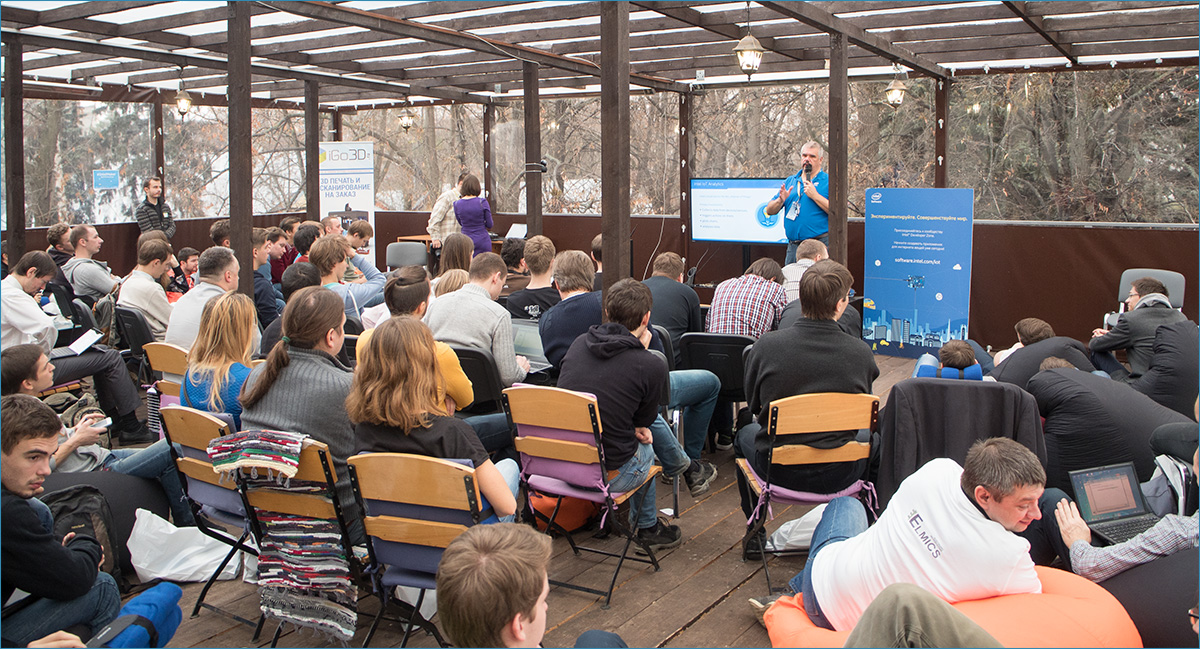
The third degree of closeness is the metaphorical designation of the topic. In the case of the hackathon, you can show any programmer in front of a computer with arbitrary code. It is not always possible to illustrate the topic with a photo. If the article is about programming approaches, career lifehacks or abstract success, the author risks putting out a vulgar and boring stock photo. It is better to make an effort and find something fresh or completely funny.

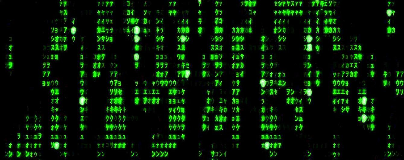
The fourth degree of proximity is a distant reminder of the hackathon. Even green tsiferki from a matrix or the conditional image of a code will suit. Use illustrations of the fourth degree fufufu. Try not to go to this stage - you will ingest karmic dust on the outskirts of Habr.
There are articles in which the illustration has almost no connection with the title or content. Such pictures can be considered with a degree of proximity 4 plus. And in the analysis of publications such too.
Now we come to the most interesting - the classification of the title illustrations to the articles. I will not evaluate articles without a picture before kat, it is obvious that the author decided not to use the illustration to attract attention and there is nothing to look at. The purpose of this text is to show which illustrations are better suited to publications. All the authors of the disassembled posts are great lads, I do not want to offend anyone (if suddenly it seemed to someone). My choice fell on March 7 and the first 15 publications for that day. Let's start.
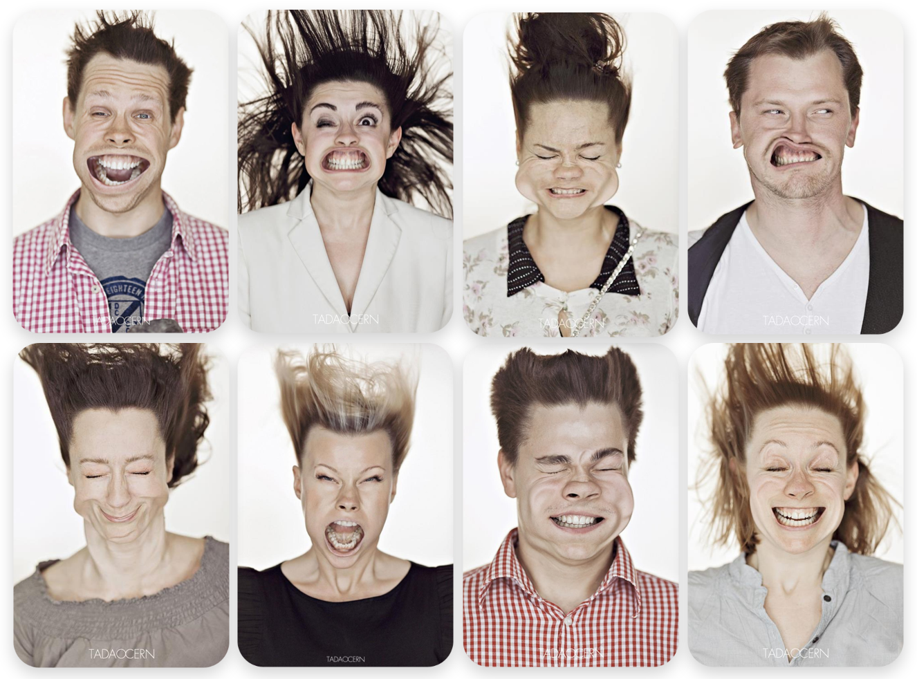
Face recognition technology can not be shown, so the illustration of 1 degree of proximity is impossible. Something indirectly related to technology is also not shown, because technology is intangible. This is a good original illustration of 3 degrees of closeness, which is not on photostocks. "Classmates" attracted attention and revealed the possibilities of technology.
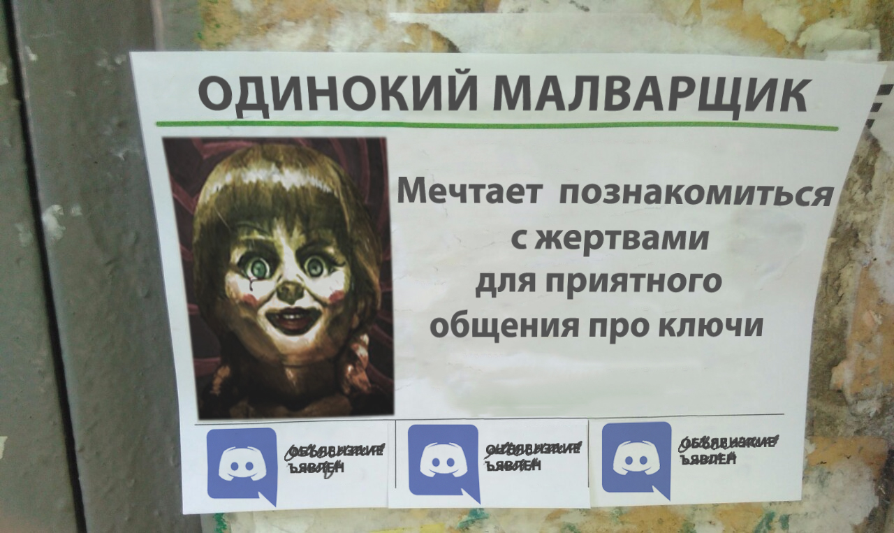
Kaspersky Lab has also prepared an illustration specifically for publication. The picture shows a doll by Annabelle (named for malware) who wants to get to know his victim. Strong illustration of 3 degrees of closeness.

This article is a translation, but there was no such picture in the original. Judging by the English names of the elements of the SaaS model, the author from Alconost collected an image from the stock components. Illustration of 3 degrees of closeness.
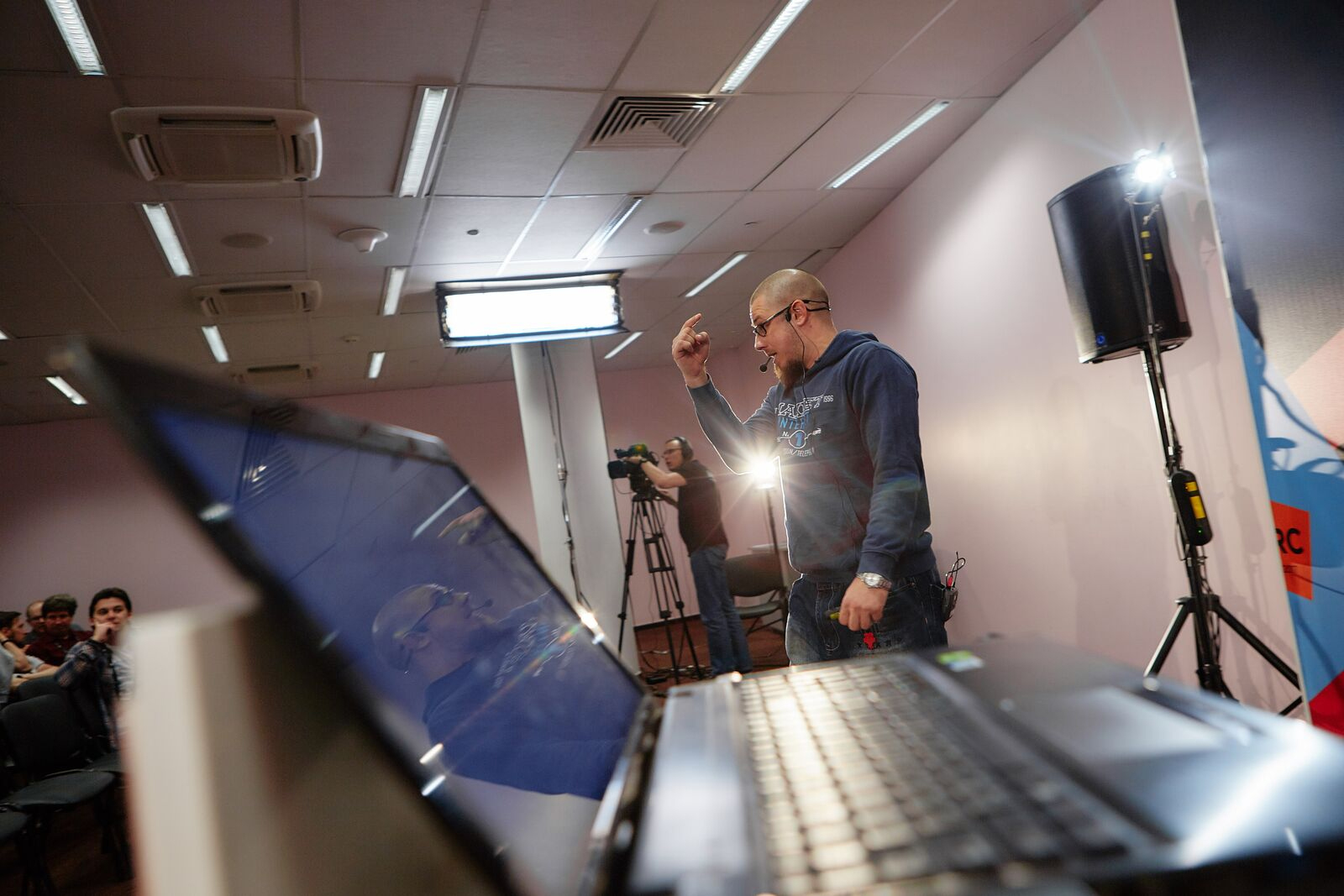
An article based on the speech of Lev Nikolayev. The photo shows his performance and he himself. Illustration of 1 degree of closeness is the best choice.

For its publication, Jet Infosystems used stock photography from Shutterstock. The article discusses security loopholes and this gate in the image is supposed to illustrate a loophole. A very distant association, this is 4 degree of closeness.
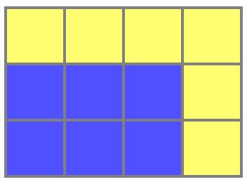
The author has prepared an illustration on his own and shows exactly what he is talking about (about mathematical techniques with squares). Illustration of 1 degree of closeness.

The company “Everyday Tools” has prepared a translation of the article. In the original, exactly the same image is used. A rather weak illustration of 4 degrees of closeness. In place of the MacBook it was worth putting the photo of the author.

Epam has supplied the publication with a gif. The article talks about how they recruit people with the specialty Data Science. The meaning of the gif, apparently, in the special magic of working with data. There is no magic here, so the choice is rather strange. Degree of proximity 4 plus.

The article is devoted to game development and possibilities of reproducing bugs. In the illustration, something resembling a time machine from the movie “Back to the Future” with captions to get closer to the topic. If you evaluate only the illustration - it is 4 degrees of proximity.

The company "RUVDS" used stock photography. The article is about the illogicality of CSS. The photo, though funny, but erased. 4 degree of closeness.

This is an article-translation and exactly the same picture is used in the original. Apparently, the authors wanted to show everyone that this is a winter release and you had to choose at least some picture. Degree of proximity 4 plus.
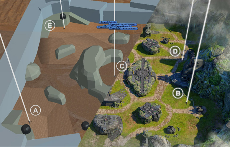
The Pixonic company writes in an article about developing maps inside games. In the illustration, the result of their work and, therefore, illustration of 1 degree of closeness.
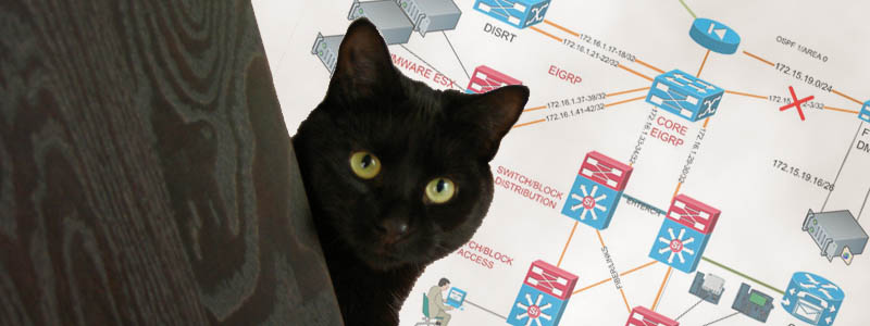
The title of the article reveals the content. In the illustration, there is a network diagram (I will not speak about the cat), which is not directly related to the detection of network devices. Illustration of 3 degrees of closeness.
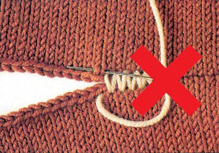
The company "FunCorp" talks about creating transition animation with the effect of "seamlessness". Image 4 degrees of closeness.
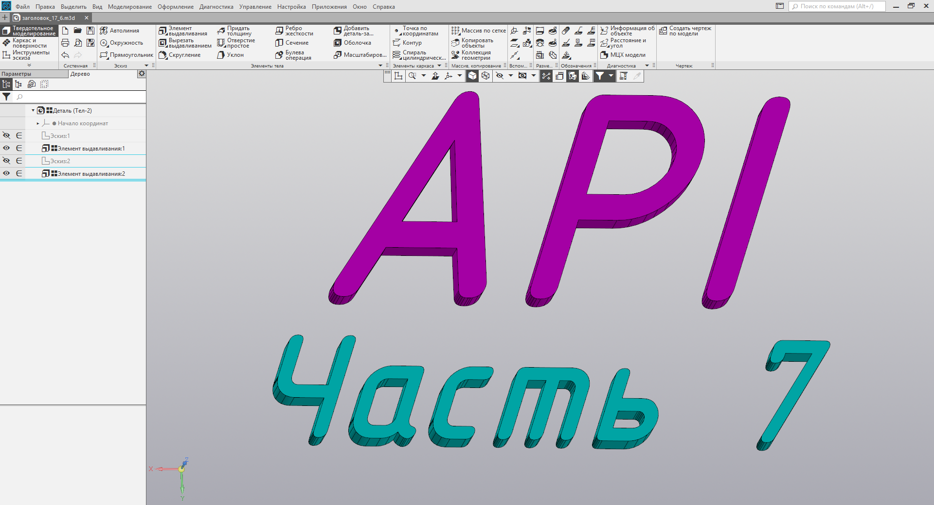
The company Ascon talks about the possibilities of setting up a software product. The picture is directly interface settings, so this is an illustration of 1 degree of closeness.
Use photos wherever possible. If not, look for a suitable metaphor that will be remembered by the reader.
It will be cool if you tell in the comments how to choose a picture for the post. Maybe someone has a special technology or basically draw yourself.
Posts without images attract less attention. Posts with a funny picture provoke a look under the cat. Posts with a bored picture from photostock are boring and reduce views. If we had the opportunity to publish the same posts with different pictures without consequences for karma, we would sometimes see an inexplicable correlation of image proximity to the main topic of the post and the number of views. Of course, there are other factors like heading or text before kata, but the effect of the picture is no less great.
In order to somehow understand the proximity of the image, the topic of the article will try to determine 4 degrees of proximity, as advised in one of the mailings by editor.
| Literally | Metaphorically | |
| The main thing | I | III |
| About indirect | II | IV |
The first degree of closeness is the literal meaning of the article. If you write about the hackathon among the employees of your company, it should be a photo from the event. As it should be: with pizza, pivasik and red eyes of the participants. Such a picture is more likely to be remembered and your article can become viral only thanks to a good photo. You can imagine a sleepless night and the smell of a cold pizza with an exhausted beer.

')
The second degree of closeness is something indirectly related to the topic of the article, depicting a detail from the text. For a hackathon, it can be any photo with a lot of people at tables with laptops. Also a bunch of people, but the competition is not clear or not. Beer and pizza are optional. If it is impossible to make a real photo, for such an illustration the main goal is to convey the essence of the action.

The third degree of closeness is the metaphorical designation of the topic. In the case of the hackathon, you can show any programmer in front of a computer with arbitrary code. It is not always possible to illustrate the topic with a photo. If the article is about programming approaches, career lifehacks or abstract success, the author risks putting out a vulgar and boring stock photo. It is better to make an effort and find something fresh or completely funny.

The fourth degree of proximity is a distant reminder of the hackathon. Even green tsiferki from a matrix or the conditional image of a code will suit. Use illustrations of the fourth degree fufufu. Try not to go to this stage - you will ingest karmic dust on the outskirts of Habr.

There are articles in which the illustration has almost no connection with the title or content. Such pictures can be considered with a degree of proximity 4 plus. And in the analysis of publications such too.
Now we come to the most interesting - the classification of the title illustrations to the articles. I will not evaluate articles without a picture before kat, it is obvious that the author decided not to use the illustration to attract attention and there is nothing to look at. The purpose of this text is to show which illustrations are better suited to publications. All the authors of the disassembled posts are great lads, I do not want to offend anyone (if suddenly it seemed to someone). My choice fell on March 7 and the first 15 publications for that day. Let's start.
1. Soup, or Recognition of 330 million people at a speed of 400 photos / sec

Face recognition technology can not be shown, so the illustration of 1 degree of proximity is impossible. Something indirectly related to technology is also not shown, because technology is intangible. This is a good original illustration of 3 degrees of closeness, which is not on photostocks. "Classmates" attracted attention and revealed the possibilities of technology.
2. Security Week 7: Dating through a coder and spam updates

Kaspersky Lab has also prepared an illustration specifically for publication. The picture shows a doll by Annabelle (named for malware) who wants to get to know his victim. Strong illustration of 3 degrees of closeness.
3. What is SaaS business

This article is a translation, but there was no such picture in the original. Judging by the English names of the elements of the SaaS model, the author from Alconost collected an image from the stock components. Illustration of 3 degrees of closeness.
4. Straightforward DNS: doing it right

An article based on the speech of Lev Nikolayev. The photo shows his performance and he himself. Illustration of 1 degree of closeness is the best choice.
5. Eternally Open Sesame, or Several Loopholes in Your IT Landscape

For its publication, Jet Infosystems used stock photography from Shutterstock. The article discusses security loopholes and this gate in the image is supposed to illustrate a loophole. A very distant association, this is 4 degree of closeness.
6. Mosaic in the bathroom and Diophantine equations

The author has prepared an illustration on his own and shows exactly what he is talking about (about mathematical techniques with squares). Illustration of 1 degree of closeness.
7. How I earned $ 200,000 at 16

The company “Everyday Tools” has prepared a translation of the article. In the original, exactly the same image is used. A rather weak illustration of 4 degrees of closeness. In place of the MacBook it was worth putting the photo of the author.
8. Interview on Data Science: what is expected of you

Epam has supplied the publication with a gif. The article talks about how they recruit people with the specialty Data Science. The meaning of the gif, apparently, in the special magic of working with data. There is no magic here, so the choice is rather strange. Degree of proximity 4 plus.
9. Unleash gaming code using the Command pattern, and debuffing while flying on a time machine.

The article is devoted to game development and possibilities of reproducing bugs. In the illustration, something resembling a time machine from the movie “Back to the Future” with captions to get closer to the topic. If you evaluate only the illustration - it is 4 degrees of proximity.
10. CSS oddities, which is useful to know

The company "RUVDS" used stock photography. The article is about the illogicality of CSS. The photo, though funny, but erased. 4 degree of closeness.
11. GitLab 10.5 released: integration with Let's Encrypt, Gemnasium dependency checks and external CI / CD files

This is an article-translation and exactly the same picture is used in the original. Apparently, the authors wanted to show everyone that this is a winter release and you had to choose at least some picture. Degree of proximity 4 plus.
12. Full Pipeline Level Designer War Robots: How we make cards that we want to play

The Pixonic company writes in an article about developing maps inside games. In the illustration, the result of their work and, therefore, illustration of 1 degree of closeness.
13. Detection of network devices

The title of the article reveals the content. In the illustration, there is a network diagram (I will not speak about the cat), which is not directly related to the detection of network devices. Illustration of 3 degrees of closeness.
14. Creating animations of transitions between Activity in Android

The company "FunCorp" talks about creating transition animation with the effect of "seamlessness". Image 4 degrees of closeness.
15. Working with API KOMPAS-3D → Lesson 7 → Getting to know the settings

The company Ascon talks about the possibilities of setting up a software product. The picture is directly interface settings, so this is an illustration of 1 degree of closeness.
Use photos wherever possible. If not, look for a suitable metaphor that will be remembered by the reader.
It will be cool if you tell in the comments how to choose a picture for the post. Maybe someone has a special technology or basically draw yourself.
Source: https://habr.com/ru/post/351280/
All Articles