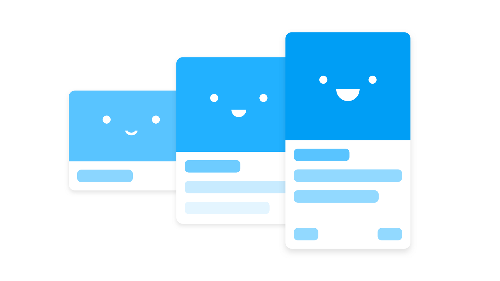
How to make a good UI animation great
In the material, the translation of which we are publishing today, designer Pablo Stanley offers several recommendations for animating micro-interactions in the user interface. In each example given here, two versions of animations are considered. The first option is good, the second, according to the author, is just great. Improving animations comes at the expense of small changes, which, as a result, can significantly improve the perception of interfaces by users.
The animations that will be discussed, demonstrate the connection of different states of the interface, indicate the interaction between common elements present in different states, unobtrusively attract the attention of users to the fact that they should definitely notice. In the course of the work, the author of the article followed ideas from the guides of Material Motion , Animation Principles and The UX in Motion Manifesto . Examples were created using InVision Studio . You can download the source files of these examples here .
Hereinafter, animated illustrations will be used, showing examples of good (Good) and excellent (Great) animation.
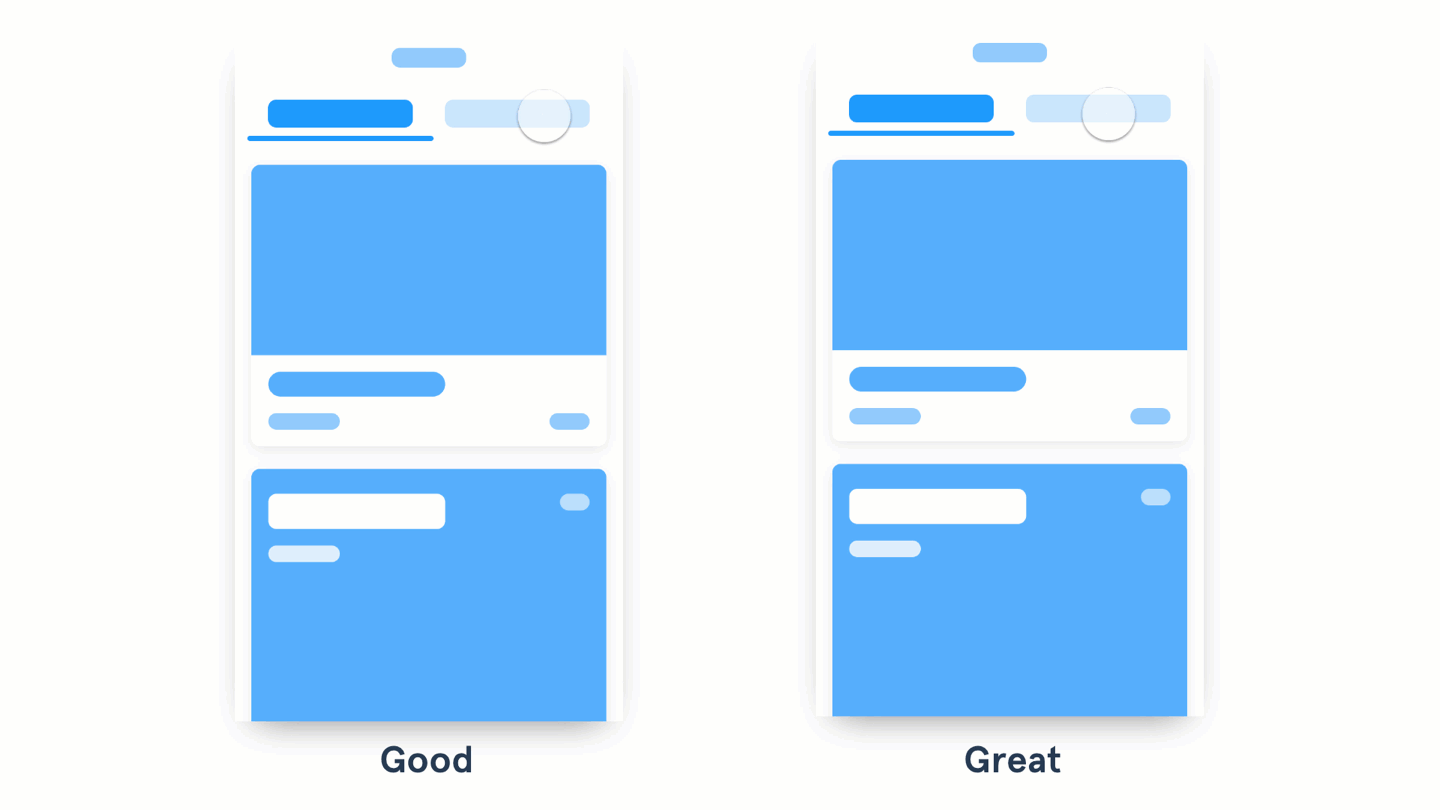
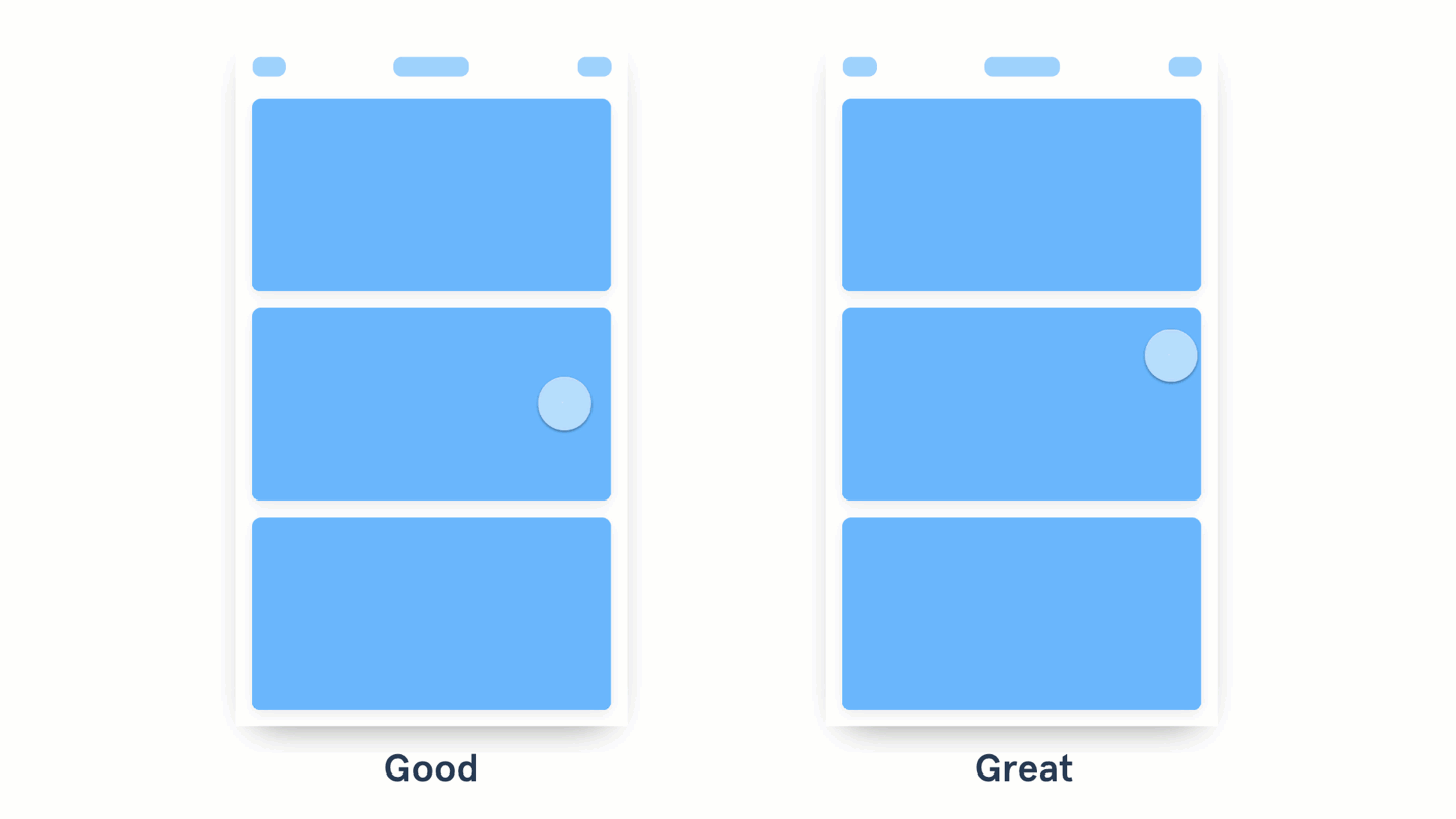
On the left, old materials disappear, and new ones appear. On the right, you can see the content shift along with the tab
When designing elements that the user works with, such as tabs or pop-up menus, try to make the layout of materials that appear when interacting with these elements connected with them. This approach will allow you to animate not only the change in the visibility of the content on the screen in response, for example, a click on a button, but also a change in its position. It would be appropriate here to recall the integration of the gesture management interface slip (swipe), which allows the user to move in a completely natural way between data fragments.
')
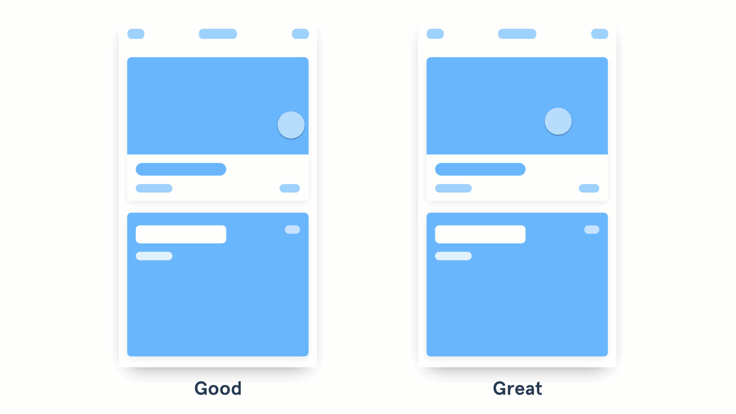
On the left, when you click on the card, a new screen opens, going up. The card on the right expands and occupies the space allotted to it.
Animizing the transition between different states, pay attention to whether there are some common elements in these two states. If there are such elements, they are recommended to be linked with each other. Thanks to InVision Studio, when creating a Motion transition, components that are common to two screens are automatically linked. This greatly facilitates the prototyping of animations.
Take a look at the Motion Manifesto material to find out which animations can be used in this situation. So, the above example applies a combination of the principles of Masking, Transformation, Parenting, and Easing discussed in this material.
Cards on the left appear on the screen, leaving the bottom up and smoothly appearing. The cards on the right are animated in a similar way, but there is a slight delay before each occurrence.
In order to achieve a “waterfall effect,” try to make each piece of content appear with a slight delay. The same applies to the appearance of groups of elements. Maintain the same dynamics of the animation and its duration so that what is happening is perceived as a uniform process. You should not apply this effect to each small element - animate groups of content. Make the animation fast and clear. Google recommends that the delay between the appearance of elements does not exceed 20 ms.
Additional examples can be found here .
The animation on the left shows the overlap with the desired content of unnecessary content. The animation on the right shifts unnecessary content as the size of the element of interest to the user increases.
When designing animations, try to make the elements of the content “know” that surrounds them, “pushing” or “pulling” other elements. Here are additional examples.
The right shows how the menu leaves the side of the button that calls it. The menu on the left appears from the button itself.
On the left, after pressing a button, a text appears below it, informing the user about what is happening. The button on the right is used as a container, it changes its appearance and becomes an indicator itself, indicating the course of the action caused by pressing this button.
Try to use the button as a container in order to inform users about what happened after clicking on this button. For example, a button that previously plays the role of an element that calls the user to action can be replaced with a rotating indicator or animation of the loading process or the progress of some other operation. For example, you can only animate the background of a button. What exactly to do - you decide, the main idea here is to use the space with which the user already interacts. It is even better when the color of the button and the text placed on it are used to confirm the success of an operation.
On the left, the element is made visible due to its color and position on the page. In the example on the right, light animation is used to attract the user's attention.
When the user needs to do something important, try to animate the appropriate element to draw attention to him. Start with a light animation and increase its intensity (change in size, color, speed) depending on how important the expected action is. Use this approach only in exceptional cases. Frequent use of this animation makes it less noticeable and annoying users.
I hope the examples in this material will help you in making the right decisions when animating interfaces. I can assume that thanks to the new tools for creating animations and prototyping, such as InVision Studio, very soon we will enter into something like a “revival era” of creative ways of interacting with the user. Perhaps the most important thing to remember when applying animation is that it is a great force and you need to use it responsibly.
I propose to use animation to explain state changes, to draw attention to the necessary actions, to indicate the interaction between elements, and to make the interfaces more interesting and memorable.
Dear readers! How do you animate user interface elements?

The animations that will be discussed, demonstrate the connection of different states of the interface, indicate the interaction between common elements present in different states, unobtrusively attract the attention of users to the fact that they should definitely notice. In the course of the work, the author of the article followed ideas from the guides of Material Motion , Animation Principles and The UX in Motion Manifesto . Examples were created using InVision Studio . You can download the source files of these examples here .
Shift materials in tabs
Hereinafter, animated illustrations will be used, showing examples of good (Good) and excellent (Great) animation.
On the left, old materials disappear, and new ones appear. On the right, you can see the content shift along with the tab
- Good animation demonstrates the disappearance and appearance of materials during the transition from one state to another.
- Excellent animation shows, thanks to the transition, the relationship of states, creating the effect of movement of materials when changing states.
When designing elements that the user works with, such as tabs or pop-up menus, try to make the layout of materials that appear when interacting with these elements connected with them. This approach will allow you to animate not only the change in the visibility of the content on the screen in response, for example, a click on a button, but also a change in its position. It would be appropriate here to recall the integration of the gesture management interface slip (swipe), which allows the user to move in a completely natural way between data fragments.
')
Indication of the connection of common card elements
On the left, when you click on the card, a new screen opens, going up. The card on the right expands and occupies the space allotted to it.
- A good animation uses transitions, such as moving left or up, to display a page containing detailed information about the item that the user clicked on.
- Excellent animation creates a connection between two states, animating common elements.
Animizing the transition between different states, pay attention to whether there are some common elements in these two states. If there are such elements, they are recommended to be linked with each other. Thanks to InVision Studio, when creating a Motion transition, components that are common to two screens are automatically linked. This greatly facilitates the prototyping of animations.
Take a look at the Motion Manifesto material to find out which animations can be used in this situation. So, the above example applies a combination of the principles of Masking, Transformation, Parenting, and Easing discussed in this material.
Waterfall effect
Cards on the left appear on the screen, leaving the bottom up and smoothly appearing. The cards on the right are animated in a similar way, but there is a slight delay before each occurrence.
- Good animation involves changing the position and transparency of materials when they appear on the screen.
- Excellent animation highlights the appearance of each group or element.
In order to achieve a “waterfall effect,” try to make each piece of content appear with a slight delay. The same applies to the appearance of groups of elements. Maintain the same dynamics of the animation and its duration so that what is happening is perceived as a uniform process. You should not apply this effect to each small element - animate groups of content. Make the animation fast and clear. Google recommends that the delay between the appearance of elements does not exceed 20 ms.
Additional examples can be found here .
The effect of pushing out unnecessary content from the screen
The animation on the left shows the overlap with the desired content of unnecessary content. The animation on the right shifts unnecessary content as the size of the element of interest to the user increases.
- Good animation is moving the element and preserving the context.
- Excellent animation demonstrates the effect of the element of interest to the user on the surrounding elements as it changes.
When designing animations, try to make the elements of the content “know” that surrounds them, “pushing” or “pulling” other elements. Here are additional examples.
A menu that takes into account the location of the button that calls it
The right shows how the menu leaves the side of the button that calls it. The menu on the left appears from the button itself.
- A good animation is when the menu leaves the side of the button that calls it.
- Excellent animation of the menu means its appearance from the element calling it, in particular, from the point of tangency of this element.
Creative use of buttons
On the left, after pressing a button, a text appears below it, informing the user about what is happening. The button on the right is used as a container, it changes its appearance and becomes an indicator itself, indicating the course of the action caused by pressing this button.
- Good interaction is the display of information about the result of pressing a button near it.
- Excellent interaction uses the button itself, which changes the view and informs the user about the results or the progress of the action caused by this button.
Try to use the button as a container in order to inform users about what happened after clicking on this button. For example, a button that previously plays the role of an element that calls the user to action can be replaced with a rotating indicator or animation of the loading process or the progress of some other operation. For example, you can only animate the background of a button. What exactly to do - you decide, the main idea here is to use the space with which the user already interacts. It is even better when the color of the button and the text placed on it are used to confirm the success of an operation.
Unobtrusive user attention
On the left, the element is made visible due to its color and position on the page. In the example on the right, light animation is used to attract the user's attention.
- A good design uses color, size and position to highlight an important action that the user should notice, or with which he should interact.
- Excellent design to attract the attention of the user, provides for the use of unobtrusive animation.
When the user needs to do something important, try to animate the appropriate element to draw attention to him. Start with a light animation and increase its intensity (change in size, color, speed) depending on how important the expected action is. Use this approach only in exceptional cases. Frequent use of this animation makes it less noticeable and annoying users.
Results
I hope the examples in this material will help you in making the right decisions when animating interfaces. I can assume that thanks to the new tools for creating animations and prototyping, such as InVision Studio, very soon we will enter into something like a “revival era” of creative ways of interacting with the user. Perhaps the most important thing to remember when applying animation is that it is a great force and you need to use it responsibly.
I propose to use animation to explain state changes, to draw attention to the necessary actions, to indicate the interaction between elements, and to make the interfaces more interesting and memorable.
Dear readers! How do you animate user interface elements?
Source: https://habr.com/ru/post/351054/
All Articles