Choosing Web Fonts: A Beginner's Guide
Eliminate the element of mystery in the choice of fonts with our step by step guide
If done correctly, typography becomes an incredibly powerful tool. Let us turn to the writings of Robert Bringhurst, whose book The Elements of Typographic Style served for decades as an ingenious reference for professionals. There you will find the sublime formulation of the craft. According to Bringhurst, typography “exists to respect the content,” and the correct typography “shows every element, every relationship between elements, and every logical nuance of text.”
Maybe these words seem inspiring or frightening. But the obvious fact is that the right choice of typography always reflects the specific needs of the project itself. These are not only aesthetic needs, but also technical and functional - and you can create very different messages from text fragments by scrolling the drop-down list from Alegreya to Zapf Dingbats. Some fonts work better in headings, while others read well in paragraphs. Some families are large enough to hold international alphabets and special characters. And if the font goes in different styles (for example, italics or small capitals) and outlines (from the thinnest Hairline to the ultra-black), then as the project is assembled, it will provide more options for fine-tuning the design.
')
Of course, there is something to think about, but some of the most important considerations are the practical and functional features of the project. Starting with things already known and going through the following points, you will find a font that fits your needs.
Are you starting a project that can go on for months or even years, for example, a magazine? Or is it a one-time project like a set of slides, a logo or a presentation?
Most likely, for a large long-term project (for example, a periodical or newsletter), over time, you will have to use typography for a wide range of tasks. For this, it is better to take a large font family, including different styles, styles, and options like small capitals and ligatures. Large families simplify branding, because binding to one font will help solve various problems that arise over time, without resorting to the use of extraneous fonts. Try these samples: Alegreya , Alegreya SC , Merriweather , Merriweather Sans , Roboto , Roboto Condensed , Work Sans .
But if this is a short-term project (for example, a poster, an album cover or a logo), then additional styles, the presence of compressed and expanded font versions may not be needed. You can even choose a font with one style if it is suitable for this particular task. Just keep in mind that the universality of a large family can still be useful as you fine-tune the text in a short-term project. Try these samples: Bubblegum Sans , Graduate , Scope One , Space Mono .
Although the number of font options can be limited to the size of the project, eliminating fonts without appropriate versatility or focusing on highly specialized fonts, but there are no clear and simple rules for determining a font with the correct aesthetic qualities. It depends on the individuality of the font, but the individuality to some extent depends on the recognition.
Many applications and websites still use a small set of the most common fonts - this is a relic of the times when this approach was most practical in digital typography. Once the most secure option was system fonts, because they are always in working condition and available on most devices. Today there is no need to compromise and limit yourself to these “workhorses”. As a rule, web fonts are as reliable as system fonts, but they offer a greater variety of choices. Try these samples: Proxima Nova, Helvetica, Museo, Futura, Brandon Grotesque (popular); Arial, Times New Roman, Courier New, Helvetica, Times, Courier, Verdana, Georgia (system); Gibson , Gotham , Classic Grotesque , Montserrat (web fonts)
But if you are still interested in finding an unusual font in order to select your project from a number of similar ones, then there are dozens of commercial companies that develop and sell proprietary fonts for a fixed fee or a monthly rate. If you want a completely unique, bespoke font - and who does not want - then its development can be an expensive and time-consuming process, so first find out the prices of manufacturers. On the other hand, any artist you hire will almost certainly cope with the many problems listed in this guide. Among the free options you can always search for a less common web font. As a rule, a font that has recently appeared is not very common - at least for now. Of course, we are not indifferent to Google Fonts . A simple look through the catalog to get an idea of how many free web fonts are there, and on the page of each family it is shown how much it is used on the Internet and in which countries it is popular.
“Designers provide an input — and an exit — from the flow of words,” writes critic Ellen Lupton, “breaking the text into parts, showing the shortest paths and detours in the information arrays.” In addition to the individual characteristics of the selected font, in a well-designed layout, visual signals, regularity and variability are used to naturally guide readers. And the choice of font in accordance with the size of the text can give a lot of signals and quick access options to help readers with navigation.
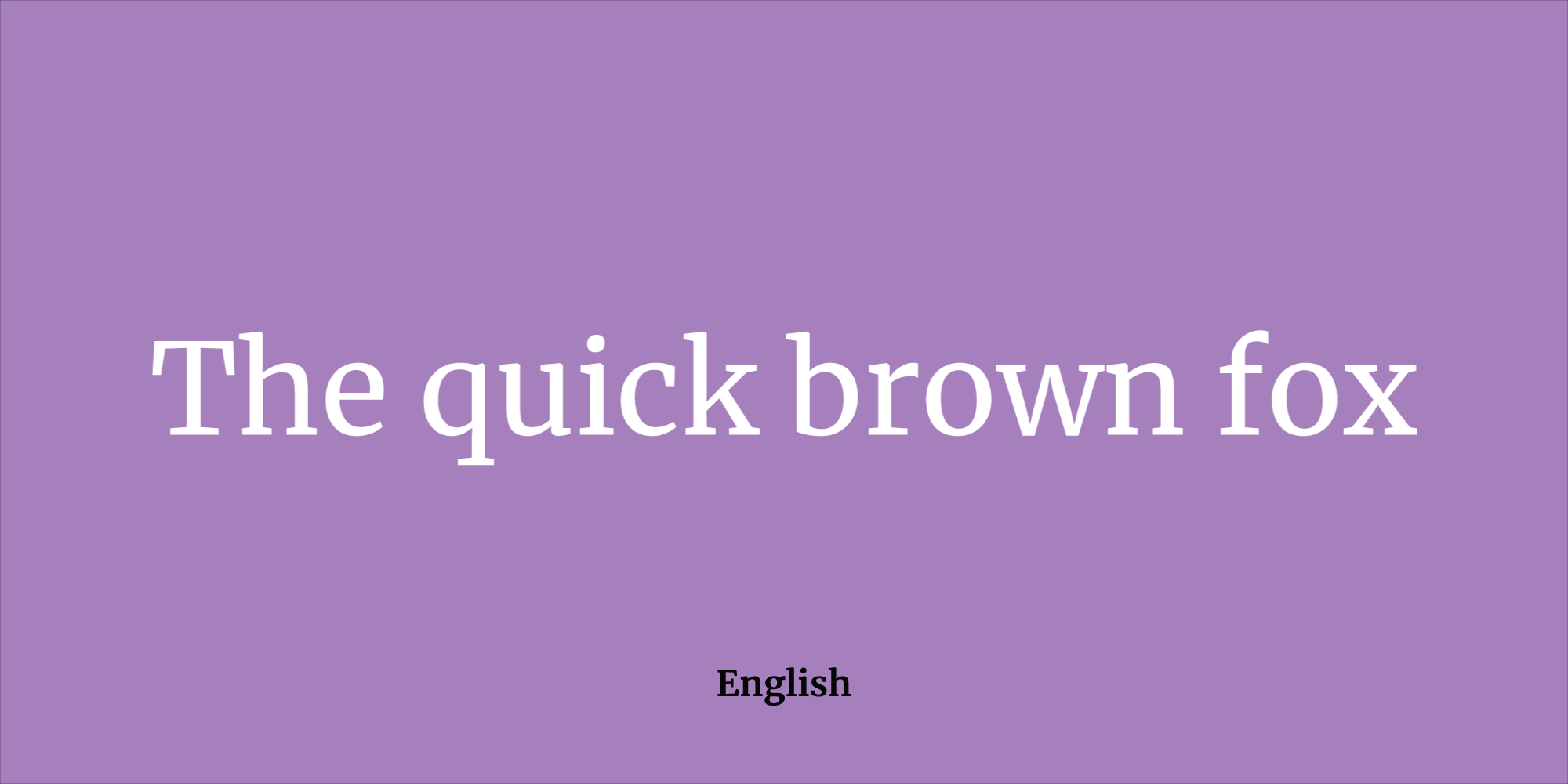
For titles and subtitles, you can choose expressive, unique, even peculiar typefaces, for example, display, decorative and handwritten styles . Such non-traditional, high-contrast designs work well in this context, because the detail and visual complexity help to attract attention. If you want to use for short fragments fonts without (sans) serifs (serif), especially large size, then the usual style looks in this role slightly inappropriate. Instead, it is recommended to use bold and compressed. If you prefer serif fonts (serif), very thin serifs (hairline serifs), then Playfair Display and Rufina fonts work well in short lines because their high contrast usually attracts the attention of the reader.
Medium-length text, about three to four paragraphs, is actually quite flexible in the design, so there are many options. If you are leaning towards a serif typeface, you can choose something old-style, like Quattrocento , a transition style like Baskerville Libre, or serif squared type, like Arvo . Prefer sans serif? Then a humanistic or grotesque style, like Cabin or Raleway , may be the best choice, and even some geometric styles like Montserrat will work well. Try some of them in the layout and see what works best in the layout.
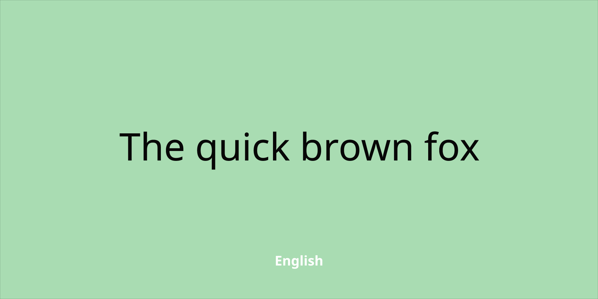
When choosing a font for volume fragments of the text - more than five paragraphs - it is recommended to use a serif font. This is a traditional book typography choice, but it also works well on screen. As a rule, old-style or transitional fonts, such as EB Garamond and Libre Baskerville , are easier for the eyes when reading large texts such as news or magazine articles. Although you can use a humanist sans-serif font for long text, it is safer to bet on familiar serif text that readers can read quickly.
When choosing a web font, it is often necessary to proceed from several considerations. Although the length of the text helps determine the choice of font, but its size is also important. For relatively small sizes up to 16 points, try sans-serif options such as Roboto , Montserrat and Raleway . Compared with serif designs, these usually have a larger “base height” (x-height), which is defined as the distance between the base and middle levels — usually the height of the letter 'x', which makes the design clearer in small sizes. Sans serif fonts usually have relatively lower line contrast and more equal line drawing, which provides them with a more even “color” on a reduced scale when packed in a small space.

“For a paragraph that should be well legible, do not use a font with ambiguous forms,” says font designer Octavio Pardo. Decorative fonts like Comfortaa (shown above) are difficult to read in long texts, so for them choose well-readable fonts - “workhorses” like Alegreya or Bellefair
You can also understand the overall font quality by letters that usually take longer to design — or are simply lower on the priority list. “Look at the form of the letters 'a', 'g' and numbers,” recommends the font designer Octavio Pardo. - In these glyphs appear risky design options. They should be bold, but picky. You can afford an extravagant design in low frequency glyphs like 'v' 'w' 'x' 'y', 'z' and italics. ”
Medium-sized text - subheadings, remote quotations and smaller headlines, from 16 to 24 points - is recommended to use a sans serif font in a geometric, grotesque or humanistic style. Good options are Montserrat , Lato and Quattrocento Sans . Avoid extreme shapes, too thick or too thin, so that the text is easy to read at a glance. If you want a more modern font that doesn't look too bookish, look for something without strong contrast lines, such as the squared font family (slab): Arvo , Sanchez, and Slabo .
Fonts for use in large sizes, more than 24 points, are called display fonts. “As a rule, their remarkable features stand out on larger sizes, and on smaller sizes, these same features usually interfere with readability. However, in almost every genre of typography, a large text is used, if the feelings that the font causes are appropriate. This is ideal for a decorative or handwritten font with high contrast lines, such as Lobster or Berkshire Swash . Try some strongly geometric, retro or even grungy font, if it sets the right tone. Just avoid fonts with large intra-letter spaces (a white area inside the outline of a character like B or q) and a large base height, as these features are implemented to help in reading small text. As a rule, they look inappropriate when scaled.
Remember that your application or website is accessible to users from all over the world. Even if you show content in the same language, many use the translation feature in the browser to display it in their native language.
“The automatic translation service increases the chances that someone will see your content in another language, up to almost 100%,” says designer Eben Sorkin, who in recent years has expanded his Merriweather font (shown above) to support more European languages and Cyrillic . “Having specific glyphs for their languages helps to please users,” says Sorkin. “The more global your audience is, the more likely you are to think about it.”
In other words, if in the chosen font there are only letters of the Latin alphabet, then the automatic translation will take the typography tool from your hands, switching the layout of these letters to some other font. A so-called “ransom note effect” will appear, in which the individual letters stand out among others. The choice of a font with characters from other languages ensures that the design of the site will remain the same for a wider circle of readers. This may sound astonishing, but in fact many font families support different scripts.
If your main task is to ensure that the font does not change in the maximum number of outlines, consider using the Noto font family (shown above).
Even with the basic Latin fonts, it makes sense to check whether there is support for the "extended Latin", which is used in certain European languages. Check accented characters such as circumflex (â), acute (á), umlaut (ä), circle (å), and light (ą). There are many others, but the choice of a font with an expanded Latin letter ensures that accented letters will not change by mistake to non-accented letters.
The font family should look consistent, even harmonious in different styles - and this is not easy to achieve. When reconciling two or more scripts, designers need to find a balance between different stories and written traditions. If you plan to use two different scripts side by side, check several simple text options - how well the two scripts are combined with each other.
Web fonts like Alegreya , Merriweather , Nunito , Roboto and Quattrocento include a large set of characters, styles and styles that translates them into the category of "superfamilies." These five "superfamilies" now also support Cyrillic . One caveat: as in Latin, some Cyrillic characters are used only in several languages, such as Serbian or Bulgarian. To support these languages, make sure that the font has extended Cyrillic support.
Other web fonts support more writing systems. Depending on the project, the support of Arabic , Greek or Jewish characters may be important. You can find web fonts that support a number of Indian scripts, such as Bengali , Devangari , Gujarati, and Tamil , as well as Southeast Asian scripts such as the Thai alphabet . In Google Fonts, options can be filtered in the drop-down menu.
The stylistic range of font families is divided into two parts: by functionality and artistic expression (design features). Functionality refers to the range of styles available to change the overall appearance of a font. In a functional font, it should be italic and fine to bold. Try these samples: Barlow , Poppins , Libre Franklin .
Fonts for artistic expressiveness (design features) are custom-made specific characters. These include small capitals, contextual alternates, and various numbering styles. Small caps can be useful for headers and footers in a specific context. They can add sophistication to the text, adding variety and creating a sense of visual hierarchy. Try these samples: Carrois Gothic SC , Cormorant SC , Patrick Hand SC .
Contextual font styles are rarely considered “necessary” font element, but in several ways they introduce a variety that can be very desirable for your project (see Montserrat Alternates ). If you use italics or a handwritten font, then the variants of the styles will make the text more “natural” by adding diversity, as in real handwriting ( Caveat , Sriracha ). Alternatively, alternate characters in serif or non-serif fonts may add hues of distinction from plain text.
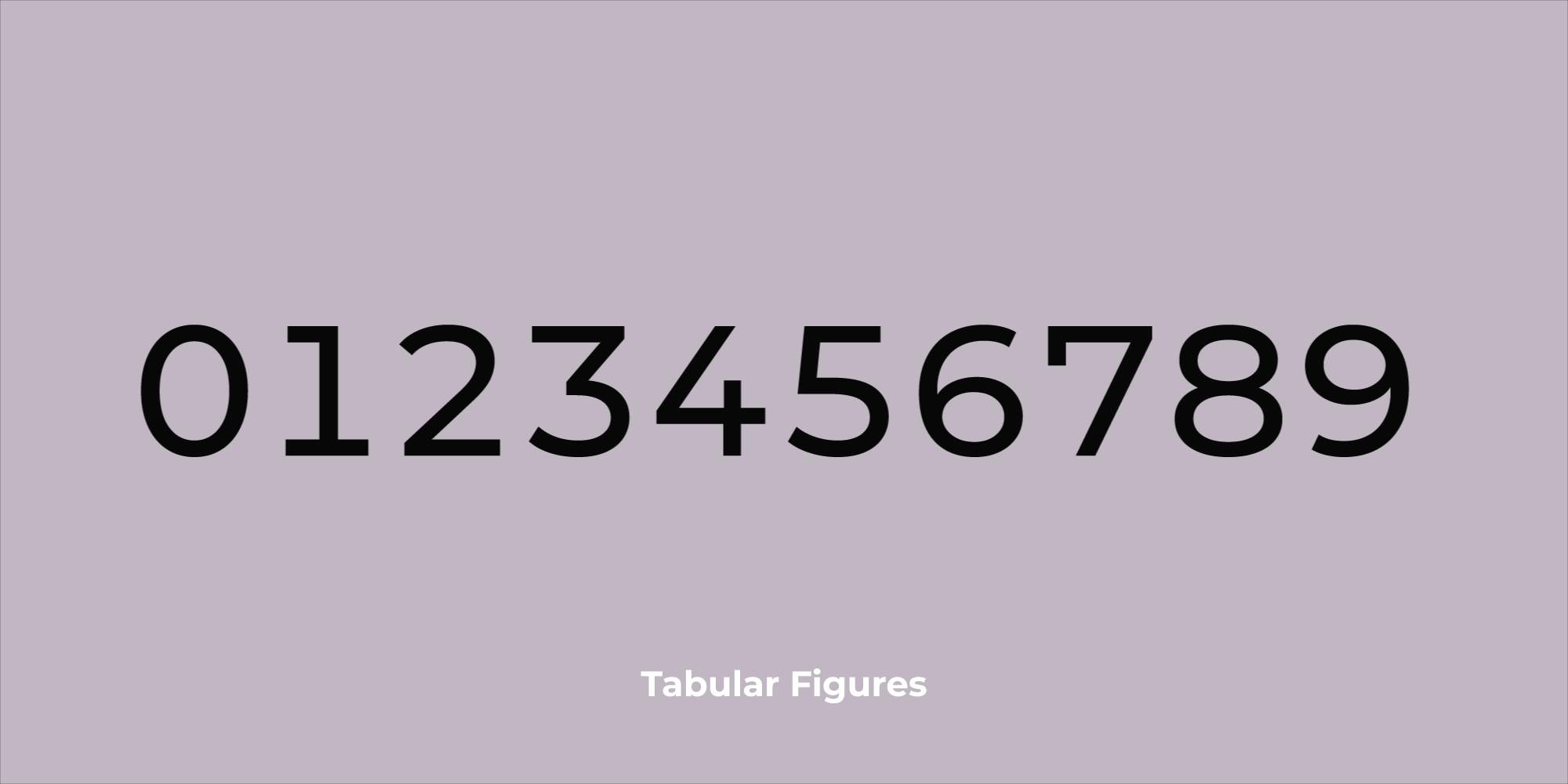
Depending on the needs of your project, do not forget to compare the styles of numbers in the selected font. The difference between Oldstyle and Tabular (shown above) will affect the choice of layout and formatting. Mono-spaced numbers (Tabular) are often used in tables, while Oldstyle numbers are more comfortable to read in paragraphs.
If you plan to use a lot of numbers, keep in mind that there are several different styles for different contexts. Oldstyle numbers are preferred for blocks of text, such as paragraphs. If you look closely, you will notice that some numbers are aligned below the baseline, which orients the rest of the text. This helps to improve the readability of numbers in long lines of text. Monospace digits are centered vertically and equal in width. This helps them to look more correctly and consistently in the tables. Also keep in mind that only some fonts contain signs of correct fractions. The same applies to more than a hundred symbols of national currencies from around the world. Try these samples: Alegreya , Exo , Montserrat , Roboto , Spectral , Google Fonts OpenType format .
Having mastered the basics, you can safely move on to more complex solutions, such as font mating. Mating can be very delicate and difficult, even for typography experts, but this does not mean that it should be avoided. “There are an infinite number of combinations, and finding the right pairing can take a lot of time,” says designer Yuing Chien, who ran the Google Fonts update last year. There is a certain amount of pleasure in testing different combinations, so check as many options as you can - the combination that works best may surprise you.
Some couples work well in contrast, while others work in similarity. Sharp differences make the layout more dynamic, while the use of different styles from the superfamily adds visual integrity. If you have chosen a unique and vivid font for headlines, try something softer and familiar for the main text. The classic version is a sans serif font for headings and a serif font for the main text. Try these options: Alegreya and Alegreya Sans (similar), Libre Franklin and Libre Baskerville (contrast).
Professional advice: when viewing pages with families in the Google Fonts directory, you can try and customize popular pairs.
It is worth making a short list and familiarize yourself with the fonts you like. Browse the full set of symbols and styles for each option. Check how they look in Cyrillic or Thai. Find a designer biography and see how this font was used in the past. First of all, do not underestimate your typographical needs or the needs of your readers. The more styles, characters, and scripts the font supports, the better prepared you are.
Typography is a subtle art, but not as difficult to understand as they say. If you think about the organization of your project, its scale and audience, then you are ready to make a reasonable choice on typography.
Several designers shared their experiences in compiling this guide: Youen Chien, Joana Correia, Dave Crossland, Nathanael Gama, Octavio Pardo, Eben Sorkin and Eduardo Tunni.
If done correctly, typography becomes an incredibly powerful tool. Let us turn to the writings of Robert Bringhurst, whose book The Elements of Typographic Style served for decades as an ingenious reference for professionals. There you will find the sublime formulation of the craft. According to Bringhurst, typography “exists to respect the content,” and the correct typography “shows every element, every relationship between elements, and every logical nuance of text.”
Maybe these words seem inspiring or frightening. But the obvious fact is that the right choice of typography always reflects the specific needs of the project itself. These are not only aesthetic needs, but also technical and functional - and you can create very different messages from text fragments by scrolling the drop-down list from Alegreya to Zapf Dingbats. Some fonts work better in headings, while others read well in paragraphs. Some families are large enough to hold international alphabets and special characters. And if the font goes in different styles (for example, italics or small capitals) and outlines (from the thinnest Hairline to the ultra-black), then as the project is assembled, it will provide more options for fine-tuning the design.
')
Of course, there is something to think about, but some of the most important considerations are the practical and functional features of the project. Starting with things already known and going through the following points, you will find a font that fits your needs.
Start with a project scale
Are you starting a project that can go on for months or even years, for example, a magazine? Or is it a one-time project like a set of slides, a logo or a presentation?
Most likely, for a large long-term project (for example, a periodical or newsletter), over time, you will have to use typography for a wide range of tasks. For this, it is better to take a large font family, including different styles, styles, and options like small capitals and ligatures. Large families simplify branding, because binding to one font will help solve various problems that arise over time, without resorting to the use of extraneous fonts. Try these samples: Alegreya , Alegreya SC , Merriweather , Merriweather Sans , Roboto , Roboto Condensed , Work Sans .
But if this is a short-term project (for example, a poster, an album cover or a logo), then additional styles, the presence of compressed and expanded font versions may not be needed. You can even choose a font with one style if it is suitable for this particular task. Just keep in mind that the universality of a large family can still be useful as you fine-tune the text in a short-term project. Try these samples: Bubblegum Sans , Graduate , Scope One , Space Mono .
What should the font say?
Although the number of font options can be limited to the size of the project, eliminating fonts without appropriate versatility or focusing on highly specialized fonts, but there are no clear and simple rules for determining a font with the correct aesthetic qualities. It depends on the individuality of the font, but the individuality to some extent depends on the recognition.
Many applications and websites still use a small set of the most common fonts - this is a relic of the times when this approach was most practical in digital typography. Once the most secure option was system fonts, because they are always in working condition and available on most devices. Today there is no need to compromise and limit yourself to these “workhorses”. As a rule, web fonts are as reliable as system fonts, but they offer a greater variety of choices. Try these samples: Proxima Nova, Helvetica, Museo, Futura, Brandon Grotesque (popular); Arial, Times New Roman, Courier New, Helvetica, Times, Courier, Verdana, Georgia (system); Gibson , Gotham , Classic Grotesque , Montserrat (web fonts)
But if you are still interested in finding an unusual font in order to select your project from a number of similar ones, then there are dozens of commercial companies that develop and sell proprietary fonts for a fixed fee or a monthly rate. If you want a completely unique, bespoke font - and who does not want - then its development can be an expensive and time-consuming process, so first find out the prices of manufacturers. On the other hand, any artist you hire will almost certainly cope with the many problems listed in this guide. Among the free options you can always search for a less common web font. As a rule, a font that has recently appeared is not very common - at least for now. Of course, we are not indifferent to Google Fonts . A simple look through the catalog to get an idea of how many free web fonts are there, and on the page of each family it is shown how much it is used on the Internet and in which countries it is popular.
What is the volume of the text?
“Designers provide an input — and an exit — from the flow of words,” writes critic Ellen Lupton, “breaking the text into parts, showing the shortest paths and detours in the information arrays.” In addition to the individual characteristics of the selected font, in a well-designed layout, visual signals, regularity and variability are used to naturally guide readers. And the choice of font in accordance with the size of the text can give a lot of signals and quick access options to help readers with navigation.
For titles and subtitles, you can choose expressive, unique, even peculiar typefaces, for example, display, decorative and handwritten styles . Such non-traditional, high-contrast designs work well in this context, because the detail and visual complexity help to attract attention. If you want to use for short fragments fonts without (sans) serifs (serif), especially large size, then the usual style looks in this role slightly inappropriate. Instead, it is recommended to use bold and compressed. If you prefer serif fonts (serif), very thin serifs (hairline serifs), then Playfair Display and Rufina fonts work well in short lines because their high contrast usually attracts the attention of the reader.
Medium-length text, about three to four paragraphs, is actually quite flexible in the design, so there are many options. If you are leaning towards a serif typeface, you can choose something old-style, like Quattrocento , a transition style like Baskerville Libre, or serif squared type, like Arvo . Prefer sans serif? Then a humanistic or grotesque style, like Cabin or Raleway , may be the best choice, and even some geometric styles like Montserrat will work well. Try some of them in the layout and see what works best in the layout.
When choosing a font for volume fragments of the text - more than five paragraphs - it is recommended to use a serif font. This is a traditional book typography choice, but it also works well on screen. As a rule, old-style or transitional fonts, such as EB Garamond and Libre Baskerville , are easier for the eyes when reading large texts such as news or magazine articles. Although you can use a humanist sans-serif font for long text, it is safer to bet on familiar serif text that readers can read quickly.
What does the size affect?
When choosing a web font, it is often necessary to proceed from several considerations. Although the length of the text helps determine the choice of font, but its size is also important. For relatively small sizes up to 16 points, try sans-serif options such as Roboto , Montserrat and Raleway . Compared with serif designs, these usually have a larger “base height” (x-height), which is defined as the distance between the base and middle levels — usually the height of the letter 'x', which makes the design clearer in small sizes. Sans serif fonts usually have relatively lower line contrast and more equal line drawing, which provides them with a more even “color” on a reduced scale when packed in a small space.
“For a paragraph that should be well legible, do not use a font with ambiguous forms,” says font designer Octavio Pardo. Decorative fonts like Comfortaa (shown above) are difficult to read in long texts, so for them choose well-readable fonts - “workhorses” like Alegreya or Bellefair
You can also understand the overall font quality by letters that usually take longer to design — or are simply lower on the priority list. “Look at the form of the letters 'a', 'g' and numbers,” recommends the font designer Octavio Pardo. - In these glyphs appear risky design options. They should be bold, but picky. You can afford an extravagant design in low frequency glyphs like 'v' 'w' 'x' 'y', 'z' and italics. ”
Medium-sized text - subheadings, remote quotations and smaller headlines, from 16 to 24 points - is recommended to use a sans serif font in a geometric, grotesque or humanistic style. Good options are Montserrat , Lato and Quattrocento Sans . Avoid extreme shapes, too thick or too thin, so that the text is easy to read at a glance. If you want a more modern font that doesn't look too bookish, look for something without strong contrast lines, such as the squared font family (slab): Arvo , Sanchez, and Slabo .
Fonts for use in large sizes, more than 24 points, are called display fonts. “As a rule, their remarkable features stand out on larger sizes, and on smaller sizes, these same features usually interfere with readability. However, in almost every genre of typography, a large text is used, if the feelings that the font causes are appropriate. This is ideal for a decorative or handwritten font with high contrast lines, such as Lobster or Berkshire Swash . Try some strongly geometric, retro or even grungy font, if it sets the right tone. Just avoid fonts with large intra-letter spaces (a white area inside the outline of a character like B or q) and a large base height, as these features are implemented to help in reading small text. As a rule, they look inappropriate when scaled.
Who is your audience and what languages does it speak?
Remember that your application or website is accessible to users from all over the world. Even if you show content in the same language, many use the translation feature in the browser to display it in their native language.
“The automatic translation service increases the chances that someone will see your content in another language, up to almost 100%,” says designer Eben Sorkin, who in recent years has expanded his Merriweather font (shown above) to support more European languages and Cyrillic . “Having specific glyphs for their languages helps to please users,” says Sorkin. “The more global your audience is, the more likely you are to think about it.”
In other words, if in the chosen font there are only letters of the Latin alphabet, then the automatic translation will take the typography tool from your hands, switching the layout of these letters to some other font. A so-called “ransom note effect” will appear, in which the individual letters stand out among others. The choice of a font with characters from other languages ensures that the design of the site will remain the same for a wider circle of readers. This may sound astonishing, but in fact many font families support different scripts.
If your main task is to ensure that the font does not change in the maximum number of outlines, consider using the Noto font family (shown above).
Even with the basic Latin fonts, it makes sense to check whether there is support for the "extended Latin", which is used in certain European languages. Check accented characters such as circumflex (â), acute (á), umlaut (ä), circle (å), and light (ą). There are many others, but the choice of a font with an expanded Latin letter ensures that accented letters will not change by mistake to non-accented letters.
The font family should look consistent, even harmonious in different styles - and this is not easy to achieve. When reconciling two or more scripts, designers need to find a balance between different stories and written traditions. If you plan to use two different scripts side by side, check several simple text options - how well the two scripts are combined with each other.
Web fonts like Alegreya , Merriweather , Nunito , Roboto and Quattrocento include a large set of characters, styles and styles that translates them into the category of "superfamilies." These five "superfamilies" now also support Cyrillic . One caveat: as in Latin, some Cyrillic characters are used only in several languages, such as Serbian or Bulgarian. To support these languages, make sure that the font has extended Cyrillic support.
Other web fonts support more writing systems. Depending on the project, the support of Arabic , Greek or Jewish characters may be important. You can find web fonts that support a number of Indian scripts, such as Bengali , Devangari , Gujarati, and Tamil , as well as Southeast Asian scripts such as the Thai alphabet . In Google Fonts, options can be filtered in the drop-down menu.
How do you evaluate the functionality of the font compared to its expressive features?
The stylistic range of font families is divided into two parts: by functionality and artistic expression (design features). Functionality refers to the range of styles available to change the overall appearance of a font. In a functional font, it should be italic and fine to bold. Try these samples: Barlow , Poppins , Libre Franklin .
Fonts for artistic expressiveness (design features) are custom-made specific characters. These include small capitals, contextual alternates, and various numbering styles. Small caps can be useful for headers and footers in a specific context. They can add sophistication to the text, adding variety and creating a sense of visual hierarchy. Try these samples: Carrois Gothic SC , Cormorant SC , Patrick Hand SC .
Contextual font styles are rarely considered “necessary” font element, but in several ways they introduce a variety that can be very desirable for your project (see Montserrat Alternates ). If you use italics or a handwritten font, then the variants of the styles will make the text more “natural” by adding diversity, as in real handwriting ( Caveat , Sriracha ). Alternatively, alternate characters in serif or non-serif fonts may add hues of distinction from plain text.
Depending on the needs of your project, do not forget to compare the styles of numbers in the selected font. The difference between Oldstyle and Tabular (shown above) will affect the choice of layout and formatting. Mono-spaced numbers (Tabular) are often used in tables, while Oldstyle numbers are more comfortable to read in paragraphs.
If you plan to use a lot of numbers, keep in mind that there are several different styles for different contexts. Oldstyle numbers are preferred for blocks of text, such as paragraphs. If you look closely, you will notice that some numbers are aligned below the baseline, which orients the rest of the text. This helps to improve the readability of numbers in long lines of text. Monospace digits are centered vertically and equal in width. This helps them to look more correctly and consistently in the tables. Also keep in mind that only some fonts contain signs of correct fractions. The same applies to more than a hundred symbols of national currencies from around the world. Try these samples: Alegreya , Exo , Montserrat , Roboto , Spectral , Google Fonts OpenType format .
What if you use more than one font?
Having mastered the basics, you can safely move on to more complex solutions, such as font mating. Mating can be very delicate and difficult, even for typography experts, but this does not mean that it should be avoided. “There are an infinite number of combinations, and finding the right pairing can take a lot of time,” says designer Yuing Chien, who ran the Google Fonts update last year. There is a certain amount of pleasure in testing different combinations, so check as many options as you can - the combination that works best may surprise you.
Some couples work well in contrast, while others work in similarity. Sharp differences make the layout more dynamic, while the use of different styles from the superfamily adds visual integrity. If you have chosen a unique and vivid font for headlines, try something softer and familiar for the main text. The classic version is a sans serif font for headings and a serif font for the main text. Try these options: Alegreya and Alegreya Sans (similar), Libre Franklin and Libre Baskerville (contrast).
Professional advice: when viewing pages with families in the Google Fonts directory, you can try and customize popular pairs.
Still undecided?
It is worth making a short list and familiarize yourself with the fonts you like. Browse the full set of symbols and styles for each option. Check how they look in Cyrillic or Thai. Find a designer biography and see how this font was used in the past. First of all, do not underestimate your typographical needs or the needs of your readers. The more styles, characters, and scripts the font supports, the better prepared you are.
Typography is a subtle art, but not as difficult to understand as they say. If you think about the organization of your project, its scale and audience, then you are ready to make a reasonable choice on typography.
Several designers shared their experiences in compiling this guide: Youen Chien, Joana Correia, Dave Crossland, Nathanael Gama, Octavio Pardo, Eben Sorkin and Eduardo Tunni.
Source: https://habr.com/ru/post/350966/
All Articles