Analog Clock, CSS and Nothing More
What is wrong here?
Hello, I recently listened to a new edition of Web Standards and there was a moment with a discussion of the article “Time of Variables” where the author decided to experiment with CSS variables and create an analog clock based on them. Everything looks gorgeous and most importantly works, but I have a lot of questions and I decided to experiment a bit and tell you my conclusions at the same time.
Do not think anything bad, I love CSS variables and everything new in CSS, but as always there are a couple but. First of all, I personally don’t really like the idea of writing to the DOM every second, because everything connected with it is resource intensive, but here I’m not quite sure how bad it can be. Secondly, despite the fact that CSS variables are very convenient to use, you still need to use them wisely, because each time you change a variable, you cause a redraw of each element that uses it. And here I see the main problem for myself.
The Rendering tab in the Chrome console helped confirm the fact of redrawing: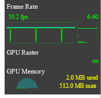

We see a redraw every second and an average fps of 50 frames, and this is on the page where we have only one clock.
How else can you?
And so I set myself the task of creating an analog clock that will not cause the page to be redrawn and rely on JavaScript to calculate the position of the arrow. Hours that will not affect the frame rate in the browser. Among all the known CSS properties for me, only one allows you to transform an element without redrawing - transform. So we will use it.
')
But first, we will create our own clocks, with which we will conveniently move the arrow using only the transform property. Create a dial with all hands:
The idea here is this: if you put each arrow into a separate container, which will be in the center of the clock, then rotating this container relative to the center, we will also rotate the arrow itself. Here is an example of such container styles for the hour hand:
.clock__hand { margin-left: -0.5em; margin-top: -0.5em; font-size: inherit; position: absolute; display: block; height: 1em; width: 1em; left: 50%; top: 50%; } .clock__hand--hour::after { content: ""; border-radius: 0.015em 0.015em 0.01em 0.01em; background-color: #000; margin-bottom: -0.02em; margin-left: -0.025em; font-size: inherit; position: absolute; display: block; height: 0.25em; width: 0.05em; bottom: 50%; left: 50%; } With the help of font-size in this case, we set the size of the dial and all components of the watch.
View code for the most hours.
Well, how much to rotate?
Rotate the arrow by 360 degrees. The correct question is: how long to rotate it? And it depends on what kind of arrow we rotate. Hour - 12 hours, minute - hour, second - minute.
.clock__hand--hour { animation: clock-hand-rotate 43200s linear infinite; } .clock__hand--minute { animation: clock-hand-rotate 3600s linear infinite; } .clock__hand--second { animation: clock-hand-rotate 60s linear infinite; } @keyframes clock-hand-rotate { from { transform: rotate(0deg) } to { transform: rotate(360deg) } } And so our clock has earned.
And what will Chrome tell us about them?

No redraws and stable 60 fps
But this is not our time.
And so our starting time is 00:00:00 because all the arrows start the animation from 0 degrees. To start with the present, we need to calculate the initial degree for each arrow separately with respect to time. And so we have two options, either on the server side, render the CSS relative to the time of the request, or use JavaScript. Of course, the server rendering is also cool without a script clock, but in order to confirm the concept, we still use JavaScript.
var date = new Date(), hours = date.getHours(), minutes = date.getMinutes(), seconds = date.getSeconds(); if (hours > 12) { hours -= 12; } var secondsStartDegree = 360 / 60 * seconds, minutesStartDegree = 360 / 60 * minutes + 6 / 60 * seconds, hoursStartDegree = 360 / 12 * hours + 30 / 60 * minutes + 0.5 / 60 * seconds; var style = document.createElement('style'); style.type = 'text/css'; style.innerHTML = '\ @keyframes clock-hand-rotate--hour {\ from {transform: rotate(' + hoursStartDegree + 'deg)}\ to {transform: rotate(' + (hoursStartDegree + 360) + 'deg)}\ }\ @keyframes clock-hand-rotate--minute {\ from {transform: rotate(' + minutesStartDegree + 'deg)}\ to {transform: rotate(' + (minutesStartDegree + 360) + 'deg)}\ }\ @keyframes clock-hand-rotate--second {\ from {transform: rotate(' + secondsStartDegree + 'deg)}\ to {transform: rotate(' + (secondsStartDegree + 360) + 'deg)}\ }\ .clock__hand--hour {\ animation: clock-hand-rotate--hour 43200s linear infinite;\ }\ .clock__hand--minute {\ animation: clock-hand-rotate--minute 3600s linear infinite;\ }\ .clock__hand--second {\ animation: clock-hand-rotate--second 60s steps(60) infinite;\ }'; document.getElementsByTagName('head')[0].appendChild(style); And there we create 3 animations for each of the arrows and connect them to the respective classes.
Here is the result.
What else is possible?
Well, if you do not have enough of the fact that you have a clock that almost does not take away browser resources. Here are a couple of chips:
- Watch with jumping minute and second hands
- Hours with different time zones
- It also works in Internet Explorer 11 and mobile browsers.
Well, what are the disadvantages
There are not so many of them, but they are:
- Since the clock is ticking time with CSS, then if the thread is hammered by some heavy tasks, the clock will stop going and when the page becomes free, it will fall behind. But all this can be corrected again by setting the keyframe.
- Not everywhere the site will look perfect, for example in the same IE11 some centers are slightly offset:

Results
I don’t know how to use these watches in production, but I have personally drawn conclusions regarding new technologies.
And I would say that it is not always worthwhile to rush for new technologies, if the old ones still can do enough. And the most important thing is that it is better to use reliable tools than to simply try to put in a new, incredible feature of the language everywhere.
And in terms of browser resources, I would never have thought that a simple drawing would take as many frames.
I hope you were interested too, thanks for reading.
Source: https://habr.com/ru/post/350884/
All Articles