For a beginner webmaster: make a one-page on Bootstrap 4 for half an hour
The Bootstrap framework is a free set of tools for creating website interfaces and web applications. Its capabilities are focused exclusively on front-end development. Bootstrap is a very popular project, which, for example, says that it is (as of the beginning of March 2018) second in the number of stars on GitHub.
If you want to learn Bootstrap, in particular, its latest, fourth version, it means that this material is prepared especially for you. Here, on a small end-to-end example, which can really be mastered in half an hour, the basics of Bootstrap will be demonstrated, having figured out that you can easily do something of your own, using this framework.
This material is aimed at novice web developers who own the basics of HTML, CSS and jQuery.
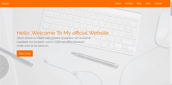
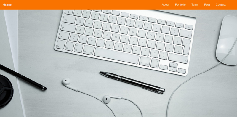
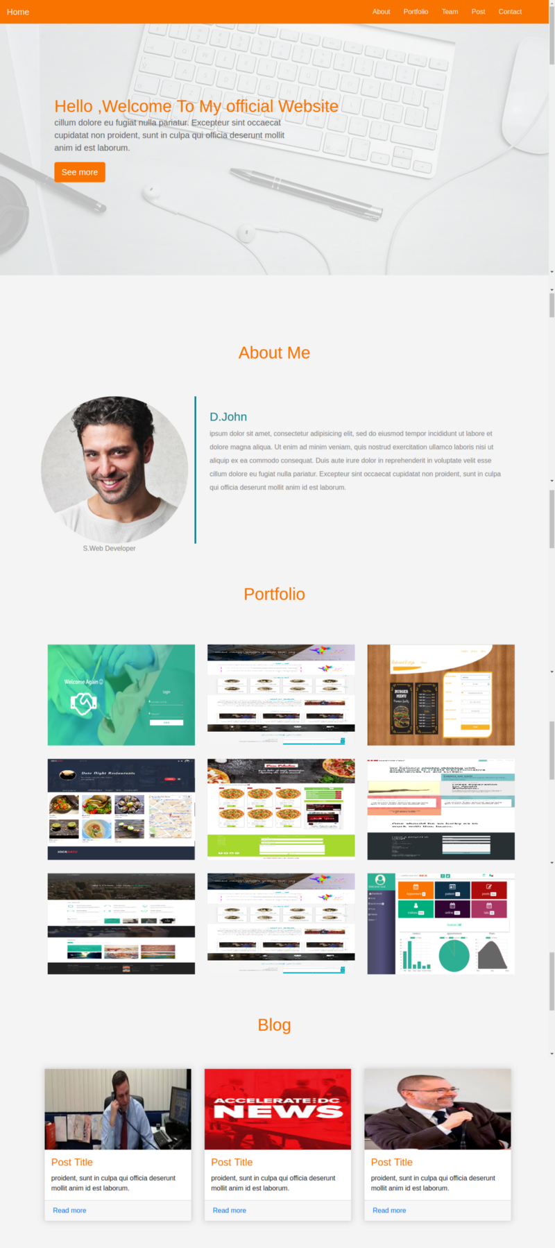
Here is a one-page website, the creation of which means Bootstrap we will talk about.
')
Ready project created by Bootstrap
There are several ways to download and use Bootstrap. For starters, you can use
Bootstrap can be connected to a page using a content delivery network. To do this, add the following link to the
You can download the latest version of Bootstrap from here and use it locally.
The project structure should look like the following figure.
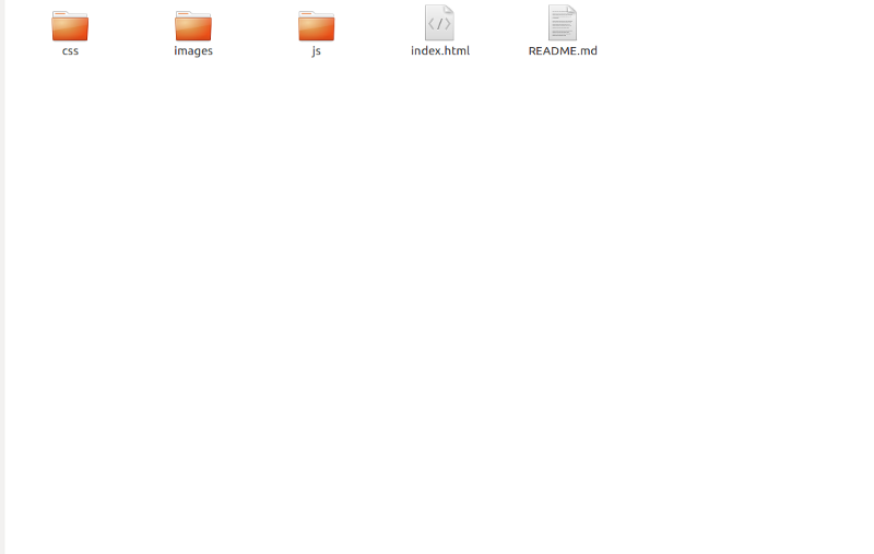
Project structure
The first stable version of Bootstrap 4 was released at the end of January of this year. Now Bootstrap includes some interesting features that were not in its previous version. Namely, if we talk about improvements and changes, we can note the following:
In fact, Bootstrap 4 has a lot in comparison with Bootstrap 3, if you need it, you can familiarize yourself with these innovations. We are starting to work on our training project.
The system of grids Bootstrap (Bootstrap Grid System) is designed to create page layouts. It simplifies the development of responsive websites. In the new version of Bootstrap the class names have not changed (it should be noted that the
The grid is divided into 12 columns, this structure, configured as needed by the developer, is the basis of the page layout.
In order to use the Bootstrap grid, you need to add the
Navigation bars in Bootstrap are created using the
Navigation bar
So, in order for a navigation bar to appear on the page, we
Now create the
This will allow you to customize the styles of page elements by placing CSS rules in this file. Add to this CSS file the rules that set the color for the navigation bar:
New mesh Bootstrap is built on the basis of flexbox, so you need to use the appropriate properties to align the content. For example, in order to place the menu of the navigation pane on the right, use the
You can use the
To describe the page
Prepare a layout for the page header. We want it to occupy the entire height of the window, so jQuery features will come in handy here. Create a
Add the following to the
It is useful to put in the header of the page some nice background image. We do this as follows:
That's what we got in the end.
Page header with background image
While the site’s header looks empty, we
Then, in
Now add a description of the project to the header. We will place it in a new
Now add here another
We will also assign the class
Bootstrap provides many classes for buttons. See some examples of button design here . As you can see in the markup example from the previous section, we added
Now we set up the styles for the
Here is what the page header will look like after performing the above steps:

The cap of the page containing the description of the project
For a start, look at what we want to create. Before you - the section of the page with information about the web developer.
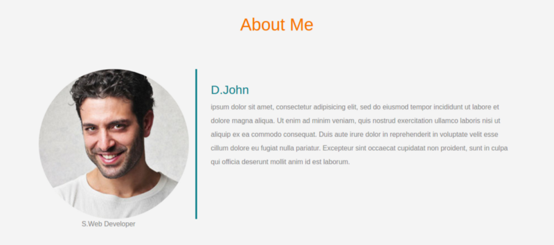
About section
Here we will take advantage of the capabilities of the Bootstrap grid in order to form a section layout consisting of two parts. Let's get started by adding the
The first part of the layout will be located on the left; it will contain a photo. The second part, located on the right, contains a description.
Here is the markup of the left side of this section:
But what happens after the description of the right part of the layout is added here:
Pay attention to adjusting the width of the columns using the above-described classes
Here are the styles for all this:
Let us now deal with the section in which the portfolio of the developer will be presented. It will contain a gallery of works.
Portfolio section
When forming the layout of this section, the same principles of working with the grid, which we considered above, are applied:
Adding the
Each item in our gallery, on medium and large screens, occupies 4 columns (recall - the class
Styling the gallery of works:
Let's talk about creating a section that contains announcements of materials from the blog, which is conducted by our conditional web developer.
Blog section
To create this section, we need the so-called cards (cards in Bootstrap terminology).
In order to create a card, you need to include a
The HTML markup of this section will look like this:
Here are the styles for cards:
This is how our one-page will look after creating the Blog section:
Page after adding Blog section
This section will contain information about the project team.
Team Section
To form this section, we will use the grid, evenly dividing the available space between the images. Each image (on large and medium screens) will occupy 3 columns of the grid, which is 25% of the total space.
Here is the HTML markup for this section:
And here are the styles:
Decorate this section with animation that appears when you hover the mouse over the image. It should look like the one below.
Animation when you hover the mouse over the image
In order to achieve this effect, add the following styles to
In this section of the page there will be a form with which visitors can send messages to the site owner. Here, as usual, in order to stylize the elements and ensure their responsiveness, we will take advantage of the possibilities of Bootstrap.
Feedback form
As in Bootstrap 3, Bootstrap 4 uses the
Add the following to the
Here are the styles for the feedback form section to be placed in the
Standard fonts are not suitable for everyone. We, using the Google Font API, apply in our project the font Raleway. It will look very good here. To import the font, add the following directive to the
Then we define global styles for various HTML tags:
The figure below shows the behavior of the page we want to achieve.
Scroll the page when clicking links in the navigation bar
In order for the page, when clicking on the links of the navigation bar, to smoothly scroll to the desired section, we will need to resort to jQuery features. If you are not very familiar with this library, know that there is nothing complicated here - just add the code below to the
After that add the
In order for all this to finally work, it remains only to add the
This completes our example. Here is the code for this project on github.
Bootstrap 4 is a great tool for creating web application interfaces. It gives the developer high-quality components that are easy to customize and perfectly fit together. In addition, Bootstrap allows you to create responsive layouts that look good on devices with different screens.
Dear readers! If today your first practical acquaintance with Bootstrap took place, tell me, are you planning to use this framework in your projects?

If you want to learn Bootstrap, in particular, its latest, fourth version, it means that this material is prepared especially for you. Here, on a small end-to-end example, which can really be mastered in half an hour, the basics of Bootstrap will be demonstrated, having figured out that you can easily do something of your own, using this framework.
Prerequisites
This material is aimed at novice web developers who own the basics of HTML, CSS and jQuery.
Here is a one-page website, the creation of which means Bootstrap we will talk about.
')
Ready project created by Bootstrap
Download and Install Bootstrap
There are several ways to download and use Bootstrap. For starters, you can use
npm . Here we need the following command: npm install bootstrap Bootstrap can be connected to a page using a content delivery network. To do this, add the following link to the
<head> : <link rel="stylesheet" href="https://maxcdn.bootstrapcdn.com/bootstrap/4.0.0/css/bootstrap.min.css" integrity="sha384-Gn5384xqQ1aoWXA+058RXPxPg6fy4IWvTNh0E263XmFcJlSAwiGgFAW/dAiS6JXm" crossorigin="anonymous"> You can download the latest version of Bootstrap from here and use it locally.
The project structure should look like the following figure.
Project structure
About the possibilities of Bootstrap 4
The first stable version of Bootstrap 4 was released at the end of January of this year. Now Bootstrap includes some interesting features that were not in its previous version. Namely, if we talk about improvements and changes, we can note the following:
- Bootstrap 4 is rewritten using flexbox technology, while Bootstrap 3 uses float technology. If you're not familiar with flexbox, take a look at this material .
- In Bootstrap 4, in CSS, the units of measure
remare used, while the units of measurement used in the past arepx. Here you can learn about how they differ. - Some components, such as panels, have been removed. Here you can find details about the changes made in Bootstrap 4.
In fact, Bootstrap 4 has a lot in comparison with Bootstrap 3, if you need it, you can familiarize yourself with these innovations. We are starting to work on our training project.
Bootstrap Mesh System
The system of grids Bootstrap (Bootstrap Grid System) is designed to create page layouts. It simplifies the development of responsive websites. In the new version of Bootstrap the class names have not changed (it should be noted that the
.xs class no longer exists).The grid is divided into 12 columns, this structure, configured as needed by the developer, is the basis of the page layout.
In order to use the Bootstrap grid, you need to add the
.row class to the main element of the page <div> . When adjusting the sizes of nested elements, the following classes are used (instead of the asterisk at the end of the class name, the number of columns of the basic 12-column grid is indicated, which a particular element should occupy):col-lg-*is a class used for pages intended for devices with large screens, like laptops;col-md-*is a class for pages designed for devices with a medium-sized screen, such as tablets;col-sm-*- class for pages that are designed small screens, for example, such as smartphones.
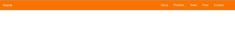
Navigation bar
Navigation bars in Bootstrap are created using the
.navbar class. In fact, this is the wrapper into which the elements forming the navigation bar are placed. Below is a panel that we will create now. It is located at the top of the page and does not disappear when scrolling.Navigation bar
So, in order for a navigation bar to appear on the page, we
.navbar add a <nav> tag to the index.html with the class .navbar , inside of which, using other classes like .navbar-brand , .navbar-toggler and .nav-item , create some special elements and structure of the site navigation system. The .fixed-top class allows you to lock the navigation bar at the top of the page. Here is the layout of the navigation bar: <nav class="navbar navbar-expand-lg fixed-top "> <a class="navbar-brand" href="#">Home</a> <button class="navbar-toggler" type="button" data-toggle="collapse" data-target="#navbarSupportedContent" aria-controls="navbarSupportedContent" aria-expanded="false" aria-label="Toggle navigation"> <span class="navbar-toggler-icon"></span> </button> <div class="collapse navbar-collapse " id="navbarSupportedContent"> <ul class="navbar-nav mr-4"> <li class="nav-item"> <a class="nav-link" href="#">About</a> </li> <li class="nav-item"> <a class="nav-link " href="#">Portfolio</a> </li> <li class="nav-item"> <a class="nav-link " href="#">Team</a> </li> <li class="nav-item"> <a class="nav-link " href="#">Post</a> </li> <li class="nav-item"> <a class="nav-link " href="#">Contact</a> </li> </ul> </div> </nav> Now create the
main.css file and connect it to the page by placing the following in the <head> the index.html file: <link rel="stylesheet" type="text/css" href="css/main.css"> This will allow you to customize the styles of page elements by placing CSS rules in this file. Add to this CSS file the rules that set the color for the navigation bar:
.navbar{ background:#F97300; } .nav-link , .navbar-brand{ color: #f4f4f4; cursor: pointer; } .nav-link{ margin-right: 1em !important; } .nav-link:hover{ background: #f4f4f4; color: #f97300; } .navbar-collapse{ justify-content: flex-end; } .navbar-toggler{ background:#fff !important; } New mesh Bootstrap is built on the basis of flexbox, so you need to use the appropriate properties to align the content. For example, in order to place the menu of the navigation pane on the right, use the
justify-content property and set its value at flex-end : .navbar-collapse{ justify-content: flex-end; } You can use the
.bg-light (light background), .bg-dark (dark background), and .bg-primary (primary background color) classes to customize the background color of the navigation pane. We use the following settings: .bg-dark{ background-color:#343a40!important } .bg-primary{ background-color:#343a40!important } Page Cap
To describe the page
<header> use the <header> : <header class="header"> </header> Prepare a layout for the page header. We want it to occupy the entire height of the window, so jQuery features will come in handy here. Create a
main.js file and connect it to the index.html before the closing <body> : <script type="text/javascript" src='js/main.js'></script> Add the following to the
main.js file: $(document).ready(function(){ $('.header').height($(window).height()); }) It is useful to put in the header of the page some nice background image. We do this as follows:
/*header style*/ .header{ background-image: url('../images/headerback.jpg'); background-attachment: fixed; background-size: cover; background-position: center; } That's what we got in the end.
Page header with background image
While the site’s header looks empty, we
.overlay add a <div> element to it, assigning the .overlay class to .overlay , which will lead to the creation of a block that is located on top of the background image of the header. Let's change that section of the index.html file, where we described the header, as follows: <header class="header"> <div class="overlay"></div> </header> Then, in
main.css , add the following: .overlay{ position: absolute; min-height: 100%; min-width: 100%; left: 0; top: 0; background: rgba(244, 244, 244, 0.79); } Now add a description of the project to the header. We will place it in a new
<div> element with the class .containter . This is an auxiliary class of the framework called Bootstrap, which is designed to host content based on the needs of a responsive layout. Here's how the markup changes in this step: <header class="header"> <div class="overlay"></div> <div class="container"> </div> </header> Now add here another
<div> element to which we assign the .description class: <div class="description text-center"> <h3><font color="#3AC1EF">▍ Hello ,Welcome To My officail Website <p> cillum dolore eu fugiat nulla pariatur. Excepteur sint occaecat cupidatat non proident, sunt in culpa qui officia deserunt mollit anim id est laborum.</p> <button class="btn btn-outline-secondary">See more</button> </font></h3> </div> We will also assign the class
.text-center this tag, which will allow aligning its contents to the center of the page. At the end of the site description there is a button. Talk about how to set it up.Buttons
Bootstrap provides many classes for buttons. See some examples of button design here . As you can see in the markup example from the previous section, we added
.btn and .btn to the <button> .btn . btn-outline-secondary .Now we set up the styles for the
.description class: .description{ position: absolute; top: 30%; margin: auto; padding: 2em; } .description h1{ color:#F97300 ; } .description p{ color:#666; font-size: 20px; width: 50%; line-height: 1.5; } .description button{ border:1px solid #F97300; background:#F97300; color:#fff; } Here is what the page header will look like after performing the above steps:
The cap of the page containing the description of the project
About section
For a start, look at what we want to create. Before you - the section of the page with information about the web developer.
About section
Here we will take advantage of the capabilities of the Bootstrap grid in order to form a section layout consisting of two parts. Let's get started by adding the
.row class to the parent element of the <div> .row : <div class="row"></div> The first part of the layout will be located on the left; it will contain a photo. The second part, located on the right, contains a description.
Here is the markup of the left side of this section:
<div class="row"> // <div class="col-lg-4 col-md-4 col-sm-12"> <img align="center" src="images/team-3.jpg" class="img-fluid"> <span class="text-justify">S.Web Developer</span> </div> </div> But what happens after the description of the right part of the layout is added here:
<div class="row"> <div class="col-lg-4 col-md-4 col-sm-12"> <img align="center" src="images/team-3.jpg" class="img-fluid"> <span class="text-justify">S.Web Developer</span> </div> <div class="col-lg-8 col-md-8 col-sm-12 desc"> <h3><font color="#3AC1EF">▍D.John</font></h3> <p> ipsum dolor sit amet, consectetur adipisicing elit, sed do eiusmod tempor incididunt ut labore et dolore magna aliqua. Ut enim ad minim veniam, quis nostrud exercitation ullamco laboris nisi ut aliquip ex ea commodo consequat. Duis aute irure dolor in reprehenderit in voluptate velit esse cillum dolore eu fugiat nulla pariatur. Excepteur sint occaecat cupidatat non proident, sunt in culpa qui officia deserunt mollit anim id est laborum. </p> </div> </div> Pay attention to adjusting the width of the columns using the above-described classes
col-lg-* , col-md-* and col-sm-* .Here are the styles for all this:
.about{ margin: 4em 0; padding: 1em; position: relative; } .about h1{ color:#F97300; margin: 2em; } .about img{ height: 100%; width: 100%; border-radius: 50% } .about span{ display: block; color: #888; position: absolute; left: 115px; } .about .desc{ padding: 2em; border-left:4px solid #10828C; } .about .desc h3{ color: #10828C; } .about .desc p{ line-height:2; color:#888; } Portfolio section
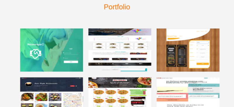
Let us now deal with the section in which the portfolio of the developer will be presented. It will contain a gallery of works.
Portfolio section
When forming the layout of this section, the same principles of working with the grid, which we considered above, are applied:
<!-- portfolio --> <div class="portfolio"> <h1 class="text-center">Portfolio</h1> <div class="container"> <div class="row"> <div class="col-lg-4 col-md-4 col-sm-12"> <img align="center" src="images/portfolio/port13.png" class="img-fluid"> </div> <div class="col-lg-4 col-md-4 col-sm-12"> <img align="center" src="images/portfolio/port1.png" class="img-fluid"> </div> <div class="col-lg-4 col-md-4 col-sm-12"> <img align="center" src="images/portfolio/port6.png" class="img-fluid"> </div> <div class="col-lg-4 col-md-4 col-sm-12"> <img align="center" src="images/portfolio/port3.png" class="img-fluid"> </div> <div class="col-lg-4 col-md-4 col-sm-12"> <img align="center" src="images/portfolio/port11.png" class="img-fluid"> </div> <div class="col-lg-4 col-md-4 col-sm-12"> <img align="center" src="images/portfolio/electric.png" class="img-fluid"> </div> <div class="col-lg-4 col-md-4 col-sm-12"> <img align="center" src="images/portfolio/Classic.jpg" class="img-fluid"> </div> <div class="col-lg-4 col-md-4 col-sm-12"> <img align="center" src="images/portfolio/port1.png" class="img-fluid"> </div> <div class="col-lg-4 col-md-4 col-sm-12"> <img align="center" src="images/portfolio/port8.png" class="img-fluid"> </div> </div> </div> </div> Adding the
.img-fluid class to each of the images makes them responsive.Each item in our gallery, on medium and large screens, occupies 4 columns (recall - the class
col-sm-12 used for devices with small screens, the class col-md-4 used for medium screens, col-lg-4 - for devices with large screens). As a result, on large and medium screens, about 33.3% of a container element will fall on one element, on small devices each element will occupy the entire screen (12 columns).Styling the gallery of works:
/*Portfolio*/ .portfolio{ margin: 4em 0; position: relative; } .portfolio h1{ color:#F97300; margin: 2em; } .portfolio img{ height: 15rem; width: 100%; margin: 1em; } Blog section and work with cards
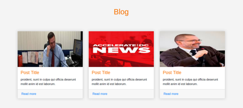
Let's talk about creating a section that contains announcements of materials from the blog, which is conducted by our conditional web developer.
Blog section
To create this section, we need the so-called cards (cards in Bootstrap terminology).
In order to create a card, you need to include a
<div> element in the layout and add the class .card to it. The following classes can be used to configure various card elements:.card-header:.card-header.card-body: main content.card-title: title.card-footer: basement.card-image: image
The HTML markup of this section will look like this:
<!-- Posts section --> <div class="blog"> <div class="container"> <h1 class="text-center">Blog</h1> <div class="row"> <div class="col-md-4 col-lg-4 col-sm-12"> <div class="card"> <div class="card-img"> <img align="center" src="images/posts/polit.jpg" class="img-fluid"> </div> <div class="card-body"> <h4 class="card-title">Post Title</h4> <p class="card-text"> proident, sunt in culpa qui officia deserunt mollit anim id est laborum. </p> </div> <div class="card-footer"> <a href="" class="card-link">Read more</a> </div> </div> </div> <div class="col-md-4 col-lg-4 col-sm-12"> <div class="card"> <div class="card-img"> <img align="center" src="images/posts/images.jpg" class="img-fluid"> </div> <div class="card-body"> <h4 class="card-title">Post Title</h4> <p class="card-text"> proident, sunt in culpa qui officia deserunt mollit anim id est laborum. </p> </div> <div class="card-footer"> <a href="" class="card-link">Read more</a> </div> </div> </div> <div class="col-md-4 col-lg-4 col-sm-12"> <div class="card"> <div class="card-img"> <img align="center" src="images/posts/imag2.jpg" class="img-fluid"> </div> <div class="card-body"> <h4 class="card-title">Post Title</h4> <p class="card-text"> proident, sunt in culpa qui officia deserunt mollit anim id est laborum. </p> </div> <div class="card-footer"> <a href="" class="card-link">Read more</a> </div> </div> </div> </div> </div> </div> Here are the styles for cards:
.blog{ margin: 4em 0; position: relative; } .blog h1{ color:#F97300; margin: 2em; } .blog .card{ box-shadow: 0 0 20px #ccc; } .blog .card img{ width: 100%; height: 12em; } .blog .card-title{ color:#F97300; } .blog .card-body{ padding: 1em; } This is how our one-page will look after creating the Blog section:
Page after adding Blog section
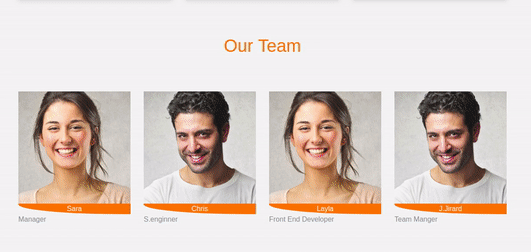
Team Section
This section will contain information about the project team.
Team Section
To form this section, we will use the grid, evenly dividing the available space between the images. Each image (on large and medium screens) will occupy 3 columns of the grid, which is 25% of the total space.
Here is the HTML markup for this section:
<!-- Team section --> <div class="team"> <div class="container"> <h1 class="text-center">Our Team</h1> <div class="row"> <div class="col-lg-3 col-md-3 col-sm-12 item"> <img align="center" src="images/team-2.jpg" class="img-fluid" alt="team"> <div class="des"> Sara </div> <span class="text-muted">Manager</span> </div> <div class="col-lg-3 col-md-3 col-sm-12 item"> <img align="center" src="images/team-3.jpg" class="img-fluid" alt="team"> <div class="des"> Chris </div> <span class="text-muted">S.enginner</span> </div> <div class="col-lg-3 col-md-3 col-sm-12 item"> <img align="center" src="images/team-2.jpg" class="img-fluid" alt="team"> <div class="des"> Layla </div> <span class="text-muted">Front End Developer</span> </div> <div class="col-lg-3 col-md-3 col-sm-12 item"> <img align="center" src="images/team-3.jpg" class="img-fluid" alt="team"> <div class="des"> J.Jirard </div> <span class="text-muted">Team Manger</span> </div> </div> </div> </div> And here are the styles:
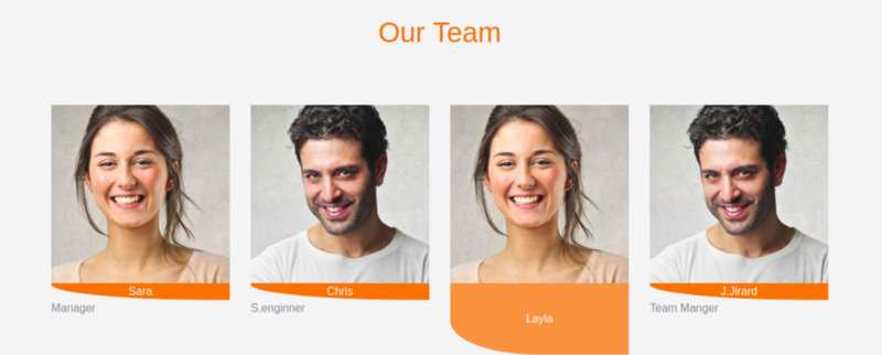
.team{ margin: 4em 0; position: relative; } .team h1{ color:#F97300; margin: 2em; } .team .item{ position: relative; } .team .des{ background: #F97300; color: #fff; text-align: center; border-bottom-left-radius: 93%; transition:.3s ease-in-out; } Decorate this section with animation that appears when you hover the mouse over the image. It should look like the one below.
Animation when you hover the mouse over the image
In order to achieve this effect, add the following styles to
main.css : .team .item:hover .des{ height: 100%; background:#f973007d; position: absolute; width: 89%; padding: 5em; top: 0; border-bottom-left-radius: 0; } Feedback form
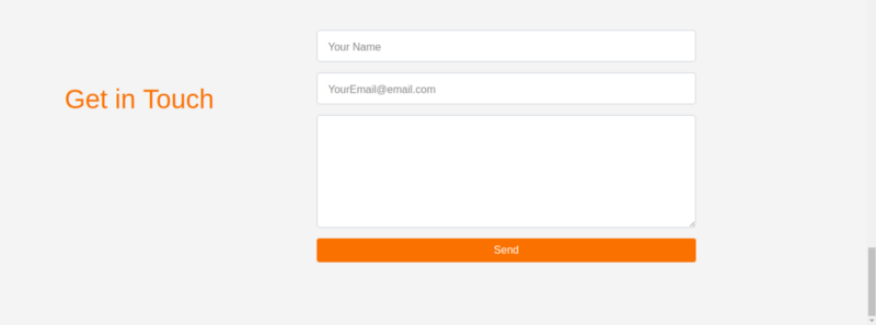
In this section of the page there will be a form with which visitors can send messages to the site owner. Here, as usual, in order to stylize the elements and ensure their responsiveness, we will take advantage of the possibilities of Bootstrap.
Feedback form
As in Bootstrap 3, Bootstrap 4 uses the
.form-control class for input fields, but now there is something new here. For example, instead of the obsolete class .input-group-addon , a new class .input-group-prepend (for badges and labels). Details on this can be found in the documentation for Bootstrap 4. In our case, each input field will be placed in a <div> element to which the class .form-group is assigned.Add the following to the
index.html file: <!-- Contact form --> <div class="contact-form"> <div class="container"> <form> <div class="row"> <div class="col-lg-4 col-md-4 col-sm-12"> <h1>Get in Touch</h1> </div> <div class="col-lg-8 col-md-8 col-sm-12 right"> <div class="form-group"> <input type="text" class="form-control form-control-lg" placeholder="Your Name" name=""> </div> <div class="form-group"> <input type="email" class="form-control form-control-lg" placeholder="YourEmail@email.com" name="email"> </div> <div class="form-group"> <textarea class="form-control form-control-lg"> </textarea> </div> <input type="submit" class="btn btn-secondary btn-block" value="Send" name=""> </div> </div> </form> </div> </div> Here are the styles for the feedback form section to be placed in the
main.css file: .contact-form{ margin: 6em 0; position: relative; } .contact-form h1{ padding:2em 1px; color: #F97300; } .contact-form .right{ max-width: 600px; } .contact-form .right .btn-secondary{ background: #F97300; color: #fff; border:0; } .contact-form .right .form-control::placeholder{ color: #888; font-size: 16px; } Fonts
Standard fonts are not suitable for everyone. We, using the Google Font API, apply in our project the font Raleway. It will look very good here. To import the font, add the following directive to the
main.css file: @import url('https://fonts.googleapis.com/css?family=Raleway'); Then we define global styles for various HTML tags:
html,h1,h2,h3,h4,h5,h6,a{ font-family: "Raleway"; } Scrolling effects
The figure below shows the behavior of the page we want to achieve.
Scroll the page when clicking links in the navigation bar
In order for the page, when clicking on the links of the navigation bar, to smoothly scroll to the desired section, we will need to resort to jQuery features. If you are not very familiar with this library, know that there is nothing complicated here - just add the code below to the
main.js file: $(".navbar a").click(function(){ $("body,html").animate({ scrollTop:$("#" + $(this).data('value')).offset().top },1000) }) After that add the
data-value attribute to each of the links in the navigation bar and bring the markup to the following form: <li class="nav-item"> <a class="nav-link" data-value="about" href="#">About</a> </li> <li class="nav-item"> <a class="nav-link " data-value="portfolio" href="#">Portfolio</a> </li> <li class="nav-item"> <a class="nav-link " data-value="blog" href="#">Blog</a> </li> <li class="nav-item"> <a class="nav-link " data-value="team" href="#"> Team</a> </li> <li class="nav-item"> <a class="nav-link " data-value="contact" href="#">Contact</a> </li> In order for all this to finally work, it remains only to add the
id attribute to the main <div> element of each section of the page. At the same time, it is necessary to ensure that its value is identical to that specified in the data-value attribute of the corresponding link. For example, here is the corresponding attribute for the About section: <div class="about" id="about"></div> This completes our example. Here is the code for this project on github.
Results
Bootstrap 4 is a great tool for creating web application interfaces. It gives the developer high-quality components that are easy to customize and perfectly fit together. In addition, Bootstrap allows you to create responsive layouts that look good on devices with different screens.
Dear readers! If today your first practical acquaintance with Bootstrap took place, tell me, are you planning to use this framework in your projects?
Source: https://habr.com/ru/post/350758/
All Articles