A couple of obscure rakes when using web fonts
Recently, in a product in which I participate, we decided to use a more modern font.
In the implementation of this seemingly simple task for the modern web, a couple of interesting and not obvious rakes were caught that I would like to talk about.
KDPV, she rake # 1
')
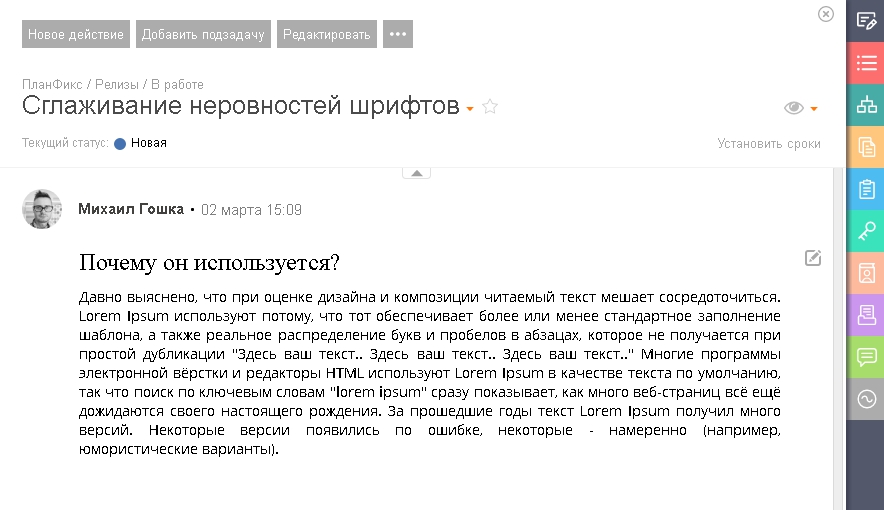
As it turned out, the chosen font looked, to put it mildly, very bad if anti-aliasing of uneven screen fonts was turned off on the computer.
In windows, for example, this tick is responsible for this:

Unfortunately, it’s impossible to tell all users - well, turn on this checkbox - therefore, it was decided to follow a different path - for users with font smoothing disabled, use Arial checked instead of a new font.
In order to do this using js, we determine whether font smoothing is enabled in the system, and if not, then we attach a special to the body. class and override styles.
The definition itself and its explanation is, for example, in Zoltan Hawryluk .
The idea is very simple there - draw the text on the canvas and check later if there are characters with translucency. By the way, this check was suggested to be added to Modernizr, but the request rejected.
Rake number 2 looks like this:
And sometimes a little differently: there were still options not bold, but some stretched font and just a slightly different one.
In all cases, the reason was one - locally installed font.
Initially, we connected the fonts using css directly with google fonts
And there is something like this css:
Solution - take css to yourself and remove local from it:
After these simple changes, all users have become happy.
(except for those who did not like the new font - but this is no longer a technical issue and let holivar what fonts are better and more beautiful beyond the scope of this article)
In the implementation of this seemingly simple task for the modern web, a couple of interesting and not obvious rakes were caught that I would like to talk about.
KDPV, she rake # 1
')
As it turned out, the chosen font looked, to put it mildly, very bad if anti-aliasing of uneven screen fonts was turned off on the computer.
In windows, for example, this tick is responsible for this:
Unfortunately, it’s impossible to tell all users - well, turn on this checkbox - therefore, it was decided to follow a different path - for users with font smoothing disabled, use Arial checked instead of a new font.
In order to do this using js, we determine whether font smoothing is enabled in the system, and if not, then we attach a special to the body. class and override styles.
The definition itself and its explanation is, for example, in Zoltan Hawryluk .
The idea is very simple there - draw the text on the canvas and check later if there are characters with translucency. By the way, this check was suggested to be added to Modernizr, but the request rejected.
Rake number 2 looks like this:
And sometimes a little differently: there were still options not bold, but some stretched font and just a slightly different one.
In all cases, the reason was one - locally installed font.
Initially, we connected the fonts using css directly with google fonts
<link href="https://fonts.googleapis.com/css?family=Exo+2" rel="stylesheet"> And there is something like this css:
@font-face { font-family: 'Exo 2'; font-style: normal; font-weight: 400; src: local('Exo 2'), local('Exo2-Regular'), url(https://fonts.gstatic.com/s/exo2/v4/7cHmv4okm5zmbtYoK-4.woff2) format('woff2'); unicode-range: U+0000-00FF, U+0131, U+0152-0153, U+02BB-02BC, U+02C6, U+02DA, U+02DC, U+2000-206F, U+2074, U+20AC, U+2122, U+2191, U+2193, U+2212, U+2215, U+FEFF, U+FFFD; } Solution - take css to yourself and remove local from it:
@font-face { font-family: 'Exo 2'; font-style: normal; font-weight: 400; src: url(https://fonts.gstatic.com/s/exo2/v4/7cHmv4okm5zmbtYoK-4.woff2) format('woff2'); unicode-range: U+0000-00FF, U+0131, U+0152-0153, U+02BB-02BC, U+02C6, U+02DA, U+02DC, U+2000-206F, U+2074, U+20AC, U+2122, U+2191, U+2193, U+2212, U+2215, U+FEFF, U+FFFD; } After these simple changes, all users have become happy.
(except for those who did not like the new font - but this is no longer a technical issue and let holivar what fonts are better and more beautiful beyond the scope of this article)
Source: https://habr.com/ru/post/350692/
All Articles