MathOps or math in monitoring
What I want to talk about began on December 30, 2010, when Etsy posted the first commit of its StatsD system on GitHub. This, now, super popular system written in JavaScript (hipsters rejoice), to which you can send metrics, measurements of the performance of pieces of your code, and it aggregates them and sends them already aggregated to the time-series storage system.
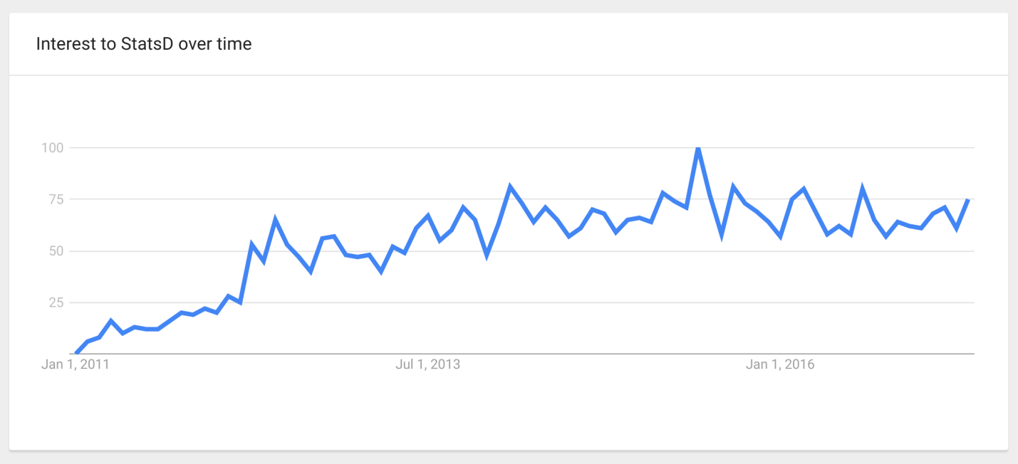
Against the background of the popularity of StatsD and other time-series systems, the idea of “ Monitor Everything ” emerged: the more different things in the system are measured, the better, because in case of an unexpected situation it will be possible to find the necessary, already collected metric, which will allow to understand everything.
')
But as often happens with any fashionable technology, which was originally made with some restrictions, when people start using it, they don’t really think about these restrictions, but do as it’s written, as it’s necessary.
And it so happened that there are a lot of problems with all this, about which, in fact, Pavel Trukhanov ( tru_pablo ) will tell us.
We are talking about queuing systems, where independent requests come. SMOs include:
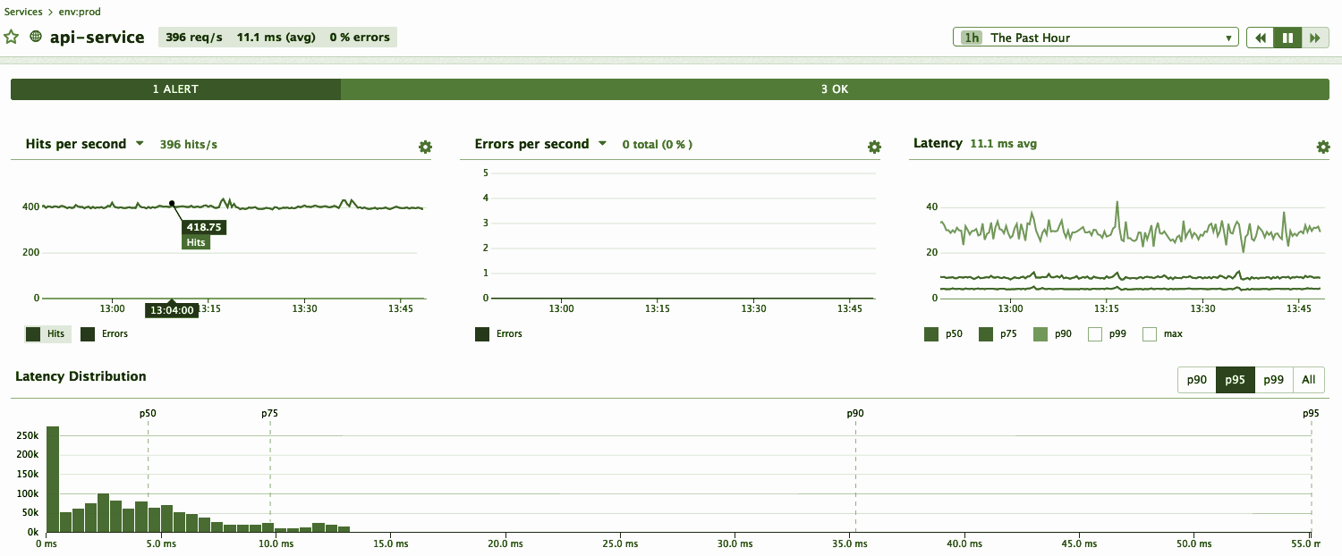
If we talk about the web, then there is access logs, in which the response time and the http-status of the response are recorded, from which it is possible to understand whether there are errors or brakes. We want the system to process incoming events quickly, without glitches, nothing “feil” and the users were happy. To do this, you need to constantly monitor that the process is proceeding as we expect. At the same time, there is our notion that everything is good, but there is a reality, and we constantly compare them.
If the process does not meet our expectations, then how we set / determined for ourselves a kind of “normal” situation, we need to further understand. For this, it is very convenient to use time series charts , in which time is plotted on a horizontal scale, and the desired parameter is plotted on a vertical scale.
I find such graphics most useful in situations where something goes wrong, as we expect, because they clearly show:
Everyone knows that the graphics are different, for example, bar , scatter (point), heatmap and others. But I like the time line exactly, and I recommend them, because our brain is able to coolly determine which of the segments is longer =) This is our evolutionary property that such a graph allows us to use directly.
Time is plotted on a horizontal scale, and a vertical scale is used for other parameters. Those. for each point in time there is one vertical strip of pixels that can be filled with information. In it, say, 800 or even 1600 points, depending on the size of your monitor.
Per unit of time a different number of events can occur in the system, 10, 100, 1000 or more, if the system is super large. No matter how many on your system, it is important that this is not one event. In addition, events can have different types, timings or results.
Despite the fact that you can make as many graphs as you like and look at different aspects on individual graphs, all the same, in the end, for a specific graph, you need to build one number from several events with numerous parameters.
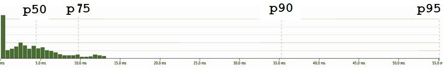
The timings can be visualized as a distribution density: the current timing value is plotted horizontally, and the number of timings with this value is plotted vertically.
The graph of the density of distribution shows that there are timings with a certain average value, there are fast, there are slow ones.
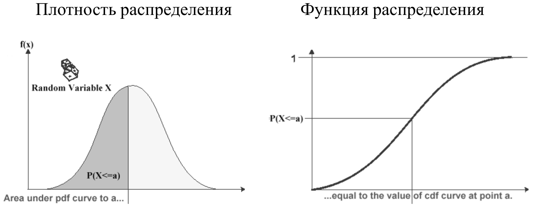
In addition to the distribution density, it is convenient to look at the distribution function , which is simply an integral of the distribution density. It is good because its range of values is limited to a segment from 0 to 1, therefore it allows you to compare completely different parameters with each other without normalization. But the distribution density is more familiar and physical.
In reality, for those systems we are talking about, the distribution density graph does not look like the well-known Gaussian bell of the normal distribution. Since, at a minimum, timings are not negative (unless you have gone back time on your server, which happens of course, but rarely). Therefore, in most real cases, the graph will look something like the following figure.
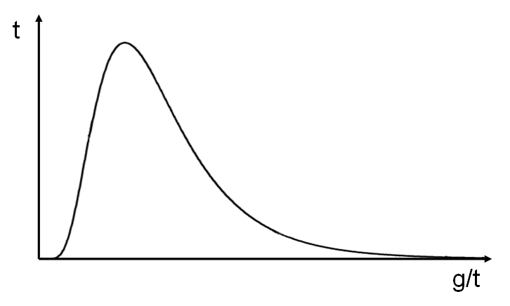
This is also a kind of model, an approximation. It is called the log-normal distribution, and is an exponent of the normal distribution function.
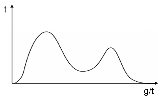
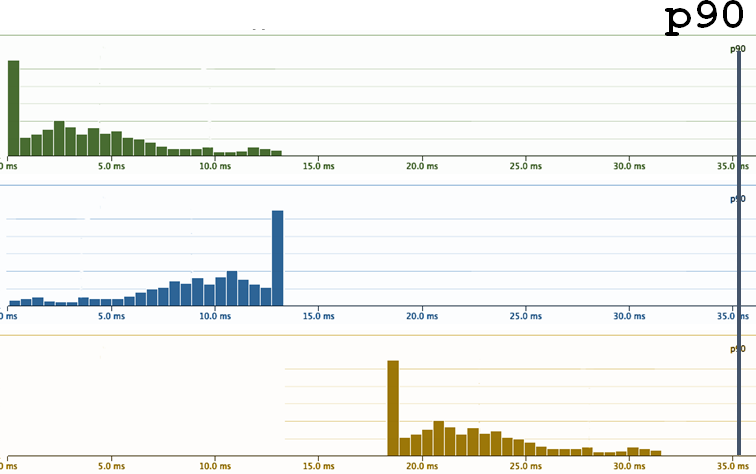
But the reality, of course, is not even that. All systems look a bit different. For example, a person screwed Memcached to his php , half of the requests went to Memcached , and half did not. Accordingly, a bimodal (two-vertex) distribution was obtained.
To be honest, the actual distribution functions look like anything (figure below). The more complex the system, the more diverse they will be. On the other hand, when the system becomes too complex, simply out of a million parts, it converses back to the normal distribution on average.
It is important to remember that these 1000 timings are calculated continuously, at each interval of time, for example, every minute. That is, for each interval we have some kind of distribution density.

1000 timings - what to do with them?
To put one number on the graph, instead of 1000, you need to take some statistics from the measurements - this means, in fact, to compress a thousand number to one. That is, with the loss of data - this is important.
Statistics that are known (and distributed):
In addition to the median, there are percentiles and other statistics, but I want to emphasize that whatever statistics we take, it will still be one number that will not fully describe a thousand observations.
Suppose we took some statistics and (hooray, finally) we have a schedule:

In this case, this is a graph of the arithmetic average. Something is already clear about it. It is clear that the average has small fluctuations, but there is no scatter of values by orders of magnitude.
Here is an example: this distribution density is taken from a specific service. Guess the statistics - select one of the options, and then I will hold a session of black magic with exposure.
Well, this may not have been difficult to guess, but here is another example:
Real complex systems usually behave this way. They always have a competition for resources, because sometimes there are many requests at the same time, and there are situations when for a specific request the stars are badly converged and the processing time is long. If we recall that the physical meaning of the expectation is the center of gravity of the distribution density, it is clear that even a few measurements on the far tail outweigh the lever rule. Therefore, the average is not located where there is a “typical average”.
My point is that the distributions may be completely different in different systems and in different parts of your system. And as long as you haven’t really calculated the average, having previously collected a bunch of observations, having built a graph on the basis of the statistics collected, in fact you can hardly guess the result correctly. Since even with the statistics collected, the average is not easy to guess.
It is believed that mean / average metric is very bad to use for monitoring. Percentile fans shout from any angle: “I saw in your monitoring an average - you are a bad person! Take and use better percentile! "
It should be noted, they say it is not from scratch and there is a certain reason in it:
1. Physical meaning.
Besides the fact that the average is the center of mass, one can describe the physical sense this way: you bet on a certain number, and the results of the bet (won or lost) accumulate. That amount, which was won by putting everything in one bag of money, is the essence of the expectation, which is equal to the arithmetic average.
But an online system, such as, for example, an online store, in which users expect to open a product card very quickly and rather buy it, cannot be compared with the concept of expectation and what it was designed for.
2. Robust emissions
The second argument of the percentile fans is that the “average is not robust to emissions”. Indeed, we have seen that even one observation on the far tail outweighs the numerous observations located closer to the beginning of the axis (in our case, with large and small timings, respectively).
But what I want to explain to you here is counterintuitive: in fact, monitoring doesn’t need robustness! On the contrary, we need non-safety to emissions - that is, a system that will clearly notice and show them. For example, if you have never had such a thing so that the average goes beyond a certain limit. And suddenly, from nowhere, there was some unprecedented distant ejection, then you, of course, want to know about it. After all, the system began to behave like never before - this is a sure sign that something is wrong. You do not want to close your eyes and say: “No, I need a robustness to emissions! This is a blowout, I don’t want to know about it. ”
Where did the demand / desire for robustness to emissions come from? When your task is not monitoring, but research of some system, for example, when you inherited a certain IT system, and you want to study some of its properties, select some basic pattern of behavior under load. We do this in some controlled environment / conditions and measure the behavior. Then it would be good if the statistics, which we are trying to characterize this behavior, have a robustness to emissions. Because we would like to discard and ignore the possible influence of some events that are completely unrelated to our research setup and with the characteristic behavior of the system. (For example, like a laboratory assistant Vasya, who recorded the observations and fell asleep or recorded incorrectly).
When you monitor and control, on the contrary you need to know about all these emissions - which ones are typical and which are out of the ordinary.
In the figure above, the Gaussian bell is "cut" into pieces.
From here comes a hasty sentence: “then let’s hang up on our (any or favorite) metrics a check that will follow when the value has come out of 3 σ from the average and warn us.” They say, "since these are rare events, then if this has already happened, then most likely something is wrong and you need to wake everyone up and do something."
In the figure, as you can see, a 3 σ departure gives approximately 0.1% probability, and it seems that these are really terribly rare events. but not really! 1 time in 700 observations you will have something to fall out there.
I want to show that even with a normal distribution of events that go beyond these notorious 3 σ , occur more often than you expect, than the general understanding of the "rare" and "abnormal". And, if it is monitoring, they will send you spam, and not benefit.
These two tasks are related:
In my opinion, the value of 300 in our first example does not describe the "average" or typical behavior of the system. The median (the 50th percentile), in my personal sense, is closer to what I would call “typical” for this distribution.
Percentile P90 is at around 550. And the more percentiles taken, the more detailed the description of the distribution will be.
Of course, you can build and look at the distribution itself, its density, but in control / monitoring or optimization tasks, you still need to operate with a limited number of parameters so that different distributions can be compared.
Let's look at one more example, one more distribution of service response times. It looks, in a sense, like:
My expectations tell me: “Dude, wait, you have almost all the observations here, up to 15 milliseconds, and 95th, why is there somewhere?”
Paradox.
Well, the 95th is a cool percentile, the fans convinced us that it is important to look not only at the middle and not at the median, but also at the higher percentiles. Let's start monitoring on the P95, since it obviously covers all the previous ones.
We set ourselves a Service Level Objective - or in Russian, a goal. For example, to P95 <55 ms and start to follow this.
Actually, there are a lot of points why this SLO is bad .
Subtle degradation
And you, for certain, would like to know that such changes occurred in the system. Therefore, the “let's only look at the X-percentile” approach does not work again. ¯ \ _ (ツ) _ / ¯
The solution suggests itself:
Let's see what happens.
Such our current requirements for the behavior of the system is the yellow border on the graph. And the blue curve is what the latency system looks like in reality. What you need to see is that to the right of p95 (the scale is non-linear), latency immediately begins to grow. In the sense that when we clamp our system on the thresholds, then where we stop controlling it, it immediately tries to jump out from under these thresholds as soon as it can faster. That is, if we have all optimized at the level of p95, then timings grow significantly on p96.
Second moment
Since we are a monitoring company, we are constantly asked: “Can you track the percentages? Do you draw the 95th percentile? "
We reluctantly answer: "Yes, you can ...". In our monitoring there are percentiles, but we hide them and try not to show them because they are misleading users.
Suppose there is a distribution density.
We see 3 percentiles and an average. But what is wrong here? It’s not so that 95 is not just "95". This is 95 out of 100. So, somewhere there are 5 more? Where are these 5%?
On the right tail the schedule is already low, and it feels that there are only very rare events to the right. And although they are, but you can not look at them.
But in the figure I collected the 5% and put a column. And a lot of them! 5% is every 20th . It's a lot! And it is immediately clear that it is wrong to ignore them .
When you look at the 95th percentile of your service, and it’s cool (let's say about 100 milliseconds), you think that everything is great! In fact, you just deliberately closed your eyes by 5%: “I will not look at that horror in the far tail of the distribution, because it’s scary and unpleasant — I don’t want to look there!” This is, of course, irresponsible .
It is clear that here too the solution suggests itself: “Ok, ok, 95 is not enough, let's take 99! We are cool guys, let's even take three nines - 99.9%! ”
Already, it would seem, at 99.9%, one thousandth is not really included, which, probably, is costly to optimize and you can score on such a rarity.
Yes?
But I will try to convince you that 99.9% is still not enough.
This is again a counterintuitive (and bold) statement. Before proving it, I would like to talk about these "senior" percentiles.
As in life, percentiles are often measured.
Now there are a lot of tools, starting with StatsD , ending with the whole variety of modern utilities that allow us to easily get different measurements.
And here we have already received response timelines. Let’s look at (our favorite) percentiles.
Here, the median (p50) is cool, I personally like super! Such a superstable - always ~ 2 milliseconds. It begs to rather hang the trigger with a threshold with a small margin of 2.2-3.5 ms and receive notifications when something goes wrong.
Let's look at the 90th percentile, and it behaves not so stable anymore
95th - at all, like a comb.
It would seem, where is the promised, praised robustness to emissions ?! This is how intuition deceives us again, prompting that “robust” means “smooth”, stable. Although in reality it is not so.
Continuing to talk about (counter) intuitive sensations of percentiles, we will look at another chart.
It seems that on this graph, p99 ranges from 1 second to ~ 2-3 seconds. And his "real value" should be somewhere around 1.1s
But if we calculate p99 for all the data accumulated during this period, it turns out that p99 is “real” in a completely different place - the difference is 10 times. How so?
First, we measure the percentile per interval - in this case per minute. For the day runs 1440 every minute measurements. We drew this graph, and our brain automatically calculates a horizontal trend for it, if we see that it does not float. Even if we guessed it: “So, this is a percentile - you probably need to take a maximum from it, it turns out to be about 5s” - anyway, it’s actually not there.
If we take this distribution and try to collect statistics, when the percentile that we calculate stops changing (or almost stops) from adding measurements over time, it turns out that it is still not where we expect it, but twice as high.
Our head calculates a certain horizontal level, and the percentile behaves differently.

For example, we look at the schedule for 8 hours and nothing much happens, and there were emissions at night. You can often see (and in this particular case) fewer requests at night. And it seems everything should work faster. And from the point of view of percentiles, everything works not necessarily faster, but somehow. Because it can be really faster, and there can be, for example, cold caches, because of which slow return.
Let's go back to the number of nines.
While we were discussing queuing systems, requests, services, perceptions, we lost real users. Users are not requests, but people. They roam the site (or in a mobile application) and want to accomplish something there through intermediate steps, which are often more than 1. And we measure statistics by individual requests.
Each user in the session has its own viewing depth. But:
We believe that only 1% of users remain on whom we are hammering if we monitor the 99th percentile. But again, this is not the case and it is as much as 10%!
And when we talk about the latency of individual subqueries that already go directly to the database, or to some web service, or application server, the ratio is even greater.
Therefore, 99.9% is often not enough “high” percentile, which you need to focus on.
Any statistician will say: "Do not trust your intuition in statistics!"
I am telling you: “Do not trust your intuition in monitoring!”
Pavel Trukhanov on Habrahabr - @tru_pablo
The company's blog and the okmeter.io service itself .
Against the background of the popularity of StatsD and other time-series systems, the idea of “ Monitor Everything ” emerged: the more different things in the system are measured, the better, because in case of an unexpected situation it will be possible to find the necessary, already collected metric, which will allow to understand everything.
')
Let's do everything that you can monitor - and it will be cool!
But as often happens with any fashionable technology, which was originally made with some restrictions, when people start using it, they don’t really think about these restrictions, but do as it’s written, as it’s necessary.
And it so happened that there are a lot of problems with all this, about which, in fact, Pavel Trukhanov ( tru_pablo ) will tell us.
Regardless of what software we are developing, mobile game or banking software, we want the system to process incoming events quickly, without glitches, nothing breaks and users are happy.
To do this, you need to constantly monitor that the process goes as it should. Okmeter does a service designed to allow thousands of engineers not to repeat the same thing from time to time in their monitoring services.
Not surprisingly, the company's director Pavel Trukhanov ( @tru_pablo ) has to read a lot about monitoring, about metrics, about mathematics, thinking, then reading a lot more and thinking a lot. This topic he became ill, and he decided to speak. This article is a transcript of his report on RHS ++ 2017
Queuing systems
We are talking about queuing systems, where independent requests come. SMOs include:
- the service that serves them;
- timings , including service time - service time and response time - waiting time in the queue;
- result of service.
If we talk about the web, then there is access logs, in which the response time and the http-status of the response are recorded, from which it is possible to understand whether there are errors or brakes. We want the system to process incoming events quickly, without glitches, nothing “feil” and the users were happy. To do this, you need to constantly monitor that the process is proceeding as we expect. At the same time, there is our notion that everything is good, but there is a reality, and we constantly compare them.
Charts
If the process does not meet our expectations, then how we set / determined for ourselves a kind of “normal” situation, we need to further understand. For this, it is very convenient to use time series charts , in which time is plotted on a horizontal scale, and the desired parameter is plotted on a vertical scale.
I find such graphics most useful in situations where something goes wrong, as we expect, because they clearly show:
- impact , that is how bad everything is;
- history - what the typical behavior of the indicator looks like;
- process dynamics , i.e. you can see whether the situation is getting worse or better.
Everyone knows that the graphics are different, for example, bar , scatter (point), heatmap and others. But I like the time line exactly, and I recommend them, because our brain is able to coolly determine which of the segments is longer =) This is our evolutionary property that such a graph allows us to use directly.
How to make such a schedule?
Time is plotted on a horizontal scale, and a vertical scale is used for other parameters. Those. for each point in time there is one vertical strip of pixels that can be filled with information. In it, say, 800 or even 1600 points, depending on the size of your monitor.
Per unit of time a different number of events can occur in the system, 10, 100, 1000 or more, if the system is super large. No matter how many on your system, it is important that this is not one event. In addition, events can have different types, timings or results.
Despite the fact that you can make as many graphs as you like and look at different aspects on individual graphs, all the same, in the end, for a specific graph, you need to build one number from several events with numerous parameters.
1000 timings - what to do with them?
The timings can be visualized as a distribution density: the current timing value is plotted horizontally, and the number of timings with this value is plotted vertically.
The graph of the density of distribution shows that there are timings with a certain average value, there are fast, there are slow ones.
In addition to the distribution density, it is convenient to look at the distribution function , which is simply an integral of the distribution density. It is good because its range of values is limited to a segment from 0 to 1, therefore it allows you to compare completely different parameters with each other without normalization. But the distribution density is more familiar and physical.
In reality, for those systems we are talking about, the distribution density graph does not look like the well-known Gaussian bell of the normal distribution. Since, at a minimum, timings are not negative (unless you have gone back time on your server, which happens of course, but rarely). Therefore, in most real cases, the graph will look something like the following figure.
This is also a kind of model, an approximation. It is called the log-normal distribution, and is an exponent of the normal distribution function.
But the reality, of course, is not even that. All systems look a bit different. For example, a person screwed Memcached to his php , half of the requests went to Memcached , and half did not. Accordingly, a bimodal (two-vertex) distribution was obtained.
To be honest, the actual distribution functions look like anything (figure below). The more complex the system, the more diverse they will be. On the other hand, when the system becomes too complex, simply out of a million parts, it converses back to the normal distribution on average.
It is important to remember that these 1000 timings are calculated continuously, at each interval of time, for example, every minute. That is, for each interval we have some kind of distribution density.
1000 timings - what to do with them?
To put one number on the graph, instead of 1000, you need to take some statistics from the measurements - this means, in fact, to compress a thousand number to one. That is, with the loss of data - this is important.
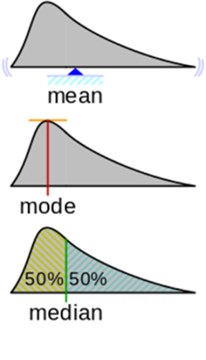
Statistics that are known (and distributed):
- The arithmetic average is the center of mass of the density graph.
- The mode for the density function is argmax of the distribution density, i.e. the position of the maximum along the X axis. Here the question arises: what to do when there are several peaks.
- Median - the value of X, in which the area of the figure is divided in half.
In addition to the median, there are percentiles and other statistics, but I want to emphasize that whatever statistics we take, it will still be one number that will not fully describe a thousand observations.
Suppose we took some statistics and (hooray, finally) we have a schedule:
In this case, this is a graph of the arithmetic average. Something is already clear about it. It is clear that the average has small fluctuations, but there is no scatter of values by orders of magnitude.
Here is an example: this distribution density is taken from a specific service. Guess the statistics - select one of the options, and then I will hold a session of black magic with exposure.
Answer
It seems you can easily imagine where the center of mass of the figure is located, but try to guess exactly, I'm sure that you are fooled! Let's get a look:
Well, this may not have been difficult to guess, but here is another example:
Answer
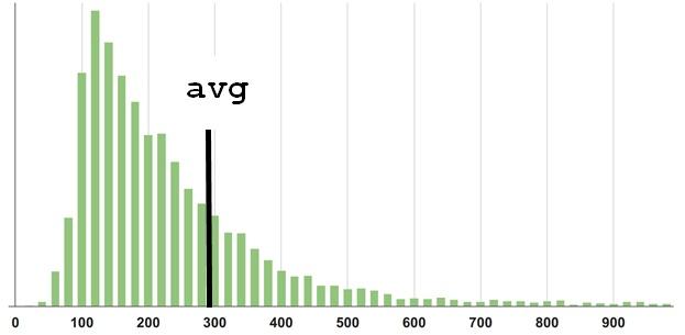
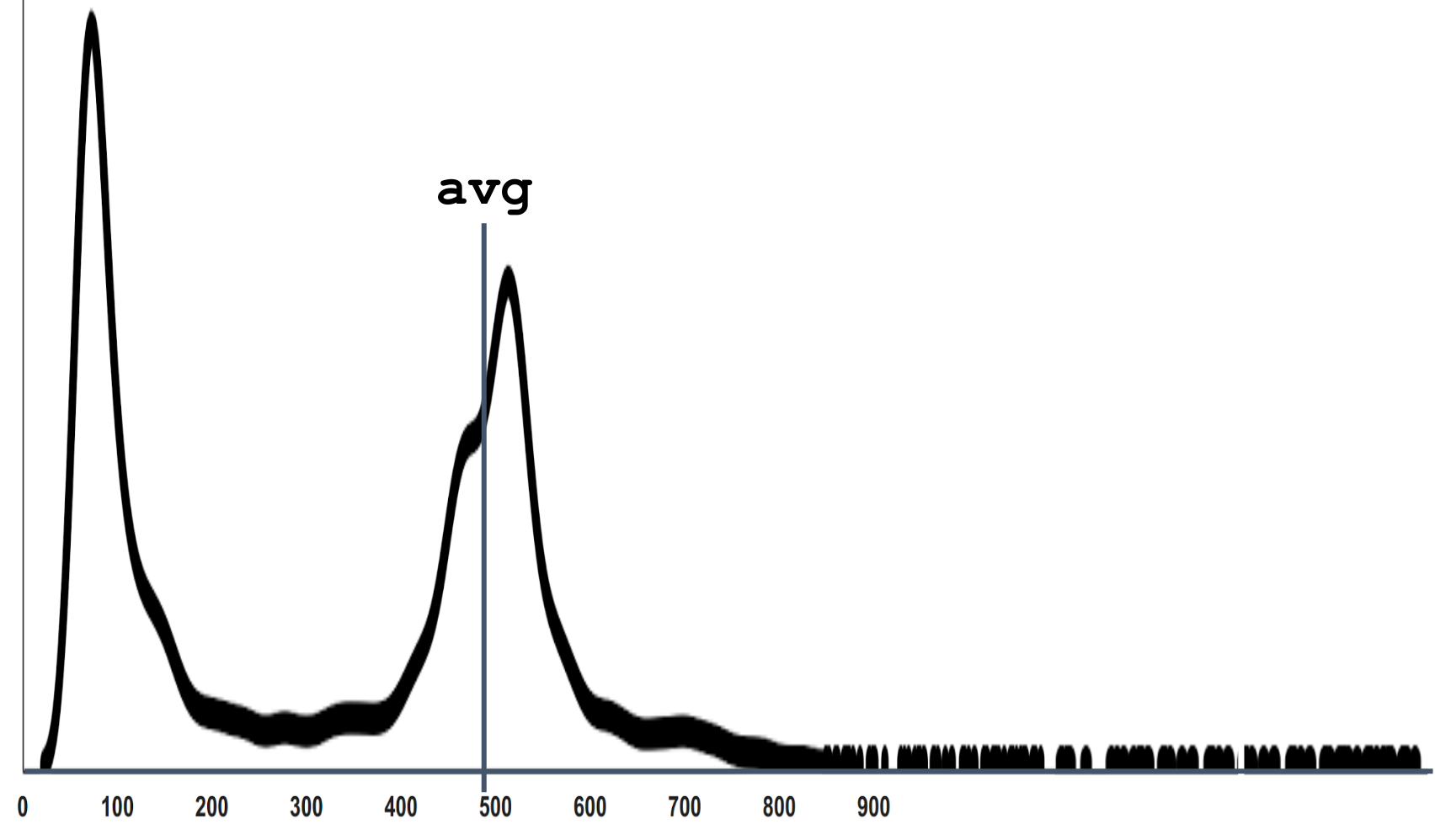
Here the average is 500. When I myself answered this question for myself, it seemed to me that 2 healthy peaks should be balanced somewhere in the region of 300.
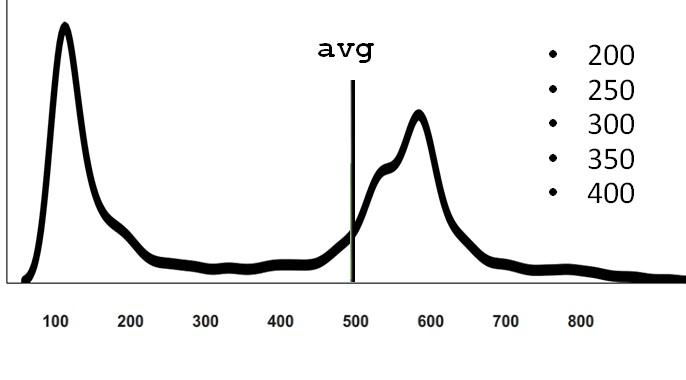
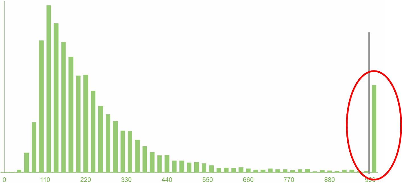
The fact is that if we otzumim this schedule, it turns out that he also has observations on the far tail, which are simply not visible in the scale in which we look.
The fact is that if we otzumim this schedule, it turns out that he also has observations on the far tail, which are simply not visible in the scale in which we look.
Real complex systems usually behave this way. They always have a competition for resources, because sometimes there are many requests at the same time, and there are situations when for a specific request the stars are badly converged and the processing time is long. If we recall that the physical meaning of the expectation is the center of gravity of the distribution density, it is clear that even a few measurements on the far tail outweigh the lever rule. Therefore, the average is not located where there is a “typical average”.
My point is that the distributions may be completely different in different systems and in different parts of your system. And as long as you haven’t really calculated the average, having previously collected a bunch of observations, having built a graph on the basis of the statistics collected, in fact you can hardly guess the result correctly. Since even with the statistics collected, the average is not easy to guess.
Disputes about arithmetic mean
It is believed that mean / average metric is very bad to use for monitoring. Percentile fans shout from any angle: “I saw in your monitoring an average - you are a bad person! Take and use better percentile! "
It should be noted, they say it is not from scratch and there is a certain reason in it:
1. Physical meaning.
Besides the fact that the average is the center of mass, one can describe the physical sense this way: you bet on a certain number, and the results of the bet (won or lost) accumulate. That amount, which was won by putting everything in one bag of money, is the essence of the expectation, which is equal to the arithmetic average.
But an online system, such as, for example, an online store, in which users expect to open a product card very quickly and rather buy it, cannot be compared with the concept of expectation and what it was designed for.
2. Robust emissions
The second argument of the percentile fans is that the “average is not robust to emissions”. Indeed, we have seen that even one observation on the far tail outweighs the numerous observations located closer to the beginning of the axis (in our case, with large and small timings, respectively).
But what I want to explain to you here is counterintuitive: in fact, monitoring doesn’t need robustness! On the contrary, we need non-safety to emissions - that is, a system that will clearly notice and show them. For example, if you have never had such a thing so that the average goes beyond a certain limit. And suddenly, from nowhere, there was some unprecedented distant ejection, then you, of course, want to know about it. After all, the system began to behave like never before - this is a sure sign that something is wrong. You do not want to close your eyes and say: “No, I need a robustness to emissions! This is a blowout, I don’t want to know about it. ”
Where did the demand / desire for robustness to emissions come from? When your task is not monitoring, but research of some system, for example, when you inherited a certain IT system, and you want to study some of its properties, select some basic pattern of behavior under load. We do this in some controlled environment / conditions and measure the behavior. Then it would be good if the statistics, which we are trying to characterize this behavior, have a robustness to emissions. Because we would like to discard and ignore the possible influence of some events that are completely unrelated to our research setup and with the characteristic behavior of the system. (For example, like a laboratory assistant Vasya, who recorded the observations and fell asleep or recorded incorrectly).
When you monitor and control, on the contrary you need to know about all these emissions - which ones are typical and which are out of the ordinary.
In the figure above, the Gaussian bell is "cut" into pieces.
Many people know the “rule of 3 σ (sigma)”: if you “retreat 3 σ ” from the mean, then the probability of getting observation outside this interval is very small.
From here comes a hasty sentence: “then let’s hang up on our (any or favorite) metrics a check that will follow when the value has come out of 3 σ from the average and warn us.” They say, "since these are rare events, then if this has already happened, then most likely something is wrong and you need to wake everyone up and do something."
In the figure, as you can see, a 3 σ departure gives approximately 0.1% probability, and it seems that these are really terribly rare events. but not really! 1 time in 700 observations you will have something to fall out there.
I want to show that even with a normal distribution of events that go beyond these notorious 3 σ , occur more often than you expect, than the general understanding of the "rare" and "abnormal". And, if it is monitoring, they will send you spam, and not benefit.
These two tasks are related:
- We first want to understand how our system behaves in the “norm” , and this is very important, because our a priori view may not correspond to reality in any way.
- Then, when we built the distributions, select the threshold values (focusing on the distribution or not too much), get alerts on them and monitor.
What is the "norm"?
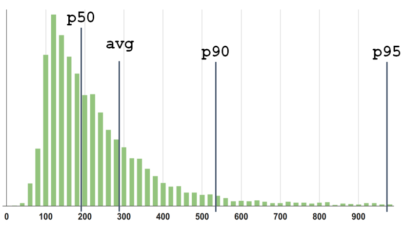
In my opinion, the value of 300 in our first example does not describe the "average" or typical behavior of the system. The median (the 50th percentile), in my personal sense, is closer to what I would call “typical” for this distribution.
Percentile P90 is at around 550. And the more percentiles taken, the more detailed the description of the distribution will be.
Of course, you can build and look at the distribution itself, its density, but in control / monitoring or optimization tasks, you still need to operate with a limited number of parameters so that different distributions can be compared.
Let's look at one more example, one more distribution of service response times. It looks, in a sense, like:
My expectations tell me: “Dude, wait, you have almost all the observations here, up to 15 milliseconds, and 95th, why is there somewhere?”
Paradox.
Well, the 95th is a cool percentile, the fans convinced us that it is important to look not only at the middle and not at the median, but also at the higher percentiles. Let's start monitoring on the P95, since it obviously covers all the previous ones.
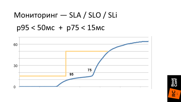
Monitoring
We set ourselves a Service Level Objective - or in Russian, a goal. For example, to P95 <55 ms and start to follow this.
Actually, there are a lot of points why this SLO is bad .
Subtle degradation
And you, for certain, would like to know that such changes occurred in the system. Therefore, the “let's only look at the X-percentile” approach does not work again. ¯ \ _ (ツ) _ / ¯
The solution suggests itself:
- Well, let's follow a large number of percentiles! One 9x-th is not enough, let's set the condition P75 <15 ms for the 75th one. And on some!
Let's see what happens.
Such our current requirements for the behavior of the system is the yellow border on the graph. And the blue curve is what the latency system looks like in reality. What you need to see is that to the right of p95 (the scale is non-linear), latency immediately begins to grow. In the sense that when we clamp our system on the thresholds, then where we stop controlling it, it immediately tries to jump out from under these thresholds as soon as it can faster. That is, if we have all optimized at the level of p95, then timings grow significantly on p96.
Second moment
Since we are a monitoring company, we are constantly asked: “Can you track the percentages? Do you draw the 95th percentile? "
We reluctantly answer: "Yes, you can ...". In our monitoring there are percentiles, but we hide them and try not to show them because they are misleading users.
Suppose there is a distribution density.
We see 3 percentiles and an average. But what is wrong here? It’s not so that 95 is not just "95". This is 95 out of 100. So, somewhere there are 5 more? Where are these 5%?
On the right tail the schedule is already low, and it feels that there are only very rare events to the right. And although they are, but you can not look at them.
But in the figure I collected the 5% and put a column. And a lot of them! 5% is every 20th . It's a lot! And it is immediately clear that it is wrong to ignore them .
When you look at the 95th percentile of your service, and it’s cool (let's say about 100 milliseconds), you think that everything is great! In fact, you just deliberately closed your eyes by 5%: “I will not look at that horror in the far tail of the distribution, because it’s scary and unpleasant — I don’t want to look there!” This is, of course, irresponsible .
It is clear that here too the solution suggests itself: “Ok, ok, 95 is not enough, let's take 99! We are cool guys, let's even take three nines - 99.9%! ”
Already, it would seem, at 99.9%, one thousandth is not really included, which, probably, is costly to optimize and you can score on such a rarity.
Yes?
But I will try to convince you that 99.9% is still not enough.
This is again a counterintuitive (and bold) statement. Before proving it, I would like to talk about these "senior" percentiles.
As in life, percentiles are often measured.
Now there are a lot of tools, starting with StatsD , ending with the whole variety of modern utilities that allow us to easily get different measurements.
- Let's measure how our service behaves!
- Come on!
- Let's stick the monitoring - I read on one thematic resource , how it is done - set - and that's it! There are charts!
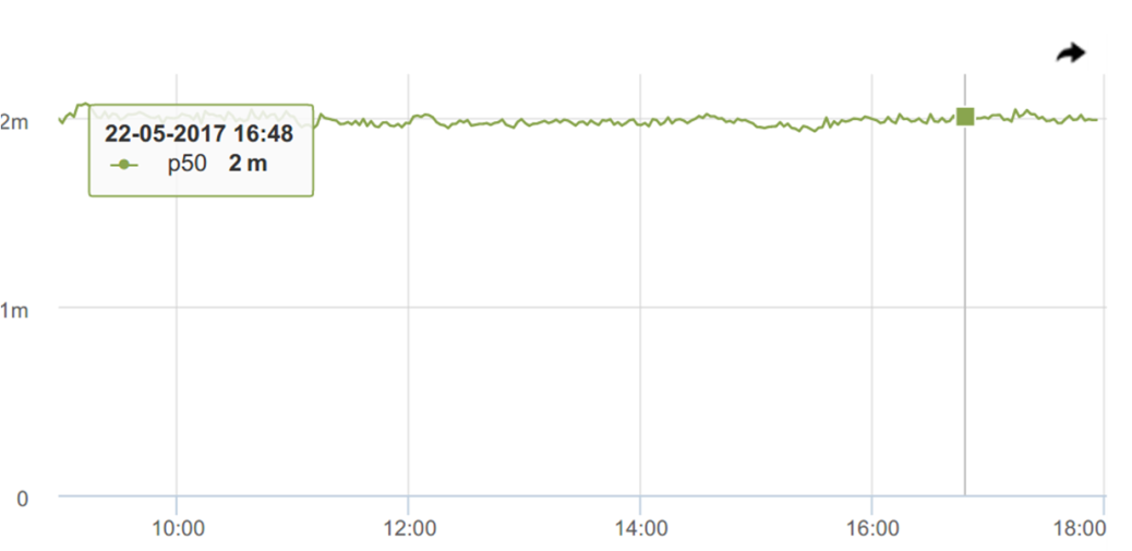
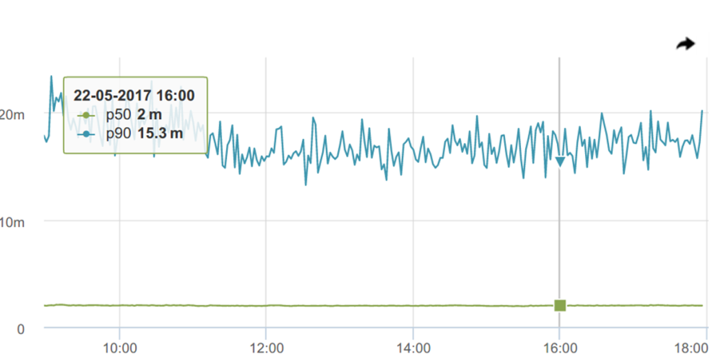
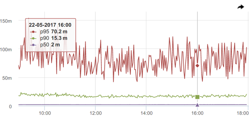
And here we have already received response timelines. Let’s look at (our favorite) percentiles.
Here, the median (p50) is cool, I personally like super! Such a superstable - always ~ 2 milliseconds. It begs to rather hang the trigger with a threshold with a small margin of 2.2-3.5 ms and receive notifications when something goes wrong.
Let's look at the 90th percentile, and it behaves not so stable anymore
95th - at all, like a comb.
It would seem, where is the promised, praised robustness to emissions ?! This is how intuition deceives us again, prompting that “robust” means “smooth”, stable. Although in reality it is not so.
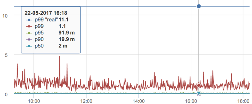
Continuing to talk about (counter) intuitive sensations of percentiles, we will look at another chart.
It seems that on this graph, p99 ranges from 1 second to ~ 2-3 seconds. And his "real value" should be somewhere around 1.1s
But if we calculate p99 for all the data accumulated during this period, it turns out that p99 is “real” in a completely different place - the difference is 10 times. How so?
First, we measure the percentile per interval - in this case per minute. For the day runs 1440 every minute measurements. We drew this graph, and our brain automatically calculates a horizontal trend for it, if we see that it does not float. Even if we guessed it: “So, this is a percentile - you probably need to take a maximum from it, it turns out to be about 5s” - anyway, it’s actually not there.
If we take this distribution and try to collect statistics, when the percentile that we calculate stops changing (or almost stops) from adding measurements over time, it turns out that it is still not where we expect it, but twice as high.
Our head calculates a certain horizontal level, and the percentile behaves differently.
For example, we look at the schedule for 8 hours and nothing much happens, and there were emissions at night. You can often see (and in this particular case) fewer requests at night. And it seems everything should work faster. And from the point of view of percentiles, everything works not necessarily faster, but somehow. Because it can be really faster, and there can be, for example, cold caches, because of which slow return.
Let's go back to the number of nines.
What have we forgotten, or what about the users?
While we were discussing queuing systems, requests, services, perceptions, we lost real users. Users are not requests, but people. They roam the site (or in a mobile application) and want to accomplish something there through intermediate steps, which are often more than 1. And we measure statistics by individual requests.
- Sessions last a long time;
- The general impression of the responsiveness of the service;
- One bad response time is strongly affected;
- Important Ajax and other resources.
Each user in the session has its own viewing depth. But:
- The probability of one page being better than p99 is 99%;
- The probability of N pages being no worse than p99 is (0.99N) * 100%;
- The number of users who stumble on something worse p99 is (1 - (0.99N)) * 100%
- For p99 and N = 10, this is 10%;
- For p99.9 and N = 20, this is 2%
We believe that only 1% of users remain on whom we are hammering if we monitor the 99th percentile. But again, this is not the case and it is as much as 10%!
And when we talk about the latency of individual subqueries that already go directly to the database, or to some web service, or application server, the ratio is even greater.
Therefore, 99.9% is often not enough “high” percentile, which you need to focus on.
Conclusion
Any statistician will say: "Do not trust your intuition in statistics!"
I am telling you: “Do not trust your intuition in monitoring!”
Contacts
Pavel Trukhanov on Habrahabr - @tru_pablo
The company's blog and the okmeter.io service itself .
Questions and answers
- We have about the same problem. The question is how to choose thresholds for monitoring? If we look at the graph of the 95th, 99th percentiles, we see peaks there. Suppose I have a Product Owner asking: “How long can we promise almost always the answer time?”, I say: “If you look at the 95th percentile, 300 milliseconds” - “Yes, okay, great! And what about the 99th? ”-“ 40 seconds ”-“ What ?! ”
It’s impossible to live with it at all. That is, if you put 40 seconds, it is not monitoring, but garbage; if you put 300 milliseconds, it turns out to be 100 alerts per hour.
The question is - how to live?
First, cheers to your Product Owner , that he understands what percentile is, because my Product owners, when I say to them: “Such and such percentile, such and such time”, one number can understand, two numbers - already finish!
Back to the question. The answer is honest and very simple - it was not necessary to spend so much time on it. You dug a hole for yourself, your Product Owner has the opportunity to see the percentile graphs (or ask you this question). You fall into it and ask me how you will not fall into it. Do not dig a hole for yourself - you will not fall into it.
No need to keep track of percentiles - this is wrong. We in Okmeter recommend choosing thresholds not on the behavior of percentiles, but on what you see fit. For example, to make the user feel good when the site is quickly opened (or slowly).
It depends on a million parameters, starting, of course, from the service itself. But at the same time, there are guidelines from industry leaders. Google says 400 milliseconds server time is fine. Amazon explains that a delay of an additional 100 milliseconds over 400 causes the conversion rate to drop by 9%, according to other estimates by 16%. But in my opinion, you, as the owner of this system, must decide that in such situations the user should see the page in such time, it should be worked out.
Further you do not draw pertsenti. Percentiles in monitoring - this is evil!
Drawing them, instead of using your internal consideration (or external Google) and saying that it should work up to such a threshold, you start looking at the graph:
- Look, we have 50 milliseconds, there are pages of this type here!
- Very good! Let's set such a threshold!
No, don't do that! You decide that the server should be responsible for 400 milliseconds. Then you draw - he was responsible for 400 milliseconds in such a percentage. Worse, but still tolerable, up to the second we have so many percent. And the fact that higher than a second - it's all no longer good!
Then you can track it, then there is no such problem that they ask you about guaranteed time.
Yes, it happens that the IT system behaves like a lognormal - a long-tail blingo. In fact, I see (we have a lot of statistics from clients) that this tail is often thicker than usual, and goes further than that of the lognormal distribution.
This is a typical real situation - not at all, but at many.
When you are asked a question: “Have you stopped drinking brandy in the morning long ago?” - no need to answer it. When you are asked: “What is our guaranteed server response time?” - there is no such guaranteed time. The server fell, the data center burned down, the meteorite fell off - and the server response time is two days while it is being repaired.
The answer is - out of the box . In the framework of percentiles honestly can not answer.
- A question again about monitoring. There are different analyzes to understand what is happening. The classic model - you can build the 50th, 90th, 99th percentile, and so on. The question is which visualization tool do you recommend - open source , not open source? How to do an analysis of temporal trends, namely to find matches, something else?
If I understand the question correctly. Suppose if we are really talking about post mortem , at this point no graphics are needed. Monitoring is monitoring, post mortem is post mortem . These are different things.
It would be desirable, of course, as always, to have a silver bullet from some system in which everything is there, it shows everything, also keeps it - you can look at it all after the fact. But this is unreal - it is just a completely different system. Such an answer, if for garlic.
- Besides percentiles and medium, what other interesting mathematical metrics and graphs can you offer? , , .
— . , .
, . , 3 , 0,1, . , , . - .
, , — , 25- 75- .
— . , . — . It all depends on the task. .
— Product Owner' , ? , Amazon . , 100 , , . .
, :
— , - StatsD , - . !
— , — , !
, .
, . , : LD50 ( lethal dose ) — , .
— , . , , . , .
— , , , . : — , — .
, - — , ? ? , — , ?
, okmeter , real-time . .
— , , , — , , .
, . 99,9% , - - , .
, , . - (99,9 99,999), .
, !
2 :
- . , — “ , , , ! ”.
- — — , — 99,9-! — !
— - — . - , , , . ? , , .
— — - , ?
Apdex score , — , 4 , .
, ? ? , , , ?
— , , , , .
, .
— - — 300-400 , . ?
— , . .
It’s impossible to live with it at all. That is, if you put 40 seconds, it is not monitoring, but garbage; if you put 300 milliseconds, it turns out to be 100 alerts per hour.
The question is - how to live?
First, cheers to your Product Owner , that he understands what percentile is, because my Product owners, when I say to them: “Such and such percentile, such and such time”, one number can understand, two numbers - already finish!
Back to the question. The answer is honest and very simple - it was not necessary to spend so much time on it. You dug a hole for yourself, your Product Owner has the opportunity to see the percentile graphs (or ask you this question). You fall into it and ask me how you will not fall into it. Do not dig a hole for yourself - you will not fall into it.
No need to keep track of percentiles - this is wrong. We in Okmeter recommend choosing thresholds not on the behavior of percentiles, but on what you see fit. For example, to make the user feel good when the site is quickly opened (or slowly).
It depends on a million parameters, starting, of course, from the service itself. But at the same time, there are guidelines from industry leaders. Google says 400 milliseconds server time is fine. Amazon explains that a delay of an additional 100 milliseconds over 400 causes the conversion rate to drop by 9%, according to other estimates by 16%. But in my opinion, you, as the owner of this system, must decide that in such situations the user should see the page in such time, it should be worked out.
Further you do not draw pertsenti. Percentiles in monitoring - this is evil!
Drawing them, instead of using your internal consideration (or external Google) and saying that it should work up to such a threshold, you start looking at the graph:
- Look, we have 50 milliseconds, there are pages of this type here!
- Very good! Let's set such a threshold!
No, don't do that! You decide that the server should be responsible for 400 milliseconds. Then you draw - he was responsible for 400 milliseconds in such a percentage. Worse, but still tolerable, up to the second we have so many percent. And the fact that higher than a second - it's all no longer good!
Then you can track it, then there is no such problem that they ask you about guaranteed time.
Yes, it happens that the IT system behaves like a lognormal - a long-tail blingo. In fact, I see (we have a lot of statistics from clients) that this tail is often thicker than usual, and goes further than that of the lognormal distribution.
This is a typical real situation - not at all, but at many.
When you are asked a question: “Have you stopped drinking brandy in the morning long ago?” - no need to answer it. When you are asked: “What is our guaranteed server response time?” - there is no such guaranteed time. The server fell, the data center burned down, the meteorite fell off - and the server response time is two days while it is being repaired.
The answer is - out of the box . In the framework of percentiles honestly can not answer.
- A question again about monitoring. There are different analyzes to understand what is happening. The classic model - you can build the 50th, 90th, 99th percentile, and so on. The question is which visualization tool do you recommend - open source , not open source? How to do an analysis of temporal trends, namely to find matches, something else?
If I understand the question correctly. Suppose if we are really talking about post mortem , at this point no graphics are needed. Monitoring is monitoring, post mortem is post mortem . These are different things.
It would be desirable, of course, as always, to have a silver bullet from some system in which everything is there, it shows everything, also keeps it - you can look at it all after the fact. But this is unreal - it is just a completely different system. Such an answer, if for garlic.
- Besides percentiles and medium, what other interesting mathematical metrics and graphs can you offer? , , .
— . , .
, . , 3 , 0,1, . , , . - .
, , — , 25- 75- .
— . , . — . It all depends on the task. .
— Product Owner' , ? , Amazon . , 100 , , . .
, :
— , - StatsD , - . !
— , — , !
, .
, . , : LD50 ( lethal dose ) — , .
— , . , , . , .
— , , , . : — , — .
, - — , ? ? , — , ?
, okmeter , real-time . .
— , , , — , , .
, . 99,9% , - - , .
, , . - (99,9 99,999), .
, !
2 :
- — 99- — 40 . ! , ! ( sarcasm)
- point , — , .
- . , — “ , , , ! ”.
- — — , — 99,9-! — !
— - — . - , , , . ? , , .
— — - , ?
Apdex score , — , 4 , .
, ? ? , , , ?
— , , , , .
, .
— - — 300-400 , . ?
— , . .
, DevOps, ++ RootConf . . , — .
Source: https://habr.com/ru/post/350666/
All Articles