Work with Anaconda on the example of searching for the correlation of cryptocurrency rates
The purpose of this article is to provide an easy introduction to data analysis using Anaconda. We will go through writing a simple Python script to extract, analyze and visualize data on various cryptocurrencies.
Step 1 - Setting up the work environment.
The only skills you need are a basic understanding of Python.
Step 1.1 - Install Anaconda
')
Anaconda distribution can be downloaded from the official website .
Installation takes place in standard Step-by-Step mode.
Step 1.2 - Setting up the project work environment
After Anaconda is installed, you need to create and activate a new environment to organize our dependencies.
Why use a medium? If you plan to develop several Python projects on your computer, it is useful to store dependencies (software libraries and packages) separately to avoid conflicts. Anaconda will create a special environment directory for the dependencies of each project, so that everything is organized and shared.
This can be done either via the command line
conda create --name cryptocurrency-analysis python=3.6 source activate cryptocurrency-analysis (Linux / macOS)
or
activate cryptocurrency-analysis (Windows)
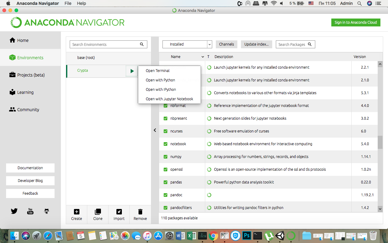
either through Anaconda Navigator

In this case, the environment is automatically activated.
Then you need to install the necessary dependencies NumPy , Pandas , nb_conda , Jupiter , Plotly , Quandl .
conda install numpy pandas nb_conda jupyter plotly quandl either through Anaconda Navigator, alternately each package

This may take a few minutes.
Step 1.3 - Launch Jupyter Notebook
There is also an option via the command line
jupyter notebook and open the browser at http://localhost:8888/and through Anaconda Navigator
Step 1.4 - Import Dependencies
After you open an empty Jupyter Notebook, the first thing to do is import the required dependencies.
import os import numpy as np import pandas as pd import pickle import quandl from datetime import datetime Then import and activate offline Plotly.
import plotly.offline as py import plotly.graph_objs as go import plotly.figure_factory as ff py.init_notebook_mode(connected=True) Step 2 - Retrieving Bitcoin Pricing Data
Now that everything is set up, we are ready to begin extracting data for analysis. To begin with, we’ll get pricing data using the free Quandl API.
Step 2.1 - Define the Quandl function
To begin with, we define a function for loading and caching data sets from Quandl.
def get_quandl_data(quandl_id): '''Download and cache Quandl dataseries''' cache_path = '{}.pkl'.format(quandl_id).replace('/','-') try: f = open(cache_path, 'rb') df = pickle.load(f) print('Loaded {} from cache'.format(quandl_id)) except (OSError, IOError) as e: print('Downloading {} from Quandl'.format(quandl_id)) df = quandl.get(quandl_id, returns="pandas") df.to_pickle(cache_path) print('Cached {} at {}'.format(quandl_id, cache_path)) return df We use pickle to serialize and save the loaded data as a file, which will allow our script not to reload the same data every time the script is run.
The function returns data as a pandas data set.
Step 2.2 - Getting a Bitcoin rate on the Kraken Exchange
We implement it as follows:
btc_usd_price_kraken = get_quandl_data('BCHARTS/KRAKENUSD') To check the validity of the script, we can look at the first 5 lines of the response received using the head () method.
btc_usd_price_kraken.head() Result:
| Date | Open | High | Low | Close | Volume (BTC) | Volume (Currency) | Weighted Price |
|---|---|---|---|---|---|---|---|
| 2014-01-07 | 874.67040 | 892.06753 | 810.00000 | 810.00000 | 15.622378 | 13151.472844 | 841.835522 |
| 2014-01-08 | 810.00000 | 899.84281 | 788.00000 | 824.98287 | 19.182756 | 16097.329584 | 839.156269 |
| 2014-01-09 | 825.56345 | 870.00000 | 807.42084 | 841.86934 | 8.158335 | 6784.249982 | 831.572913 |
| 2014-01-10 | 839.99000 | 857.34056 | 817.00000 | 857.33056 | 8.024510 | 6780.220188 | 844.938794 |
| 2014-01-11 | 858.20000 | 918.05471 | 857.16554 | 899.84105 | 18.748285 | 16698.566929 | 890.671709 |
And build a graph to visualize the resulting array.
btc_trace = go.Scatter(x=btc_usd_price_kraken.index, y=btc_usd_price_kraken['Weighted Price']) py.iplot([btc_trace]) 
Here we use Plotly to generate our visualizations. This is a less traditional choice than some of the more well-known libraries, such as Matplotlib, but I think Plotly is a great choice because it creates fully interactive diagrams using D3.js.
Step 2.3 - Getting Bitcoin Rate on Multiple Exchanges
The nature of the exchange is that pricing is determined by supply and demand, therefore, no stock exchange contains the “true price” of Bitcoin. To solve this problem, we will extract additional data from three larger exchanges to calculate the total price index.
We will upload the data of each exchange to the dictionary.
exchanges = ['COINBASE','BITSTAMP','ITBIT'] exchange_data = {} exchange_data['KRAKEN'] = btc_usd_price_kraken for exchange in exchanges: exchange_code = 'BCHARTS/{}USD'.format(exchange) btc_exchange_df = get_quandl_data(exchange_code) exchange_data[exchange] = btc_exchange_df Step 2.4 - Combining all prices into a single data set
Define a simple function to merge data.
def merge_dfs_on_column(dataframes, labels, col): series_dict = {} for index in range(len(dataframes)): series_dict[labels[index]] = dataframes[index][col] return pd.DataFrame(series_dict) Then combine all the data on the column "Weighted Price".
btc_usd_datasets = merge_dfs_on_column(list(exchange_data.values()), list(exchange_data.keys()), 'Weighted Price') Now we’ll look at the last five lines, using the tail () method to make sure everything looks fine and the way we wanted.
btc_usd_datasets.tail() Result:
| Date | Bitstamp | COINBASE | ITBIT | Kraken | avg_btc_price_usd |
|---|---|---|---|---|---|
| 2018-02-28 | 10624.382893 | 10643.053573 | 10621.099426 | 10615.587987 | 10626.030970 |
| 2018-03-01 | 10727.272600 | 10710.946064 | 10678.156872 | 10671.653953 | 10697.007372 |
| 2018-03-02 | 10980.298658 | 10982.181881 | 10973.434045 | 10977.067909 | 10978.245623 |
| 2018-03-03 | 11332.934468 | 11317.108262 | 11294.620763 | 11357.539095 | 11325.550647 |
| 2018-03-04 | 11260.751253 | 11250.771211 | 11285.690725 | 11244.836468 | 11260.512414 |
Step 2.5 - Comparing price data sets.
The next logical step is to visualize the comparison of prices received. To do this, we define a helper function that will build a graph for each of the exchanges using Plotly.
def df_scatter(df, title, seperate_y_axis=False, y_axis_label='', scale='linear', initial_hide=False): label_arr = list(df) series_arr = list(map(lambda col: df[col], label_arr)) layout = go.Layout( title=title, legend=dict(orientation="h"), xaxis=dict(type='date'), yaxis=dict( title=y_axis_label, showticklabels= not seperate_y_axis, type=scale ) ) y_axis_config = dict( overlaying='y', showticklabels=False, type=scale ) visibility = 'visible' if initial_hide: visibility = 'legendonly' trace_arr = [] for index, series in enumerate(series_arr): trace = go.Scatter( x=series.index, y=series, name=label_arr[index], visible=visibility ) if seperate_y_axis: trace['yaxis'] = 'y{}'.format(index + 1) layout['yaxis{}'.format(index + 1)] = y_axis_config trace_arr.append(trace) fig = go.Figure(data=trace_arr, layout=layout) py.iplot(fig) And call her
df_scatter(btc_usd_datasets, ' (USD) ') Result:
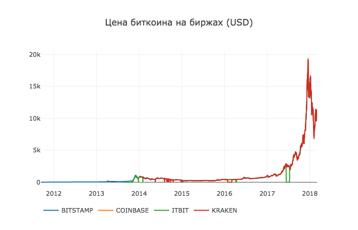
Now we will remove all zero values, since we know that the price has never been zero in the period we are considering.
btc_usd_datasets.replace(0, np.nan, inplace=True) And re-create the schedule
df_scatter(btc_usd_datasets, 'Bitcoin Price (USD) By Exchange') Result:
Step 2.6 - Calculate Average Price
Now we can calculate a new column containing the average daily bitcoin price on all exchanges.
btc_usd_datasets['avg_btc_price_usd'] = btc_usd_datasets.mean(axis=1) This new column is our bitcoin price index. Build his schedule to make sure that he looks normal.
btc_trace = go.Scatter(x=btc_usd_datasets.index, y=btc_usd_datasets['avg_btc_price_usd']) py.iplot([btc_trace]) Result:

We will use this data later to convert other cryptocurrency exchange rates to USD.
Step 3 - Acquiring data on alternative cryptocurrencies
Now that we have an array of data with Bitcoin prices, let's take some data about alternative cryptocurrencies.
Step 3.1 - Define functions for working with the Poloniex API.
We will use the Poloniex API to get the data. We define two helper functions for loading and caching JSON data from this API.
First, we define the
get_json_data function, which will load and cache JSON data from the provided URL. def get_json_data(json_url, cache_path): try: f = open(cache_path, 'rb') df = pickle.load(f) print('Loaded {} from cache'.format(json_url)) except (OSError, IOError) as e: print('Downloading {}'.format(json_url)) df = pd.read_json(json_url) df.to_pickle(cache_path) print('Cached response at {}'.format(json_url, cache_path)) return df Then we define a function to format the HTTP requests for the Poloniex API and call our new function
get_json_data to save the received data. base_polo_url = 'https://poloniex.com/public?command=returnChartData¤cyPair={}&start={}&end={}&period={}' start_date = datetime.strptime('2015-01-01', '%Y-%m-%d') end_date = datetime.now() pediod = 86400 def get_crypto_data(poloniex_pair): json_url = base_polo_url.format(poloniex_pair, start_date.timestamp(), end_date.timestamp(), pediod) data_df = get_json_data(json_url, poloniex_pair) data_df = data_df.set_index('date') return data_df This input function receives a pair of cryptocurrencies, for example, “BTC_ETH” and returns historical data on the exchange rate of two currencies.
Step 3.2 - Downloading data from Poloniex
Some of the alternative cryptocurrencies in question cannot be bought on exchanges directly for USD. For this reason, we will upload the bitcoin exchange rate for each of them, and then we will use the existing bitcoin pricing data to convert this value to USD.
We upload exchange data for nine popular cryptocurrencies - Ethereum , Litecoin , Ripple , Ethereum Classic , Stellar , Dash , Siacoin , Monero , and NEM .
altcoins = ['ETH','LTC','XRP','ETC','STR','DASH','SC','XMR','XEM'] altcoin_data = {} for altcoin in altcoins: coinpair = 'BTC_{}'.format(altcoin) crypto_price_df = get_crypto_data(coinpair) altcoin_data[altcoin] = crypto_price_df Now we have 9 data sets, each of which contains historical average daily stock exchange ratios of bitcon to alternative cryptocurrency.
We can look at the last few lines of the Ethereum pricing table to make sure it looks normal.
altcoin_data['ETH'].tail() | date | close | high | low | open | quoteVolume | volume | weightedAverage |
|---|---|---|---|---|---|---|---|
| 2018-03-01 | 0.079735 | 0.082911 | 0.079232 | 0.082729 | 17981.733693 | 1454.206133 | 0.080871 |
| 2018-03-02 | 0.077572 | 0.079719 | 0.077014 | 0.079719 | 18482.985554 | 1448.732706 | 0.078382 |
| 2018-03-03 | 0.074500 | 0.077623 | 0.074356 | 0.077562 | 15058.825646 | 1139.640375 | 0.075679 |
| 2018-03-04 | 0.075111 | 0.077630 | 0.074389 | 0.074500 | 12258.662182 | 933.480951 | 0.076149 |
| 2018-03-05 | 0.075373 | 0.075700 | 0.074723 | 0.075277 | 10993.285936 | 826.576693 | 0.075189 |
Step 3.3 - Price Conversion to USD.
Since we now have a bitcoin exchange rate for each cryptocurrency and we have an index of historical Bitcoin prices in USD, we can directly calculate the price in USD for each alternative cryptocurrency.
for altcoin in altcoin_data.keys(): altcoin_data[altcoin]['price_usd'] = altcoin_data[altcoin]['weightedAverage'] * btc_usd_datasets['avg_btc_price_usd'] By this we have created a new column in each alternative cryptocurrency data set with prices in USD.
Then we can reuse our function
merge_dfs_on_column to create a combined price data set in USD for each of the cryptocurrencies. combined_df = merge_dfs_on_column(list(altcoin_data.values()), list(altcoin_data.keys()), 'price_usd') Now add the bitcoin price to the dataset as the final column.
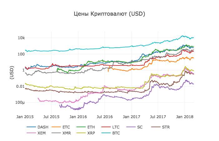
combined_df['BTC'] = btc_usd_datasets['avg_btc_price_usd'] As a result, we have a data set containing daily prices in USD for ten cryptocurrencies, which we are considering.
We use our
df_scatter function to display all cryptocurrency prices on a chart. df_scatter(combined_df, ' (USD)', seperate_y_axis=False, y_axis_label='(USD)', scale='log') This chart provides a fairly solid "big picture" of how the exchange rates of each currency have changed over the past few years.
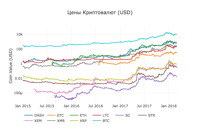
In this example, we use the logarithmic scale of the Y axis to compare all currencies in the same area. You can try different parameter values (for example, scale = 'linear') to get different points of view on the data.
Step 3.4 - Calculation of cryptocurrency correlation.
You may notice that cryptocurrency exchange rates, despite their completely different values and volatility, seem slightly correlated. And as seen from the surge in April 2017, even small fluctuations seem to occur synchronously in the entire market.
We can test our correlation hypothesis using the Pandas
corr () method, which calculates the Pearson correlation coefficient for each column in a data set relative to each other. In the calculation, we also use the pct_change () method, which converts each cell in the dataset from the absolute value of the price to the percentage change.First, we calculate the correlations for 2016.
combined_df_2016 = combined_df[combined_df.index.year == 2016] combined_df_2016.pct_change().corr(method='pearson') Result:
| DASH | Etc | Eth | LTC | SC | STR | XEM | Xmr | Xrp | Btc | |
|---|---|---|---|---|---|---|---|---|---|---|
| DASH | 1.000000 | 0.003992 | 0.122695 | -0.012194 | 0.026602 | 0.058083 | 0.014571 | 0.121537 | 0.088657 | -0.014040 |
| Etc | 0.003992 | 1.000000 | -0.181991 | -0.131079 | -0.008066 | -0.102654 | -0.080938 | -0.105898 | -0.054095 | -0.170538 |
| Eth | 0.122695 | -0.181991 | 1.000000 | -0.064652 | 0.169642 | 0.035093 | 0.043205 | 0.087216 | 0.085630 | -0.006502 |
| LTC | -0.012194 | -0.131079 | -0.064652 | 1.000000 | 0.012253 | 0.113523 | 0.160667 | 0.129475 | 0.053712 | 0.750174 |
| SC | 0.026602 | -0.008066 | 0.169642 | 0.012253 | 1.000000 | 0.143252 | 0.106153 | 0.047910 | 0.021098 | 0.035116 |
| STR | 0.058083 | -0.102654 | 0.035093 | 0.113523 | 0.143252 | 1.000000 | 0.225132 | 0.027998 | 0.320116 | 0.079075 |
| XEM | 0.014571 | -0.080938 | 0.043205 | 0.160667 | 0.106153 | 0.225132 | 1.000000 | 0.016438 | 0.101326 | 0.227674 |
| Xmr | 0.121537 | -0.105898 | 0.087216 | 0.129475 | 0.047910 | 0.027998 | 0.016438 | 1.000000 | 0.027649 | 0.127520 |
| Xrp | 0.088657 | -0.054095 | 0.085630 | 0.053712 | 0.021098 | 0.320116 | 0.101326 | 0.027649 | 1.000000 | 0.044161 |
| Btc | -0.014040 | -0.170538 | -0.006502 | 0.750174 | 0.035116 | 0.079075 | 0.227674 | 0.127520 | 0.044161 | 1.000000 |
Coefficients close to 1 or -1 mean that the data correlate strongly or inversely correlate, respectively, and coefficients close to zero mean that the values tend to fluctuate independently of each other.
To visualize these results, we will create another helper function.
def correlation_heatmap(df, title, absolute_bounds=True): heatmap = go.Heatmap( z=df.corr(method='pearson').as_matrix(), x=df.columns, y=df.columns, colorbar=dict(title='Pearson Coefficient'), ) layout = go.Layout(title=title) if absolute_bounds: heatmap['zmax'] = 1.0 heatmap['zmin'] = -1.0 fig = go.Figure(data=[heatmap], layout=layout) py.iplot(fig) correlation_heatmap(combined_df_2016.pct_change(), " (2016)") 
Here, the dark red values represent strong correlations, and the blue values represent strong inverse correlations. All other colors represent different degrees of weak / non-existent correlations.
What does this chart tell us? In fact, this shows that there was very little statistically significant connection between how prices of different cryptocurrencies fluctuated during 2016.
Now, to test our hypothesis that cryptotermines have become more correlated in recent months, we repeat the same tests using data for 2017 and 2018.
combined_df_2017 = combined_df[combined_df.index.year == 2017] combined_df_2017.pct_change().corr(method='pearson') Result:
| DASH | Etc | Eth | LTC | SC | STR | XEM | Xmr | Xrp | Btc | |
|---|---|---|---|---|---|---|---|---|---|---|
| DASH | 1.000000 | 0.387555 | 0.506911 | 0.340153 | 0.291424 | 0.183038 | 0.325968 | 0.498418 | 0.091146 | 0.307095 |
| Etc | 0.387555 | 1.000000 | 0.601437 | 0.482062 | 0.298406 | 0.210387 | 0.321852 | 0.447398 | 0.114780 | 0.416562 |
| Eth | 0.506911 | 0.601437 | 1.000000 | 0.437609 | 0.373078 | 0.259399 | 0.399200 | 0.554632 | 0.212350 | 0.410771 |
| LTC | 0.340153 | 0.482062 | 0.437609 | 1.000000 | 0.339144 | 0.307589 | 0.379088 | 0.437204 | 0.323905 | 0.420645 |
| SC | 0.291424 | 0.298406 | 0.373078 | 0.339144 | 1.000000 | 0.402966 | 0.331350 | 0.378644 | 0.243872 | 0.325318 |
| STR | 0.183038 | 0.210387 | 0.259399 | 0.307589 | 0.402966 | 1.000000 | 0.339502 | 0.327488 | 0.509828 | 0.230957 |
| XEM | 0.325968 | 0.321852 | 0.399200 | 0.379088 | 0.331350 | 0.339502 | 1.000000 | 0.336076 | 0.268168 | 0.329431 |
| Xmr | 0.498418 | 0.447398 | 0.554632 | 0.437204 | 0.378644 | 0.327488 | 0.336076 | 1.000000 | 0.226636 | 0.409183 |
| Xrp | 0.091146 | 0.114780 | 0.212350 | 0.323905 | 0.243872 | 0.509828 | 0.268168 | 0.226636 | 1.000000 | 0.131469 |
| Btc | 0.307095 | 0.416562 | 0.410771 | 0.420645 | 0.325318 | 0.230957 | 0.329431 | 0.409183 | 0.131469 | 1.000000 |
correlation_heatmap(combined_df_2017.pct_change(), " (2017)") 
combined_df_2018 = combined_df[combined_df.index.year == 2018] combined_df_2018.pct_change().corr(method='pearson') | DASH | Etc | Eth | LTC | SC | STR | XEM | Xmr | Xrp | Btc | |
|---|---|---|---|---|---|---|---|---|---|---|
| DASH | 1.000000 | 0.775561 | 0.856549 | 0.847947 | 0.733168 | 0.717240 | 0.769135 | 0.913044 | 0.779651 | 0.901523 |
| Etc | 0.775561 | 1.000000 | 0.808820 | 0.667434 | 0.530840 | 0.551207 | 0.641747 | 0.696060 | 0.637674 | 0.694228 |
| Eth | 0.856549 | 0.808820 | 1.000000 | 0.700708 | 0.624853 | 0.630380 | 0.752303 | 0.816879 | 0.652138 | 0.787141 |
| LTC | 0.847947 | 0.667434 | 0.700708 | 1.000000 | 0.683706 | 0.596614 | 0.593616 | 0.765904 | 0.644155 | 0.831780 |
| SC | 0.733168 | 0.530840 | 0.624853 | 0.683706 | 1.000000 | 0.615265 | 0.695136 | 0.626091 | 0.719462 | 0.723976 |
| STR | 0.717240 | 0.551207 | 0.630380 | 0.596614 | 0.615265 | 1.000000 | 0.790420 | 0.642810 | 0.854057 | 0.669746 |
| XEM | 0.769135 | 0.641747 | 0.752303 | 0.593616 | 0.695136 | 0.790420 | 1.000000 | 0.744325 | 0.829737 | 0.734044 |
| Xmr | 0.913044 | 0.696060 | 0.816879 | 0.765904 | 0.626091 | 0.642810 | 0.744325 | 1.000000 | 0.668016 | 0.888284 |
| Xrp | 0.779651 | 0.637674 | 0.652138 | 0.644155 | 0.719462 | 0.854057 | 0.829737 | 0.668016 | 1.000000 | 0.712146 |
| Btc | 0.901523 | 0.694228 | 0.787141 | 0.831780 | 0.723976 | 0.669746 | 0.734044 | 0.888284 | 0.712146 | 1.000000 |
correlation_heatmap(combined_df_2018.pct_change(), " (2018)") 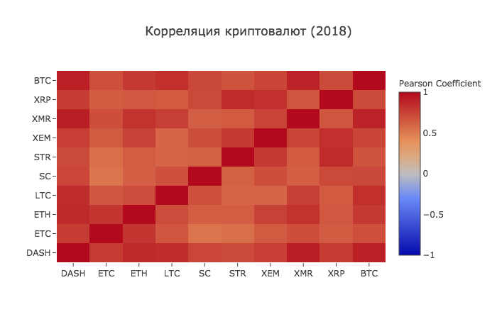
And here we see what we assumed - almost all cryptocurrencies have become more interconnected with each other in all directions.
At this point, we assume that the introduction to working with data in Anaconda has been successfully passed.
Source: https://habr.com/ru/post/350500/
All Articles