How to make the best sites in Russia
On March 1, the award ceremony of the contest “Golden Site 2017” took place, the next day the evaluations of the competent jury were published. Last fall, the author of this article decided to take part in this fascinating event, and the process turned from serious (what was meant at the beginning) into an interesting (what happened as a result). I would like to share some of the trends in web development, which appeared in the sites that won the competition.
Tools:
Desktop-mapping the best sites of Russia, I studied in the Chrome browser - 47.46% of all desktop-users (1 place in popularity, hereinafter - GA statistics for 2017 of the site I work with) on a monitor with a resolution of 1920 × 1080 px - 22.61% of all desktop, (TOP2, lags behind the most popular 1366 × 768 for a while with its 27.11%)
Mobile displays were viewed on a smartphone (35.9% smartphones, 8.85% tablets, 55.26% monitors) S Galaxy Note 4 (SM-N910C) using a Yandex browser.
Note: since, like almost any other mobile device owner, I can choose how to arrange this device for me when browsing the Internet, I decided to view the best sites in Russia in landscape-orientation.
The competition, which ended in March 2018, turned out to be a jubilee, twentieth, and quite a lot of work was submitted for it. I was initially interested in the thematic category “Brand’s website and auto / moto dealer”, so I’ll start to describe the best principles of website building with works submitted for this nomination.
The 3rd place in the nomination “Brand and auto / moto dealer site” was taken by the website of auto accessories rcsbrand.ru. The developers say: "We have created a stylish online store with a universal responsive interface, user-friendly functionality and animation, allowing the user to more easily read the information."
Main page (3), desktop: when you hover over the top menu item, an empty block appears under the item. It is not clear for what purpose it appears there, and why it is empty, probably some kind of clever UI-move.
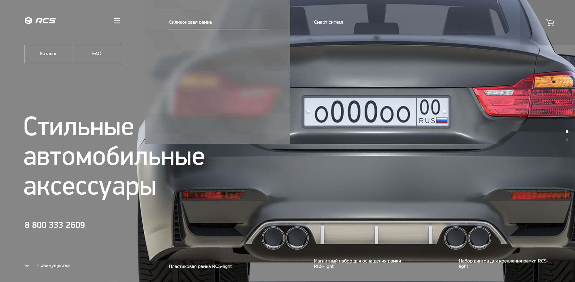
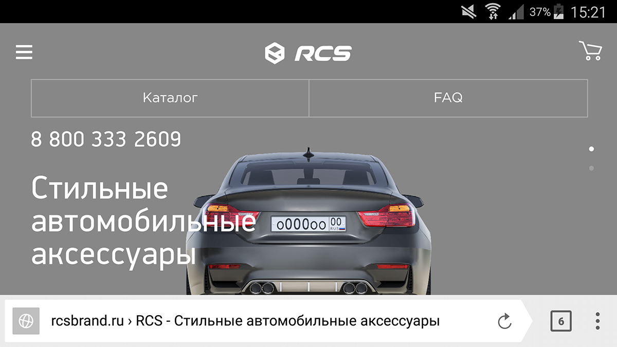
Smartphone, landscape-orientation: the main menu moves down, but it is closed by the browser toolbar. And it is impossible to understand which picture represents which accessory.
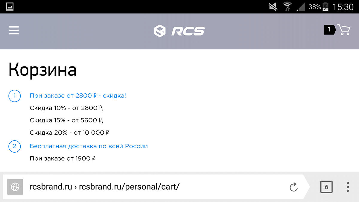
I would like to draw attention to the basket site, rated by the jury as the 3rd best automotive in Russia. Here's how to impose, so that, in the opinion of the developers, it turned out stylishly, and according to the jury of the competition, so that the layout could be included into the winners of the Golden Site. Desktop:
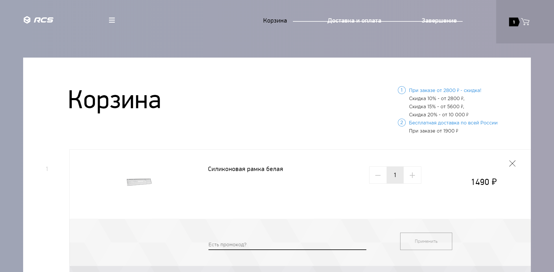
With a browser window size of 1917 × 940 px, the image size of the ordered goods is 110 × 50 px, i.e. the product picture that interested us occupies 0.3% (zero point, three tenths of a percent) of the browser window area.
And this is how it is necessary to impose a basket (in which the product is already located, and it is the only one) for landscape to become one of the best:
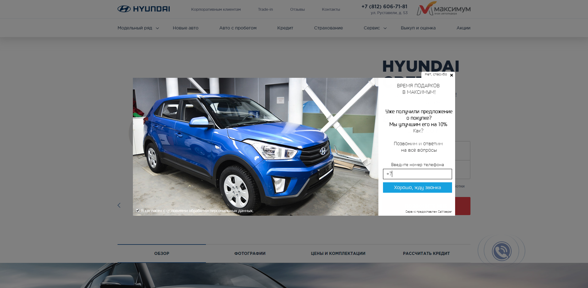
Moving on to the second best auto / moto-brand site in Russia, maximum-hyundai.ru. Authors about their work: “Modern design. Easy, thoughtful interface. The site is convenient to view on all types of devices. "
Separately, it is worth noting that this is the best dealer site (the first place went to the website of the representative office of the automotive brand). What should be the best dealer site (4)? First of all, the pop-up “we will call you back” is obligatory on it.
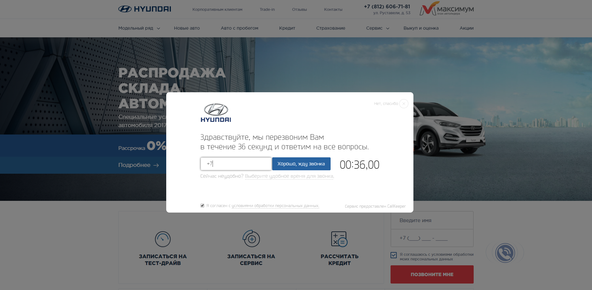
Pay attention to the banner for the pop-up. On the desktop, it looks like this:
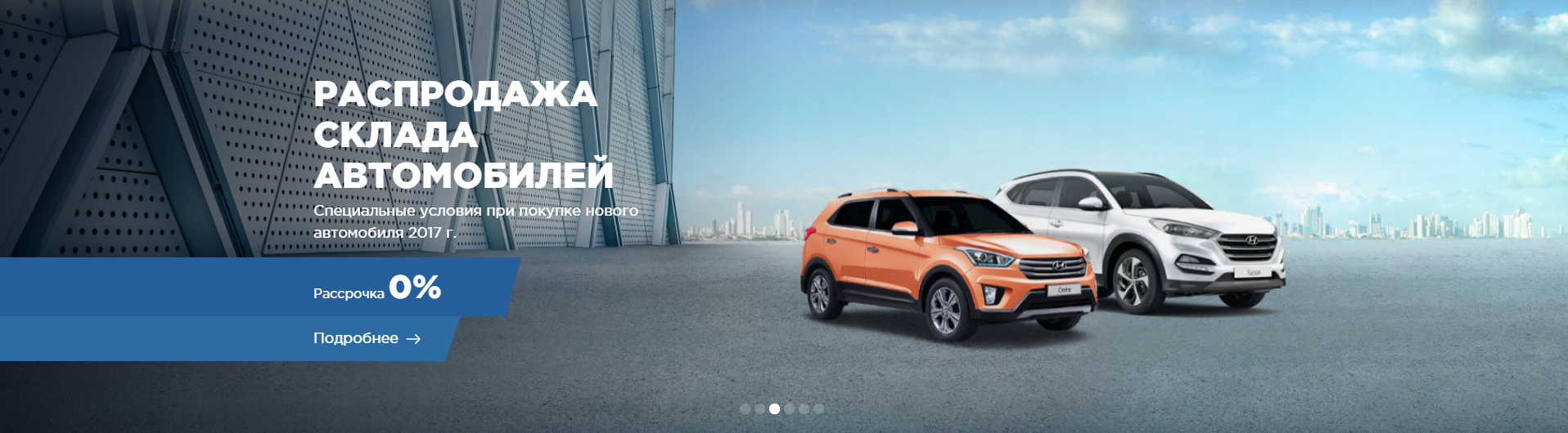
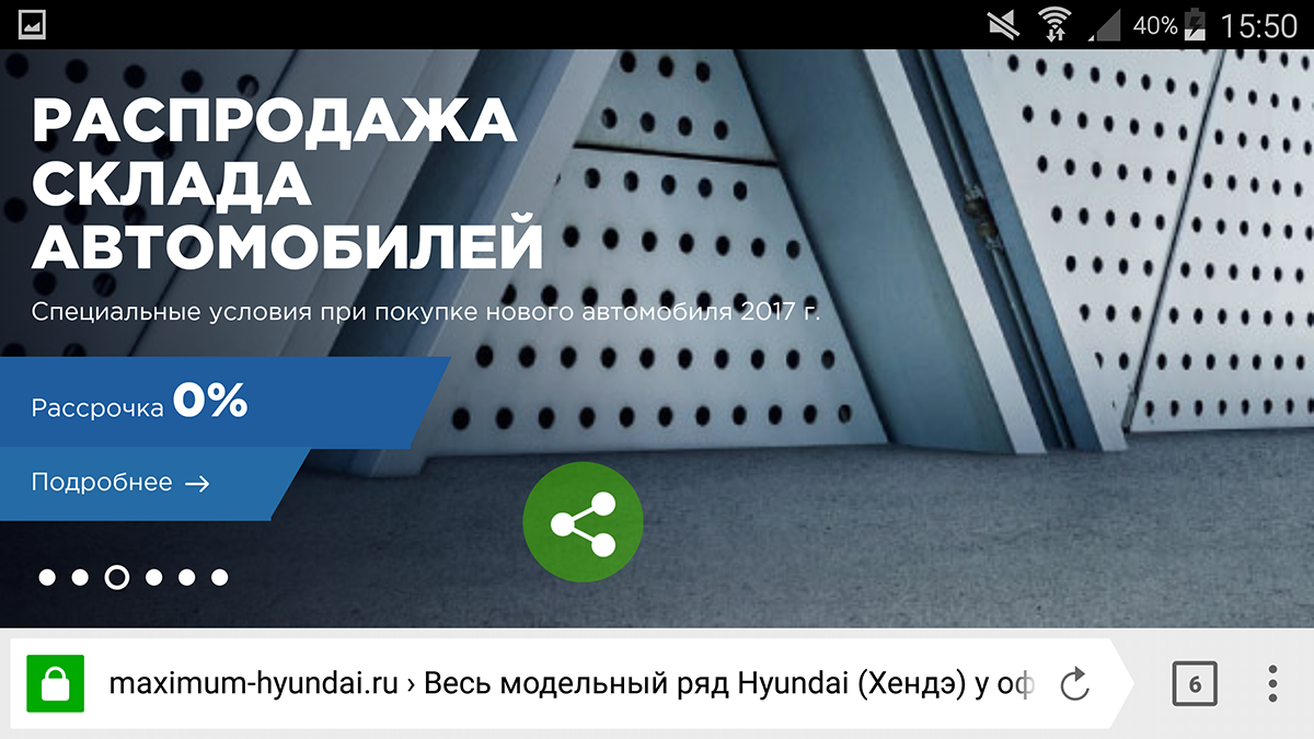
By the way, the best practice is that the banner is not clickable, and the transition can be made only by clicking on the plate with the inscription "Read more". And make up a banner for a smartphone like this:
Let's try to go through the following user scenario: we are interested in a certain model (let it be Creta), we wanted to find out how much money they want to take from us and for something there are some configurations of this model, how they differ and how much they cost.
Click "Model range", select "Creta", get on the page with the model (5), see below the "Price and configuration" - what we need. True, we throw out another pop-up:
We remove the pop-up, click on the "Prices and configuration." For some reason, instead of a complete set appear technical characteristics of the model, and an additional menu. But there is a point “2. Grade ", and you can click. Here is one of the best car kits for monitors:
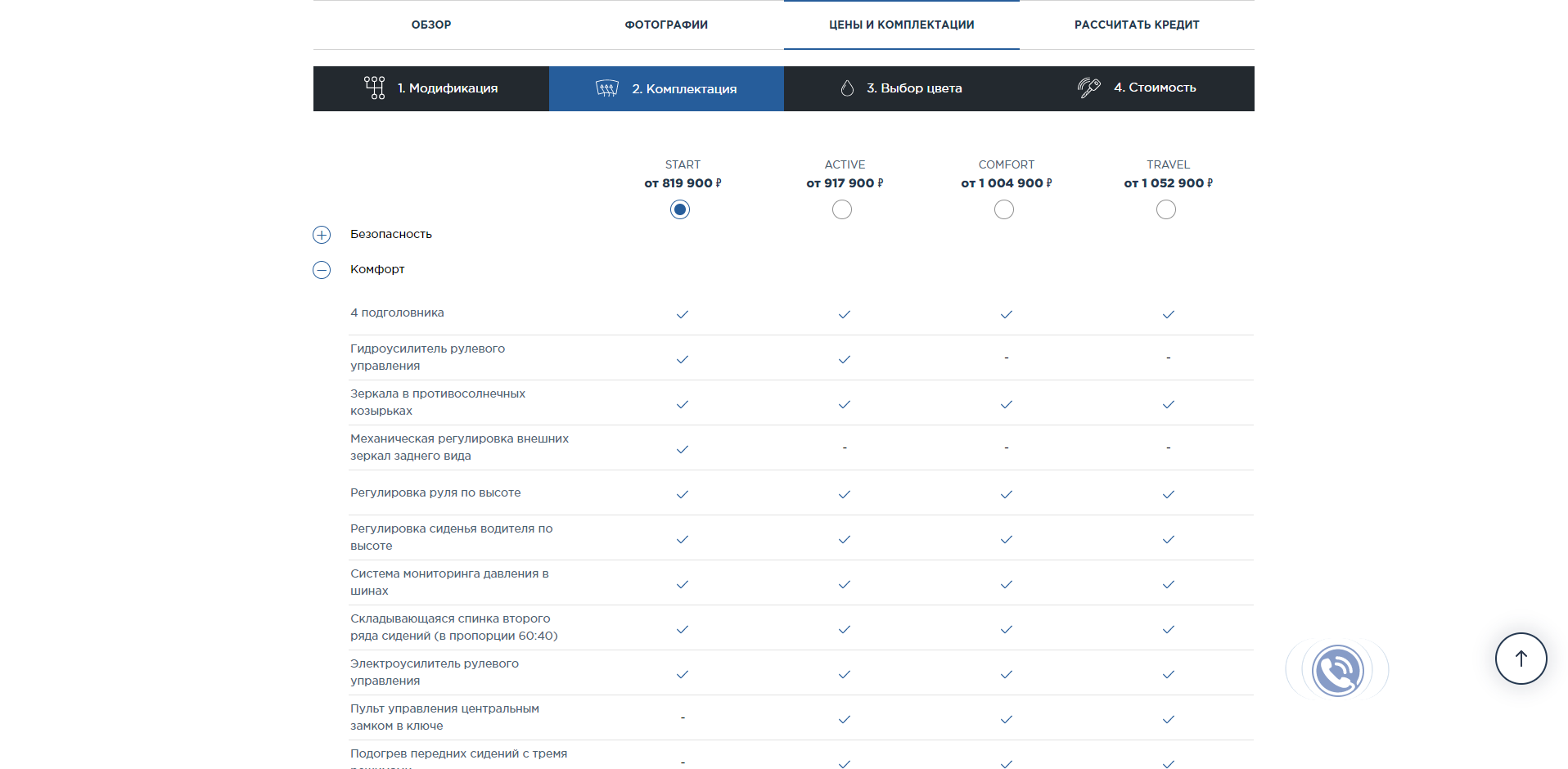
The block with content occupies 61.5% of the width of the browser window, i.e. on the left and on the right, almost by 20% - of free unused space. Description of complete sets takes 11% of the width.
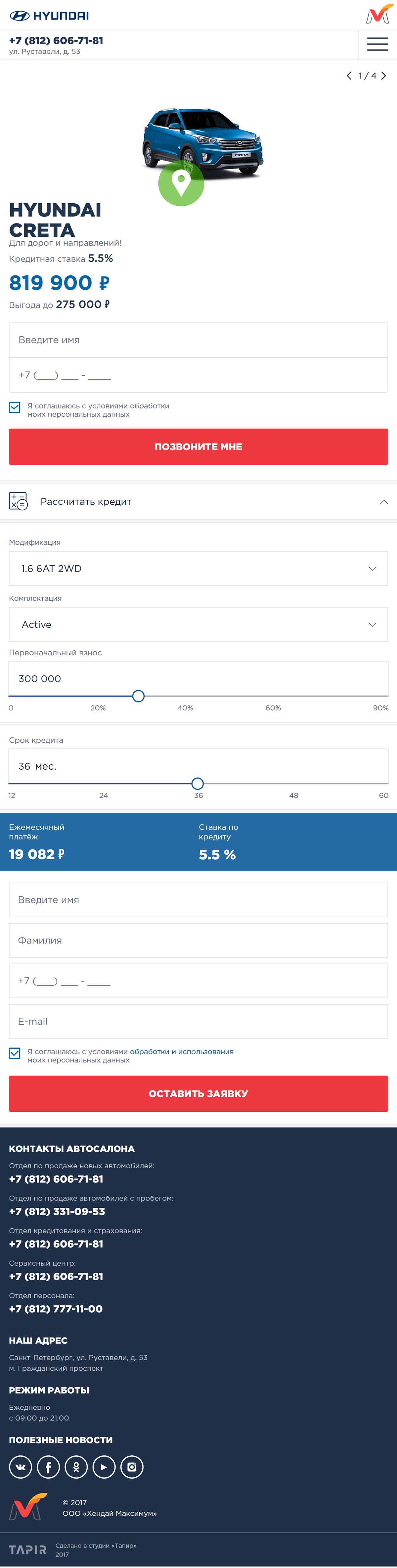
Let's try to find the same information on a mobile device. The menu is hidden behind the hamburger, by clicking on it we also select the “Model range” and “Creta”, and get to the page with the model. But here we are in for a surprise: on the page adapted for mobile, there are NO navigation elements with which one could open the model bundle! Accordingly, it is impossible to study these configurations on a smartphone. Here is the full page layout of the best dealer site in Russia, adapted for the landscape-orientation of the phone:
Separately, after the jury, I would like to note the excellent layout of elements on the page and the effective use of the entire area of the browser window.
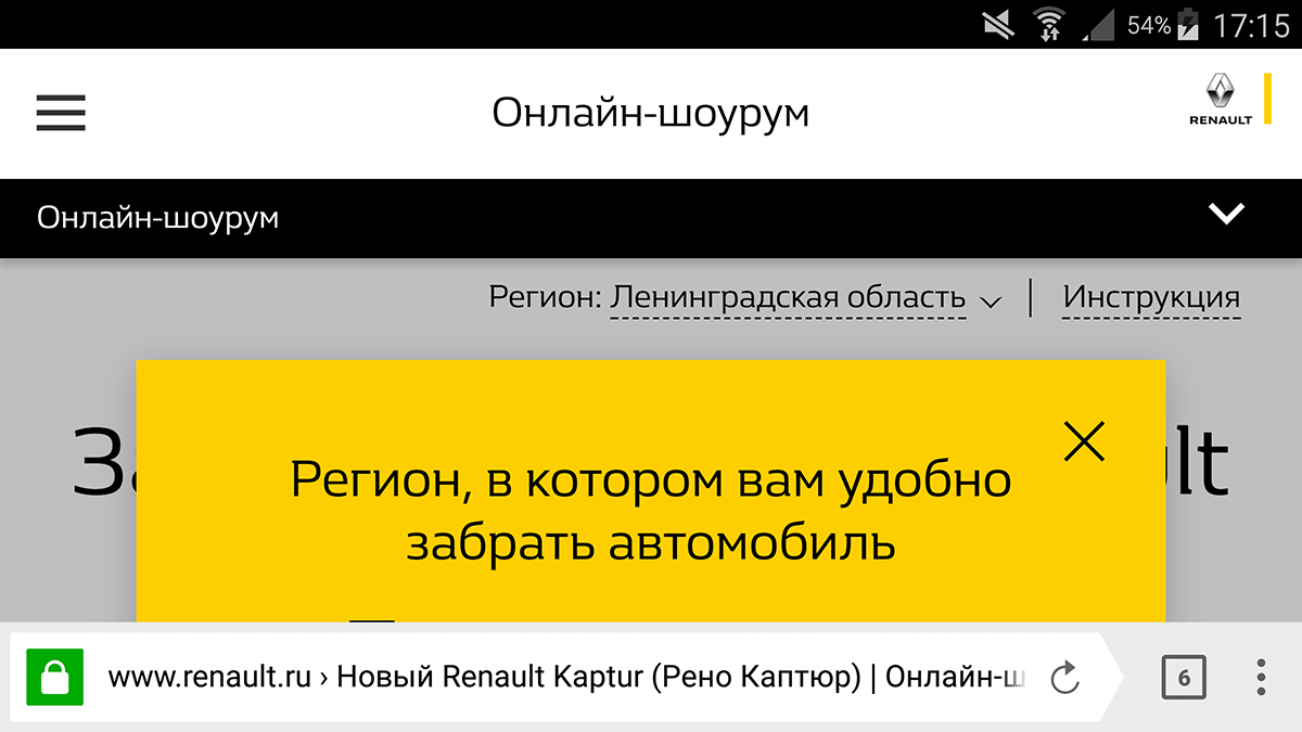
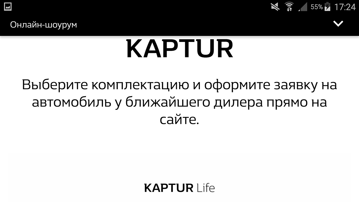
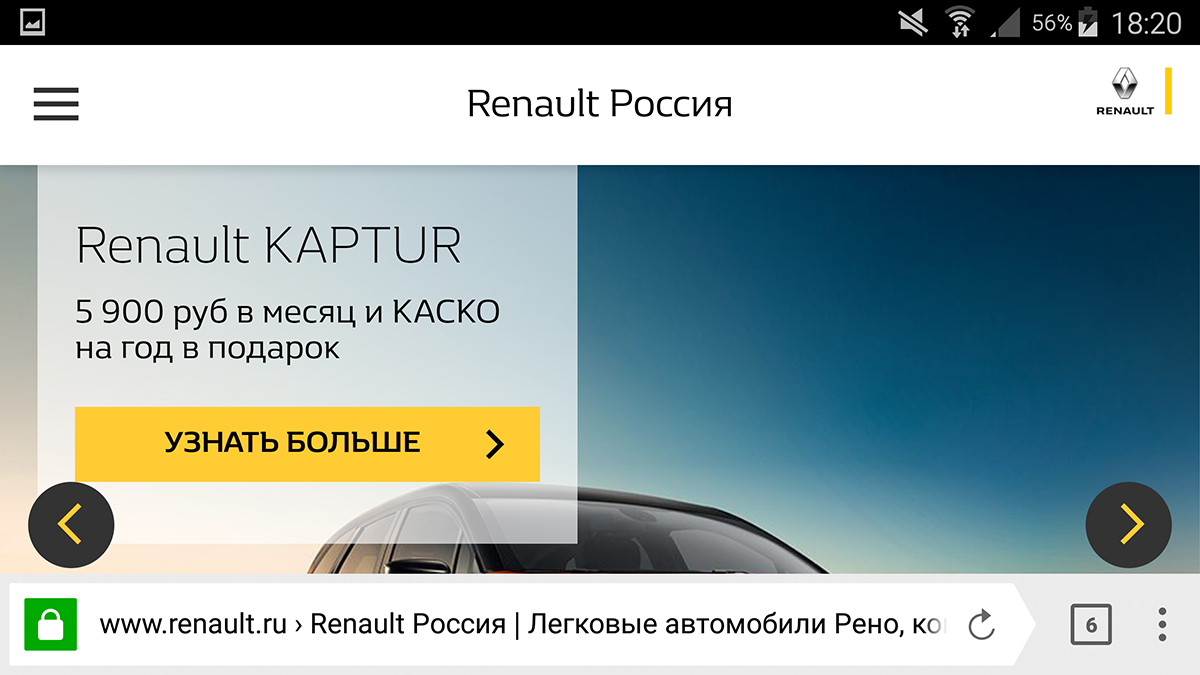
But we are waiting for the best automotive website in Russia. The first place “Golden site” gave online showroom renault.ru. The link from the presentation page of the winner leads directly to the Kaptur model (6). We remove the functional pop-ups with the region and the hint, and we see the perfect layout of the best autosite:
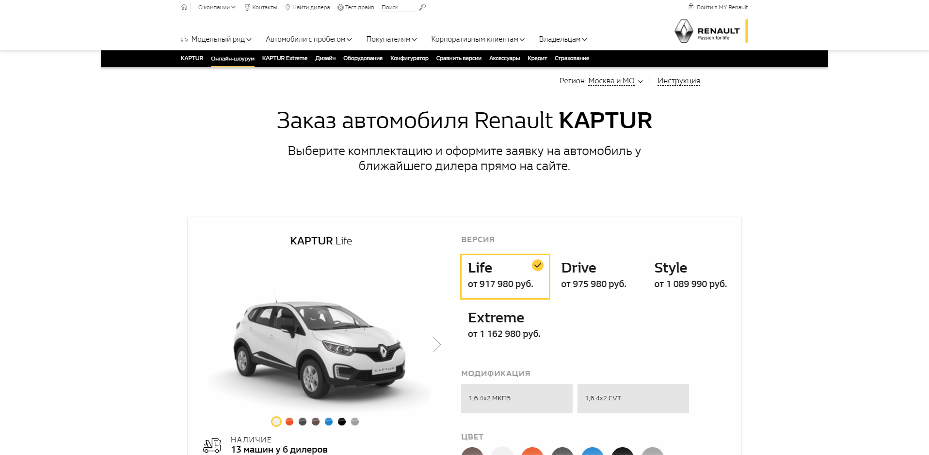
The page shows us with an example that we need to typeset so that when the browser window is 1918 px wide, the content part occupied 1140 px, and the right and left side should be left with 20% of unused space.
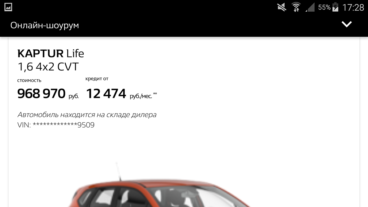
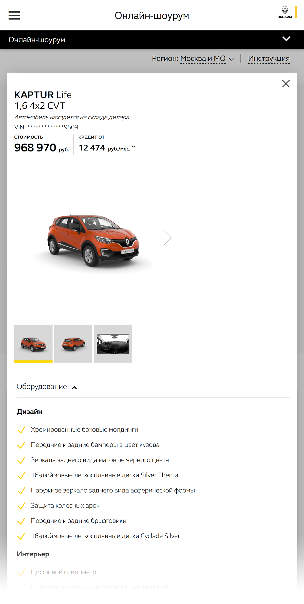
Well, the UX of this page is made according to the principle “Repetition is the mother of learning”: the content consists of two main blocks, one of which is “Choose a complete set and place an order ...”, and the second one - “... choose a popular complete set ...” with the same functionality. We use the same custom script as before: try to find and study what is included in the proposed configuration. Since already on the page we are offered to choose equipment, it is logical to assume that after choosing we will be able to find out what equipment is included in these equipment. We leave the version of "Life", click "Select". A pop-up opens with a map and the heading "Choose a dealer."
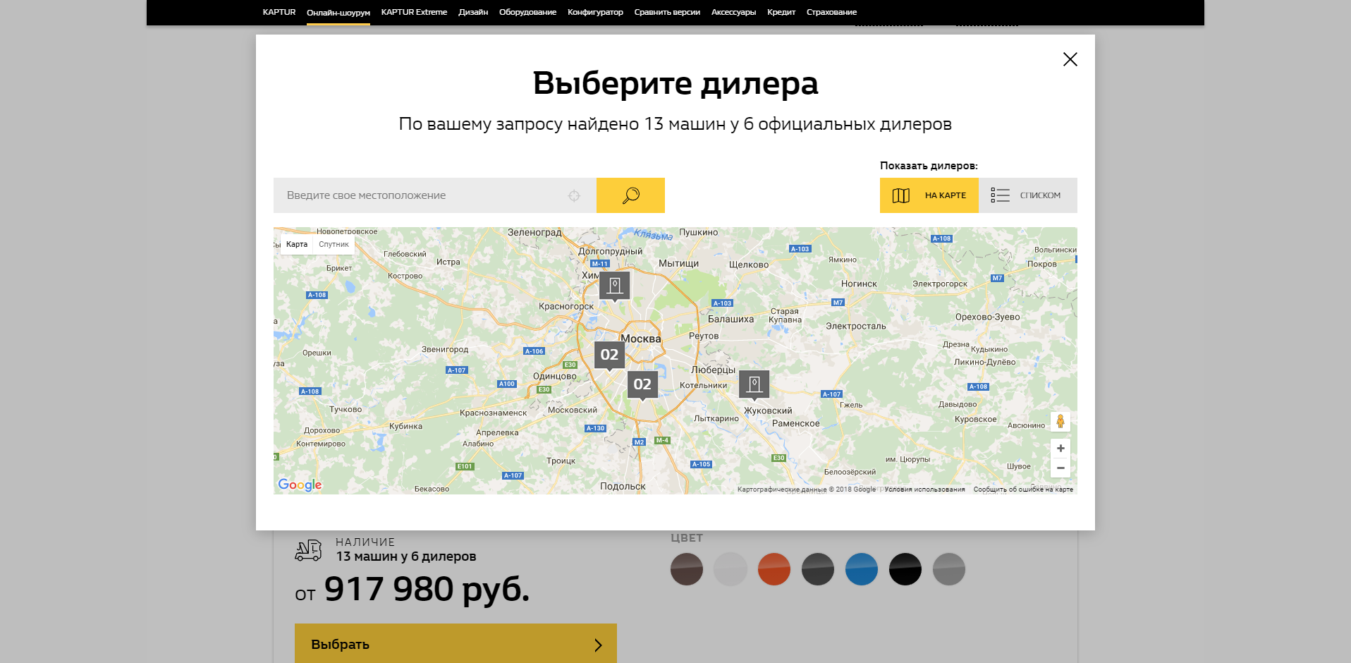
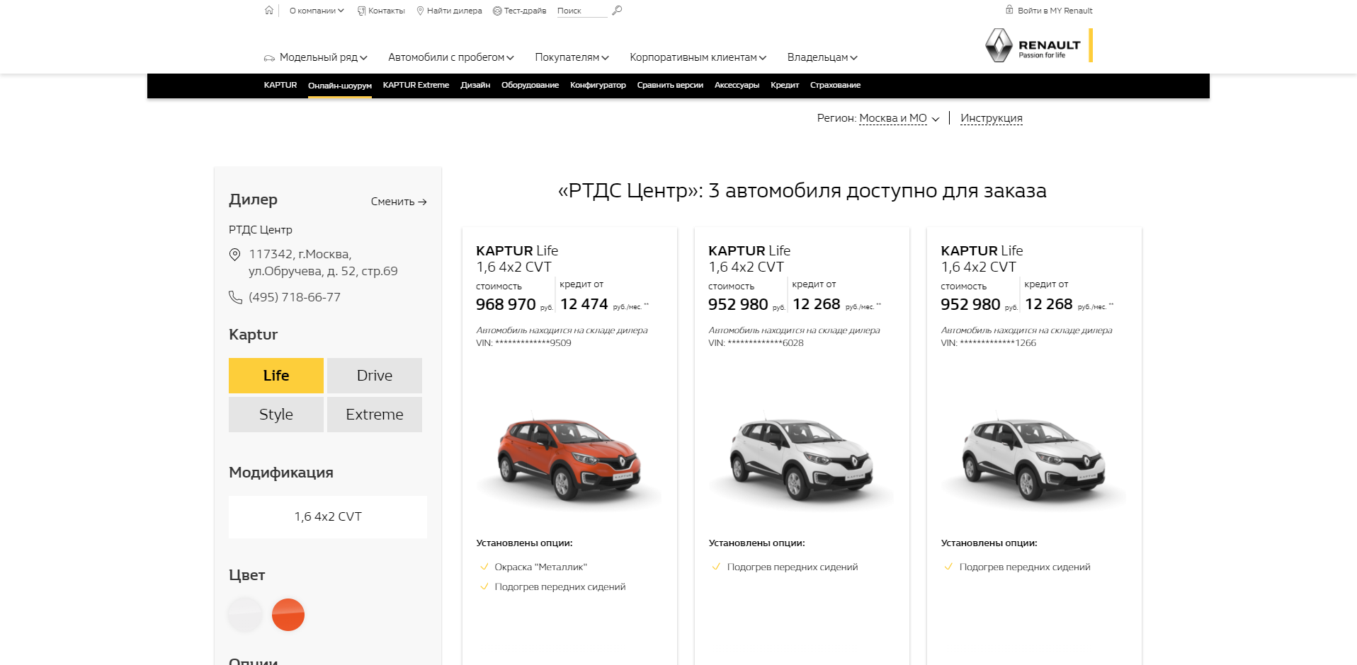
We do not give up hope to study the selected equipment, we select the first dealer to be found (2nd click on “Show dealers list”, 3rd click on any dealer). A new page with cars opens, and it is rolled up in such a way that the “Details” buttons (where we still hope to find a description of the equipment) go beyond the visible part of the page on the widescreen monitor. Naturally, as with the banners of the former winner, the car cards themselves are not clickable, i.e. you must first scroll down to go somewhere.
4th action - scroll down, 5th - click on "Details". Pops up another pop-up, with information about the selected car, and, finally, we get to not even the button, but the inscription "all features", which will show us the list of equipment of the chosen configuration.
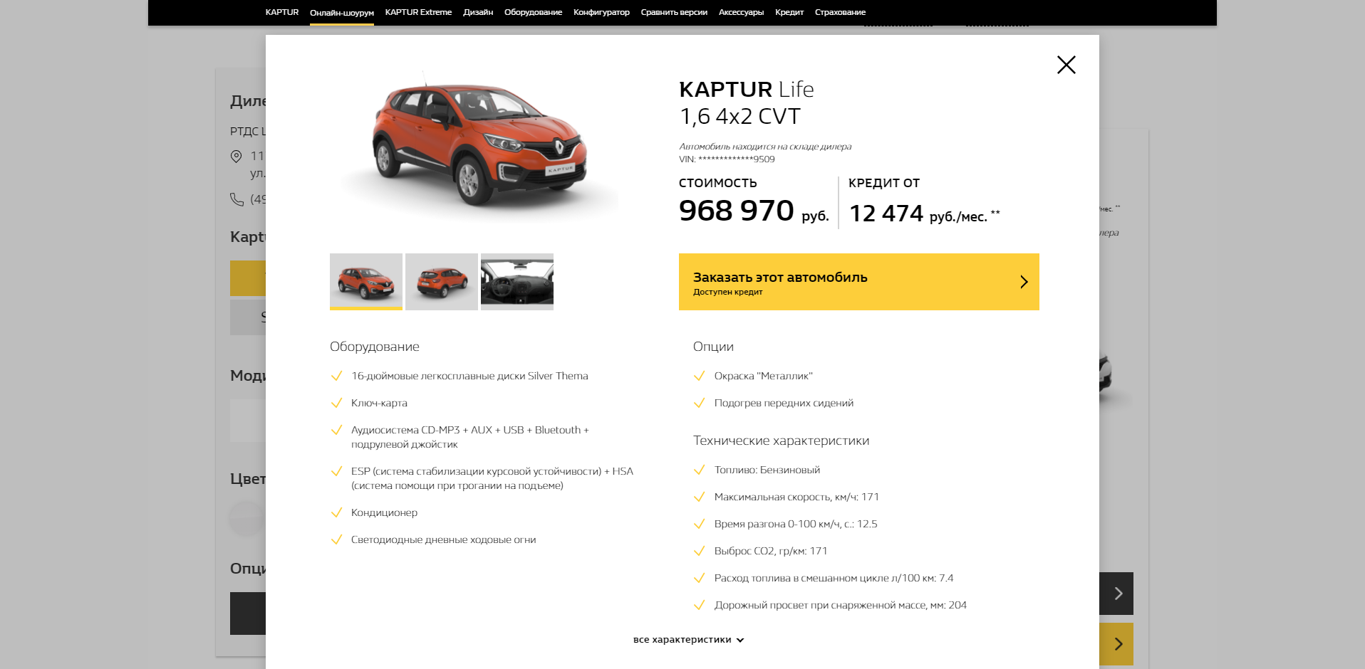
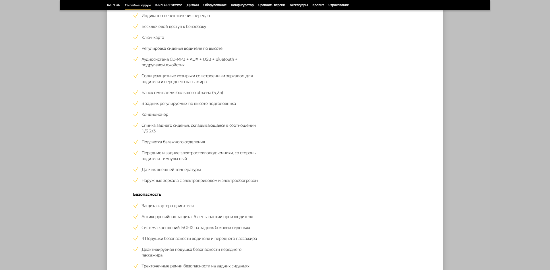
The equipment list divides half of the content space with the technical characteristics of the model (according to the scenario, we are interested in the first and are not interested in the second, but if they give, we must take it). Scroll, we look that the selected package includes. Wonderful layout starts from the moment when those. specifications end with:
We try the same on a mobile device. Immediately we see how to make up a pop-up, defining the region of the user:
Example of the best indents:
Car card on the best automotive website:
Click on this card, scroll down, open "Equipment", and below - "all equipment". Hurray, we can see what completes the selected version. The best car site shows us this:
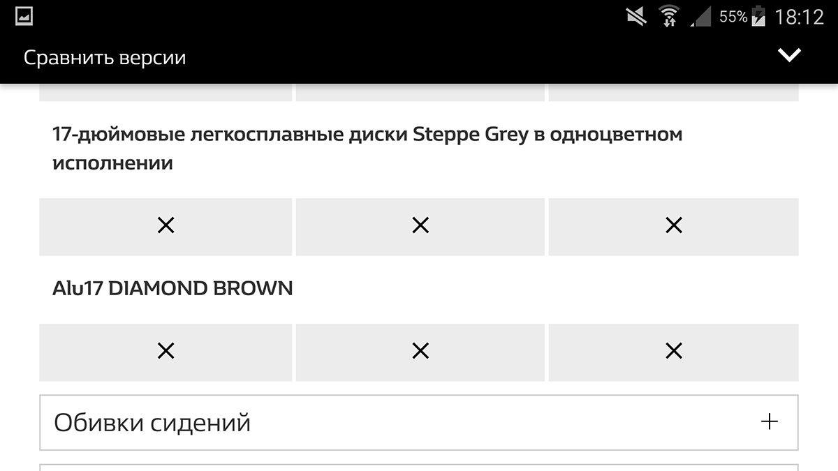
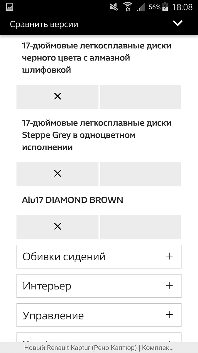
But we got to any one configuration, and in the scenario we want to understand what they are and how they differ. Desktop allows us to do this relatively simply: in the third top menu there is a navigation element “Compare Versions”. Click on it, select versions for comparison, and get an example of a better display of the comparison of complete sets (7):
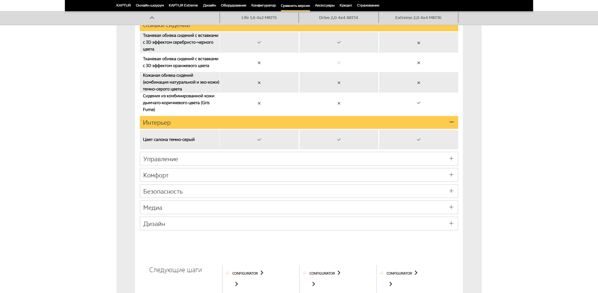
A table opens to us, a cell with a description of a specific configuration occupies a width of 244 px with a width of 1918 px browser window, i.e. information occupies 12.7% of the width of the browser, while the left and right of 20% is an empty unused area. This is with regard to design. Having looked at the page under the UX prism, pay attention to the following steps and click on the suggested “Configurator” link. The best automotive website of Russia sends us to a 3D configurator (8), which is displayed in my way:
How does the version comparison page display us a mobile device? Here, the developers of the best automotive site, apparently, interpreted the principle of mobile first in a very interesting way: in the landscape, we, like on the desktop, can compare three configurations:
But if we turn the device in portrait, then the third selected equipment disappears, and we already compare only two:
If we follow the UX-tips on the following steps on the phone and click on “Configurator”, then we will be taken to the page where you will be offered to download the “Renault 360” application or visit the Renault website, transferring to the main page of the best automotive site we are exploring. well laid out banners:
Banners, in the best traditions of website building, are not clickable; to go to the corresponding pages, the button “Learn more” is added to each banner.
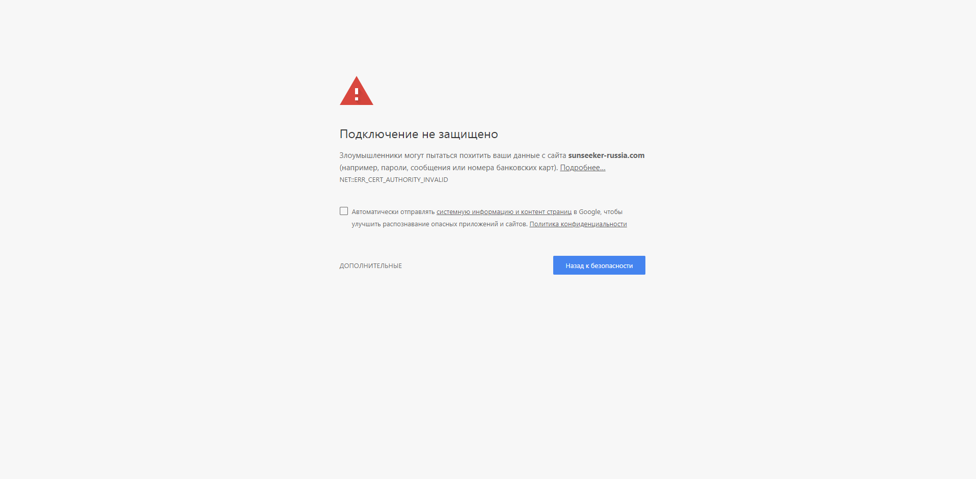
The author of this article submitted his work to the contest “Golden Site”, and, as I said above, I was interested in the nomination “Brand’s website and auto / moto dealer” nomination. However, I was guided by several other principles in the design of the site, its pages and elements of these pages. The competent jury decided that the site made by me deserves the very last place, setting a rating of 3.5 points. Much higher - by 5 points - in the nomination “auto / moto” the site about yachts was rated, the link (9) to which from the nominee’s presentation page shows this:
And even more highly - by 5.75 points - the jury rated “Calculator of the cost of ownership of the fleet for KIA”, the link to which on the presentation page (10) is designated as “ xn — 7ug /”
Among the nominees was also the site “You Can Do More” (work for TOYOTA), which got the 4th place with 6.2 points. The authors of this work write: “As part of the campaign, three films were shot that became the center of all communication.” Before that, it seemed to me that it was certainly more convenient to watch films in landscape-orientation. This is how this site (11) looks like on the phone screen:
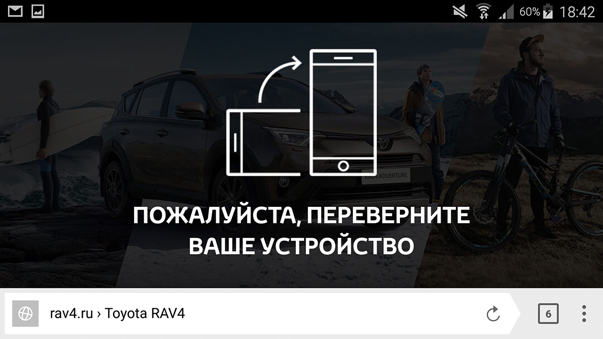
However, to make up so for the landscape means to follow the trend of Russian responsive design.
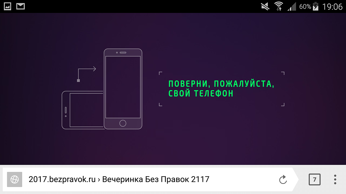
"Party Without Rights 2117" (12), third place in the category "Promo-site of an event, concert, exhibition, conference, cultural object" (jury score - 7.75 points):
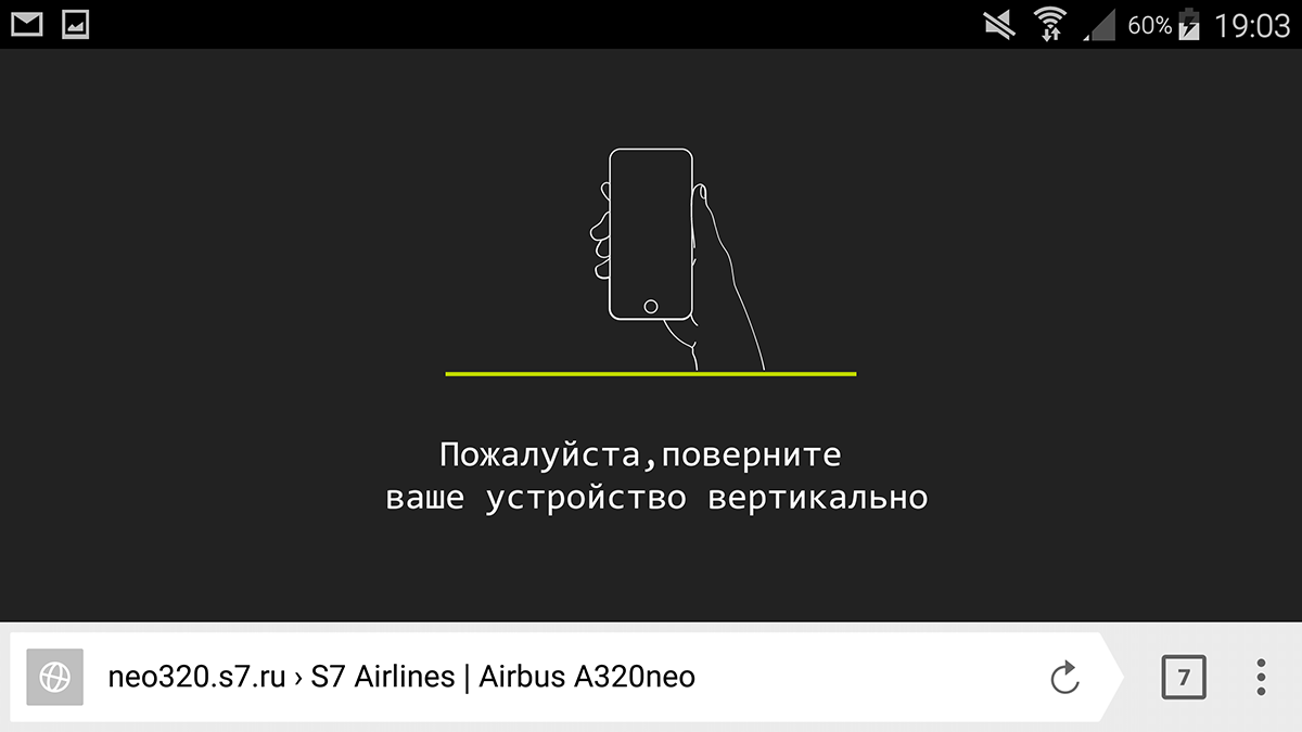
“Presentation of the first Airbus320neo in Russia” for S7 (13), second place in the same category (8 points, developer description: “High-quality mobile version”):
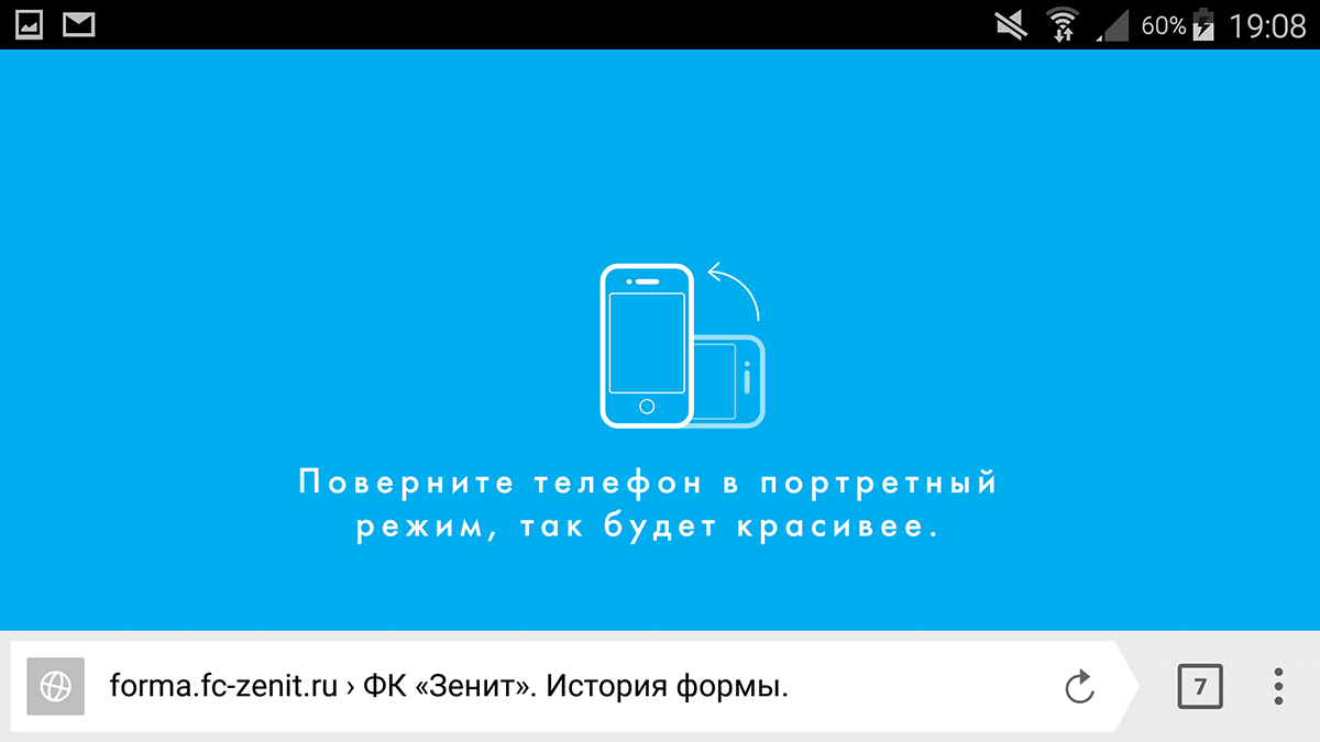
FC "Zenith". History of form ”(14), first place in the category“ Website of a sports organization, club, project, event ”(also 8 points):
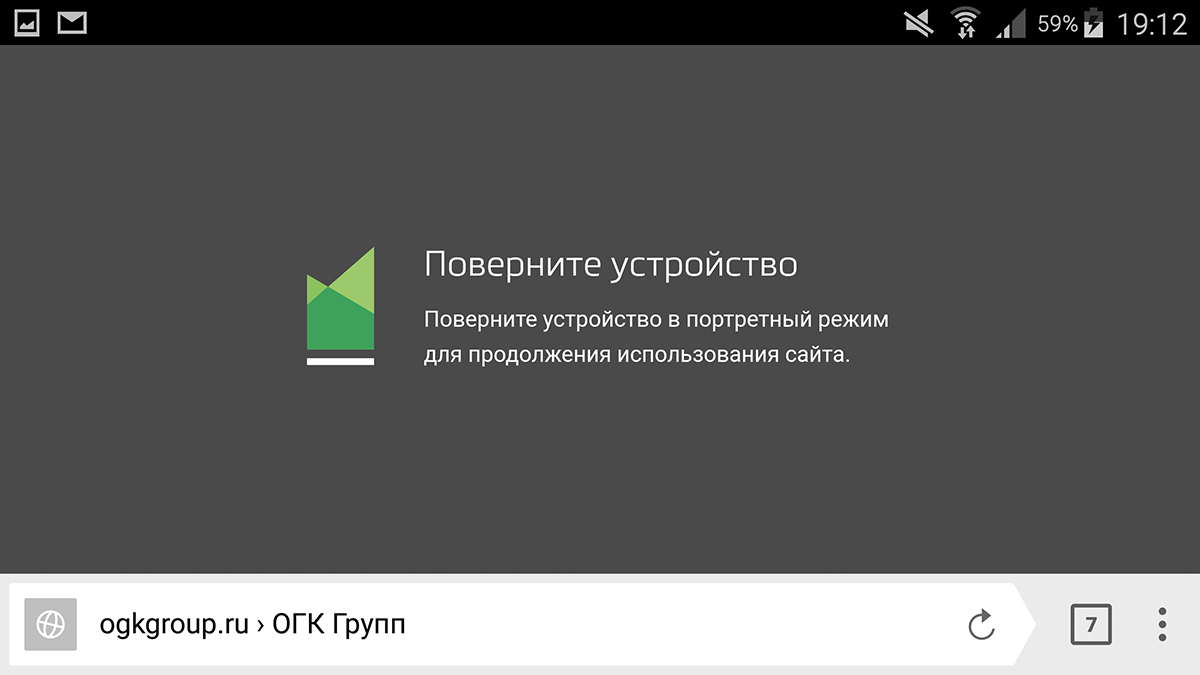
“OGK Group” (15), second place in the category “Website of the industrial / fuel and energy company or dealer” (jury evaluation - 8.4)
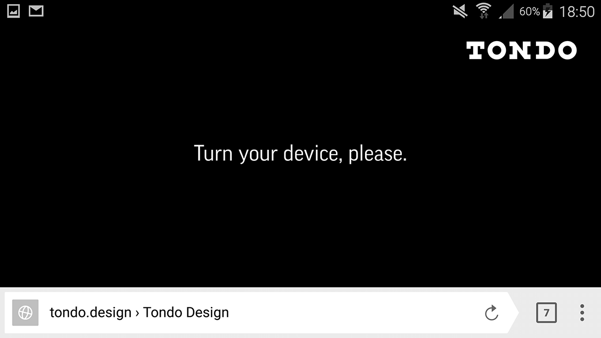
Finally, TONDO (16) - the third place in the “Golden” nomination “Best Design” (jury evaluation - 8.2):
By the way, about the "gold" nominations. I naively hoped that my work would be able to compete in two of them - “The Best Design” and “The Best Usability / UX”. Naturally, with such trends, my hopes were not destined to be justified - web pages that adapt to any orientations of both smartphones and tablets, as well as different desktop monitors are inferior to the best just with an insurmountable margin.
8.29 points from the jury, first place in “Best Design”, third in the category “Best usability / UX”, second place in the thematic “Best website for consumers (b2c)”, first places in the categories “Website of a bank or insurance company "And" Financial service, online banking "occupied Raiffeisenbank, the work of AIC. That is, this is really the best site in Russia, an example of an ideal layout. I will not describe it in detail, I will show only a few moments that immediately caught my eye.
If the main page of this site (17) on the monitor is scrolled to a block with the exchange rate, then you can see this display:
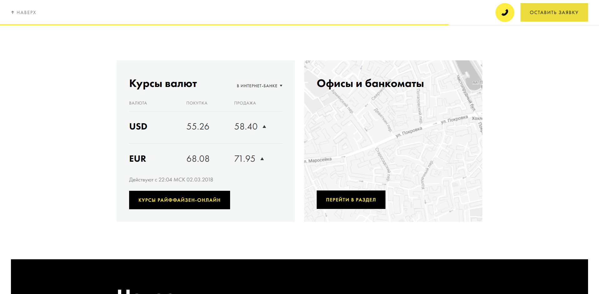
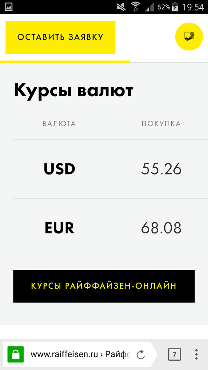
We see two currencies, their purchase rate and selling rate. Let's see the same block on the phone in portrait:
And in the landscape:
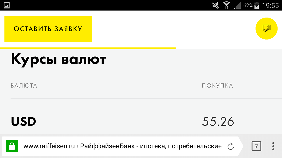
On the smartphone screen in both orientations, the selling rate did not fit in the visible content part, moreover, no elements showing that this block scrolls horizontally, and that there is an invisible selling rate on the right — no.
But back to the desktop mapping. With the exception of the top banner, the page is not the full width of the page: with a 1914 px browser window width, the content part is 1170 px, or 61% of the width, and, accordingly, almost 20% on the left and right is unused space. And this layout immediately catches the eye, if you start to view the content immediately after the main banner:
After this, the main banner has two (apparently important) blocks, designed as a carousel - unnamed with 4 elements in it and the block “Special Offers”, consisting of three blocks. And because the layout “cuts” 20% right and left, the carousel either starts or ends, leaving unused space before or after it.
Those. instead of a seemingly logical arrangement, when all the elements in these blocks are immediately visible, and they do not even need to be scrolled - the dimensions make it possible to fit everything in one row, because of lateral unused voids, the first or last element of the carousel is always not visible, and from the opposite side - a lot of unused space.
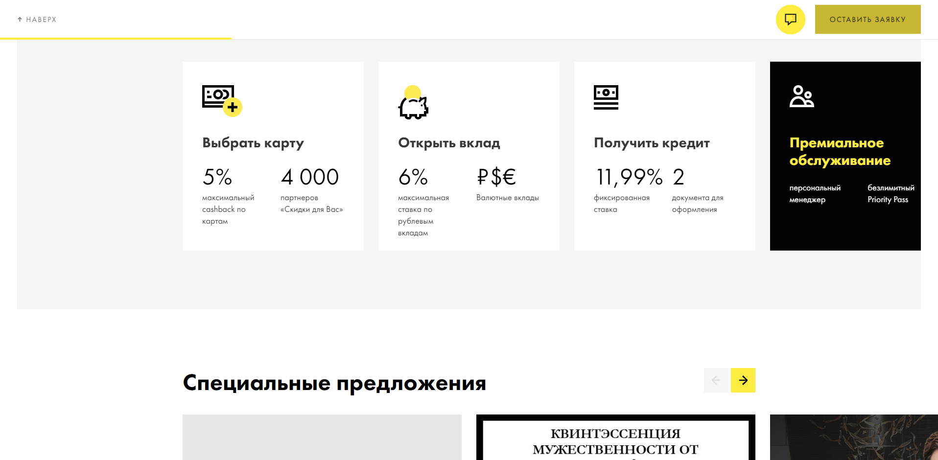
The fact that the layout was not made for widescreen 1920-pixel monitors, we are shown other pages on the site, for example, with the selection of credit cards (18):
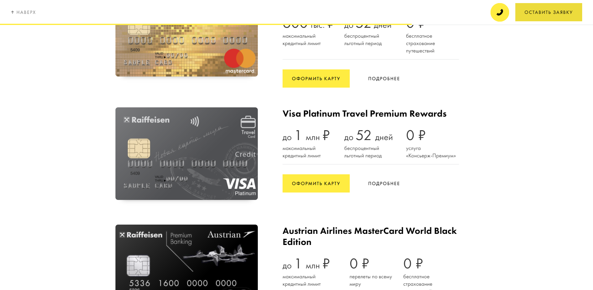
Pay attention to the signature of the zero-ruble service - “Concierge Premium” service. On the phone in landscape-orientation, this fragment colorfully illustrates the best design of the best Russian site:
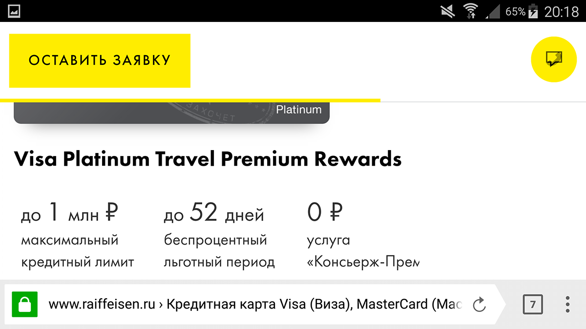
How to make up the adaptive version for the phone: use not the full width, even if the picture (map image), then 46% of the empty space remains on the right, and if the text is 33%, even if the text does not fit. Well, in height: with the visible browser toolbar, the content part occupies only 68.5% of the screen height, and 31.5% (almost a third!) Let the white block, which is also not very full, see the void between “Leave a request” and the icon chat. 8.29 points and first place in the nomination "Best Design".
Based on the foregoing, the following trends of Russian site building can be identified:
- No need to use "rubber layout" in the adaptive display for the desktop. The best standard is fixed width, so that on monitors 1920 × 1080 20% on the right and the same on the left was empty.
- No need to impose a different orientation of mobile devices. The principle of better Russian adaptation is not necessary, as it is more convenient for the user, let him adapt to the layout, and not the layout for the user.
- No need to make banners clickable. The best standard is to add “more”, “further” dies to each element that motivates to go somewhere, and only it is clickable.
- The more vertical indents between the elements - the better.
- Typography - hanging prepositions, dashes in phone numbers, etc. - you can not think about it at all.
Follow these trends and you will have the best design, the best usability and the best UX.
At least, in the opinion of the competent jury, one of the most authoritative (if not the most authoritative) competition of the Russian Internet. Quote from the official site about the competition (2):
"Golden Site" - the key and the oldest competition of Internet projects in RuNet. Since 1997, an independent jury of the competition, which in different years was led by Artemy Lebedev, Anton Nosik, Alex Exler, Sergey Plugotarenko and other Runet stars, has presented the cherished statuettes of the Golden Cybermaster to the most worthy projects. In 2014, the competition was restarted with the participation of Mikhail Vakhterov (the founder and ideologist of the competition), the Russian Association of Electronic Communications (RAEC) and the RUWARD project group.
And finally - an example of how not to make sites, according to the key competition of Russia (the work scored 3.5 points, the lowest score of the jury):
- Job description of the author of the article, which received one of the lowest marks in the competition - http://2017.goldensite.ru/work/the-website-of-the-brand-and-dealer-auto-moto/4453/
- The page “About the competition”, from where the quote is taken that it is key, and about Runet stars, starting with Lebedev and Nosik - http://2017.goldensite.ru/about/
- http://rcsbrand.ru/
- https://maximum-hyundai.ru/
- https://maximum-hyundai.ru/lineup/creta
- https://www.renault.ru/vehicles/range/kaptur/showroom.html?c020_model=HAH
- https://www.renault.ru/vehicles/range/kaptur/compare.html
- https://ru.co.rplug.renault.com/c/BAU5/A0bg?v=2
- https://sunseeker-russia.com/
- http://2017.goldensite.ru/work/the-website-of-the-brand-and-dealer-auto-moto/4509/
- http://rav4.ru/
- http://2017.bezpravok.ru/
- http://neo320.s7.ru/
- http://forma.fc-zenit.ru/
- http://ogkgroup.ru/
- http://tondo.design/
- https://www.raiffeisen.ru/
- https://www.raiffeisen.ru/retail/cards/credit/
')
Source: https://habr.com/ru/post/350410/
All Articles