Graphs of the message of the President of the Russian Federation 2018

I will say straight away that the post is not about politics and the message, but about how NOT graphics should be done, in general, nobody needs to do that, especially for the president, especially when the audience is so vast.
Parsing flight arts
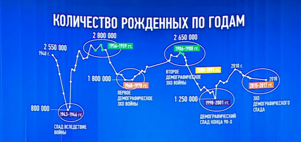
So, the graph with the title picture. What we see.
- no baseline ie zero
- axes, why do we need them
- minimum year 1940, maximum 2018, with only 55 points on the line
- 6 numerical fertility rates, but only two understand what year they are related
- periods are marked with colored labels, but points for them are marked only in 2 cases out of 7
- the length of periods in years does not correspond to the number of points circled in the oval
- the second demographic echo of the war, it refers to the yellow period (1989-1991), but we automatically match the signature with the green (1986-1989)
And most importantly, as you probably guess, the demographic echo is not for nothing that is called. Demographic holes followed with a perid of about 25 years. This corresponds to the age of marriage (and replenishment in the family). Now the trend is that young people marry later. So most likely another echo is still waiting for us. That's just this schedule, we hesitate to say about it.
I am not a demographer, so if something goes wrong, let knowledgeable people correct me.
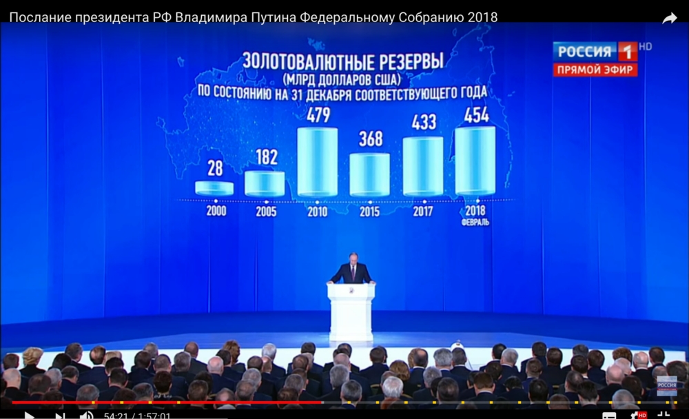
More fun. The simplest bar chart, it’s also a bar chart. It would seem that there might be something wrong.

Did you notice?
And if so?

The height of the columns is strange, is not it? Let's look at 2017 and 2024: they differ 10 times in numerical indicators, and hardly 3.5 times in height. 1986 and 1996 is a similar situation, but the ratio is different. So what is the scale here in fact. Well, what is not linear is already clear, but I would like to know more precisely.
Do you think such a schedule is only one? Here's another.

The rest is not much better, you can see for yourself. Do you have confidence in such graphs and data on them?
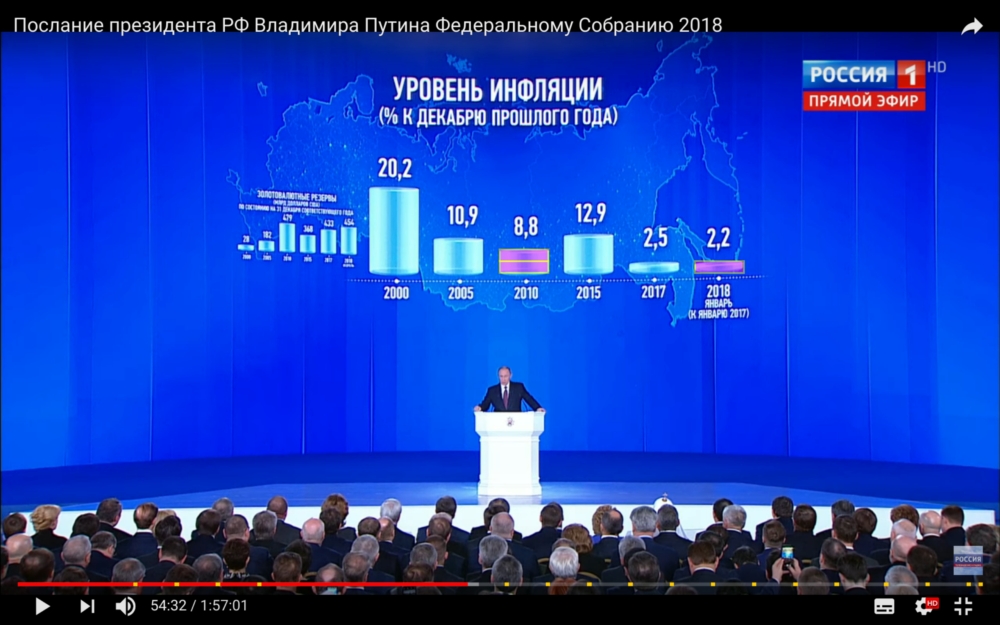
Well, as a climax.

We wrote "% of December last year." Apparently, it meant the total inflation for the year. Or not? We see that in 2017 by December it was 2.5% (oh, dreams of dreams). And in 2018 by January 2.2%. So, this past January is almost the same level as last year? Solid questions.
I think this can stop.
Main question
Now the main question: how can this be. Can you believe all these graphs and data? No, everyone has become accustomed to ridiculous graphics and maps in the information media. But there is a constant rush, everlasting rumble, they can and forgive (although no, it is impossible). But here, obviously, the event was prepared strongly in advance.
You know, if the message were charts that skillfully embellished achievements and masked failures, it would be much more interesting to disassemble them. I mean at least the classic "technology": "How to lie with the help of statistics . " And so, it's a shame even somehow.
Usually, I advise less experienced colleagues to read Tafti and learn the principles of Gestalt, but in this case ... In fact, there is a high probability that almost no one noticed these jambs. And I just have a professional deformation. From a professional point of view, this is an epic fail. With philistine - time will tell.
I would very much like all the data, on the basis of which all this indecency was drawn, to be made publicly available. I think we have enough competent data visualization specialists and designers who can make normal, informative diagrams of them that will not be a shame to show at the state level.
PS: timing on the screenshots specifically left so that you can make sure of everything yourself. Record this one .
')
Source: https://habr.com/ru/post/350308/
All Articles