Writing a component - a table, not in the usual way.
Another small article easier to follow. I'll tell you how I draw tables in Vue .
There are a lot of table components for Vue. With various possibilities. And everywhere differently the table gathers in template of page or any component.
It basically happens something like this:
')
Here we pass the data ( items ) and column settings ( columns ) to the cmp-table component. And the component itself already renders a table for these settings.
Settings are organized for everyone. Simply setting up the columns separately or, generally, everything in a heap - settings of columns, tables, some actions, etc.
In this approach, I don’t like the way the setting of the render rendering is organized. Both their names in thead heading of the table and the contents of the columns themselves .
I want to see this functionality in the template itself, to build columns there (their contents and header). So clearer and more convenient. As for me.
Such an approach, for example, is used in the most popular type of component collection today - Element .
There it looks like this:
Here everything is clear. We immediately imagine a general view of the columns and cells. And in the el-table component we transfer only the data and settings of the table itself.
And everything would be fine. I like the overall Element . But he often noticed that their tables slowed down. Got into their code. And ofigel on how misleadingly there is a render of lines, cells and everything else. Just tons of code. And I began to think how it is possible to make the construction of the table as they have, only easier. Much easier.
Now I will tell and show you what I did.
Immediately that in the end will be our component. So that what happens next is easier to understand:
Our table will consist of two parts:
table-column.js :
This is a Vue component with the name vu-table-column and a couple of incoming parameters:
Yes - this is all we need to implement the current requirements for our component. Then it will be clear why everything is so simple.
And go through the code.
At the beginning we import table styles.
And I’m also using the get- function lodash here . It's not obligatory. It is here so that the code is ultimately shorter.
Further the entering parameter of rows where we transfer our data, in the form of an array of lines.
Now for the render functions:
In columnOptions, we configure the settings of our columns and cells.
To do this, first collect, filtering, all elements with the vu-table-column tag ( TableColumn component) from the default slot ( this. $ Slots.default ) of the Table component.
We need the TableColumn component so far only in order to transfer the column settings in a convenient and visual way. This is why there are no render functions in the TableColumn . Because we do not render this component. Just take the data.
And we go over the array of filtered vu-table-column , form an array of objects with incoming props from vu-table-column and add the scopedSlot property. It will store the default slot with a limited scope , if one is passed to the page template in the vu-table-column . It is a function that renders the contents of this slot. And you can pass to it any parameters that are used in the template of this slot. We will use this slot for custom type of cells.
Next we collect columnsHead (table header cells) - go over the above defined column settings ( columnOptions ) by pulling out the title - the name of the column that we passed to vu-table-column .
We form an array of rows (the actual rows of the table itself) - we go over our incoming rows , and in each tr element we draw the cells using the renderColumns method:
In the method, we pass the h- function (alias of the $ createElement function that renders vNode ), the given strings, and an array of columnOptions column settings .
And collect an array of cells in which we render:
Everything!
That's all the code for drawing cells and caps.
Then you can stick the filtering, hiding / showing columns, sorting and everything your heart desires. This is the next story. And it will be in the next article. In order not to write endless texts.
And an example of using the written component:
Here we use both regular titles and a custom view of the cells.
In the Rating cells, we use the data items (which are passed to the scopedSlot function and containing the incoming array with strings) and the value of the rating property to determine whether the current row is the highest rated. If yes, print in bold text 'Best choice!'
And the finished result:
Here is a component in the end turned out.
I am currently drinking it. I add functionality. And in the next article I will describe the expansion of opportunities.
There are a lot of table components for Vue. With various possibilities. And everywhere differently the table gathers in template of page or any component.
It basically happens something like this:
')
<template> <cmp-table :items="items" :columns="columns"/> </template> <script> export default { name: 'page', data() { return { items: [ { id: 1, name: 'Sony' } , { id: 2, name: 'Apple' }, { id: 3, name: 'Samsung' } ], columns: [ { prop: 'id', title: 'ID' }, { prop: 'name', title: 'Name' } ] } } } </script> Here we pass the data ( items ) and column settings ( columns ) to the cmp-table component. And the component itself already renders a table for these settings.
Settings are organized for everyone. Simply setting up the columns separately or, generally, everything in a heap - settings of columns, tables, some actions, etc.
In this approach, I don’t like the way the setting of the render rendering is organized. Both their names in thead heading of the table and the contents of the columns themselves .
I want to see this functionality in the template itself, to build columns there (their contents and header). So clearer and more convenient. As for me.
Such an approach, for example, is used in the most popular type of component collection today - Element .
There it looks like this:
<template> <el-table :data="tableData" style="width: 100%"> <el-table-column prop="date" label="Date" width="180"/> <el-table-column prop="name" label="Name" width="180"/> <el-table-column prop="address" label="Address"/> </el-table> </template> <script> export default { name: 'page', data() { return { tableData: [{ date: '2016-05-03', name: 'Tom', address: 'No. 189, Grove St, Los Angeles' }, { date: '2016-05-02', name: 'Tom', address: 'No. 189, Grove St, Los Angeles' }, { date: '2016-05-04', name: 'Tom', address: 'No. 189, Grove St, Los Angeles' }] } } } </script> Here everything is clear. We immediately imagine a general view of the columns and cells. And in the el-table component we transfer only the data and settings of the table itself.
And everything would be fine. I like the overall Element . But he often noticed that their tables slowed down. Got into their code. And ofigel on how misleadingly there is a render of lines, cells and everything else. Just tons of code. And I began to think how it is possible to make the construction of the table as they have, only easier. Much easier.
Now I will tell and show you what I did.
Immediately that in the end will be our component. So that what happens next is easier to understand:
- building columns like Element (el-table)
- ability to customize the type of cells
- very little code
- and the possibility of expanding the functionality without any problems
Our table will consist of two parts:
- TableColumn component - with its help we will form the view of the table heading and cells
- Table component - everything will be assembled and rendered in it
TableColumn component - or our brevity is all
table-column.js :
export default { name: 'vu-table-column', props: ['prop', 'title'] }; This is a Vue component with the name vu-table-column and a couple of incoming parameters:
- prop - in it we transfer the name of the property of the row of the transferred data to the table
- title - the name of this property, which will be displayed in the table header.
Yes - this is all we need to implement the current requirements for our component. Then it will be clear why everything is so simple.
Table component - or why write more code if you can
table.js
import './style.scss' import { get } from 'lodash' export default { name: 'vu-table', props: { rows: { type: Array, required: true } }, methods: { renderColumns(h, row, columnsOptions) { return columnsOptions.map((column, index) => { return h('td', { class: 'vu-table__tbody-td' }, [ column.scopedSlot ? column.scopedSlot({row, items: this.rows}) : row[column.prop] ]) }) } }, render(h) { const columnsOptions = this.$slots.default.filter(item => { return (item.componentOptions && item.componentOptions.tag === 'vu-table-column') }).map(column => { return Object.assign({}, column.componentOptions.propsData, { scopedSlot: get(column, 'data.scopedSlots.default') } ) }) const columnsHead = columnsOptions.map((column, index) => { return h('th', { class: 'vu-table__thead-th', key: index}, column.title) }) const rows = this.rows.map((row, index) => { return h('tr', { key: index }, [ this.renderColumns(h, row, columnsOptions) ]) }) return h('table', { class: 'vu-table' }, [ h('thead', { class: 'vu-table__thead' }, [ h('tr', [ columnsHead ]) ]), h('tbody', { class: 'vu-table__tbody' }, [ rows ]) ]) } }; And go through the code.
import './style.scss' import { get } from 'lodash' export default { name: 'vu-table', props: { rows: { type: Array, required: true } } ... } At the beginning we import table styles.
And I’m also using the get- function lodash here . It's not obligatory. It is here so that the code is ultimately shorter.
Further the entering parameter of rows where we transfer our data, in the form of an array of lines.
Now for the render functions:
render(h) { const columnsOptions = this.$slots.default.filter(item => { return (item.componentOptions && item.componentOptions.tag === 'vu-table-column') }).map(column => { return Object.assign({}, column.componentOptions.propsData, { scopedSlot: get(column, 'data.scopedSlots.default') } ) }) const columnsHead = columnsOptions.map((column, index) => { return h('th', { class: 'vu-table__thead-th', key: index}, column.title) }) const rows = this.rows.map((row, index) => { return h('tr', { key: index }, [ this.renderColumns(h, row, columnsOptions) ]) }) return h('table', { class: 'vu-table' }, [ h('thead', { class: 'vu-table__thead' }, [ h('tr', [ columnsHead ]) ]), h('tbody', { class: 'vu-table__tbody' }, [ rows ]) ]) } In columnOptions, we configure the settings of our columns and cells.
To do this, first collect, filtering, all elements with the vu-table-column tag ( TableColumn component) from the default slot ( this. $ Slots.default ) of the Table component.
We need the TableColumn component so far only in order to transfer the column settings in a convenient and visual way. This is why there are no render functions in the TableColumn . Because we do not render this component. Just take the data.
And we go over the array of filtered vu-table-column , form an array of objects with incoming props from vu-table-column and add the scopedSlot property. It will store the default slot with a limited scope , if one is passed to the page template in the vu-table-column . It is a function that renders the contents of this slot. And you can pass to it any parameters that are used in the template of this slot. We will use this slot for custom type of cells.
Next we collect columnsHead (table header cells) - go over the above defined column settings ( columnOptions ) by pulling out the title - the name of the column that we passed to vu-table-column .
We form an array of rows (the actual rows of the table itself) - we go over our incoming rows , and in each tr element we draw the cells using the renderColumns method:
renderColumns(h, row, columnsOptions) { return columnsOptions.map((column, index) => { return h('td', { class: 'vu-table__tbody-td' }, [ column.scopedSlot ? column.scopedSlot({row, items: this.rows}) : row[column.prop] ]) }) } In the method, we pass the h- function (alias of the $ createElement function that renders vNode ), the given strings, and an array of columnOptions column settings .
And collect an array of cells in which we render:
- or a custom view, if there is a slot in the column settings with limited visibility, by running the scopedSlot function with row parameters (containing the row object) and items (data passed to vu-table). Here we can transfer everything we need
- or just the value of the property named column.prop from the row row
When rendering array elements , do not forget to assign the key parameter to each element. Otherwise, when updating the data, there may be collisions in the displayed data.And at the end of the render function, we output the summary table, with header cells and rendered rows inserted into it.
Everything!
That's all the code for drawing cells and caps.
Then you can stick the filtering, hiding / showing columns, sorting and everything your heart desires. This is the next story. And it will be in the next article. In order not to write endless texts.
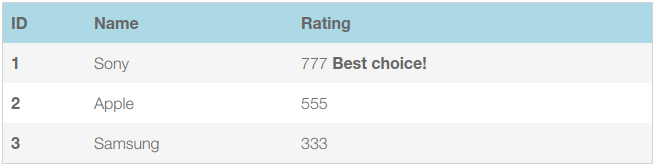
And an example of using the written component:
example.vue
<template lang="html"> <div> <vu-table :rows="rows"> <vu-table-column prop="id" title="ID"> <template slot-scope="{ row }"> <b>{{ row.id }}</b> </template> </vu-table-column> <vu-table-column prop="name" title="Name"/> <vu-table-column prop="rating" title="Rating"> <template slot-scope="{ row, items }"> {{ row.rating }} <b v-if="items.every(item => item.rating <= row.rating)">Best choie!</b> </template> </vu-table-column> </vu-table> </div> </template> <script> export default { name: 'example-page', data() { return { rows: [ { id: 1, name: 'Sony', rating: 777 }, { id: 2, name: 'Apple', rating: 555 }, { id: 3, name: 'Samsung', rating: 333 } ] } } }; </script> Here we use both regular titles and a custom view of the cells.
In the Rating cells, we use the data items (which are passed to the scopedSlot function and containing the incoming array with strings) and the value of the rating property to determine whether the current row is the highest rated. If yes, print in bold text 'Best choice!'
And the finished result:
Here is a component in the end turned out.
I am currently drinking it. I add functionality. And in the next article I will describe the expansion of opportunities.
Source: https://habr.com/ru/post/350292/
All Articles