Using CSS Grid to Design User Interfaces
CSS-grid is a great tool for creating page layouts of content-oriented sites, including large pieces of text and other materials. In addition, this technology is of great importance for a great many traditional user interfaces of web applications.
In the material that we are translating today, Josh Marinacci talks about how to use CSS-grid to design page layouts. It will be about the pages that are able to respond to the user's impact and to change their content, but always behave as expected from them, in particular - when scrolling through their contents.
The CSS Grid Layout technology, or simply CSS grid, is intended for building layouts of web pages.
This technology allows web designers to create beautiful dynamic layouts using quite a bit of clear code, rather than endlessly experimenting with the CSS
')
CSS is a truly powerful technology that makes it easy to create dynamic content - oriented websites . However, the grid is well suited not only to place on the pages pretty blocks with text and pictures. Grid gives you full control over two dimensions of the page layout. Including, it does not “break” when scrolling the page. This means access to features that we take for granted in ordinary applications. Among them, for example, folding side panels and the presence of fixed toolbars. All this is now, with the help of the grid, very easy to implement on web pages.
I have been creating web development tools for many years. Here is a screenshot of the editor I created to develop my retro RPG style games. As soon as the Flexbox technology appeared , I immediately adopted it. I created complex layouts using nested horizontal and vertical blocks, using several auxiliary classes for tasks like scrolling and resizing elements.
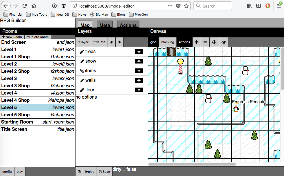
RPG style game development tool
The Flexbox technology, without a doubt, allowed me to work more productively when compared to the times when I used absolute positioning and struggled with the
Panel alignment issues
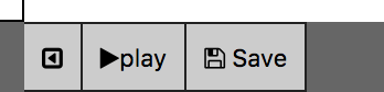
Here is another screenshot. The toolbar, which is located above the drawing area, according to my idea, should always be present at the top of the page, however, you should start scrolling this area as the panel disappears.

Vanishing Toolbar
Each of these problems can be solved with the help of the
The fundamental problem of the Flexbox module is that by applying it, we work in one dimension. This makes Flexbox an excellent choice for one-dimensional designs like toolbars or navigation bars, but things are not nearly as good if the designer has the task of aligning the content horizontally and vertically. Here we need funds for building two-dimensional layouts, and that is why we are so interested in the CSS Grid Layout technology, which was originally intended for the formation of two-dimensional grids.
Here is a layout similar to the ones we’ve already reviewed, but built using CSS-grid.

Layout built using CSS-grid
Pay attention to the bottom of the page. All panels are perfectly aligned with each other. In addition, using the grid-gap property for lines, instead of adding borders to each panel, I don’t have to worry about the different widths of the grid lines. Everything, without extra effort, looks like it should look like.

Larger part of the layout showing perfect alignment of panels
The most significant advantage that I get using the CSS-grid is the ability to adapt the page layout to the changes. My applications often have sidebars. I need everything in the layout to behave as expected, regardless of whether the panel is expanded or collapsed, and, ideally, it is required that all these changes occur without the need to recalculate the parameters of the layout in JavaScript. Side panels consist of many components, there are caps and basements. All this should be aligned, regardless of the size of these elements. Using a CSS grid like this can be achieved by using the excellent CSS function minmax () .
If you’ve already studied CSS-grids, then you know that layouts can be described using patterns for grid rows and columns. For example, a template like
Now the grid column will always have a width that is sufficient to output what is placed in it, and the minimum required width will be used. Thus, if one part of a column (for example, a cap) is wider than the others, the width of the column will increase so that it can hold everything you need.
If the size of the elements becomes smaller, or the elements disappear completely, then the column will change accordingly. In general, here we see the reproduction of compression and stretching of flexbox-blocks, but what we have is working with everything that is in the column, and not just with one element. This is a true two-dimensional layout.
Here is the code for the remainder of the demo page, which we are discussing here.
Here is another code snippet.
In order for the switch buttons to work on the side panels, I prepared the following code. Pay attention that using modern DOM API and arrow functions, we can, in several lines, reproduce what was previously done by means of jQuery.
In addition, note that the appearance of the CSS-grid does not mean recognizing the Flexbox technology as obsolete or abandoning it. We still use Flexbox where it is needed, in particular - for one-dimensional layouts such as toolbars. Here are the styles I use for toolbars based on
The
You can experiment with all this in a specially prepared project on Codepen .

Codepen project
CSS-grid is a great tool for designing interactive web application interfaces that allows you to control how the content of the page is arranged horizontally and vertically. Such layouts are simply and clearly arranged, all elements in them are properly aligned, and the
If you are developing web applications or any interactive websites, I’m sure you should try the CSS grid.
Dear readers! Do you use a CSS grid when designing web pages?

In the material that we are translating today, Josh Marinacci talks about how to use CSS-grid to design page layouts. It will be about the pages that are able to respond to the user's impact and to change their content, but always behave as expected from them, in particular - when scrolling through their contents.
About CSS Grid Layout Technology
The CSS Grid Layout technology, or simply CSS grid, is intended for building layouts of web pages.
This technology allows web designers to create beautiful dynamic layouts using quite a bit of clear code, rather than endlessly experimenting with the CSS
float property that we had to use earlier. My friend and colleague Jan Simmons talked about the CSS grid for many years , tirelessly trying to get their support implemented in browsers, and his efforts were crowned with success. At the end of the last code, support for CSS Grid Layout technology has appeared in current versions of all major desktop and mobile browsers. By the way, Jen launched a new channel on YouTube, Layout Land , which is designed for anyone who wants to master the possibilities of CSS Grid Layout.')
CSS is a truly powerful technology that makes it easy to create dynamic content - oriented websites . However, the grid is well suited not only to place on the pages pretty blocks with text and pictures. Grid gives you full control over two dimensions of the page layout. Including, it does not “break” when scrolling the page. This means access to features that we take for granted in ordinary applications. Among them, for example, folding side panels and the presence of fixed toolbars. All this is now, with the help of the grid, very easy to implement on web pages.
Design without CSS-grid
I have been creating web development tools for many years. Here is a screenshot of the editor I created to develop my retro RPG style games. As soon as the Flexbox technology appeared , I immediately adopted it. I created complex layouts using nested horizontal and vertical blocks, using several auxiliary classes for tasks like scrolling and resizing elements.
RPG style game development tool
The Flexbox technology, without a doubt, allowed me to work more productively when compared to the times when I used absolute positioning and struggled with the
float . But here, not everything was smooth. Take a look at the enlarged fragment of the previous screenshot, at the place where the panels converge. Check out the alignment issues with the bottom panels.Panel alignment issues
Here is another screenshot. The toolbar, which is located above the drawing area, according to my idea, should always be present at the top of the page, however, you should start scrolling this area as the panel disappears.
Vanishing Toolbar
Each of these problems can be solved with the help of the
float property, going deeper into the subtleties of positioning the elements, but the result is very fragile. Whenever I add a new panel, I have to re-check and refine the entire layout again and again, looking for which particular div element chooses too much space when resizing the elements. In addition, with this approach, the markup code does not look very nice. Structures from nested horizontal and vertical blocks become overly complex. For example, below is a snippet of code in which there are only two levels of nesting. But two levels are far from the limit. At the same time, as the interaction schemes with the page and its functionality develop, the process of working on it becomes more complicated. <div class='hbox'> <div class='vbox'> <div class='hbox'>header</div> <div class='scroll'> <div class='sidebar'>sidebar</div> </div> <div class='footer'>footer</div> </div> <div class=vbox> <div class='hbox'>button button spacer label spacer button button </div> <div class='center'>main content</div> <div class='hbox'>the footer</div> </div> <div class=vbox> <div class='hbox'>header</div> <div class='scroll'> <div class='sidebar'>sidebar</div> </div> <div class='footer'>footer</div> </div> </div> Transition to the second dimension
The fundamental problem of the Flexbox module is that by applying it, we work in one dimension. This makes Flexbox an excellent choice for one-dimensional designs like toolbars or navigation bars, but things are not nearly as good if the designer has the task of aligning the content horizontally and vertically. Here we need funds for building two-dimensional layouts, and that is why we are so interested in the CSS Grid Layout technology, which was originally intended for the formation of two-dimensional grids.
Here is a layout similar to the ones we’ve already reviewed, but built using CSS-grid.
Layout built using CSS-grid
Pay attention to the bottom of the page. All panels are perfectly aligned with each other. In addition, using the grid-gap property for lines, instead of adding borders to each panel, I don’t have to worry about the different widths of the grid lines. Everything, without extra effort, looks like it should look like.
Larger part of the layout showing perfect alignment of panels
The most significant advantage that I get using the CSS-grid is the ability to adapt the page layout to the changes. My applications often have sidebars. I need everything in the layout to behave as expected, regardless of whether the panel is expanded or collapsed, and, ideally, it is required that all these changes occur without the need to recalculate the parameters of the layout in JavaScript. Side panels consist of many components, there are caps and basements. All this should be aligned, regardless of the size of these elements. Using a CSS grid like this can be achieved by using the excellent CSS function minmax () .
If you’ve already studied CSS-grids, then you know that layouts can be described using patterns for grid rows and columns. For example, a template like
200px 1fr 200px allows you to create side panels with a width of 200 pixels with an area for the content in the middle, occupying the remaining space. And what happens if the panels should be collapsible? If you do not take any additional effort, the column where the panel was, and will occupy 200 pixels, even if its contents will be minimized. In this situation, you can use the minmax() function, when called, the max - minmax() in our case, this is the second parameter) uses the min-content keyword. #grid { display: grid; box-sizing: border-box; width: 100vw; height: 100vh; grid-template-columns: [start] minmax(auto, min-content) [center]1fr [end] minmax(auto,min-content); grid-template-rows: [header]2em [content]1fr [footer]2em; grid-gap: 1px; background-color: black; } Now the grid column will always have a width that is sufficient to output what is placed in it, and the minimum required width will be used. Thus, if one part of a column (for example, a cap) is wider than the others, the width of the column will increase so that it can hold everything you need.
If the size of the elements becomes smaller, or the elements disappear completely, then the column will change accordingly. In general, here we see the reproduction of compression and stretching of flexbox-blocks, but what we have is working with everything that is in the column, and not just with one element. This is a true two-dimensional layout.
Here is the code for the remainder of the demo page, which we are discussing here.
.start { grid-column: start; } .center { grid-column: center; } .end { grid-column: end; } header { grid-row: header; } footer { grid-row: footer; } .sidebar { overflow: auto; } Here is another code snippet.
<div id="grid"> <header class="start">header</header> <header class="center"> <button id="toggle-left">toggle left</button> ... </header> <header class="end">header</header> <div class="start sidebar">sidebar</div> <div class="center content">the center content</div> <div class="end sidebar"> sidebar ... </div> <footer class="start">left footer</footer> <footer class="center">center footer</footer> <footer class="end">right footer</footer> </div> In order for the switch buttons to work on the side panels, I prepared the following code. Pay attention that using modern DOM API and arrow functions, we can, in several lines, reproduce what was previously done by means of jQuery.
const $ = (selector) => document.querySelector(selector) const $$ = (selector) => document.querySelectorAll(selector) const on = (elem, type, listener) => elem.addEventListener(type,listener) on($('#toggle-left'),'click',()=>{ $$(".start").forEach((elem) => elem.classList.toggle('closed')) }) on($('#toggle-right'),'click',()=>{ $$(".end").forEach((elem) => elem.classList.toggle('closed')) }) In addition, note that the appearance of the CSS-grid does not mean recognizing the Flexbox technology as obsolete or abandoning it. We still use Flexbox where it is needed, in particular - for one-dimensional layouts such as toolbars. Here are the styles I use for toolbars based on
header elements: <header class="center"> <button id="toggle-left">toggle left</button> <button>open</button> <button>save</button> <span class="spacer"></span> <span>filename.txt</span> <span class="spacer"></span> <button>delete</button> <button id="toggle-right">toggle right</button> </header> header { background-color: #ccc; display: flex; flex-direction: row; } .spacer { flex: 1; } The
spacer class makes the elements take up all the extra space. Using two such classes between the buttons, I can make the toolbar change the size if necessary, but make it so that the file name is always in its center. The toolbars of common applications behave in the same way.You can experiment with all this in a specially prepared project on Codepen .
Codepen project
Results
CSS-grid is a great tool for designing interactive web application interfaces that allows you to control how the content of the page is arranged horizontally and vertically. Such layouts are simply and clearly arranged, all elements in them are properly aligned, and the
grid-gap property allows you to automatically create boundaries between them. CSS-grid tools allow you to modify the appearance of layouts without the involvement of JavaScript, they give full control over the placement of the contents of the pages. It is very important to note here that all these are standard features supported by browsers that do not require the use of heavy CSS frameworks.If you are developing web applications or any interactive websites, I’m sure you should try the CSS grid.
Dear readers! Do you use a CSS grid when designing web pages?
Source: https://habr.com/ru/post/350166/
All Articles