30 seconds CSS
We bring to your attention a collection of useful CSS snippets in which you can figure out in 30 seconds, or even faster.
Clearfix
Allows an item to automatically apply clear to its children.
Note: only useful if you still use float when creating layouts. Consider switching to more modern approaches using flexbox or mesh.
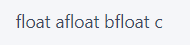
HTML
<div class="clearfix"> <div class="floated">float a</div> <div class="floated">float b</div> <div class="floated">float c</div> </div> CSS
.clearfix::after { content: ""; display: block; clear: both; } .floated { float: left; } Example
Explanation
.clearfix::afterdefines a pseudo-element.content: ''allows the pseudo-element to affect the layout.clear: bothmeans that within one block formatted context, the left or right, or both sides of the element cannot adjoin the elements to which the float was previously applied.
Browser support
99+%
There are no underwater stones.
Constant width to height ratio
If the element has a width change, then the height dynamically changes proportionally, with a given coefficient (that is, the ratio of width to height remains unchanged).
HTML
<div class="constant-width-to-height-ratio"></div> CSS
.constant-width-to-height-ratio { background: #333; width: 50%; padding-top: 50%; } Explanation
padding-top and padding-bottom can be used as an alternative to height , since the percentage of the height of the element becomes the percentage of the width. That is, 50% means that the element height will be 50% of the width. As a result, the aspect ratio does not change.
Browser support
99+%
padding-top shifts all content to the bottom of the element.
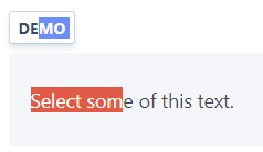
Custom text selection
Changes the text selection style.
HTML
<p class="custom-text-selection">Select some of this text.</p> CSS
.custom-text-selection::selection { background: red; color: white; } Example
Explanation
::selection defines a pseudo-selector in the element to apply a style to the text when it is selected.
Browser support
84.6%
This feature is not yet in the specifications, for its full support you need to use prefixes.
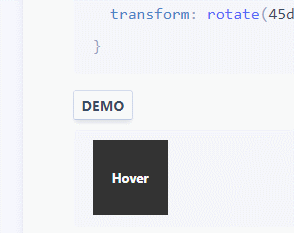
Variable animation smoothness
Variables that can be reused for the transition-timing-function properties provide more options than the built-in ease , ease-in , ease-out and ease-in-out .
HTML
<div class="easing-variables"></div> CSS
:root { --ease-in-quad: cubic-bezier(0.55, 0.085, 0.68, 0.53); --ease-in-cubic: cubic-bezier(0.55, 0.055, 0.675, 0.19); --ease-in-quart: cubic-bezier(0.895, 0.03, 0.685, 0.22); --ease-in-quint: cubic-bezier(0.755, 0.05, 0.855, 0.06); --ease-in-expo: cubic-bezier(0.95, 0.05, 0.795, 0.035); --ease-in-circ: cubic-bezier(0.6, 0.04, 0.98, 0.335); --ease-out-quad: cubic-bezier(0.25, 0.46, 0.45, 0.94); --ease-out-cubic: cubic-bezier(0.215, 0.61, 0.355, 1); --ease-out-quart: cubic-bezier(0.165, 0.84, 0.44, 1); --ease-out-quint: cubic-bezier(0.23, 1, 0.32, 1); --ease-out-expo: cubic-bezier(0.19, 1, 0.22, 1); --ease-out-circ: cubic-bezier(0.075, 0.82, 0.165, 1); --ease-in-out-quad: cubic-bezier(0.455, 0.03, 0.515, 0.955); --ease-in-out-cubic: cubic-bezier(0.645, 0.045, 0.355, 1); --ease-in-out-quart: cubic-bezier(0.77, 0, 0.175, 1); --ease-in-out-quint: cubic-bezier(0.86, 0, 0.07, 1); --ease-in-out-expo: cubic-bezier(1, 0, 0, 1); --ease-in-out-circ: cubic-bezier(0.785, 0.135, 0.15, 0.86); } .easing-variables { width: 50px; height: 50px; background: #333; transition: transform 1s var(--ease-out-quart); } .easing-variables:hover { transform: rotate(45deg); } Example
Explanation
Variables declared globally outside the pseudo-class: root CSS, which match the root element of the document tree. In HTML: root corresponds to the element and is identical to the html selector, except that its specificity is higher.
Browser support
87.2%
There are no underwater stones.
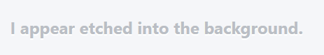
Embossed text
Creates a depressed or engraved text background.
HTML
<p class="etched-text">I appear etched into the background.</p> CSS
.etched-text { text-shadow: 0 2px white; font-size: 1.5rem; font-weight: bold; color: #b8bec5; } Example
Explanation
text-shadow: 0 2px white creates a white shadow with an offset of 0px horizontally and 2px vertically from its original position. The background should be darker than the shade, and the text should be slightly faded so that it looks impressed / engraved against the background.
Browser support
97.9%
There are no underwater stones.
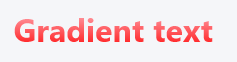
Gradient text
Makes a gradient fill text.
HTML
<p class="gradient-text">Gradient text</p> CSS
.gradient-text { background: -webkit-linear-gradient(pink, red); -webkit-text-fill-color: transparent; -webkit-background-clip: text; } Example
Explanation
background: -webkit-linear-gradient(...)makes a gradient background on a text element.webkit-text-fill-color: transparentfills the text with a transparent color.webkit-background-clip: textreinforces the background with text, fills the text with a gradient background as a color.
Browser support
90.7%
️ Uses non-standard properties.
Thin frame
It makes a border around the element, the thickness equivalent to one native pixel of the device, very sharp, not blurred.
HTML
<div class="hairline-border">text</div> CSS
.hairline-border { box-shadow: 0 0 0 1px; } @media (min-resolution: 2dppx) { .hairline-border { box-shadow: 0 0 0 0.5px; } } @media (min-resolution: 3dppx) { .hairline-border { box-shadow: 0 0 0 0.33333333px; } } @media (min-resolution: 4dppx) { .hairline-border { box-shadow: 0 0 0 0.25px; } } Example

Explanation
Box-shadowwhen using a spread (spread) adds a pseudo frame, which can use subpixels *.- Use
@media (min-resolution: ...)to check the ratio of logical and physical pixels on the device (device pixel ratio) (1ddpxequivalent to 96 DPI), set thebox-shadowspread to1 / dppx.
Browser support
95%
️For full support, an alternate syntax and validation of a JavaScript user agent is needed.
- https://caniuse.com/#feat=css-boxshadow
https://caniuse.com/#feat=css-media-resolution
- Chrome does not support sub-pixel values for
border. Safari does not support them forbox-shadow. Firefox supports subpixel values in both cases.
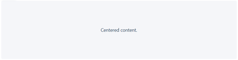
Horizontal and vertical centering
Centers the child element vertically and horizontally within the parent element.
HTML
<div class="horizontal-and-vertical-centering"> <div class="child"></div> </div> CSS
.horizontal-and-vertical-centering { display: flex; justify-content: center; align-items: center; } Example
Explanation
display: flexincludes flexbox.justify-content: centercenters the child horizontally.align-items: centercenters the child vertically.
Browser support
97.8%
️For full support, prefixes are needed.
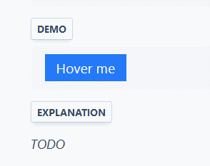
Gradient mouse cursor tracking (JavaScript required)
When you hover the cursor is accompanied by a gradient effect.
HTML
<button class="mouse-cursor-gradient-tracking"> <span>Hover me</span> </button> CSS
.mouse-cursor-gradient-tracking { position: relative; background: #2379f7; padding: 0.5rem 1rem; font-size: 1.2rem; border: none; color: white; cursor: pointer; outline: none; overflow: hidden; } .mouse-cursor-gradient-tracking span { position: relative; } .mouse-cursor-gradient-tracking::before { --size: 0; content: ''; position: absolute; left: var(--x); top: var(--y); width: var(--size); height: var(--size); background: radial-gradient(circle closest-side, pink, transparent); transform: translate(-50%, -50%); transition: width .2s ease, height .2s ease; } .mouse-cursor-gradient-tracking:hover::before { --size: 200px; } JavaScript var btn = document.querySelector('.mouse-cursor-gradient-tracking') btn.onmousemove = function (e) { var x = e.pageX - btn.offsetLeft var y = e.pageY - btn.offsetTop btn.style.setProperty('--x', x + 'px') btn.style.setProperty('--y', y + 'px') } Example
Explanation
::beforedefines a pseudo-element--size,--x,--yare a set of custom CSS propertiesbackground: radial-gradient(circle closest-side, pink, transparent);defines gradient--size: 200px;show gradient on hoverbtn.style.setProperty('--x', x + 'px')andbtn.style.setProperty('--y', y + 'px')determine the position of the block with the gradient relative to the container
Note. If the parent element is positioned relative to the content ( position: relative ), then it will also have to subtract and its offset.
var x = e.pageX - btn.offsetLeft - btn.offsetParent.offsetLeft var y = e.pageY - btn.offsetTop - btn.offsetParent.offsetTop Browser support
87.2%
JavaScript JavaScript required.
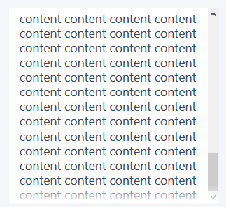
Overscan gradient
Adds a gradient to the redundant element to better display the content that can be scrolled.
HTML
<div class="overflow-scroll-gradient"> <div class="overflow-scroll-gradient__scroller"> Content to be scrolled </div> </div> CSS .overflow-scroll-gradient { position: relative; } .overflow-scroll-gradient::after { content: ''; position: absolute; bottom: 0; width: 300px; height: 25px; background: linear-gradient(rgba(255, 255, 255, 0.001), white); /* transparent keyword is broken in Safari */ } .overflow-scroll-gradient__scroller { overflow-y: scroll; background: white; width: 300px; height: 250px; padding: 15px 0; line-height: 1.2; text-align: center; } Example
Explanation
position: relativeto the parent element specifies the Cartesian positioning of the pseudo-elements.::afterdefines a pseudo-element.background-image: linear-gradient(...)adds a linear gradient from transparent to white (top to bottom).position: absolutetakes a pseudo-element from the document stream and positions it relative to the parent element.width: 300pxspecifies the size of the scrollable element (child relative to the parent containing the pseudo-element).height: 25pxis the height of the gradient pseudo-element, it should be relatively small.bottom: 0positions the pseudo-element at the bottom of the parent element.
Browser support
94.8%
There are no underwater stones.
Popout menu
When you hover the cursor, the interactive menu pops up.
HTML
<div class="reference"> <div class="popout-menu"> Popout menu </div> </div> CSS
.reference { position: relative; } .popout-menu { position: absolute; visibility: hidden; left: 100%; } .reference:hover > .popout-menu { visibility: visible; } Example
Explanation
position: relativefor the reference parent element sets the Cartesian positioning of the child element.position: absolutetakes a pop-up menu from the document flow and positions it relative to the parent element.left: 100%entire menu to the left of the parent element.visibility: hiddeninitially hides the menu and allows transitions (unlike display: none)..reference:hover > .popout-menumeans that when the mouse cursor passes over .reference, the child elements with the class .popout-menu are selected immediately, and their visibility changes to visible, as a result we see the menu.
Browser support
99+%
There are no underwater stones.
Beautiful text underline
A prettier alternative to text-decoration: underline , when the line does not intersect the lower bearing elements of the letters. Natively implemented as text-decoration-skip-ink: auto , but at the same time we have less opportunity to control the underlining.
HTML
<p class="pretty-text-underline">Pretty text underline without clipping descending letters.</p> CSS
.pretty-text-underline { display: inline; font-size: 1.25rem; text-shadow: 1px 1px 0 #f5f6f9, -1px 1px 0 #f5f6f9, -1px -1px 0 #f5f6f9, 1px -1px 0 #f5f6f9; background-image: linear-gradient(90deg, currentColor 100%, transparent 100%); background-position: 0 1.04em; background-repeat: repeat-x; background-size: 1px 1px; } .pretty-text-underline::selection { background-color: rgba(0, 150, 255, 0.3); text-shadow: none; } Example

Explanation
text-shadow: ...has four values with shifts, covering the area of 4 × 4 pixels, so that the underscore has a “thick” shadow covering the line at the intersection of the letter letter. Use the background color. For larger fonts, set a larger areabackground-image: linear-gradient(...)creates a 90-degree gradient of the current text color (currentColor).- The
background-*properties specify a 1 × 1 px gradient at the bottom and repeat it along the X axis. - The pseudo-selector
::selectionis responsible for ensuring that the text's shadow does not overlap the text selection.
Browser support
94.8%
Firefox requires prefixes to work in ::selection
Separator
Uses the SVG form to separate two different blocks to get a visually more interesting display on the screen compared to the standard horizontal split.
HTML
<div class="shape-separator"></div> CSS
.shape-separator { position: relative; height: 48px; } .shape-separator::after { content: ''; background-image: url(data:image/svg+xml;base64,PHN2ZyB2aWV3Qm94PSIwIDAgMjQgMjQiIHhtbG5zPSJodHRwOi8vd3d3LnczLm9yZy8yMDAwL3N2ZyIgZmlsbC1ydWxlPSJldmVub2RkIiBjbGlwLXJ1bGU9ImV2ZW5vZGQiIHN0cm9rZS1saW5lam9pbj0icm91bmQiIHN0cm9rZS1taXRlcmxpbWl0PSIxLjQxNCI+PHBhdGggZD0iTTEyIDEybDEyIDEySDBsMTItMTJ6IiBmaWxsPSIjZmZmIi8+PC9zdmc+); position: absolute; width: 100%; height: 24px; bottom: 0; } image / svg + xml; base64, PHN2ZyB2aWV3Qm94PSIwIDAgMjQgMjQiIHhtbG5zPSJodHRwOi8vd3d3LnczLm9yZy8yMDAwL3N2ZyIgZmlsbC1ydWxlPSJldmVub2RkIiBjbGlwLXJ1bGU9ImV2ZW5vZGQiIHN0cm9rZS1saW5lam9pbj0icm91bmQiIHN0cm9rZS1taXRlcmxpbWl0PSIxLjQxNCI + PHBhdGggZD0iTTEyIDEybDEyIDEySDBsMTItMTJ6IiBmaWxsPSIjZmZmIi8 + PC9zdmc +); .shape-separator { position: relative; height: 48px; } .shape-separator::after { content: ''; background-image: url(data:image/svg+xml;base64,PHN2ZyB2aWV3Qm94PSIwIDAgMjQgMjQiIHhtbG5zPSJodHRwOi8vd3d3LnczLm9yZy8yMDAwL3N2ZyIgZmlsbC1ydWxlPSJldmVub2RkIiBjbGlwLXJ1bGU9ImV2ZW5vZGQiIHN0cm9rZS1saW5lam9pbj0icm91bmQiIHN0cm9rZS1taXRlcmxpbWl0PSIxLjQxNCI+PHBhdGggZD0iTTEyIDEybDEyIDEySDBsMTItMTJ6IiBmaWxsPSIjZmZmIi8+PC9zdmc+); position: absolute; width: 100%; height: 24px; bottom: 0; } Example

Explanation
position: relativegives the element a Cartesian positioning of the pseudo-elements.::afterspecifies the pseudo-element.background-image: url(...)adds a SVG form (triangle 24 × 24 in base64 format) as a background image of a pseudo-element, which is repeated many times by default. It must be the same color as the detachable block.position: absolutetakes a pseudo-element from the document stream and positions it relative to the parent element.width: 100%stretches an element across the entire width of its parent element.height: 24pxsets the same height as the SVG form.bottom: 0positions the pseudo-element at the bottom of the parent element.
Browser support
98%
There are no underwater stones.
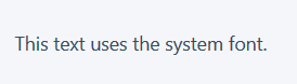
System font stack
Uses native operating system fonts to make the application look as natural as possible.
HTML
<p class="system-font-stack">This text uses the system font.</p> CSS
.system-font-stack { font-family: -apple-system, BlinkMacSystemFont, "Segoe UI", Roboto, Oxygen-Sans, Ubuntu, Cantarell, "Helvetica Neue", Helvetica, Arial, sans-serif; } Example
Explanation
The browser searches for each of the fonts listed below. If the first font is unavailable - it searches for the second, if it is also unavailable - it searches for the third, etc.
-apple-systemis the San Francisco font used in iOS and macOS (but not in Chrome).BlinkMacSystemFontis the San Francisco font used in macOS Chrome.Segoe UIused in Windows 10.Roboto- in Android.Oxygen-Sans- in GNU + Linux.Ubuntuis in Linux."Helvetica Neue"andHelvetica- in macOS 10.10 and below (taken in quotes, because there is a space in the name).Arialwidely supported by all OS.sans-serif- spare sans serif font, used if all of the above are not available.
Browser support
99+%
There are no underwater stones.
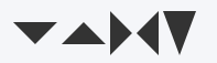
Triangle
With pure CSS, it creates a triangular shape.
HTML
<div class="triangle"></div> CSS
.triangle { width: 0; height: 0; border-top: 20px solid #333; border-left: 20px solid transparent; border-right: 20px solid transparent; } Example
Explanation
The border color is the color of the triangle itself. The side toward which the vertex of the triangle faces is opposite to the border-* property. For example, border-top means that the arrow points down.
Experiment with px values to change the proportions of the triangle.
Browser support
99+%
There are no underwater stones.
Text clipping
If the text is longer than one line, it will be cut off, and an ellipsis will be substituted at the end.
HTML
<p class="truncate-text">If I exceed one line's width, I will be truncated.</p> CSS
.truncate-text { overflow: hidden; white-space: nowrap; text-overflow: ellipsis; } Example
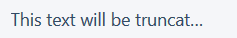
Explanation
overflow: hiddendoes not allow the text to go beyond the limits of the dimensions (for a block it is 100% of the width and automatic height).white-space: nowrapdoes not allow text to take one line in height.text-overflow: ellipsismakes it so that when the text reaches the specified size, an ellipsis is inserted at the end.
Browser support
98.1%
Only works with single line items.
')
Source: https://habr.com/ru/post/350160/
All Articles