Custom animations in the mobile application
Every year, the modern mobile audience places increasingly high demands on the quality of applications and services. And first of all it concerns the design of interactions and mobile animations.
Every day we exchange messages, use social networks, instant messengers, and many of these services contain dozens of non-standard thought-out animations.
Custom (non-standard) animations are a big field for experiments and application development. What knowledge will be needed by the designer and what problems can be expected in the development process? Let's look at these questions on the example of the iFunny application.
The basics
Documentation
Let's start with the theory. The following three documents will help us to better understand what are animations in mobile interfaces:
')
- Material Design by Google. It mainly describes animations from a mathematical and engineering point of view. This is a basic document for any designers who work with interfaces. There are many recommendations on default “safe” values of speed and acceleration, basic principles of choreography of movement of objects, examples and much more.
- Human Interfaces Guidelines from Apple. In this document, animations are described from an emotional point of view. That is, what feelings and impressions the user should leave animation in the interfaces.
- 12 principles of Disney animation. The multipliers Frank Thomas and Ollie Johnston published a book in 1981 entitled The Illusion of Life: Disney Animation, in which they talked about the 12 basic principles of realistic animation. Despite the fact that these rules were created for animations, many of them went directly into modern interfaces.
Purpose
Each animation must clearly perform its function. Therefore, it is important to understand which group it belongs to and what are the limitations in terms of design.
Conventionally, all the animations can be divided into 3 large groups:
- Auxiliary . The most voluminous group. These animations simplify navigation, reflect the position of an object in the system, demonstrate the hierarchy of application objects, focus attention and make the interface as a whole intuitive for the user.
One example of such an animation is a smooth exit of a picture from a general gallery, which demonstrates a hierarchy of objects and simulates action in the real world, when we take a picture and bring it closer to examine it. - Transmitting system status and user feedback indicators . The main task of this group of animations is to show the user in real time where he is, what is happening with the application, and display the system's response to the user’s action.
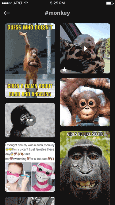
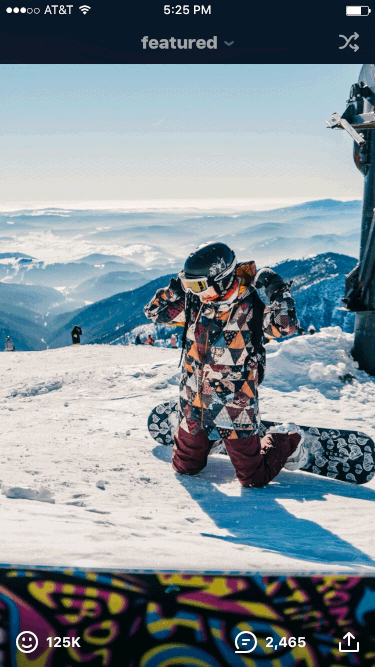
An example is a spinner that appears when a profile page is updated. - Entertaining . This can include any animation, the main purpose of which is to entertain the user. In iFunny, there are such animations when evaluating a meme or a repost in a Featured and Collective tape.
Despite the fact that this group imposes minimal restrictions on the designer, it should be implemented very metered and only where it is relevant, since each such animation takes time from the user and can become an obstacle in achieving the final goal.
Duration
By default, Android offers three basic animation durations:
- 200 ms - short;
- 400 ms - average;
- 500 ms is a long one.
Of course, this does not mean that you can not use other values. It is possible and necessary to experiment, but at the initial stage these values will be able to protect against errors in the choice of the optimal variant.
If we talk about the recommended range of durations of animations in mobile interfaces, it is approximately from 100 to 700 ms. These figures are based on the peculiarities of a person’s visual perception of information, namely, saccade and fixation .
Acceleration
No matter how optimal the values of speed and duration are, the linear movement of objects always looks unnatural, false and will annoy your users.
Consider the main types of acceleration curves used in mobile development.

Linear : movement with uniform speed. Such an animation always looks bad and artificial, since in the physical world all objects move at an uneven speed.
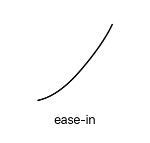
Ease-in : slow start and fast completion. This curve is used quite rarely in interfaces, because due to the long acceleration, the animation still looks inhibited.
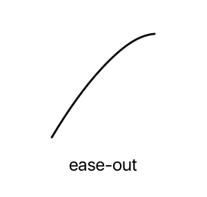
Ease-out : quick start and braking. Used quite often. The rapid appearance of the object at the beginning of the movement does not make the user wait, and smooth braking imitates the behavior of moving objects in the physical world. Looks natural and nice.
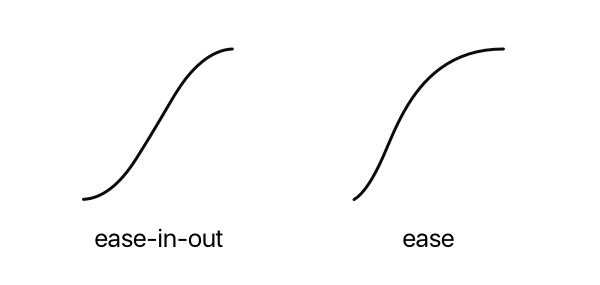
Ease, ease-in-out : slow start, acceleration and deceleration. These acceleration curves are used most often. They look neat, natural and comply with the principles of Disney animation: a smooth start and a smooth finish.
But when using the ease and ease-in-out curves in a program such as After Effects, you should carefully change the shape of the curve so that the animation does not become very sharp.
IFunny experience
From the theory we turn to practice on the example of iFunny. Let us examine the difficulties and problems that had to face, and see the final versions of some animations.
Main menu
Since iFunny decided to abandon the usual “hamburger”, custom animation was also needed for the non-standard menu.
One of the initial prototypes looked like this:
Everything about him was not bad: a smooth appearance, and an elaborate general choreography of the movement. The ease-in-out acceleration curve was used.
The animation was as smooth as possible and the total timing was 700 ms.
But any decision in animation, as in design as a whole, must be balanced and reasonable. Some time later, it became noticeable that you had to wait longer and longer until all the elements took up their final position with a new menu call. Attempting to speed up the entire animation made it harsh and even less enjoyable.

In this case, time remembered the appointment of animation. Since the call to the navigation menu is an action performed by users hundreds of times a day, its main task is to provide fast and comfortable navigation between sections.
The obvious and right decision came to the rescue - to simplify. The final animation of the navigation menu looked like this:
The overall coordinated movement was replaced by the sequential appearance of elements from transparency.
Since the feeling of falling out of the menu was preserved, then the background was as simplified as possible. Now he, like all menu items, appeared through alpha.
The final version retained the original idea and allowed to reduce the timing to 250 ms (against 700 ms in the original version). The animation remained attractive and began to perform its task.
Memes gallery
Another major animation application iFunny - scrolling gallery of memes.
I wanted to support the general concept of multi-layer application.
The first version looked like this:

But it turned out that when the gallery scrolled, memes ran over each other and distracted attention from the newly arrived element. The user experience issue also surfaced. The classic gallery view is horizontal or vertical. In our version there was a feeling that the memes are stacked in a big pile, and the return to the previous memes was no longer as natural as the swipe to the right, in which the meme moves after the finger movement.
The disadvantages were eliminated by returning to the classic gallery with a slight decrease in the scale of the leaving meme.

Here you should also pay attention to an interesting point in terms of development. The animation didn’t become easier - the shift and decrease of the leaving meme remained. But visually the gallery became lighter, tidier and retained the look familiar to users.
Other animations
Most of the time designing the designer spends on the development of much less noticeable and massive animations. Such work is also very important: it is from the details that the general feeling of working with the interface is formed.
For example, the consistent appearance of memes during the transition to a vertical gallery , which holds the user from top to bottom, specifying the vector of the subsequent movement.
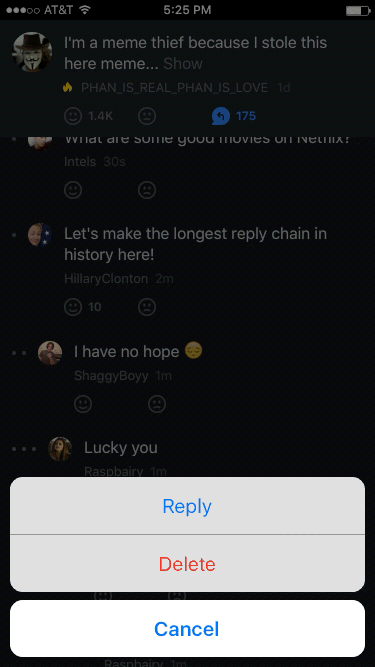
Delete reply to comment . Thanks to this solution, after deleting a comment, the user's view returns to the same place where he was before the context menu was called.
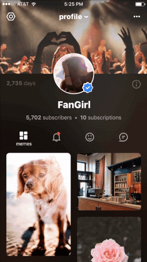
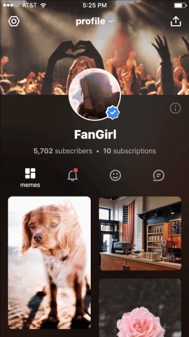
On the user profile screen, his nickname was located under the avatar, and when scrolling he moved to the toolbar. Thus, the user could at any time see whose profile it is.
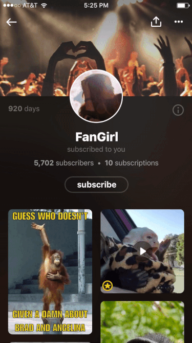
This decision, by the way, was overseen by Twitter. In fact, there is nothing wrong with borrowing some good ideas.
Tabs . To preserve the airiness and accuracy of appearance, the captions of inactive tabs are hidden. The name appears only in the active state.
Designer's work does not end with the transmission of animation metrics and the description of the general principles of element behavior. Sometimes a task requires the compilation of small algorithms that provide for the correct display of elements in non-standard situations. For example, disclosing a response to a comment.
Initially, the spinner was shown immediately from the time of the tap on the icon for disclosing answers until the moment they appeared. But with the fast internet, it looked messy.
For this case, simple rules were invented that made it possible to handle situations with slow and fast Internet separately.
In the beginning it was already mentioned that the lower limit of the duration of animation for comfortable perception by the human eye is 100–200 ms. That is why we have introduced a delay in the appearance of a spinner. That is, if the answers had time to boot faster than 200 ms, then the spinner was not displayed.
If the answers did not have time to load in 200 ms, the spinner was displayed from the 201st millisecond. Additionally, in order to eliminate short-term blinking, the minimum spinner display time was set.
It is obvious that animation in mobile interfaces is an important and necessary part of the interaction design. Carefully thought over mobile animation facilitates content consumption, positively affects brand loyalty and even increases the amount of time the user spends in the application. And development in this area is an integral part of any strong and progressive team.
Are you experimenting with mobile animations? Share your experience and solutions with us in the comments!
Source: https://habr.com/ru/post/350106/
All Articles