Dot wow effects: magic with simple words
We continue to look at techniques for creating various animations in interfaces. We have already become acquainted with particles , masks and changing the forms of various objects - it was the turn to draw dotted lines.
Before proceeding to the article, I will make a small digression. This series of articles is intended for developers (first of all beginners) who want to do beautiful things, but are completely confused in complex tools. Every time we touch on one method of using this or that instrument and see how it can be applied to creating some kind of effects. Comments that “at the time of the flash was better” or that “you need to draw animations in AfterEffects” certainly have a right to exist, but they will be taken out of context and will not help the beginners in solving their problem.
Let's return to the topic. SVG elements have a set of properties containing the word stroke - stroke. These properties allow us to make any line dashed. First of all, we will be interested in the following properties:
')
- stroke
- stroke-width
- stroke-linecap
- stroke-dasharray
- stroke-dashoffset
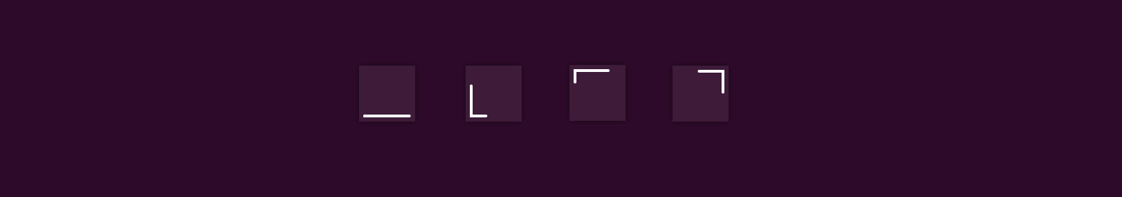
The stroke property allows you to set the color of the lines, stroke-width - their thickness, stroke-linecap allows you to set the style for rounding the ends of the line. Usually we use either the default value (there are no rounds) or the round value (round shape). In the examples you will see both options.
These three properties are not particularly difficult to understand, but the remaining ones are better disassembled separately.
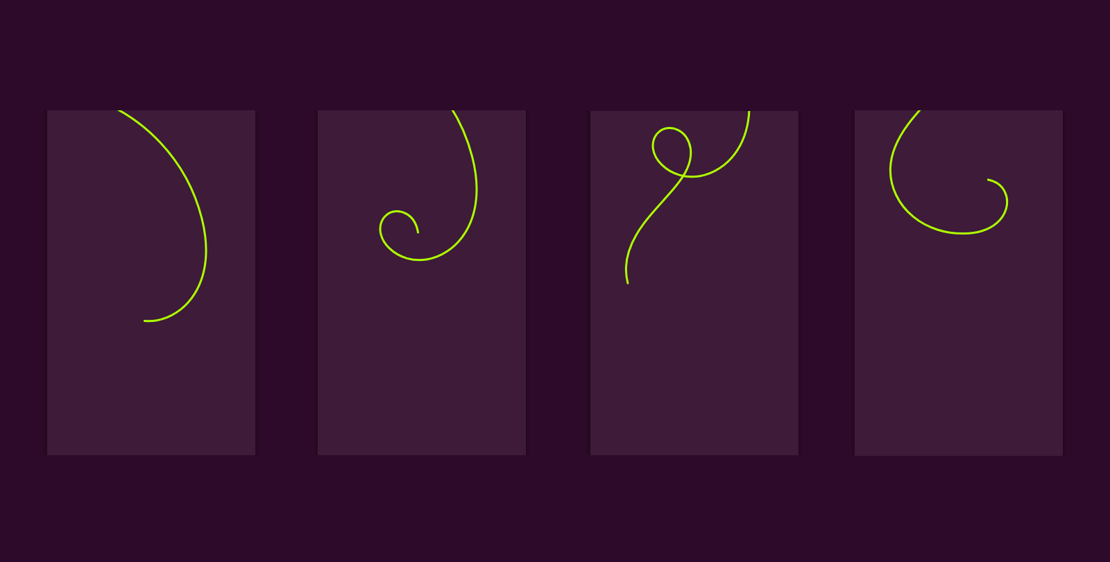
Stroke-dasharray
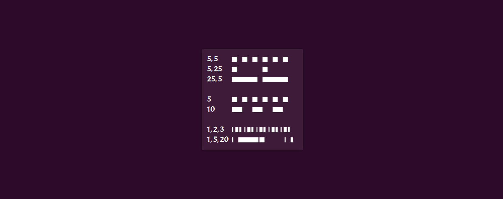
This property usually causes the greatest difficulty for beginners. At first glance, especially on a curved line, it’s not at all clear what the effects of which values (and there may be many). But in fact, everything is very simple.
Imagine a dash line. We start to look at it from the beginning. It has touches and spaces. They alternate. Barcode, space, stroke, space, etc. Now imagine a sequence of lengths. Say 8mm, 2mm, 8mm, 2mm, etc. As in the guestbook written. It turns out that we have a cycle of 2 values. 8mm always gets on the stroke, 2mm - on the space.
If we did not know about the standard and would use our own sequence of 5mm, 5mm, 5mm, 5mm, then there would be a cycle from one value. 5mm would hit both the stroke and the space.
And you can take a long cycle, say 1mm, 5mm, 20mm (similar values are in the illustration). Then the matches will be a longer sequence: 1mm is a stroke, 5 is a space, 20 is a stroke, 1 is a space, 5 is a stroke, 20 is a space, and again 1 is a stroke. All cycle is closed.
For those who want to quickly play with this property, leave a link to the sandbox .
Stroke-dashoffset

The property stroke-dashoffset is needed in order to move the dotted line relative to the line along which it goes. In the example it goes along straight segments, so the result that this property gives is quite obvious. The main thing to remember about the sign of displacement - intuitively it may seem that the plus and minus are confused.
Another sandbox for those who want to try.
These two properties were created in order to just make the lines dashed, but we will not apply them in exactly the same way. We can say that it is not quite as intended. Perhaps it is this fact that prevents some developers from remembering some tools at the moment of solving the problem - it seems to them that this particular tool is not intended for such work. But, as we know, in some cases a microscope is the best tool for hammering nails.
Single stroke preloader
You've probably already seen similar animations. This fragment revolves in a circle, square or some other curve. Now we are interested in the insides of this example. In a nutshell, we need a closed curved line. We will use the square to simplify our calculations, but the general methods will work with any curves.
<svg viewBox='0 0 100 100'> <rect x='10' y='10' height='80' width='80' fill='none' stroke='#fff' stroke-width='5' stroke-linecap='round' /> </svg> The length of one side of the square is 80. The perimeter is 320. This is the length of the line on which everything will happen. If this were a complicated hand-drawn path, we would have known in advance how long it would have been there. The fragment, which we will twist in a circle, will also have a length of 80. It is in no way tied to the length of the side of the square, just a coincidence. It remains 320 - 80 = 240. Returning to the context of dotted lines, we can say that 80 is a stroke, 240 is a space:
<svg viewBox='0 0 100 100'> <rect x='10' y='10' height='80' width='80' fill='none' stroke='#fff' stroke-width='5' stroke-linecap='round' stroke-dasharray='80 240' stroke-dashoffset='0' /> </svg> Little life hacking:
It can often be convenient to take large spaces (so that the sum of numbers in the stroke-dasharray is greater than the length of the curve), so as not to stuff the head with counts when animating one fragment on an open curve.Since the line is closed, we can shift it all with the help of the stroke-dashoffset and it will seem that the fragment is spinning in a circle.
anime({ targets: '. . .', strokeDashoffset: -320, // easing: 'linear', duration: 1000, loop: true }); We continue ...
Preloader sooner or later must come to a state when the process was completed, the end of which we were waiting for. It would be nice not just to remove the preloader, but to show the user that everything is fine, everything is completed. One option is to transform it into a tick.

For such transitions usually take two curves - one for the preloader, the other for the final animation. We will add the path:
<svg viewBox='0 0 100 100'> <rect . . . stroke-dasharray='80 240' stroke-dashoffset='0' /> <path . . . d='m50 90 L 10 90 L 10 50 L 50 90 L 90 10' stroke-dasharray='142 200' stroke-dashoffset='62' /> </svg> Please note that this is not a pure check mark, this is part of the square + check mark. It is good to hide the transition from one curve to another by overlapping them. The fragment moves in a square, reaches a certain point, we hide the square and show the second curve with the exact same fragment in the same place where it was before the transition. Further, the new fragment is moving along the new curve, but it seems to us that the trajectory of the initial fragment has changed.
let finish = anime({ targets: 'ok', strokeDashoffset: -84, autoplay: false }); let animation = anime({ targets: 'loader', strokeDashoffset: -320, loop: true, run: (anim) => { if (loadingCompleted && anim.progress > 60 && anim.progress < 61) { anim.pause(); document.getElementById('loader').style.display = 'none'; document.getElementById('ok').style.display = 'block'; finish.play(); } } }); Animation of stroke-dasharray does not work very well in certain browsers (I won’t point a finger at IE), so I have to manage to animate the stroke-dashoffset. The initial value of the stroke-dashoffset for the new curve is calculated based on the length of the new fragment. Its length (142) minus the length of the initial (80) = offset (62).
Tru underscore
We often use underscores for various elements. This is a good way to indicate interaction with something other than color. Many do not even think that with underscores you can do something interesting.
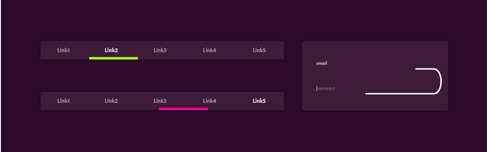
The first example is the usual horizontal menu. It is on every second site. We slightly diversify the effect of underlining the active element of this menu.
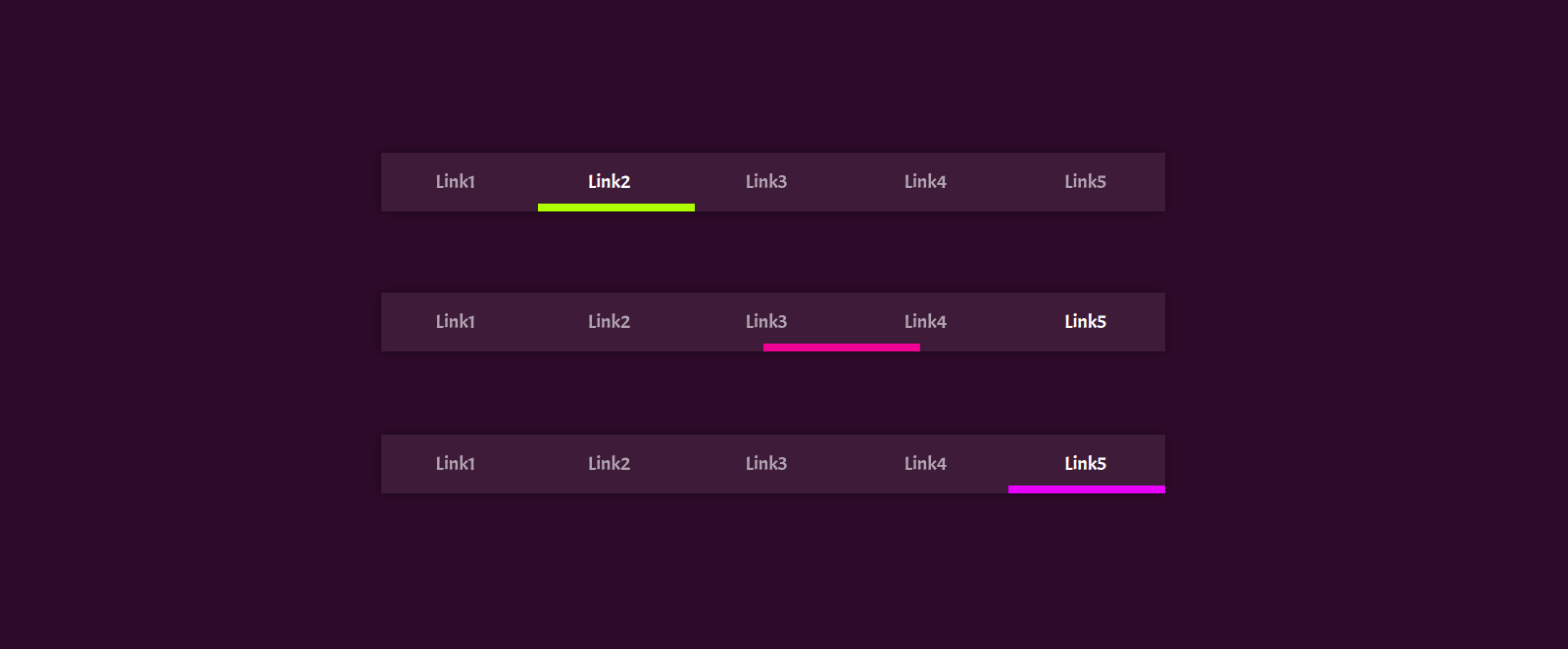
Immediately pay attention to the markup:
<div class='main-navigation'> <a class='item'>Link1</a> <a class='item'>Link2</a> <a class='item'>Link3</a> <a class='item'>Link4</a> <a class='item'>Link5</a> <svg class='underline' viewBox='0 0 100 1'> <line x1='0' x2='100' y1='0' y2='0' stroke-dasharray='20 80'></line> </svg> </div> Adding SVG doesn't break it much. So this technique as a whole can also be applied when finalizing an existing layout. The values of 20, 80 turned out, as you might guess, out of 100. This is the length of the line. We have five elements, and we need to emphasize only one. 100/5 = 20, and 80 remains on the big-big space. Next thing is the technique (index - the number of the menu item to which you want to move the underscore):
anime({ targets: '. . .', strokeDashoffset: [-(100 / 5) * index], stroke: `hsl(${ (index * 360 / 5) % 360 }, 100%, 50%)` }); It remains only to do this when you hover the mouse or focus from the keyboard on the elements. I think you should not tell how it is done. In the example, the animation is automated for easy viewing.
Mega underline
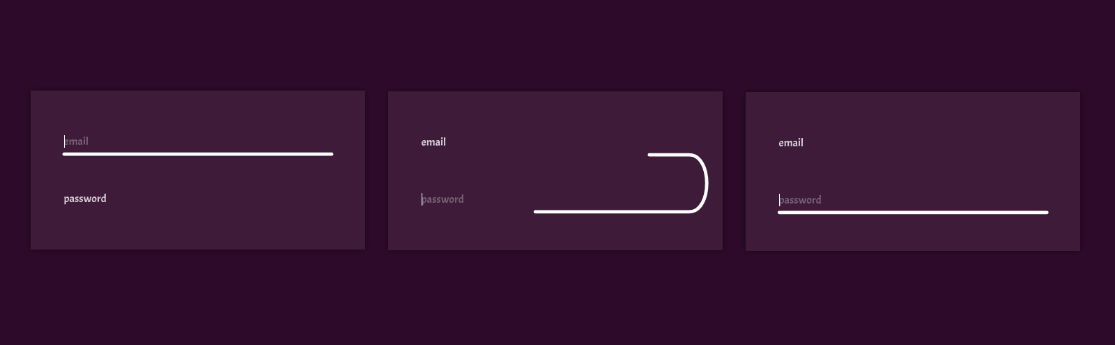
If the previous example is already pretty much fed up with many, this one is not yet. The general idea is the same as in the previous example, just the elements are one below the other, and the line is a little curve.
<form> <input type='text' placeholder='email' /> <input type='password' placeholder='password' /> <svg viewBox='0 0 100 100'> <path . . . d='. . .' stroke-dasharray='. . .' stroke-dashoffset='. . .'></path> </svg> </form> As you can see, the markup is not very complicated. After a little styling of all this, we can draw the path, knowing what size relationships we have in our form. In the same way we find the length of the fragment that will move. And then hang on focus / blur handler with our movement:
email.addEventListener('focus', () => { anime({ targets: '. . .', strokeDashoffset: 0 }) }); Scrollll ...
We all scroll. Every day many times. Sometimes we find scrolling through pages, slow or horizontal ... Once I saw all this in one bottle. Horror. But there are less destructive effects for the psyche that look good on the landing pages, which we scroll from beginning to end, most likely only once. I'm talking about the lines that follow us. They can be tied to performing some actions, presentation of services or scrolls, as in our example.
First we need to draw the line itself. We have no content, so its form is not so important - it is not tied to anything.

Then we will turn it upright and place it on the page. The most important thing here is to monitor the location of the content and the length of the SVG element itself so that nothing goes in different directions. Such things are always unique, so it is difficult to give some universal recommendations on this matter.
Technically, there will be nothing new. We simply bind the stroke-dashoffset value to the scroll:
window.addEventListener('scroll', () => { let d = document.body.offsetHeight / path.getTotalLength(); let offset = -Math.floor(window.pageYOffset / d) + 50; anime({ targets: '. . .', strokeDashoffset: [offset], duration: 0 }); }); The result is quite interesting.
You can just draw too
Of course, it is worth mentioning that you can just draw lines. We make a full-length stroke and an equally long space, and then shift this long, long dotted line by the length of the curve. It turns out the effect of the usual line drawing.
In this example, the letters also change color, but these are only details. The most important thing here is drawing curves.
You can still get the amusing effect of crawling worms or just a jumble of lines moving in a random direction.
We draw a curved curve line, make a dotted line and move it. Nothing complicated, all the same as in the previous examples. CSS animations are used in the sandbox to implement the movement, but keep in mind that IE has problems integrating such animations and SVGs, so use JS and everything will be fine.
Conclusion
Drawing dashes is not a very difficult activity, but nevertheless it is worth mastering it and, if necessary, using it without inventing your brain with crutches and difficult decisions, where you can do without them.
Source: https://habr.com/ru/post/349988/
All Articles