Product Design Digest February 2018
For seven years now I have been publishing regular reviews of recent articles on the topic of interfaces, new tools and collections of patterns, interesting cases and historical stories. From the tapes of several hundred thematic subscriptions, approximately 5% of the worthwhile publications are selected that are interesting to share. Previous materials: April 2010-January 2018 .

Shankar Balasubramanian analyzes a relatively new pattern of “handlebars” (roughly speaking, “handles”), which are promoted by hidden gestures interfaces (for example, there are many of them in the iPhone X). He adds the necessary affordans, from the absence of which the experimental touch interfaces have suffered for a long time.

')
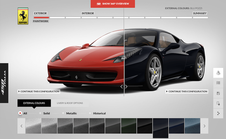
Vitaly Friedman examines examples and offers a clever checklist for the design of hardware configurators and other products in online stores. As usual, zvizdillion examples.
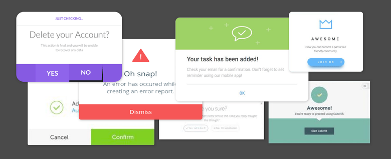
Explanatory checklist for designing popups from Naema Baskanderi. A similar checklist for designing confirmation dialogs from Jakob Nielsen.
Intercom's Ruairí Galavan describes the company's approach to meeting a new user. Like Samuel Hulick, they look at the problem more broadly than just a few training messages - it is important to lead the client through the entire life cycle (they are focused on a paid subscription).
Tips for creating generic interface texts from Matt Jones from GE.
Aimee Gonzalez-Cameron shows what the designer should do in a seemingly impasse - users have to partially work in the interface of the partner product, which cannot be changed, and he himself is not so hot. She focused on user expectations before they go to a third-party interface, and it helped greatly increase loyalty.
Jeff Sauro has conducted comparative testing of several US flower delivery sites. There are also NPS values (very low, by the way).
* average NPS -2%
Detailed memo on the design of mobile applications from Nikolai Babich.
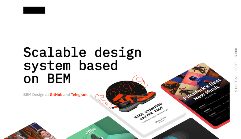
Yandex has launched a set of prototyping tools and themes for BEM. It turned out a good template for a quick start of your design system - you can redefine styles for your tasks (this was how Studio Manufactory and the first version of Alfa-Bank’s platform did). An article by Mikhail Koloskov about the approach as a whole and a presentation to the launch . BEM is generally one of the most respected domestic developments in the international community - a huge number of people at the last conference on design systems Clarity warmly recalled it. It will be great if this results in “our Bootstrap”.
Such initiatives help to change the minds of designers, many of whom still understand the design system as a template in Sketch or another design tool, rather than a technological solution on the components in the code into which the design is sewn. Brad Frost is also tired of this . This is the thinking of the middle of the last century, when this word was understood as the system of visual identification of the brand, to which a beautiful printed book went (they were actively republished in recent years). But then it was about the physical products and objects that are on the shelf in the store (or the chain store itself), and we are working with digital products, where the layout does not guarantee anything and changes many times before launching to users. So you have to work with the main material of this environment - the code.
In the last issue , a bridge between the two worlds (components in the code and design tools) was mentioned, which will be one of the main themes of the year. So, Mark Dalgleish describes in detail how SEEK linked components to React and templates in Sketch (they are assembled from a live guideline). Watch out for such things carefully and try it yourself - it’s easier to implement it than it seems.
Well, just a few fresh stories about the creation of design systems:
At the end of 2016, the publishing house of Two Waves Books released the book Dave Gray “Liminal Thinking” . UXmatters publishes an excerpt from it about the formation of beliefs - well-submitted features for designers of the psychology of users.
Interesting thoughts on how much attachment to new technologies is a problem or a disease, or is it just a feature of any trend and in the past everything went in a similar way.
Another tool for creating site maps in the browser.

Andrea Drugay from Dropbox shows your template for working with interface texts. In general, nothing special, the usual specification on the tables.
The story of the redesign of clinics in Kirov, taking into account the principles of designing services and lean production. Interesting facts about how to analyze the behavior of patients and the work of doctors.

This year's first new tool for the design and prototyping of Phase interfaces. A standard set of features for animation, creating characters for anything, adaptability, exporting to code for the web and native platforms.

The last three or four years of movement in this market has become so noticeable that even Bloomberg wrote about it, which usually hovers in the clouds of mega-corporations. A good indicator of the maturity of the market, where designers six years ago humbly thought that they would always have to be content with Photoshop - a tatter from the upper arm, not sharpened by interfaces. This can be seen for money:
Invision
$ 235M
Figma
$ 42.9M
Framer
$ 9M
Marvel
$ 8M
Zeplin
$ 1.2M
There are purchases, but so far partially successful - InVision strengthens its ecosystem, and Google lets out Pixate and Form.
The world loves designers, no matter what they say. If you go back to practice, here's what happened during the past month and a half:
Jeff Sauro advises to always remember the goals of user research, so as not to get lost in the details during its implementation. It offers a format for recording research objectives and basic hypotheses that can be tracked along the way.
Maria Goncharova from Alfa-Bank talks about the better understanding of users of product teams through the display of mini-films based on the research.
Harris Schneiderman shows how to make a list with drag and drop lines on the web, taking into account accessibility requirements for people with disabilities.
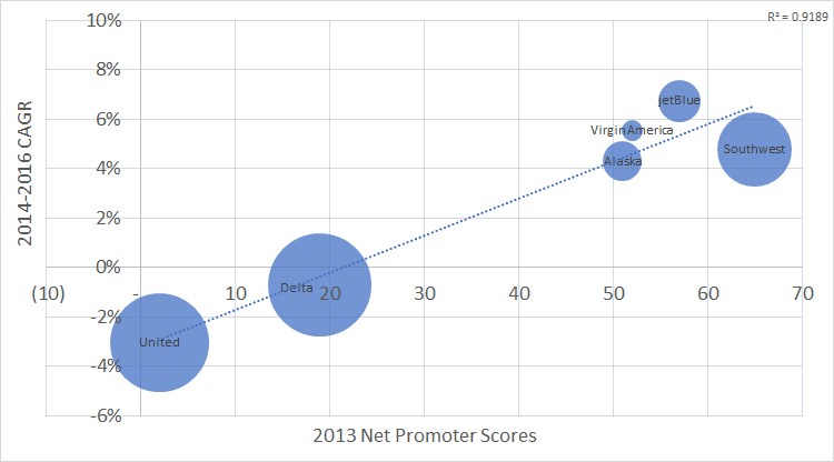
Jeff Sauro made a valuable review of research on the impact of NPS on financial metrics - company earnings and repeat purchases. There is no clear answer, but it turned out an excellent critical eye. Later, he conducted his own research on whether user satisfaction, expressed in different metrics (SAT and NPS), affects the company's future profits using the example of airlines . In general, there is a connection.
An excellent brief reminder of the Page Laubheimer of the Nielsen / Norman Group about respondent survey options during user testing - how SUS, SEQ and NASA-TLX work.
Nomensa's Tim Dixon talks about the Digital Impact Framework (DIF) approach, which allows you to link specific objectives and results when working on a product with long-term goals. He has four points of application of efforts: economic, social, process and innovative.
The most powerful example of strategic thinking when updating a product for corporate users from Burcu S. Bakioglu, Ben Basilan and JonDelina 'JD' Buckley from the ADP Innovation Center. They built an excellent, understandable approach for identifying interface metrics that are tied to key business indicators, and then analyzing key user tasks and comparing them so that you can track improvements over time. You rarely find such a meaningful and focused approach with a minimum of water.
Heather Phillips, together with Designer Fund, launched a questionnaire for design teams to help determine their level of maturity. A good template, although it is rather about design management and very abstractly affects the product itself.

IBM Sandra Tipton design manager gives advice to designers on scheduling a large number of meetings. How to highlight important and minor, how to reduce them depending on the goals and involvement.
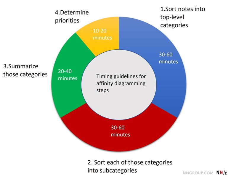
Kara Pernice from the Nielsen / Norman Group describes step-by-step instructions on how to conduct a working session to draw a relationship chart from a variety of unstructured ideas.
The author of the book “Sprint” about design sprints Jake Knapp gives a pack of tips to their facilitator.

Gibson Biddle (vice president of product at Netflix from 2005 to 2010) spoke about the work on the brand. A sensible model of its definition from positioning to specific values is described, as well as a step-by-step evolution of the product itself - naturally, through the company's traditional experiments. It is unlikely that this is something strongly new for specialists on the topic, but the combination of the brand with the interface and digital branding in general is one of the most important topics of recent years, when more and more Internet companies are becoming mature as a business and are trying to work with the user at all levels . Here, good examples are extremely few and such a detailed case is worth its weight in gold.

Aytekin Tank talks about the launch of new functionality in the JotForm online forms service - how they rolled it out on users so as not to squander involvement.
A 1996 Kent Sullivan lost article was found in which he talks about working on the Windows 95 interface. This is the most valuable material that shows how advanced the approach was at that time - iterative work, emphasis on usability testing and many other methods and practices which seem mundane now, but were used by single companies 25 years ago. It is very interesting to read about how, for example, it was difficult to accustom people to the now double click of the mouse. Windows 95 is one of the most important interfaces in history that made such a complex thing as a computer accessible to the mainstream user, including through the mission “computer to every home”. Translation .
Bang! Bang! Education and Yandex Publisher launch a free online course on design history from 1918 to 2018. In the list of teachers - a good half of strong domestic companies and designers. Start June 9th.

The most powerful overview of how the role and tasks of design have changed in recent decades from Hugh Dubberly. Especially valuable is the fact that the evidence of this evolution refers to key books and articles, so that you can trace it yourself.
Luke Wroblewski shows how much the usage time of phones has grown in recent years - both in general and relative to other devices.
From other news of the mobile market: in China for the first time, sales of mobile subsided . The growth of the market in the world as a whole has become lower, but this is another bell to its severe slowdown. I wonder what the followers of the Post-PC will say.
A good reminder of Alexander Bespoyasov for front-end developers, which is close in spirit to the manifesto of the product designer. It is important that the movement in this direction from all members of the product team.
Stephen Hay advises designers to spend their energy wisely and not to draw a layout for every sneeze - it is often possible to transfer knowledge of the interface to a developer or manager in much simpler ways.
The book by Artem Dashinsky dedicated to solving test tasks for hiring. Continuing the theme:
Dmitry Barbanel launches a new curriculum for designers - daily workouts for designers in Telegram . There are few details, but it looks like a mature version of the Daily UI format. Program on Bang website! Bang! Education .
The O'Reilly Design Conference 2017 was held March 20-22 in San Francisco. Pabini Gabriel-Petit and Krispian Emert publish a report on master classes within it.
A team of enthusiasts from GOV.uk launches the first international conference on the design of public websites. The International Design in Government Conference will be held July 17-18 in London.
Fresh links can also be tracked in the Facebook group of the same name, VKontakte , received once a month by mail or read in the Telegram . Thanks to everyone who also publishes links in it, especially Gennady Dragun, Pavel Skripkin, Dmitry Podluzhny, Anton Artyomov, Denis Efremov, Alexey Kopylov, Taras Brizitsky, Yevgeny Sokolov and Anton Oleinik. More and more materials in reviews appear thanks to them.
Patterns and best practices
Handlebars in UI Design
Shankar Balasubramanian analyzes a relatively new pattern of “handlebars” (roughly speaking, “handles”), which are promoted by hidden gestures interfaces (for example, there are many of them in the iPhone X). He adds the necessary affordans, from the absence of which the experimental touch interfaces have suffered for a long time.
')
Designing A Perfect Responsive Configurator
Vitaly Friedman examines examples and offers a clever checklist for the design of hardware configurators and other products in online stores. As usual, zvizdillion examples.
Best Practices for Modals / Overlays / Dialog Windows
Explanatory checklist for designing popups from Naema Baskanderi. A similar checklist for designing confirmation dialogs from Jakob Nielsen.
Introducing CARE - A simple framework for user onboarding
Intercom's Ruairí Galavan describes the company's approach to meeting a new user. Like Samuel Hulick, they look at the problem more broadly than just a few training messages - it is important to lead the client through the entire life cycle (they are focused on a paid subscription).
The UX Designer's Copy Toolkit
Tips for creating generic interface texts from Matt Jones from GE.
Design Like a Teacher
Aimee Gonzalez-Cameron shows what the designer should do in a seemingly impasse - users have to partially work in the interface of the partner product, which cannot be changed, and he himself is not so hot. She focused on user expectations before they go to a third-party interface, and it helped greatly increase loyalty.
The User Experience of Flower Websites
Jeff Sauro has conducted comparative testing of several US flower delivery sites. There are also NPS values (very low, by the way).
* average NPS -2%
A Comprehensive Guide To Mobile App Design
Detailed memo on the design of mobile applications from Nikolai Babich.
Mailing Lists
- Matt Helbig, curator of the Really Good Emails collection, shows how they choose high-quality emails using the example of a few good letters.
Baymard Institute Studies
- Christian Holst from Baymard Institute gives online shopping advice on the right moment in the process of placing an order, when you should ask the user to register.
Design systems and guidelines
BEM Design
Yandex has launched a set of prototyping tools and themes for BEM. It turned out a good template for a quick start of your design system - you can redefine styles for your tasks (this was how Studio Manufactory and the first version of Alfa-Bank’s platform did). An article by Mikhail Koloskov about the approach as a whole and a presentation to the launch . BEM is generally one of the most respected domestic developments in the international community - a huge number of people at the last conference on design systems Clarity warmly recalled it. It will be great if this results in “our Bootstrap”.
Such initiatives help to change the minds of designers, many of whom still understand the design system as a template in Sketch or another design tool, rather than a technological solution on the components in the code into which the design is sewn. Brad Frost is also tired of this . This is the thinking of the middle of the last century, when this word was understood as the system of visual identification of the brand, to which a beautiful printed book went (they were actively republished in recent years). But then it was about the physical products and objects that are on the shelf in the store (or the chain store itself), and we are working with digital products, where the layout does not guarantee anything and changes many times before launching to users. So you have to work with the main material of this environment - the code.
In the last issue , a bridge between the two worlds (components in the code and design tools) was mentioned, which will be one of the main themes of the year. So, Mark Dalgleish describes in detail how SEEK linked components to React and templates in Sketch (they are assembled from a live guideline). Watch out for such things carefully and try it yourself - it’s easier to implement it than it seems.
Well, just a few fresh stories about the creation of design systems:
- Marcin Treder describes the 6-day sprint on the formalization of the design system , which they used to organize the UX Pin interface. True, there is only about the level of the visual language without many important details of the implementation in the code.
- Design system HubSpot Canvas . Julie Nergararian talks about how she was created .
- Nathan Curtis describes three models of the architecture of the teams supporting the design system and the technical solution itself.
- Cristiano Rastelli talks about creating a Badoo dating service design system. In the first part about the problem statement and architecture .
iOS 11
- Apple tightened the requirements for developers and banned the use of emodzhi for interface design .
Android
- The Google Pixel template for Photoshop from Daniel Bolyhos .
- Firebase analytical system allows you to predict the moment when the user is best offered to evaluate the application .
Understanding the user
Dave Gray - Liminal Thinking
At the end of 2016, the publishing house of Two Waves Books released the book Dave Gray “Liminal Thinking” . UXmatters publishes an excerpt from it about the formation of beliefs - well-submitted features for designers of the psychology of users.
New tech "addictions" are mostly just old moral panic
Interesting thoughts on how much attachment to new technologies is a problem or a disease, or is it just a feature of any trend and in the past everything went in a similar way.
Information architecture, conceptual design, content strategy
Wireflow
Another tool for creating site maps in the browser.
How to improve your design process with copy docs
Andrea Drugay from Dropbox shows your template for working with interface texts. In general, nothing special, the usual specification on the tables.
Designing new clinics in Kirov
The story of the redesign of clinics in Kirov, taking into account the principles of designing services and lean production. Interesting facts about how to analyze the behavior of patients and the work of doctors.
Design and design of interface screens
Phase
This year's first new tool for the design and prototyping of Phase interfaces. A standard set of features for animation, creating characters for anything, adaptability, exporting to code for the web and native platforms.
The last three or four years of movement in this market has become so noticeable that even Bloomberg wrote about it, which usually hovers in the clouds of mega-corporations. A good indicator of the maturity of the market, where designers six years ago humbly thought that they would always have to be content with Photoshop - a tatter from the upper arm, not sharpened by interfaces. This can be seen for money:
Invision
$ 235M
Figma
$ 42.9M
Framer
$ 9M
Marvel
$ 8M
Zeplin
$ 1.2M
There are purchases, but so far partially successful - InVision strengthens its ecosystem, and Google lets out Pixate and Form.
The world loves designers, no matter what they say. If you go back to practice, here's what happened during the past month and a half:
- Sketch: Fresh plugins: quick creation of guides around a selected object ; quick conversion of interface screens and simple shapes into an isometric projection ; Diya for animation inside Sketch. Articles: Tom Gebauer shows the organization of symbols for working with tables ; translation of a memo to create a modern library of characters from Michael Fouquet of Hudl. Selection of references to the free templates .
- Adobe XD: February update : Improved work with vector graphics, generator specifications and simply improve the interface. Other news: icon sets from famous designers - Lance Wyman, Anton & Irene and Büro Destruct. Discussion with Kyle Galle, where he answers questions on the development of plug-ins .
- InVision: Maze helps usability testing based on InVision prototypes. You give users a special link, at the output there are a lot of useful analytics like heatmaps and task execution times.
- Haiku: Pre-release released . You can download the application for Mac and see the web components engine .
- Framer: A selection of articles appeared on the site about how teams and designers use it in practice, and in September their own conference, Loupe, will take place. A step-by-step guide to creating an interactive prototype from Greg Rog and translating excerpts from the book Meng To “Design + Code” with parts for working with Framer.
- Zach Johnston explains how the Dropbox design team prototypes desktop applications with Framer. It is important that they do this in the context of the present desktop, relatively loaded.
- Lingo: Version 4 has been released with multiple interface enhancements.
- PDFI.js: The script allows you to parse PDF into components. How to make it PSD .
- Zeplin: Now you can create plugins .
User research and testing, analytics
Use a Research Grid to Focus Study Decisions
Jeff Sauro advises to always remember the goals of user research, so as not to get lost in the details during its implementation. It offers a format for recording research objectives and basic hypotheses that can be tracked along the way.
UX Cinema - Emotions. The senses. Interview
Maria Goncharova from Alfa-Bank talks about the better understanding of users of product teams through the display of mini-films based on the research.
Visual programming and browser design
Enter The Dragon (Drop) - Accessible List Reordering
Harris Schneiderman shows how to make a list with drag and drop lines on the web, taking into account accessibility requirements for people with disabilities.
New scripts
- The script allows you to make the effect of targeting depends on the direction of movement of the cursor .
- JavaScript library for glitch text presentation.
- Implement iMac for presentation of layouts on CSS. When scrolling - a spectacular parallax.
- The script makes a spectacular animation of loading the image with the division into parts .
- A hover effect with an animated gradient.
Work with SVG
Web typography
- A small tutorial on customizing the variable fonts in CSS from Richard Rutter from Clearleft.
- Mark Otto tells how GitHub switched to system fonts in the interface , adapted for specific platforms. This is one of the popular solutions for those products for which the existing limitations of loadable fonts cannot be circumvented (first of all, the download speed).
Metrics and ROI
Does the Net Promoter Score Predict Company Growth?
Jeff Sauro made a valuable review of research on the impact of NPS on financial metrics - company earnings and repeat purchases. There is no clear answer, but it turned out an excellent critical eye. Later, he conducted his own research on whether user satisfaction, expressed in different metrics (SAT and NPS), affects the company's future profits using the example of airlines . In general, there is a connection.
Beyond the NPS - Measuring Permit for Sustainability, NASA-TLX, and
An excellent brief reminder of the Page Laubheimer of the Nielsen / Norman Group about respondent survey options during user testing - how SUS, SEQ and NASA-TLX work.
Measuring the Value of UX
Nomensa's Tim Dixon talks about the Digital Impact Framework (DIF) approach, which allows you to link specific objectives and results when working on a product with long-term goals. He has four points of application of efforts: economic, social, process and innovative.
UX strategy and management
Measuring the ROI for UX in an Enterprise Organization, Part 1
The most powerful example of strategic thinking when updating a product for corporate users from Burcu S. Bakioglu, Ben Basilan and JonDelina 'JD' Buckley from the ADP Innovation Center. They built an excellent, understandable approach for identifying interface metrics that are tied to key business indicators, and then analyzing key user tasks and comparing them so that you can track improvements over time. You rarely find such a meaningful and focused approach with a minimum of water.
Level up
Heather Phillips, together with Designer Fund, launched a questionnaire for design teams to help determine their level of maturity. A good template, although it is rather about design management and very abstractly affects the product itself.
How are well-known design teams
- Booking: Kelly van der Veen talks about the structure and interaction of product teams in the company , as well as the aggregation of user insights using the NomNom service. And Anna Efimenko - about the tasks that solve user research in the company .
- Facebook: Courtney Kaplan on how design teams work and what is the role of a design manager in them .
Meetings vs Making
IBM Sandra Tipton design manager gives advice to designers on scheduling a large number of meetings. How to highlight important and minor, how to reduce them depending on the goals and involvement.
Team interaction
Affinity Diagramming - Collaboratively Sort UX Findings & Design Ideas
Kara Pernice from the Nielsen / Norman Group describes step-by-step instructions on how to conduct a working session to draw a relationship chart from a variety of unstructured ideas.
Methodologies, procedures, standards
The Facilitator's Handbook - 23 Design Sprint Tips
The author of the book “Sprint” about design sprints Jake Knapp gives a pack of tips to their facilitator.
Cases
Branding for builders
Gibson Biddle (vice president of product at Netflix from 2005 to 2010) spoke about the work on the brand. A sensible model of its definition from positioning to specific values is described, as well as a step-by-step evolution of the product itself - naturally, through the company's traditional experiments. It is unlikely that this is something strongly new for specialists on the topic, but the combination of the brand with the interface and digital branding in general is one of the most important topics of recent years, when more and more Internet companies are becoming mature as a business and are trying to work with the user at all levels . Here, good examples are extremely few and such a detailed case is worth its weight in gold.
How to focus on a customer (not the competition) brought us +1 million signups
Aytekin Tank talks about the launch of new functionality in the JotForm online forms service - how they rolled it out on users so as not to squander involvement.
Modern editorial CMS
- Sanette Tanaka and Katie Kovalcin from Vox Media talk about how a new publication format was made for Chorus CMS - extended collections on the topic.
Story
Designing Windows 95's User Interface
A 1996 Kent Sullivan lost article was found in which he talks about working on the Windows 95 interface. This is the most valuable material that shows how advanced the approach was at that time - iterative work, emphasis on usability testing and many other methods and practices which seem mundane now, but were used by single companies 25 years ago. It is very interesting to read about how, for example, it was difficult to accustom people to the now double click of the mouse. Windows 95 is one of the most important interfaces in history that made such a complex thing as a computer accessible to the mainstream user, including through the mission “computer to every home”. Translation .
Free online course on world design history from the best Russian designers
Bang! Bang! Education and Yandex Publisher launch a free online course on design history from 1918 to 2018. In the list of teachers - a good half of strong domestic companies and designers. Start June 9th.
Trends
Connecting things - Broadening design to include systems, platforms, and product-service ecologies
The most powerful overview of how the role and tasks of design have changed in recent decades from Hugh Dubberly. Especially valuable is the fact that the evidence of this evolution refers to key books and articles, so that you can trace it yourself.
Algorithmic design
- Sandra Upson talks about ethics in the era of content generated by algorithms . Given the proliferation of experiments that create realistic speeches by politicians or reviews of restaurants, it will soon be difficult to distinguish real events from fictional events.
- Adobe's Scott Prevost talks about his vision for algorithmic design tools . He identifies three tasks in which they are particularly useful - to give ideas for the finalization of the design, to simplify work with the layouts and evaluate the effectiveness of the result.
- Michael Schrage describes five models of user interaction with algorithms - from the assistant to the "boss".
- The uKit team talks about their new solution, which automatically recycles site design .
- Autodesk's Erin Bradner talks about algorithmic design in industrial design . They call the approach a generative design, but in the early stages of the development of advanced directions there is always confusion in terms.
Changing time spent
Luke Wroblewski shows how much the usage time of phones has grown in recent years - both in general and relative to other devices.
From other news of the mobile market: in China for the first time, sales of mobile subsided . The growth of the market in the world as a whole has become lower, but this is another bell to its severe slowdown. I wonder what the followers of the Post-PC will say.
Car Interfaces
Smart watches and bracelets
- Against the background of a general drop in interest in smart watches and bracelets, there are problems with Nokia , who bought Withings.
- At Fitbit, too, not everything is sweet - the market of smart bracelets was reduced by 18% in 2017, although there is some kind of life in smart watches.
Interface simplification
Voice Interfaces
- Amazon's Angela Nguyen provides design tips for Alexa voice assistant.
For general and professional development
The frontend is not painful!
A good reminder of Alexander Bespoyasov for front-end developers, which is close in spirit to the manifesto of the product designer. It is important that the movement in this direction from all members of the product team.
Sketch and destroy
Stephen Hay advises designers to spend their energy wisely and not to draw a layout for every sneeze - it is often possible to transfer knowledge of the interface to a developer or manager in much simpler ways.
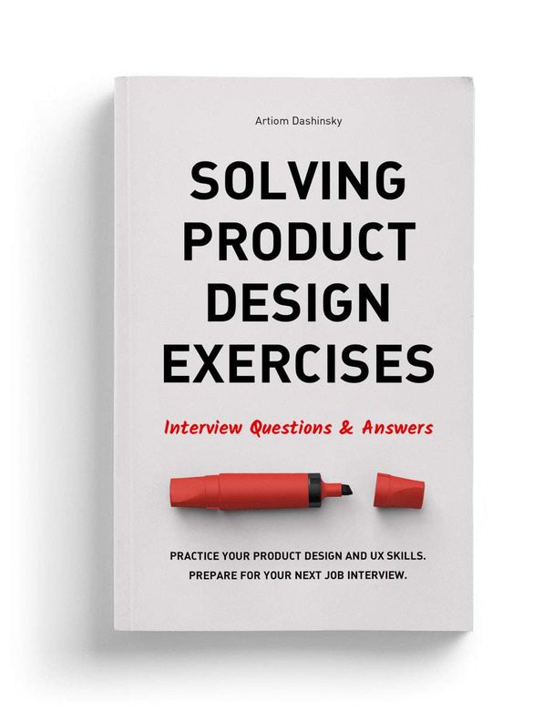
Solving Product Design Exercises - Interview Questions & Answers
The book by Artem Dashinsky dedicated to solving test tasks for hiring. Continuing the theme:
DesignWorkout - daily workouts for designers
Dmitry Barbanel launches a new curriculum for designers - daily workouts for designers in Telegram . There are few details, but it looks like a mature version of the Daily UI format. Program on Bang website! Bang! Education .
Conference proceedings
Conference Review: O'Reilly Design Conference 2017
The O'Reilly Design Conference 2017 was held March 20-22 in San Francisco. Pabini Gabriel-Petit and Krispian Emert publish a report on master classes within it.
International Design in Government 2017
A team of enthusiasts from GOV.uk launches the first international conference on the design of public websites. The International Design in Government Conference will be held July 17-18 in London.
Fresh links can also be tracked in the Facebook group of the same name, VKontakte , received once a month by mail or read in the Telegram . Thanks to everyone who also publishes links in it, especially Gennady Dragun, Pavel Skripkin, Dmitry Podluzhny, Anton Artyomov, Denis Efremov, Alexey Kopylov, Taras Brizitsky, Yevgeny Sokolov and Anton Oleinik. More and more materials in reviews appear thanks to them.
Subscribe to the newsletter ! A letter arrives once a month.
Source: https://habr.com/ru/post/349928/
All Articles