Sleight of hand and no fraud: practical tips on accelerated design training for developers
We improve the design of the project with the help of tactically competent actions, and not talent.
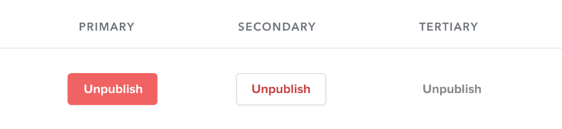
Whether you like it or not, every web developer is inevitably faced with situations where he needs to make a decision regarding visual design.
Perhaps in the company in which you work, there is no full-time designer, and you need to implement an interface for the new functionality. Or, maybe, you decided to earn extra money on a side project, and you would like it to look better than “one more bootstrap site”.
It’s easy to give up and say: “I can never do it properly, I'm not an artist!” But it turns out there are a lot of clever tricks you can use to raise your work to another level without having experience in graphic design .
')
Under the cut are seven simple ideas that you can use to improve your projects.
1. To create a hierarchy, use color and weight instead of size.
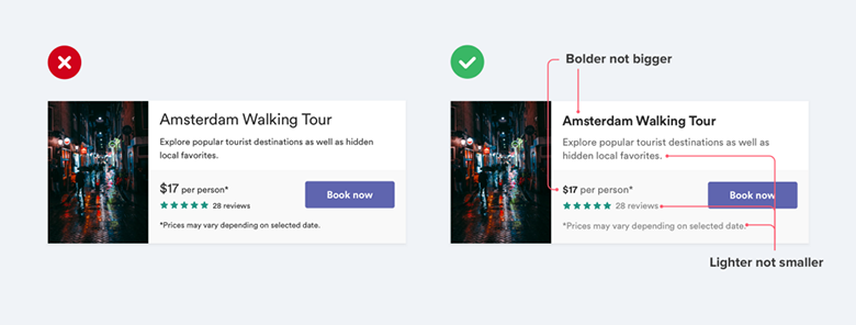
A common style mistake is when the font size is used to control the hierarchy.
“Is this text important? Let's make it bigger.
Is this text secondary? Let's make it smaller. ”
Instead of shifting this difficult task only to the font size, try using the font color or weight (thickness) for the same purpose.
“Is this text important? Let's make it fat.
Is this text secondary? Let's use a lighter color. "
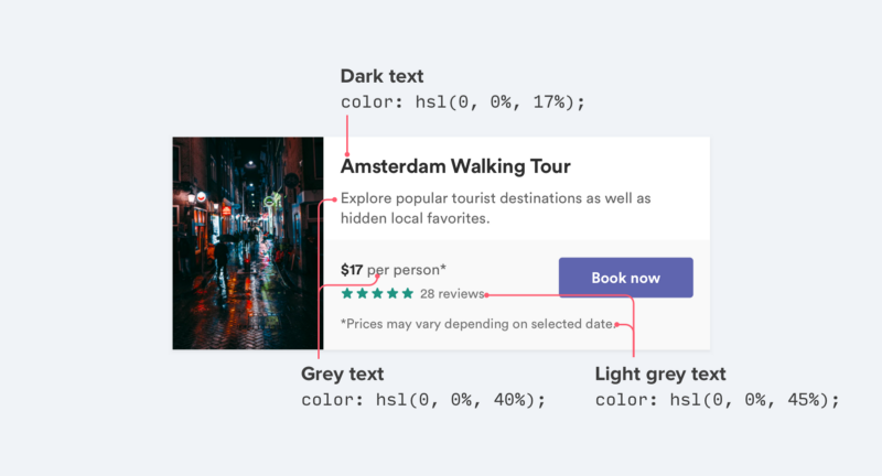
Try sticking with two or three colors:
- Dark (but not black) color for the main content (for example, an article title)
- Gray for secondary content (for example, the publication date of the article)
- Lighter gray for supporting content (for example, for a copyright notice in the footer)
Similarly, for work with the user interface, usually two fonts of two scales are enough:
- Regular font (400 or 500 depending on the font) for most texts
- Heavier (bold) font (600 or 700) for text that you want to underline
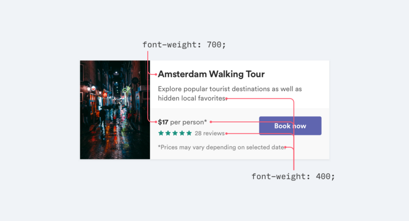
Avoid fonts weighing up to 400 in the user interface ; they may work well when used in large headers, but they are too difficult to read while decreasing. If you plan to use a lighter font (thin) to loosen some text, use a lighter color or smaller size instead.
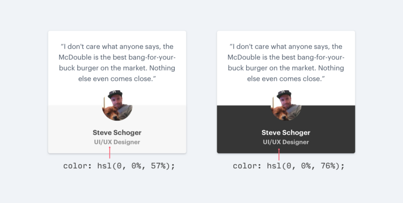
2. Do not use gray text color on a colored background.
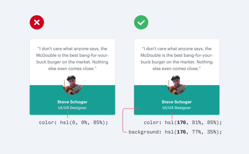
Dyeing text in light gray is a great way to “loosen” it on a white background, but on colored backgrounds it doesn’t work as well.
The effect that we see with gray on a white background is associated with reduced contrast and weakening of the opposition.
Giving the text color closer to the background color is what actually helps to create a hierarchy, and not that the text is made light gray.
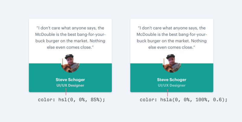
There are two ways to reduce contrast when working with bright backgrounds:
1. Increase the transparency of white text.
Use white text and increase transparency. This allows the background color to appear a little, weakening the meaning of the text. It does not create a conflict with the background color.
2. Pick a color based on the background color
This works better than increasing transparency when the background is an image or pattern, or when transparency makes the text too boring or blurry.
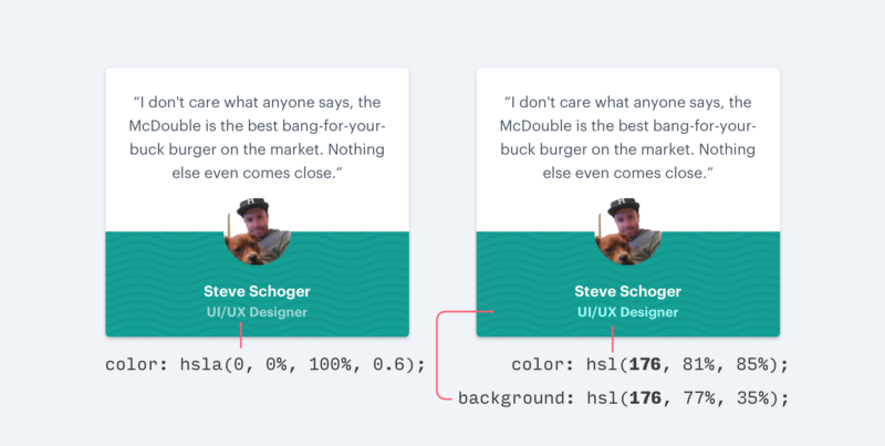
Choose a color that has the same shade as the background. Adjust the saturation and weight until the text looks harmonious.
3. Shift the shadows
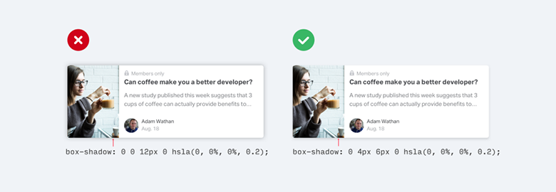
Instead of using large values for blurring and stretching to make the shadows more visible, add a vertical offset.
It looks much more natural, because it helps to imitate a light source directed from above, as we are accustomed to see in the real world.
This also applies to internal shadows, for example, in input forms:
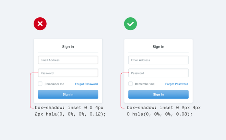
If you are interested in learning more about shadow design, I recommend the Material Design Guidelines fantastic tutorial.
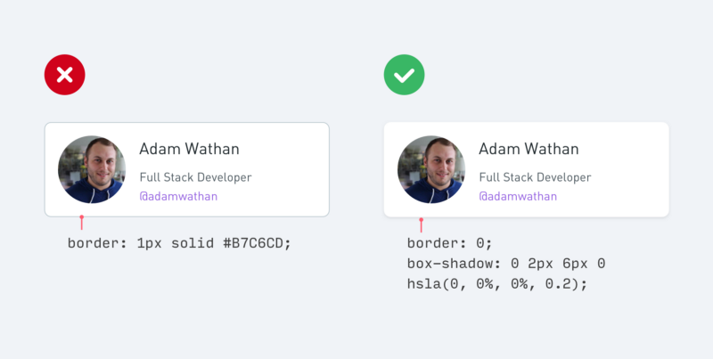
4. Use fewer borders
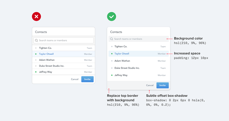
When you need to mark the separation between the two elements, try to resist the temptation to add borders immediately.
Of course, borders are a great way to separate the two elements from each other, but this is not the only way, and using them in too many quantities can overload your design with details and create a feeling of clutter.
The next time you find yourself on the verge, try one of these ideas:
1. Use the element shadow (box shadow)
Box shadow does an excellent job of delineating the outline, but may be more subtle than the border , fulfilling the same goal and not distracting.
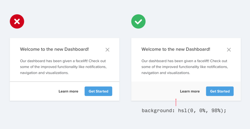
2. Use two different background colors.
A slightly different background color for neighboring elements is usually all you need to make a distinction between them. If you already use a different background color in addition to the border, try deleting it; it may not be necessary.
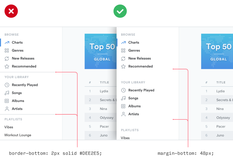
3. Add extra spacing.
Is there a way to create a separation between elements better than just increasing the spacing? Placing away is a great way to distinguish between groups of elements without complicating the user interface.
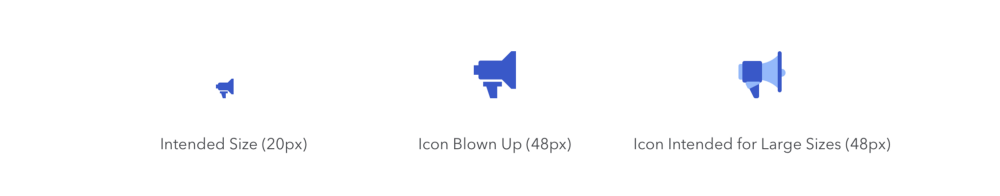
5. Do not increase the icons, which should be small
If you are developing something that should use large icons (for example, the “main benefits” section of the landing page), using a free set of icons such as Font Awesome or Zondicons , you can instinctively decide to increase the size until it is will meet your needs.
After all, these are vector images, and the quality will not suffer if you increase the size, right?
Yes, vector images will not degrade in quality when you increase their size, but icons that were drawn at 16-24px will never look professional when you increase them 3 or 4 times their estimated size. They will not have enough details, and they will always feel disproportionately "stocky."
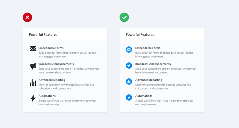
If you have small icons, try placing them in a different form, giving it a background color:
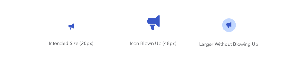
This allows you to keep the size of the icon closer to the intended, filling the desired space.
If you have a budget, you can also use a premium set of icons designed for increased use (for example, Heroicons or Iconic ).
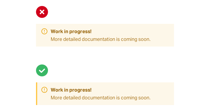
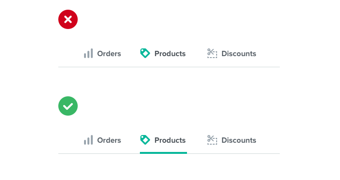
6. Use a border accent to add color to a faceless design.
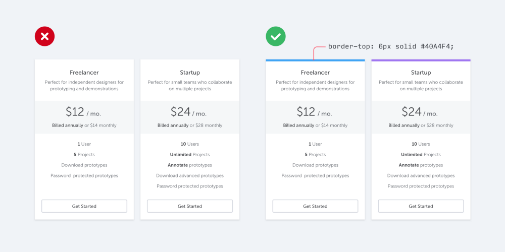
If you are not a graphic designer, how do you add the signs of visual flair that other projects get through beautiful photos or colorful illustrations to your user interface?
One simple trick can make a big difference. It is to add colorful accents to the borders of some interface elements that would otherwise look a bit faceless.
For example, next to the warning message:
... or to highlight the active item in the navigation:
... or even at the top of the entire layout:
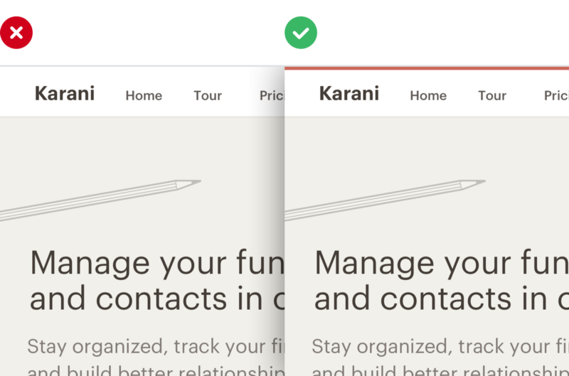
Adding a colored rectangle to the user interface does not require the talent of a graphic designer, but can be very useful in creating a more “designer” website.
Is it hard to choose a color? Try using a pre -made palette, such as searching for Dribbble colors , to avoid the feeling of overflowing with endless color choices in the traditional way.
7. Not every button needs a colored background.
When there are several actions that a user can take on a page, it is easy to fall into the trap when designing an interface for these actions based solely on the meaning of words.
Frameworks such as Bootstrap encourage this by giving you a menu of semantic styles to choose from when adding a new button:
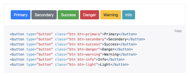
“Is this a positive action? Make a green button. „
“Does it delete the data? Make the button red. ”
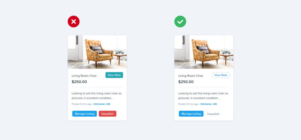
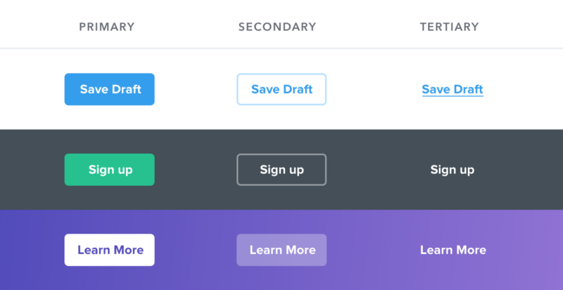
Semantics is an important part of button design, but there is a more important dimension that is usually forgotten: hierarchy .
Every action on the page is somewhere in an important pyramid. On most pages, there is only one true primary action, several less important secondary actions, and some rarely used tertiary actions.
When developing these actions, it is important to inform them about their place in the hierarchy.
- Primary actions should be obvious. The clean, high-contrast background colors work great here.
- Secondary actions should be clear, but less noticeable. Contour styles and lower contrast background colors are great options.
- Tertiary actions should be open, but unobtrusive. Styling these actions as links is usually the best approach.
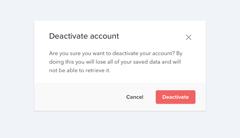
“What about destructive actions, shouldn't they always be red?”
Not necessary! If the destructive action is not the main action on the page, it might be better to use 2 or 3 options for styling buttons.
Save the big, red button for the case when this negative action is in fact the main action on the interface page, for example, in the confirmation dialog:
Other Cloud4Y blog articles:
→ Make me think
→ Principles of gestalt in user interface design
→ Compare what you can not: cheap hosting and cloud on the VMware stack
→ How to create a truly random and provably secure password
→ “Strashilka” about GDPR
Source: https://habr.com/ru/post/349826/
All Articles