How we improved technical support with cohort analysis
There is a huge amount of graphical visualization tools that can do real miracles with them. All of them have a different purpose and specialization.
But now it’s not about them. This is not about tools, but about how to use them in a very specific situation, namely, when analyzing the activities of the internal technical support service.
In a large organization, the work of centralized services is often critical.
')
Imagine that you are the head of a 10-person support service, and your team serves a team of 200 teams, each with 7-10 people. This is a minimum of 1,400 people who daily fill you with work.
Now let's add even more reality here and imagine that you are performing some kind of centralized function (for example, setting something up), without which commands cannot produce a result.
It turns out that everything is tied to you, and the faster and more efficiently your team will work, the faster all the other teams in the company will produce the result.
And here complaints about the slow processing of requests begin ...
Naturally, in this situation, the manager needs factual data, not words.
Cohort analysis comes to the rescue.
When you first encounter a cohort analysis, it causes a natural feeling of rejection and rejection, because too different from traditional graphs and metrics.
But in fact there is nothing difficult in it. In essence, cohort analysis is something like seasonality.
Seasonality is when similar time periods are taken, for example, years or weeks, and the behavior of the measured value is plotted from them.
Provide a temperature chart. If we analyze it using a cohort analysis, then we can take a year as a cohort and plot the temperature from the beginning to the end of the year.
Comparing the graphs for different years, you can see the same temperature behavior , repeated from year to year.
Everyone is used to metric graphs in their usual interpretation. When it comes to plotting a graph, the first thing that comes to mind is the total, average or amount.
But there is a problem: often such values do not give "insight", i.e. with their help, you will not recognize any essential data that allows you to understand the essence of the problem.
Cohort analysis, in contrast to the usual metrics, gives such a result, which allows you to get to the truth.
That is why it is increasingly used by startups and commercial companies (the AARRR metrics are analyzed using a cohort analysis) to get a real picture of their activities.
Let's look at a specific example of what a cohort analysis is and how it can be used to optimize a technical support service in a large company.
After reading the article, you will learn how to conduct cohort analysis yourself, using only ordinary Excel and a standard set of functions.
The head of technical support, let's call him Ivan, decided to check whether the requests to his service are really executed for a very long time.
Fortunately, all requests are registered via Jira and it is enough just to upload all the tickets together with their history to Excel:

Only some 3300 entries.
The first thing that came to Ivan's mind was to look at the average time for processing applications.
Function = CLEANERS () helped calculate the number of working days from the moment of creation of the application to its transfer to the “Resolved” status:

Using the Excel PivotTable, Ivan received an average time to process an application:
(working days)
“This is terrible!” Ivan exclaimed, because the SLA recorded 2 days for testing tickets, not 16.
The graph showed an even more horrible picture:

(Average time of working off, work days)
(Number of solved requests per day)
From somewhere there were requests, with an average time of working off of 200 working days (!).
The problem was obvious, but it was completely incomprehensible from the graphs exactly where it originated and what its essence was. The graphics were silent.
Ivan fell into despair and did not know what to do. Then came anger.
After thinking for a while, he decided to punish those of his subordinates who work poorly.
For this, he built a graph of the average duration of processing applications:

(on the X axis - the names of the applicants, hidden, Y - the average time of execution of the application by this person, work. days)
Guilty have been identified.
But Boris, Ivan’s acquaintance, asked him not to rush into punishment, but first try to apply the cohort analysis, because it’s not as difficult as it seems.
An Excel pivot table for the duration of closure of tickets (select all data / Insert / Pivot table) was built using the tickets downloaded from Jira.
First of all, the entire data array had to be divided into cohorts. Usually this is done by the date of birth of the object.
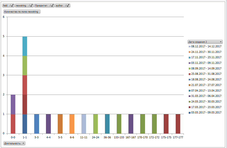
For the selection of cohorts, the pivot table was grouped by weekly intervals by the date the ticket was created, and as a metric, the duration of the test was calculated (the number of working days elapsed from the time the ticket was created until its execution).
Next, a summary diagram is constructed for them:

Each cohort is displayed on the chart in its own color.
And, lo and behold! The reality has become different.
52% of the tickets are still in the SLA. And yes, 47% of tickets are closed for a long time - right up to 200 days (most likely there are just forgotten tasks?).
But what about the average time worked out, which was calculated earlier? As you can see, it has nothing to do with reality and shows a kind of incomprehensible number that is not clear how to interpret. That is why the use of averages is very harmful.
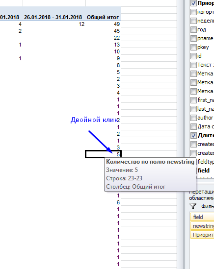
Having received a real picture of the world, Ivan first of all decided to understand what kind of tickets with 200 working days of execution are.
In pivot tables, this is very simple: just double-click on a pivot table cell, and Excel displays a list of the tickets that make up this cell.
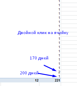
It turned out that really it was forgotten tickets, closed, apparently, during the "cleaning".
Unfortunately, such “emissions” greatly affect the value of the average and spoil it strongly towards inadequacy, and this is another argument against its use in the analysis.
Looking closely at the schedule, Ivan saw the peaks ...
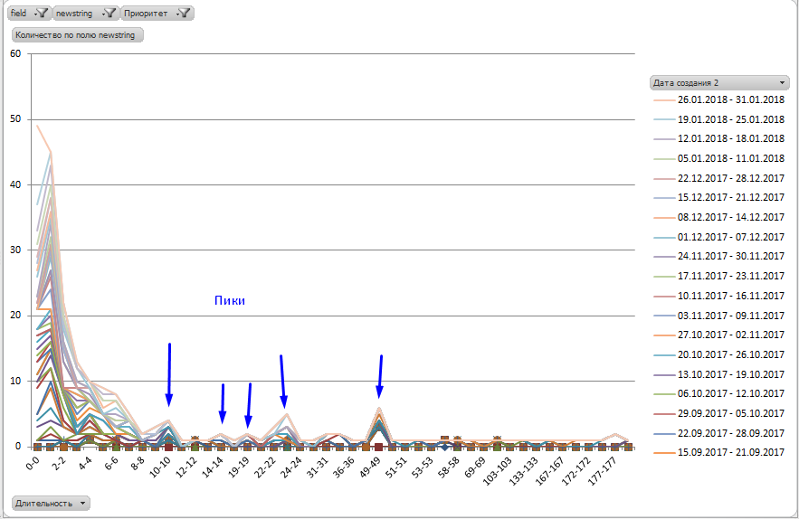
Most likely, Ivan thought, there are some special types of tasks that require more time than laid down in the SLA.
Double click on “23” showed a list of tickets with the execution duration of 23 business days:
It turned out, as Ivan had expected, most of the tickets were of the same type and requested the creation of stands.
In the same way, Ivan analyzed all the peaks on the chart and, based on the results, changed the SLA for the selected types of tasks, and also accelerated some of them, figuring out exactly where the slowdown was hiding.
Ivan’s second insight was that there shouldn’t be a tail on the chart at all.
Something like this:
After all, the tail to the right, in essence, denotes violation of the SLA and delay in the execution of tickets.
Naturally, tasks of different types require different time for implementation, therefore in reality there will be tail and peaks, however it is very desirable that they tend to zero.
Indeed, what about employees with an “outstanding” average task execution time?
As expected, the situation with the worst employee is actually not so bad (the same cohort graph, but in the form of a bar chart, provided for convenience):
He obviously performs most of the requests on time, and the average time is spoiled by “emissions” in the form of 170-day closing of tickets. By the way, here is the one who closed them so late!
And this is how an employee works who has performed the most tasks:

It is well seen that he is all right with the implementation of standards.
But this is not all that cohort analysis provides.
Now you can find out exactly who has the greatest number of tasks with the execution time> 2 days.

(on Y - the number of tasks with the execution time> 2 days, on the X axis - the name of the contractor)
There is something to work with, right?
And, of course, the list of “Losers” has become a bit different, it has completely different surnames.
Having started work on tasks, Ivan achieved significant results already in the first week.
The graph shows 3 cohorts of January 2018.
The improvement in the form of a shift of the lines to the left towards zero is noticeable.
The green line of the last cohort shows that the results have improved significantly and all tickets are closed within 1 business day.
Changing the type of the graph to a columnar, it becomes clearly visible that most of the tickets are closed on the same or the next day:

The change in grouping confirms the data:

Ivan realized how powerful a tool he received, and from that moment he constantly used it to get a real picture of what was happening in his department.
There are many metrics in the world, beautiful and different, but not all of them provide an opportunity to really dig into the process, to detect and eliminate its bottleneck.
Cohort analysis is undoubtedly a good fit for this.
To conduct a cohort analysis:
I'm sure cohort analysis is something that can really help.
Try it and you use this tool to tidy up your department, division or even company.
Good luck in job!
PS Read three more of my articles on cohort analysis:
But now it’s not about them. This is not about tools, but about how to use them in a very specific situation, namely, when analyzing the activities of the internal technical support service.
In a large organization, the work of centralized services is often critical.
')
Imagine that you are the head of a 10-person support service, and your team serves a team of 200 teams, each with 7-10 people. This is a minimum of 1,400 people who daily fill you with work.
Now let's add even more reality here and imagine that you are performing some kind of centralized function (for example, setting something up), without which commands cannot produce a result.
It turns out that everything is tied to you, and the faster and more efficiently your team will work, the faster all the other teams in the company will produce the result.
And here complaints about the slow processing of requests begin ...
Naturally, in this situation, the manager needs factual data, not words.
Cohort analysis comes to the rescue.
When you first encounter a cohort analysis, it causes a natural feeling of rejection and rejection, because too different from traditional graphs and metrics.
But in fact there is nothing difficult in it. In essence, cohort analysis is something like seasonality.
Seasonality is when similar time periods are taken, for example, years or weeks, and the behavior of the measured value is plotted from them.
Provide a temperature chart. If we analyze it using a cohort analysis, then we can take a year as a cohort and plot the temperature from the beginning to the end of the year.
Comparing the graphs for different years, you can see the same temperature behavior , repeated from year to year.
Everyone is used to metric graphs in their usual interpretation. When it comes to plotting a graph, the first thing that comes to mind is the total, average or amount.
But there is a problem: often such values do not give "insight", i.e. with their help, you will not recognize any essential data that allows you to understand the essence of the problem.
Cohort analysis, in contrast to the usual metrics, gives such a result, which allows you to get to the truth.
That is why it is increasingly used by startups and commercial companies (the AARRR metrics are analyzed using a cohort analysis) to get a real picture of their activities.
Let's look at a specific example of what a cohort analysis is and how it can be used to optimize a technical support service in a large company.
After reading the article, you will learn how to conduct cohort analysis yourself, using only ordinary Excel and a standard set of functions.
Get to know Ivan ...
The head of technical support, let's call him Ivan, decided to check whether the requests to his service are really executed for a very long time.
Fortunately, all requests are registered via Jira and it is enough just to upload all the tickets together with their history to Excel:
Only some 3300 entries.
The first thing that came to Ivan's mind was to look at the average time for processing applications.
Function = CLEANERS () helped calculate the number of working days from the moment of creation of the application to its transfer to the “Resolved” status:
Using the Excel PivotTable, Ivan received an average time to process an application:
(working days)
“This is terrible!” Ivan exclaimed, because the SLA recorded 2 days for testing tickets, not 16.
The graph showed an even more horrible picture:
(Average time of working off, work days)
(Number of solved requests per day)
From somewhere there were requests, with an average time of working off of 200 working days (!).
The problem was obvious, but it was completely incomprehensible from the graphs exactly where it originated and what its essence was. The graphics were silent.
Ivan fell into despair and did not know what to do. Then came anger.
After thinking for a while, he decided to punish those of his subordinates who work poorly.
For this, he built a graph of the average duration of processing applications:
(on the X axis - the names of the applicants, hidden, Y - the average time of execution of the application by this person, work. days)
Guilty have been identified.
But Boris, Ivan’s acquaintance, asked him not to rush into punishment, but first try to apply the cohort analysis, because it’s not as difficult as it seems.
How to select cohorts
An Excel pivot table for the duration of closure of tickets (select all data / Insert / Pivot table) was built using the tickets downloaded from Jira.
First of all, the entire data array had to be divided into cohorts. Usually this is done by the date of birth of the object.
For the selection of cohorts, the pivot table was grouped by weekly intervals by the date the ticket was created, and as a metric, the duration of the test was calculated (the number of working days elapsed from the time the ticket was created until its execution).
Next, a summary diagram is constructed for them:
Each cohort is displayed on the chart in its own color.
And, lo and behold! The reality has become different.
52% of the tickets are still in the SLA. And yes, 47% of tickets are closed for a long time - right up to 200 days (most likely there are just forgotten tasks?).
But what about the average time worked out, which was calculated earlier? As you can see, it has nothing to do with reality and shows a kind of incomprehensible number that is not clear how to interpret. That is why the use of averages is very harmful.
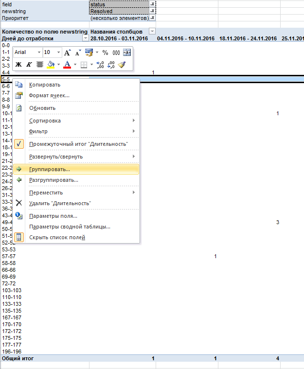
Having received a real picture of the world, Ivan first of all decided to understand what kind of tickets with 200 working days of execution are.
In pivot tables, this is very simple: just double-click on a pivot table cell, and Excel displays a list of the tickets that make up this cell.
It turned out that really it was forgotten tickets, closed, apparently, during the "cleaning".
Unfortunately, such “emissions” greatly affect the value of the average and spoil it strongly towards inadequacy, and this is another argument against its use in the analysis.
Investigate the cohort graph
Looking closely at the schedule, Ivan saw the peaks ...
Most likely, Ivan thought, there are some special types of tasks that require more time than laid down in the SLA.
Double click on “23” showed a list of tickets with the execution duration of 23 business days:
It turned out, as Ivan had expected, most of the tickets were of the same type and requested the creation of stands.
In the same way, Ivan analyzed all the peaks on the chart and, based on the results, changed the SLA for the selected types of tasks, and also accelerated some of them, figuring out exactly where the slowdown was hiding.
Ivan’s second insight was that there shouldn’t be a tail on the chart at all.
Something like this:
After all, the tail to the right, in essence, denotes violation of the SLA and delay in the execution of tickets.
Naturally, tasks of different types require different time for implementation, therefore in reality there will be tail and peaks, however it is very desirable that they tend to zero.
What about the "Losers"?
Indeed, what about employees with an “outstanding” average task execution time?
As expected, the situation with the worst employee is actually not so bad (the same cohort graph, but in the form of a bar chart, provided for convenience):
He obviously performs most of the requests on time, and the average time is spoiled by “emissions” in the form of 170-day closing of tickets. By the way, here is the one who closed them so late!
And this is how an employee works who has performed the most tasks:
It is well seen that he is all right with the implementation of standards.
But this is not all that cohort analysis provides.
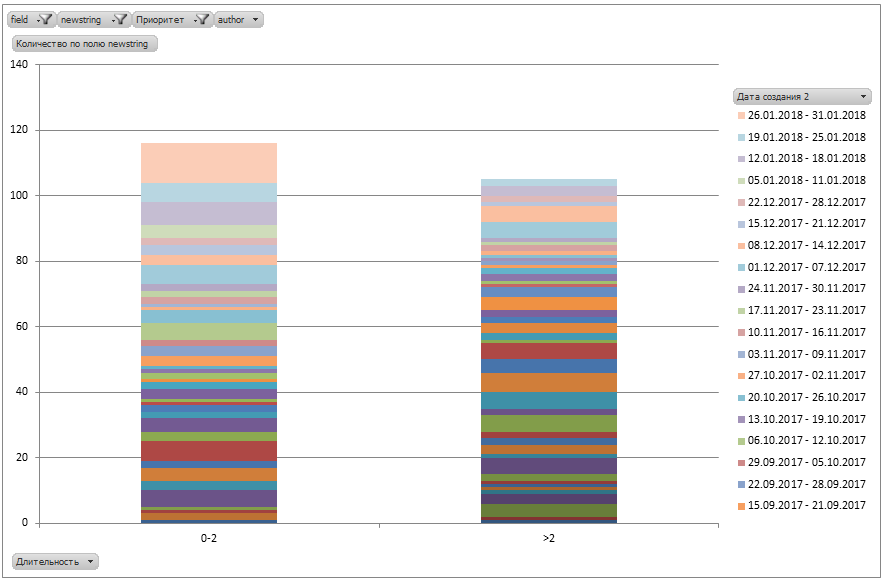
Now you can find out exactly who has the greatest number of tasks with the execution time> 2 days.
(on Y - the number of tasks with the execution time> 2 days, on the X axis - the name of the contractor)
There is something to work with, right?
And, of course, the list of “Losers” has become a bit different, it has completely different surnames.
Is there a result of all this?
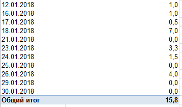
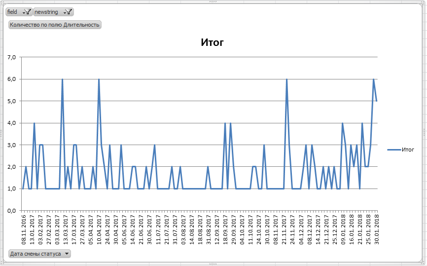
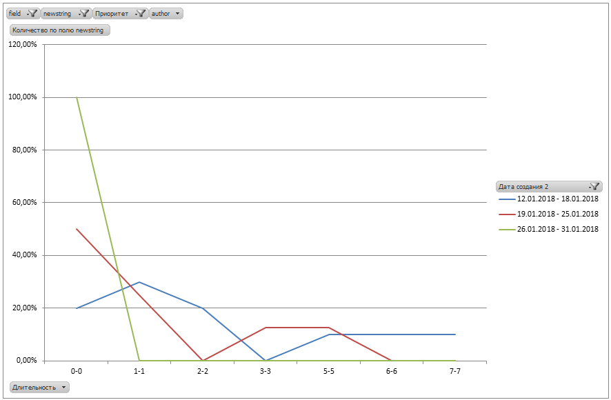
Having started work on tasks, Ivan achieved significant results already in the first week.
The graph shows 3 cohorts of January 2018.
The improvement in the form of a shift of the lines to the left towards zero is noticeable.
The green line of the last cohort shows that the results have improved significantly and all tickets are closed within 1 business day.
Changing the type of the graph to a columnar, it becomes clearly visible that most of the tickets are closed on the same or the next day:
The change in grouping confirms the data:
Ivan realized how powerful a tool he received, and from that moment he constantly used it to get a real picture of what was happening in his department.
Conclusion
There are many metrics in the world, beautiful and different, but not all of them provide an opportunity to really dig into the process, to detect and eliminate its bottleneck.
Cohort analysis is undoubtedly a good fit for this.
To conduct a cohort analysis:
- Upload all your events to Excel (for example, tickets from Jira);
- Decide on the target metric, for example, the duration of the execution of tickets;
- Build a pivot table by ticket creation date and duration of its execution;
- Group creation dates by week to make it more convenient;
- Build a pivot chart based on a table. Use different lines for each week;
- Using filters and grouping changes, display data in different perspectives - by people, projects, releases, and so on.
- Analyze the peaks (outliers) on the chart - look at the tickets hidden under them and see why they originated. Because of the specifics or something else? If necessary, change the SLA.
- If possible, eliminate the "tail" (if this is relevant to you);
- Measure the results of your actions.
I'm sure cohort analysis is something that can really help.
Try it and you use this tool to tidy up your department, division or even company.
Good luck in job!
PS Read three more of my articles on cohort analysis:
Source: https://habr.com/ru/post/349724/
All Articles