Variable forms and wow effects: magic with simple words
We continue to consider the ideas of creating different effects for sites. We finished on SVG masks , and today on the agenda is the path element and the forms that are created with its help. More precisely, their changes. And again we will try to avoid the use of complex technologies, consider the transformation of some icons into others, the creation of elastic elements and the use of silhouettes to give the site an atmosphere.
Why all this?
Changing the form in the interfaces is a very useful thing if you are working on the impression that the site will have on the user.
With the help of form conversion, you can beautifully show the user that the state of an element has changed. This could be the answer to his actions (for example, he opened the hamburger menu and its icon turned into a cross) or something that happens by itself (a notification came or the download ended and you need to change its indicator).
')
On the other hand, we can better beat the movement that is already on the page. The same menu or pop-up notification can become elastic, slightly change its shape when moving, especially at times when the idea is moving with acceleration. This approach is often used with cartoon characters - they are constantly “stomps” and “sausage”, thanks to which the movements look more alive. So why not apply it on the site?
What will we use?
SVG again. But this time the path element. In essence, a path is a curved line that can be closed, in which case we can fill it with some color or picture. Also path is used as a trajectory of movement, but about this some other time. This element has a d attribute that interests us first. Usually its value looks like this:
<path d='m 51.012704,994.53093 c 3.967595,2.89879 7.978605,5.78167 12.374577,7.97717 4.395972,2.1955 9.228469,3.6917. . . .' /> This is information about those points on which the curve is constructed, as well as all their parameters. If the picture is compressed, there will be fewer decimal places in the numbers, but nothing will become clearer. You can of course search the network for a description of the syntax that is used there, remember where there should be spaces and commas, but .... Forget about it. Nobody rules such things with their own hands. Everything is done in vector graphics editors:
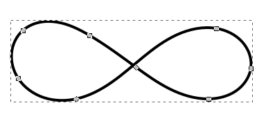
Agree, to move the mouse points on the screen is much easier than trying to fix the numbers directly in the source.
Since our final task is to transform one image into another, an important condition arises: the number of points in both variants must be the same. And their types should also be the same. This is due to the fact that modern tools, which we will most likely use for animation, cannot adequately transform very different curves. More precisely, they can do it, but it will look awful.
Start with a more complex shape, and then from its points make it simpler. This will help keep the animation smooth.
Another point to remember is that when moving from one complex shape to another, the points on which the curve is built will move along straight lines (most tools all animate that way). From this follows another remark:
When moving between objects that are complex in shape, it may be necessary to take intermediate steps so that self-intersection of curves and strange cross fillings do not appear.
We will assume that we can take a graphic editor and draw some simple forms in it. Further action is best shown on practical examples.
Let's see all this in practice.
The first example would be a hamburger. A bit like a hieroglyph, it will look good on the site of a sushi bar or tattoo salon. But we are interested in the general idea of how to change one icon to another.
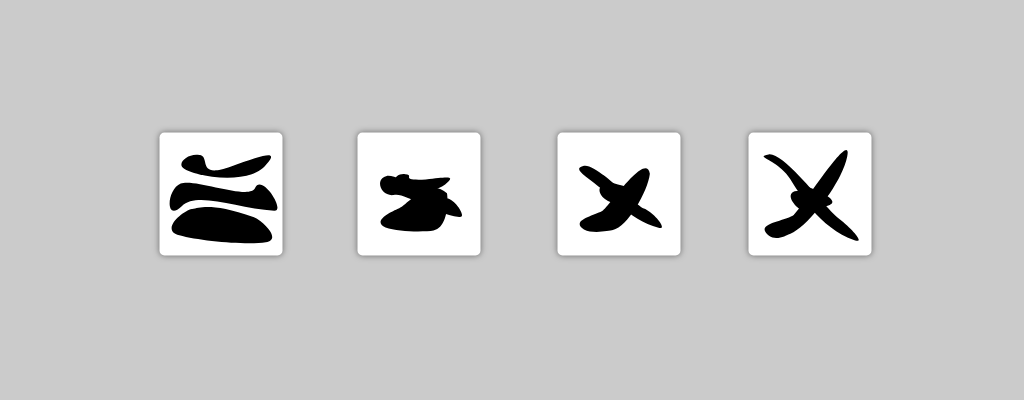
Here we have three elements, three curves:
<svg id='hamburger' viewBox='. . .'> <g> <path id='part-1' fill='#000' d='. . .' /> <path id='part-2' fill='#000' d='. . .' /> <path id='part-3' fill='#000' d='. . .' /> </g> </svg> To better understand which element goes where, take a look at the color illustration:

If the number of elements would be different, we would simply hide the extra for those that are reused.
The only thing we need to do in order to implement the transformation is to take our favorite animation tool (in this series of articles we use anime.js) and change the d attribute values of the curves from the ones in the first icon to those which are used in the second.
let hamburger = anime.timeline(); hamburger .add({ targets: '#part-1', d: '. . .' // }) .add({ targets: '#part-2', d: '. . .' // }) .add({ targets: '#part-3', d: '. . .' // }); And what if the icons are not so comfortable?
It so happens that the thought of animating some elements comes to mind after they were drawn by
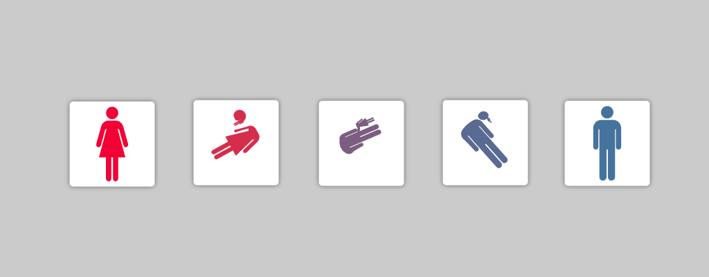
There are tools that work with different objects, including arbitrary curves. For example SVG Morpheus. In addition to the simple transformation of elements, this tool adds different rotations. Sometimes he gives porridge, which was already mentioned above, but most often the effect is acceptable, especially if the icons have more or less strict geometric shapes. And sometimes even funny, as in this case.
But remember that in most cases it is better to get together and redraw everything as it should be, than to drag another dependency into the project because of a couple of icons.
Go to elasticity
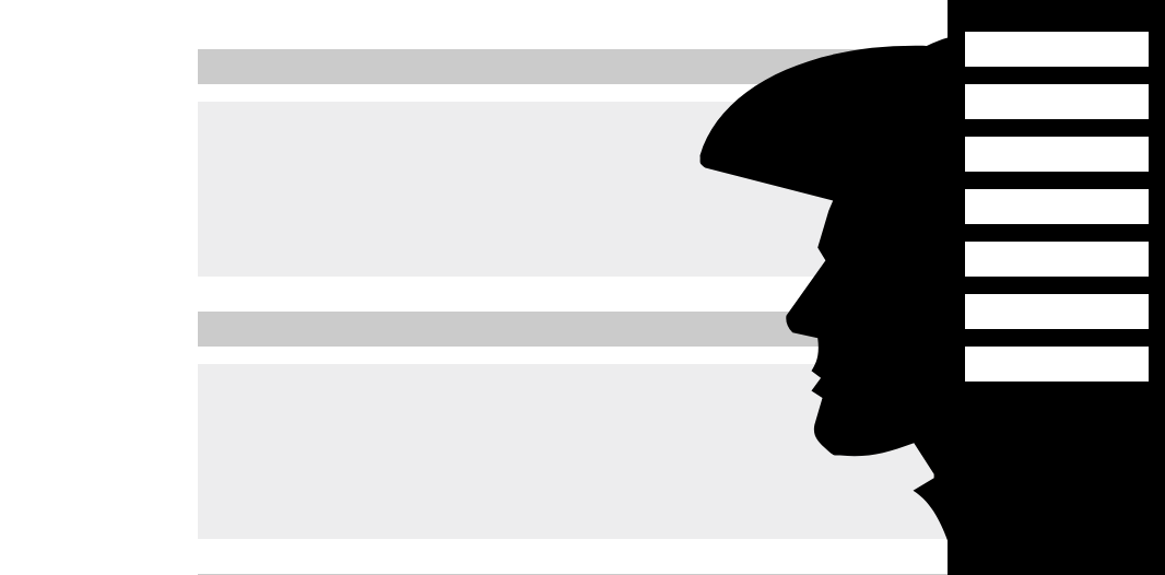
Here the main idea is to decorate the form of some already existing interface elements. Often, similar effects are applied to exit panels. The basic idea is that the front or rear border of a moving object is changed in the process. For example, a notification departing from the edge of the screen may have a “tail” on the back side, which decreases as the movement slows down and disappears completely when stopped. We implement a similar effect, but with the front border of the side menu.
The approach to creating such effects assumes minimal changes to an existing layout. The SVG element is located on the very edge of the element by absolute positioning and exists as if “in itself”.
In this case, the shape of a rectangle is used, in which one of the borders is bent in one or the other direction. This is the simplest option. It makes no sense to give code examples, since all operations are identical to those in the first example.
A more interesting approach would be to use ready-made solutions for damped oscillations, when the animation goes to the end point, then further away, comes back, then back and forth again, and so on. They can be found on the net.
It is worth noting that such things look doubly beautiful on minimalist sites, where there is a lot of pure white space. If instead of filling with color we draw the curve itself (with a light thin line, maybe 1-2px), then we get the effect of a flexible dividing line for the elements.
Develop thought
Simple elasticity is nice, but it does not have a face. In terms of spectacularity, it can be interesting to make meaningful silhouettes coming out of our interface elements instead of bumps and concavities.
This allows you to add atmospheric site. Themed cafe, exhibition of reenactors, various clubs
In technical terms, everything is the same as in the previous example, but the effect is completely different:
This one is definitely worth adopting. It works particularly well on large screens. The main thing is to remember about adaptability, which is absent in the example, but still on a real site.
Instead of conclusion
Animating curves is simple and entertaining (if everything is well drawn at once). We can say that this is one of the most useful tools in the maker-up's arsenal when creating non-standard sites, besides, it does not require a long study.
Source: https://habr.com/ru/post/349564/
All Articles