Media queries in responsive design 2018
In July 2010, I wrote an article “How to use CSS3 media queries to create a mobile version of your site” for Smashing magazine. After almost eight years, this article is still very popular. I decided to return to this topic, because now we have such layout methods as Flexbox and CSS Grid. In this article, we will look at modern methods of using media queries in responsive design, and also consider what might happen in the future.
Are media queries needed at all?
The first thing to do before writing a media query in 2018 is to ask yourself whether you need to use it at all. When building grids using float, we create a flexible grid by calculating the size of our columns using percentages. These percentages are calculated by the method of Ethan Marcotte (Ethan Marcotte), described in the article Fluid Grids . This method formed the basis of technology, which we now know as “responsive design”. To change the size or proportions of the columns, we must add a reference point using the media query and redefine them. There is no other possibility in working with percentages - the columns will always be equal to the percentage of the container in which they are located, be it a wide or narrow container.
Flexbox, CSS Grid and multi-column layout are adaptive by default, since their specifications were written in a world where adaptive design and cross-design are already a reality. This means that they already include many features that make it easy to create adaptive grids.
')
This CodePen provides examples of how the Multi-column, Flexbox, and Grid are resized and positioned according to the available space. There are no media queries and quite a bit of CSS.
Using the flexibility of these layout methods, we can create flexible blocks that will be placed differently depending on the available screen space without using media queries. For example, a multimedia object that you want to display as a column when space is limited, and as a line when there is enough space. This can be achieved with just a few lines of CSS.
Let's say flex-basis for our elements is 250px. If there is no space for two 250px columns, they will line up in a column, and if you specify positive flex-grow, they will still fill all the available space.
.media { display: flex; flex-wrap: wrap; } .media > * { flex: 1 1 250px; } 
When there is enough space to display two columns
Content in one column
One of the features of using the Flexbox is that the available space for a block is limited either by screen size or by a container with less available space. Media queries cannot solve this problem, since they only look at the available dimensions of the entire screen. Thus, new ways of building content allow us to realize what media queries cannot.
The example below shows how the content can be limited by the viewport (resize the window to see flexibility) and the container.
Only if such behavior of grids is not enough for you, you should think about the use of media queries. In a bunch of media queries and CSS Grid, you can completely override the grid. Media queries and CSS Grid complement each other perfectly. With just a single line of CSS, we can override how and where the elements will be located in the grid without changing the markup. Let's start with a one-column grid for a narrow width.
grid { display: grid; grid-gap: 1em; grid-template-columns: 1fr; } For a wider grid, I use the media query to redefine the number of columns and set the property so that some blocks span several neighboring cells.
@media (min-width: 40em) { .grid { grid-template-columns: 2fr 1fr; } header, footer { grid-column: 1 / 3; } } The combination of appropriately applied media queries and new layout techniques provides us with many opportunities to achieve the best UX on any device. In this CodePen, I merged the grid above with a slightly earlier media object. As you can see, there is enough space for content on the desktop, but when the available area for content becomes too narrow, the grid is transformed by a media query, and the blocks appear in one column without a media query.
Media Queries - Best Practices
I think we all agree that we still need media queries, but the ways they are used are definitely changing. Below are a few tips on how to use media queries in 2018 to the maximum.
DO NOT FOCUS ON DEVICES, ADD CONTROL POINTS WHEN YOU BELIEVE THAT THE MESH HAS TO BE RESTORED
When we first started using media queries, there were very few devices to worry about. Most people are worried about the iPhone. However, over the course of several months, the market for devices and the variety of their sizes quickly expanded. It makes no sense to focus on individual devices. Instead, simply add control points where your mesh needs to be rearranged. If you stretch the browser window with a mobile design, the lines of text become too long. Noticed what was uncomfortable to read? At this very moment, at this width, you can add a media query and write several additional CSS properties.
Thus, devices whose screen size is smaller than this control point will receive a grid for mobile devices, and those that are larger will receive a grid that uses all the available horizontal space of the window. It does not matter whether the device is an iPhone, a Samsung smartphone, or even a web designer playing with its browser window.
THERE ARE NOT ONLY PIXELS
When creating control points, think about switching from pixels. A line of text that is too long is the main sign that while setting a control point. It is better to use em instead of pixels, this will protect against cases where the user has a larger font size than expected.
BE ESPECIALLY CAREFULLY CHANGING THE FLEX AND CSS GRID ELEMENTS ORDER
The tantalizing CSS Grid feature and, to a lesser extent, the Flexbox - the ability to change the order of elements at different control points. This functionality can provide an excellent UX for users using the keyboard and mouse. But for users who use their finger to control, this can create significant inconvenience. In particular, these are users with poor eyesight. Although they use a screen reader, they can still see a lot of what is on the screen. This also applies to users who move on the screen using a keyboard or some device other than a mouse or finger.
These users go from heading to heading, from link to link, and their devices will follow the order in which the elements are listed in the source of the document, and not in the order that they display on the screen. If you change the order of content at different control points, be sure to double-check how convenient it is to navigate your site using the keyboard.
Note For more information, read the article “Flexbox & the keyboard navigation disconnect” .
DON'T FORGET ABOUT VERTICAL MEDIA REQUESTS
Most developers associate media queries with device widths. The main thing is to provide enough horizontal space to display multiple columns of content. But media queries can also be used to check the available height.
Vertical media queries can be useful, for example, when you need to make sure that the screen has enough height to display and view content in several columns side by side without having to scroll up and down. In the CSS below, a multi-column grid will only be rebuilt if there is enough space for two columns of 15em. I added a media query with min-height to check when there is enough height to start building columns. If this is a small screen in landscape mode, then only one column will appear so that the user can scroll down and read.
@media (min-height: 500px) { section { column-width: 15em; } } Media Requests Level 4: What to Expect?
Media queries that we use to create responsive design came to us from the CSS Level 3 specification. The new Level 4 media query specification is being developed by the CSS working group. This specification will add new functionality, and there will be some changes in the syntax. Not everything is still implemented and not everything works even in modern browsers, but you should already pay attention to the new specification and explore what might happen in the near future. This will help us be prepared to create user interfaces that work well with a wide range of devices and a variety of output formats.
Determine the input device, not the screen size
Screen size is a pretty rough way to determine which device a user uses and how he interacts with it. Modern screen devices are incredibly powerful mini-computers. The user can work on his phone using an external keyboard and mouse, even with a small screen size; quite capable of clicking on small interface elements. But it could be a large tablet with a huge screen - the mobile version will not work for it. However, the owners of such tablets use their finger as a pointing device, so they do not have the ability to do normal pointing, and their fingers are not as accurate as the mouse pointer.
Previously, we could only find out the size of the user's screen, now the situation is somewhat different. Now we can determine whether the user can point to the elements, as well as the type of his pointer, be it a finger or a mouse. The pointer and hover properties will help improve UX for different types of users and collect more accurate statistics. The examples below will work in current versions of Chrome, Safari and Edge. You can check Can I Use for a complete list of browsers support.
You can test the CodePen below from any mobile browser. The content property will display the result of checking the type of pointer you are using.
@media (pointer:coarse) { .which-pointer::after { content: "You have a coarse pointer, are you on a touchscreen device?"; } } @media (pointer:fine) { .which-pointer::after { content: "You have a fine pointer, are you using a mouse or trackpad?"; } } To find out if you can hover, check the availability of the hover function:
@media (hover) { .can-i-hover::after { content: "You look like you can hover."; } } @media (hover:none) { .can-i-hover::after { content: "I don't think you can hover."; } } 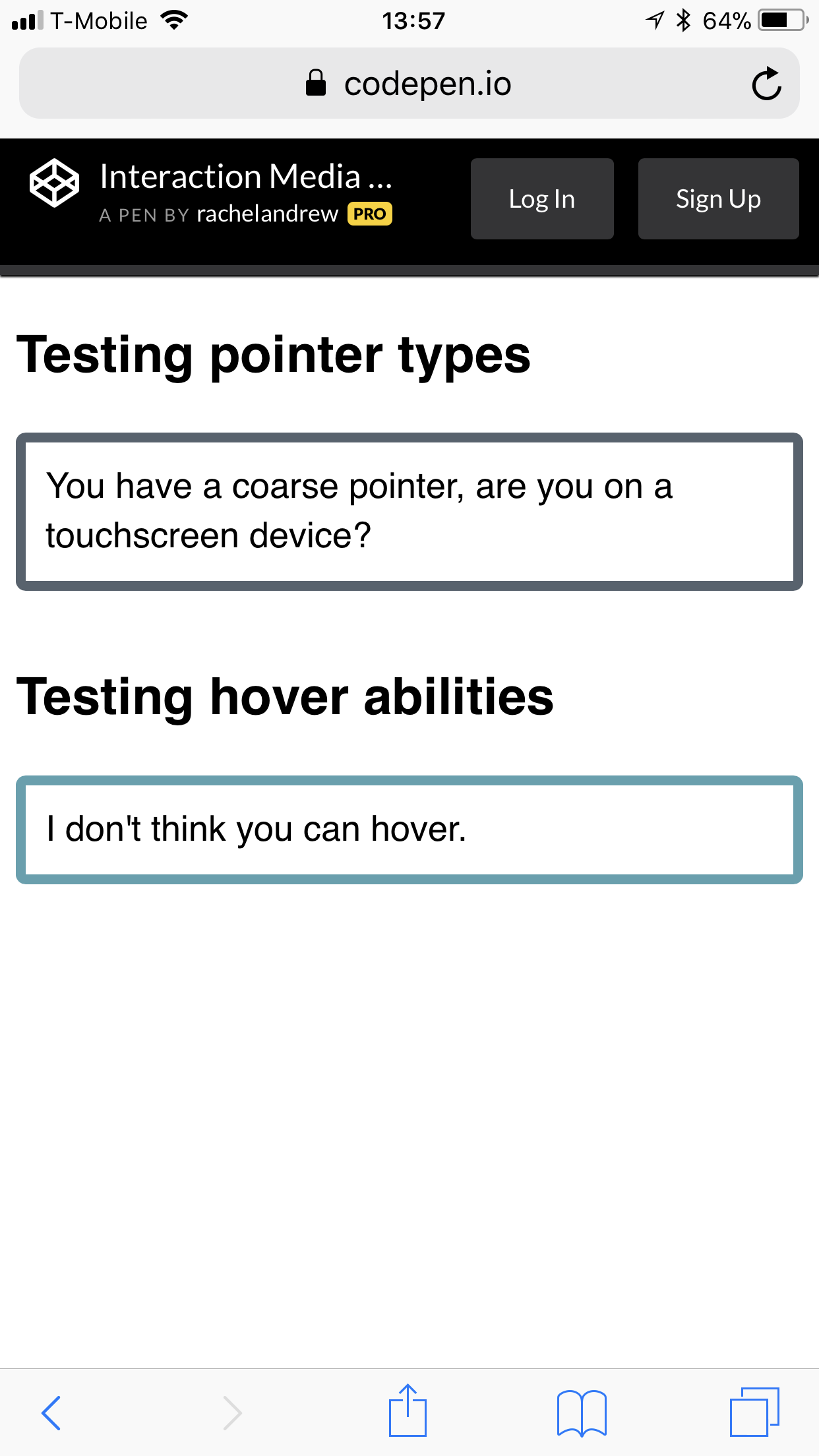
Testing cursor support and pointing status on the iPhone
Test it yourself in CodePen.
There are also the properties of any-pointer and any-hover , which checks all the available features of any tablet and smartphone to signs and guidance. Great care should be taken when using these properties, since switching users from the primary pointing device can result in poor UX. The specification reads as follows:
“Designing a page based on any-hover and any-pointer is likely to result in a bad UX, because the properties only indicate the last available input mechanism. However, authors can use these properties to determine the functionality they want to provide, based on any additional pointing devices available to the user. ”
Firefox - browser lagging behind the implementation of this functionality. Here is a link to this bug. Hopefully we will see full support soon.
Content Overflow and Display Quality Media Features
The overflow-block property that is not yet implemented, part of Display Quality Media Features , will allow you to test how the block behaves when content is full.
Media requests must be different when content overflows. The standard way to solve this problem for tablets and desktop is to add scrolling. But some devices, such as an electronic billboard, cannot overflow. We also have, Paged Media, if you print content ,.
There is another useful feature that will help determine on which device the content is displayed - overflow: block . For example, you want to check whether Paged Media is content.
@media (overflow-block: paged) { } Syntactic changes
Media queries are as we know them, quite voluminous in writing. Changing the syntax of media queries Level 4 will help with this. Often we use ranges, for example between 40em and 59em.
@media (min-width: 40em) and (max-width: 59em) { } We could write as a range in this form:
@media (40em <= width <= 59em ) { } In the second code example, we set the condition that the width must be greater than or equal to 40em, and also less than or equal to 59em. This is much simpler and shorter than the prefixes with the minimum and maximum widths of the first example. You can still use the old syntax. However, such a less voluminous alternative seems very useful.
Media queries are still a useful tool in our arsenal for creating adaptive grids. I saw how people were crawling out of skin with a CSS Grid to avoid using a couple of media queries, but there is no reason to avoid them. As I hope, I have demonstrated that there are new and useful features that will help us improve our user interfaces for more users. Here are some additional links, articles and presentations to learn more about this material. Some of them I used in the preparation of this article, others are useful for additional reading.
- 7 Habits of Highly Effective Media Queries , Brad Frost
- Vertical Media Queries and Wide Sites , Trent Walton
- Media Queries 4 , Florian Rivoal, dotCSS 2017 (video)
- "Interaction Media Features and Potential (for incorrect assumptions)" , Patrick H. Lauke, Dev.Opera
Source: https://habr.com/ru/post/349484/
All Articles