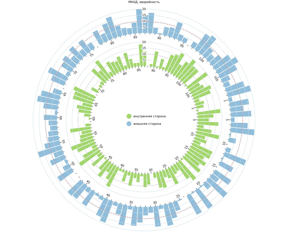
Ring bar graphs in stock

An evolutionary approach to solving problems is most appropriate for data visualization. Divide from simple to complex, from one-dimensional data to multidimensional iteration after iteration. In this article, we will look at various options for pie charts, from the simplest one-dimensional to non-standard self-made multidimensional. As a tool we will use D3.js. I ask all interested under cat.
Note: next to the Russian terms in parentheses will be given the English version.
Pie Bar
A ring, pie, or radial bar chart ( radial column / bar chart ) is a variation on the classic bar chart .
The circle as the x-axis (X) and the concentric circles as the coordinate lattice, here’s the actual distinguishing features of this kind of graph from the usual bar chart. It all looks like this.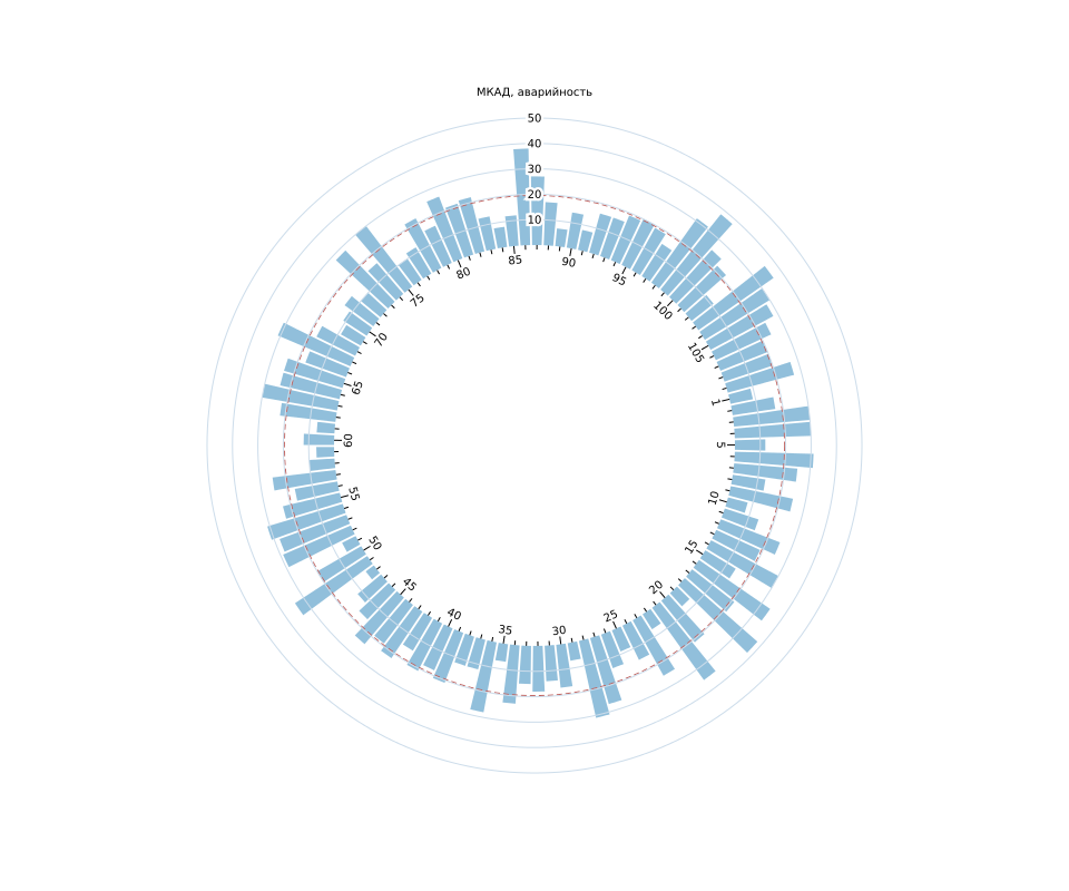
There is one nuance, namely what scale ( scale ) to use? The fact is that the farther from the center, the greater will be the length of the outer arc ( C = 2πR ) and the area of our sector ( S ~ πR 2 ). Therefore, we need to decide what is more important for us: to compensate for the different visual weight of our columns or to maintain the regularity of the grid.
For the first option, you can use the scale proposed by Mike Bostock:
(function(global, factory) { typeof exports === "object" && typeof module !== "undefined" ? factory(exports, require("d3-scale")) : typeof define === "function" && define.amd ? define(["exports", "d3-scale"], factory) : (factory(global.d3 = global.d3 || {}, global.d3)); }(this, function(exports, d3Scale) { 'use strict'; function square(x) { return x * x; } function radial() { var linear = d3Scale.scaleLinear(); function scale(x) { return Math.sqrt(linear(x)); } scale.domain = function(_) { return arguments.length ? (linear.domain(_), scale) : linear.domain(); }; scale.nice = function(count) { return (linear.nice(count), scale); }; scale.range = function(_) { return arguments.length ? (linear.range(_.map(square)), scale) : linear.range().map(Math.sqrt); }; scale.ticks = linear.ticks; scale.tickFormat = linear.tickFormat; return scale; } exports.scaleRadial = radial; Object.defineProperty(exports, '__esModule', {value: true}); })); For a regular grid, use the standard linear scale ( d3.scaleLinear() ). I used it in my examples.
Formulation of the problem
Some time ago I had a chance to talk with representatives of one of the divisions of the Moscow Department of Transport; they then suggested that I should think about the task of visualizing data on road accidents at the Moscow Ring Road. It was assumed that there is information about the place and time of the incident and the speed limit on the road section. It was necessary to check whether there is a connection between the speed limit and the number of accidents. Find spatial and temporal patterns (if they exist). The first problem is solved with the help of scatterplot and regression construction. The second one is much more creative, we are going to deal with it here.
Yes, I was never given any data, so the matter didn’t go further than a couple of sketches and discussions.
Hereinafter, we will display the “hypothetical” (random) number of accidents at the Moscow Ring Road during the reporting period. The abscissa axis is divided into kilometer cutoffs and rotated accordingly. The main purpose of visualization is to find potential spatial and temporal anomalies or patterns. Yes, it is necessary to preserve the “topology” of the road, that is, a looping. It is beautiful, and in this case is quite logical.
Two variables in one fell swoop
Since the traffic on the Moscow Ring Road is two-way, we need to display statistics in two directions at once. You can do this in different ways, consider them in more detail. All graphics are clickable and lead to the source code on bl.ocks.org . Each version of the digram is accompanied by a comment about its readability *. Some drawbacks of the graphs can be leveled with the help of the interactive: various hover effects, focusings, etc. ... But here we will consider the possibilities of the graphs only as static pictures.
* chart readability - a set of graph properties that determine the speed and completeness of perception of the information displayed on the chart.
Pie chart with grouping
Perhaps the first thing that comes to mind is to group the indicators.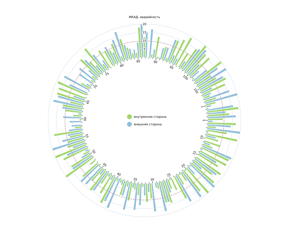
Readability:
It is quite difficult to assess the overall picture, because of the proximity of the columns, they are easy to compare, but it is difficult to evaluate two trends at once.
Two pie bar charts
Let's try to spread our roads and data in space.
Readability:
Here are just two graphics. Trends are easily tracked. Pairwise comparison also works, but worse. It happens, we treat one, cripple the other.
Pie Cumulative Bar Chart
Again, let's try to combine the indicators, now in the form of a cumulative chart.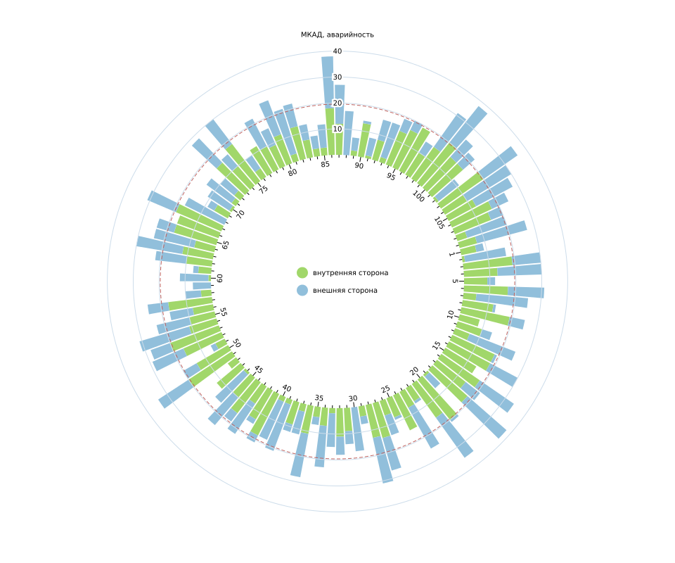
The option of the cumulative chart is quite possible. But cumulative diagrams are not for nothing called this, they are good when it is important for us to simultaneously see the indicator as a whole and its constituent parts. We have a slightly different situation. Also this type of graphics does not work on a large number of columns, and we have a lot of them. We get just a picture with a beautiful "fence".
Readability:
Pairwise comparison is, the total value is (although not necessary), but to trace the trend for the second indicator is very difficult because of the different initial level.
Pie Cumulative Divergent Bar Graph
Option cumulative charts with negative values. We do not have them, but it is important for us that the base of the columns is common. Change the sign of one of the columns, then create a cumulative diagram with an offset: stack.offset ([offset]) . As the offset function, we pass d3.stackOffsetDiverging .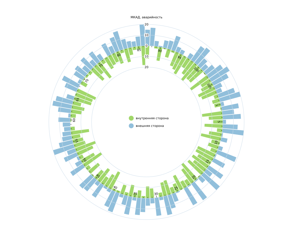
Readability:
Pairwise comparison is. The external trend is visible, internal, too, but worse. The picture as a whole is now there, although it is still not clearly visible.
Pie Cumulative Opposite Bar Graph
The name of the author, as actually the schedule (maybe I'm not a pioneer, but just bad looking). Here I decided to invert the previous version of the chart. It turned out that's what.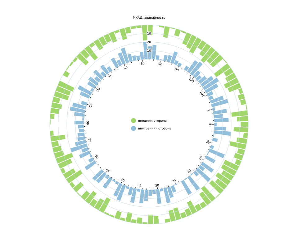
This chart is based on the principles of gestalt.
On the principle of closure: our eye is trying to close the "open" figures.

On the principle of the background-figure.

On the one hand, the smaller of the figures is perceived as the main graph, on the other, the convex graph prevails over the concave. This creates instability, but at the expense of color we can manage it.
From the point of view of the code, the fundamental difference in the eigenfunction of the shift, in this case, it looks like this:
function stackOffsetOpposing(series, order) { // Check if no staks (amount of series < 1) if (!((n = series.length) > 1)) return; // find max sum var stackSums = []; var stackMaxes = []; for (var i = 0, n = series.length; i < n; i++) { var stackMax = d3.max(series[i], function(d) { return Math.abs(d[1] - d[0])}); stackMaxes.push(stackMax); } var max = d3.sum(stackMaxes); // Redifining baselines for (var i, j = 0, d, dy, yp, yn, n, m = series[order[0]].length; j < m; ++j) { for (yp = 0, yn = max, i = 0; i < n; ++i) { if ((dy = (d = series[order[i]][j])[1] - d[0]) >= 0) { //d[0] -bottom; d[1] -top d[0] = yp, d[1] = yp += dy; } else if (dy < 0) { d[1] = yn; yn += dy; d[0] = yn; } else { d[0] = yp; } } } } Readability:
Pairwise comparison is. Both trends are visible. There is a picture in general.
Yes, the schedule remains cumulative, so you can add subcategories.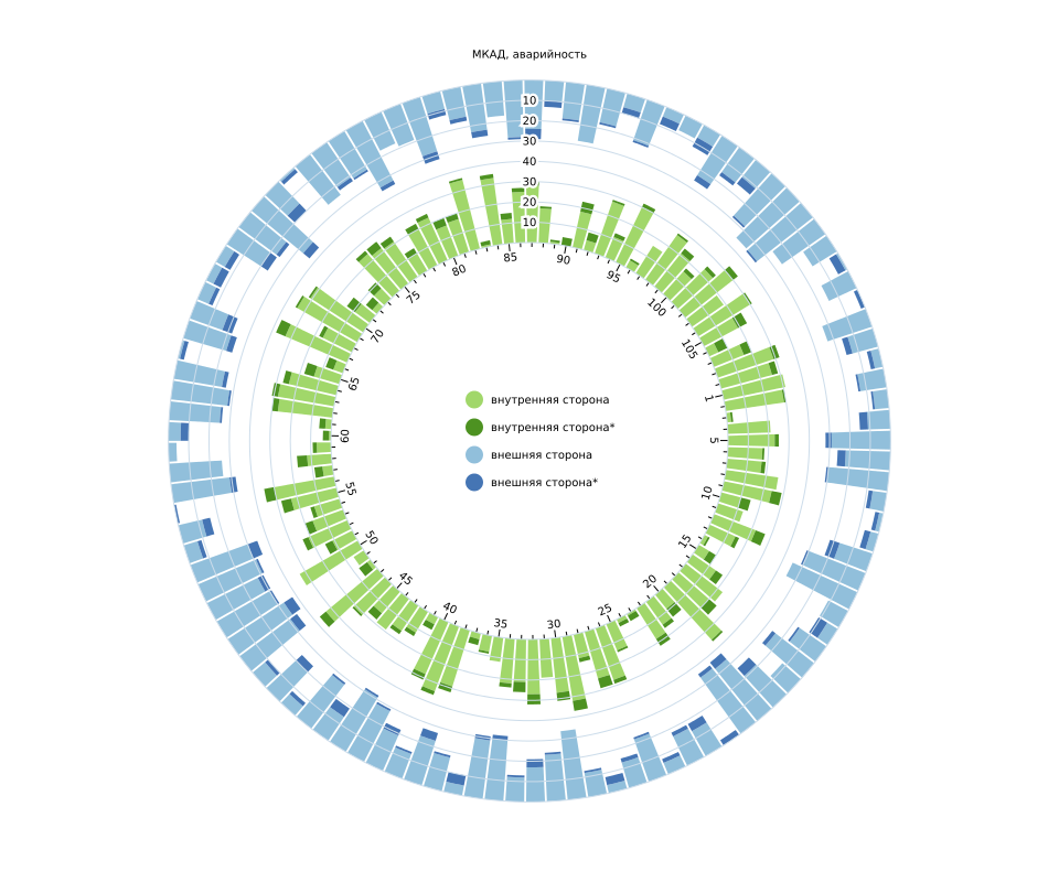
Benefits:
- well visible data in antiphase
- no need to look far, no context is lost
- both trends are visible
- total picture on the "empty" graphics
Temporary rings
By analogy with the annual rings of trees, you can add rings with data for different reporting periods. The main thing is not to overdo it and choose the right width of the rings. It may look like this.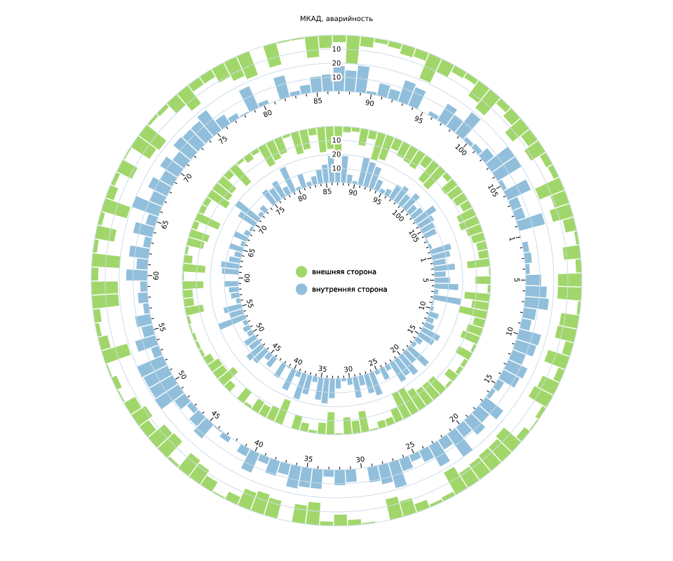
A good option for printing in large format, on the screen, in my opinion, looks pretty heavy.
Conclusion
We reviewed the various options for pie charts, their pros and cons. Despite the fact that this class of diagrams is far from being the best in terms of readability, it is good in terms of visual appeal. So if you attract the attention of the “beholder” more important to you than the speed of fishing useful information, then this option may be quite suitable. I hope the examples reviewed will be useful to you in real work. Yes, JS code does not meet modern standards, but it should be clear. In any case, these are only examples and preparations for real visualization.
And lastly
If there were real data, it would be possible to add an interactive one, screw the filtering, etc. ... And since there is none, and the tutorial article, we’ll dwell on it. But if suddenly someone (CTO, Yandex?) Provides a sample with real data, then it would be possible to continue the research.
And what type of schedule would you suggest? Write your own options in the comments =)
')
Source: https://habr.com/ru/post/349454/
All Articles
