As we did "narrative" - a new format of publications in Yandex. Dzen
For two years, Yandex.Dzen learned to solve the problem of personalized content recommendations. Now Zen is not only an aggregator of articles and videos from third-party Internet resources, but also a content platform. In the summer of 2017, the publishers platform was launched, on which everyone can create publications, and upon reaching 7000 inspections - earn money from it. You can read about the monetization system and other features of the platform in Zen magazine .
Articles and videos are traditional types of content. In order to attract authors to the platform and give them new tools to increase the audience, Zen decided to go beyond the usual formats. One of the new formats was the narrative. This is a set of cards, united by a common theme. Internet users are less and less read, but still want to get interesting stories (so they, for example, watch TV shows, short videos and live broadcasts). We created a format that helps authors tell consecutive short stories and entertain readers.
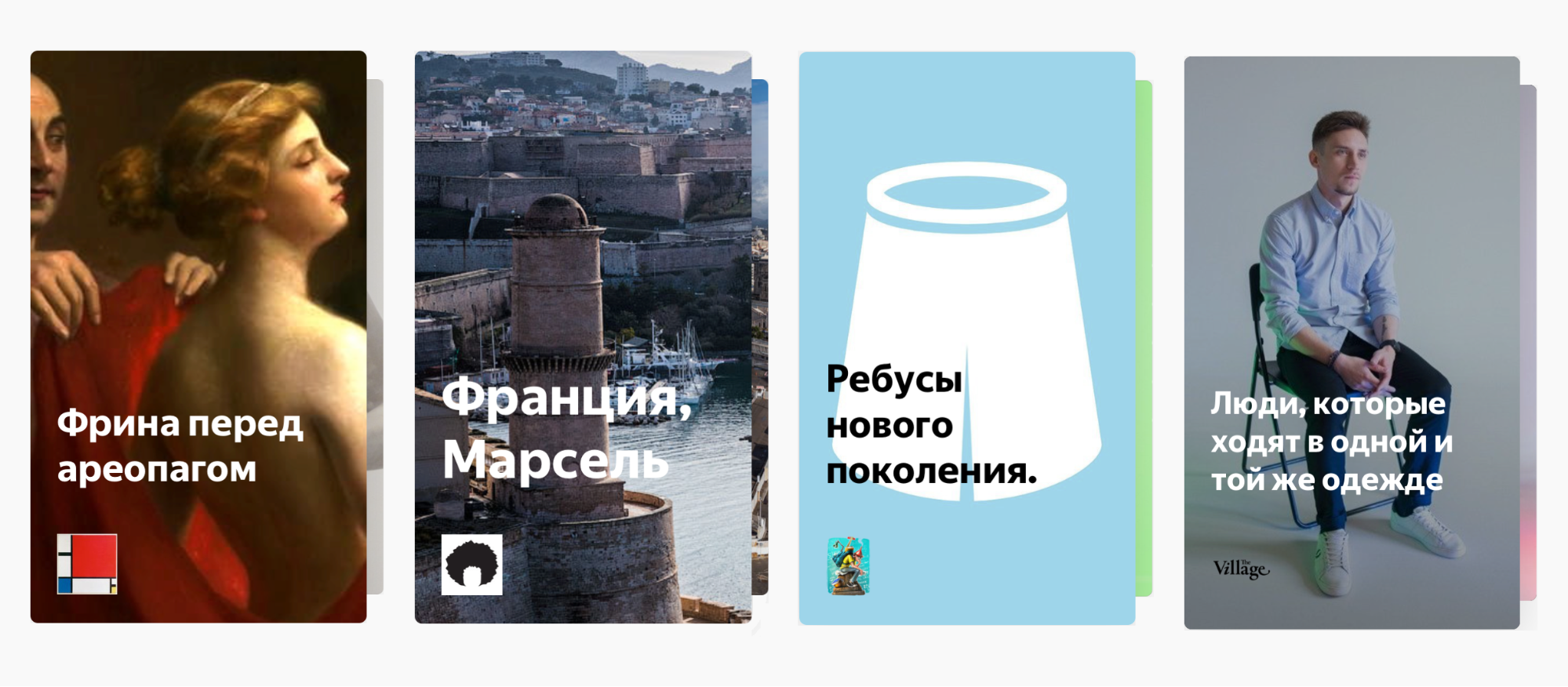
The card can contain text, links, images, video and GIF-animation. A narrative can tell a story, give step-by-step instructions or a recipe, publish a list of useful books, describe the advantages and disadvantages of budget management approaches. This is a format for authors who create interesting content, but do not write long texts.
Basically, the format is focused on mobile phones, as people often consume information and entertainment content from mobile devices. We added restrictions: the format should be capacious, but short, so the number of narrative cards is not infinite. Each card contains a maximum of one video and one link, it allows you to keep the story consistently, without overloading the reader’s attention. An interested person can go from the narrative to the author's site, read the expanded version of the material, but the content of the narrative should be enough to sort out the topic.
')

The closest analogue of narratives, stories on Instagram, is limited in time and shows only 24 hours. This affects the content: the materials may not be related to a common theme, they are not informative, they are focused on social interaction and getting reactions from familiar people. Despite the fact that we like stories, this format does not suit Zen. Our publications are shown much longer and are recommended to the audience, often not belonging to one social or geographical group. We built a format that combines the ease of microformat with the involvement and plot of the longrides.
To enable users to create diverse and unique narratives, we needed to provide them with a special editor with tools for building and styling content — like presentation software. The editor had to tell the authors how to make the presentation visually appealing, report on format restrictions, and be easy to use. Therefore, we added a view mode where the narrative is presented in the way that the readers will see it. We did not limit the authors to the patterns of the arrangement of elements: all elements on the narrative card can be arbitrarily arranged. In addition, we have developed a system of layers, which allows you to control the imposition of elements on each other.

In the process of creating the editor, we are faced with a number of interesting technical problems. This article is about how we solved them.
The technological base consisted of React (for the editor), preact (for display), Redux, Draft.js (for text blocks), and flowtype. The state is stored in a normalized form (see normalizr), which made it possible to quickly produce the most frequent operation - updating the properties of elements on the card. For other actions (such as swapping cards, adding and removing blocks, etc.), the normalized state also shows better performance than regular data storage in the form of a tree of objects.
The first task was to create an adaptive card that preserves the composition at any size. On mobile platforms, the card tends to occupy the maximum area based on the aspect ratio, so its dimensions can vary greatly from device to device.
Consequently:
Consider ways to implement these requirements.
At first, I wanted to use pure CSS. And indeed, the network describes several ways that allow you to do this:
Thus, the solution on pure CSS had to be abandoned, and as a result, the solution on JS was used, which turned out to be much more compact and understandable than the solution on CSS:
It does not give a noticeable minus in the speed of rendering, there is a potential for acceleration. For example, you can remove the alignment from the main JS bundle and execute it immediately after the HTML code of the cards. Then the cards will be immediately displayed in the correct sizes.

To proportionally resize text elements within a slide, we did the following:
Thus, setting the font size in em leads to an automatic recalculation of the font size of the elements.
To save the composition, the introduction of a relative coordinate system is best. Thanks to the web platform, such a system is already there - this is the task of the size and location of the blocks in percent! Indeed, whatever the size of the card in pixels, the size and location of objects, given in percent, allow them to change proportionally.
It turns out that we have introduced a new coordinate system (“card”) within each card with a visible area from 0 to 100% on each of the axes. Now we need to learn how to recalculate all pixel dimensions as percentages. This will be needed when we will:
Now, having a "card" coordinate system, you can place blocks on a card, without worrying that their relative position will be distorted when the card is resized.
Each block has a geometry property that describes the size and location of the block:
If you add a block with a fixed aspect ratio (for example, a picture or video), the problem arises of recalculating the dimensions from the pixel coordinate system to the “card” one.
For example, when adding a picture to a slide, the default is 90 percent width of an element in the “card” coordinate system. Knowing the original dimensions of the image (Image.naturalWidth and Image.naturalHeight), the dimensions of the “card pixel” and the width of the image in the new coordinates, it is necessary to calculate the height (also in the new coordinates). Having resorted to the knowledge of higher arithmetic, we derived the calculation function in the "card" coordinate system. For example, you can calculate the height of the image:
Here natural is the size of the image in px, container is the size of the slide in px, relativeWidth is the size of the image on the slide in percent.

When we mastered transfers to the “card” coordinate system, it became easy to realize the movement of an object. The code that is responsible for this is something like this:
In any decent visual editor, you can resize the object by dragging the “squares” located at the corners of its borders. We also had to implement this opportunity.

It was not so easy to write a compact and clear code that handles the resizing of an object depending on the angle the user pulls. Before “cycling” our decision, we conducted a review of how this is done in popular libraries. For example, the code in jQuery UI looks like this:
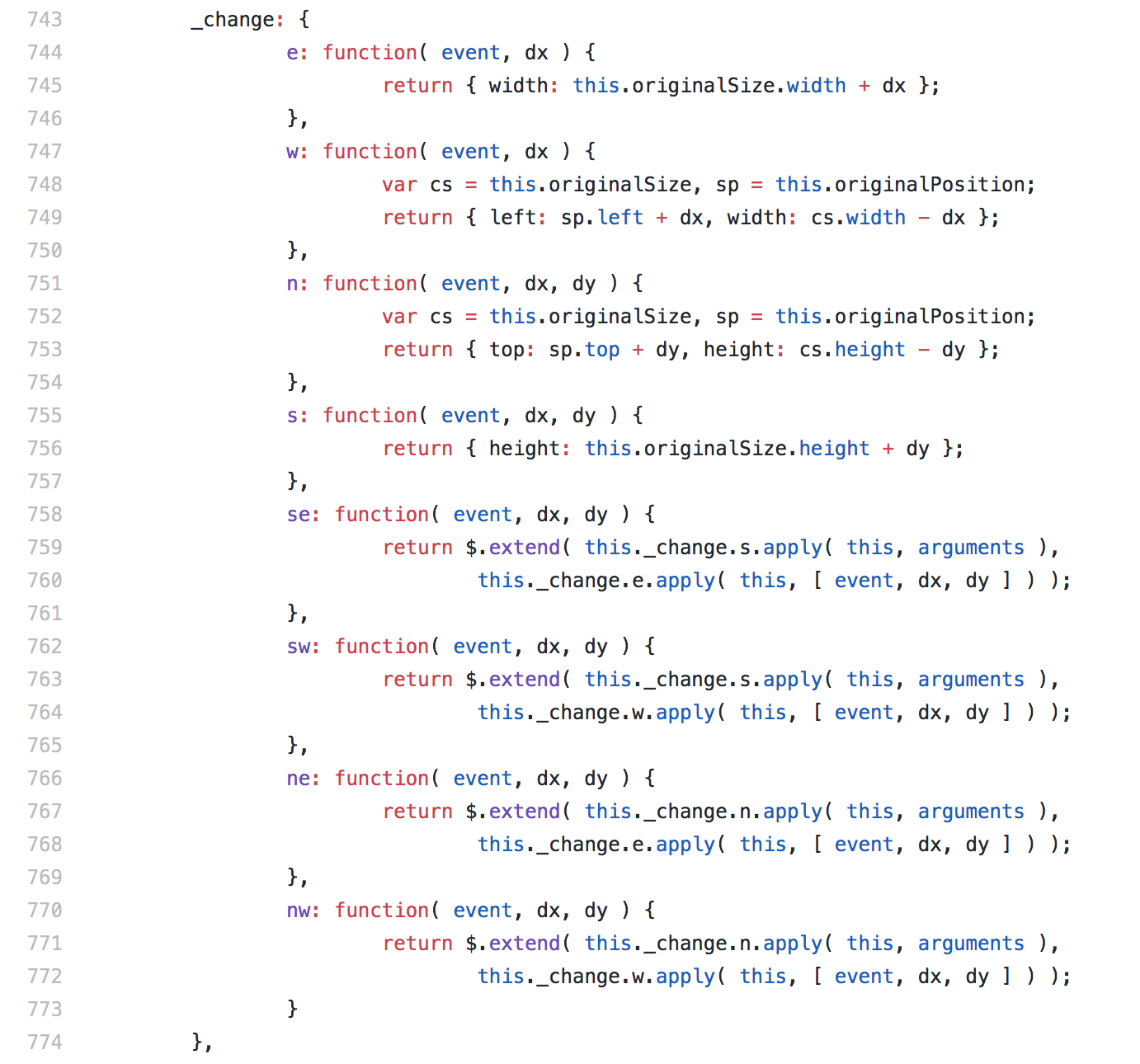
The code looks compact, but it is not easy to understand: functions are not “clean”, a large number of internal methods of the class and its properties are used, the context of the function execution is important (see apply).
In our project, about the same code is written as follows . Here the minimum size of the object and the optional restriction on the preservation of the aspect ratio (preserveAspectRatio) are also taken into account - this is important when resizing the video or image.
Our code can not be called compact, but the function turned out to be “clean”, and the structure of the solution itself is rectilinear.
It would be great if you, dear readers, offered a version of the code that solves this problem. I admit that there is a certain regularity, after understanding which the code becomes super-short and understandable.
After a more or less extensive testing of the narrative began, we were surprised to find that in some cases the same text with the same font, size, and other attributes has a different number of lines on different platforms!
For example, in Safari, when creating a narrative, a text block had 4 lines, but when viewing it in Chrome on Android, 3 lines were shown. We have not figured out the exact reason for this behavior and blamed it on the features of text rendering engines on various platforms.
We solved the problem by splitting text blocks into lines before publication. And here, too, was an interesting place. The first approach to defining strings was to wrap each character in a <span> and determine its position using getBoundingClientRect. It worked quickly, and we didn’t notice for quite a long time the problem that this approach gave rise to. Guess what problem is it?
It turned out that many fonts, including Yandex Sans Text , contain optimizations of the display of intersymbol distance for certain combinations of characters (kerning).

If each character is wrapped in a <span>, this optimization does not work! It turns out that a string with the specified combinations, but without <span> tags around each character (that is, what the editor user sees it) may be shorter than with tags.
This problem can be quickly resolved with the ancient CSS property of font-kerning: none, which simply disables these optimizations. Most likely, most people viewing a narrative will not notice anything.
But there must be a way to make everything beautiful! And we found a solution in using the same ancient, but very useful Range API, which can provide information similar to getBoundingClientRect () for a given range of text selection. Now we are working on this decision, and we hope that in the near future it will go to production.
Many authors used translucent images to increase the contrast of the font placed on top of the photo. Others wrote to us with requests to add the corresponding function to the editor itself.
Our designer, Anya, was surprised by the development of the choice of the most difficult version of the substrate geometry. In addition to combining lines of similar length in one rectangle, the idea was to use the middle of a lowercase letter without detail elements (for example, “a” or “o”) as the axis of symmetry. Such an implementation creates an enhanced “cartoonish” effect of the resulting figures - they resemble speech bubbles in comics.
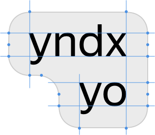

We had to draw the figures manually, using the dimensions of the lines calculated at the last stage. They are implemented as closed svg-paths consisting of arcs of circles of the same radius and straight lines.
Since none of the known technologies was suitable for solving the problem, we wrote our svg curve drawing algorithm, which is used for the cover.
Narrative is a new format, and it needs to be developed. For better engagement in history, we will increase the area of the narrative card, add graphic elements and animations, support the use of gestures and the possibility of a seamless continuation of viewing similar narratives.
Readers appreciate the quality of publications. To make publishing better, we will tell the authors what the audience likes. Some authors have already shared their observations and ways of creating good narratives.
From a technical point of view, there are unresolved problems and room for optimization. For example, in some embedded browsers on Android (usually in browsers from the vendor itself), when the system font is increased, setting the font size on a web page not below a certain threshold is forced. In the case of a narrative, this, of course, breaks the composition.
A native implementation of the narrative viewer on iOS and Android is planned, so we are exploring the possibility of simplifying the creation of such viewers. It seems to us that one of the interesting ways is the “screenshots” of individual elements on the slide. They would allow not to think about the correct font size: pictures, unlike text, vary very naturally in size due to the percentage "card" coordinate system. In addition, we don’t need to load the Yandex font at all, it will not be necessary to drag the rather intricate algorithm for rendering the text substrate, etc.
Finally, we plan to transfer video from streams (initially there was a good infrastructure for streaming video) to regular MP4 / WebM files: with short videos, this approach shows better compatibility and speed.
The article was prepared by Yandex.Dzena staff: Dmitry Dushkin and Vasily Gorbunov wrote about the frontend, Uliana Salo - about the design.
Articles and videos are traditional types of content. In order to attract authors to the platform and give them new tools to increase the audience, Zen decided to go beyond the usual formats. One of the new formats was the narrative. This is a set of cards, united by a common theme. Internet users are less and less read, but still want to get interesting stories (so they, for example, watch TV shows, short videos and live broadcasts). We created a format that helps authors tell consecutive short stories and entertain readers.
Narratives of publishers and authors
The card can contain text, links, images, video and GIF-animation. A narrative can tell a story, give step-by-step instructions or a recipe, publish a list of useful books, describe the advantages and disadvantages of budget management approaches. This is a format for authors who create interesting content, but do not write long texts.
Basically, the format is focused on mobile phones, as people often consume information and entertainment content from mobile devices. We added restrictions: the format should be capacious, but short, so the number of narrative cards is not infinite. Each card contains a maximum of one video and one link, it allows you to keep the story consistently, without overloading the reader’s attention. An interested person can go from the narrative to the author's site, read the expanded version of the material, but the content of the narrative should be enough to sort out the topic.
')
Example: narrative about narrative
The closest analogue of narratives, stories on Instagram, is limited in time and shows only 24 hours. This affects the content: the materials may not be related to a common theme, they are not informative, they are focused on social interaction and getting reactions from familiar people. Despite the fact that we like stories, this format does not suit Zen. Our publications are shown much longer and are recommended to the audience, often not belonging to one social or geographical group. We built a format that combines the ease of microformat with the involvement and plot of the longrides.
To enable users to create diverse and unique narratives, we needed to provide them with a special editor with tools for building and styling content — like presentation software. The editor had to tell the authors how to make the presentation visually appealing, report on format restrictions, and be easy to use. Therefore, we added a view mode where the narrative is presented in the way that the readers will see it. We did not limit the authors to the patterns of the arrangement of elements: all elements on the narrative card can be arbitrarily arranged. In addition, we have developed a system of layers, which allows you to control the imposition of elements on each other.
Narrative editor
In the process of creating the editor, we are faced with a number of interesting technical problems. This article is about how we solved them.
Stack used
The technological base consisted of React (for the editor), preact (for display), Redux, Draft.js (for text blocks), and flowtype. The state is stored in a normalized form (see normalizr), which made it possible to quickly produce the most frequent operation - updating the properties of elements on the card. For other actions (such as swapping cards, adding and removing blocks, etc.), the normalized state also shows better performance than regular data storage in the form of a tree of objects.
We make the card and blocks on the card responsive
The first task was to create an adaptive card that preserves the composition at any size. On mobile platforms, the card tends to occupy the maximum area based on the aspect ratio, so its dimensions can vary greatly from device to device.
Consequently:
- The card retains the specified aspect ratio (we chose 44:75) for any screen size.
- The text on the card also keeps the same relative space occupied at any card size. That is, the font size should be proportional to the size of the card.
- Blocks retain relative sizes and location for any card size.
Consider ways to implement these requirements.
How to keep the card aspect ratio?
At first, I wanted to use pure CSS. And indeed, the network describes several ways that allow you to do this:
- Dimensioning through padding using the padding property specified in percent, since the relative value of the block width is taken. This method did not fit, since it does not allow to “enter” the card into the screen. In other words, if the height of the card exceeds the height of the screen, the card will not decrease in height, keeping its proportions.
- Dimensioning by combining the height, width, max-height and max-width specified in vh and vw allows you to achieve the desired effect. However, the method is limited by the size of the screen. In other words, when embedding cards in the layout, where the card will not occupy the whole screen (for example, in the editor), the aspect ratio will not be maintained.
Thus, the solution on pure CSS had to be abandoned, and as a result, the solution on JS was used, which turned out to be much more compact and understandable than the solution on CSS:
// @flow type Size = { width: number, height: number }; function getFittedSlideSize(container: Size, target: Size): Size { const targetAspectRatio = target.width / target.height; const containerAspectRatio = container.width / container.height; // if aspect ratio of target is "wider" then target's aspect ratio const fit = targetAspectRatio > containerAspectRatio ? 'width' // fit by width, so target's width = container's width : 'height'; // fit by height, so target's height = container's height return { width: fit === 'width' ? containerWidth : Math.round(containerHeight * ( target.width / target.height)), height: fit === 'height' ? containerHeight : Math.round(containerWidth * (target.height / target.width)), }; } It does not give a noticeable minus in the speed of rendering, there is a potential for acceleration. For example, you can remove the alignment from the main JS bundle and execute it immediately after the HTML code of the cards. Then the cards will be immediately displayed in the correct sizes.
The proportions of the card are saved on any screen.
How to keep relative sizes of text elements?
To proportionally resize text elements within a slide, we did the following:
- All dimensions in text elements are given in em.
- For a slide, the font size is set in px and calculated in the proportion obtained from the following positions:
- Let the base width of the slide (BASE_WIDTH) be 320px.
- Let the base font size (BASE_FONT_SIZE) be equal to 16px for the base width of the slide.
- Then when you change the size of the slide, the new font size is calculated as follows:
const relativeFontSize = (BASE_FONT_SIZE * slideSize.width) / BASE_WIDTH;
Thus, setting the font size in em leads to an automatic recalculation of the font size of the elements.
How to make objects on the card keep their location and relative sizes?
To save the composition, the introduction of a relative coordinate system is best. Thanks to the web platform, such a system is already there - this is the task of the size and location of the blocks in percent! Indeed, whatever the size of the card in pixels, the size and location of objects, given in percent, allow them to change proportionally.
It turns out that we have introduced a new coordinate system (“card”) within each card with a visible area from 0 to 100% on each of the axes. Now we need to learn how to recalculate all pixel dimensions as percentages. This will be needed when we will:
- Consider the size of objects, based on the knowledge of what are the sizes on one axis, and the original size. For example, if we insert an image on a slide, we set the default 90 percent width and must calculate the height in percent.
- Move objects on the card.
- Change their size.
Initializing objects with unknown dimensions
Now, having a "card" coordinate system, you can place blocks on a card, without worrying that their relative position will be distorted when the card is resized.
Each block has a geometry property that describes the size and location of the block:
{ geometry: { x: number, y: number, width: number, height?: number } } If you add a block with a fixed aspect ratio (for example, a picture or video), the problem arises of recalculating the dimensions from the pixel coordinate system to the “card” one.
For example, when adding a picture to a slide, the default is 90 percent width of an element in the “card” coordinate system. Knowing the original dimensions of the image (Image.naturalWidth and Image.naturalHeight), the dimensions of the “card pixel” and the width of the image in the new coordinates, it is necessary to calculate the height (also in the new coordinates). Having resorted to the knowledge of higher arithmetic, we derived the calculation function in the "card" coordinate system. For example, you can calculate the height of the image:
function getRelativeHeight(natural: Size, container: Size, relativeWidth: number) { return (natural.height / natural.width) * (container.width / container.height) * relativeWidth; } Here natural is the size of the image in px, container is the size of the slide in px, relativeWidth is the size of the image on the slide in percent.
Moving objects
When we mastered transfers to the “card” coordinate system, it became easy to realize the movement of an object. The code that is responsible for this is something like this:
type Size = {width: number, height: number}; type Position = {x: number, y: number}; class NarrativeEditorElement extends React.Component { // ... handleUpdatePosition = (e) => { // slide - DOM-, const {slide} = this.props; if (!this.state.isMoving) { // this.ref — DOM- (, ..) this.initialOffsetLeft = this.ref.offsetLeft; this.initialOffsetTop = this.ref.offsetTop; } const relativePosition = getRelative( {width: slide.offsetWidth, height: slide.offsetHeight}, {x: this.initialOffsetLeft + e.deltaX, y: this.initialOffsetTop + e.deltaY}, ); this.setState({ geometry: { ...this.state.geometry, x: relativePosition.x, y: relativePosition.y, }, isMoving: true, }); } // ... } function getRelative(slideSize: Size, position: Position) { return { x: 100 * position.x / slideSize.width, y: 100 * position.y / slideSize.height, }; } 4-point resizing
In any decent visual editor, you can resize the object by dragging the “squares” located at the corners of its borders. We also had to implement this opportunity.
It was not so easy to write a compact and clear code that handles the resizing of an object depending on the angle the user pulls. Before “cycling” our decision, we conducted a review of how this is done in popular libraries. For example, the code in jQuery UI looks like this:
The code looks compact, but it is not easy to understand: functions are not “clean”, a large number of internal methods of the class and its properties are used, the context of the function execution is important (see apply).
In our project, about the same code is written as follows . Here the minimum size of the object and the optional restriction on the preservation of the aspect ratio (preserveAspectRatio) are also taken into account - this is important when resizing the video or image.
Our code can not be called compact, but the function turned out to be “clean”, and the structure of the solution itself is rectilinear.
It would be great if you, dear readers, offered a version of the code that solves this problem. I admit that there is a certain regularity, after understanding which the code becomes super-short and understandable.
The problem of inconsistent text rendering on different platforms
After a more or less extensive testing of the narrative began, we were surprised to find that in some cases the same text with the same font, size, and other attributes has a different number of lines on different platforms!
For example, in Safari, when creating a narrative, a text block had 4 lines, but when viewing it in Chrome on Android, 3 lines were shown. We have not figured out the exact reason for this behavior and blamed it on the features of text rendering engines on various platforms.
We solved the problem by splitting text blocks into lines before publication. And here, too, was an interesting place. The first approach to defining strings was to wrap each character in a <span> and determine its position using getBoundingClientRect. It worked quickly, and we didn’t notice for quite a long time the problem that this approach gave rise to. Guess what problem is it?
It turned out that many fonts, including Yandex Sans Text , contain optimizations of the display of intersymbol distance for certain combinations of characters (kerning).
The font-kerning CSS property is set in the right column: none
If each character is wrapped in a <span>, this optimization does not work! It turns out that a string with the specified combinations, but without <span> tags around each character (that is, what the editor user sees it) may be shorter than with tags.
This problem can be quickly resolved with the ancient CSS property of font-kerning: none, which simply disables these optimizations. Most likely, most people viewing a narrative will not notice anything.
But there must be a way to make everything beautiful! And we found a solution in using the same ancient, but very useful Range API, which can provide information similar to getBoundingClientRect () for a given range of text selection. Now we are working on this decision, and we hope that in the near future it will go to production.
Difficult substrate under text elements
Many authors used translucent images to increase the contrast of the font placed on top of the photo. Others wrote to us with requests to add the corresponding function to the editor itself.
Our designer, Anya, was surprised by the development of the choice of the most difficult version of the substrate geometry. In addition to combining lines of similar length in one rectangle, the idea was to use the middle of a lowercase letter without detail elements (for example, “a” or “o”) as the axis of symmetry. Such an implementation creates an enhanced “cartoonish” effect of the resulting figures - they resemble speech bubbles in comics.
Algorithm and implementation of the substrate
We had to draw the figures manually, using the dimensions of the lines calculated at the last stage. They are implemented as closed svg-paths consisting of arcs of circles of the same radius and straight lines.
Since none of the known technologies was suitable for solving the problem, we wrote our svg curve drawing algorithm, which is used for the cover.
Conclusion
Narrative is a new format, and it needs to be developed. For better engagement in history, we will increase the area of the narrative card, add graphic elements and animations, support the use of gestures and the possibility of a seamless continuation of viewing similar narratives.
Readers appreciate the quality of publications. To make publishing better, we will tell the authors what the audience likes. Some authors have already shared their observations and ways of creating good narratives.
From a technical point of view, there are unresolved problems and room for optimization. For example, in some embedded browsers on Android (usually in browsers from the vendor itself), when the system font is increased, setting the font size on a web page not below a certain threshold is forced. In the case of a narrative, this, of course, breaks the composition.
A native implementation of the narrative viewer on iOS and Android is planned, so we are exploring the possibility of simplifying the creation of such viewers. It seems to us that one of the interesting ways is the “screenshots” of individual elements on the slide. They would allow not to think about the correct font size: pictures, unlike text, vary very naturally in size due to the percentage "card" coordinate system. In addition, we don’t need to load the Yandex font at all, it will not be necessary to drag the rather intricate algorithm for rendering the text substrate, etc.
Finally, we plan to transfer video from streams (initially there was a good infrastructure for streaming video) to regular MP4 / WebM files: with short videos, this approach shows better compatibility and speed.
The article was prepared by Yandex.Dzena staff: Dmitry Dushkin and Vasily Gorbunov wrote about the frontend, Uliana Salo - about the design.
Source: https://habr.com/ru/post/349220/
All Articles