Autoencoder in the tasks of political event clustering
I do not like to read articles, watch demo and code
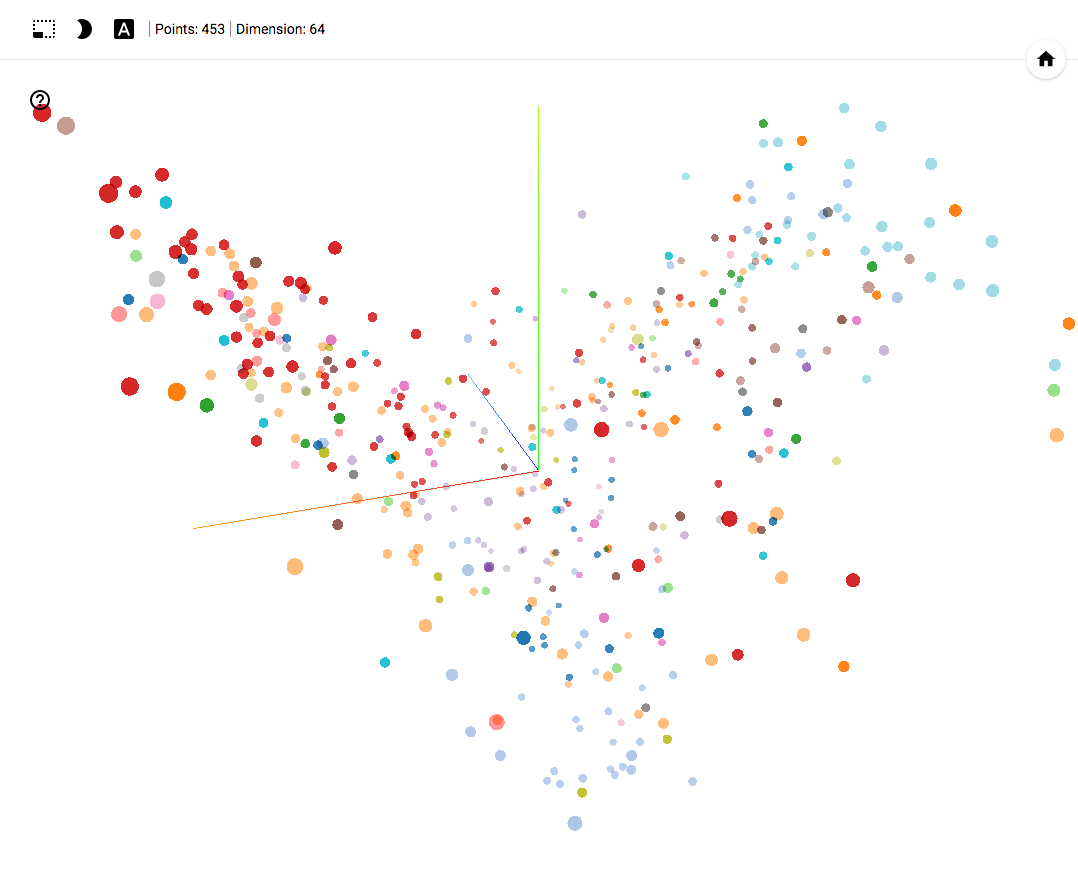
TensorBoard Projector demo
GitHub project
- Works in Chrome .
- Open and click on Bookmarks in the lower right corner.
- In the upper right corner we can filter the classes.
- At the end of the article there are GIF images with examples of use.
GitHub project
Digression from the topic
In this article, we will talk about machine learning tools , approaches and practical solutions. The analysis is carried out on the basis of political events, which is not the subject of discussion of this article. Please do not raise the topic of politics in the comments to this article.
For several years in a row, machine learning algorithms have been used in various fields. Analytics of various political events, such as forecasting voting results, developing clustering mechanisms for decisions, analyzing the activities of political actors, can also become one of such areas. In this article I will try to share the result of one of the studies in this area.
Formulation of the problem
Modern machine learning tools allow you to transform and visualize a large amount of data. This fact made it possible to analyze the activities of political parties by transforming votes for 4 years into a self-organizing space of points reflecting the behavior of each of the deputies.
')
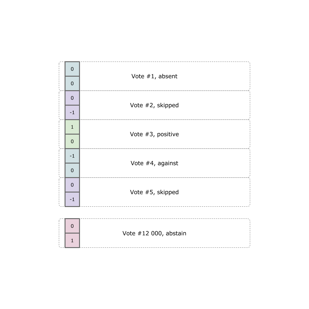
Each politician expressed himself in fact twelve thousand votes. Each vote can take one of five options (did not come to the hall, came but missed the vote, voted “for”, “against” or abstained).
Our task is to transform all the voting results into a point in the three-dimensional Euclidean space reflecting a certain weighted position.
Open data
All initial data were obtained on the official website , and then transformed into data for the neural network.
Autoencoder
As was seen from the statement of the problem, it is necessary to represent twelve thousand votes in the form of a vector of dimension 2 or 3. A person can operate with categories of 2-dimensional and 3-dimensional spaces, it is extremely difficult for a person to work with a larger number of spaces.
To reduce the bit we will use autoencoder.
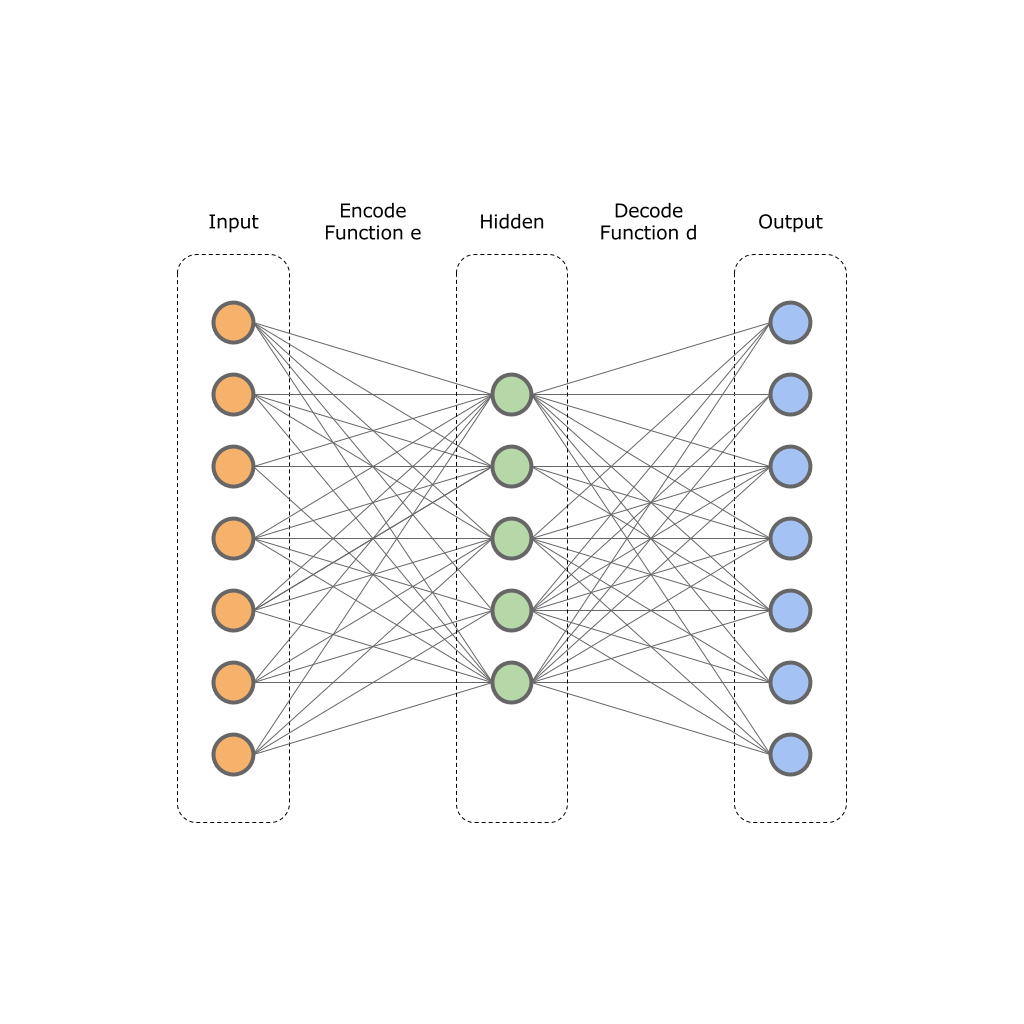
The basis of autoencoders is based on the principle of two functions:
 - Encoder function;
 - decoder function;
The input of such a network is the original vector
 dimension
  and the neural network transforms it into a hidden layer value
  dimension
  . Next, the neural network decoder transforms the value of the hidden layer in the output vector
  dimension , wherein
  . That is, the hidden layer will result in a smaller dimension, but at the same time it will be able to reflect the entire set of source data.
For network training, the target error function is used:

In other words, we minimize the difference between the values of the input and output layers. The trained neural network allows you to compress the dimension of the original data to a certain dimension
on a hidden layer .This image shows one input, one hidden and one output layer. In practice, these layers may be more.
I tried to tell the theory, let's move on to practice.
Our data is already collected in JSON format from the official site, and encoded into a vector.
Now we have a dataset of 24000 x 453 dimension. We create a neural network using TensorFlow:
# Building the encoder def encoder(x): with tf.variable_scope('encoder', reuse=False): with tf.variable_scope('layer_1', reuse=False): w1 = tf.Variable(tf.random_normal([num_input, num_hidden_1]), name="w1") b1 = tf.Variable(tf.random_normal([num_hidden_1]), name="b1") # Encoder Hidden layer with sigmoid activation #1 layer_1 = tf.nn.sigmoid(tf.add(tf.matmul(x, w1), b1)) with tf.variable_scope('layer_2', reuse=False): w2 = tf.Variable(tf.random_normal([num_hidden_1, num_hidden_2]), name="w2") b2 = tf.Variable(tf.random_normal([num_hidden_2]), name="b2") # Encoder Hidden layer with sigmoid activation #2 layer_2 = tf.nn.sigmoid(tf.add(tf.matmul(layer_1, w2), b2)) with tf.variable_scope('layer_3', reuse=False): w2 = tf.Variable(tf.random_normal([num_hidden_2, num_hidden_3]), name="w2") b2 = tf.Variable(tf.random_normal([num_hidden_3]), name="b2") # Encoder Hidden layer with sigmoid activation #2 layer_3 = tf.nn.sigmoid(tf.add(tf.matmul(layer_2, w2), b2)) return layer_3 # Building the decoder def decoder(x): with tf.variable_scope('decoder', reuse=False): with tf.variable_scope('layer_1', reuse=False): w1 = tf.Variable(tf.random_normal([num_hidden_3, num_hidden_2]), name="w1") b1 = tf.Variable(tf.random_normal([num_hidden_2]), name="b1") # Decoder Hidden layer with sigmoid activation #1 layer_1 = tf.nn.sigmoid(tf.add(tf.matmul(x, w1), b1)) with tf.variable_scope('layer_2', reuse=False): w1 = tf.Variable(tf.random_normal([num_hidden_2, num_hidden_1]), name="w1") b1 = tf.Variable(tf.random_normal([num_hidden_1]), name="b1") # Decoder Hidden layer with sigmoid activation #1 layer_2 = tf.nn.sigmoid(tf.add(tf.matmul(layer_1, w1), b1)) with tf.variable_scope('layer_3', reuse=False): w2 = tf.Variable(tf.random_normal([num_hidden_1, num_input]), name="w2") b2 = tf.Variable(tf.random_normal([num_input]), name="2") # Decoder Hidden layer with sigmoid activation #2 layer_3 = tf.nn.sigmoid(tf.add(tf.matmul(layer_2, w2), b2)) return layer_3 # Construct model encoder_op = encoder(X) decoder_op = decoder(encoder_op) # Prediction y_pred = decoder_op # Targets (Labels) are the input data. y_true = X # Define loss and optimizer, minimize the squared error loss = tf.reduce_mean(tf.pow(y_true - y_pred, 2)) tf.summary.scalar("loss", loss) optimizer = tf.train.RMSPropOptimizer(learning_rate).minimize(loss) Full listing autoencoder.
The network will be trained by the RMSProb optimizer in 0.01 increments.
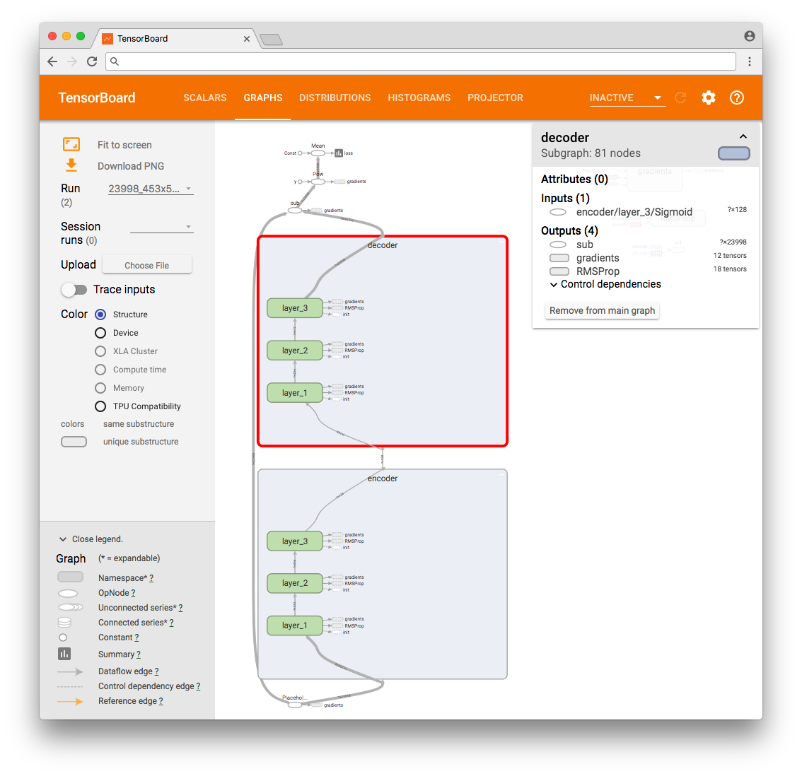
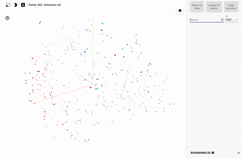
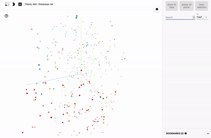
As a result, we can see the TensorFlow operations graph.
For an additional test, select the first four vectors and interpret their values at the network input and output as a picture. This way we can visually see that the values of the output layer are “identical” (with an error) to the values of the input layer.

Original input.
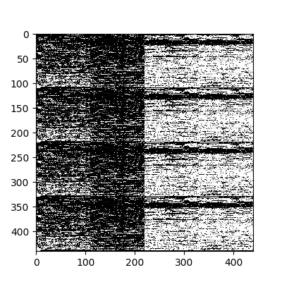
The values of the output layer of the neural network.
Afterwards, we consistently transfer all our original data to the network, retrieving the values of the hidden layer. These values will be our desired compressed data.
By the way, I tried to select different layers and chose the configuration that allowed us to get closer to the minimum error.
PCA and t-SNA dimension reducers.
At this stage, we have 450 vectors with a dimension of 64. This is already a very good result, but not enough to give to a person. For this reason, “go deeper.” We will use the PCA and t-SNA downscaling approaches. There are a lot of articles written about the principal component analysis (PCA) method, so I will not dwell on its analysis, but I would like to tell you about the t-SNA approach.
The original document Visualizing data using t-SNE contains a detailed description of the algorithm , for example, I will consider the option of reducing the two-dimensional dimension to one-dimensional.
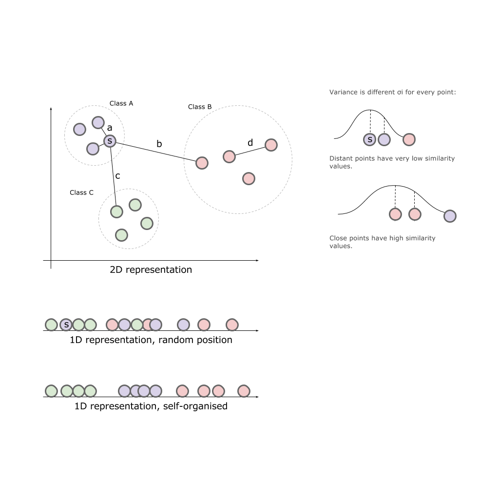
Having a two-dimensional space and three classes A, B, C located in this space, we will try to simply project the classes on one of the axes:

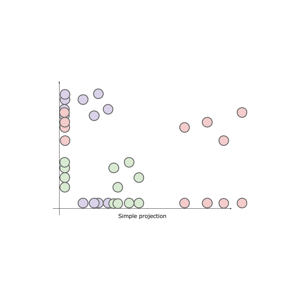
As a result, no axis can give us a complete picture of the original classes. Classes are “mixed”, which means they lose their natural properties.
Our task is to place elements in our finite space in proportion remotely (approximately) to how they were placed in the original space. That is, those that were close to each other and should be closer than those that were located at a distance.
Stochastic Neighbor Embedding
Express the initial relationship between points in the original space as the distance in the Euclidean space between the points
 ,
,  :
: and correspondingly
  for points in the desired space.
We define the conditional probability of similarity (conditional probabilities that represent similarities) of points in the source space:
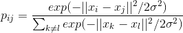
This expression describes how close the point is.
to the point provided that the distance to the nearest class points we characterize as a Gaussian distribution around with a given variance  (centered on point ). Dispersion is unique for each point and is calculated separately based on the fact that points with higher density have less variance.
The following describes the similarity point
 with a point
  in the new space, respectively:
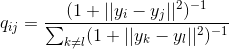
Again, since we are only interested in the modeling of paired similarities, we put
 .
.If the display points
and correctly simulate the similarity between high-size data points and conditional probabilities  and
and  will be equal. Motivated by this observation, the SNE seeks to find a low-dimensional representation of the data that minimizes the discrepancy between and .
The algorithm finds the variance values.
 for Gaussian distribution at each specific point . It is unlikely that there is one value. which is optimal for all points in the data set, since the data density may vary. Lower density in dense areas usually more appropriate than in more sparse areas. SNE using a binary search selects .
The search takes place when taking into account the measures of effective neighbors (perplexion parameter) that will be taken into account when calculating
.The authors of the algorithm find an example in physics, describing this algorithm as a bunch of objects by various springs that are able to attract and repel other objects. Leaving the system for some time, she will independently find a point of rest, having balanced the tension of all the springs.
t-Distributed Stochastic Neighbor Embedding
The difference between SNE and the t-SNE algorithm is to replace the Gaussian distribution with the Student's distribution (also known as t-Distribution, t-Student distribution) and change the error function to a symmetrized one.
Thus, the algorithm first places all the original objects in a space of lower dimension. After begins to move the object behind the object, based on how far (close) they were to other objects in the original space.
TensorFlow, TensorBoard and Projector
Today there is no need to implement such algorithms on their own. We can use the ready-made math packages scikit , matlab or TensorFlow .
I wrote in a previous article that the TensorFlow toolkit includes a package for visualizing data and the TensorBoard learning process.
So let's use this solution.
import os import numpy as np import tensorflow as tf from tensorflow.contrib.tensorboard.plugins import projector # Create randomly initialized embedding weights which will be trained. first_D = 23998 # Number of items (size). second_D = 11999 # Number of items (size). DATA_DIR = '' LOG_DIR = DATA_DIR + 'embedding/' first_rada_input = np.loadtxt(DATA_DIR + 'result_' + str(first_D) + '/rada_full_packed.tsv', delimiter='\t') second_rada_input = np.loadtxt(DATA_DIR + 'result_' + str(second_D) + '/rada_full_packed.tsv', delimiter='\t') first_embedding_var = tf.Variable(first_rada_input, name='politicians_embedding_' + str(first_D)) second_embedding_var = tf.Variable(second_rada_input, name='politicians_embedding_' + str(second_D)) saver = tf.train.Saver() with tf.Session() as session: session.run(tf.global_variables_initializer()) saver.save(session, os.path.join(LOG_DIR, "model.ckpt"), 0) config = projector.ProjectorConfig() # You can add multiple embeddings. Here we add only one. first_embedding = config.embeddings.add() second_embedding = config.embeddings.add() first_embedding.tensor_name = first_embedding_var.name second_embedding.tensor_name = second_embedding_var.name # Link this tensor to its metadata file (eg labels). first_embedding.metadata_path = os.path.join(DATA_DIR, '../rada_full_packed_labels.tsv') second_embedding.metadata_path = os.path.join(DATA_DIR, '../rada_full_packed_labels.tsv') first_embedding.bookmarks_path = = os.path.join(DATA_DIR, '../result_23998/bookmarks.txt') second_embedding.bookmarks_path = = os.path.join(DATA_DIR, '../result_11999/bookmarks.txt') # Use the same LOG_DIR where you stored your checkpoint. summary_writer = tf.summary.FileWriter(LOG_DIR) # The next line writes a projector_config.pbtxt in the LOG_DIR. TensorBoard will # read this file during startup. projector.visualize_embeddings(summary_writer, config) The result can be viewed on my TensorBoard Projector.
- Works in Chrome .
- Open and click on Bookmarks in the lower right corner.
- In the upper right corner we can filter the classes.
- Below are gif pictures with examples.
GIF pictures larger.

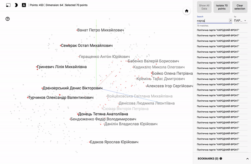
Also, the whole portal is now available - projector , which allows you to visualize your existing dataset directly on the Google server.
- Go to the website projector
- Click “Load data”
- Choose our dataset with vectors
- Add pre-assembled metadata: labels, classes, and so on.
- We connect the color differentiation (color map) on one of the columns.
- If desired, add a json config file and publish data for public viewing.
It remains to send the link to your analyst.
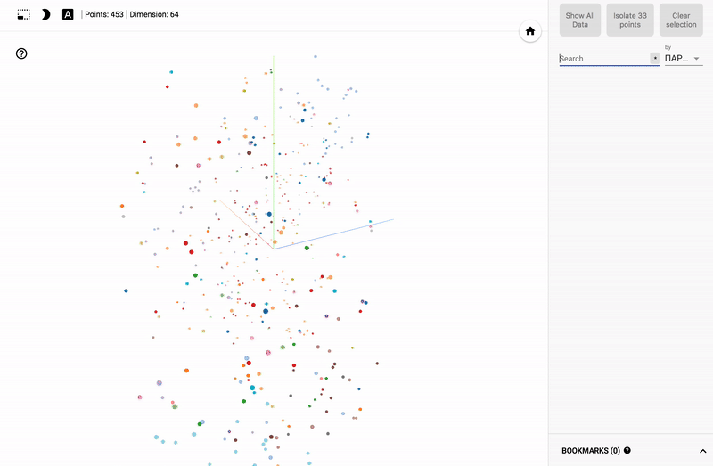
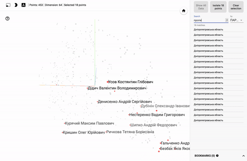
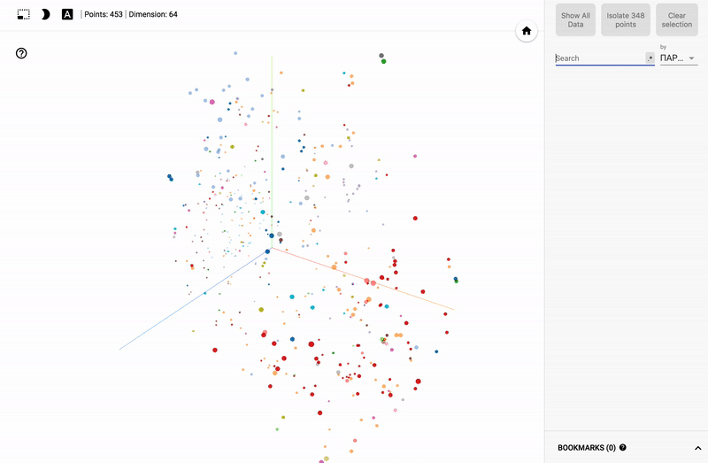
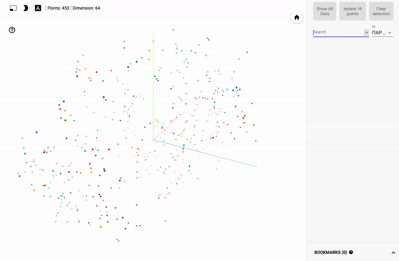
For those who are interested in the subject area, it will be interesting to look at different sections, for example, the distribution in polls of politicians from different areas.
- Accuracy of voting of individual parties.
- Distribution (blurring) of voting politicians from one party.
- The similarity of voting politicians from different parties.
findings
- Autoencoders are a family of relatively simple algorithms that give surprisingly fast and good convergence results.
- Automatic clustering is not the answer to the question about the nature of the source data, it requires additional analytics, but it does provide a fairly quick and clear vector in which you can start working with your data.
- TensorFlow and TensorBoard are powerful and rapidly developing machine learning tools allowing to solve tasks of varying complexity.
Source: https://habr.com/ru/post/349048/
All Articles