Why your application looks better in Sketch
Find the difference

Look at these two pictures - see the difference?
If you look closely, you will notice that they are slightly different. In the picture on the right:
')
- Shade more
- Gradient darker
- The word "in" on the first line, not the second
The left picture is a screenshot from Sketch, and the right one is a representation of the same design on iOS. Such discrepancies appear when rendering the image. Fonts, line spacing, shadow radius, color and gradient parameters, and all other constants are exactly the same.
As you can see, some aspects of the original design may be lost when translating the layout file into the actual code. Below we will look at some of these nuances so that you know what to look for and how to correct the situation.
Why is it important
Design is critical to the success of a mobile application. It is especially important on the iOS platform: its users are accustomed to products that not only work well, but also look good.
If you are a mobile developer or designer, then you know how much the smallest details can affect the user experience. Only people who are truly serious about their work are able to create high-quality products.
There are a number of reasons why design in an application may not look as good as at the design stage. We will analyze one of the less obvious reasons in detail - the difference in rendering in Sketch and on iOS.
Translation difficulties
Some of the interface elements reveal significant differences in Sketch and in iOS. We will focus on the following three:
- Typography
- Shadows
- Gradients
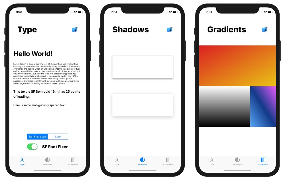
1. Typography
Typography is of different types, in this example I will consider the one that corresponds to the Text element in Sketch and UILabel on iOS.
Let's see how they differ:
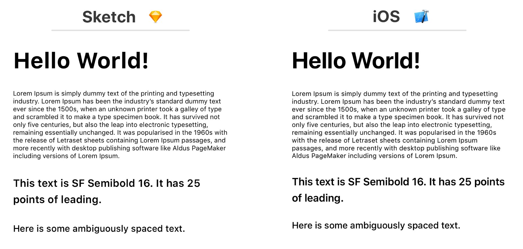
The main difference in the example above is how the text is broken into lines. For example, in the third fragment, which begins with "This text is SF Semibold", in the design the first line ends with the number 25, and in the appendix - the word "points". The same problem is observed in the text block - the breakdown into lines does not match.
Another, less noticeable difference is that in Sketch leading (that is, the distance between the lines) and discharge (that is, the distance between the characters) is slightly larger.
If you impose two options, all these discrepancies immediately strike the eye:

Maybe it's in the font? Let's try replacing San Francisco with Lato (a very popular free font). Then we get the following result:

Already better!
Some inconsistency in line spacing and detente remains the same, but it can be neglected. Still, be careful - if the text should overlap in a certain way with other elements, such as a background image, these small inconsistencies may be noticeable.
How to fix it
In part, these problems are related to the default font used on iOS - San Francisco. When rendering this system font, iOS automatically calculates the tracking value in accordance with the size. The table for automatic calculation is available on the Apple website . There is a special plugin called SF Font Fixer that allows you to take these values into account in Sketch. I highly recommend it to anyone with a San Francisco font design.
Note: Always ensure that the Sketch text field runs smoothly along the text border. This can be done by highlighting the text, switching the “Fixed” and “Auto” settings, and then setting the desired width of the field. If there is too much empty space, this may lead to incorrect values in the layout.
2. Shadows
If there are universal rules for typography in layouts, in terms of shadows, everything is not spelled out so clearly.
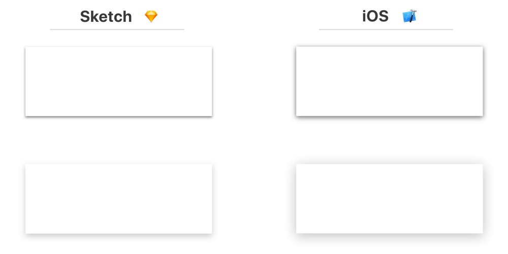
As you can see from the image above, iOS has more shadows by default. In these examples, this is most striking on the upper border of the rectangles.
With shadows, things are not easy, because they have different sets of parameters in Sketch and on iOS. The most important difference is that in CALayer there is no such category as spread, although this problem can be circumvented by increasing the size of the layer that contains the shadow.

Shadows can look completely different in Sketch and iOS versions. I came across cases when the shadow looked perfectly in the layout, but with the same parameters it turned out to be almost invisible when the application was launched on the device.
How to fix it
You will have to tinker with the shadows - so that they look exactly as intended, you need to debug manually. In many cases, you want to make the radius a little smaller, and the transparency - a little higher.
// old layer.shadowColor = UIColor.black.cgColor layer.shadowOpacity = 0.2 layer.shadowOffset = CGSize(width: 0, height: 4) layer.shadowRadius = 10 // new layer.shadowColor = UIColor.black.cgColor layer.shadowOpacity = 0.3 layer.shadowOffset = CGSize(width: 0, height: 6) layer.shadowRadius = 7 The scale of the necessary changes depends on the color, size and shape - in our example it took only a very small amount to adjust the parameters.
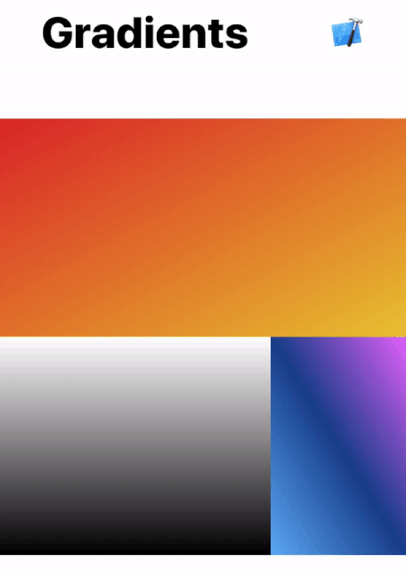
3. Gradients
Gradients are also a headache.
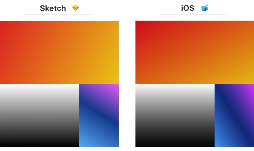
Of these three examples, the differences are visible only in the orange and blue gradients. In the case of an orange gradient, blending into Sketch happens more horizontally, and on iOS, more likely vertically. As a result, the gradient looks generally darker in the final application than in the design.
In the case of blue, the difference is even more noticeable - the angle of inclination in iOS is closer to 90 degrees. This gradient is based on three colors: blue in the lower left corner, blue in the center and pink in the upper right corner.
How to fix it
If the angle is distorted, then you may need to change the starting and ending points. Try experimenting a bit with startPoint and endPoint in CAGradientLayer to eliminate these changes.
// old layer.startPoint = CGPoint(x: 0, y: 1) layer.endPoint = CGPoint(x: 1, y: 0) // new layer.startPoint = CGPoint(x: 0.2, y: 1) layer.endPoint = CGPoint(x: 0.8, y: 0) The magic formula is not here - you just need to change the values and look at the result until the versions become identical.
Jirka Třečák left an excellent comment with links to materials, which explains how the rendering of gradients. Read if you want to study the problem more deeply at the code level.
See for yourself
I made a demo version of the application, which allows you to easily see how all these differences look on a real device. It includes all the examples given above, the source code and the Sketch file, so you can play around with the constants.
This is a good way to bring the problem to the team - just give them a phone and let them be convinced with their own eyes. To move from picture to picture (as in the gifs of the illustrations from this article), just click on the screen.
Download open-source demo version of the application here .
findings
Do not take it for granted that the same values will give the same results. Even if the numbers are the same, the visual presentation may differ.
In general, after the implementation of any design, it is necessary to do additional iterations. Collaboration of designers and developers plays a crucial role in creating a quality product.
Source: https://habr.com/ru/post/349012/
All Articles