Html-sketchapp - a pledge of unity of programmers and designers
Mark Dalgleish, head of the SEEK design system development department, says that if you look at any team that uses a design system, you will find that there are obvious advantages to this approach. They consist in the fact that designers and programmers work more productively than without the availability of such a system, the results of their work become more uniform, the interaction between different groups of employees turns out to be clearer and more coherent.
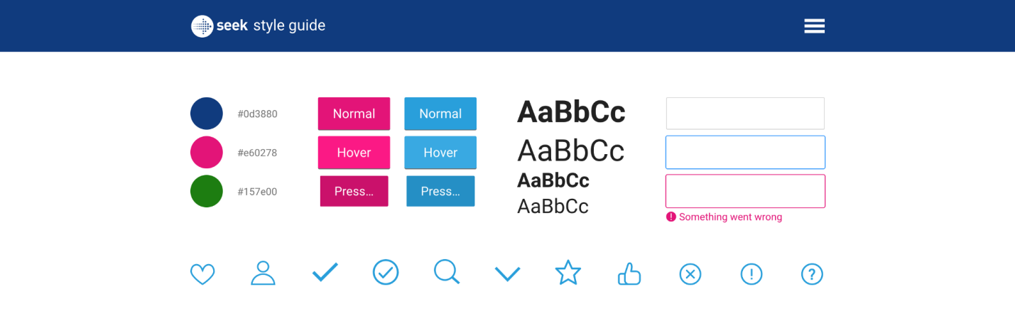
SEEK Online Style Guide
However, most design systems have a fundamental flaw. Designers and developers, even with the introduction of something rather modern, continue to work in completely different environments. As a result, in order to maintain the code and design materials in a consistent state, it is necessary to put a lot of effort, otherwise those materials that designers and programmers work with over time, go farther apart from each other.
')
Not surprisingly, companies using design systems have the feeling that there is stagnation in the development of tools in our industry. These tools are not adapted to the environment in which we work, they are not particularly useful in the crucial task of transferring what is done by the developers to the environment in which the designers work.
Is it really that bad? Mark believes that in the near future we are waiting for changes for the better. In this material, he talks about how SEEK was able to bring together the systems in which designers and developers work as much as modern technologies allow.
We, at SEEK , have been working on an interactive style guide for more than a year, while the interface elements are represented by React components, the number of which is constantly growing. As might be expected, this radically changed our vision of visual design.
As a result, we have at our disposal a design system based on a program code that determines not only what specific projects created by the company will look like, but also the content of the style guide with which the designers work.
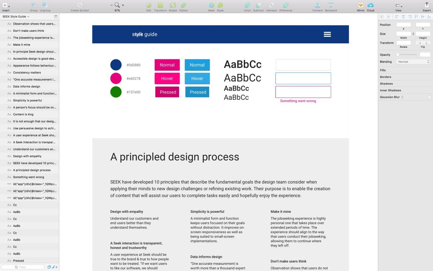
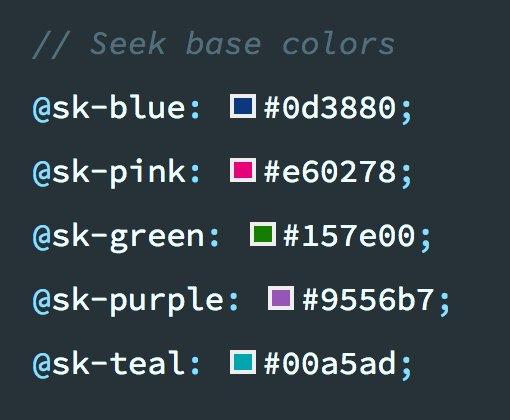
Today, this guide is presented as an interactive, regularly updated website. But at the very beginning of work on the design system, we tried to formalize the rules in the form of a PDF document. Then a set of initial materials for Sketch appeared , standardized symbols, colors and styles of texts included in which could easily be used as a starting point for new projects.

Initial Sketchbook for SEEK
A little later, we experimented with Craft , with a set of plug-ins for Sketch from InVision , of which I would particularly like to mention the plugin Library .
This allowed us to create a common library of company symbols, use them in all teams and in all documents.
Craft Library Library Plugin
At the very beginning of the preparation of the library, the huge amount of work necessary to keep this library up to date, in particular, in the situation of the constant development of existing and the emergence of new templates in our projects, became obvious.
The developers, often together with the designers, made changes to the code, which had a major impact on the visual design, but our static design library remained the same as it was before these changes. In order to bring it up to date, someone had to remember that it needs to be updated, which usually did not happen.
So, here it was a question of spreading changes in the direction from developers to designers. The same problems were characteristic of the reverse process. Developers lacked a reliable source of reliable and up-to-date design information, information from which they could use in their code.
Around this time, we began work on our first React project. The rendering was carried out on the server, here we used webpack and CSS modules (we, along the way, participated in their development). All this ultimately led to the creation of our interactive style guide.
The fact that React is component-oriented has made the transition to interactive leadership almost inevitable. At the same time, we have seen that similar processes occur in other companies around the world.
As soon as we created a fairly large collection of components, other teams working on new projects quickly took advantage of our work. However, since the style guide now consisted of React components and LESS styles, it was not particularly useful for designers. It didn’t surprise us much, we didn’t try to fix it as soon as possible. The fact is that the technology gap between designers and developers is an old problem that has been present in our industry for so long that we are accustomed not to notice it.
Everything remained in the same state until we learned about the react-sketchapp project created by Airbnb.

React-sketchapp
Here's what Airbnb employee John Gold says about react-sketchapp: “In Sketch, we use symbols and overrides, in React we use components and properties. These concepts are so similar that it seemed silly not to unite them. ”
We did not believe the eyes. Here it is - the real code for React, which goes straight into Sketch. It seemed that we would finally be able to create a design system from which both developers and designers will be able to draw the latest and most relevant data.
With this approach, the basis for design rules is the code that is not only used in production, but also falls into the environment in which the designers work. As the development of the code, and therefore the design rules, these rules could be automatically maintained up to date, accessible to designers, without the need to manually transfer anything to Sketch.
Of course, when we delved a bit into this topic, we found that in order to work with react-sketchapp you need to fulfill some requirements:
So, although the react-sketchapp is just a terrific project that we can recommend to others with a pure heart, its technical requirements, unfortunately, meant that we would not be able to use it in the short or medium term.
Even if we decided to move our component library, we would need to find an answer to another question. This question was about version control.
As you may already know, there are tools that allow you to use version control inside the design tools. However, we needed the materials that the designers work with to be processed by means of an external version control system. We would like to perceive these materials as, say, ordinary code, so that they are located in the same place as this ordinary code, and not in a certain allocated space that has nothing in common with everything else. Therefore, we decided to experiment.
Using Kactus and some custom scripts for Node , we tried to commit Sketch files to the repository of the style guide.
Kactus showing git diff for a sketch file
Technically, we could achieve what we wanted, but, to our regret, we could not manage the workflow we needed. Maybe someone else will succeed, but this did not suit us. The point here is that even with such an approach, support for synchronizing code and design materials turned out to be extremely tedious, this process was prone to errors, and its results were difficult to verify.
However, the fact that code files and Sketch files could be contained in the same version control system led to a clearer understanding of the problem we faced, although it didn’t help us in resolving the problem itself. Moreover, when using the version control system approach, the person who coordinated the style guide with the code had to perform many auxiliary actions. The costs of time and effort turned out to be incomparable with the possible advantages, the value of which was still in question. As a result, work on the sketch files was soon abandoned. We recognized the experiment as unsuccessful.
We have practically lost hope for success, we were already ready to admit that we could not put developers and designers together in one workspace, as the html-sketchapp project appeared, which changed absolutely everything.
As it turned out, we were not only worried about the problems related to the integration of the react-sketchapp into the existing technology stack. This is what Konrad Jvinel of Brainly writes about this: “We could not quickly overcome these limitations, which is why we created the html-sketchapp”.
The html-sketchapp takes a completely different approach.

Html-sketchapp results
As you can tell from the title of this project, the html-sketchapp allows you to generate Sketch files from regular HTML content, but, unlike react-sketchapp, there are no restrictions on the choice of technologies with which this content is prepared.
Web projects that html-sketchapp is capable of working with can be created with Preact , or Vue , or Angular , or Backbone , or jQuery , or even with Ruby or PHP .
Nobody forbids using React, but now the application can be styled as the developer wants, using any suitable primitives.
The requirements for the project, which could be processed using the html-sketchapp, were incredibly simple: if you have an HTML page, you can import it into Sketch.
At first glance, what the html-sketchapp did seemed something incredible, but when we looked at its internal mechanisms, we quickly discovered that all this was not so difficult.
In order to understand how the html-sketchapp works, you first need to understand the Sketch file format. Perhaps, it may come as a surprise to someone that Sketch files are, in fact, ordinary Zip files.
Sketch file opened as an archive file
After unpacking Sketch files as regular archives, you can find out that they are mainly composed of JSON files, which, of course, can be opened in any completely ordinary text editor.

JSON file from a sketch file opened in a text editor
If you look at the contents of these files, you can see that their format is relatively simple, mostly they consist of small blocks of nested classes.
At the lowest level, the html-sketchapp allows you to programmatically generate instances of these classes and convert them to JSON. But he goes much further, not limited to these actions.
Perhaps the most powerful feature of the html-sketchapp is nodeToSketchLayers . It allows you to convert browser elements into Sketch layer arrays. It is here that the lion’s share of the sacrament takes place, since it contains all the logic of extracting browser styles and converting them into their Sketch equivalents.
After preparing the source materials, the SymbolMaster class comes in , which puts everything together and dynamically generates the Sketch symbols. Symbols are the basis of any Sketch library, which means that by finding the path between HTML and Sketch, we can, by processing the React components displayed in the browser, form what designers need.
Unfortunately, due to some limitations in the current Sketch format regarding how text styles are encoded, the generated document is not quite valid Sketch-file - in html-sketchapp such files are called Almost Sketch (almost Sketch-files), or, for brevity - asketch. Such files must be manually imported using the appropriate plug-in . But, fortunately, this process is not too complicated.
At first, the task of linking all this together seemed to be very heavy, but it so happened that GitHub already had a demo project showing the process of converting an existing style guide into a Sketch document.
As soon as we discovered it, we almost immediately began to experiment. As a result, the results that simply shook us were surprisingly fast.
First, we decided to independently find out the possibilities of the html-sketchapp and “fed” him the home page of the website of our style guide.
Here's a tweet that demonstrates.
The results of processing the page using html-sketchapp
Next, we started to generate our first characters from the Button component, by rendering several different variations of this component.
Here is the HTML page with the component.
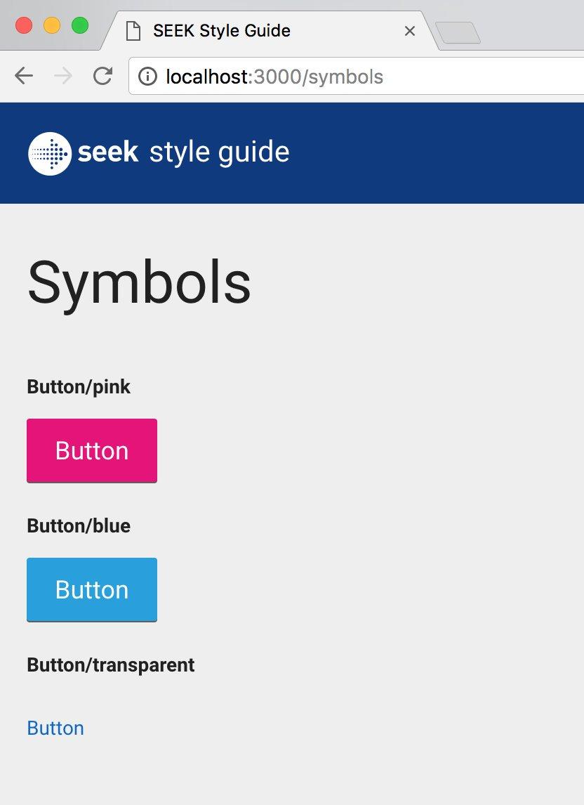
HTML page with the component displayed on it
But what we did.

The results of processing the page using html-sketchapp.
In order to achieve this, we came up with a special JavaScript file that is added to the folder of each component (for example,
Each file would export an object specifying the symbol name and its corresponding React elements.
Then we created a special hidden route on the style guide site, which imported any file ending in
An instance of each character was wrapped in a
This template proved to be extremely effective, and soon we expanded it so that it included text styles and document colors .
Description of text styles
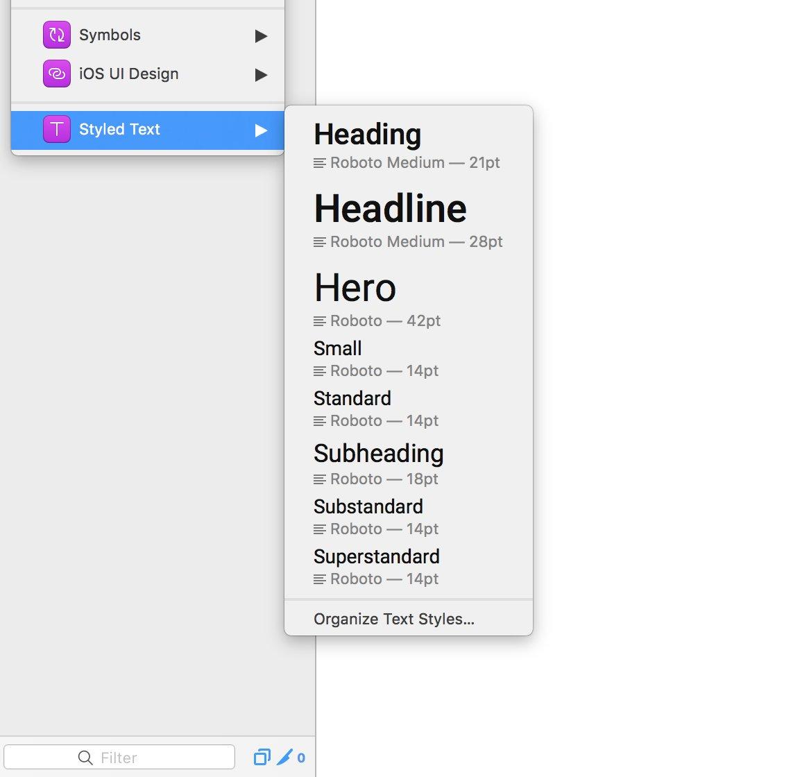
Text styles
Color description

Color examples on the webpage
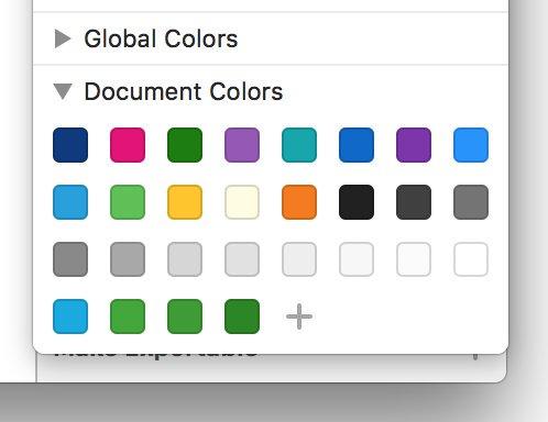
Imported colors
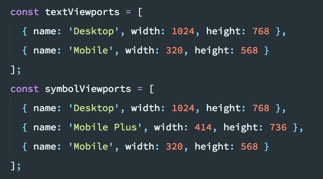
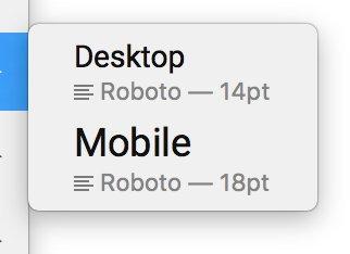
Our style guide was responsive, so we automated the process of resizing the browser window and took pictures of characters at different screen sizes.
Browser window settings
Text Styles in Sketch
Sketch Design Elements
This gave us a convenient opportunity to add, delete and rename window sizes, working with a single file. Symbols are generated for each required window size.
After we managed to achieve all of what we just said, we had the feeling that we solved a seemingly unsolvable problem that concerned support for responsive design in Sketch.
All this worked surprisingly well, although we still needed to finalize something, in particular, with regard to support for Sketch. It reminded me of how they usually organize support for a browser in which there are errors.
What began as a not very large-scale experiment quickly turned into a kind of mini-framework.
It did not take us too long to integrate the html-sketchapp and all the developments related to this project into our style guide. The preparation of a fresh version of the style guide has now been carried out as part of the standard build process.
However, if you look at the corresponding pull query , you will find that this integration required us to include a lot of auxiliary code and dependencies in the project, despite the fact that at a high level we tried to achieve the execution of one conceptually simple task.
In order to generate a library for Sketch, you had to perform the following steps:
We also wanted to automate this process. It seemed to us a completely natural possibility of doing all this with one team, which would be enough just to pass the desired URL. That's what we got as a result.
Less than a month after we integrated the html-sketchapp into the formation system of our style guide, we transferred html-sketchapp-cli to the category of open -source projects — a small command-line utility that automates auxiliary operations.
Now all we needed to create a manual was one dependency and a simple configuration file.
In addition, the use of html-sketchapp-cli allowed to remove a lot of code.
Html-sketchapp-cli implementation results
All of these tools are now part of our normal work. Changes made to the styles by developers, very quickly get to the designers.
After each successful build of the style guide, we not only automatically deploy our site on the GitHub pages (using gh-pages ) and publish the component library to npm (using semantic-release ) - now we are still, automatically, generating the very “almost Sketch files, ready to be imported into our official Sketch library.
This sketch library is then distributed, via a shared disk, to members of the design team. And this means that our designers always have an up-to-date copy of the library, which is synchronized with their current project in real time, even with the Sketch editor open.
Thanks to the new built-in support for the Sketch libraries , designers can open the SEEK Style Guide Library menu and select the components they need, knowing that naming conventions and visual styles are in line with the expectations of the developers.
Designer's workplace
Since we implemented this mechanism, we see how changes made to the code continuously flow into Sketch, and sometimes those who make these changes do not even have Sketch installed. Since the style guide is connected to running applications, styles are constantly being improved by people from across the organization, and now we can be sure that all these changes fall into the Sketch library, constantly keeping it up to date.
Technically, developers and designers are still working in different environments, but we are working hard to bring them closer together.
No matter how significant everything that was discussed, for us this is only an interim solution. Transferring data from web pages to Sketch is a very powerful feature. This is a big step towards a unified development environment, but we, and the entire web development industry, need to move on.
The border between developers and designers may become increasingly blurred, but the design tools of the future must completely erase this border. In order to take advantage of this potential, we need such design tools that do not imitate, albeit fairly accurately, the target environment. We need tools that are created on the basis of this environment.
Fortunately, there is no shortage of people in the world who are working right now on the problem of universal development and design environments. Tools like Compositor , Interplay , Alva , Haiku , Webflow, and UXPin aim to break the walls between the design tools and the code behind the web projects. We believe that the emergence of even more such tools will not have to wait long.
Who knows, maybe we will even see, as more traditional design tools introduce a similar approach in order not to lose relevance, especially considering that design systems are increasingly becoming an ordinary part of the modern designer's toolbox.
In the meantime, while we are waiting for the emergence of new design tools that will implement the principles that move the industry forward, projects like react-sketchapp and html-sketchapp are already preparing us for new approaches in design and development, developing new thinking in us.
Honestly, now is an amazingly right moment to start to perceive web design in a new way.
Dear readers! Do you use react-sketchapp or html-sketchapp in your projects?

SEEK Online Style Guide
However, most design systems have a fundamental flaw. Designers and developers, even with the introduction of something rather modern, continue to work in completely different environments. As a result, in order to maintain the code and design materials in a consistent state, it is necessary to put a lot of effort, otherwise those materials that designers and programmers work with over time, go farther apart from each other.
')
Not surprisingly, companies using design systems have the feeling that there is stagnation in the development of tools in our industry. These tools are not adapted to the environment in which we work, they are not particularly useful in the crucial task of transferring what is done by the developers to the environment in which the designers work.
Is it really that bad? Mark believes that in the near future we are waiting for changes for the better. In this material, he talks about how SEEK was able to bring together the systems in which designers and developers work as much as modern technologies allow.
Our journey in the world of design systems
We, at SEEK , have been working on an interactive style guide for more than a year, while the interface elements are represented by React components, the number of which is constantly growing. As might be expected, this radically changed our vision of visual design.
As a result, we have at our disposal a design system based on a program code that determines not only what specific projects created by the company will look like, but also the content of the style guide with which the designers work.
Today, this guide is presented as an interactive, regularly updated website. But at the very beginning of work on the design system, we tried to formalize the rules in the form of a PDF document. Then a set of initial materials for Sketch appeared , standardized symbols, colors and styles of texts included in which could easily be used as a starting point for new projects.
Initial Sketchbook for SEEK
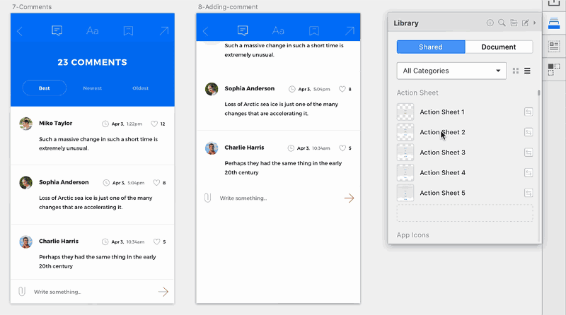
A little later, we experimented with Craft , with a set of plug-ins for Sketch from InVision , of which I would particularly like to mention the plugin Library .
This allowed us to create a common library of company symbols, use them in all teams and in all documents.
Craft Library Library Plugin
At the very beginning of the preparation of the library, the huge amount of work necessary to keep this library up to date, in particular, in the situation of the constant development of existing and the emergence of new templates in our projects, became obvious.
The developers, often together with the designers, made changes to the code, which had a major impact on the visual design, but our static design library remained the same as it was before these changes. In order to bring it up to date, someone had to remember that it needs to be updated, which usually did not happen.
So, here it was a question of spreading changes in the direction from developers to designers. The same problems were characteristic of the reverse process. Developers lacked a reliable source of reliable and up-to-date design information, information from which they could use in their code.
Path from React to react-sketchapp
Around this time, we began work on our first React project. The rendering was carried out on the server, here we used webpack and CSS modules (we, along the way, participated in their development). All this ultimately led to the creation of our interactive style guide.
The fact that React is component-oriented has made the transition to interactive leadership almost inevitable. At the same time, we have seen that similar processes occur in other companies around the world.
As soon as we created a fairly large collection of components, other teams working on new projects quickly took advantage of our work. However, since the style guide now consisted of React components and LESS styles, it was not particularly useful for designers. It didn’t surprise us much, we didn’t try to fix it as soon as possible. The fact is that the technology gap between designers and developers is an old problem that has been present in our industry for so long that we are accustomed not to notice it.
Everything remained in the same state until we learned about the react-sketchapp project created by Airbnb.
React-sketchapp
Here's what Airbnb employee John Gold says about react-sketchapp: “In Sketch, we use symbols and overrides, in React we use components and properties. These concepts are so similar that it seemed silly not to unite them. ”
We did not believe the eyes. Here it is - the real code for React, which goes straight into Sketch. It seemed that we would finally be able to create a design system from which both developers and designers will be able to draw the latest and most relevant data.
With this approach, the basis for design rules is the code that is not only used in production, but also falls into the environment in which the designers work. As the development of the code, and therefore the design rules, these rules could be automatically maintained up to date, accessible to designers, without the need to manually transfer anything to Sketch.
Of course, when we delved a bit into this topic, we found that in order to work with react-sketchapp you need to fulfill some requirements:
- It is necessary that the components are built using React (this is quite obvious). Fortunately, we already used React, so it did not seem to be a problem.
- Styles must be defined in javascript. In our case, since our design system was built using CSS modules, we have already made some progress in the right direction. We are big fans of CSS-in-JS , but we were not ready to scatter styles throughout our ecosystem, at least we weren't going to do it in a hurry.
- Components should use generic primitives (View, Text, StyleSheet) and not browser primitives, using something like react-primitives . Overall, react-sketchapp was closer to React Native than to normal React. Again, this was something that we could well go on, but such a transition would require a lot of work, and, perhaps, in the course of its implementation, we would have to make some compromises.
So, although the react-sketchapp is just a terrific project that we can recommend to others with a pure heart, its technical requirements, unfortunately, meant that we would not be able to use it in the short or medium term.
Even if we decided to move our component library, we would need to find an answer to another question. This question was about version control.
Design materials and universal version control system
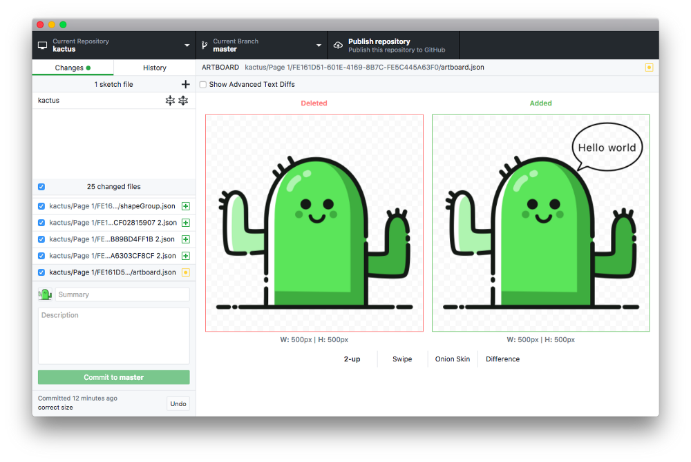
As you may already know, there are tools that allow you to use version control inside the design tools. However, we needed the materials that the designers work with to be processed by means of an external version control system. We would like to perceive these materials as, say, ordinary code, so that they are located in the same place as this ordinary code, and not in a certain allocated space that has nothing in common with everything else. Therefore, we decided to experiment.
Using Kactus and some custom scripts for Node , we tried to commit Sketch files to the repository of the style guide.
Kactus showing git diff for a sketch file
Technically, we could achieve what we wanted, but, to our regret, we could not manage the workflow we needed. Maybe someone else will succeed, but this did not suit us. The point here is that even with such an approach, support for synchronizing code and design materials turned out to be extremely tedious, this process was prone to errors, and its results were difficult to verify.
However, the fact that code files and Sketch files could be contained in the same version control system led to a clearer understanding of the problem we faced, although it didn’t help us in resolving the problem itself. Moreover, when using the version control system approach, the person who coordinated the style guide with the code had to perform many auxiliary actions. The costs of time and effort turned out to be incomparable with the possible advantages, the value of which was still in question. As a result, work on the sketch files was soon abandoned. We recognized the experiment as unsuccessful.
We have practically lost hope for success, we were already ready to admit that we could not put developers and designers together in one workspace, as the html-sketchapp project appeared, which changed absolutely everything.
Html-sketchapp
As it turned out, we were not only worried about the problems related to the integration of the react-sketchapp into the existing technology stack. This is what Konrad Jvinel of Brainly writes about this: “We could not quickly overcome these limitations, which is why we created the html-sketchapp”.
The html-sketchapp takes a completely different approach.
Html-sketchapp results
As you can tell from the title of this project, the html-sketchapp allows you to generate Sketch files from regular HTML content, but, unlike react-sketchapp, there are no restrictions on the choice of technologies with which this content is prepared.
Web projects that html-sketchapp is capable of working with can be created with Preact , or Vue , or Angular , or Backbone , or jQuery , or even with Ruby or PHP .
Nobody forbids using React, but now the application can be styled as the developer wants, using any suitable primitives.
The requirements for the project, which could be processed using the html-sketchapp, were incredibly simple: if you have an HTML page, you can import it into Sketch.
Generating Sketch Files
At first glance, what the html-sketchapp did seemed something incredible, but when we looked at its internal mechanisms, we quickly discovered that all this was not so difficult.
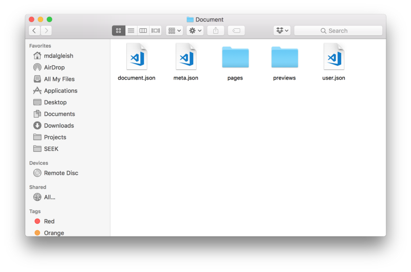
In order to understand how the html-sketchapp works, you first need to understand the Sketch file format. Perhaps, it may come as a surprise to someone that Sketch files are, in fact, ordinary Zip files.
Sketch file opened as an archive file
After unpacking Sketch files as regular archives, you can find out that they are mainly composed of JSON files, which, of course, can be opened in any completely ordinary text editor.
JSON file from a sketch file opened in a text editor
If you look at the contents of these files, you can see that their format is relatively simple, mostly they consist of small blocks of nested classes.
At the lowest level, the html-sketchapp allows you to programmatically generate instances of these classes and convert them to JSON. But he goes much further, not limited to these actions.
Perhaps the most powerful feature of the html-sketchapp is nodeToSketchLayers . It allows you to convert browser elements into Sketch layer arrays. It is here that the lion’s share of the sacrament takes place, since it contains all the logic of extracting browser styles and converting them into their Sketch equivalents.
After preparing the source materials, the SymbolMaster class comes in , which puts everything together and dynamically generates the Sketch symbols. Symbols are the basis of any Sketch library, which means that by finding the path between HTML and Sketch, we can, by processing the React components displayed in the browser, form what designers need.
Unfortunately, due to some limitations in the current Sketch format regarding how text styles are encoded, the generated document is not quite valid Sketch-file - in html-sketchapp such files are called Almost Sketch (almost Sketch-files), or, for brevity - asketch. Such files must be manually imported using the appropriate plug-in . But, fortunately, this process is not too complicated.
At first, the task of linking all this together seemed to be very heavy, but it so happened that GitHub already had a demo project showing the process of converting an existing style guide into a Sketch document.
As soon as we discovered it, we almost immediately began to experiment. As a result, the results that simply shook us were surprisingly fast.
Experimenting with html-sketchapp
First, we decided to independently find out the possibilities of the html-sketchapp and “fed” him the home page of the website of our style guide.
Here's a tweet that demonstrates.
The results of processing the page using html-sketchapp
Next, we started to generate our first characters from the Button component, by rendering several different variations of this component.
Here is the HTML page with the component.
HTML page with the component displayed on it
But what we did.
The results of processing the page using html-sketchapp.
In order to achieve this, we came up with a special JavaScript file that is added to the folder of each component (for example,
Button.sketch.js ). Such files define the characters we would like to export.Each file would export an object specifying the symbol name and its corresponding React elements.
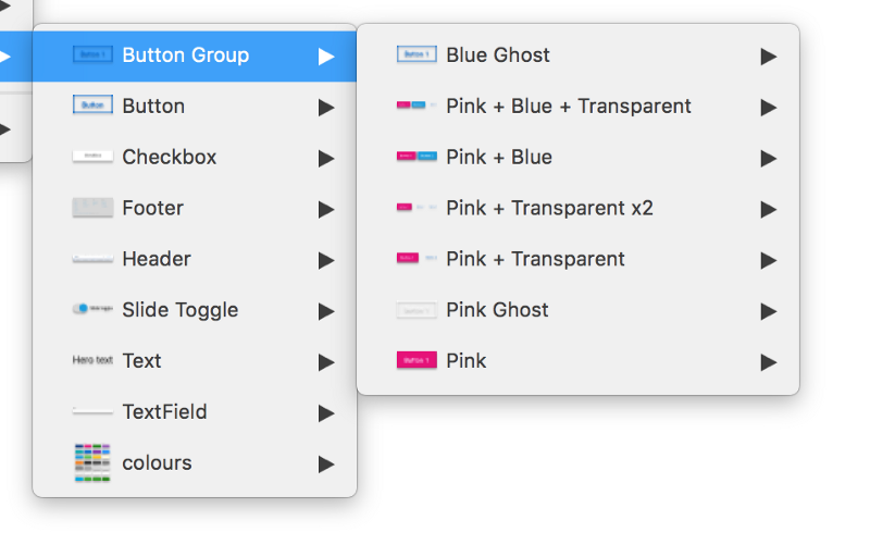
import React from 'react'; import Button from './Button'; export const symbols = { 'Button/Pink': <Button color="pink">Button</Button>, 'Button/Blue': <Button color="blue">Button</Button>, 'Button/Transparent': <Button color="transparent">Button</Button>, }; Then we created a special hidden route on the style guide site, which imported any file ending in
.sketch.js and rendered its corresponding React elements on the screen. In doing so, we were able to significantly simplify the conversion process, displaying everything that Sketch needs on one page.An instance of each character was wrapped in a
div element, in the data attribute of which the name of this character was specified, which allowed us to simplify the selection and naming of characters on the page. <div data-sketch-symbol="Button/Pink"> ... </div> This template proved to be extremely effective, and soon we expanded it so that it included text styles and document colors .
Description of text styles
Text styles
Color description
Color examples on the webpage
Imported colors
Our style guide was responsive, so we automated the process of resizing the browser window and took pictures of characters at different screen sizes.
Browser window settings
Text Styles in Sketch
Sketch Design Elements
This gave us a convenient opportunity to add, delete and rename window sizes, working with a single file. Symbols are generated for each required window size.
After we managed to achieve all of what we just said, we had the feeling that we solved a seemingly unsolvable problem that concerned support for responsive design in Sketch.
All this worked surprisingly well, although we still needed to finalize something, in particular, with regard to support for Sketch. It reminded me of how they usually organize support for a browser in which there are errors.
From experiments to production
What began as a not very large-scale experiment quickly turned into a kind of mini-framework.
It did not take us too long to integrate the html-sketchapp and all the developments related to this project into our style guide. The preparation of a fresh version of the style guide has now been carried out as part of the standard build process.
However, if you look at the corresponding pull query , you will find that this integration required us to include a lot of auxiliary code and dependencies in the project, despite the fact that at a high level we tried to achieve the execution of one conceptually simple task.
In order to generate a library for Sketch, you had to perform the following steps:
- Compiling a browser script using a webpack. There should have been an html-sketchapp and code for selecting and converting elements.
- Run a static web server on any available port.
- Launch Puppeteer (this is a Chromium browser without a user interface ).
- Go to the specified URL.
- Implementing a compiled script in a working instance of Puppeteer.
- Creating, using functions from a compiled script, snapshots of elements using each of the specified screen sizes.
- Write received JSON files to disk.
- Stop static web server.
- Stop the browser.
We also wanted to automate this process. It seemed to us a completely natural possibility of doing all this with one team, which would be enough just to pass the desired URL. That's what we got as a result.
Html-sketchapp-cli
Less than a month after we integrated the html-sketchapp into the formation system of our style guide, we transferred html-sketchapp-cli to the category of open -source projects — a small command-line utility that automates auxiliary operations.
Now all we needed to create a manual was one dependency and a simple configuration file.
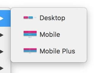
module.exports = { serve: 'docs/dist', url: '/sketch-exports', outDir: 'dist/asketch', viewports: { 'Desktop': '1024x768', 'Mobile Plus': '414x736', 'Mobile': '320x568' } }; In addition, the use of html-sketchapp-cli allowed to remove a lot of code.
Html-sketchapp-cli implementation results
Design as a continuous process
All of these tools are now part of our normal work. Changes made to the styles by developers, very quickly get to the designers.
After each successful build of the style guide, we not only automatically deploy our site on the GitHub pages (using gh-pages ) and publish the component library to npm (using semantic-release ) - now we are still, automatically, generating the very “almost Sketch files, ready to be imported into our official Sketch library.
This sketch library is then distributed, via a shared disk, to members of the design team. And this means that our designers always have an up-to-date copy of the library, which is synchronized with their current project in real time, even with the Sketch editor open.
Thanks to the new built-in support for the Sketch libraries , designers can open the SEEK Style Guide Library menu and select the components they need, knowing that naming conventions and visual styles are in line with the expectations of the developers.
Designer's workplace
Since we implemented this mechanism, we see how changes made to the code continuously flow into Sketch, and sometimes those who make these changes do not even have Sketch installed. Since the style guide is connected to running applications, styles are constantly being improved by people from across the organization, and now we can be sure that all these changes fall into the Sketch library, constantly keeping it up to date.
Technically, developers and designers are still working in different environments, but we are working hard to bring them closer together.
Results
No matter how significant everything that was discussed, for us this is only an interim solution. Transferring data from web pages to Sketch is a very powerful feature. This is a big step towards a unified development environment, but we, and the entire web development industry, need to move on.
The border between developers and designers may become increasingly blurred, but the design tools of the future must completely erase this border. In order to take advantage of this potential, we need such design tools that do not imitate, albeit fairly accurately, the target environment. We need tools that are created on the basis of this environment.
Fortunately, there is no shortage of people in the world who are working right now on the problem of universal development and design environments. Tools like Compositor , Interplay , Alva , Haiku , Webflow, and UXPin aim to break the walls between the design tools and the code behind the web projects. We believe that the emergence of even more such tools will not have to wait long.
Who knows, maybe we will even see, as more traditional design tools introduce a similar approach in order not to lose relevance, especially considering that design systems are increasingly becoming an ordinary part of the modern designer's toolbox.
In the meantime, while we are waiting for the emergence of new design tools that will implement the principles that move the industry forward, projects like react-sketchapp and html-sketchapp are already preparing us for new approaches in design and development, developing new thinking in us.
Honestly, now is an amazingly right moment to start to perceive web design in a new way.
Dear readers! Do you use react-sketchapp or html-sketchapp in your projects?
Source: https://habr.com/ru/post/348610/
All Articles