Modern CSS for dinosaurs
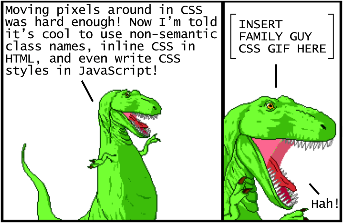
“It’s hard to move pixels in CSS!” And now they tell me how cool it is to use non-semantic class names, inline styles in HTML, and even write CSS styles in JavaScript!
[Insert the griffin gif here.] - Ha!
Illustrations from Dinosaur Comics by Ryan North
Oddly enough, CSS is considered at the same time one of the most simple and one of the most difficult languages for a web developer. Certainly, it is quite simple at the beginning - you define the style properties, the values for specific elements and ... this is almost all you need to know! However, in large projects, the situation becomes quite confusing and difficult to organize CSS in some meaningful way. Changing any line of CSS to style an element on one page often leads to unintended consequences for elements on other pages.
To understand the inherent complexity of CSS, a variety of advanced practices have been created. The problem is that there is still no consensus on which of them are the best, and many of them completely contradict each other. If this is your first time trying to learn CSS, then this situation is disorienting, to say the least.
')
The purpose of this article is to show the historical context of how CSS techniques and tools evolved to their current state in 2018. Understanding this story will make it easier to understand each approach and how to use it profitably. So, let's begin!
Using CSS for basic styles
Let's start with the simplest web site, using only a simple
index.html file that refers to a separate index.css file: <!DOCTYPE html> <html lang="en"> <head> <meta charset="UTF-8"> <title>Modern CSS</title> <link rel="stylesheet" href="index.css"> </head> <body> <header>This is the header.</header> <main> <h1>This is the main content.</h1> <p>...</p> </main> <nav> <h4>This is the navigation section.</h4> <p>...</p> </nav> <aside> <h4>This is an aside section.</h4> <p>...</p> </aside> <footer>This is the footer.</footer> </body> </html> As long as we do not use any classes or id in HTML, only semantic tags . Generally, without using CSS, a website would look like this (with placeholder text):
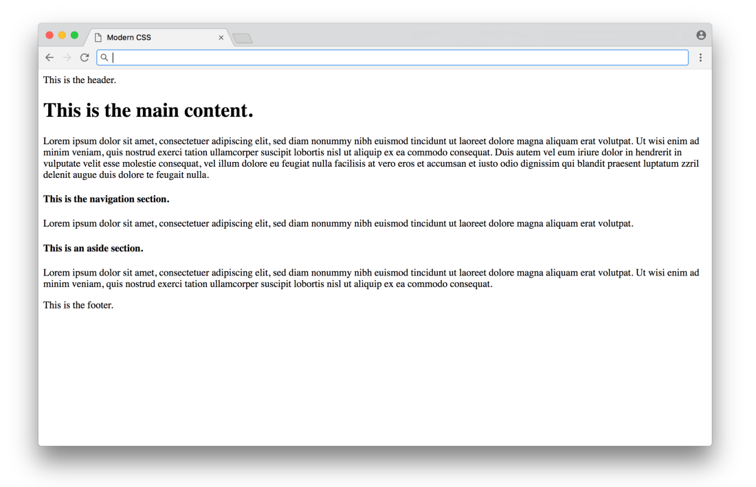
Click here for a real example.
Functionally, but not very pretty. We can add CSS to improve the basic design in
index.css : /* BASIC TYPOGRAPHY */ /* from https://github.com/oxalorg/sakura */ html { font-size: 62.5%; font-family: serif; } body { font-size: 1.8rem; line-height: 1.618; max-width: 38em; margin: auto; color: #4a4a4a; background-color: #f9f9f9; padding: 13px; } @media (max-width: 684px) { body { font-size: 1.53rem; } } @media (max-width: 382px) { body { font-size: 1.35rem; } } h1, h2, h3, h4, h5, h6 { line-height: 1.1; font-family: Verdana, Geneva, sans-serif; font-weight: 700; overflow-wrap: break-word; word-wrap: break-word; -ms-word-break: break-all; word-break: break-word; -ms-hyphens: auto; -moz-hyphens: auto; -webkit-hyphens: auto; hyphens: auto; } h1 { font-size: 2.35em; } h2 { font-size: 2em; } h3 { font-size: 1.75em; } h4 { font-size: 1.5em; } h5 { font-size: 1.25em; } h6 { font-size: 1em; } Here, most of the CSS is styling (fonts with sizes, line heights, etc.), with some color styles and centered layout. You would have to study the design to find out the good values of these parameters (here are the styles from sakura.css ), but the CSS code itself is not too complicated to read here. The result looks like this:
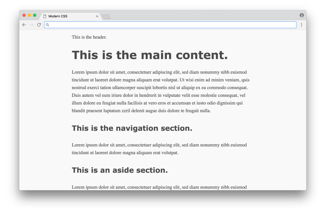
Click here for a real example.
What a difference! This is CSS send - an easy way to add styles to a document, without programming or complex logic. Unfortunately, things get a little more complicated when we start using CSS for something more than just the design and colors (let's figure it out further).
Using CSS for markup
In the 1990s, before CSS technology became widespread, there were few options for marking content on a page. HTML was originally designed as a language for creating simple documents, not dynamic websites with side menus, columns, etc. In those days, the markup was often produced by HTML tables — the entire page was entirely placed in the table, which was used to organize the content in columns and rows. This approach worked, but the reverse side was a close linkage of content and presentation - if you wanted to change the markup on the site, sometimes you had to rewrite a significant amount of HTML.
CSS has given a strong impetus to the separation of content (written in HTML) and presentation (written in CSS). There is a way to render all the markup from HTML (no more tables) to CSS. It is important to note that CSS, like HTML, was also not originally designed for page layout, so the first markup attempts can hardly be called elegant.
Let's see how this works in practice with our example above. Before defining any CSS markup, we first reset all fields and padding (which affect the markup calculation), and mark the sections with different colors (not for beauty, but for their visual distinction when testing different layouts).
/* RESET LAYOUT AND ADD COLORS */ body { margin: 0; padding: 0; max-width: inherit; background: #fff; color: #4a4a4a; } header, footer { font-size: large; text-align: center; padding: 0.3em 0; background-color: #4a4a4a; color: #f9f9f9; } nav { background: #eee; } main { background: #f9f9f9; } aside { background: #eee; } Now the website will look like this temporarily:
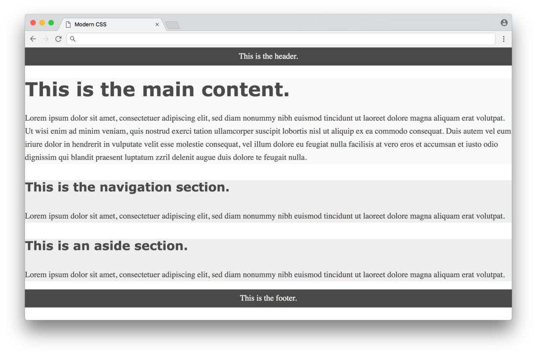
Click here for a real example.
We are now ready to use CSS to mark up content on the page. Let's evaluate three different approaches in chronological order, starting with the classic float layouts.
Float based layout
The CSS float property was originally entered to place an image inside a column of text on the left or right (as you often see in newspapers). Web developers of the early 2000s took advantage of the fact that you can assign the float property not only to images, but to any element, that is, you can create the illusion of rows and columns by assigning float to whole content divs. But again, the float is not intended for this purpose, so such an illusion is difficult to implement in a consistent way.
In 2006, A List Apart published a popular article, “In Search of the Holy Grail,” which outlined a detailed and careful approach to creating a layout known as the Holy Grail - a heading, three columns and a footer. Now it seems insane that such a fairly simple layout was called the Holy Grail, but it was so difficult to create a stable layout in pure CSS.
Below is a float-based layout for our example based on the technique described in the article:
/* FLOAT-BASED LAYOUT */ body { padding-left: 200px; padding-right: 190px; min-width: 240px; } header, footer { margin-left: -200px; margin-right: -190px; } main, nav, aside { position: relative; float: left; } main { padding: 0 20px; width: 100%; } nav { width: 180px; padding: 0 10px; right: 240px; margin-left: -100%; } aside { width: 130px; padding: 0 10px; margin-right: -100%; } footer { clear: both; } * html nav { left: 150px; } Looking at CSS, you can see several hacks needed for the layout (negative boundaries,
clear: both property, hard-coded width calculations, etc.) - the article explains in detail the need for each of these hacks. Here is the result: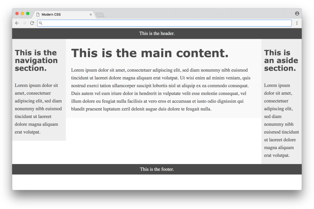
Click here for a real example.
Not bad, but for three colors you can see that the columns have different height, and the page does not fill the entire height of the screen. These are inevitable problems when using the float approach. All that a float can do is to press the content to the left or right border of the section - in CSS there are no means to influence the height of the content in other sections. For years, the problem lacked a simple solution until there were flexbox-based layouts.
Flexbox based layout
The flexbox property in CSS was first proposed in 2009, but it did not receive broad support in browsers until about 2015. The property is designed to determine how space is distributed in a single column or row, which makes it a more suitable layout method than a float. Thus, after ten years of using float-based layouts, web developers have finally been able to use CSS for the layout without the hacks inherent in float layouts.
Below is a flexbox based layout for our example. It is based on the technique described on the site Solved by Flexbox (a popular resource where various flexbox examples are published). Please note that the work of flexbox requires an additional wrapper div around three columns in HTML:
<!DOCTYPE html> <html lang="en"> <head> <meta charset="UTF-8"> <title>Modern CSS</title> <link rel="stylesheet" href="index.css"> </head> <body> <header>This is the header.</header> <div class="container"> <main> <h1>This is the main content.</h1> <p>...</p> </main> <nav> <h4>This is the navigation section.</h4> <p>...</p> </nav> <aside> <h4>This is an aside section.</h4> <p>...</p> </aside> </div> <footer>This is the footer.</footer> </body> </html> Here is the CSS flexbox code:
/* FLEXBOX-BASED LAYOUT */ body { min-height: 100vh; display: flex; flex-direction: column; } .container { display: flex; flex: 1; } main { flex: 1; padding: 0 20px; } nav { flex: 0 0 180px; padding: 0 10px; order: -1; } aside { flex: 0 0 130px; padding: 0 10px; } This is a much more compact code compared to the float-based layout! At first glance, the properties and values of flexbox are a bit confusing, but they eliminate the need for a large number of hacks, such as negative boundaries - a huge victory. Here is the result:
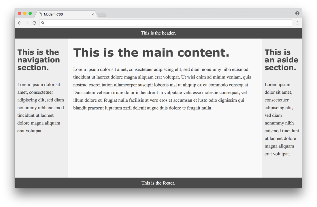
Click here for a real example.
Much better! All columns are the same height and occupy the entire height of the page. In a sense, it looks perfect, but this approach has a couple of minor flaws. First, browser support - now all modern browsers support flexbox, but some older browsers will never support it. Fortunately, browser developers are taking significant steps to complete the life cycle of older versions, which will make a more stable development environment for web designers. Another drawback is the fact that we need to add
<div class="container"> to the markup - it would be nice to do without it. In a perfect world, any CSS layout will not require editing HTML markup at all.But the biggest drawback is in the CSS code itself. Flexbox eliminates a lot of float hacks, but the code is not as expressive as it could be for a layout description. Flexbox CSS is hard to read and get a visual understanding of how all the elements will fall on the page. Because of this, you are trying to guess the right parameters - and check what happened.
It is important to emphasize once again that flexbox is designed to place elements in a single column or row - it is not created for the layout of the whole page! Even though he copes with it regularly (much better than the float-based approach), other specifications have been specially developed for layout in several columns or lines. They are called CSS grid.
Grid based layout
CSS grid was first proposed in 2011 (not long after flexbox), but it took a long time until browsers began to support it. At the beginning of 2018, the CSS grid is supported by most modern browsers (a huge step forward compared to the situation a year or two ago).
Below is a grid-based layout for our example. It is based on the first method described in this article on CSS tricks . Note that in this example we can get rid of the
<div class="container"> that we had to add to the flexbox based layout. Here we just use the original HTML without any changes. This is what CSS looks like: /* GRID-BASED LAYOUT */ body { display: grid; min-height: 100vh; grid-template-columns: 200px 1fr 150px; grid-template-rows: min-content 1fr min-content; } header { grid-row: 1; grid-column: 1 / 4; } nav { grid-row: 2; grid-column: 1 / 2; padding: 0 10px; } main { grid-row: 2; grid-column: 2 / 3; padding: 0 20px; } aside { grid-row: 2; grid-column: 3 / 4; padding: 0 10px; } footer { grid-row: 3; grid-column: 1 / 4; } The result is visually identical to the flexbox-based layout. However, here the CSS code is much better in the sense that it clearly shows the desired layout. The size and shape of the columns and rows are defined in the body selector, and each grid element is directly determined by its position.
The only thing that can confuse is the
grid-column property, which defines the starting and ending positions of the column. It may be confusing, because in this example there are three columns, but the numbers from 1 to 4 are used. The situation becomes clearer if you look at the illustration: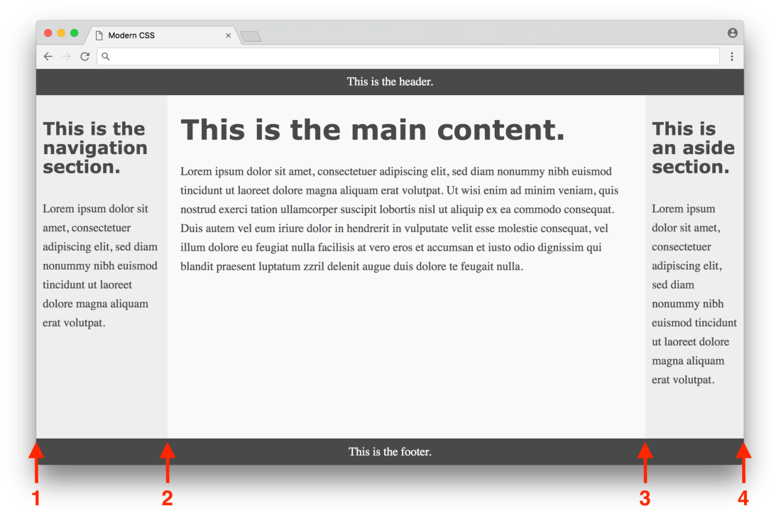
Click here for a real example.
The first column starts at position 1 and ends at position 2, the second column starts at 2 and ends at 3, and the third column starts at position 3 and ends at position 4. In the header, the
grid-column property is set to 1 / 4 for the extension full page, in nav there is a grid-column with a value 1 / 2 for expanding to the first column, etc.When you get used to the grid syntax, it becomes clear that this is the perfect way to implement layout in CSS. The only real flaw is not all browsers support. But again, the situation has improved significantly over the past year. It is difficult to overestimate the value of the CSS grid as the first real tool in CSS, which was originally designed for the layout, that is, for the layout of the entire page. In a sense, web designers always had to be very conservative when creating creative layouts, because until recently, tools remained very fragile, demanding a variety of hacks and non-standard loopholes. Now, with the advent of the CSS grid, there is the potential for a new wave of creative design layouts that it was impossible to create before - great times!
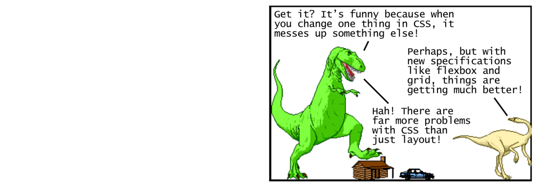
- Received? It's funny that when you change something in CSS, it breaks something else!
- Perhaps, but with new specifications like flexbox and grid, everything has become much better!
- Ha! There are more difficulties in CSS, not just layout!
Using CSS preprocessor for new syntax
So far we have been considering using CSS for simple styles and layouts. Now we will study the tools that help to work with the CSS language itself. Let's start with CSS preprocessors.
The CSS preprocessor allows you to write styles in other languages, which are then converted to CSS so that the browser understands them. This was extremely important at a time when browsers were too slow to implement support for new features. The first popular CSS preprocessor Sass was released in 2006. It implemented a new short syntax (padding instead of parentheses, no semicolons, etc.) and added advanced functions that are missing from CSS, such as variables, auxiliary functions and calculations. Here is what the color section from our previous example looks like when using Sass with variables:
$dark-color: #4a4a4a $light-color: #f9f9f9 $side-color: #eee body color: $dark-color header, footer background-color: $dark-color color: $light-color main background: $light-color nav, aside background: $side-color Notice how
$ denotes reusable variables. There are no brackets or semicolons, which makes the syntax cleaner. Pure syntax is nice, but functions like variables made a real revolution at the time because they opened up new possibilities for writing clean and supported CSS.To use Sass, you need to install Ruby . This programming language is used to compile Sass code into regular CSS. Then you need to install the Sass gem , then run the command in the command line to convert your .sass files to .css files. Here’s an example of what this command looks like:
sass --watch index.sass index.cssThis command converts the Sass code from the
index.sass file to regular CSS in the index.css file (the --watch argument indicates the launch every time the input data changes after saving, which is convenient).This process is known as the assembly stage, and in 2006 it was a fairly significant barrier to entry. If you're short of programming languages like Ruby, then everything is easy for you. But many front-end developers at that time worked only with HTML and CSS, where similar tools are not required. So this is a considerable requirement for the developer to study the whole ecosystem in order to use the functions of the CSS preprocessor.
In 2009, the CSS preprocessor Less . It is also written in Ruby and has similar functionality with Sass. The key difference was the syntax, which made the most similar to the CSS. This means that any CSS code at the same time is the valid Less code. Here is the same example on the Less syntax:
@dark-color: #4a4a4a; @light-color: #f9f9f9; @side-color: #eee; body { color: @dark-color; } header, footer { background-color: @dark-color; color: @light-color; } main { background: @light-color; } nav, aside { background: @side-color; } It is almost the same (only the prefix
@ instead of $ for variables), but it doesn’t look as beautiful as the Sass example. Here we see the same braces and semicolons as in CSS. But the fact of being close to CSS made it easy for web designers to master this preprocessor. In 2012, Less was rewritten to use JavaScript (in particular, Node.js ) instead of Ruby when compiling. After that, Less began to work faster than its Ruby competitors, and the preprocessor itself became more attractive for developers who already use Node.js in their work.To convert the given code into regular CSS, you first need to install Node.js , then install Less and run the command:
lessc index.less index.cssThe command converts the Less code from the
index.less file to regular CSS in the index.css file. Notice that the lessc command lessc no way to keep track of file changes, as sass does. So you’ll have to use some other tool to automatically track and compile .less files, which makes the process a little more difficult. Again, there is nothing difficult for programmers who are used to using command line tools, but this is a significant barrier for ordinary designers who simply want to use the CSS preprocessor.When Less became popular, the Sass developers added a new SCSS syntax to their preprocessor in 2010 (a superset of CSS similar to Less). They also released LibSass , the port of the Ruby Sass engine in C / C ++, which accelerated its work and made it available for programming in various languages.
Another alternative CSS preprocessor Stylus was released in 2010. It is written in Node.js and has a cleaner syntax than Sass or Less. Usually, in discussing CSS preprocessors, these three programs are mentioned as the most popular (Sass, Less, and Stylus). In the end, they are all very similar in functionality, so you can't go wrong by choosing any of them.
However, some believe that the value of CSS preprocessors has decreased recently, because browsers have finally begun to implement some of their functions (such as variables and calculations). Moreover, there is an opposite approach - postprocessing CSS, due to which CSS preprocessors can be completely outdated (obviously, this is a controversial issue). CSS postprocessors, we now consider.
Using CSS Postprocessing for Conversion Functions
The CSS postprocessor uses JavaScript to analyze and convert your CSS to valid CSS. In this sense, it is quite similar to the CSS preprocessor - it can be considered as another way to solve the same problem. The key difference is that the CSS preprocessor uses a special syntax to define the transformation object, and the CSS postprocessor can parse the original CSS code and transform it without any special syntax. It is best to show this with an example. Look at the part of the CSS from the above example, where we define the style of the header tags:
h1, h2, h3, h4, h5, h6 { -ms-hyphens: auto; -moz-hyphens: auto; -webkit-hyphens: auto; hyphens: auto; } The lines from the second to the fourth are called vendor prefixes. Browsers use vendor prefixes when testing new CSS features or using them experimentally. Thus, developers can test these features before final implementation in the browser. Here, the
-ms prefix for the Microsoft Internet Explorer browser, the -moz prefix for Mozilla Firefox, and the -webkit prefix for browsers on the Webkit engine (such as Google Chrome, Safari, and the latest versions of Opera).It is rather inconvenient to embed these different vendor prefixes for using CSS properties. It would be nice if some tool would automatically do it for us if necessary. This can be done using CSS preprocessors. For example, in the SCSS syntax:
@mixin hyphens($value) { -ms-hyphens: $value; -moz-hyphens: $value; -webkit-hyphens: $value; hyphens: $value; } h1, h2, h3, h4, h5, h6 { @include hyphens(auto); } Here we use the mixin function in Sass , which once defines a piece of CSS - and then reuses it everywhere. When this file is compiled into regular CSS, any
@include operator @include replaced with the CSS code from the corresponding @mixin .In general, this is a good solution, but you are responsible for determining mixin for each CSS property where you need to specify vendor prefixes. These mixin definitions require support: when browsers officially implement some CSS functions, you may want to remove unnecessary vendor prefixes.Instead of mixin, I would just like to write normal CSS so that the tool automatically finds properties that need prefixes and add them where necessary. CSS postprocessor can work this way. For example, if you are using PostCSS with the autoprefixer plugin , you can write completely ordinary CSS without any vendor prefixes, and the postprocessor will do all the work:
h1, h2, h3, h4, h5, h6 { hyphens: auto; } If you run the CSS postprocessor on this code, then instead of the line
hyphens: auto;, all the corresponding vendor prefixes will appear (in accordance with the rules of autochange from the autoprefixer plugin that you do not need to manually change). That is, you can just write plain CSS without worrying about some kind of compatibility or special syntax, which is great!In addition to autoprefixer, there are other plug-ins for PostCSS, allowing you to do really cool things. The cssnext plugin allows you to apply experimental CSS features. The CSS modules plugin automatically modifies classes to avoid name conflicts. Plugin stylelintfinds errors and conflicting conditions in your CSS. These tools really started in the last year or two, demonstrating such developer workflow features that were never available before!
However, progress has to be paid. Installing and using a CSS postprocessor like PostCSS requires more effort than a CSS preprocessor. Not only do you have to install and run tools from the command line, but also install and configure individual plugins and define a more complex set of rules (such as which browsers to take into account, etc.). Instead of running PostCSS directly from the command line, many developers integrate it into configurable build systems like Grunt , Gulp or webpack. This makes it easier to manage all the different build tools that you can use for the frontend.
Note : If you have never used modern assembly systems for the frontend, then it may seem that you need to learn too much information. If you want to start from scratch, read my article "Modern JavaScript for dinosaurs" , which explains all the necessary JavaScript tools needed to use these modern functions in front-end development.
It is worth noting that controversy has evolved around CSS postprocessors. Some say that the terminology is too confusing ( some think that all these tools should be called CSS preprocessors; others say that they should be called simply CSS processors, etc.). Someone believes that CSS postprocessors will eliminate the need for CSS preprocessors altogether, some think that they should be used together. In any case, you need to learn CSS postprocessors if you want to squeeze everything out of CSS.
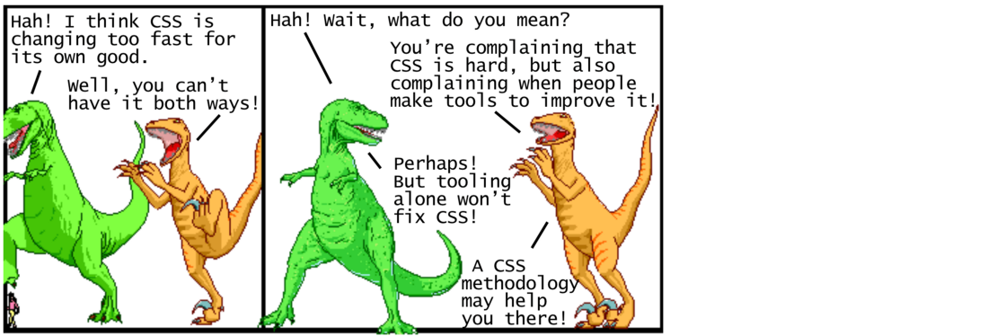
— ! , CSS .
— , !
— ! , ?
— , CSS , , !
— ! CSS!
— CSS!
CSS
Tools like CSS preprocessors and CSS postprocessors have come a long way in improving the usability of CSS development. But these tools alone are not enough to solve the problem of supporting large CSS codebases. To solve this problem, we began to create different guidelines on how to write CSS - usually they are called CSS methodologies.
Before delving into any particular CSS methodology, it is important to understand the reasons why long-term CSS support is so complex. The key problem is the global nature of CSS. Each style you set is globally applied to all parts of the page. You have to work or enter a detailed naming convention to support unique class names, or introduce CSS specificity rulesto determine which style should be applied to each element. CSS methodologies offer an organized way to write CSS to avoid these pain points in large code bases. Consider some popular methodologies in chronological order.
OOCSS
OOCSS (Object Oriented CSS) was first introduced in 2009 as a methodology, based on two main principles. The first principle is to separate the structure from the shell . This means that CSS with a structure definition (like a layout) should not be mixed with CSS, which defines a shell (like colors, fonts, etc.). So it is easier to remake the shell, that is, the appearance of the application. The second principle is to separate the content from the container . This means representing elements as reusable objects with the key idea that an object should look the same regardless of its position on the page.
OOCSS offers well-designed guidelines, but does not accurately describe the specifics of this approach. Subsequent methodologies like SMACSS took key concepts and added more details to make them easier to work with.
SMACSS
SMACSS (Scalable and Modular Architecture for CSS) appeared in 2011 as a methodology that recommends writing CSS in five separate categories: basic rules, layout rules, modules, state rules, and subject rules . The SMACSS methodology also recommends a specific convention regarding naming. For example, in the layout rules, class names should be prefixed with
l-or layout-. In state rules, class names must be prefixed with prefixes that describe the state, for example, is-hiddenor is-collapsed.In SMACSS, there is much more specificity than OOCSS, but this methodology still requires careful consideration of what CSS rules to include in each of the categories. Subsequent approaches like BEM partially take decisions, so they are easier to use in practice.
BEM
Introduced in 2010, the BEM methodology (Block, Element, Modifier) is based on dividing the user interface into independent blocks. A block is a reusable component (an example would be a search form defined as
<form class="search-form"></form>). The element is a smaller part of the block, and it cannot be reused by itself (an example could be a button from a search form defined as <button class="search-form__button">Search</button>). A modifier is an entity that defines the appearance, state, or behavior of a block or element (an example would be a disabled search form button defined as <button class = "search-form__button search-form__button - disabled"> Search </ button>).The BEM methodology is simple to understand, with a specific naming convention, which allows beginners to use it without having to make any difficult decisions. The flip side of the coin is that some class names are rather verbose and do not conform to the traditional rules for indicating semantic names . Subsequently, new methodologies appeared, such as Atomic CSS, where this unconventional approach has moved to a completely new level!
Atomic CSS
The Atomic CSS methodology (also known as Functional CSS) appeared in 2014. It is based on the idea of creating small, highly specialized classes with names that are based on a visual function. This approach is completely opposite to the aforementioned OOCSS, SMACSS, and BEM: instead of treating elements on the page as reusable objects, Atomic CSS generally ignores these objects and uses reusable narrowly specialized utility classes to set the style of each element. So instead
<button class="search-form__button">Search</button>you get something like <button class="f6 br3 ph3 pv2 white bg-purple hover-bg-light-purple">Search</button>.If your first reaction to this example is to recoil in horror - you are not alone. Many see this methodology as an absolute violation of established CSS best practices. However, quite a few substantive discussions took place, where the effectiveness of these practices in some cases is being questioned. This article puts a good emphasis on how traditional task separation leads to the creation of CSS, which depends on HTML (even when using methodologies like BEM), while an “atomic” or functional approach forces us to create HTML, which depends on CSS. Both options are acceptable, but upon closer inspection you will find that the complete separation of CSS and HTML is impossible in principle!
Other CSS methodologies like CSS in JS actually include the understanding that CSS and HTML will always depend on each other. This recognition led to the creation of one of the most controversial methodologies to date ...
CSS in JS
The CSS methodology in JS was introduced in 2014. It is based on defining CSS styles not in a separate style sheet, but directly inside each component. This methodology was developed for the React JavaScript framework (which itself chose the ambiguous approach of defining HTML for a component directly in JavaScript instead of a separate HTML file). Initially, the methodology used nested styles, but in later implementations of JavaScript it generated CSS code (with unique class names by component) and inserted it into the document along with the style tag.
The CSS methodology in JS also completely contradicts the well-established CSS best practices for content separation. The fact is that over time, our ways of using the web have changed dramatically. Initially, the web consisted mainly of static sites - it made sense to separate HTML content from CSS presentation. Nowadays, the Web is used for dynamic web applications - here reusable components make sense.
The goal of the CSS methodology in JS is to allow components to be defined with hard boundaries that consist of their own encapsulated HTML / CSS / JS, so that CSS from one component has no ability to affect other components. React was one of the first popular frameworks to promote these components with rigid boundaries. Under his influence, the same components were introduced in other popular frameworks such as Angular, Ember, and Vue.js. It is important to note that the CSS methodology in JS is relatively new, so many experiments continue in this area - developers are trying to establish new best practices for CSS in the era of components for web applications.
It’s easy to get confused by so many different CSS methodologies, but it’s important to remember that there is no one right approach — you have to present them as different available tools that can be used when you have a fairly complex CSS code base in your hands. It is convenient to have a choice from different thoughtful approaches, so that all the latest experiments in this field will benefit every developer in the long run!
Conclusion
This is what modern CSS looks like in a nutshell. We discussed using CSS for basic styles with layout properties, using CSS for layout using float, flexbox and grid, using a CSS preprocessor for new syntax , such as variables and mixins, using a CSS postprocessor for transformation functions such as adding vendor prefixes, as well as CSS methodologies for reliable maintenanceand overcome the global nature of CSS styles. We did not have a chance to understand in detail many other CSS functions, such as advanced selectors, transitions, animations, forms, dynamic variables - the list goes on and on. You can discuss a lot in CSS - if someone says that this is simple, then he probably doesn't know half of it!
With modern CSS it can definitely be inconvenient to work, because it continues to change and develop at a rapid pace. But it is important to remember the historical context, how the Web has evolved over the years - and it's nice to know that a lot of smart people are working on specific tools and methodologies so that the best CSS practices develop along with the web. Now is an exciting time to be a web developer, and I hope that this information will serve as a map on your journey!
— ! - CSS, ?
— , !
—… . CSS-, CSS [ ]
Source: https://habr.com/ru/post/348500/
All Articles