Web typography: create tables for reading, not for beauty
Nataliya Shergina, freelance editor and student of Netology , translated Richard Rutter's longrid about web-typography especially for the blog.

Good designers take the time to typography. They carefully select fonts, sort through a number of typographic scales and scrupulously use spaces (white space) for the convenience of the user. Then there is the temptation to create - and now all thoughts are no longer about the user. However, tables are needed primarily to be read and used, and not just admired.
')
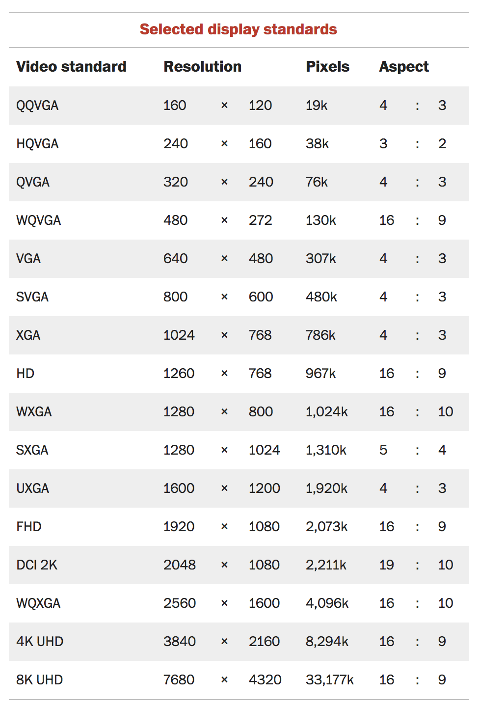
There are a huge number of tables: some contain simple numerical data, others contain a mixture of text and numerical indicators. Some need to read row by row, while others can be quickly viewed vertically. The potential for using tables is as great as for words. In the form of tables you can present financial indicators, bus schedules, foreign dictionaries, the content of documents and books, numeric conversions, prices, comparisons, technical characteristics and so on.
Despite all the variety of sizes, structure, content and goals, two simple design principles apply to any table: it should be easy to read and not distort the meaning of the data contained in it.
Tables do not need to "decorate" just to make them look more aesthetic. A well-designed table can be beautiful, but only if the form primarily serves the content.
The design of tables should not be something boring and monotonous. On the contrary, it can turn into a creative process, no less interesting than work in other areas of design.
If possible, consider the readability of each table in advance. Your job as a designer is to find ways to make information readable, easy to learn and use.
Working with text on the web, you are not trying to put as many words on the screen as you like. The same principle applies to tables: no need to push as much data as possible there. There is a temptation to reduce the size of the text in the table, and if all the information is numeric, it may work. But even in such a scenario, the user must easily read the information from his usual position without approaching the screen.
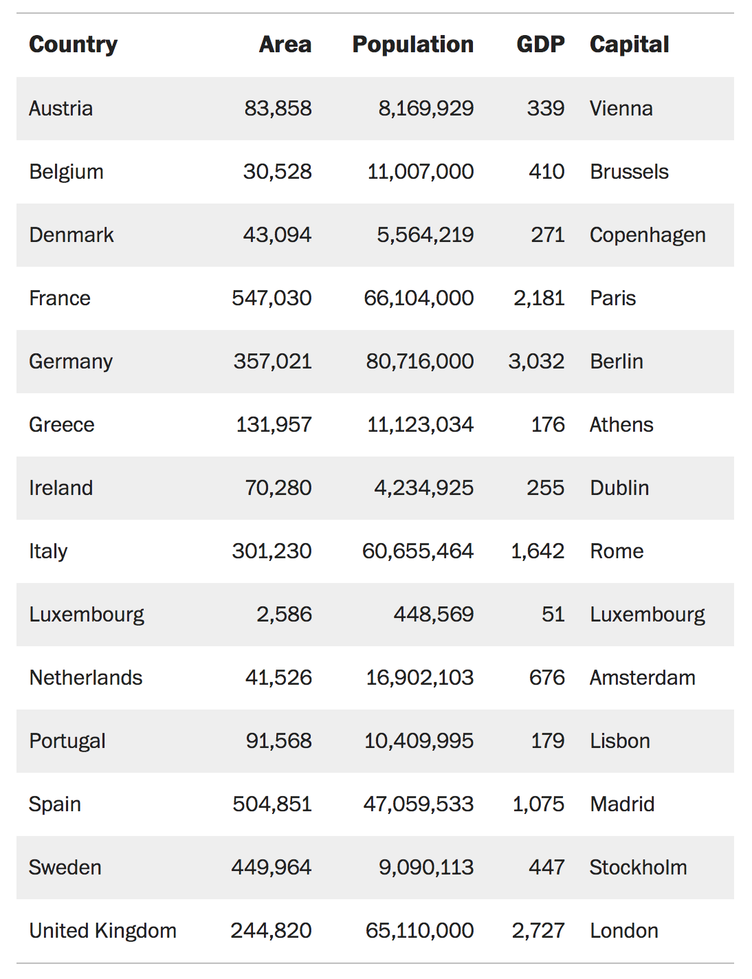
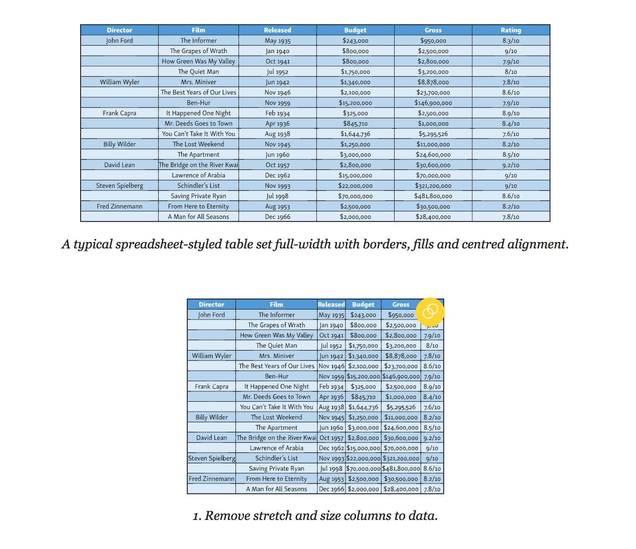
Many designers instinctively apply the parameter "width" to the tables on the principle of working with images. The table is stretched to the full width of the column or page. This is the temptation to stretch: from a distance it becomes like an image. And if at a distance the table looks good, then there will be unnecessary space between the data units that makes reading difficult. In addition, the entire width of the tables is full of background image and colored borders, which makes it even more like a picture, while the user needs the structure of the text. For the sake of your readers do not give in to this temptation.
You might want to align all the columns to the width. However, this does not improve readability. Some cells will become too wide, the information in them will be lost, and the connection between the data of adjacent columns will be interrupted. Other cells, by contrast, will be too narrow, compressing the contents of the table. Columns in the table should be aligned depending on the amount of data in them. Columns with small numbers should be narrow, and columns with paragraphs should be relatively wide. It will take time to create such a table, especially if you are a print designer - you will need to manually set the width of each column for the layouts. Fortunately, browsers will do all the work for you. They used special algorithms to display tables long before the appearance of CSS, so just rely on them.
Edward Tufti, the internationally recognized master of visual information display, speaking about the design of the tables in the book “Visual display of quantitative information”, notes that almost everything that is not data or white space should be removed (white space). Minimizing design elements and focusing on the information presented is the first principle of typographic design of tables.
Highlighting every other line, a striped fill distorts the data value, making the information in non-empty lines less significant. Use the fill carefully and only to direct the user's attention in the right direction. When listing the selection should go from top to bottom, in other cases - in the direction of reading.
The same applies to the borders and lines between the rows and columns of the table. Use them rarely, never better. Jan Chihold notes:
The table should not look like a grid in which each number is surrounded by borders. Try to do without any boundaries. Use them only if you can’t do without them at all. Vertical borders are needed only when the distance between the columns is too small, as this can lead to errors when interpreting the data in the table. Tables without vertical borders look better than with them, and thin borders look better than thick ones.
Jan Chihold, Asymmetric Typography, 1967 .
Separate columns and rows by borders only if alignment, discharge, and merging are not enough to guide the reader. If separation by borders is still necessary, use light fill tones. Your goal - to highlight the right, and not to build a barrier.
Once again, the tables are created so that they are read, and not just viewed. Therefore, align the text in the table as you would align it in a different context - that is, along the left edge. Avoid alignment in width, leave the text a bit “torn” on the right, otherwise the distance between the words stretched to the full width of the line will create “rivers” (holes) and the data will be difficult to read. If the right edge is too “ragged”, use word wrap to a new line.
Align the numbers to the right. It helps to compare the values when you skim the table from top to bottom. To make reading easier, use the same number of decimal places.
For consistency and ease of perception, align the table headings in accordance with the alignment of the data in it: if it is numerical data, then on the right, and if it is text, then on the left. For example:
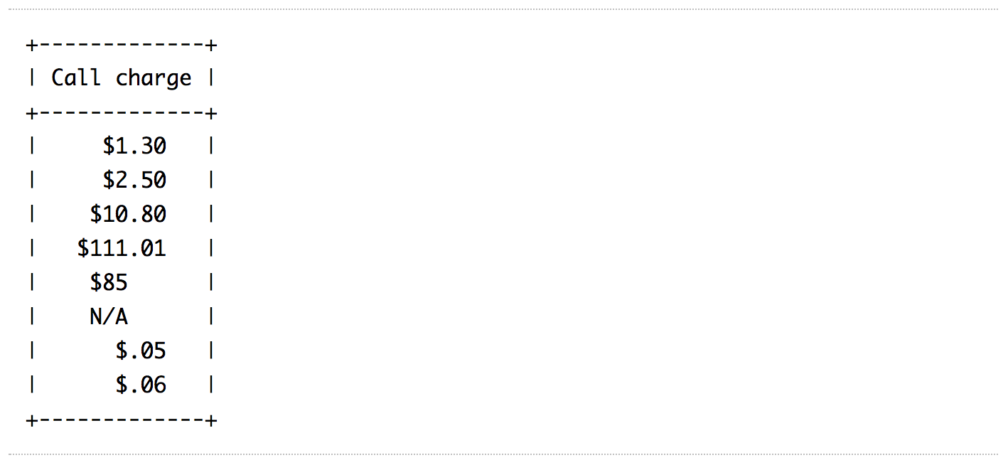
It is not always possible to control the accuracy of the data. Sometimes, instead of storing decimal values, numbers are rounded to a whole. In this case, right-justified alignment does not help to quickly scan the contents of the column — small numbers with decimal values appear large visually. Do not align with the right edge, but comma in decimal fraction. This will help the reader to easily identify and compare the numbers in the table.
In HTML 4, decimal alignment was theoretically possible using the
The
In the example below, the data is centered and aligned to the decimal point:
In this example, the data is aligned with the “×” and “:” symbols:
Many tables, for example, financial reports or schedules, consist mainly of numbers. Their main goal is to present numeric data using columns, rows, or their combinations. The reader can view such a table vertically, search for the necessary information or compare numerical indicators. Sometimes a single glance at a column or row is enough to determine what kind of information is presented.
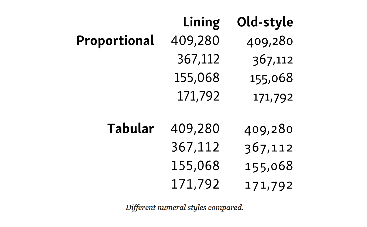
It is much easier to compare and compare numbers if units, tens and hundreds are aligned vertically. In other words - all the digits in the number should be the same width.
Numbers of the same width are included in monospace fonts, which are quite suitable for the presentation of data in the table. However, many proportional fonts (that is, those in which 1 is already 8, and W is wider than I) also include an additional set of monospaced numbers. Such figures are called tabular. They are designed differently than standard proportional ones. For example, unit (1) has a horizontal base, and zero (0) may be somewhat the same, in order to better adjust to the width of the selected number. Tabular numbers are usually included in the muscular (uppercase) and minuscule (lowercase) variations of numbers. Use tabular uppercase numbers to simplify the comparison of numerical data in a table.
To define table caps, use the property
For browsers with
For proportional digits, set the
After getting rid of borders, dividers and cell fills, it is necessary to use the “white space” in order for the table to be read. At this stage, you need to forget about the design of spreadsheets and start thinking in terms of typography and the principles of gestalt grouping.
To do this, you need to separate the data so that each element is easily read and considered separately from the others. First, remove the distance between the cells using
In standard HTML tables, adjacent cells have their borders and are located at a certain distance from each other. This distance between cells is maintained, even if the borders themselves have been removed. The
The next step is to add padding for each cell to separate the data. The upper indentation of the cell is better to do a little less. This will help to visually balance the distance between the lower and upper lines. To ensure that the entire table is properly aligned, use the same indentation for the cell headers as for the data cells. The length of the line in the tables is often short, so the height of the line can be reduced. In the example below, we have removed all the extra line spacing, but you may need more space, depending on the font and the amount of text in the cells.
The most useful principles of gestalt grouping in the design of tables is the principle of proximity and similarity. Combine similar data so that they are more easily perceived against the background of other information. In other words, separate the columns and rows from each other. Plus grouping is that it is easier to perceive such a table, which means it reads better than a table with columns and rows that are not divided into groups. Highlight data that is similar in meaning and content using alignment, the same color or font.
We will talk more about the typographical features of captions to the tables in the chapter “How to choose a font for a functional text”, but in this chapter it also makes sense to say a few words about the design of signatures. If you enclose a table in a
You can place a caption on the table or after it, using the
The table below contains the caption and uses the principles of gestalt grouping, separating similar data using colored lines.
Note that in this example the decimal numbers are not comma-aligned. The purpose of the table is not the comparison of numerical values, but the determination of the multiplication factor. Therefore, numeric data is right aligned.
French writer-aviator Antoine de Saint-Exupéry wrote 3 that “ perfection is achieved not when there is nothing to add, but when nothing can be taken away ”.
Despite the fact that this quote has already become a cliché, it correctly reflects the approach to the design of tables. The table should not look like it is spread in Excel, which in itself is a tool. The table serves to simplify the presentation of data that can be read and understood. Spreadsheet in Excel allows you to add text formatting, border styles and cell fills, which turns it into a picture, but does not improve readability. Tables can also be beautiful, but they are not works of art, and therefore they do not need to be decorated. When styling a table, think about those who will use them.
To correctly display information in the table, every millimeter is important. Sometimes the table has to be wider than the standard line of 45–75 characters, and therefore adaptation for small screens is not an easy task. The best option is to work separately with each table, but this is not always possible, especially if you need to apply a single style to all tables from the CMS database.
The most obvious way to save space is to use a compressed font or shrink a size (but not both at the same time). In any case, the readability of the table should not suffer.
If your table has long headings and limited screen width, using oblique fonts can save space.
Below is an example of how this can be achieved in CSS using the
The simplest solution for adaptive table layout is to allow the browser to use horizontal scrolling when part of the table is moved outside the device screen. At the same time, make sure that only the table scrolls to the left and right, and not all the text on the screen.

To achieve this effect, wrap the table in a
Below is an example of how to use CSS to activate a scroll for a table without affecting the rest of the text on the page:
You should not set a fixed width for the table: the browser will squeeze it as far as possible before applying the scroll. To preserve readability, use non-breaking spaces and the
If you work with small tables and space is limited, feel free to present them in the form of lists. The tables most suitable for this are lists with structured data, such as a directory of employees.
If there is not enough space for such a table, you can try to change its structure. In the example below, the table has become more compact as a whole, it takes up more vertical space, but it fits better into narrow screens.
Both tables use the same HTML markup. The only difference is the
Four simple steps to turn tables into a list using media queries and CSS (without JavaScript):
Along with the styles above, you will need to apply a few additional CSS styles so that the table does not lose in aesthetics. This method was first applied by Aaron Gustafson 4 .
There are many techniques 5 for creating responsive tables. Some are based only on CSS (we mentioned two), others are more complex using JavaScript. What to decide on the technique, ask yourself how and why the user will use the table. For example, tables for comparing data in columns or rows deserve special attention.
One way to make it easier to compare data in columns is to hide small fields with the ability to turn them back into the table. This technique was popularized by Filament Group 6 using stock fluctuation tables.

Often, the tables are not given due attention: they are poorly thought out and incorrectly laid out. Adaptability of tables is not as simple as it seems at first glance. It largely depends on the purpose for which the tables will be used. Do not neglect the tables, they can be informative and rich in meaning and content.
Netology courses on the topic:
Free programs and classes:
Notes to the text:
1. Asymmetric Typography by Jan Tschichold (1967, after 1935 original).
2. Character-based Alignment in a Table Column (http://wbtyp.net/103) in the CSS Text Module Level 4.
3. Terre des Hommes (translated to Wind, Sand and Stars) by Antoine de Saint-Exupéry (1939).
4. ' Responsive Tables ' (http://wbtyp.net/16) by Aaron Gustafson on Easy Designs blog (2013).
5. See CSS-Tricks ' Responsive Tables ' (http://wbtyp.net/148) for the latest options.
6. Filament Group's ' Tablesaw ' (http://wbtyp.net/15) responsive table plug-ins.
Good designers take the time to typography. They carefully select fonts, sort through a number of typographic scales and scrupulously use spaces (white space) for the convenience of the user. Then there is the temptation to create - and now all thoughts are no longer about the user. However, tables are needed primarily to be read and used, and not just admired.
')
Treat tables as text to be read.
There are a huge number of tables: some contain simple numerical data, others contain a mixture of text and numerical indicators. Some need to read row by row, while others can be quickly viewed vertically. The potential for using tables is as great as for words. In the form of tables you can present financial indicators, bus schedules, foreign dictionaries, the content of documents and books, numeric conversions, prices, comparisons, technical characteristics and so on.
Despite all the variety of sizes, structure, content and goals, two simple design principles apply to any table: it should be easy to read and not distort the meaning of the data contained in it.
Tables do not need to "decorate" just to make them look more aesthetic. A well-designed table can be beautiful, but only if the form primarily serves the content.
Tables are not images with data. These are reference books for careful study and analysis.A properly designed table is easy to read and identifies common patterns and patterns in the analyzed data. Typographic Designer Ian Chihold writes 1 :
The design of tables should not be something boring and monotonous. On the contrary, it can turn into a creative process, no less interesting than work in other areas of design.
If possible, consider the readability of each table in advance. Your job as a designer is to find ways to make information readable, easy to learn and use.
Working with text on the web, you are not trying to put as many words on the screen as you like. The same principle applies to tables: no need to push as much data as possible there. There is a temptation to reduce the size of the text in the table, and if all the information is numeric, it may work. But even in such a scenario, the user must easily read the information from his usual position without approaching the screen.
Do not stretch the table
Many designers instinctively apply the parameter "width" to the tables on the principle of working with images. The table is stretched to the full width of the column or page. This is the temptation to stretch: from a distance it becomes like an image. And if at a distance the table looks good, then there will be unnecessary space between the data units that makes reading difficult. In addition, the entire width of the tables is full of background image and colored borders, which makes it even more like a picture, while the user needs the structure of the text. For the sake of your readers do not give in to this temptation.
You might want to align all the columns to the width. However, this does not improve readability. Some cells will become too wide, the information in them will be lost, and the connection between the data of adjacent columns will be interrupted. Other cells, by contrast, will be too narrow, compressing the contents of the table. Columns in the table should be aligned depending on the amount of data in them. Columns with small numbers should be narrow, and columns with paragraphs should be relatively wide. It will take time to create such a table, especially if you are a print designer - you will need to manually set the width of each column for the layouts. Fortunately, browsers will do all the work for you. They used special algorithms to display tables long before the appearance of CSS, so just rely on them.
Use the fill to the minimum
Edward Tufti, the internationally recognized master of visual information display, speaking about the design of the tables in the book “Visual display of quantitative information”, notes that almost everything that is not data or white space should be removed (white space). Minimizing design elements and focusing on the information presented is the first principle of typographic design of tables.
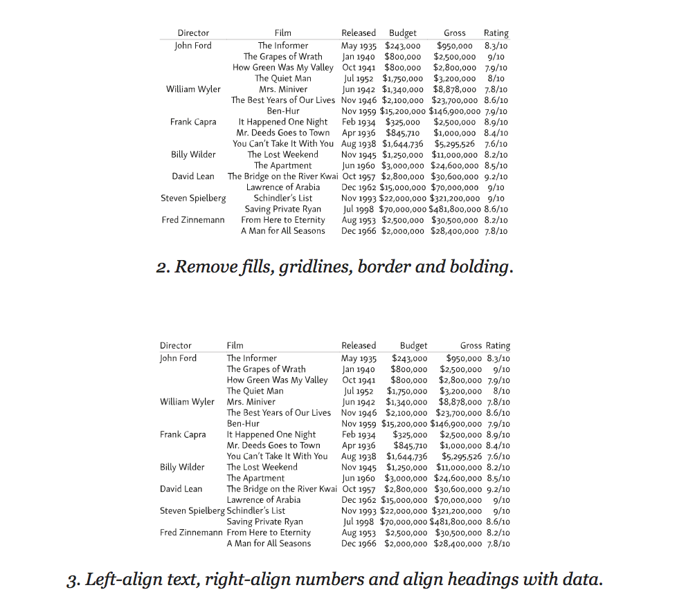
First get rid of any frames and borders in the tables. This is excessive Victorian embellishment, because the alignment of the text will mark the table borders.Try to improve readability using only alignment, line spacing and merging. Avoid any fillings, especially “zebra” - alternating fill lines, and in general any background other than white. Filled tables can look good, but this design distracts from the content.
Highlighting every other line, a striped fill distorts the data value, making the information in non-empty lines less significant. Use the fill carefully and only to direct the user's attention in the right direction. When listing the selection should go from top to bottom, in other cases - in the direction of reading.
The same applies to the borders and lines between the rows and columns of the table. Use them rarely, never better. Jan Chihold notes:
The table should not look like a grid in which each number is surrounded by borders. Try to do without any boundaries. Use them only if you can’t do without them at all. Vertical borders are needed only when the distance between the columns is too small, as this can lead to errors when interpreting the data in the table. Tables without vertical borders look better than with them, and thin borders look better than thick ones.
Jan Chihold, Asymmetric Typography, 1967 .
Separate columns and rows by borders only if alignment, discharge, and merging are not enough to guide the reader. If separation by borders is still necessary, use light fill tones. Your goal - to highlight the right, and not to build a barrier.
Align text to the left, numbers to the right, and heading to the data in the table.
Once again, the tables are created so that they are read, and not just viewed. Therefore, align the text in the table as you would align it in a different context - that is, along the left edge. Avoid alignment in width, leave the text a bit “torn” on the right, otherwise the distance between the words stretched to the full width of the line will create “rivers” (holes) and the data will be difficult to read. If the right edge is too “ragged”, use word wrap to a new line.
Align the numbers to the right. It helps to compare the values when you skim the table from top to bottom. To make reading easier, use the same number of decimal places.
For consistency and ease of perception, align the table headings in accordance with the alignment of the data in it: if it is numerical data, then on the right, and if it is text, then on the left. For example:
Align comma in decimal
It is not always possible to control the accuracy of the data. Sometimes, instead of storing decimal values, numbers are rounded to a whole. In this case, right-justified alignment does not help to quickly scan the contents of the column — small numbers with decimal values appear large visually. Do not align with the right edge, but comma in decimal fraction. This will help the reader to easily identify and compare the numbers in the table.
In HTML 4, decimal alignment was theoretically possible using the
td tag and its char attribute, but in practice this property was not supported. In HTML 5, text-align used for this purpose, although at the time of writing this article, the support of this property for aligning numbers in a table is not ideal. (CSS Text Level 4 Module 2 )The
text-align syntax is the following: the quotation mark is the character by which alignment occurs (usually a dot or comma), then a space is entered after the space indicating the type of alignment (default is right ).In the example below, the data is centered and aligned to the decimal point:
td { text-align: "." center; } In this example, the data is aligned with the “×” and “:” symbols:
Use mauscule (uppercase) numbers in tables with numeric data.
Many tables, for example, financial reports or schedules, consist mainly of numbers. Their main goal is to present numeric data using columns, rows, or their combinations. The reader can view such a table vertically, search for the necessary information or compare numerical indicators. Sometimes a single glance at a column or row is enough to determine what kind of information is presented.
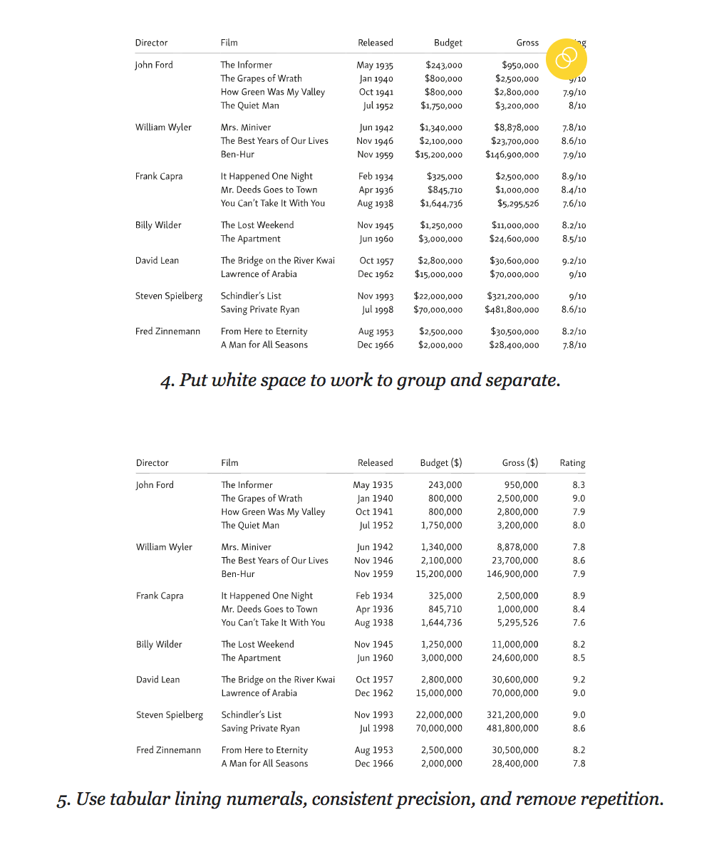
It is much easier to compare and compare numbers if units, tens and hundreds are aligned vertically. In other words - all the digits in the number should be the same width.
Numbers of the same width are included in monospace fonts, which are quite suitable for the presentation of data in the table. However, many proportional fonts (that is, those in which 1 is already 8, and W is wider than I) also include an additional set of monospaced numbers. Such figures are called tabular. They are designed differently than standard proportional ones. For example, unit (1) has a horizontal base, and zero (0) may be somewhat the same, in order to better adjust to the width of the selected number. Tabular numbers are usually included in the muscular (uppercase) and minuscule (lowercase) variations of numbers. Use tabular uppercase numbers to simplify the comparison of numerical data in a table.
To define table caps, use the property
font-variant-numeric with lining-nums and tabular-nums : table { font-variant-numeric: lining-nums tabular-nums; } For browsers with
font-feature-settings use the tags OpenType lnum and tnum .Proportional numbers
For proportional digits, set the
font-variant-numeric to proportional-nums . For browsers with font-feature-settings use the OpenType pnum tag.Use spaces to separate and merge - white space
After getting rid of borders, dividers and cell fills, it is necessary to use the “white space” in order for the table to be read. At this stage, you need to forget about the design of spreadsheets and start thinking in terms of typography and the principles of gestalt grouping.
To do this, you need to separate the data so that each element is easily read and considered separately from the others. First, remove the distance between the cells using
border-collapse : table { border-collapse: collapse; } In standard HTML tables, adjacent cells have their borders and are located at a certain distance from each other. This distance between cells is maintained, even if the borders themselves have been removed. The
border-collapse property with a collapse value causes the browser to remove double borders at the junction of the cells, leaving only one. Since we delete most of the borders in the table, the border-collapse model is most acceptable for us.The next step is to add padding for each cell to separate the data. The upper indentation of the cell is better to do a little less. This will help to visually balance the distance between the lower and upper lines. To ensure that the entire table is properly aligned, use the same indentation for the cell headers as for the data cells. The length of the line in the tables is often short, so the height of the line can be reduced. In the example below, we have removed all the extra line spacing, but you may need more space, depending on the font and the amount of text in the cells.
td, th { padding: 0.125em 0.5em 0.25em 0.5em; line-height: 1; } The most useful principles of gestalt grouping in the design of tables is the principle of proximity and similarity. Combine similar data so that they are more easily perceived against the background of other information. In other words, separate the columns and rows from each other. Plus grouping is that it is easier to perceive such a table, which means it reads better than a table with columns and rows that are not divided into groups. Highlight data that is similar in meaning and content using alignment, the same color or font.
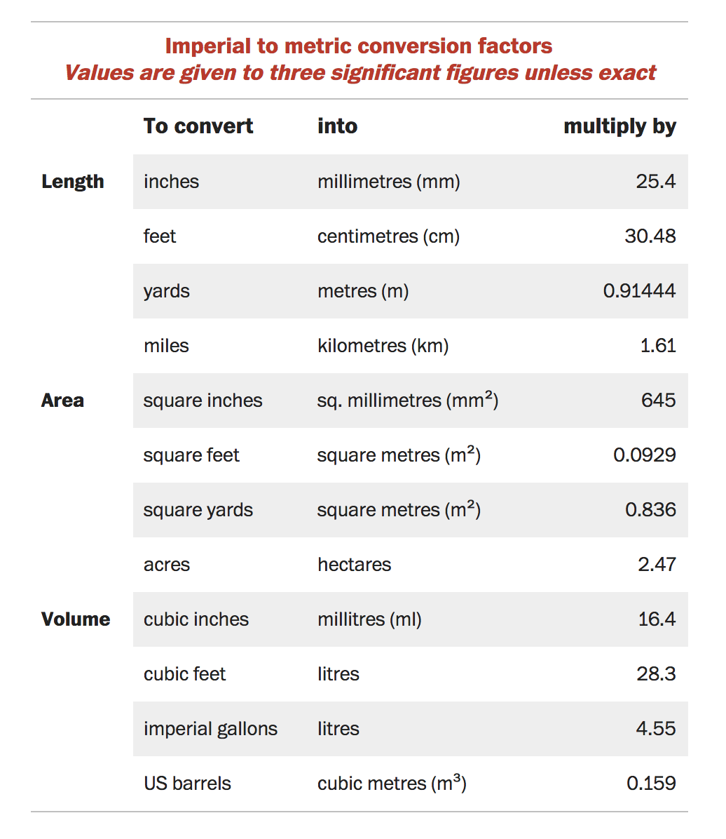
Table captions
We will talk more about the typographical features of captions to the tables in the chapter “How to choose a font for a functional text”, but in this chapter it also makes sense to say a few words about the design of signatures. If you enclose a table in a
figure tag, which is quite reasonable, use the figcaption tag before or after it. If the figure element is not used, caption will be suitable for captions, which is placed immediately after the opening table tag and before any tabular data, for example: <table> <caption> Imperial to metric conversion factors <p><i>Values are given to three significant figures</i></p> </caption> <thead> … </thead> <tbody> … </tbody> </table> You can place a caption on the table or after it, using the
caption-side property and the corresponding value top or bottom . caption { caption-side: bottom; } The table below contains the caption and uses the principles of gestalt grouping, separating similar data using colored lines.
Note that in this example the decimal numbers are not comma-aligned. The purpose of the table is not the comparison of numerical values, but the determination of the multiplication factor. Therefore, numeric data is right aligned.
Do not overdo it with the design
French writer-aviator Antoine de Saint-Exupéry wrote 3 that “ perfection is achieved not when there is nothing to add, but when nothing can be taken away ”.
Despite the fact that this quote has already become a cliché, it correctly reflects the approach to the design of tables. The table should not look like it is spread in Excel, which in itself is a tool. The table serves to simplify the presentation of data that can be read and understood. Spreadsheet in Excel allows you to add text formatting, border styles and cell fills, which turns it into a picture, but does not improve readability. Tables can also be beautiful, but they are not works of art, and therefore they do not need to be decorated. When styling a table, think about those who will use them.
Adapt tables for small screens.
To correctly display information in the table, every millimeter is important. Sometimes the table has to be wider than the standard line of 45–75 characters, and therefore adaptation for small screens is not an easy task. The best option is to work separately with each table, but this is not always possible, especially if you need to apply a single style to all tables from the CMS database.
The most obvious way to save space is to use a compressed font or shrink a size (but not both at the same time). In any case, the readability of the table should not suffer.
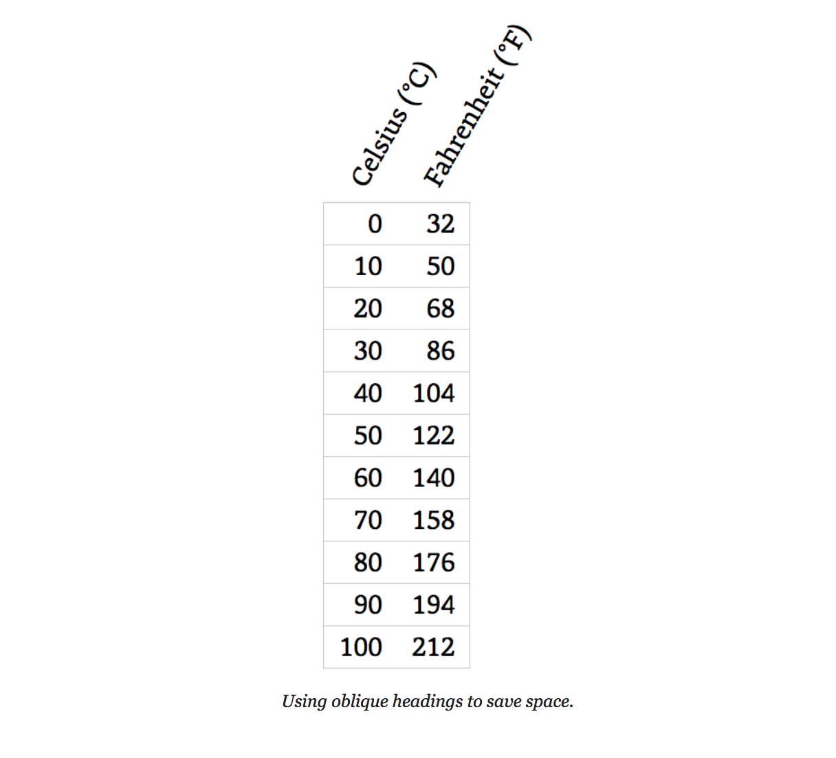
Try italics for headlines
If your table has long headings and limited screen width, using oblique fonts can save space.
Below is an example of how this can be achieved in CSS using the
transform and transform-origin properties. Use absolute positioning for headings, this will allow you to change the original width of the columns - if necessary, decrease with the data. th { transform-origin: bottom left; position: absolute; } th.degC { transform: translate(2.58em,-2em) rotate(-60deg); } th.degF { transform: translate(5.14em,-2em) rotate(-60deg); } Add horizontal scrolling to tables
The simplest solution for adaptive table layout is to allow the browser to use horizontal scrolling when part of the table is moved outside the device screen. At the same time, make sure that only the table scrolls to the left and right, and not all the text on the screen.
To achieve this effect, wrap the table in a
figure tag. <figure class="fig-table"> <table> … </table> </figure> Below is an example of how to use CSS to activate a scroll for a table without affecting the rest of the text on the page:
.fig-table { max-width: 100%; overflow-x: scroll; } You should not set a fixed width for the table: the browser will squeeze it as far as possible before applying the scroll. To preserve readability, use non-breaking spaces and the
white-space:nowrap . Remember that a readable table with a scroll is much better than an unreadable table without it.Convert simple tables into lists
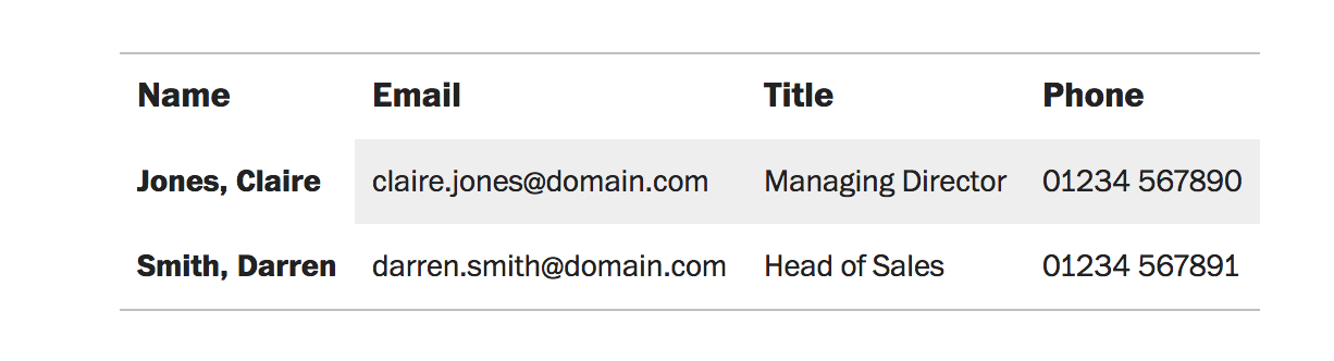
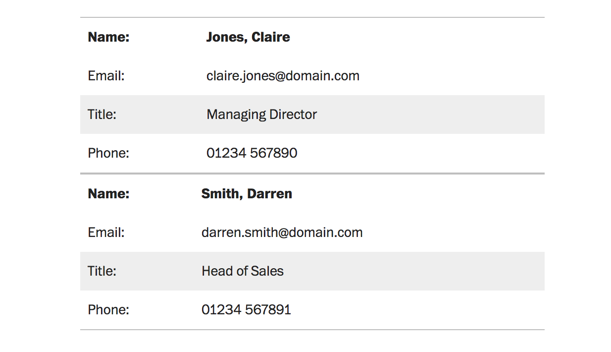
If you work with small tables and space is limited, feel free to present them in the form of lists. The tables most suitable for this are lists with structured data, such as a directory of employees.
If there is not enough space for such a table, you can try to change its structure. In the example below, the table has become more compact as a whole, it takes up more vertical space, but it fits better into narrow screens.
Both tables use the same HTML markup. The only difference is the
data-title attribute, which is applied to each cell in the second version. This attribute is convenient because it repeats the category names in the left column (Name, Email, Title, Phone). <th data-title="Name">Jones, Claire</th> <td data-title="Email">claire.jones@domain.com</td> <td data-title="Title">Managing Director</td> <td data-title="Phone">01234 567890</td> Four simple steps to turn tables into a list using media queries and CSS (without JavaScript):
- Determine the width of the screen at which the layout of the table begins to stray.
- Align all table elements vertically using
display:block. - Hide the row headers of all empty cells.
- Display the names of each data item (optional).
@media (max-width: 25em) { table, caption, tbody, tr, th, td { display: block; text-align: left; } thead, th:empty, td:empty { display: none; visibility: hidden; } th[data-title]:before, td[data-title]:before { content: attr(data-title) ": "; display: inline-block; width: 3.5em; } } Along with the styles above, you will need to apply a few additional CSS styles so that the table does not lose in aesthetics. This method was first applied by Aaron Gustafson 4 .
Making tables adaptive, based on their goals.
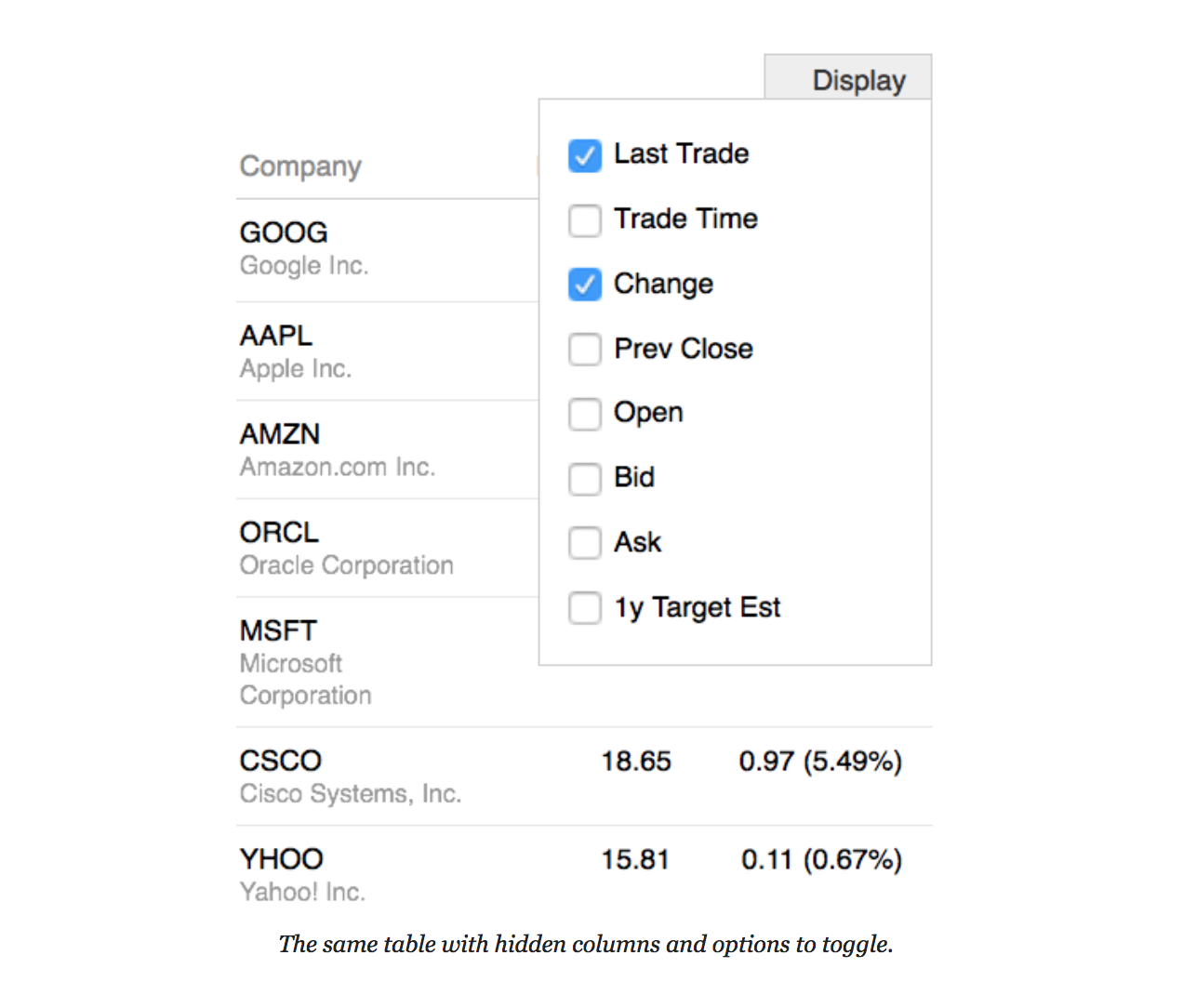
There are many techniques 5 for creating responsive tables. Some are based only on CSS (we mentioned two), others are more complex using JavaScript. What to decide on the technique, ask yourself how and why the user will use the table. For example, tables for comparing data in columns or rows deserve special attention.
One way to make it easier to compare data in columns is to hide small fields with the ability to turn them back into the table. This technique was popularized by Filament Group 6 using stock fluctuation tables.
Often, the tables are not given due attention: they are poorly thought out and incorrectly laid out. Adaptability of tables is not as simple as it seems at first glance. It largely depends on the purpose for which the tables will be used. Do not neglect the tables, they can be informative and rich in meaning and content.
From the Editor
Netology courses on the topic:
- offline course: “ Grocery Designer ” (the program was created jointly with Badoo, the best student is waiting for a paid internship in London);
- program profession " Fullstack-designer ";
- online course " Infographics: the art of presenting data ";
- video course " Basics of typography: how to work with fonts ."
Free programs and classes:
- " Graphic design: composition, color, typography ";
- " Adobe Photoshop: Basics for a Web Designer ";
- " Adobe XD: The Basics for the Interface Designer ."
Notes to the text:
1. Asymmetric Typography by Jan Tschichold (1967, after 1935 original).
2. Character-based Alignment in a Table Column (http://wbtyp.net/103) in the CSS Text Module Level 4.
3. Terre des Hommes (translated to Wind, Sand and Stars) by Antoine de Saint-Exupéry (1939).
4. ' Responsive Tables ' (http://wbtyp.net/16) by Aaron Gustafson on Easy Designs blog (2013).
5. See CSS-Tricks ' Responsive Tables ' (http://wbtyp.net/148) for the latest options.
6. Filament Group's ' Tablesaw ' (http://wbtyp.net/15) responsive table plug-ins.
Source: https://habr.com/ru/post/348390/
All Articles