Design basic graphics R
Basic graphics in R are bad for printing (to be honest, you could better select the default values). In general, these functions for some are a sign of the decline of the R. era. I think most people will agree that R has better graphical functions (for example, ggplot2). But sometimes it would be advisable to make a schedule with the help of basic functions. For example, if the graphics in your publication should be replicable even after five years.
In this post we will look at methods that allow you to drastically change the appearance of the basic graphics in R. With some (ok, sometimes large) efforts, you can change all the parameters of the chart exactly as you need.
Usually I can not stand using the
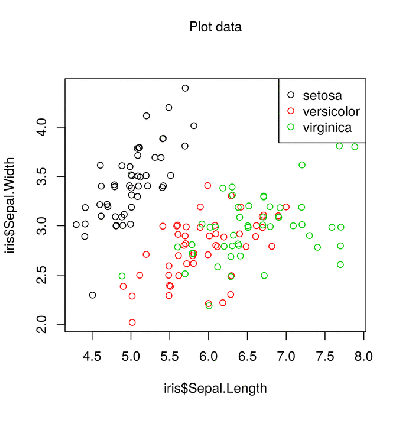
iris dataset. Probably, this is the most used set in the world of R. That is why we will take it in this post to demonstrate all the possibilities.Standard scatterplot in R:
')
plot(iris$Sepal.Length, iris$Sepal.Width, col = iris$Species) legend("topright", legend = levels(iris$Species), col = 1:3, pch = 21) 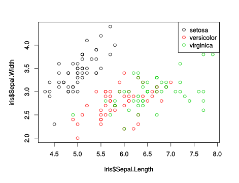
This gives a simple scatterplot with a legend and a default color scheme. The list of what is wrong with this schedule is quite long, including:
- colors
- indents
- axis signatures
- intersecting points
- empty space
But even in the basic graphic system R you can fix it all!
Fix problems
The first problem with this scatterplot is some points on top of one another. Therefore, the first step is to arrange the points far away so that they do not overlap - the
jitter() function will help. ## , geom_jitter iris$Sepal.Length = jitter(iris$Sepal.Length) iris$Sepal.Width = jitter(iris$Sepal.Width) Now choose better colors (I chose a palette from this site ). The
palette() function allows you to globally change the color palette for base graphs R. alpha = 150 # palette(c(rgb(200, 79, 178, alpha = alpha, maxColorValue = 255), rgb(105, 147, 45, alpha = alpha, maxColorValue = 255), rgb(85, 130, 169, alpha = alpha, maxColorValue = 255))) Now several characteristics of the graph - the function
par() : par(mar = c(3, 3, 2, 1), # mgp = c(2, 0.4, 0), # las = 1, # tck = -.01, # xaxs = "i", yaxs = "i") # Now it’s the turn of the
plot() function itself. There were flowers, and these are berries. We create a plot with the function plot() with a lot of arguments: plot(iris$Sepal.Length, iris$Sepal.Width, bg = iris$Species, # pch = 21, # : xlab = "Sepal Length", ylab = "Sepal Width", # axes = FALSE, # frame.plot = FALSE, # xlim = c(4, 8), ylim = c(2, 4.5), # panel.first = abline(h = seq(2, 4.5, 0.5), col = "grey80")) Add marks on the x-axis:
at = pretty(iris$Sepal.Length) mtext(side = 1, text = at, at = at, col = "grey20", line = 1, cex = 0.9) and axis y:
at = pretty(iris$Sepal.Width) mtext(side = 2, text = at, at = at, col = "grey20", line = 1, cex = 0.9) Only the legend remains. But instead of using the
legend() function, we will display the names near the dots with the text() function. text(5, 4.2, "setosa", col = rgb(200, 79, 178, maxColorValue = 255)) text(5.3, 2.1, "versicolor", col = rgb(105, 147, 45, maxColorValue = 255)) text(7, 3.7, "virginica", col = rgb(85, 130, 169, maxColorValue = 255)) Finally, the chart title:
title("The infamous IRIS data", adj = 1, cex.main = 0.8, font.main = 2, col.main = "black") Together:

Much better.
Why not ggplot2 (or something else)?
It seems that creating a simple scatterplot is a lot of work. Why not use X, Y or ggplot2? The main advantage you get is that your schedule will almost certainly be replicable in all future versions of R. Serious application.
Source: https://habr.com/ru/post/347710/
All Articles