I modeled the bitcoin price for the entire 2018. You will not believe in the result (approx. Translation. And you will be right)
Disclaimer: The article is written out of curiosity and interest, is the personal opinion of the author and is not intended for making investment decisions. For these purposes, take personal due diligence measures, do not do anything stupid, and don’t invest more than you can afford to lose.
Disclaimer 2: there are no guarantees that future income will be similar to past income, and previous growth does not indicate future. I understand. Did I mention that out of curiosity? Do not treat this as a strict science, for these purposes, I would have published a scientific article, and not a blog post with hyphae and memes. Take it easy :)
However, in the specific case of bitcoin, I (the author of the original text, this is a translation) believe that bitcoin is “right, strong” money, but fiat money is not. Therefore, if you consider there are also enough such people, this may be the reason that future income will be similar to income in the past.
')

It will be just a 5 minute adventure.
I am doing a simple Monte Carlo simulation of the daily increase in the dollar price of a bitcoin to try to find out what its most likely price will be by the end of 2018. You can find all the code I used for this on GitHub .
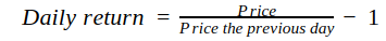
The gain in our case is how much the price has changed from one observation to the next. When we study daily data, the increment will be calculated daily. There are several formulas. For our purposes it will be quite simple:
In an ideal world, the daily increase in the value of financial assets will fall into a normal distribution, but the reality is far from that, and the actual daily gains have more “heavy” tails. What does it mean? This means that extreme events have a higher probability than predicted by the normal distribution law. Distributions do not resemble each other, as you can see below.
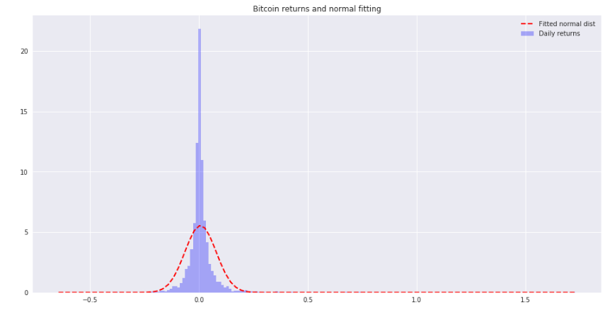
Here you can barely make out the difference between the tails, but believe me, the tails of the distribution of price increments of bitcoin are thicker.
According to Wikipedia, Monte Carlo methods are a generic name for a group of numerical methods based on obtaining a large number of implementations of a stochastic (random) process, which is formed in such a way that its probability characteristics coincide with similar values of the problem being solved.
In principle, for the Monte Carlo simulation in the field of finance, we assume that the future behavior of the asset price will be similar to its past behavior, and we generate many random versions of this future, so-called random walks , similar to the past. This is done using random samples from past observations to create each of these new random walks.

It is assumed that the future will be like the past. Brave and can be very wrong, but that's all there is. I think it is better than nothing ¯ \ _ (ツ) _ / ¯ ( comic source )
To build each of the random walks in our simulator, we will take increments from a random sample of daily price increments from 2010 to today, add one increment for each day in the future and multiply them cumulatively to get the price increment options until December 31, 2018 of the year. We multiply the current Bitcoin price by the obtained values of the random walk of the price increase to get the simulated future prices. This will be done 100,000 times. As a result, we will see the distribution of 100,000 variants of forecast prices at the end of the year, obtained by these random walks.
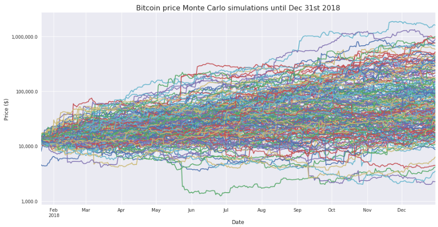
The first 200 random walks look like this:

This graph gives us little information, since the exponential growth in some random walks made the scale of the graph too large, while the majority of random walks ended by orders of magnitude below the random walk with a maximum total price. A logarithmic scale for the vertical axis will help us better understand what is happening:
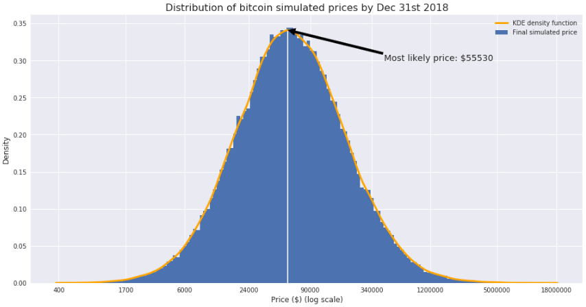
As we can see, the final price in most random walks is from 10 to 100 thousand dollars. Now it would be nice to see a histogram showing the distribution of the final price forecasts in all 100,000 random walks that we created earlier. Here she is:

We face the same problem as before. We cannot draw any conclusions from this graph. Rebuild it using a logarithmic scale for the horizontal axis. Thus, it looks much better:

It seems that the most likely price ranges from $ 24K to $ 90K. To more accurately find this price, we could do a few things. The first is to simply calculate the median: $ 58,843. Another option is to find the probability density function and calculate the price corresponding to the maximum of this function. The result of this is shown below:
Estimates at the most likely price are similar and both are above 50 thousand dollars.
It is important to note that this estimate does not need to be taken separately; it is better to use it as a way to find confidence intervals in which the future price is with a certain probability. In this case, the 80% confidence interval for the Bitcoin price will have borders from $ 13,200 to $ 271,277. Another way to look at this is that the probability that the price at the end of the year will be below 13,200 will be equal to the probability that the price will be higher than $ 271,277 (if the price moves in the future just as in the past).
Now that we know the probability density function, we could, for example, calculate the probability that the price will be below a certain level by the end of the year.
In particular, if we want to calculate the probability that this price will be equal to or lower than today's (January 20, 2018), we just need to calculate the value of the integral distribution function (the shaded area in the following figure):

What is the probability? 9.84%.
Yes I know. Nothing can always continue to grow, and the fact that it happened in the past does not mean that it will happen in the future. Below is a chart describing another asset that has also grown strongly in the past.

The monetary base is the most liquid part of the US money supply. It includes bank notes, checks and bank deposits. And do you believe more that the US can constantly print money "out of thin air"?
This text seemed interesting to us for educational purposes, as it describes well the application of the Monte Carlo method with an example that is relevant. However, it is worth noting that it is expected that the behavior of the Bitcoin price will be similar to the growth in the past rather erroneously than true.
In 1995, research company Gartner proposed a hype cycle, a technology maturity curve, graphically representing the stages through which technological innovation passes through its development.
This phenomenon is observed with the appearance of any new technology and technology, whether it be the appearance of tablets on the market or the introduction of blockchain technology.
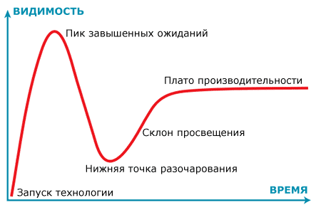
As you can see, the curve consists of five phases:
“Technology Launch” - the first phase of the cycle: a technological breakthrough, the launch of an implementation project that promises desired goals and the solution of many problems (well, if not all)
“The peak of high expectations” - public excitement leads to excessive enthusiasm and unrealistic expectations. Successful application of technology is possible, but usually there are more failures than successes.
"The bottom point of disappointment" - the technology is not able to meet expectations and quickly extinguishes enthusiasm. Different “valid” reasons begin to appear that impede the progress of the project.
“The slope of enlightenment” - here begin meetings, revisions of some ideas or tasks, adjustments to the project, sometimes many tasks that seemed important and necessary at the beginning are dismissed, but related tasks appear that are found during the project and give more advantages for the organization.
"Performance plateau" - the benefits of technology are becoming obvious and recognized by all. The technology is stable and evolves into the second and third generation. The final plateau height depends on how widely the technology is applied.
Read more article on Habré .

Technology and their place on the curve according to Gartner in 2017, you can see on the chart. The shape of this curve suggests that the continuation of the growth of the Bitcoin price is unlikely to the past, unless there are other “anomalous” reasons.

Disclaimer 2: there are no guarantees that future income will be similar to past income, and previous growth does not indicate future. I understand. Did I mention that out of curiosity? Do not treat this as a strict science, for these purposes, I would have published a scientific article, and not a blog post with hyphae and memes. Take it easy :)
However, in the specific case of bitcoin, I (the author of the original text, this is a translation) believe that bitcoin is “right, strong” money, but fiat money is not. Therefore, if you consider there are also enough such people, this may be the reason that future income will be similar to income in the past.
')
It will be just a 5 minute adventure.
I am doing a simple Monte Carlo simulation of the daily increase in the dollar price of a bitcoin to try to find out what its most likely price will be by the end of 2018. You can find all the code I used for this on GitHub .
Daily increase? What is it?
The gain in our case is how much the price has changed from one observation to the next. When we study daily data, the increment will be calculated daily. There are several formulas. For our purposes it will be quite simple:
In an ideal world, the daily increase in the value of financial assets will fall into a normal distribution, but the reality is far from that, and the actual daily gains have more “heavy” tails. What does it mean? This means that extreme events have a higher probability than predicted by the normal distribution law. Distributions do not resemble each other, as you can see below.
Here you can barely make out the difference between the tails, but believe me, the tails of the distribution of price increments of bitcoin are thicker.
Okay, but what is a Monte Carlo simulation?
According to Wikipedia, Monte Carlo methods are a generic name for a group of numerical methods based on obtaining a large number of implementations of a stochastic (random) process, which is formed in such a way that its probability characteristics coincide with similar values of the problem being solved.
In principle, for the Monte Carlo simulation in the field of finance, we assume that the future behavior of the asset price will be similar to its past behavior, and we generate many random versions of this future, so-called random walks , similar to the past. This is done using random samples from past observations to create each of these new random walks.
It is assumed that the future will be like the past. Brave and can be very wrong, but that's all there is. I think it is better than nothing ¯ \ _ (ツ) _ / ¯ ( comic source )
Monte Carlo simulation of BTC prices in USD during 2018
To build each of the random walks in our simulator, we will take increments from a random sample of daily price increments from 2010 to today, add one increment for each day in the future and multiply them cumulatively to get the price increment options until December 31, 2018 of the year. We multiply the current Bitcoin price by the obtained values of the random walk of the price increase to get the simulated future prices. This will be done 100,000 times. As a result, we will see the distribution of 100,000 variants of forecast prices at the end of the year, obtained by these random walks.
Random walks
The first 200 random walks look like this:
This graph gives us little information, since the exponential growth in some random walks made the scale of the graph too large, while the majority of random walks ended by orders of magnitude below the random walk with a maximum total price. A logarithmic scale for the vertical axis will help us better understand what is happening:
Final pricing distribution
As we can see, the final price in most random walks is from 10 to 100 thousand dollars. Now it would be nice to see a histogram showing the distribution of the final price forecasts in all 100,000 random walks that we created earlier. Here she is:
We face the same problem as before. We cannot draw any conclusions from this graph. Rebuild it using a logarithmic scale for the horizontal axis. Thus, it looks much better:
It seems that the most likely price ranges from $ 24K to $ 90K. To more accurately find this price, we could do a few things. The first is to simply calculate the median: $ 58,843. Another option is to find the probability density function and calculate the price corresponding to the maximum of this function. The result of this is shown below:
Estimates at the most likely price are similar and both are above 50 thousand dollars.
It is important to note that this estimate does not need to be taken separately; it is better to use it as a way to find confidence intervals in which the future price is with a certain probability. In this case, the 80% confidence interval for the Bitcoin price will have borders from $ 13,200 to $ 271,277. Another way to look at this is that the probability that the price at the end of the year will be below 13,200 will be equal to the probability that the price will be higher than $ 271,277 (if the price moves in the future just as in the past).
Now that we know the probability density function, we could, for example, calculate the probability that the price will be below a certain level by the end of the year.
In particular, if we want to calculate the probability that this price will be equal to or lower than today's (January 20, 2018), we just need to calculate the value of the integral distribution function (the shaded area in the following figure):
What is the probability? 9.84%.
Yes I know. Nothing can always continue to grow, and the fact that it happened in the past does not mean that it will happen in the future. Below is a chart describing another asset that has also grown strongly in the past.
The monetary base is the most liquid part of the US money supply. It includes bank notes, checks and bank deposits. And do you believe more that the US can constantly print money "out of thin air"?
Comment Cloud4Y
This text seemed interesting to us for educational purposes, as it describes well the application of the Monte Carlo method with an example that is relevant. However, it is worth noting that it is expected that the behavior of the Bitcoin price will be similar to the growth in the past rather erroneously than true.
In 1995, research company Gartner proposed a hype cycle, a technology maturity curve, graphically representing the stages through which technological innovation passes through its development.
This phenomenon is observed with the appearance of any new technology and technology, whether it be the appearance of tablets on the market or the introduction of blockchain technology.
As you can see, the curve consists of five phases:
“Technology Launch” - the first phase of the cycle: a technological breakthrough, the launch of an implementation project that promises desired goals and the solution of many problems (well, if not all)
“The peak of high expectations” - public excitement leads to excessive enthusiasm and unrealistic expectations. Successful application of technology is possible, but usually there are more failures than successes.
"The bottom point of disappointment" - the technology is not able to meet expectations and quickly extinguishes enthusiasm. Different “valid” reasons begin to appear that impede the progress of the project.
“The slope of enlightenment” - here begin meetings, revisions of some ideas or tasks, adjustments to the project, sometimes many tasks that seemed important and necessary at the beginning are dismissed, but related tasks appear that are found during the project and give more advantages for the organization.
"Performance plateau" - the benefits of technology are becoming obvious and recognized by all. The technology is stable and evolves into the second and third generation. The final plateau height depends on how widely the technology is applied.
Read more article on Habré .
Technology and their place on the curve according to Gartner in 2017, you can see on the chart. The shape of this curve suggests that the continuation of the growth of the Bitcoin price is unlikely to the past, unless there are other “anomalous” reasons.
Source: https://habr.com/ru/post/347512/
All Articles