How to make a website accessible to the blind and visually impaired?
If you follow the evolution of the creation of sites and services, you will notice that at first it was important that they at least were and worked. Then the creators began to think about the external beauty and attractiveness for customers, and then gradually began to focus on the convenience for users.
Now there is a new trend - “availability”. After all, now sites are viewed not only from large monitors in a relaxed atmosphere, but also from smartphones in shaky buses and laptops in noisy cafes, and more retirees and even people with disabilities appear among users.
In 1996, the World Wide Web Consortium (W3C) was created, and at one of the meetings a draft guideline was proposed to improve the accessibility of the web. The initiative received support from major sponsors such as Microsoft, IBM, Adobe, and now all popular browsers have accessibility settings and WAI-ARIA markup support to enable people with physical disabilities to get full use of the Internet (impaired vision and musculoskeletal system).
Now there are guides for the web in order to increase the accessibility of content: the international standard WCAG2.0 for users with various health restrictions (vision, hearing, motility, etc.) and the Russian national standard for accessibility of web resources for the visually impaired. GOST R 52872- 2012 They were designed for people with disabilities, but using the same principles will increase the level of comfort in working with the site and for healthy people. After all, people may just get tired or read the site from a small phone with a dim screen, on which the text is poorly visible.
')
Among the huge number of recommendations for improving the level of accessibility, we have identified three types that it is desirable to follow on any massive sites - both sites of banks or government agencies, and entertainment. Compliance with these recommendations will help not only visually impaired people, but also you and me!
(5.1.7.7 GOST R 52872-2012 : the font size of the text can be changed within 200 percent without the use of assistive technologies in such a way that the user does not need to resort to horizontal scrolling to read the line when the page is in full screen mode).
Scalable layout will be useful for mass users - for example, when they enter the site from a device with a small screen.
As a successful example of using a scalable layout, you can cite the website of the Central Bank of the Russian Federation . The site scale can be increased in the browser not only up to 200%, but also up to 500% without the appearance of horizontal scrolling.
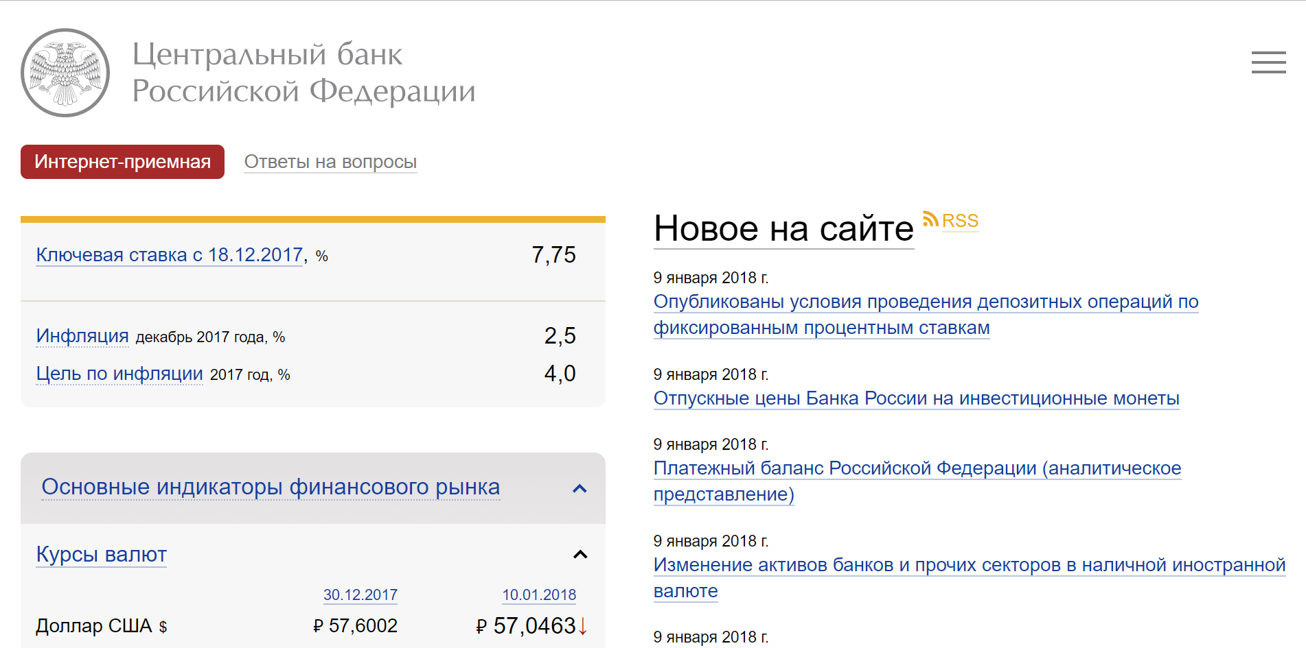
In the screenshot: increase the scale to 200%. No scroll bars
(5.1.7.3 GOST R 52872-2012 : The visual display of text and text images has a contrast ratio of at least 4.5: 1).
It is important that the main text on the site can be easily read from screens of different brightness and quality. There are also many people with various visual impairments. For example, users with color vision disorders will simply not see the text or will be able to see it with great difficulty if it is not contrasted with the background. Often, when developing brandbooks, this recommendation is not taken into account in pursuit of a beautiful design, and then it turns out that the text on the website is difficult to read.
Text contrast can be checked using contrast checkers, such as Color Contrast Analyzer , or browser extensions, such as “Contrast Ratio Checker” for Chrome. There are even online contrast checkers that do not require installation on a computer.
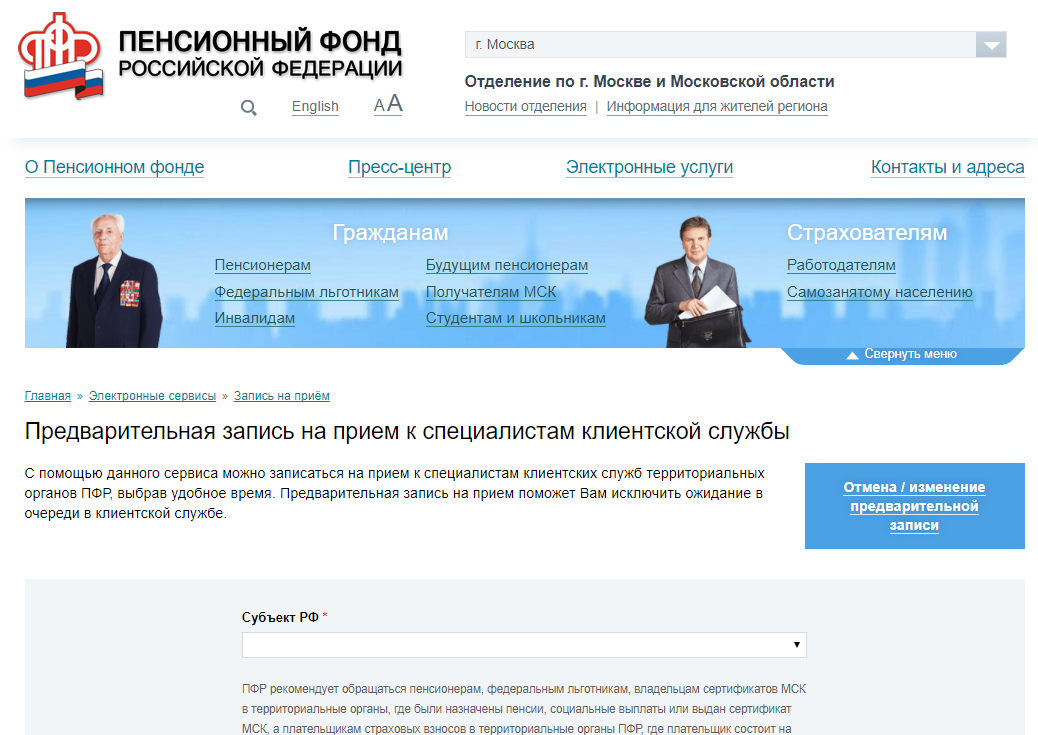
On the website of the Pension Fund of the Russian Federation, the main text has a sufficient contrast ratio of 14: 1.
For additional text (hints, promotional materials), the contrast requirements are slightly less stringent.
(5.2.1.1 GOST R 52872-2012 : The entire content functionality can be controlled via the keyboard interface without any restrictions on the key press time, except when the called function requires input using other devices depending on the direction of movement of the user, and not only from the end point. This does not prohibit and should not impede the provision of input capabilities using the mouse and other methods in addition to the keyboard).
Switching between the keyboard and the mouse is a time cost that can be minimized if TAB and ENTER work correctly. Many of us use the keyboard to navigate without even thinking about it.
People with disabilities may not use the mouse because of problems with fine motor skills. And blind people can use on-screen speakers - programs for dubbing text on the screen. In such cases, it is important that the focus function correctly on the site (when pressing the TAB button, the following link / button was highlighted, and the link where the transition would be made was displayed in the browser status bar).
Working with the keyboard on the site is well implemented on the site Gosuslug .
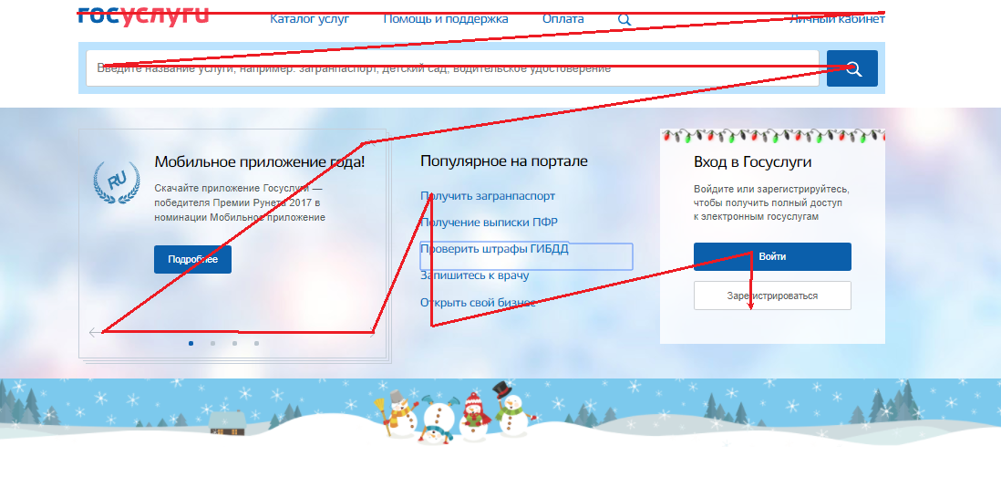
Public services: when you press the TAB button, the focus is switched sequentially to each button / link.
If you look at the sites of foreign colleagues, for example, the Barclays Bank website has the ability to skip duplicate items (top menu) while operating from the keyboard. It is activated only by the TAB key.
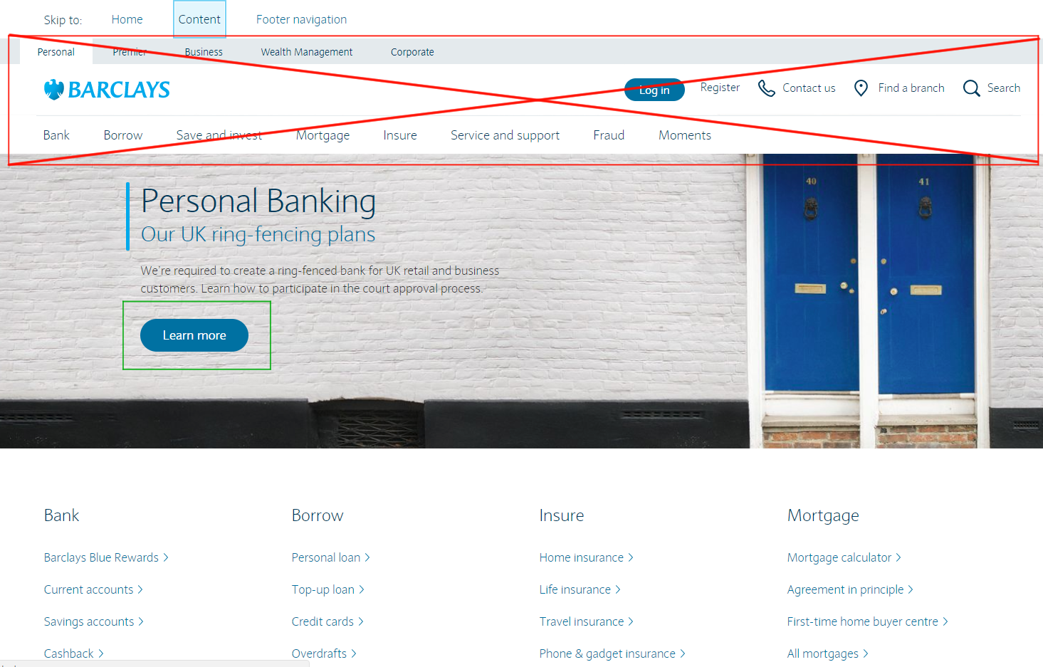
The screenshot shows that the entire through top menu is skipped and the transition to the first button on the page takes place immediately.
This speeds up access to the desired content when controlled from the keyboard when viewing the site.
As you can see, most of the requirements - technical, related to the layout of the site .
But about the “layout ecology” they began to think only recently. Although the availability of web content for people with disabilities was talked about back in 1994, the rapid development of the web led to the fact that now well-designed websites, taking into account the recommendations for comfortable reading, are more the exception or the “good taste rules” of serious web studios.
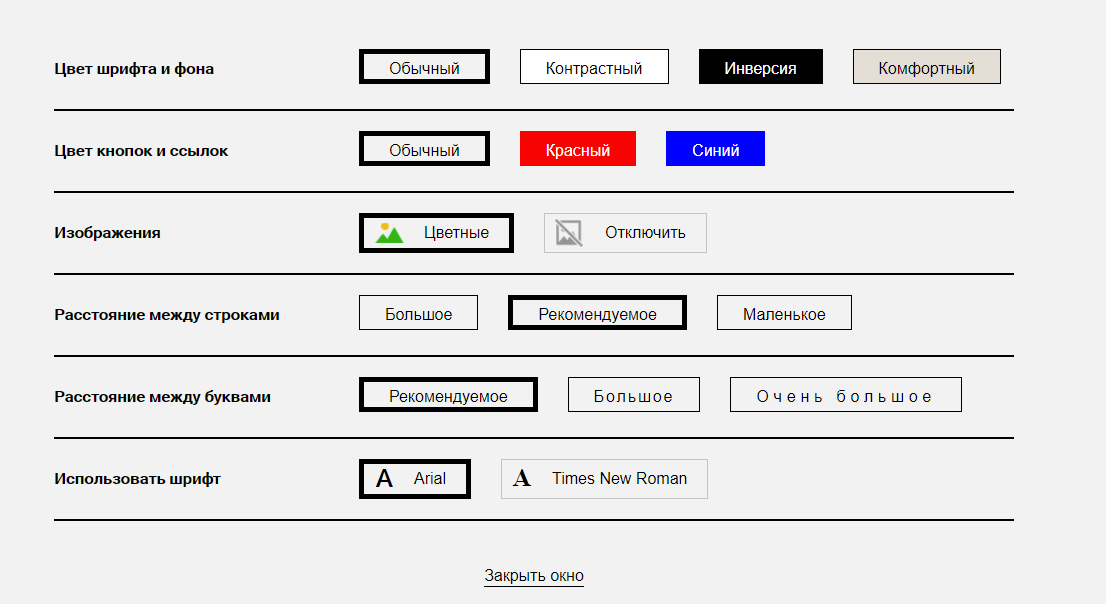
Good effect can be achieved without correcting the layout of the entire site . For example, many government sites use a solution such as “Panel for the Visually Impaired”, which solves the issue of contrast and font size. Using it, you can add features that meet the needs of people with disabilities - for example, the ability to customize the color display on the website will help people with color blindness, and increasing the spacing between letters and lines, as well as setting the serif font, for people with dyslexia, for whom the standing letters change when reading places.
Such a panel is well implemented on the PFRF website already mentioned above.
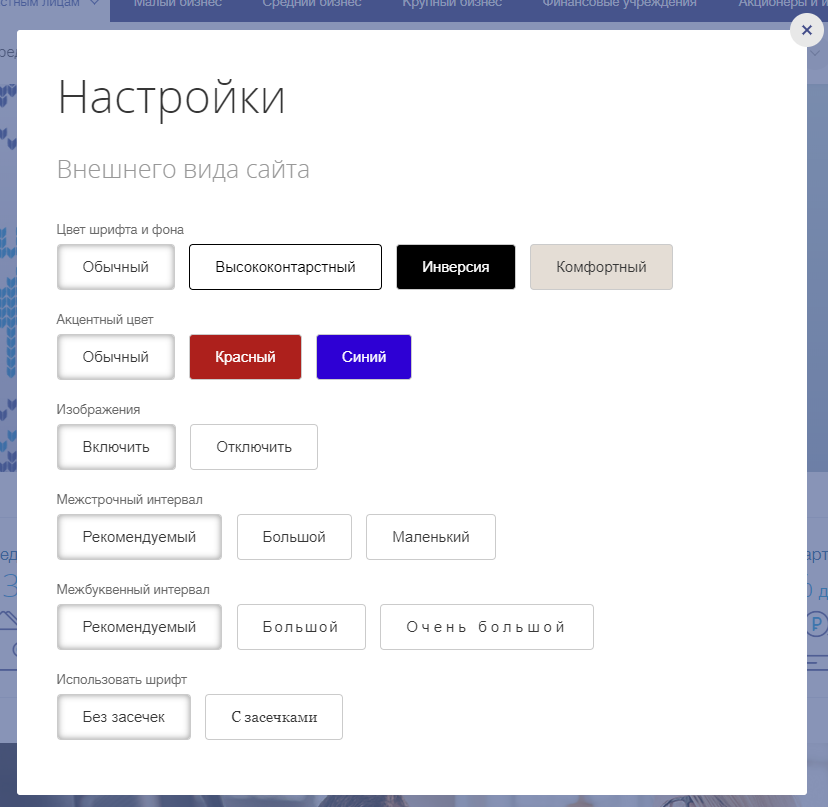
Also a good version of its implementation is on the Rosbank website. It uses different color scheme settings than the PFRF.
The panel of comfortable reading on the Rosbank website.
In 2018, such a panel appeared on the VTB website.
The panel of comfortable reading on the updated VTB website.
On the website of the Pension Fund of the Russian Federation there are several other options for adjusting the contrast, as well as built its own “narrator”, so you do not need to run additional programs.
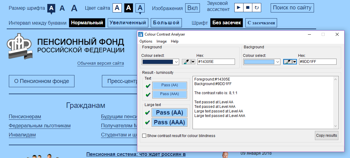
Panel of comfortable reading on the website of the PFRF (with the contrast setting applied)
To install such a panel, it is not necessary to have access to the source code of the site. There are similar plug-ins for popular CMS, which almost everyone can install at no special cost, because the plug-in is installed either automatically or requires not too time-consuming user manipulations with a ready-made script. For example, you can use the Comfortable Reading plugin (for WordPress and Joomla).
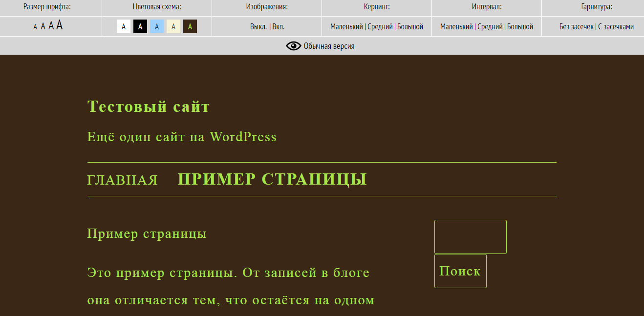
Example of site setup using the Comfortable Reading plugin
Consider sites where there is such functionality, but there are problems with its implementation. Problems can be divided into three main types:
Only the font size and color settings are used. This increases the comfort of reading for visually impaired people, however, it ignores the needs of people, for example, with dyslexia, which will still be difficult to read the text: the letters will merge. Such people would be helped, for example, by increasing the distance between letters and serif font.
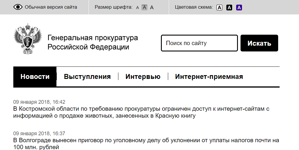
Example: the site of the Prosecutor General of the Russian Federation . There are font size settings and three color scheme options.
The version for the visually impaired is located on a separate URL. Also, it may lack part of the content compared to the normal version. This is not the best solution, because you need to maintain two separate versions of the site, which leads to additional costs. This option is used, for example, on http://kremlin.ru/ .
On some sites, the settings panel ( PFRF ) or the adaptive version ( state services ) are well implemented, but there are problems of interaction with the programs of screen speakers. For example, some of the content is not voiced or it is difficult to establish focus on an element when the narration’s program is on.
USABILTIYALB spoke in detail at the banking breakfast in September 2017 about the problems of the work of Internet banks and mobile applications with a screen speaker.
For example, very pale, imperceptible icons are used, as on the website of the Accounts Chamber of the Russian Federation :
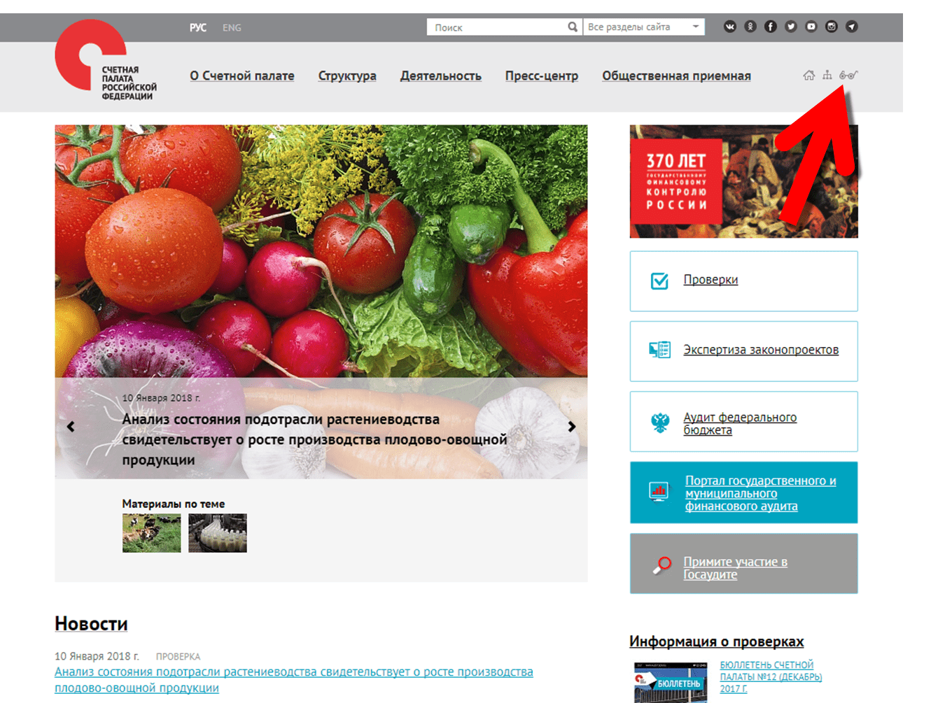
Could you immediately notice the icon if it were not highlighted in the screenshot?
Sometimes non-standard pictograms are used, in appearance it is difficult to guess that this is a version for the visually impaired (for example, the website of the Constitutional Court ).
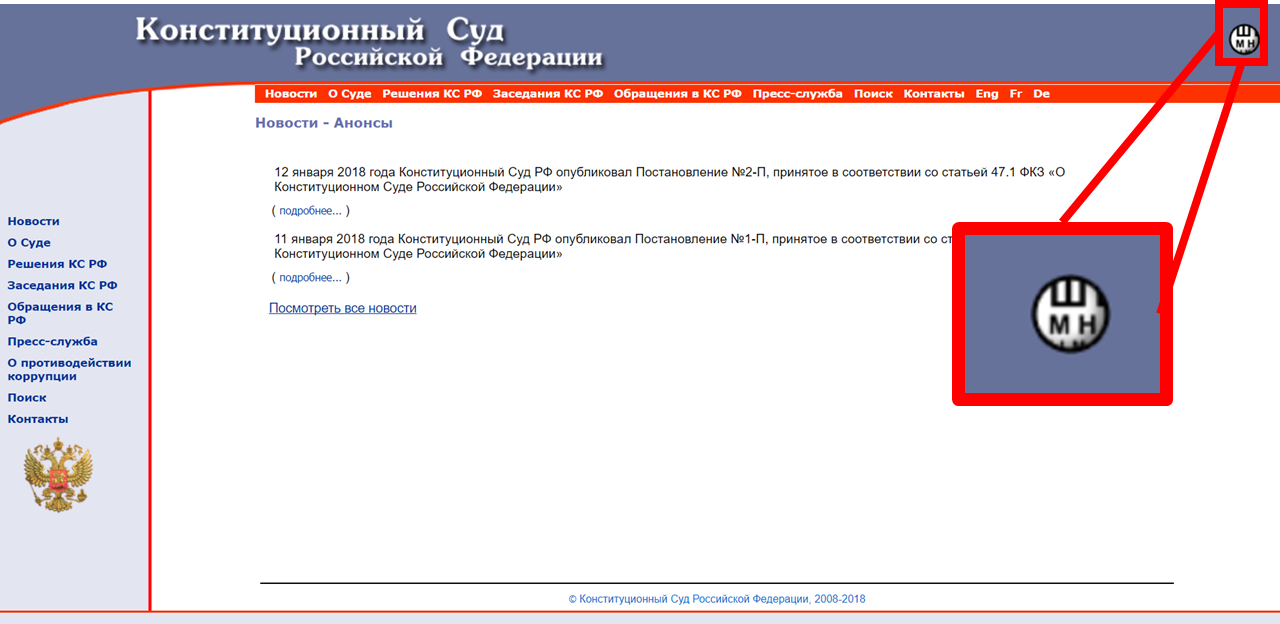
An example of a non-standard icon
As you can see, there is no single standard for developing a site version for the visually impaired. So, in several of the solutions discussed above with a panel for setting the site readings, different parameters and color schemes are used, somewhere a part of the functionality is missing.
We see that the development of usability and accessibility at the moment is not so much on the business side, but on the state side. Accessibility issues are actively discussed and solved in the banking sector , with the support of the CBRF.
On January 1, 2016, Federal Law No. 419- “On Amendments to Certain Legislative Acts of the Russian Federation on Social Protection of Persons with Disabilities” in connection with the ratification of the Convention on the Rights of Persons with Disabilities entered into force, and most government websites added a version for the visually impaired. However, some of them have no such version.
This, for example:
RF Security Council http://www.scrf.gov.ru/
Supreme Court of the Russian Federation http://www.supcourt.ru/
Federation Council http://www.council.gov.ru/
Rosstandart http://www.gost.ru/
The availability of sites is important not only for government sites, but also for business. Following the recommendations on improving the level of accessibility will already help to expand the audience not only at the expense of persons with disabilities, but also by improving the user qualities of the site for a wide audience and you and me. Of course, to take the most effective measures, it is necessary to conduct an audit of the current version of the site, draw up a statement of work on the layout, corresponding to the recommendations, or at least introduce a panel of comfortable reading.
In our opinion, in the near future there will be standards for the panel for the visually impaired, and the rules of “good form” layout will be observed more and more often!
Now there is a new trend - “availability”. After all, now sites are viewed not only from large monitors in a relaxed atmosphere, but also from smartphones in shaky buses and laptops in noisy cafes, and more retirees and even people with disabilities appear among users.
When did you think about availability?
In 1996, the World Wide Web Consortium (W3C) was created, and at one of the meetings a draft guideline was proposed to improve the accessibility of the web. The initiative received support from major sponsors such as Microsoft, IBM, Adobe, and now all popular browsers have accessibility settings and WAI-ARIA markup support to enable people with physical disabilities to get full use of the Internet (impaired vision and musculoskeletal system).
Now there are guides for the web in order to increase the accessibility of content: the international standard WCAG2.0 for users with various health restrictions (vision, hearing, motility, etc.) and the Russian national standard for accessibility of web resources for the visually impaired. GOST R 52872- 2012 They were designed for people with disabilities, but using the same principles will increase the level of comfort in working with the site and for healthy people. After all, people may just get tired or read the site from a small phone with a dim screen, on which the text is poorly visible.
')
Ecology of accessibility
Among the huge number of recommendations for improving the level of accessibility, we have identified three types that it is desirable to follow on any massive sites - both sites of banks or government agencies, and entertainment. Compliance with these recommendations will help not only visually impaired people, but also you and me!
1. Scalable layout
(5.1.7.7 GOST R 52872-2012 : the font size of the text can be changed within 200 percent without the use of assistive technologies in such a way that the user does not need to resort to horizontal scrolling to read the line when the page is in full screen mode).
Scalable layout will be useful for mass users - for example, when they enter the site from a device with a small screen.
As a successful example of using a scalable layout, you can cite the website of the Central Bank of the Russian Federation . The site scale can be increased in the browser not only up to 200%, but also up to 500% without the appearance of horizontal scrolling.
In the screenshot: increase the scale to 200%. No scroll bars
2. Sufficient contrast of text and background
(5.1.7.3 GOST R 52872-2012 : The visual display of text and text images has a contrast ratio of at least 4.5: 1).
It is important that the main text on the site can be easily read from screens of different brightness and quality. There are also many people with various visual impairments. For example, users with color vision disorders will simply not see the text or will be able to see it with great difficulty if it is not contrasted with the background. Often, when developing brandbooks, this recommendation is not taken into account in pursuit of a beautiful design, and then it turns out that the text on the website is difficult to read.
Text contrast can be checked using contrast checkers, such as Color Contrast Analyzer , or browser extensions, such as “Contrast Ratio Checker” for Chrome. There are even online contrast checkers that do not require installation on a computer.
On the website of the Pension Fund of the Russian Federation, the main text has a sufficient contrast ratio of 14: 1.
For additional text (hints, promotional materials), the contrast requirements are slightly less stringent.
3. Ability to work with the service using the keyboard
(5.2.1.1 GOST R 52872-2012 : The entire content functionality can be controlled via the keyboard interface without any restrictions on the key press time, except when the called function requires input using other devices depending on the direction of movement of the user, and not only from the end point. This does not prohibit and should not impede the provision of input capabilities using the mouse and other methods in addition to the keyboard).
Switching between the keyboard and the mouse is a time cost that can be minimized if TAB and ENTER work correctly. Many of us use the keyboard to navigate without even thinking about it.
People with disabilities may not use the mouse because of problems with fine motor skills. And blind people can use on-screen speakers - programs for dubbing text on the screen. In such cases, it is important that the focus function correctly on the site (when pressing the TAB button, the following link / button was highlighted, and the link where the transition would be made was displayed in the browser status bar).
Working with the keyboard on the site is well implemented on the site Gosuslug .
Public services: when you press the TAB button, the focus is switched sequentially to each button / link.
If you look at the sites of foreign colleagues, for example, the Barclays Bank website has the ability to skip duplicate items (top menu) while operating from the keyboard. It is activated only by the TAB key.
The screenshot shows that the entire through top menu is skipped and the transition to the first button on the page takes place immediately.
This speeds up access to the desired content when controlled from the keyboard when viewing the site.
As you can see, most of the requirements - technical, related to the layout of the site .
But about the “layout ecology” they began to think only recently. Although the availability of web content for people with disabilities was talked about back in 1994, the rapid development of the web led to the fact that now well-designed websites, taking into account the recommendations for comfortable reading, are more the exception or the “good taste rules” of serious web studios.
What if the layout of the site is bad? Comfortable reading bar!
Good effect can be achieved without correcting the layout of the entire site . For example, many government sites use a solution such as “Panel for the Visually Impaired”, which solves the issue of contrast and font size. Using it, you can add features that meet the needs of people with disabilities - for example, the ability to customize the color display on the website will help people with color blindness, and increasing the spacing between letters and lines, as well as setting the serif font, for people with dyslexia, for whom the standing letters change when reading places.
Such a panel is well implemented on the PFRF website already mentioned above.
Also a good version of its implementation is on the Rosbank website. It uses different color scheme settings than the PFRF.
The panel of comfortable reading on the Rosbank website.
In 2018, such a panel appeared on the VTB website.
The panel of comfortable reading on the updated VTB website.
On the website of the Pension Fund of the Russian Federation there are several other options for adjusting the contrast, as well as built its own “narrator”, so you do not need to run additional programs.
Panel of comfortable reading on the website of the PFRF (with the contrast setting applied)
To install such a panel, it is not necessary to have access to the source code of the site. There are similar plug-ins for popular CMS, which almost everyone can install at no special cost, because the plug-in is installed either automatically or requires not too time-consuming user manipulations with a ready-made script. For example, you can use the Comfortable Reading plugin (for WordPress and Joomla).
Example of site setup using the Comfortable Reading plugin
There is a panel - no problem? It is not that simple!
Consider sites where there is such functionality, but there are problems with its implementation. Problems can be divided into three main types:
1. Limited functionality
Only the font size and color settings are used. This increases the comfort of reading for visually impaired people, however, it ignores the needs of people, for example, with dyslexia, which will still be difficult to read the text: the letters will merge. Such people would be helped, for example, by increasing the distance between letters and serif font.
Example: the site of the Prosecutor General of the Russian Federation . There are font size settings and three color scheme options.
2. A separate version of the site for the visually impaired.
The version for the visually impaired is located on a separate URL. Also, it may lack part of the content compared to the normal version. This is not the best solution, because you need to maintain two separate versions of the site, which leads to additional costs. This option is used, for example, on http://kremlin.ru/ .
3. Problems of working with the screen speaker
On some sites, the settings panel ( PFRF ) or the adaptive version ( state services ) are well implemented, but there are problems of interaction with the programs of screen speakers. For example, some of the content is not voiced or it is difficult to establish focus on an element when the narration’s program is on.
USABILTIYALB spoke in detail at the banking breakfast in September 2017 about the problems of the work of Internet banks and mobile applications with a screen speaker.
4. The version for the visually impaired is difficult to find even for a sighted person
For example, very pale, imperceptible icons are used, as on the website of the Accounts Chamber of the Russian Federation :
Could you immediately notice the icon if it were not highlighted in the screenshot?
Sometimes non-standard pictograms are used, in appearance it is difficult to guess that this is a version for the visually impaired (for example, the website of the Constitutional Court ).
An example of a non-standard icon
As you can see, there is no single standard for developing a site version for the visually impaired. So, in several of the solutions discussed above with a panel for setting the site readings, different parameters and color schemes are used, somewhere a part of the functionality is missing.
Conclusion
We see that the development of usability and accessibility at the moment is not so much on the business side, but on the state side. Accessibility issues are actively discussed and solved in the banking sector , with the support of the CBRF.
On January 1, 2016, Federal Law No. 419- “On Amendments to Certain Legislative Acts of the Russian Federation on Social Protection of Persons with Disabilities” in connection with the ratification of the Convention on the Rights of Persons with Disabilities entered into force, and most government websites added a version for the visually impaired. However, some of them have no such version.
This, for example:
RF Security Council http://www.scrf.gov.ru/
Supreme Court of the Russian Federation http://www.supcourt.ru/
Federation Council http://www.council.gov.ru/
Rosstandart http://www.gost.ru/
The availability of sites is important not only for government sites, but also for business. Following the recommendations on improving the level of accessibility will already help to expand the audience not only at the expense of persons with disabilities, but also by improving the user qualities of the site for a wide audience and you and me. Of course, to take the most effective measures, it is necessary to conduct an audit of the current version of the site, draw up a statement of work on the layout, corresponding to the recommendations, or at least introduce a panel of comfortable reading.
In our opinion, in the near future there will be standards for the panel for the visually impaired, and the rules of “good form” layout will be observed more and more often!
Source: https://habr.com/ru/post/347478/
All Articles