Gestalt principles in user interface design
Have you ever looked at the sky, noticed a cloud of unusual shape, resembling an animal or an image of familiar things? Have you ever wondered why and how you just looking at the fluffy accumulation of water droplets, this association arises? This is all because of how our brain works.

')
The brain is always trying to understand the world, comparing previous perception of visual images and connecting the dots. He has his own “strange” way of perceiving outlines and forms, grouping information, filling in gaps to create an overall picture.
Understanding how our brain works will help you become a wiser designer and master of visual communication. This can help determine which visual elements are most effective in a particular situation, and how you can use them to effectively influence perceptions, arouse attention and changes in user behavior. Especially useful in this part of the article relating to solving the problems of intuitive user interface design.
“Great designers understood the enormous role that psychology plays in visual perception. What happens when users' eyes meet with designer creativity? How does their mind react to the message they want to share with them?
- Laura Busche, Brand Content Strategist at Autodesk
It is already clear that visual design and psychology are connected and influence each other. The principles of gestaltism can help us understand and control these connections.
What is gestalt?
Gestalt (form in German) is a group of principles of visual perception, developed by German psychologists in the 1920s. It is based on the theory that "an organized whole is perceived as more than the sum of its parts . "
"The whole is not the sum of the parts."
- Kurt Koffka
The principles of gestaltism are an attempt to describe how people perceive visual elements when certain principles or conditions are applied. They are built on four key ideas:
Appearance / manifestation
People tend to identify elements first in a more general form. Our brain recognizes the whole faster than the components.
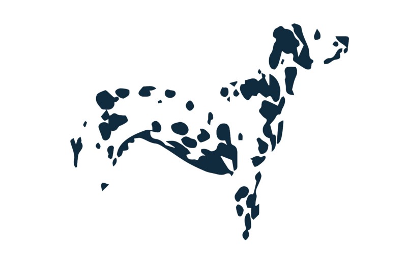
Incarnation / Socialization
People can recognize objects, even if parts are missing. Our brain compares what we see with familiar patterns stored in our memory and fills in the blanks.

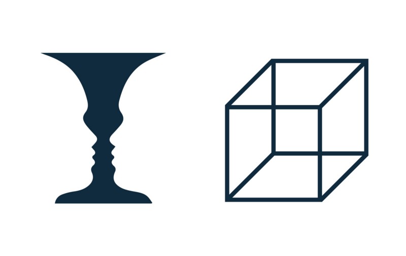
Multiple stability
People often interpret ambiguous objects in more than one way, switching between alternatives in the search for certainty. As a result, one point of view will become more dominant, while switching to another interpretation will become more complicated.
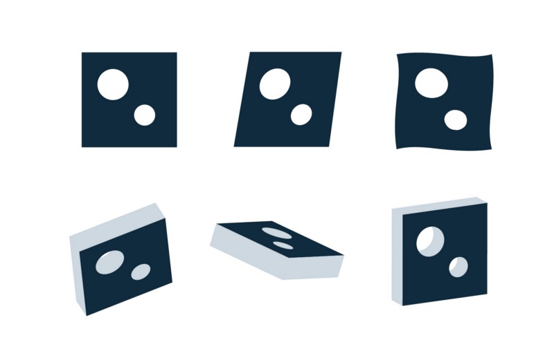
Invariance / invariance
People can recognize simple objects regardless of their rotation, scale, and movement. The brain can perceive objects from different points of view, despite their appearance.
To implement these ideas, the principles of gestalt were formulated, which the user interface designers can use to increase the effectiveness of visual communication.
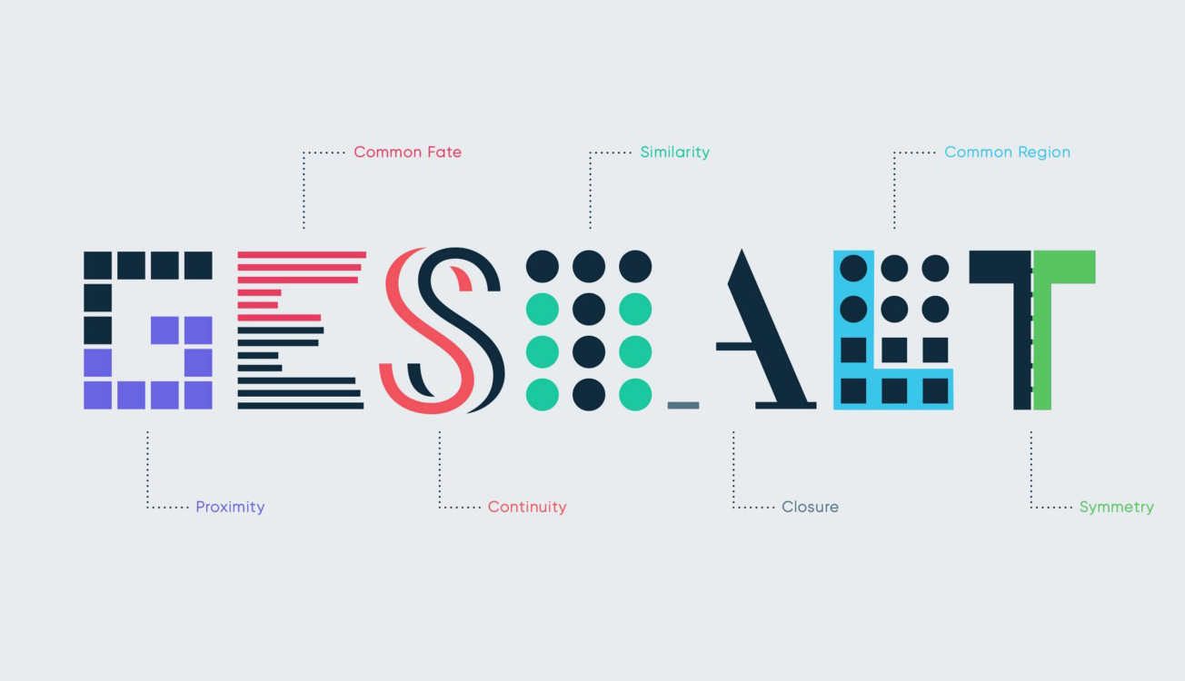
Basic principles
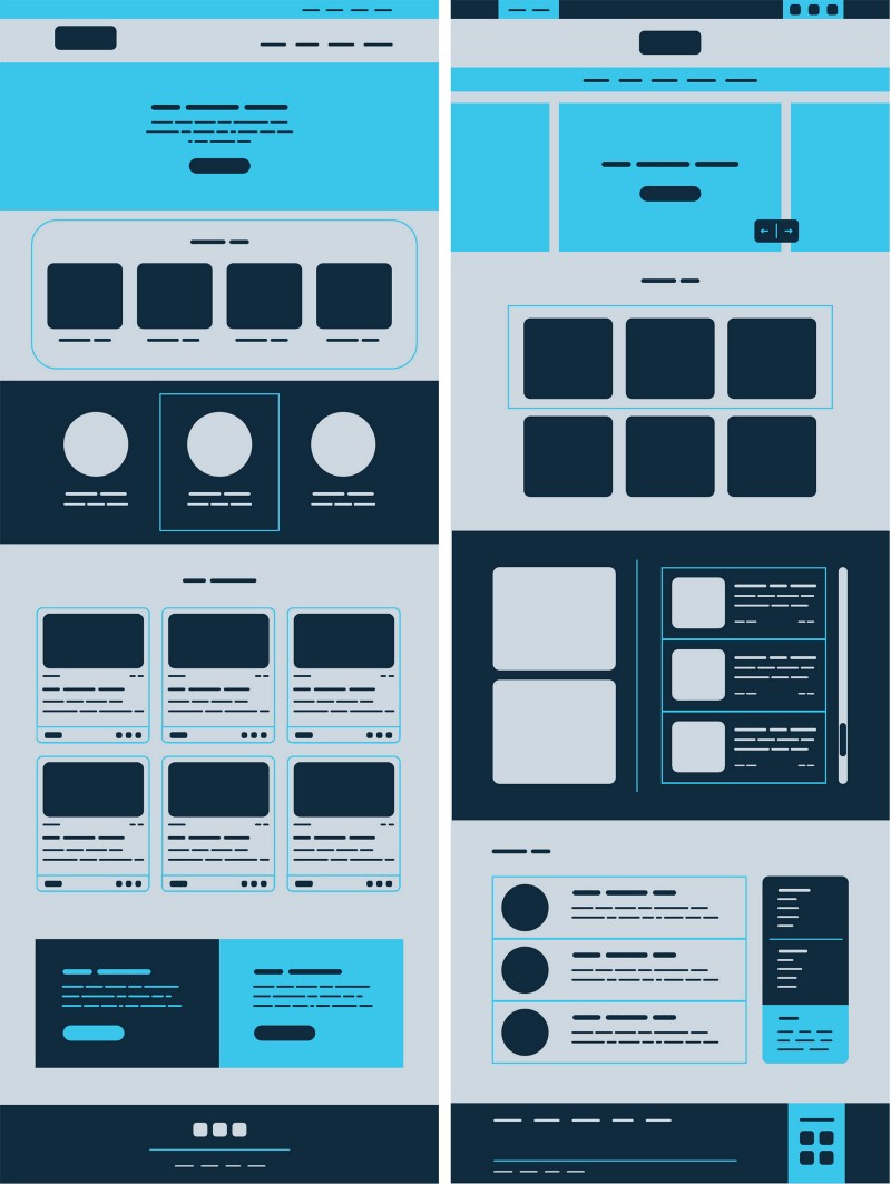
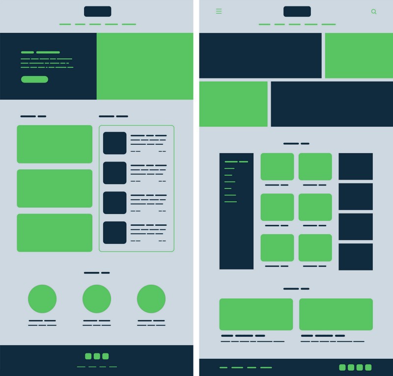
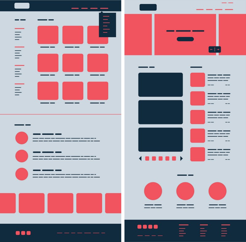
Proximity
Items that are close to each other are perceived as more related than those that are farther apart. Thus, the various elements can be considered as a group, and not separately.

How is the proximity principle applied in user interface design?
We can use this principle to group similar information, organize content and organize elements and blocks. Proper use will have a positive impact on visual communication and work with users.
According to the principle, elements that are connected to each other should be closer to each other, while unbound elements should be placed separately. The empty space plays a vital role here because it creates a contrast that directs the eyes of users along the intended path. Clean Space can enhance the visual hierarchy and control the flow of information, making it easier to read and scan layouts. This will help users quickly achieve their goals and delve into the content.
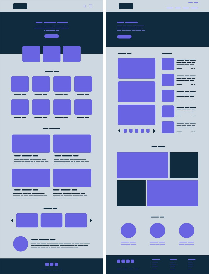
We can apply the principle of proximity almost everywhere from navigation panels, cards, galleries and banners to lists and body text.
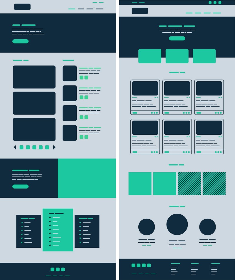
Common Areas
Similar to the principle of proximity, elements located in the same closed area are perceived as grouped.
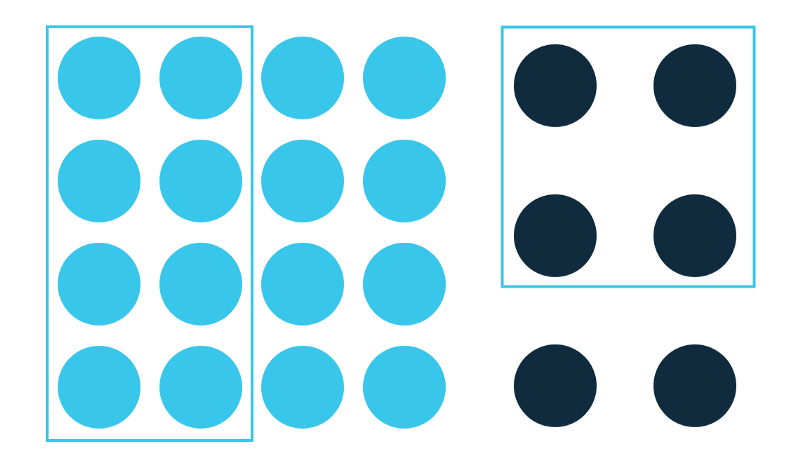
The principle of the general area is particularly useful. And not only in organizing the grouping of information and content, but also in sharing content, acting as a focal point.
This principle may contain many signs, according to which objects are combined into larger groups. We can use lines, colors, shapes and shadows. Often it is useful to bring elements to the foreground and to focus the user's attention on the interaction with the interface or importance.
Similarity
Elements that have similar visual characteristics are perceived as more related than those that do not have similar characteristics.
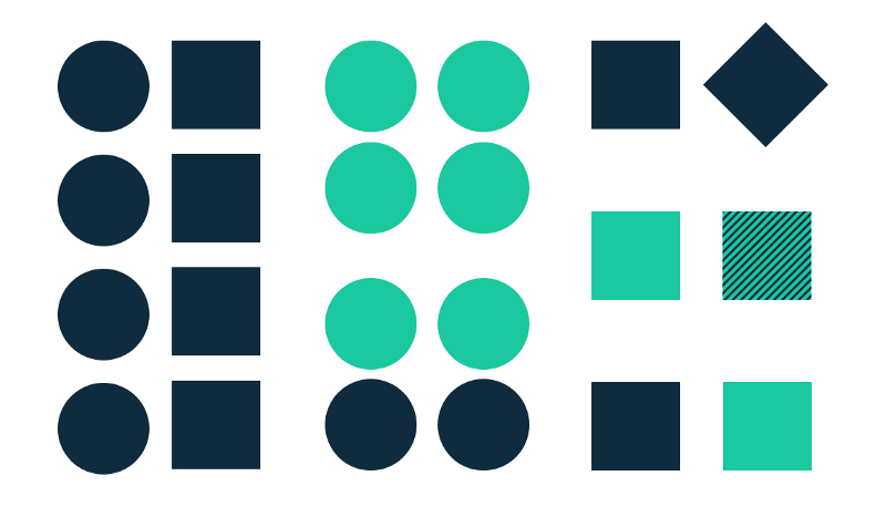
We tend to perceive similar elements as a group or pattern. We may also think that they serve one purpose. Similarities can help us organize and classify objects within a group and associate them with a specific value or function.
There are various ways to make elements perceived as similar and, therefore, related. These include the similarity of color, size, shape, texture, size and orientation. Moreover, some are more “sociable” than others (for example, color> size> shape ). When a similarity occurs, the object can be selected, being different from the rest. Let's call this approach "Anomaly". It can be used to create contrast or increase visual weight. It can draw the user's attention to a specific piece of content (main focus), helping with viewing, detection in the general stream.
We can use the principle of similarity in navigation, links, buttons, headers, calls to action and much more.
Closure / End
A group of elements is often perceived as one recognizable shape or figure. When looking at complex elements, we strive to see in them a simple recognizable form. Completion also occurs in the brain when the object is incomplete, or parts of it are not finished.
As stated in the “Completion” principle, when presenting a sufficient amount of information, our brain will draw conclusions, filling in the gaps and creating a single whole. In this way, we can reduce the number of elements needed to convey information, reducing entanglement and making the design more attractive. Completion can help us minimize visual noise and convey a message, reinforcing the concept in a fairly small space.

We can use the “Completion” principle in Iconography, where simplicity helps to convey meaning quickly and clearly.
Symmetry
Symmetric elements, as a rule, are perceived as belonging to each other, regardless of the distance between them, giving us a sense of wholeness and order.

Symmetric elements are simple, harmonious and visually pleasing. Our eyes seek these attributes along with order and stability in order to make sense of the world. For this reason, Symmetry is a useful tool for transferring information quickly and efficiently. Symmetry creates comfort by helping us focus on what's important.
Symmetrical compositions are good, but they can also be a bit boring and static. Visual symmetry tends to be more dynamic and interesting. Adding an asymmetrical element to an otherwise symmetrical design can help draw attention to something useful or call for action. Symmetry along with healthy asymmetry is important in any design.
It is good to use symmetry for galleries, product displays, lists, navigation, banners and any pages loaded with content.
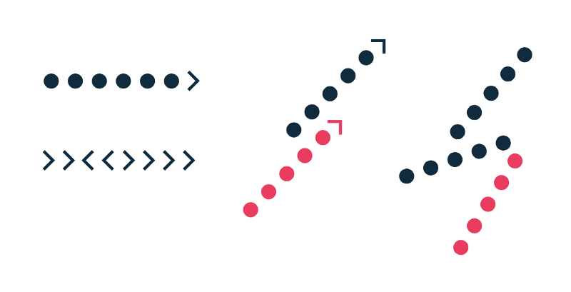
Principle of continuation
Elements arranged in a line or on a smooth curve are perceived as more connected than ordered randomly.
Elements following the continuous line are perceived as grouped. The smoother the sections of the line, the more uniform we see - our mind prefers the path of least resistance.
Continuity helps us interpret the direction and movement of the composition. This happens when aligning elements, and it can help our eyes to move smoothly around the page, improving legibility. The principle of continuity enhances the perception of information by groups, creates order and guides users through different segments of content. Breaking continuity can signal the end of a section, paying attention to a new piece of content.
Linear row and column layout is a good example of continuity. We can use them in a menu or submenu, in lists, carousels, and so on.
General purpose / behavior
Elements moving in the same direction are perceived as more connected than moving in different directions or not moving at all.
Regardless of how far apart the elements are or how different they may be, if they move or change together, they are perceived as connected.
The principle is more effective when the elements move synchronously: in the same direction, at the same time and at the same speed. It can help with grouping relevant information and linking actions with results. Violation of movement synchronicity may attract the attention of users and direct them to a specific element or function. It can also denote the relationship between different groups.
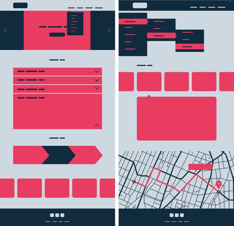
We can use the principle of general behavior in expandable menus, accordion menus, prompts, with multi-level scrolling and scrolling indications.
Conclusion
User interface design is not only colorful pixels and bright graphics. Basically it is communication, efficiency and convenience. The principles of gestalt are always relevant, helping us to achieve these goals, creating the conditions for a pleasant user experience and greater business success.
PS To work with "heavy" software that requires high-performance graphics cards, including designers, in our cloud GPU (cloud graphics) is available on the VMware virtualization platform.
Source: https://habr.com/ru/post/347444/
All Articles