UI, which itself teaches the player control

[Approx. Trans .: In games with non-standard controls, developers need to teach players to use all the features. One solution to this problem was the playable UI game menu implemented by Juicy Beast.]
In May 2013, we participated in gameJam ToJam and in three days created a game. Thus was born the original version of Toto Temple .
About a year later, and after many changes, events, and even a partnership agreement with Ouya, Toto Temple evolved into a better and more refined Toto Temple Deluxe!
Rules of the game
If you haven't played it, here are the short rules of gameplay:
')
- Grab a goat and drag it on your head to earn points
- The first player to win 3000 points wins
- If you don't have a goat, then steal it!
- You can steal a goat by hitting its current owner in a dash (this is important)
In essence, this is the purpose of Toto Temple. It has greater depth, but the player will have to figure out the rest. Here are examples of very important features:
- Jerks are needed not only to pick up a goat
- They allow you to move faster in a straight line, so you should use them to move quickly (it is better not to walk)
Noticed how the yellow player managed to get to the goat faster than the green one?
Well, that's it, now you know how to play Toto Temple. Since then, we have added much more content, but the basics have remained the same.
The first concept UI (version for gamejam)
Before we talk about the new UI system used in Toto Temple Deluxe, let's see how we started. The first (and only) menu in the version for jam was this:
Press A to enter, B to ... leave?
Everything is very simple. The player presses "A" to join the game, and when there are at least two players in it, the "press start" option appears and you can start the game. Note that there is no “color picker” option. The player simply presses "A" and finds out what color he got, depending on the selected controller.
The lack of choice of color initially seems strange, but during the jam it did not seem very important, especially because there was no difference in behavior and skills between the different colors (more on this below).
Participation in events: wait for problems
In November 2013, the original version of Toto Temple was exhibited at Gamercamp, a small cozy event held in Toronto.
Between the game gem version and the version presented at Gamercamp, we made many changes to the gameplay: smoother control, balancing of the points system, etc. But we did not make any changes to the UI system. Why change something that is not broken?
During an event, it is usually best to let players deal with the game and control themselves. This allows you to spend less effort and is a good sign that the game (or UI) has a quality design.
However, at that time we noticed that in the game most players had no idea how to use the “jerk” mechanics. Even after “reading” a short tutorial on managing and listening to our verbal explanations, the players continued to move by running and jumping.
Do you see? No jerks. Oh, wait ... The green player seems to have understood something ...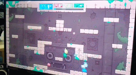
We repeated again and again: “To make a jerk, you need to press the X button and the direction in which you want to jerk. For example, to make a jerk up, you need to simultaneously press "up" on the left joystick and the X button. You can jerk in all four directions, even successively left-up-up-right, if you want. "
As far as we understood, the players tied the breakthrough mechanics with “goat theft” and only with it, because it is the main goal. They waited for them to line up with the goat owner. As we said above, jerks can be used for faster movements, which most players do not even think about. From a technical point of view, this is not so bad, because they have to learn this on their own during the game, but it still seemed to us that we could find the best way to explain this concept to new players.
Back to the drawing board
At this stage, we noticed that most players have problems making jerks in different directions. However, with jerks left and right, everything is more or less normal, because when the player’s Toto character automatically looks left or right, to jerk in that direction, simply press X (without pressing the joystick).
At first, jerks down are needed less often (the player begins to use them more actively when he needs to move a lot around the level). The real problem was a jerk up. It is necessary to jerk upwards more often than downwards, so that gravity pulls the player downwards and he has to climb up the level.
Jerks noticeably faster than running and jumping
Over time, players realize that jerks are always useful, but it's hard to enjoy the game without knowing this important detail. We needed to do something about it.
Character Selection: First Lesson
A little later, having gathered all this new information, we demonstrated Toto Temple at a small gaming event in Montreal called The Prince of Arcade . It was a good opportunity to improve the training methods of players and test them in action.
The first thing that occurred to us to solve the jerk problem was to add platformer and physics elements to the menu itself and literally ask the players to make a breakthrough up to enter the game instead of simply pressing the “A” button. This does not teach them how to play, but at least they will be familiar with the shortcut keys.
Jerk up to enter, jerk down to exit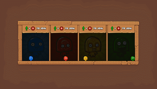
Having watched people play the game all evening, we noticed that most of them took less time to start performing jerks in different directions. The new "playable" menu definitely had its effect.
At the time, we didn’t know that this would only be our very first step towards a fully physical and playable UI.
Deluxe Transformation
Soon after testing our playable menu, we met some great guys from Ouya and we managed to make a partnership agreement to create a larger and better version of the game.
We planned to create new levels, new modes, selected bonuses and, of course, a completely new UI system. Since we chose a more physical and playable approach to the new UI, we decided to literally "go outside", adding columns similar to temples and the like.
No more abstract boxes! Feel the fresh air?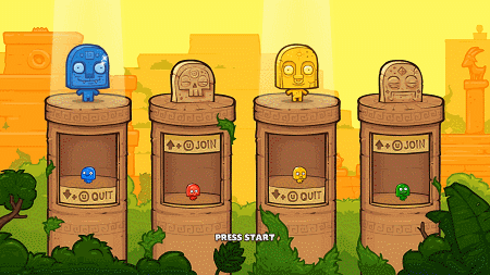
The first version based on the new vision was almost the same, but instead of boring and flat boxes, the characters were in the outdoor structures (see above).
Since now we did not have such a large and bright picture of the character in the background, we added color statues over the top to increase the contrast between the players who entered and left. This creates a spotlight at the top of the screen, which is easier for the eye to perceive compared to just turning on / off a button. It also creates a small visual “feast”, although this was not the main goal. The newcomer should have felt a little more strongly that the game is happy for his participation!
Strange behavior
For some strange reasons that we did not understand, many players first made a dash up to enter the game, and then immediately dash down to get out of it. Then again, pull up, pull down. Again, and again, and again.
They continued to do so until someone clicked on Start, and if they were lucky, at that moment they were in the game and got to the next stage. Most of the time they were out of the game, and we had to go back, wait for them to enter, and start again.
In the worst cases, one player thoughtlessly made a dash down and out of the game while we waited for the other players to enter. What the heck?
We thought that the players were not used to influencing the UI by playing their character. They simply did not understand that their actions change the parameters of the game.
We also made the background brighter so that it was obvious that the player had entered.
To solve the problem, we simply removed the “make a jerk down to exit” button (see below). To get out of the game, it was necessary to make a breakthrough to the “join” button (that is, we made a system with a switch button).
This helped to reduce the number of cases of strange switching back and forth, but still some players sometimes entered and left the game again and again, using only the top button. This did not completely solve the problem, but at least they understood from the first what to do.
More content, more problems.
The new character select function was ready and working, but we still needed new menus for the new Deluxe version content (levels, modes, etc.). To be honest, we didn’t really think about it when we were making the first screen of the playable menu.
When developing a design, they usually strive to preserve the visual and functional integrity of the entire process. Since we had “buttons” on the first screen, with which we had to press with a jerk, it is logical to save the same system for other screens.
The first new menu was the level selection screen, and from that moment everything became a bit more complicated.
At a more fundamental level, at the time of the transition to the playable menu system, we banned the use of most input methods from the controller for everything except character control. Now the movements of the left joystick moved the character, so we could not use the cursor or pointer. When you press button A, the character jumped, so we could not use it to confirm actions. Pressing X was the same story, because it was used so that the character would jerk different screen buttons.
We have already met with this problem in the first version, but just used the “Start” button to start the game. It was a fairly simple fix.
Level selection: more training
Next we needed a level selection screen. We thought to create 5-6 new levels (or temples) for the Deluxe version, so we needed a way to choose one of them.
Still striving for the integrity of the functional, we created the first iteration in which the left and right buttons were used to select the level:
Parts of the graphics are not yet, but the meaning is clear
When creating a sketch of a new screen, we thought: “Oh, and this is a great opportunity to teach the player something else!”
On this screen, we could teach him two more aspects of management:
- You can make a breakthrough not only up, but also left and right
- Are the buttons too high? Then the player will guess that you can jump first, and then make a dash!
To help us even more in understanding actions, we even added some details to shift the player’s eyes from the character’s initial position up to the buttons on the sides.
Here's what worked:
- We noticed that many players simply select the default level, when they first playtest, immediately press the Start button. We decided that this is quite normal, because when playing for the first time, the player usually does not know a single level (and the first is no worse than all the others). They saw that there were other levels, so they understood that they can be selected manually.
- Most players recognized the buttons and realized that they had to jump to hit them, as they did on the previous screen.
But that did not work:
- The players understood the “jump and jerk” combination, but since they were new to the game, they could hardly press the button several times in a row.
- The problem arose because the eye was keen to look at the images of the levels so that you could choose the one you liked, but at the same time you had to look at the character in order to accurately aim at the buttons. It was strange and uncomfortable.
- Some players took too long to realize that the X button could be used not only to enter the game (they might not have noticed the jerk animation because they were looking for the X button on the controller).

“So wait. What buttons? How am I here ... ", - yellow player
Here is what we did (see above):
- To make the choice of the level more convenient, we added a small step so that the player could thoughtlessly make a dash to the left or right, focusing on the level image. Now this screen no longer taught sequential leaps and jerks, but at least taught them jumps (they are needed to get to the button) - something that the previous screen did not require.
- We added level icons with one thumbnail to make it easier to see the whole picture (total number of levels).
- We moved the “left / right dash” prompt from the upper center of the screen and positioned it on both sides. In addition, they are now closer to each of the buttons, so they are easier to notice. We also made them blue, just like the X button of the controller itself (in this case, the U button on the Ouya controller).
- This was not a particular problem, but we made the whole box smaller in width so that the jerk from one button to the other took less time.
Mode Selection: Last Exam
The last menu to add was the mode selection screen. Although in nature it was very simple, its implementation was the most difficult.
In order to briefly explain to you the idea of moving around the UI, I will explain the order in which players go through the three menu screens:
- The character selection is done first, because we need to know how many players will proceed to the next stage.
- The choice of the mode is the second, so that players can quickly determine the teams, if they wanted it initially. We wanted to give players the opportunity to make their choice as quickly as possible, so that they would not have to wait and remember it.
- Level selection is the last. If we decided to create special levels for different modes, then at this stage the mode filter would already be selected.
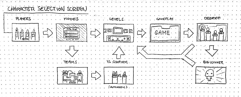
An early sketch of the entire process of moving through the UI
For the mode selection screen, we needed an easy way to select a mode from the list, as was done on the level selection screen. The obvious choice would be to copy the level selection screen, but this did not seem right to us (it would be difficult for players to quickly distinguish one screen from another, etc.).
In addition, we wanted to use as many different controls as possible, so another obvious choice was to jerk up and down to move through the list (and not left and right).
We placed the buttons above and below, and the screen was almost ready. Then came the hard part - we had to come up with the design of the team selection field (see below).
Choosing a team with the help of a side choice, hurray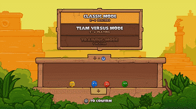
As you probably remember, one of the difficulties was that most of the controller buttons were already used to move the character.
The formation of commands without a joystick-controlled cursor or confirmation with the “A” button made us take a different path. Having only a small field with physics at our disposal, we had to create an easy-to-understand and quick-to-set up system that does not require the use of controller buttons.
As can be seen from the above illustration, we decided to use another variable to configure: the position of the character in the field. These were the components and how we used them:
- Blocks of avatars are on the player’s head until he chooses a team and automatically falls into place when he enters the “team zone”
- The physical block "VS" literally divides the two teams, and is also used as a "dead zone" to make the transition from team to team more obvious.
- Button "jerk down" cyclically scrolls the list down
- The "Press start" indicator appears when commands are selected.
We had no serious problems with this screen, so it remains unchanged.
Let's summarize the training
So, even before the player enters the game, he will understand (subconsciously at least) the following:
- He should know that the X button can be used simultaneously with the joystick.
- He should know that A is a jump.
- He should know that X is working in different directions, including up, left and right
The player may not remember clearly what he was doing in the menu, but the subconscious picture of control for him should look like this (see below). And this is good, because all these buttons are enough to play!

After the release of the game: player requests
Toto Temple Deluxe has been released, and you have already seen most of the UI that entered the game. After the release, we continued to communicate with the players on the forums, in the comments, blogs, etc ...
Most often we received two comments (or requests):
- I can not play with friends, can you add bots to the game?
- I want to choose my color at the beginning of the game! I know that this will not change anything in terms of gameplay, but [color name] is my favorite color, and I would like to play it.
Both requests are absolutely fair, and after long discussions and estimates of the costs of these opportunities, we decided to add them, despite the high cost, duration and complexity of implementation. I know this is not very smart of us, but we love our players.
Update: destroy the screen for the sake of one opportunity
Both the choice of bots and the choice of color are closely related to the choice of character, so we immediately realized that this would cause problems, at least from the point of view of the UI.
At that time, the character selection menu (if you can call it a choice at all) was not very suitable for players to select a character color. Box columns are rather small, and managing the bot selection system would further increase the density of items.
We tried to come up with other solutions to keep the UI ready for this screen, but none of them seemed effective, understandable, or correct. Therefore, we decided to start everything from scratch!
Characters automatically jump when the player presses the joystick to wake them up. Thus, you can immediately understand who you control!
Here is what has changed:
- We left big statues in the game. This is not a change, but we love them too much and could not throw them away.
- Now we have one common field instead of beautiful individual columns (we are still sad because of their loss).
- We added colorless Toto with player numbers above the head so players can know who they control.
- You can select the desired color by striking the corresponding button in the wrench.
- You can change the current color only to not yet selected.
- It is impossible to steal other people's colors.
- We do not have bots yet, but this design allows us to decide whether, for example, a green character will be controlled by a bot, etc. We simply divided the “login” button into two buttons: “Login” and “Add as bot”. At least that is the plan.
Conclusion: advantages and difficulties
Creating a fully playable UI was a good experiment for us. Perhaps, one could do without him, but he allowed us to introduce new players to the management. We could have done with traditional text tutorials, but most players would simply ignore them and experience difficulties in understanding how to control the game.
Obviously, creating a playable UI system is a good move if the game requires it, but such a system introduces its share of problems:
Benefits:
- The player hardly notices that he is learning
- This is much more fun than text and step-by-step tutorials.
- It makes it easier for players to get acquainted with the game mechanics
Difficulties:
- Now developers can not use all the buttons of the controller
- Difficult to find a good balance between efficiency and clarity
- It is very easy to start adding physical buttons all over the place, but soon it starts to confuse the player.
Games with very simple mechanics or with almost no menu will not get big benefits from such a system. On the other hand, a playable UI can keep the player involved in the game and its overall integrity, even if you don’t need a learning tool.
Look at games like Antichamber Alexander Bruce and Braid Jonathan Blow . Both have playable menus, despite the fact that they do not need to train the player in the literal sense. However, they allow you to maintain involvement, so the player does not break out of the game universe every time he needs to go to the menu.
In Antichamber, the player simply looks around and points to objects to interact with the menu.
In Braid, a player physically goes through the door to select a world / level.
Of course, we will not argue that our method is the best or the only way to implement a playable menu. This is just a long description (perhaps too long, I'm sorry) of our development process.
Source: https://habr.com/ru/post/347424/
All Articles