Which diagram to use?
With the advent of technology in every home, the emergence of new channels for advertising, programmatic, and other clever things to grab people's attention, the amount of data that marketers have to analyze is growing. We decided to remind you about one of our great Power BI tools. We present you the first article in the series from our friends from CoMagic.

I give the word to the author.
')
Suppose there is data from different systems for 2017 and 2016, the analysis of which will help answer the following questions:
Data to answer these questions can be presented as a dashboard (dashboard) in Power BI. They are easy to share with anyone, and it is more convenient to use Excel. And besides data and diagrams, you can put popular filters on dashboards. Consider which diagrams are best for answering our questions.
Bar and pie charts, as well as histograms are excellent for comparing the effectiveness of advertising channels and different types of hits. Recall their main types:
After loading data from sources and transforming tables into a convenient view, you can proceed to creating charts using Power Query.
To build a diagram, click on the icon in the VISUALIZATION panel, select the table in the FIELDS section and note how the table columns should be displayed.
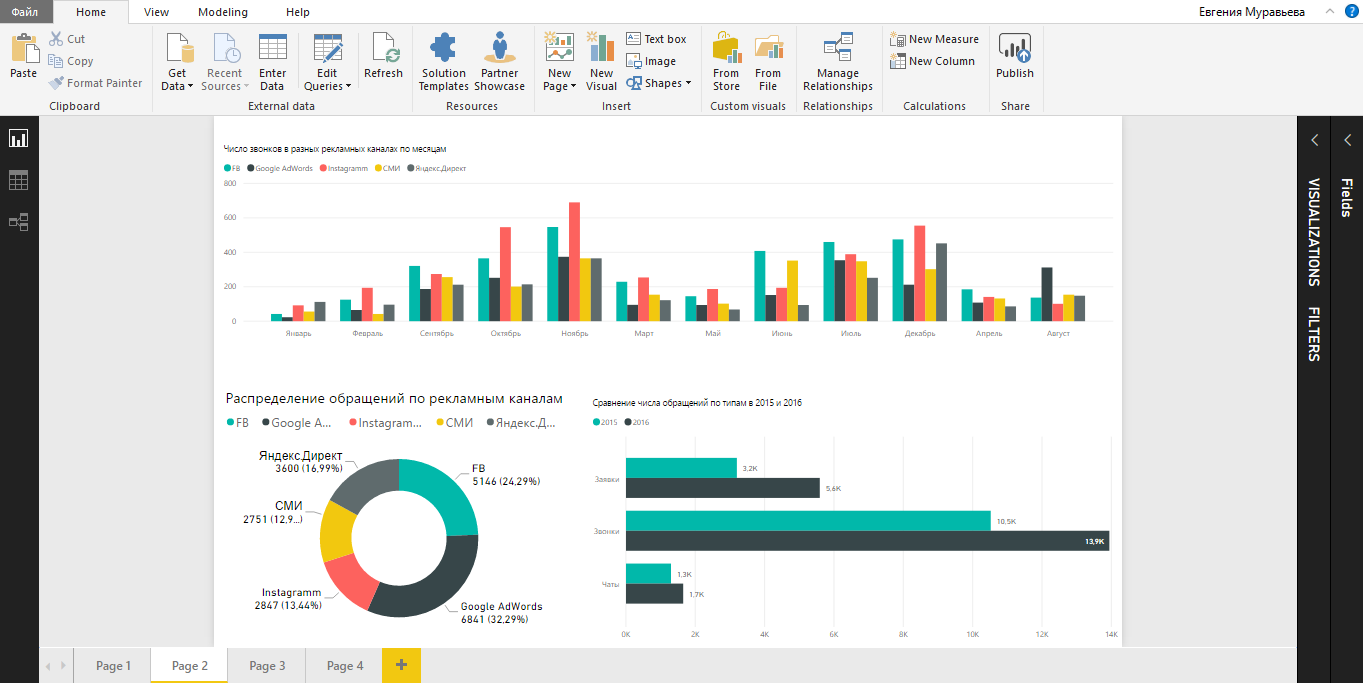
To find out which advertising channels bring the most hits, we build a stacked bar chart.
The diagram clearly shows not only the total number of calls, calls and chats, but also the contribution of each individual channel. Turning on and off the columns, we compare the effectiveness of the channels in pairs or see the role of each channel separately. In Excel, this would have to build separate charts.
Tip: using drag-and-drop, drag fields from any table into the area of any diagram, adding the required data if necessary.
To compare the distribution of all hits by type in different periods, for example, in 2017 and 2016, the stacked columns chart will help.
Which year was more productive in terms of appeals is visible to the naked eye:

Tip: add a line to the chart with the value of the planned number of hits. To do this, click on the magnifying glass icon with the graph inside on the visualization panel and enter the Constant line field.
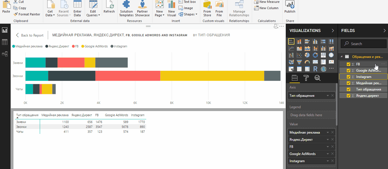
In order to compare the number of calls, chats and requests for two years, it is more convenient to use a grouped diagram .
In contrast to the stacked chart, a clustered bar chart will help determine how much the number of different types of hits has changed in two periods. To “rotate” a column-by-column diagram, in the data table we swap columns and rows. Years should be in columns, and circulation in rows.

A grouped bar graph (clustered column chart) is another type of chart for comparing a large number of data across multiple categories. We use this type to compare advertising channels in each month of 2016 by the number of calls.
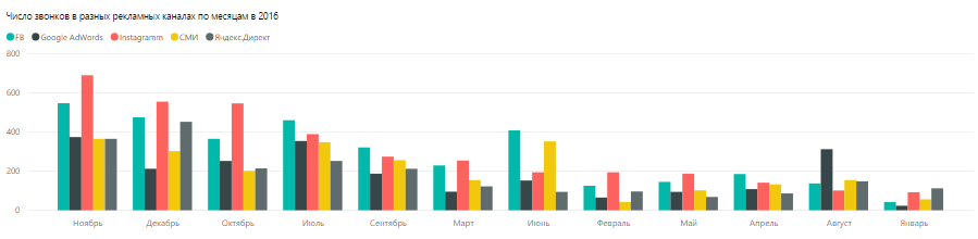
Tip: to sort by one of the fields, click “More options” in the right corner of the diagram window. So you can quickly determine which months through Instagram or any other channel came the most calls.
Normalized charts (bar chart (stacked bar chart) and histogram (stacked column chart) are used when you need to provide data in percent. The same task is performed by donut chart and pie chart. Pie chart. You can use normalized to compare indicators in several periods, and circular - only in one.
Diagrams differ in the perception of information. If in doubt which chart is right, build everything and select the best one. In the legend, you can present the data in percentages, absolute values, specify only the name of the categories or complete information, as in our donut chart example.
Let us compare the structure of calls by their quality parameters using normalized diagrams.

Tip: the legend of any chart is clickable. To highlight one of the categories, just click on it.
To identify the channel that brought the maximum number of hits in 2016, fit a pie or donut chart .

Tip: To rebuild a chart for a specific type of reference, add a slice and select the Type of reference column in the table in the FIELDS panel. Click on calls, requests or chats so that the chart is rearranged on new data.
For a marketer, this is the ability to track the effectiveness of advertising channels in real time. First of all, we are talking about contextual advertising. Visitors who come to the site for advertising, call the company, write in the chat or leave an application on the site. Experts want to know the conversion in circulation, and then in the transaction. Data on visits, clicks on ads, advertising costs, and all calls come from several sources: advertising and analytical systems, call tracking, social networks, CRM. Power BI helps you process and present this data.
Getting started in Power BI is not really that difficult. You only need to import data from familiar services such as Google Analytics, Yandex.Metrica or CoMagic, create simple tables and visualize them. And clickable elements and filters will contribute to the convenience of analytics and comparison.

Evgenia Ponosova marketer CoMagic . In the team, he is responsible for the content part and closely follows the introduction of new tools into the work.
I give the word to the author.
')
Why on the example of Power BI
Suppose there is data from different systems for 2017 and 2016, the analysis of which will help answer the following questions:
- What advertising channels brought the most leads? How many of them are calls, chats, applications on the site?
- Comparison with the previous period: how did the structure of appeals change in 2016-2017?
- In which months of 2017 was the maximum number of calls?
- How many of all calls were quality, repeated, and how many lost in 2017 and 2016?
Data to answer these questions can be presented as a dashboard (dashboard) in Power BI. They are easy to share with anyone, and it is more convenient to use Excel. And besides data and diagrams, you can put popular filters on dashboards. Consider which diagrams are best for answering our questions.
8 popular comparison charts
Bar and pie charts, as well as histograms are excellent for comparing the effectiveness of advertising channels and different types of hits. Recall their main types:
- Accumulated charts - when the data is added up, and you can evaluate the contribution of each data type to the total amount.
- Normalized charts - when the sum of data is taken as 100%, the contribution of each type of data is displayed in percent.
- Charts with grouping - when different types of data are grouped in a chart according to a common parameter. Charts with grouping are both normalized and accumulated.
After loading data from sources and transforming tables into a convenient view, you can proceed to creating charts using Power Query.
To build a diagram, click on the icon in the VISUALIZATION panel, select the table in the FIELDS section and note how the table columns should be displayed.
To find out which advertising channels bring the most hits, we build a stacked bar chart.
The diagram clearly shows not only the total number of calls, calls and chats, but also the contribution of each individual channel. Turning on and off the columns, we compare the effectiveness of the channels in pairs or see the role of each channel separately. In Excel, this would have to build separate charts.
Tip: using drag-and-drop, drag fields from any table into the area of any diagram, adding the required data if necessary.
To compare the distribution of all hits by type in different periods, for example, in 2017 and 2016, the stacked columns chart will help.
Which year was more productive in terms of appeals is visible to the naked eye:
Tip: add a line to the chart with the value of the planned number of hits. To do this, click on the magnifying glass icon with the graph inside on the visualization panel and enter the Constant line field.
In order to compare the number of calls, chats and requests for two years, it is more convenient to use a grouped diagram .
In contrast to the stacked chart, a clustered bar chart will help determine how much the number of different types of hits has changed in two periods. To “rotate” a column-by-column diagram, in the data table we swap columns and rows. Years should be in columns, and circulation in rows.
A grouped bar graph (clustered column chart) is another type of chart for comparing a large number of data across multiple categories. We use this type to compare advertising channels in each month of 2016 by the number of calls.
Tip: to sort by one of the fields, click “More options” in the right corner of the diagram window. So you can quickly determine which months through Instagram or any other channel came the most calls.
Normalized charts (bar chart (stacked bar chart) and histogram (stacked column chart) are used when you need to provide data in percent. The same task is performed by donut chart and pie chart. Pie chart. You can use normalized to compare indicators in several periods, and circular - only in one.
Diagrams differ in the perception of information. If in doubt which chart is right, build everything and select the best one. In the legend, you can present the data in percentages, absolute values, specify only the name of the categories or complete information, as in our donut chart example.
Let us compare the structure of calls by their quality parameters using normalized diagrams.
Tip: the legend of any chart is clickable. To highlight one of the categories, just click on it.
To identify the channel that brought the maximum number of hits in 2016, fit a pie or donut chart .
Tip: To rebuild a chart for a specific type of reference, add a slice and select the Type of reference column in the table in the FIELDS panel. Click on calls, requests or chats so that the chart is rearranged on new data.
Benefits of Power BI
For a marketer, this is the ability to track the effectiveness of advertising channels in real time. First of all, we are talking about contextual advertising. Visitors who come to the site for advertising, call the company, write in the chat or leave an application on the site. Experts want to know the conversion in circulation, and then in the transaction. Data on visits, clicks on ads, advertising costs, and all calls come from several sources: advertising and analytical systems, call tracking, social networks, CRM. Power BI helps you process and present this data.
Getting started in Power BI is not really that difficult. You only need to import data from familiar services such as Google Analytics, Yandex.Metrica or CoMagic, create simple tables and visualize them. And clickable elements and filters will contribute to the convenience of analytics and comparison.
about the author
Evgenia Ponosova marketer CoMagic . In the team, he is responsible for the content part and closely follows the introduction of new tools into the work.
Source: https://habr.com/ru/post/346878/
All Articles