Things that cause mistrust and alienate your customers from the site
Disclaimer: Things that I will talk about today for most people connected with the web environment are obvious and quite understandable (at least, it seems to me), but I do not cease to meet them on the vast expanses of the Internet to this day.
So, what will scare a potential client away from your site (it will be mainly about selling landings) or make him wary:
')
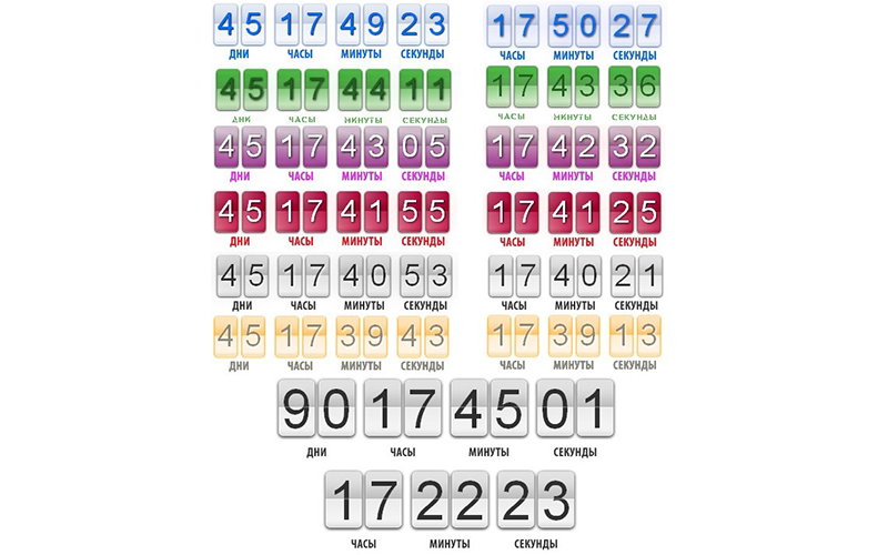
You must have come across them. Those same meters, after which the action on the product or service will disappear, the price will fly up to the ceiling again, or in general the desired item will disappear from the company's warehouses. But it is at best.
Usually, this is just a cheap divorce, and after the time of these timers elapses ... Nothing. Once I even visited such a site, where when updating a page, a similar counter was also reset and started counting from the default time. But now is not about that.
Why is this way to increase conversion is a failure? I found many arguments in favor of and to the detriment of such techniques, but it can be said unequivocally that in 2018 this is at least not effective. A person seeing a countdown counter, even if he is computer illiterate, at the subconscious level asks himself the question: “Are they trying to manipulate me?” Indeed, any call to perform an action here and now alarms us and forces us to be more vigilant.
Personally, seeing such things right away, I think that they don’t want to fool me and of course use the services of such a site. Before placing such constructions on your landing page, ask yourself the question: “How would I react to this thing?” Have you asked? That's the same thing.
All the same applies to the buttons "Buy Now!", "BUY!", "Right now!", Which are waiting for you on each landing screen and from which you can not leave, no matter how quickly you scroll. I realized that I can buy this thing and will definitely do it if I like it. Please do not need me to remind you of this, I can change my mind!
In general, in order not to frighten the user, try to be extremely unobtrusive, they will certainly appreciate it, really.

You have also repeatedly seen such sections, and I generally have nothing against them if they are well-designed and carry some meaning. For the most part, you can stumble upon abstract inscriptions near icons such as “Excellent quality”, “Fast work”, “High efficiency”, and so on. Agree that this is already pretty boring and people do not believe in these empty words, which are just visual noise.
If you really want to interest and attract a client, then take the trouble to find the real advantages of your company, what can it offer something that cannot be found among competitors? Or what is she really the best? Work on the visual presentation, make this section of the landing creatively, outside the box and then the user will not remain indifferent, because the hack from the hard work can be distinguished with the naked eye.
Of course this can be done not always. I understand perfectly that half of the customers, not only real advantages, they cannot say two extra words about their company. In this case, the block with the benefits can be replaced by the company's portfolio. So people will clearly see what it is and what to expect from it.
No, do not think anything like that, I am by no means an opponent of stock photographs. Sitting in an armchair at home we can choose from millions of free photos for our needs and this is great.
It will be a question of those most notorious photos which are well simply icon of a pattern. My favorite example: you need to select a photo of the working team for the site, which of the offered ones is more appealing to you?

I am sure that most would choose the right one. The photo on the left is sterile, it does not cause any emotions (at least positive), does not have the effect of sincerity, but on the contrary pushes away. Placing such photos on your website, and even more so on the main screen, you kind of hint to the user: “I don’t care about my company and customers, I just want to make money.”
So what should be a good photo on the site? Authentic, evoking, creative, not tattered with patterns, clearly reflecting the direction of the site. Underline whatever applicable. You can all at once. An excellent example would be to hire a photographer or take a couple of unexpected photos yourself while your team is working. It is a pity that not everyone can afford it, and if they can, they would bother?
Returning to the topic of unobtrusiveness from the first paragraph. If you embed a feedback form, you should not make it chase the user around the site and callous eyes to him, thereby distracting from the content. Focus on the content and then the user himself will pursue it.
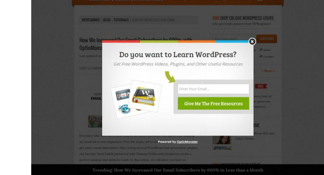
As for the pop-up windows, then I just want to ask the question: “What are people counting on who made the decision to make a pop-up that pops up immediately upon entering the site? Or even every couple of minutes? ”On a random press? Maybe.
But be that as it may, excessive obsession leads a person to the idea that the services or goods that are offered to him are of low quality and are in low demand, which is why they are so diligently promoted. A good product does not need the praises and presentation. Well, maybe quite a bit.
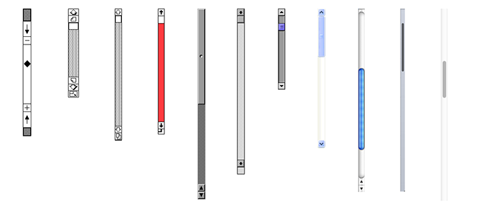
Of course, the scroll will not make anyone wary or cause distrust, but every year the people living in the network, are becoming more lazy and lazier. That is why the trends now have multi-page landing pages (it sounds contradictory), each menu item of which directs you to a new page with a minimum of scrolling.
The user simply gets tired of flipping through a long canvas and eventually decides to go to the competition.
To keep it you need to either have unique insider content on the site or not let the user get bored while scrolling. In extreme cases, make a floating menu.
PS And you should forget about the horizontal scroll at all. Seriously, there’s just no such thing for you. This evil is commensurate with the autoplay audio on the site or the aforementioned pop-ups.
As we can see, things that were originally intended to increase conversion now have the opposite effect. The Internet is progressing and modernizing, and with it the users. I hope all of the above points will eventually become archaisms and will remain only on the dusty shelves of history.
And that's all, I hope you were interested in reading, and the newbies learned something new for themselves. Make cool sites, do not be lazy, invest completely in the work and then the results will not take long to wait. Successes!
So, what will scare a potential client away from your site (it will be mainly about selling landings) or make him wary:
Counters, timers, buy now
')
You must have come across them. Those same meters, after which the action on the product or service will disappear, the price will fly up to the ceiling again, or in general the desired item will disappear from the company's warehouses. But it is at best.
Usually, this is just a cheap divorce, and after the time of these timers elapses ... Nothing. Once I even visited such a site, where when updating a page, a similar counter was also reset and started counting from the default time. But now is not about that.
Why is this way to increase conversion is a failure? I found many arguments in favor of and to the detriment of such techniques, but it can be said unequivocally that in 2018 this is at least not effective. A person seeing a countdown counter, even if he is computer illiterate, at the subconscious level asks himself the question: “Are they trying to manipulate me?” Indeed, any call to perform an action here and now alarms us and forces us to be more vigilant.
Personally, seeing such things right away, I think that they don’t want to fool me and of course use the services of such a site. Before placing such constructions on your landing page, ask yourself the question: “How would I react to this thing?” Have you asked? That's the same thing.
All the same applies to the buttons "Buy Now!", "BUY!", "Right now!", Which are waiting for you on each landing screen and from which you can not leave, no matter how quickly you scroll. I realized that I can buy this thing and will definitely do it if I like it. Please do not need me to remind you of this, I can change my mind!
In general, in order not to frighten the user, try to be extremely unobtrusive, they will certainly appreciate it, really.
The section with the advantages of your company
You have also repeatedly seen such sections, and I generally have nothing against them if they are well-designed and carry some meaning. For the most part, you can stumble upon abstract inscriptions near icons such as “Excellent quality”, “Fast work”, “High efficiency”, and so on. Agree that this is already pretty boring and people do not believe in these empty words, which are just visual noise.
If you really want to interest and attract a client, then take the trouble to find the real advantages of your company, what can it offer something that cannot be found among competitors? Or what is she really the best? Work on the visual presentation, make this section of the landing creatively, outside the box and then the user will not remain indifferent, because the hack from the hard work can be distinguished with the naked eye.
Of course this can be done not always. I understand perfectly that half of the customers, not only real advantages, they cannot say two extra words about their company. In this case, the block with the benefits can be replaced by the company's portfolio. So people will clearly see what it is and what to expect from it.
Stock Photos
No, do not think anything like that, I am by no means an opponent of stock photographs. Sitting in an armchair at home we can choose from millions of free photos for our needs and this is great.
It will be a question of those most notorious photos which are well simply icon of a pattern. My favorite example: you need to select a photo of the working team for the site, which of the offered ones is more appealing to you?
I am sure that most would choose the right one. The photo on the left is sterile, it does not cause any emotions (at least positive), does not have the effect of sincerity, but on the contrary pushes away. Placing such photos on your website, and even more so on the main screen, you kind of hint to the user: “I don’t care about my company and customers, I just want to make money.”
So what should be a good photo on the site? Authentic, evoking, creative, not tattered with patterns, clearly reflecting the direction of the site. Underline whatever applicable. You can all at once. An excellent example would be to hire a photographer or take a couple of unexpected photos yourself while your team is working. It is a pity that not everyone can afford it, and if they can, they would bother?
Pop-ups and feedback forms
Returning to the topic of unobtrusiveness from the first paragraph. If you embed a feedback form, you should not make it chase the user around the site and callous eyes to him, thereby distracting from the content. Focus on the content and then the user himself will pursue it.
As for the pop-up windows, then I just want to ask the question: “What are people counting on who made the decision to make a pop-up that pops up immediately upon entering the site? Or even every couple of minutes? ”On a random press? Maybe.
But be that as it may, excessive obsession leads a person to the idea that the services or goods that are offered to him are of low quality and are in low demand, which is why they are so diligently promoted. A good product does not need the praises and presentation. Well, maybe quite a bit.
Scroll
Of course, the scroll will not make anyone wary or cause distrust, but every year the people living in the network, are becoming more lazy and lazier. That is why the trends now have multi-page landing pages (it sounds contradictory), each menu item of which directs you to a new page with a minimum of scrolling.
The user simply gets tired of flipping through a long canvas and eventually decides to go to the competition.
To keep it you need to either have unique insider content on the site or not let the user get bored while scrolling. In extreme cases, make a floating menu.
PS And you should forget about the horizontal scroll at all. Seriously, there’s just no such thing for you. This evil is commensurate with the autoplay audio on the site or the aforementioned pop-ups.
Summing up
As we can see, things that were originally intended to increase conversion now have the opposite effect. The Internet is progressing and modernizing, and with it the users. I hope all of the above points will eventually become archaisms and will remain only on the dusty shelves of history.
And that's all, I hope you were interested in reading, and the newbies learned something new for themselves. Make cool sites, do not be lazy, invest completely in the work and then the results will not take long to wait. Successes!
Source: https://habr.com/ru/post/346872/
All Articles